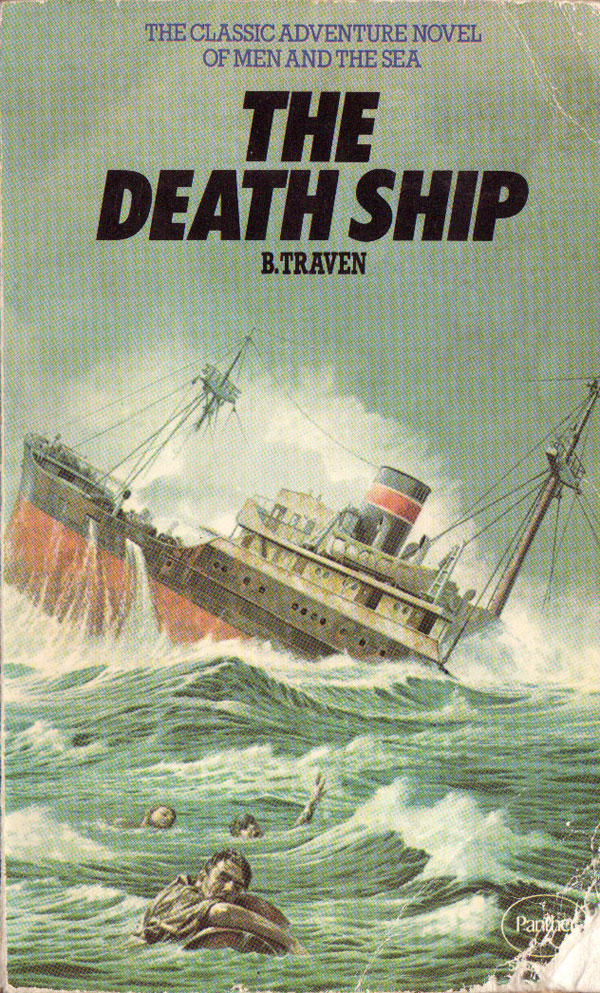
By far the most response to this book cover blog over the past year was to the six-week installment about the covers of the mysterious German-born, Mexican-bound, antiauthoritarian novelist B. Traven (Weeks 14-19, which you can see HERE). Both Jared Davidson (in New Zealand) and “Ret Marut” (thought to be the real name of Traven) emailed me images of the 1974 Panther UK edition of The Death Ship. Ret also sent me a great link to something they wrote on Traven, which you can read HERE. There is also a somewhat “official” Traven site at BTraven.com, which has tons more info on Traven, plus full bibliography, small images of tons more covers, and a collection of his photography.
Spurred on by all the interest in Traven, I’ve scoured the web and used bookstores trying to find more covers. I’ve come up with 17 more covers of The Death Ship (all below), as well as about 20 additional covers of other books (which I’ll share next week). If anyone out there has even more Traven covers, definitely email them to me! (Images at least 300 pixels in width are preferred…)
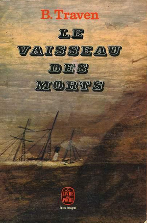
Well, lets jump right in. The Panther cover above is cool, a bit like the cover of a comic book (hummm, are there Traven comic books?). Below are two covers from the French publisher Editions Livre de Poche. The on the left is an earlier edition, 1967, the title and such are just dumped on a darkened painting of a sinking ship. I do like how it almost looks like it was a painting of an old sail-based schooner or something, and then they just painted in a little smokestack and smoke puffs amongst the masts! The 1974 edition next to it has a cover that is, well, more 1974. The orange over-tint and obviousness of the image make it seem like a pulp novel—romance! war!—or maybe a promo poster for a cruise on a battleship. The long shot with the majority of the cover being water isn’t a bad idea, it’s just doesn’t really pull of the idea of being forever forced out at sea.

These Spanish covers are much more interesting. The first is a new edition published by Acantilado, and although super obvious (black ship! skulls! shadows!) it has a really nice graphic quality, and although probably unintentional, I like how the ship could just as easily be beached in the desert as trolling the ocean. The cover next to it is one of my favorites of this batch, a 1975 edition by the Barcelona-based publisher Circulo de Lectures. A great 60s/70s style illustration of a soldier (almost out of a kids book) is transformed into a skeleton. The comic look doesn’t quite fit the subject, but that is also what makes the whole thing both funny and a but unsettling.


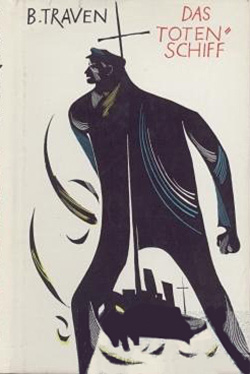
The vast majority of new covers I found are from German editions. I think there’s been huge increase of German booksellers on the web, as I wasn’t able to find any of these cover images before. It appears that the primary publisher of Traven in German is a publisher named Volk und Welt Verlag. The next 5 images are all from them. The two below must be from the same designer, and although the first is labeled 1962, and the second 1964, I wonder if one is actually the dust jacket and the other the cloth cover from the same hardback edition. Both feature the same hand-written typeface for the title, with the “T” in Totenschiff becoming a primary graphic element. The one on the right is a bit more advanced, the T becoming the mast of shadowy skull ship. The controlled use of red, black, and white adds power to the covers.


The cover below to the left is only remarkable in that it is suprisingly dull for a Volk und Welt edition. Traven is in such an amazingly cliche’d font, it looks like the name of New Jersey side-of-the-highway diner instead of an author. The cover to the right is the opposite. It is in the Traven house style for all Traven Volk und Welt trade paperbacks from the 60s and 70s. Each one features a great illustration by Werner von Klemke, you can see more in the earlier Traven posts, and a couple new ones in next weeks post. The black and blue image of a sailor leaps off the white cover, but he is literally part of the ship that holds him back, which both flows out of him and appears to have impaled him. The hand-written titles are quite nice as well.

Below to the left is the last Volk und Welt Death Ship cover, and it is in the later house style of what I am assuming was a multi-volume Traven omnibus put together in the 1980s. Each volume contains multiple novels and/or stories (this one is a joint collection of The Death Ship and The White Rose) and the cover is composed of a flat field of color, titles in the powerful Block Berthold, and a black and white etching in a bold black frame. Quite simple and effective. These covers are classic looking without feeling too dated, and I would have never guessed that they were produced in the 1980s.
To the right is a really unique cover from Verlag Reclam, which is based in Leipzig (as opposed to Berlin). Too bad I could only find a crappy image of it, but it is nice to see the expressionistic and over-active line drawing completely dominate the cover.


The Buchmeister Verlag cover below to the left is from the 1930 hardcover, a bold a straightforward embossing on the cloth cover. The title sits like a ship a top the horizon line, and thinner lines below could be interpreted as waves in perspective. I know I keep saying it in these blogs, but the simplicity is so refreshing, I really wish I could get away with making a cover that looks like this today. To the right is a 1989 Bucher Gilde Gutenberg edition, one of the few covers that completely forgoes the seemingly obligatory visual references to the “Death” and “Ship” in the title. The simple line drawing of a figure is mechanical and odd, maybe a reference to the more existential themes in the book.


The two covers below are from Rohwolt Verlag, in particular their Taschenbuch (or trade paperback) series, which all have the “rororo” logo on the cover. The one on the left is from 1981, and has a real Jules Verne feel, almost cartoon-y steam punk. The second, more contemporary edition uses a black and white still from the 1959 German film based on the book.


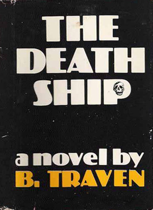
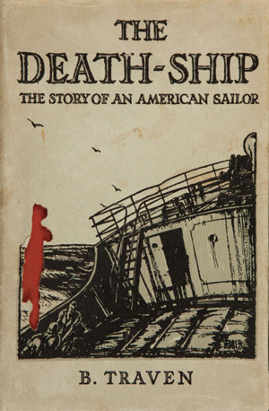
Two last Death Ship covers for English editions. The 1973 Lawrence Hill dust jacket for the hardcover is subdued, simple type floating in a sea of black with a small cro-magnon looking skull in the void of the P. The type and style harkens back to pre-73, so this maybe a reworking of an earlier imprint on the actual cloth cover. The publisher must have felt the cover wasn’t communicative enough, because a later edition uses the same image/type, but runs a diagonal text bar across the bottom half, explaining what awaits the reader inside. Next to that is the dustjacket of the 1934 Chatto Wndus edition, which is likely the first UK edition. The image is expected, a ship at sea (and I can’t read the artist’s name), but the type is unique, all caps outlined, nice.
And some further house-cleaning: Dan Berger sent me the cover below for the hardback of Clark Howard’s American Sunday, a book about George Jackson and his murder (see the post from weeks 44 and 52). Not the most exciting cover, and a bit unclear in terms of representation. The red, white, and blue immediately make the cover feel “American,” and the bleeding star could be read as the murder of Jackson hurts the US. But then the shadowy black shapes in the corners seem to say that there is something lurking on the edges of what we see that threatens us, and it is hard to not read those shapes as “blackness” or the Black Panther Party…some mixed design messages at work here. Also notice the stencil font, a quick, proven, short-hand for “prison book”!!
Next to that is the Victor Serge Conquered City cover Alec Dunn sent in, and tried to post in the comment section of last weeks blog post. I believe it is the hardback edition published in the late 60s by Doubleday, with a cover by Stanislaw Zagorski, whom Alec gave some background on in his comment (see HERE). Zagorski did covers featuring similar hands for the other 2 novels in the series. This cover is fabulous, the illustration of the hand crushing the Russian city conveys the content, but the the turrets on the buildings are sharp and pointy and appear to be stabbing the hand, making it clear that the conquering is complicated. The title font is also compelling, and the large black lowercase are nicely complimented by the serifed tall caps above and below.




How book covers have changed. A lot of modern covers are heavily manipulated photographic compositions. Some of the above examples are really beautiful. Dos Totenschiff is amazing. So dark and sinister.
Thanks for sharing.