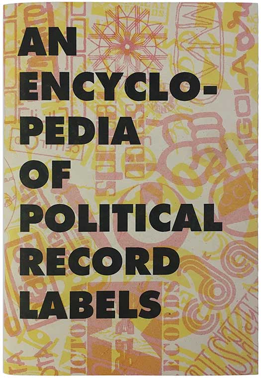
I’m very excited to have a new studio, which will also be the home of Interference Archive, but between packing, moving, building shelving, and regular freelance work, I haven’t had a minute to think about book covers in the past couple weeks. Over the next couple weeks I think I’ll just be pulling together small little pockets of covers I’ve collected over the past couple years.
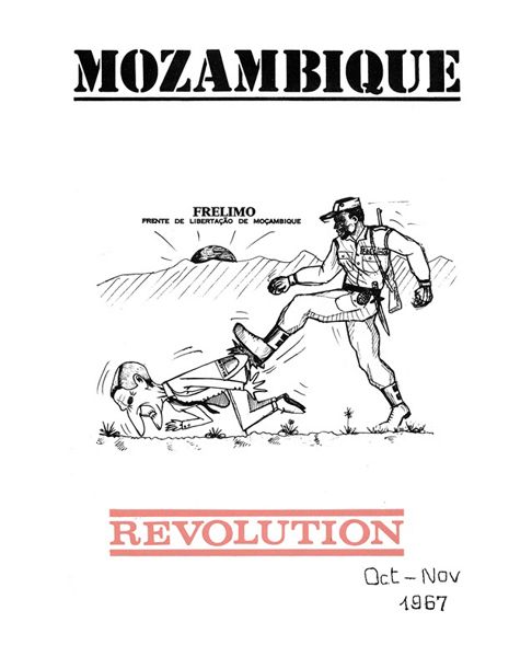
While doing research for Signs of Change, I came across an English language publication produced by FRELIMO, the liberation movement of Mozambique. It appears that Mozambique Revolution was FRELIMO’s English organ of communication with its support and solidarity movement. This is just a smattering of covers—9 total—while the publication was monthly and ran from 1963-1975. There’s some pretty interesting and smart design here, which like many 60s and 70s movement publications, seems driven in part by the technological limitations of producing quick and inexpensive output at high volume.
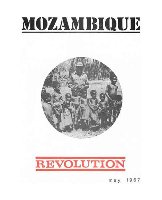
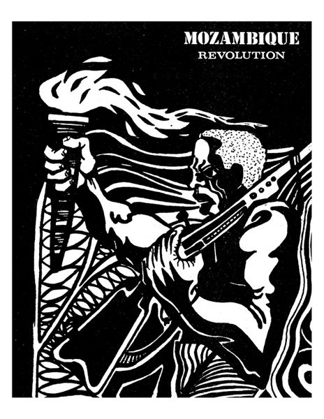
Above and below left are issues from 1967, and representative of the early printing, with Mozambique in stencil font at the top, and Revolution in red at the bottom. In between there is always a black and white image of some sort, usually a photograph. Starting in 1969 the design became a bit more fluid, with graphics used on posters re-purposed for full bleed covers (below right, September 1969).
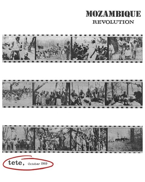
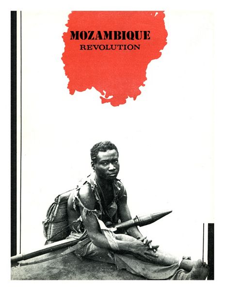
October 1969 sees a layout similar to the 67 issues, but it is more adventurous and “designed,” with the 3 strips of photos reproduced and the title shrunk and moved to the top right. The October 1970 issue (below right) sees an even further design jump, with a montage of images, the soldier in black and a geographical outline of Mozambique above his head. I assume it is no accident that the country’s outline also contains title, visually locating the revolution. In addition the thick and thin stripes line the sides, from top to bottom on the left, and strangely only a fifth of the page up on the right. I’m unsure why this decision was made, but it works visually!
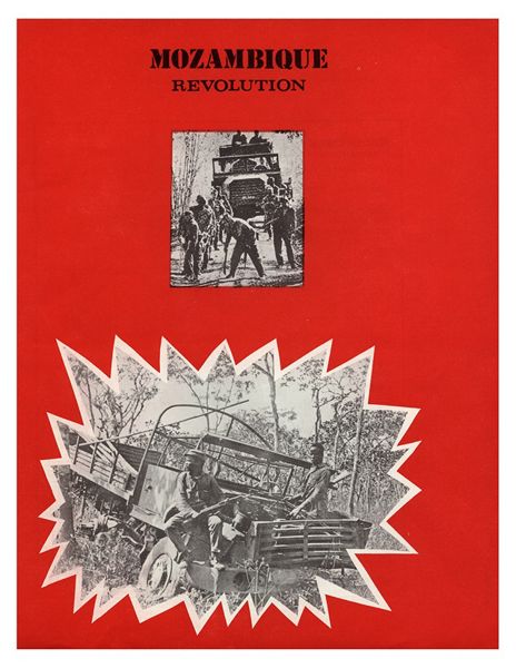
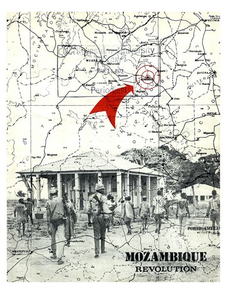
May 1971’s cover is clunkier, but also charming, with a destroyed Portuguese military vehicle set in a cut out explosion to the bottom left on a field of red. I think the smaller inset photo is either an attempt to show a “before and after” or maybe show the FRELIMO soldiers that took out the jeep, but either way the cover would have been stronger with the single image. October 71 is my favorite of the bunch, a very successful use of limited color. Marching soldiers are laid on top of a map of Mozambique, with a simple red arrow and circle pin pointing the location of where they are going. It is such a clean and elegant way to illustrate both the general advance of resistance forces, but also the specific location they have or are about to capture.
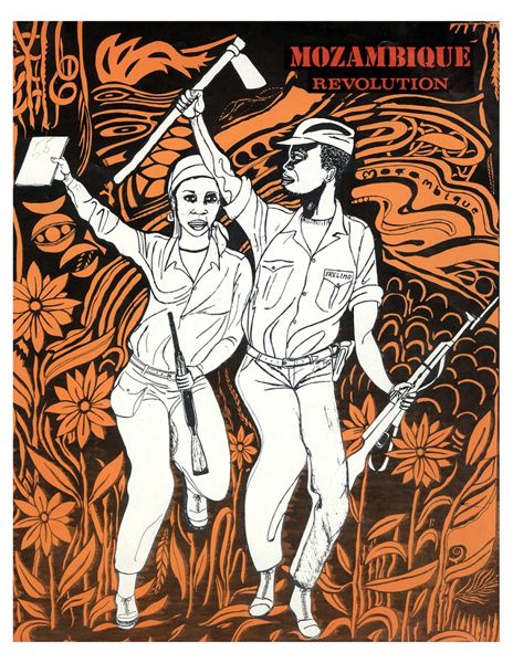
April 1973’s cover is another reworked poster image, but this time with color, both orange and red. (I wish I could remember the name of this artist, and the book with that info is packed away in a box right now. When I find it, I’ll leave a comment below!) A number of the artists working in Mozambique during the revolution share this neo-psychedelic style, with cartoonish people fading in and out of trippy abstract or floral patterns.
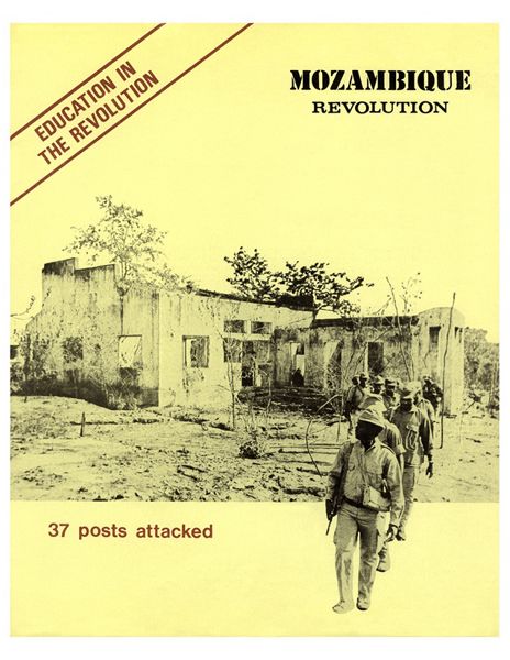
And the last issue, October 1970, has a very confident design. The paper color has changed to yellow, red is used only as a highlight, and the bottom of the photo image is cropped so that the soldiers are literally walking out of the page, another great and simple visual way of representing movement and advance.
