Onward to the Angela Davis pamphlets! Because these have been produced by a diverse collection of publishers and activist groups, the design is much broader and more interesting than the mainstream books. There must have been at least a dozen different groups organizing for Davis’ release while she was on trial in 1972, and all of them produced publications in support of her cause. One of my favorite covers is the pamphlet to the right, On Trial: Angela Davis or America? with a main essay by Civil Rights Movement veteran and celebrity Ralph Abernathy (Angela Davis Legal Defense Committee, 1971). This cover has all the elements of good publication design. The type treatment is subtle, clean, and modern (literally, it is Futura!), leaving the singular central graphic to do the primary communication work. And that it does. The simple gesture of turning the stars on the U.S. flag into vertical bars instantly conjures prison associations with the word and idea of “America,” and clearly answers the question in the title of which is on trial. In addition, the designer (uncredited) is smart enough to play to the strengths of single color printing, and the necessary conversion of the flag into black and white furthers the prison association.
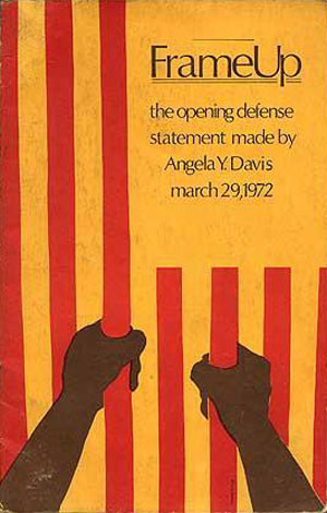
The next cover is Frame Up: The Opening Defense Statement Made by Angela Davis, March 29, 1972 (National United Committee to Free Angela Davis, 1972). It is similar in multiple ways to On Trial, but this time the flag is fully turned on 90 degrees clockwise, the bars are printed in red, and just in case you didn’t get it, a pair of black arms hold the bars, either solidifying the association or as overkill, depending on your perspective. The cover is still strong—red and black on yellow stock is a good choice and the type is solid and nicely understated—but doesn’t have the same efficiency as the one above.
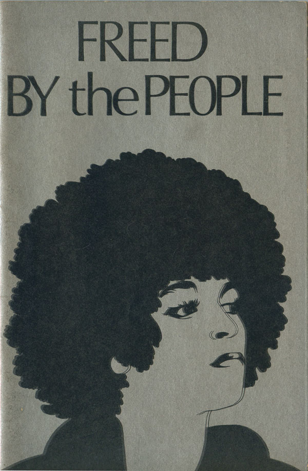
Freed by the People: The Closing Defense Statement Made In the Angela Davis Case, June 1, 1972 (National United Committee to Free Angela Davis, 1972), with its unique and powerful illustration of Davis, goes for a very different feel, much more in line with the covers for If They Come in the Morning (see HERE). The focus has shifted from the failures of the criminal justice system onto Davis herself, adding to her existing cult of personality. This makes sense for activists that not only wanted her free, but supported her politics and felt she would be an advocate for them as a public figure. Although the style is different, I wouldn’t be surprised if Freed by the People didn’t have the same designer as Frame Up, as they share a publisher and a not entirely common titling font. I suppose Optima might have been more popular in the 70s than it is today, but I have rarely seen it on other political pamphlets.
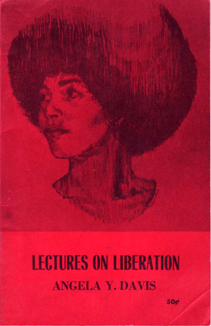
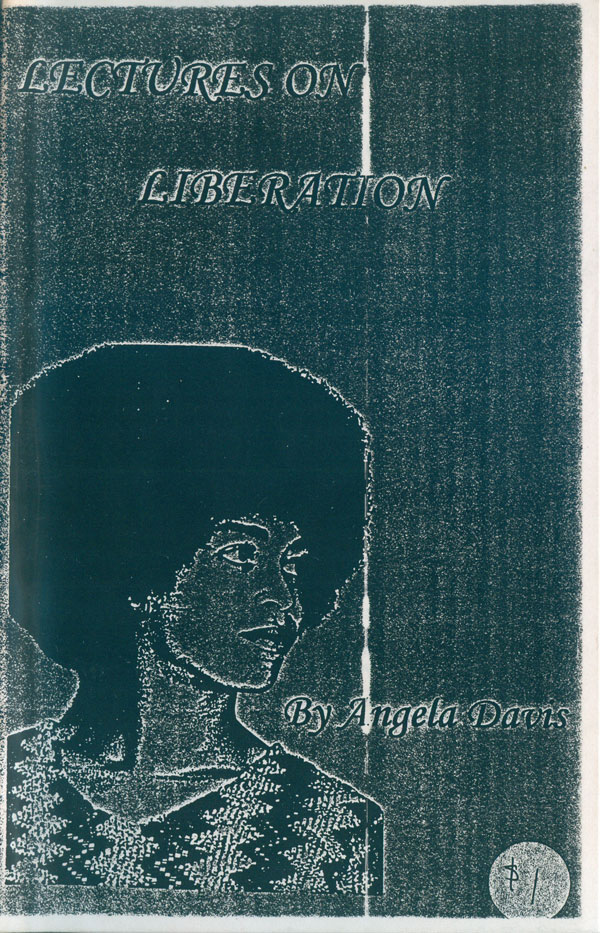
While the two above pamphlets are from Davis’ San Francisco support group, the below are from New York. To the left is the original Lectures on Liberation (New York Committee to Free Angela Davis, 1971), whose cover features a much more impressionistic image of Davis, possibly drawn with drafting markers. While the above covers are extremely stylish for political pamphlets, this one is much more traditional, black printed on a color stock, simple singular image (likely not made specifically for the publication), and basic type. To the right is a photocopy of a different edition of Lectures which I picked up sometime in the 90s as it was circulating in prison activist circles. Per above, it has a single image of Davis, not created for this publication, and basic, or in this case awkward, type treatment. It’s not really even fair to judge the cover because it was clearly created by someone much, much more interested in the content than the package (otherwise they never would have put the title in all capitals of a Chancery Italic).
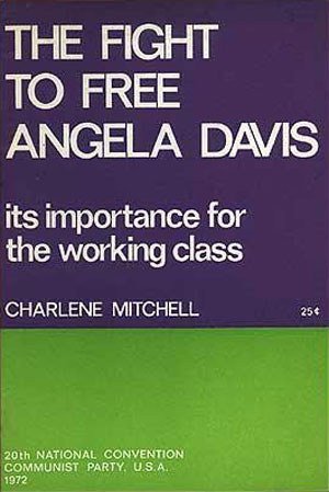
Below are two more support pamphlets, the one on the left is a reprinting of a statement by Charlene Mitchel of the Communist Party U.S.A. about the political importance of supporting Davis. I love the purple and green, and the all Helvetica type treatment works too. The funny thing about these more stodgy and sectarian left publications is that the best of the lot from the 60s and 70s, like this one, largely reproduce variations on Left design from the 20s and 30s. So while handsome, they hardly look contemporary. A Political Biography of Angela Davis (N.Y. Committee to Free Angela Davis, 1972) is even less inspired, with its serifed all-caps title and awkward snapshot of Davis in front of a portrait of Lenin (or is it Gus Hall with a goatee?).

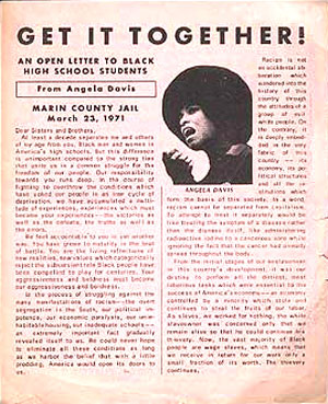
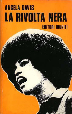
Get It Together! (1971) is a Davis support pamphlet aimed at high school students, laid out like a newspaper, and featuring a well-known activist photo of Davis, with her afro cropped into an almost perfect circle. The Italian book La Rivolta Nera (The Black Revolt, Editori Riuniti, 1972) uses the same photo but two-tones it. This book is largely an Italian translation of If They Come in the Morning, but they must of changed the name in hopes of increasing sales, and use this much more active image of Davis than those used on the U.S. and U.K. editions (even though the photo on the cover of the first U.S. edition has her speaking, but she seems stiff, almost inert: see HERE).
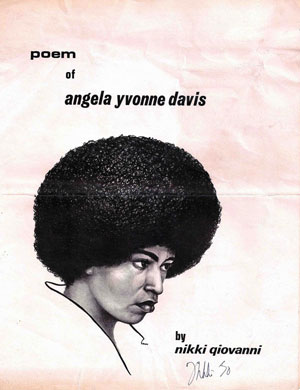
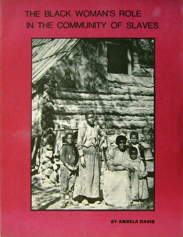
Nikki Giovanni’s Poem of Angela Yvonne Davis (Afro Art, 1970) is one of the earliest pamphlets I found, pre-dating the real explosion of Davis-mania in 71 and 72. This might be why the drawing of Davis, although sporting the signature afro, is neither heroic nor smiling, but quite human. The Black Woman’s Role in the Community of Slaves (New England Free Press, 1972) forgoes any representation of Davis or her struggle in order to focus on the subject of the pamphlet and her research, the important roles Black women have played in the history of the U.S. By skipping right over the hype, this pamphlet re-centers Davis’ role as a movement scholar rather than fugitive or celebrity
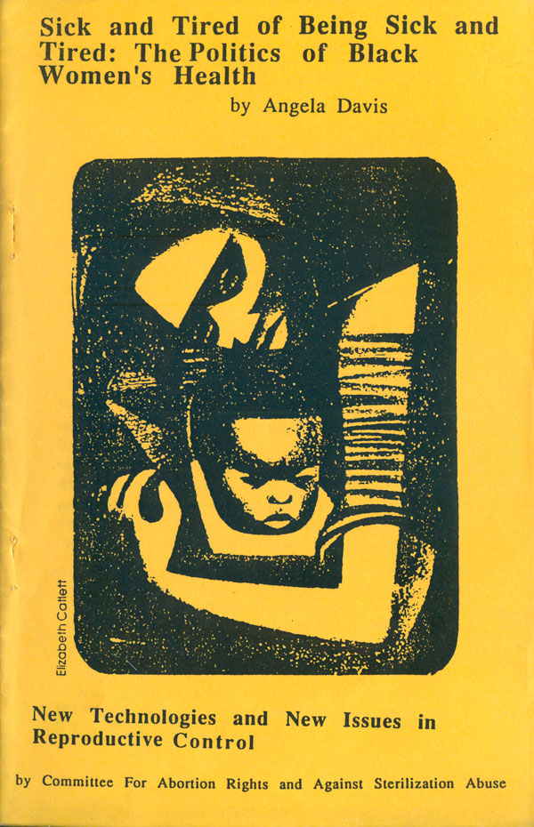
Like with her book covers, later pamphlet designs shed the heroism and image-based cult of personality of many of the ones produced during her trial. Violence Against Women and the Ongoing Challenge to Racism (1985) uses the fixed (and staid) series design of Kitchen Table Press’s “Freedom Organizing Series.” A 90s era photocopied pamphlet version of “Sick and Tired of Being Sick and Tired” produced by the anarchist Youth Greens uses an image by Black political print maker Elizabeth Catlett on the cover.

As the printed political pamphlet has become an endangered species in the 21st century, a number of left-leaning publishers have begun producing small, slim volumes by well-known authors on popular subjects as a way to both reinvent the pamphlet and encourage people with tighter budgets (especially younger people) to continue buying books. One of these presses is Seven Stories, and they’ve produced two of these pamphlet-type pocket books by Davis, both capturing her return to prison-related scholarship and activism. Are Prisons Obsolete? (2003) and Abolition Democracy (2006) are both challenges to the prison-industrial complex. Unfortunately they both also suffer from the same design flaw, an attempt to capture the outdated nature of prisons, and the visual banality of their walls, which might be politically appropriate, but fails to capture the viewer’s attention. The crumbling door and walls featured on the cover of Are Prisons Obsolete? seems like it would make a great photo in an exhibition about decaying prisons, but doesn’t quite click as a cover. The wall in the background of Abolition Democracy is simply not interesting enough to make me think of much of anything, and certainly doesn’t add to, resonate much with, or clarify the somewhat obscure meaning of the title.


Next week I’m going to look at books by others about Davis and her trial. If you have any covers I’ve missed, please send them over, either drop a note in the comments section here, or email me at josh [at] just seeds dot org.


