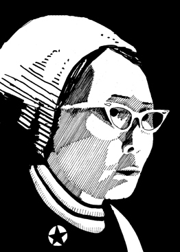
It’s interesting to think about how to approach illustrations like this, you want it to represent the person, you want it to look like the person and maybe capture some of what you consider interesting or inspiring (their spirit). I didn’t want it to look like the weird ‘portraits in history’ that were in the Sunday comics when I was a kid.
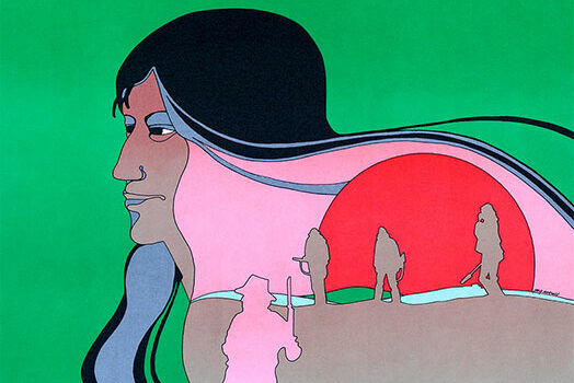
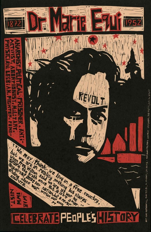
Some people really put the image in context with symbols (like Roger’s previous blog post of Geronimo– where there actually isn’t a face in it at all), others did fairly straight portraiture. I was thinking of what I’d do for an image of Yuri Kochiyama. Her standing over a ruined prison…? seemed a little hyperbolic. She was arrested during the occupation of the Statue of Liberty in 1977- and that is a powerful image, but she was there in solidarity and support with Puerto Rican activists protesting the unfair treatment of political prisoners. To use this as her image casts her as a leading catalyst, which is not something I’m sure she’d be comfortable with.
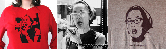
Anyway, deadlines were looming so I started trolling the internet for pictures of her to see if anything caught my eye. There’s a great image of her with a microphone from the 60s, making a speech at a rally or something, but that one has been used a lot.
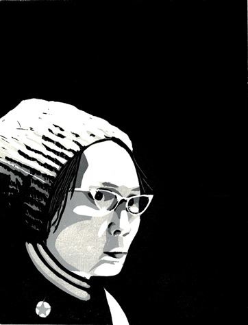
There was no way I could do this as one color, even two colors started to seem impossible to me. Three? maybe. But really I wanted to do 4 colors! Instead of cutting each individual plate I decided to do a reduction cut, which would lessen a lot of the work.
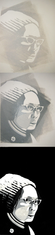
(For non-printers a reduction cut is where you use one piece of linoleum (or wood) and you print from the lightest colors to the darkest colors, cutting out (or reducing) the image as you go. It’s nice because you keep the same registration marks, so a lot of the work in lining up colors is eliminated. They are also called suicide cuts, once you get your printing done your block has been reduced down to the darkest color, making it unusable again.)
Anyway, I enjoyed the process on this one, reduction cuts can be pretty fast moving. I printed and cut the 1st three grays in one night. Then I waited a day (for the ink to dry) to put the black over the top. Multi color printing is always interesting too because I tend to find that I really like the look of the unfinished product, in this portrait of Yuri I really like it with only grays, and the way that brayers left the ink rolling out from her face….
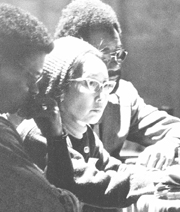
This was a fun mental process to go through, how do we choose to represent someone? Especially in a case like Roger’s with Geronimo, when there’s only one or two pictures of someone and those pictures are really well-known. With Yuri at least I had a ton of photos to look through.
Also if you’re interested in Yuri Kochiyama, read the book I read….”Heartbeat of Struggle” by Diane C. Fujino. It’s really great!
Thank you for this entry Icky!I haven’t been making art for a very long time and find the best way to learn techniques is from this kind of step by step process documentation. They end up being tutorials for me. I would not have been able to identify how you made the Yuri piece but not have some familiarity with a multi color linoleum process. Super cool and inspiring!
thanks for posting this, icks. always really interested in hearing people’s processes behind their image-making. i love the brayer-marks as well..