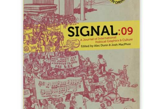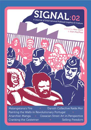
After a tough two years (and many gentle reminders from the PM crew) Signal 02 is finally finished. Signal is ongoing project between Josh MacPhee and me, with the aim of documenting international art, graphics, and culture tied to social movements around the world.
Signal 01 had six features: Dutch comix anti-hero Red Rat; graffiti artist Impeach; a photo essay on Adventure Playgrounds; the designer Rufus Segar & Anarchy Magazine; the Taller Tupac Amaru; and posters from the propaganda brigades of Mexico in 1968. With issue 2, we wanted to expand the focus a little and try to cover some new areas and struggles. Here are some highlights:
Røde Mor
A few years back, Josh and I took a rambling trip through Europe trying to collect material for Signal. In Copenhagen, Josh gave a slide-show about political posters including a Danish poster by an (at the time) unknown artist. We were informed that image was made by Dea Trier Mørch, a relatively well-known Danish printmaker who was part of a cultural collective called Røde Mor (Danish for Red Mother). Røde Mor’s musical wing, a rock circus/band was quite popular in their time, hitting high in the pop charts and playing festivals. Røde Mor’s graphic section made posters for protests, unions, and international struggles. Our hosts played us some of their music, and we were intrigued enough to take a journey to a poster museum in Aarhus that housed (and also sold) a collection of Røde Mor’s graphic output. It turned out that the poster museum was in the midst of a historical village (as in re-enactments of old Danish living and industry) and had mostly old cigarette advertisements displayed.
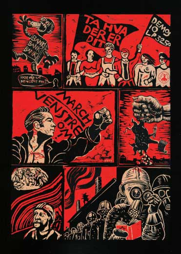
Slightly confused by this, Josh and I took the train back to Copenhagen and the next day, in a book store, stumbled upon some graphic novels and portfolios of Røde Mor’s (that was a bit of a running theme of that trip: any effort to actively seek something out met in failure, but luck, curiosity, and greed for books delivered a wealth of new discoveries). At that time, I fell in love with their work.
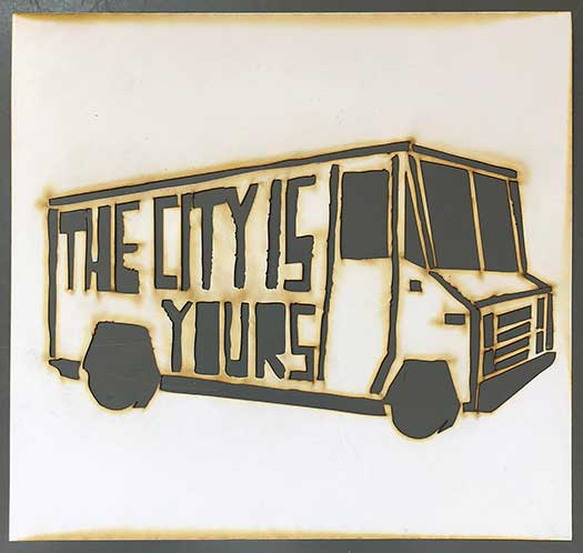
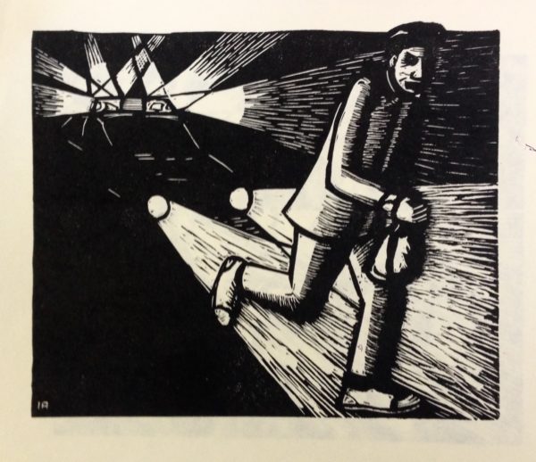
The graphic novel that I found, BILLEDROMAN, tells three wordless stories from 1973. The first about a Vietnamese woman taking up arms against the Americans, the second about the coup against Allende in Chile, and the third follows a Danish factory worker as she becomes radicalized (the cover image on Signal 02 is from this story). Each story was done by a different artist (Yukari Ochiai, Thomas Kruse, and Dea Trier Mørch, respectively). All were made with one color block prints. Their individual work is distinctive (after a bit of familiarity it’s easy to tell who did what), but they feel complimentary to each other. There’s also something warm to much of their work. They were attempting to revive the idea of proletarian art; so while the themes are confrontational, advocating revolution, they also feel very inclusive, playful, and sympathetic.
I feel like I shouldn’t play favorites within the collective, but I am especially influenced by the work of Dea Trier Mørch, who did the third story mentioned above. Her images are simple with strong line-work, and at the same time highly descriptive & evocative despite their minimalism. She was also a well known author, her most popular book Vinterbørn (Winter’s Child, 1976) which she also illustrated, was an experimental feminist novel about childbirth. It was a bestseller and was later made into a film (it is also the only book of hers translated into English, easy to find and cheap).
Kasper Ostrup Frederiksen is an acquaintance of Josh’s, a Dane living in England. He also shared a fascination with Røde Mor, and had done some research on them in the past. We contacted him about doing a piece on the collective and he quickly obliged (considering that we’re at least a year behind deadline on this issue, I still feel a little guilty with how quickly Kasper got us his piece- sorry Kasper!). It tells the story of the collective as well as having translations of several of their manifestoes, which gives a much rounder view of who they were and what they believed in:
Red Mother is the revolution’s mother
The mother of the oppressed, the weak and the orphans
Red Mother waits for you, won’t forget you and keeps the food warm
Red Mother is a wild and ferocious lioness
Red Mother walks with an olive branch in its beak
Red Mother is a black sheep and, also, a red flag
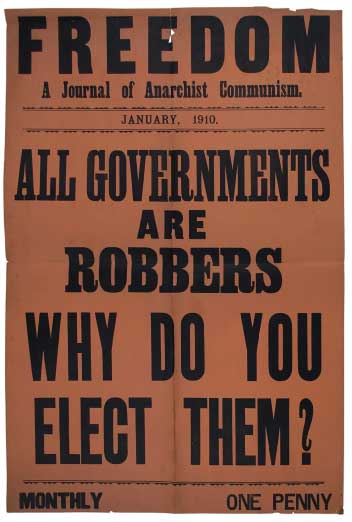
Freedom Broadsides
Freedom is an anarchist publication that began in 1886(!). In Signal, we have a collection of old broadsides that we think were used as advertising for new issues of the newspaper. We’re not sure where the advertisements were posted, consultation with English anarcho-historians only led to educated speculation (who guessed that maybe they were posted on the sides of news-stands). I like to picture dedicated cadres of street vendors wearing them as sandwich board signs with headlines that read: “Government and The People; Shattering the Dumb Gods,” “The Crime of Crimes; Capitalism Condemned,” and (my favorite) “All Governments Are Robbers! Why Do You Elect Them?” Most of these date from 1900 to 1910. They work as both a history of the movement and as a fine example of type craft in the early twentieth century.
Josh found these at the Kate Sharpley Library, and when he did, he grunted with delight, which caused me to walk over and see what all the fuss was about.
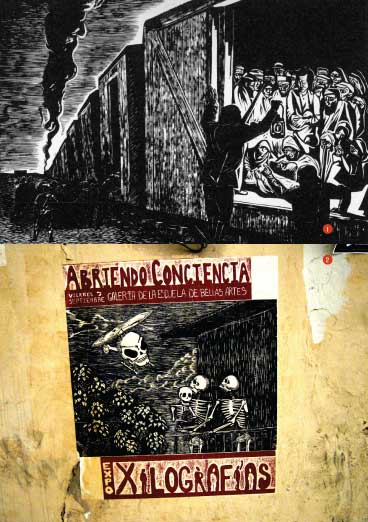
Oaxacan Street Art in a Mexican Context
We were both eager to get some writing from Deborah Caplow, an art historian, professor, and author in the Pacific NW. I knew of her from her excellent book on Mexican printmaker (and founding member of Taller de Grafica Popular) Leopold Mendez.
Originally Josh and I wanted to see if we could dig a little deeper into the TGP’s art process. There are bits of information of how they worked in various books about individual artists within the collective, but the only books on the collective itself are not available in English. Our understanding of their collective practice is that they would decide on general themes and images for a poster as a group, and assign the task to one of the artists within the TGP. The artist would bring back a rough sketch of their idea and it would then be open to collective criticism and adjustment. Sometimes entire works would be redone by different artists within the group. This process, while rare these days, isn’t unheard of in art collectives (it is however, ironically, standard practice in commercial/applied art); but at the time (1930s/1940s) this way of working was a pretty wild idea. Josh contacted Deborah and she countered with an article she wanted to do that placed the posters and graffiti that had appeared around the uprising in Oaxaca within a context of Mexican political print making. Which sounded excellent.
Mexican prints, especially Mexican political prints, are very distinctive. There’s a richness to the imagery, and often an almost-impossibly skilled use of line work to give the images great depth and movement. Amongst the circle of printmakers that make up Justseeds (the art collective Josh and I are both members of) the influence of the TGP is probably second to none. One of my favorite prints from the TGP starts out this article, Leopold Mendez’ Deportacion a la muerte, which is a haunting, high-contrast, print that anguished over the traffic of human lives to the Nazis’ death camps in WWII.
The more contemporary work in the article is also quite stunning, most of it done by the collective ASARO. A few years back I saw a presentation by one of the members of this group, who had brought up a pile of prints which had been wheat pasted in the streets of Oaxaca while things there were still quite volatile. My friends and I were blown away by the quality and creativity of the work we saw. The article in Signal shows the strong lineage from Posada to the TGP to these contemporary artists.
The Yamaga Manga
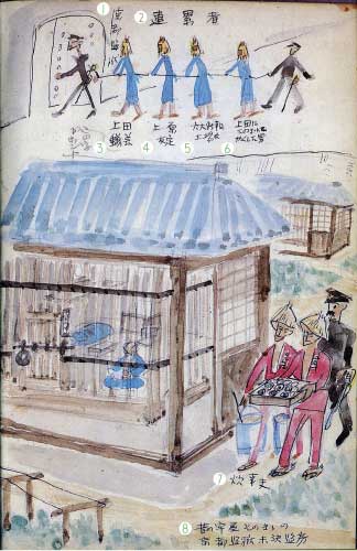
We contacted Keisuke Narita of the Irregular Rhythm Asylum and the Center for International Research on Anarchism in Tokyo about getting some work in this issue from Japan. We didn’t have anything in mind in particular and left it open. He sent us various examples of design, old and new, and what jumped out at the time were couple of pages of illustration with narration (comics or manga) painted in muted watercolors. When we expressed an interest in these, Kei informed us that they were made by Taiji Yamaga, a well-known figure in Japanese anarchist and Esperantist circles in Japan, near the end of his life. He made them as a visual reference when he was writing down his memories. They were titled “Sketches From Memory,” and they do have a dreamy, staccato flow to them, reminiscent of the ways that memories flow together in bursts.
The narrative covers the tumultuous political life of anarchists in Japan in the early twentieth century. They are beautifully drawn and highly expressive. These were translated by a team in Montreal, led by Adrienne Hurley who has translated other work for PM Press and is also (I believe and hope) working on a history of Japanese Anarchism.
Cranking the Gestetner
Lincoln Cushing wrote a piece about a printing press, the Gestetner, that was popular with radicals in the late 1960s up to the mid-’70s. The Gestetner press could produce pieces that looked better then the low-end mimeographs, could produce faster quantities than hand silk-screening, and was simpler (and less expensive) then a full offset press. This is the back side of art production for political movements, working out how to make things look good, how to make things fast, and how to do it without it dominating your life or forcing you to start a business printing wedding invitations to support printing radical chap-books about free love. The article shows the influence of one old printing technology (Josh originally described the Gestetner to me as an evolutionary dead-end, the cro-magnon of printing presses) and how this technology was used: fully, gleefully, exploited by artists in the movement. Accompanying the article, of course, are several examples of amazing posters made on Gestetner presses.
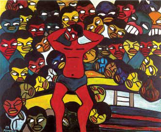
Malangatana’s Fire
Malangatana Valente Nguenha was a Mozambican artist and revolutionary; active and prodcuing art beginning in the 1950s, through the revolution (overthrowing the Portuguese colonizers in 1974), and up to his death in 2011. The article in Signal, we hope, will be one of many covering relatively unknown (in the US) cultural work from Africa.
Malangatana worked in many mediums. We feature mostly his paintings, which are a riot of color, dense, sometimes grotesque, sometimes exuberant. Malangatana was part of a revolution that succeeded and there’s an interesting anecdote in the article where he is collaborating with exiled Chilean artists on a mural. Malangatana’s work is described as sad and ‘anguished’, while the Chileans work is hopeful and exhortatory. Malangatana’s art was not propaganda (though I respect propagandists, don’t get me wrong), but intensely honest. You get the feeling from the article that he felt a great responsibility to be a voice of the people, and it was not his concern how that fit into any particular political platform. He has beautiful line work in his paintings, they flirt with abstraction but doesn’t quite go all the way.
The article was written by Judy Seidman who wrote and edited one of the essential books on political poster art: Red On Black: The Story of the South African Poster Movement. She was also a member of the Medu Arts Ensemble and is great artist and poster-maker in her own right.
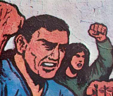
Revolutionary Portugal
And finally we have piece from PM author Phil Mailer (Portugal: The Impossible Revolution?, about the Carnation Revolution in 1974). Following the revolution, artists and political parties took to the streets in abundance, promoting their own programs or platforms. By 1975 Mailer says that, “there was hardly an unpainted wall anywhere in Lisbon or in the rural towns across the country.” The walls were open to any and all to use, so the visible output varied quite a bit. Some of the work is stylized, accomplished, almost slick with its messaging and aesthetic. Other murals are crude and didactic. But all of it (that I’ve seen, that we have pictures of) is brightly colored, almost exhilarated with possibility. What stands out to me with the Portuguese murals is the seemingly large influence that comics had on their aesthetics. Propaganda from the Eastern Bloc often showed workers as almost superhuman, well rounded men and women with giant hands wielding rifles, ploughs, sickles, and doves. The Portuguese version of the worker is a little different, looking more like Clark Kent in a pair of overalls, or even like Ziggy with an AK47. Anyway, nice stuff and it leaves me hungry to see more.
So that’s Signal 02. I think it’s a tight issue with a lot of really great content (I’m biased I suppose).
After it’s all said and done, there are a few things I notice about this issue. One is that we we’re seeking out information about collective work. Part of this, I’m sure, is personal: we both work collectively on art and there’s some curiosity about how other folks have made this work in the past. Within our art collective (Justseeds) and in many folks I know there’s some trepidation about producing truly collective work. I’ve described the way that (we believe) the Taller de Grafica Popular operated and people have groaned and sighed, “That sound like a nightmare.” I imagine it’s a mix of bad experience with collectives (infoshops anyone?), and a perceived idea of Maoist, Orwellian, Weathermen-esque brutal self-criticism sessions. Maybe it’s that I know a lot of anarchists or maybe it’s that we’re Americans, prizing the individual and individual voice. It makes me a little sad to hear those groans as collective work sparks the imagination in ways that are different than individual work. Røde Mor, the TGP, and APPO are great examples of collective work where the individual (the human aspect) is highly visible but it seems to me that work stands stronger due to the connections that are made within the group (both aesthetically and ideologically).
With Signal, we are also seeking out different graphic and aesthetic traditions from around the world. There’s something very different about how art and ideas are expressed depending on where it’s made, work from Japan and work from the US and work from Mexico are qualitatively different. All cultural expression has different lineages and influences that shape how producers choose to express themselves. With Signal, we are hoping to explore how work is made, why choices were made in output, and what effect the artwork had on a particular movement or struggle (and conversely what effect the movement had on the artwork). As we stated in the intro to Signal:
Art, design, graphics, and culture have been important tools for every social movement that has attempted to challenge the status quo. But not all tools are the same: we don’t use a nail gun to plant a garden, or a rake to fix the plumbing. We hope to broaden the visual discussion of possibility. Social movements have successfully employed everything from print- making to song, theatre to mural painting, graffiti to sculpture. We are internationalists. We are curious about the different graphic traditions and visual languages that exist throughout the world. We feel that broadening our cultural landscape will strengthen the struggle for equality and justice.
Postscript: I wrote this wrap-up to Signal:02 while it was still warm from the printers . . . Josh is out of contact somewhere in the Adirondack Mountains, so the “we” of this blog entry is really an “I”, with a speculated (and educated) guess of the thoughts shared by my partner in all this, Josh. Mistakes, suppositions, and assumptions are all mine.
Originally posted on the PM Press Blog