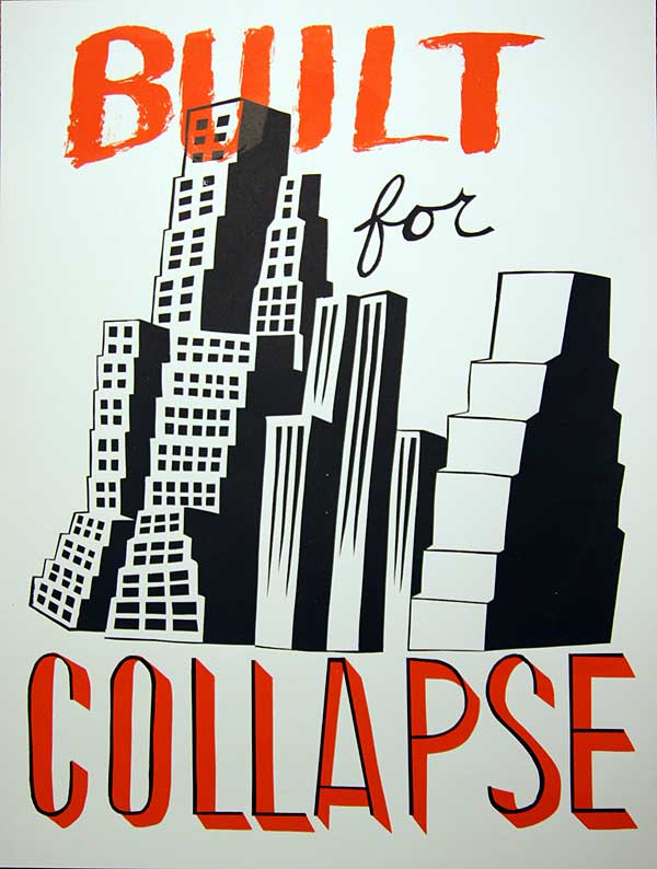
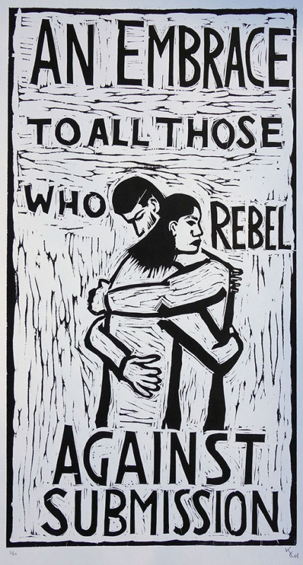
I created this image in the last few hours of the Justseeds installation, at UW-Milwaukee. I’m kind of obsessed with current economic events. So I decided to make a poster about it. The text came out of some discussions that Roger and I were having during the collaboration. Condos and high-end development projects have been a high priority for NYC’s current mayor Michael Bloomberg, one that I reference in this image is the Atlantic Yards.
The Atlantic Yards is a mega-development project designed by Forest City Ratner a company with close relationships to powerful NY politicians as well as the NY Times. The company wishes to build a basketball arena and 13 towers, mostly residential, near downtown Brooklyn. There are so many problematic factors to this project like traffic congestion, desire to use eminent domain, community displacement, request of
“Federal Stimulus” money, and so much more. You can find a ton of information on blogs like NoLandGrab.com and Develop Don’t Destroy Brooklyn and Atlantic Yards Report to name a few.
I felt like referencing the renderings of this development project was appropriate in highlighting how overdevelopment of cities, like Brooklyn, has led to economic crisis. Construction combined with predator lending and stretching potential homeowners beyond their means has brought us to the stage of crisis that we are experiencing.
One hope of mine is to make this into stickers, for the front door of every new condo in NYC. If you are interested in using this image, gimme a holler, I can pass along a high-res file.
In thinking about my next image, maybe it will be about the wealth extraction from the majority of the populace to a small percentage of bankers, er, the ruling class?
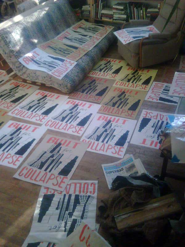
Here’s a flick of my friends loft, where I was fortunate enough to be able to borrow and use as a printing studio for this run. Thanks Jesse!



Awesome!
Ha! Your image makes Bruce Ranter’s Atlantic Yards an official “poster project.”
hey, is this poster available for purchase? i’d love to get one!
boring and not pretty. get back to the drawing board kid.
hey “anon”
maybe you could be a bit more articulate in your critique,
It might help me make better design decisions.
“Boring” and “pretty” are both subjective, and this would look incredibly different if I was making this for someone else.
Please be more (de)constructive with your thoughts,
cos I can’t use either of those adjectives.
If your print said “Done Deal,” I’m sure “anon” would’ve loved it.