I love mass market paperbacks. They are small, fit in your pocket, and were usually printed cheaply and in such volume that they hold little monetary value these days. Most of these African/American Library books I’ve been able to find on dollar racks, or for $2-$3. It’s pretty great to have this collection of literature still circulating for super cheap.
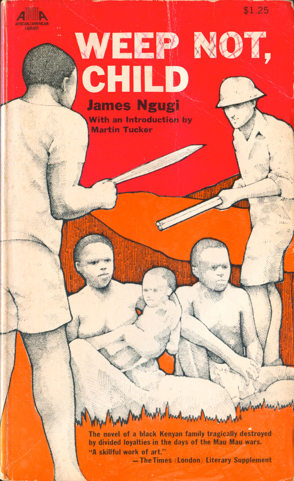
This second half of the African novels (see the first part HERE) starts with Weep Not, Child, the first novel by Ngugi wa Thiong’o, then going under the name James Ngugi. It’s got a hip cover, with a pointelist drawing on a background of rich orange and red. Leaving the drawings black and white was a solid decision, allowing them to pop to the foreground, and giving a sense of action or motion that is otherwise lacking (as the figures themselves are so stiff).
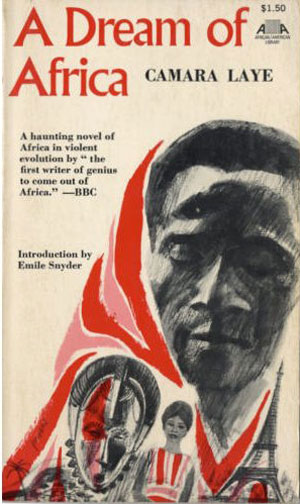
Like Ngugi, Camera Laye was one of the early African authors picked up and popularized in the West. The cover for A Dream of Africa fairly bluntly illustrates the tensions between Africa and Europe. The central figure is flanked by a traditional African mask on one side and the Eiffel Tower on the other. The images all tilt to the right, which gives the cover some movement, and then the pink and red are used to both wrap the face, but spice up the other pieces as a background color. Not stunning, but not bad either.
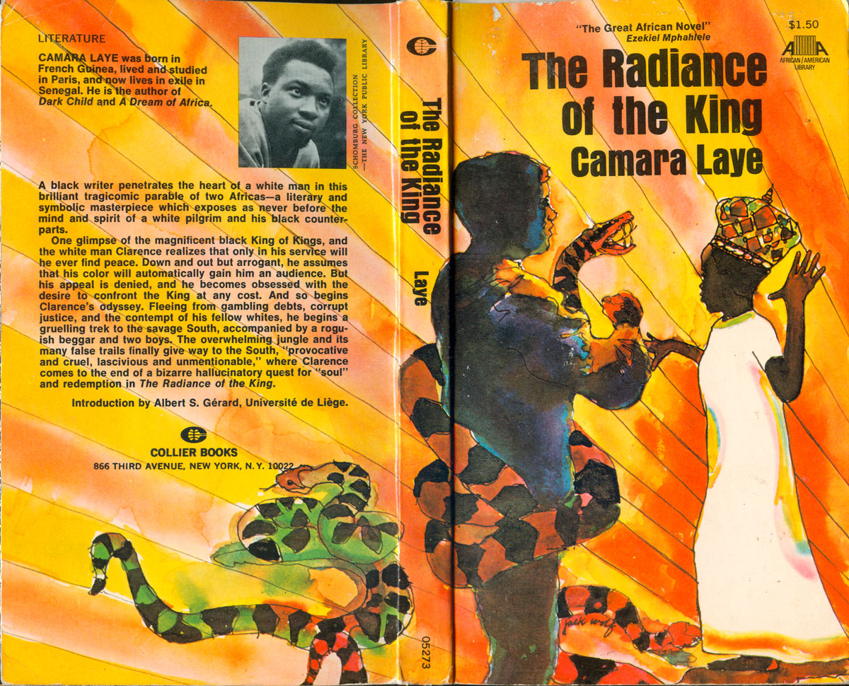
The cover of The Radiance of the King is also carried by the strength of the illustration, but the overall execution isn’t quite strong enough. The pen and ink and watercolor style is cool, as are the deification lines in the back, and the darkening of the white figure and the white frock on the black one is a smart reversal and complication. At the same time these two Laye covers are a good representation of the overall problems with many of the Af/Am Library covers. Both illustrations [by Jack Wolf in this case] are interesting and appropriate, but they function too much like editorial illustrations. They aren’t effectively integrated into an overall cover design, they don’t necessarily interact with the type and even sightly conflict with it, in the case of Radiance.
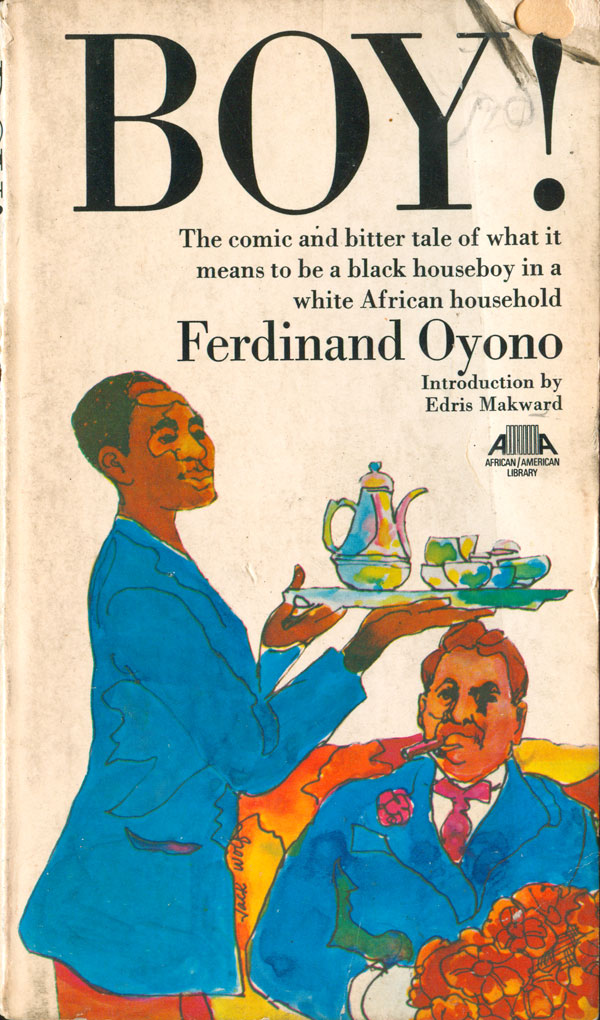
The two covers for Ferdinand Oyono’s books fair a bit better. Boy! (published as Houseboy in Heinemann’s African Writers Series) has another Jack Wolf cover illustration, done in a similar style to the Laye book above. But this time the designer chose a much more appropriate font, and the tall and classy Didot complements the image, adding to the sense of farce of colonialism disguised under an upper class veneer.
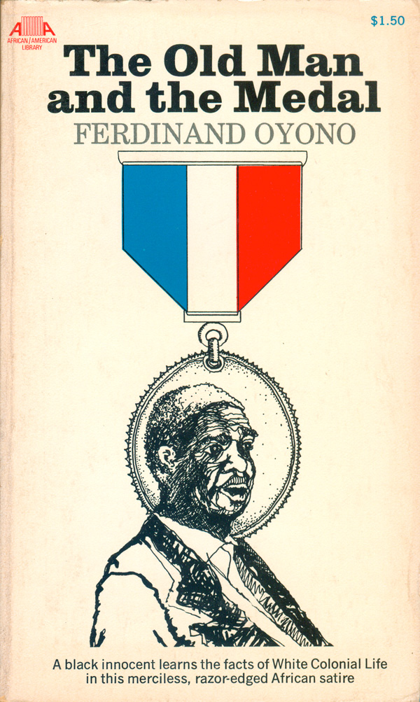
The illustration on The Old Man and the Medal is so self-contained that the titling font doesn’t much matter. The spot color in the medal identifies it as French and colonial, and the man on the one hand appears as the image on the medal, but with his shoulders also present, he also seems trapped by it or within it.
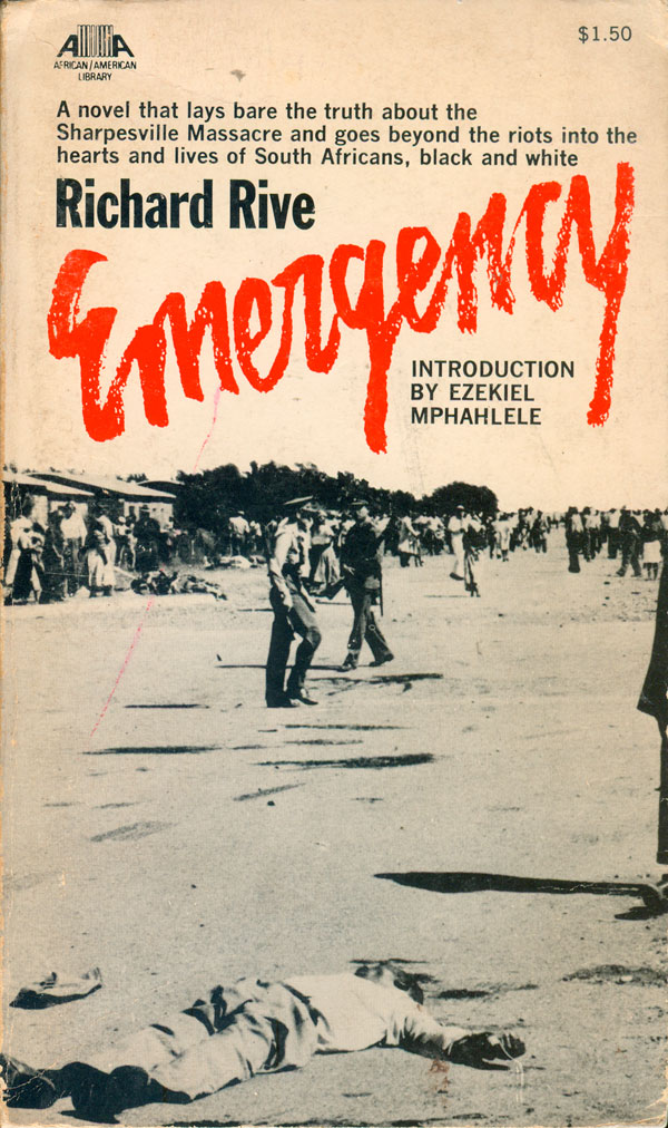
Richard Rive’s novel about the Sharpesville Massacre in South Africa, Emergency, is the only book in the series with a photographic cover. It is almost as if the horror of the real event was so too much to illustrate, that there was nothing stronger than the actual documentary evidence of bodies in the streets. The lack of color adds to the documentary feel of the image, and the bright red title jumps off the page, scrawled and bloody, a call to arms.
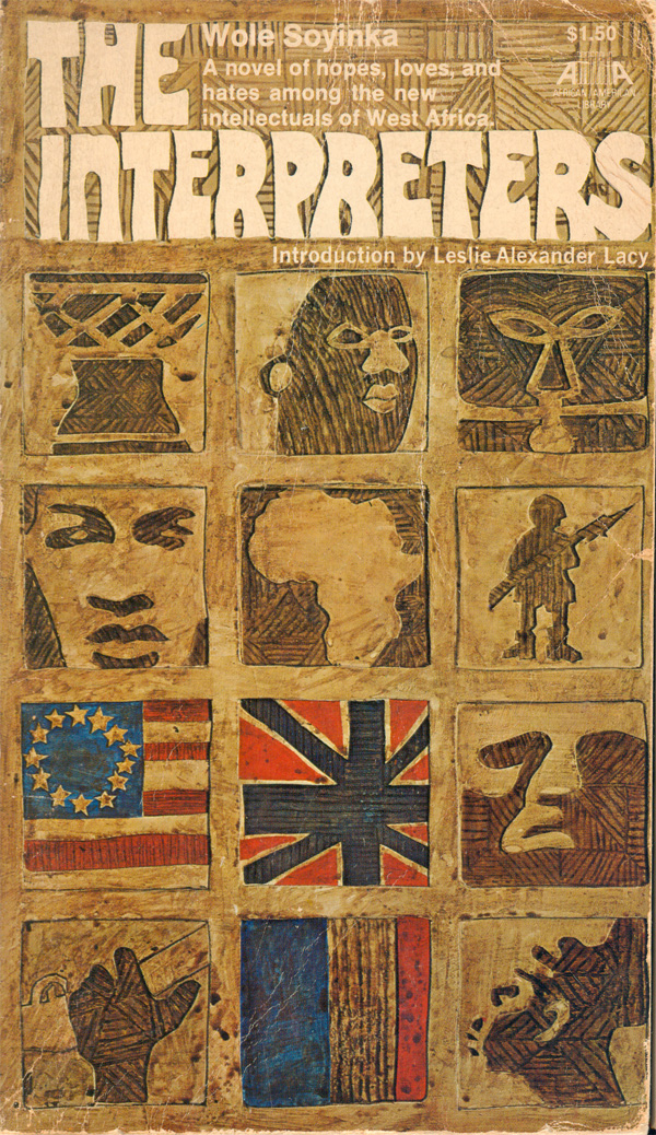
Wole Soyinka’s The Interpreters carries a cover composed of a grid of “carved” images, similar to a couple of the Peter Abrahams covers from last weeks’ post (see HERE). The cover works well, building an image of the content with a dozen small icons, and integrating the title at the top. Blocks fluctuate from representations of individuals to masks to flags.
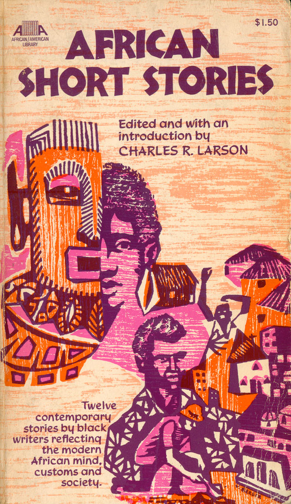
I compliment the bold color combination of purple, pink, and orange on the cover of African Short Stories, and in particular the foregoing of any black. The illustration itself, by V. Berger, contains a powerful combination of woodblock feel and patterning, but fits somewhere between too much and not enough. The montage of images has some cool elements—in particular the man with his arms in the air and the man whose chest turns into a gardener—but the boy’s face/African mask element is the weakest, yet largest part. It would have been more effective to either cut element and just enlarge the bottom right quadrant to fill the entire cover, or to add even more parts, sinking the mask/face into a much larger and complicated collage. The modified Nueland typeface and the mask both function as cheap shorthand for “tribal African,” giving the cover a borderline racist vibe. Including in the volume are strong pieces by Sembene Ousamane, Ngugi, Alex La Guma, and Ezekial Mphahlele—none of whom are effectively represented by this simplified image of Africa.
That’s it for the African authored books, so onward to the Caribbean ones. The first is Victor Stafford Reid’s The Leopard, which has one of my favorite covers here. Another example of diasporic cross-fertilization, this is a book by a Jamaican about the Mau Mau in Kenya. The central illustration is once again by Jack Wolf, and is a nice scrappy drawing of a Mau Mau fighter carrying a white child. The red of the figure sets it apart from the ornamental background, which is echoed in the man’s loin cloth. The title is hand drawn, and compliments the line quality of the man. The cover also wraps around, and someone was smart enough to know that the actual leopard pictured on the back was not a strong enough image to carry the front cover.

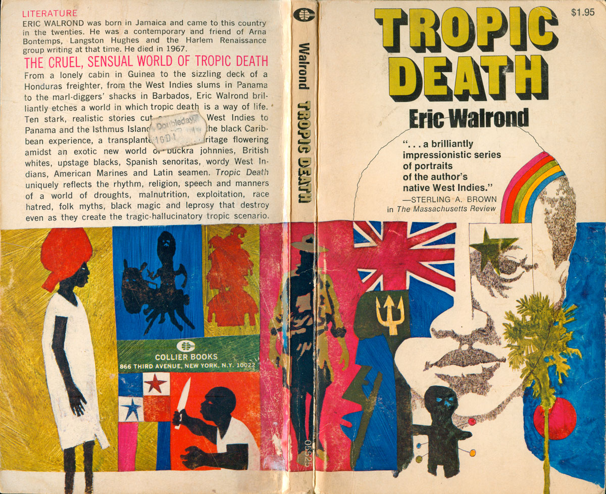
Eric Walrond’s Tropic Death has a great collaged cover, also a central face which disassembles as you view it. Eyes morph into stars and flags, rainbows cut across the scalp, cheeks are obscured by trees and other faces, and the chin dips behind a voodoo doll. The color is a stronger palette and the title is bolder than usual, grabbing attention and balancing the power of the image.
Next week I’ll look at the last of the Af/Am Library, the books by US authors, as well as share the complete bibliography of the series I’ve made up. Thanks for reading!
