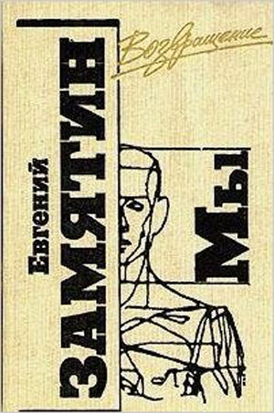
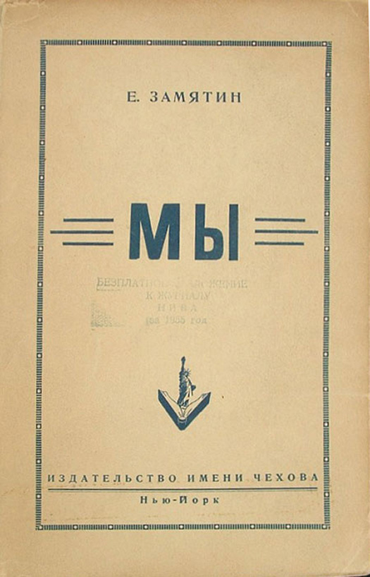
This week back to Zamyatin’s We, and a look at all the non-English editions. (You can check out all the English-language covers HERE.) When first written, the book was not allowed to be published in the Soviet Union. But I found an image of a copy online from the Russian-language Chekhov Press in New York City, which published it in the US in 1952 (cover to the right). It’s clean and very European looking, the only real adornment being the press logo, the Statue of Liberty emerging from an open book!
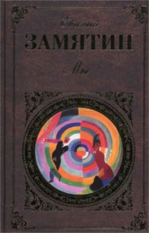
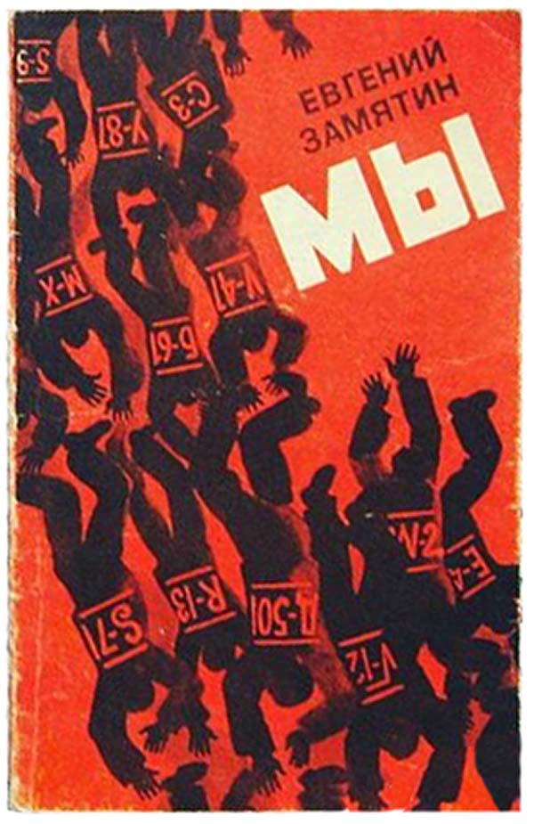
All of the Russian editions published in the USSR were samizdat, or published underground and distributed illegally. Since the 1990s a number of Russian editions from Russia have come out, including the two below. The one on the left doesn’t do much for me, but I really love the brightly colored circle in the center of the copy on the right. Although in many ways the book feels colorless when you read it, but the swirling kaleidoscope quality of the does embrace some of the fractured affect of We, and maybe even a prism-like quality of light refracting through the glass blocks which make up the One State. I found the cover on the far right online with no context, so I’m not sure when it is from, but it looks older, so it might be another samizdat. It’s a great design, the figures literally falling into each other, making a mass of writhing limbs, their numbers the only thing distinguishing one from the other.
There are a couple images of Polish covers online. I’m not sure when the one on the left was produced, but I suspect sometime after the Penguin edition featuring Georgii Petrusov’s photograph of Rodchenko (see last week), since the painting here seems to be a representation of We‘s protagonist, known only a D-503, as green-tinted Rodchenko. The painting is quite creepy, and the figure looks more like a reject super-villain than an engineer from the the future.
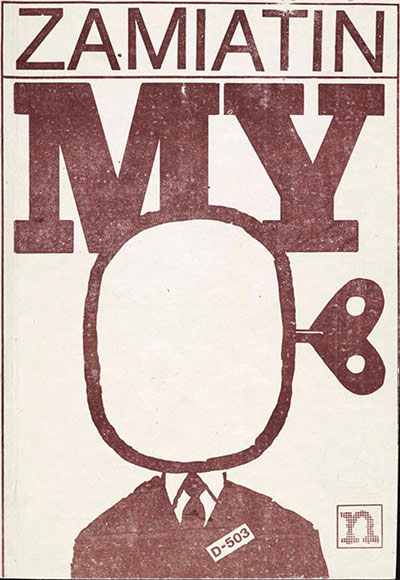
The cover to the right is of a Polish samizdat edition, from 1985 (attributed to Supernowa Publishers). This might be my all time favorite cover of We. In the hands of the scrappy one-color design and production of underground literature, the head of D-503 is now a blank space, but a wind-up blank space.

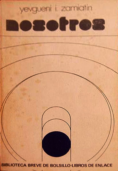
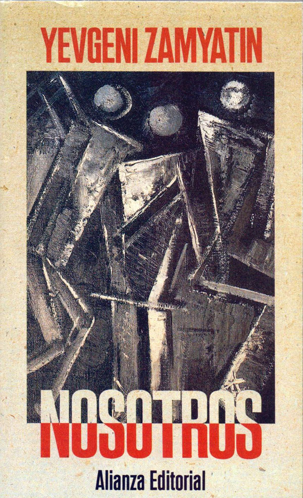
Below are a couple cool Spanish editions as well. I would guess the one on the right (published by Seix Barral) is from the 70s, and has a nice abstract sci-fi feel. The one on the right is from Laianza Editorial in Madrid, published in 1993. The painting is heavily reminiscent of Duchamp’s Nude Descending a Staircase, n.2, which was painted in 1912, nine years before Zamayatin wrote We. It works well on the cover, the figure(s) much more static than Duchamp’s, but still splintering and fractured.
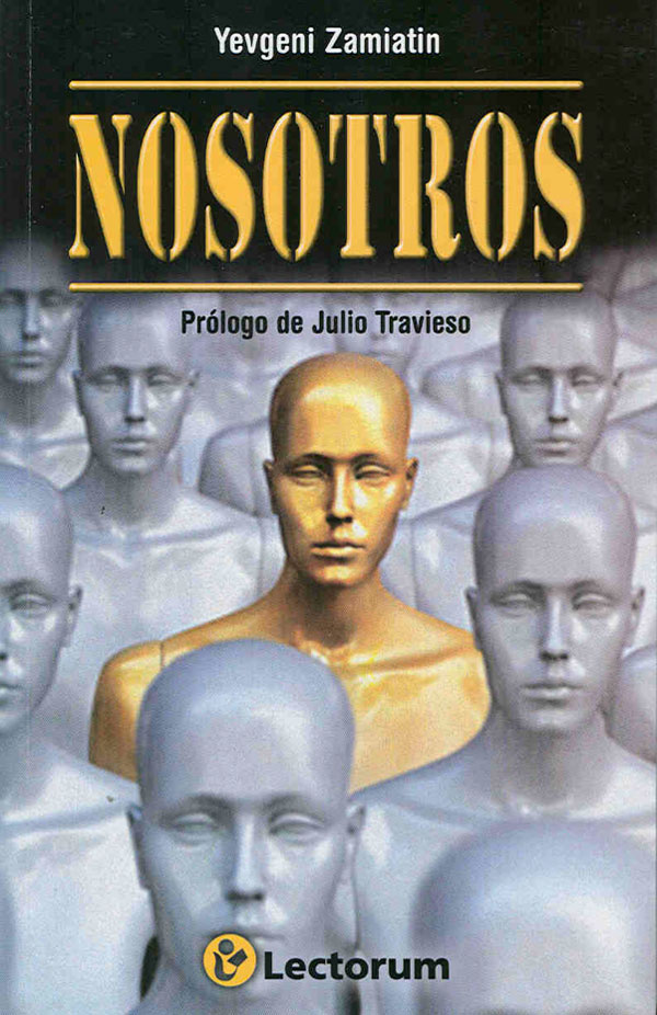
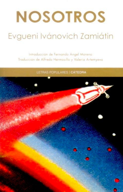
The cover on the 2010 Lectorum edition is both overly didactic, and completely awful. The creepy mannequins might have worked if they had been pushed further as a visual idea rather than just plopped down on the cover, and the stencil font with the 3D modeling is terrible. The cover on the right is from a 2011 edition published by Catedra, and it works much better. The titling still leaves a lot to be desired, but the illustration has a really nice vintage sci-fi vibe, which works since this book is definitely a pioneer of the genre.
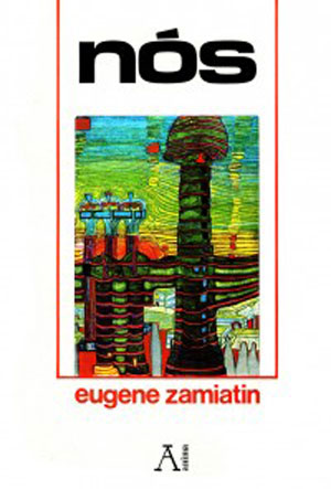
Last I’ve dug up a Brazilian cover (on the left) and a Turkish one (right). The Brazilian cover appears to feature some sort of modified Hundertwasser painting. It looks like a straight up Hundertwasser, except the three blue figures on the left don’t look familiar, and the factory at the bottom right seems too clearly representative. I’m not sure.
The Turkish cover is one of the most creative from a design perspective, crafting a landscape for the One State out of circuit board-like lines. It’s simple, effective, and fun.

Hopefully these past couple weeks have convinced you to read We. It’s pretty quick, I think I read it over about a half dozen subway rides, and once you get into it it’s a nice roller coaster ride. I’m looking forward to reading it again, and going back to Orwell, Huxley, and Bellamy, as well.
[Post updated with additional material on 01/07/18.]





Well, I’m partial to the Penguin 1980 by Chesterman. Guess I’m just a sucker for a pretty face. Took me quite a while to locate a copy!
Have you read Z’s short stories? I just read a bunch. A real master, he was!
You like the airbrushed look! That one is included here in the first post about WE: https://justseeds.org/jbbtc-174/
I haven’t read the short stories, but have been meaning too!