In November, while touring London with comrades from Interference Archive, we stopped at Bookmarks, a nice-sized bookshop run by the Socialist Workers Party (which is a sister organization to the International Socialist Organization in the the U.S.). They have a nice, cheap, used pamphlet section, with rows and rows of old leftist publications. I found some great stuff, including a small cluster of 1980s pamphlets put out by the SWP themselves. All were designed by Roger Huddle, who might have been their in-house designer for the decade. Huddle has a website now (HERE), and it looks like he still might be an SWP member. He was also part of a design group called Artworkers. The designs for the pamphlets are great examples of a neo-Constructivism, and appear to borrow heavily from the book designs of two other British leftist designers: David King and Richard Hollis. King is the more obvious influence, as Huddle shares with him a love for heavy black lines and sharp angles as dominant visual elements.
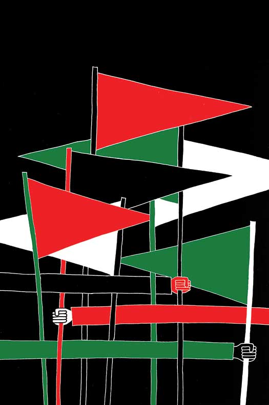
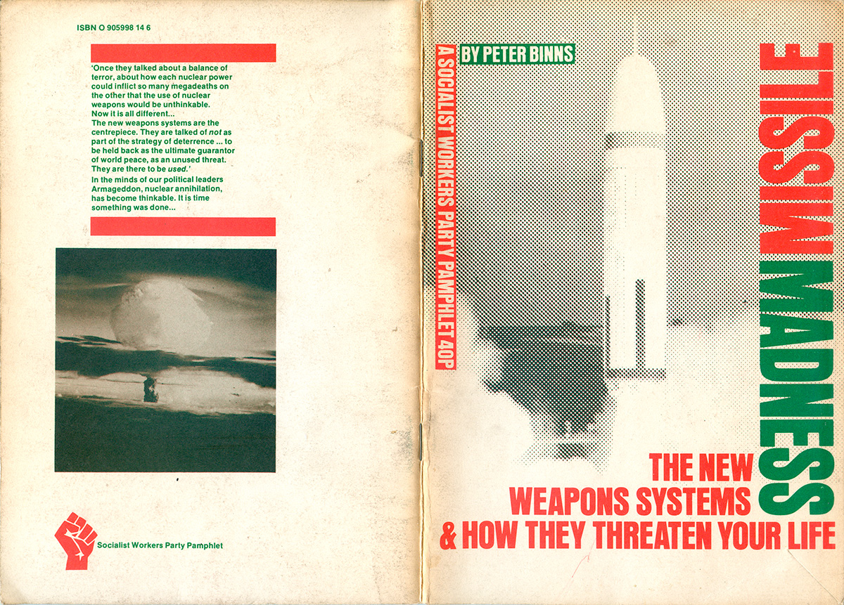
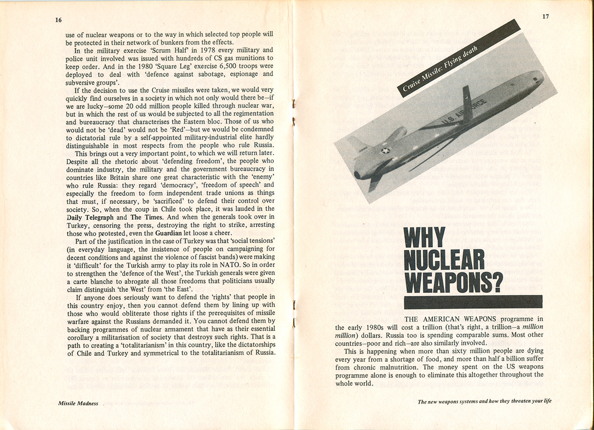
We can actually see the style evolve by looking at the first and then second edition of Missile Madness by Peter Binns. The first, published in 1980 and here on the right, boxes the object of study—the mad missile— between two sets of titles. The top left frame is created by text in bold boxes, author and publisher; the bottom right is created by interlocking of the title and subtitle at a 90 degree angle. The title smartly nestles into the subtitle, rather than simply sitting on top, and then the two words of the title read away from each other. This is a nice touch, not effecting readability but adding to the sense of a topsy-turvy world. Finally, the use of color is great, the red and green merging to create the almost black of the missile.
The duotone is used to further effect on the back cover, with the red and green overlapping to render the photograph of the mushroom cloud a level of depth seen nowhere else on the cover. Also, take a look at the full visual construction of the back cover. The photo is the main element, and sits left justified to the outer edge of the cover. The red bars that box the text above are justified to the right side of the photo, and then the text within in the left justified to the edges of the bars. Then the SWP publishing mark at the bottom is left justified to the photo. This back-and-forth justification creates a powerful assemblage, which feels both tightly packed and active, giving the eye a lot of places to move. And here and in all the pamphlets some variation on a black, condensed Helvetica is used as the font.
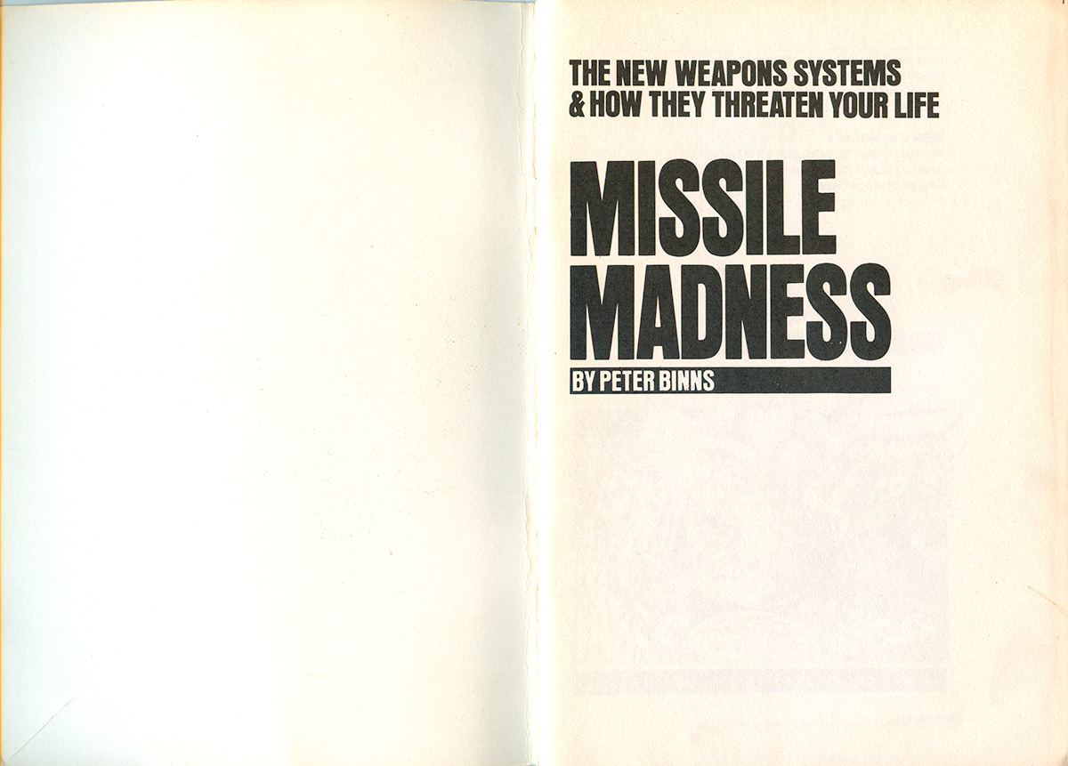
The title page is solid, but compared to the cover, almost dull. The interior design is less punchy than the outside, but still has some kick, with bold black underlines on the section titles, and sharply angled imagery.
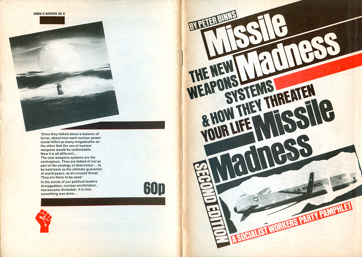
A year later a second edition of Binn’s pamphlet was released, with a completely revamped cover. The neo-Constructivism is taken to extremes here, with the author, title, subtitle, etc. all set in bold sans-serif and piled on top of each other at a 20 degree angle. It is almost too much, leaving little place for the eye to settle and actually read the words. The decision to have the title printed twice on the cover adds to the sense of over-kill. The red and the black also make for a less powerful duotone, the overlap of the two creating a rich black that isn’t distinct enough from the plain black.
The insides got spruced up too. The main improvement is the re-setting of the section headings as nice stacks of words that are left justified, with one word knocked out of justification.
The Medical Consequences of Nuclear Weapons was published in 1982, and is very similar in design to the pamphlet above. Once again red and black are the duotone colors, and thick bars are used heavily as a design element. Here the bars are set both straight and angled, and the bars become a sort-of ribbon or banner, connecting the images on the back cover to the text on the front. The use of a breaking slash in the bars is also new, maybe adding to the sense of “consequences” alluded to in the title.
The insides are a further evolution of the design, with a mix of thin and thick lines, and the collaging on straight and angled imagery. The title page is a bit strange, with the bold text and bars of the title graphic mixed with the thin-line frame, which feels out of place too classical in comparison. What I do particularly like is the bringing of the bold bars into the info-graphics later in the pamphlet.
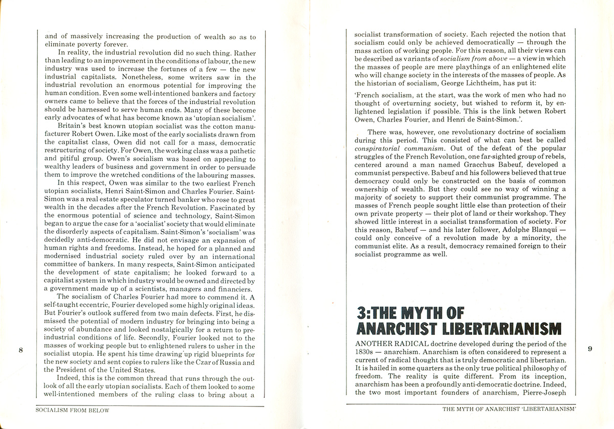
David McNally’s Socialism from Below is the next in the series, published in 1984. The colors are green and red again, but the thick bars have largely been traded in for torn lines. I suppose the red star is emerging from below the green field, but it’s not entirely clear what the green represents—money/capitalism? This cover isn’t a duotone, and the black printed on it is actually black, so it’s a little less fun.

The insides are a nice, clean version of the designs above. Easily readable blocks of text are framed by thin vertical lines and section headings are nice, numbered, extra bold, sans-serif lines of text. I was going to try to get through this post without actually talking about the content of these pamphlets, but I can’t do. Section 3 here is “The Myth of Anarchist Libertarianism” and is full of all the usual spurious and bullshit accusations that Trotskyists make against historical anarchism in order to feel better about their slavish commitment to Leninist authoritarianism. One of the main arguments against anarchism is that Proudhon never “found anything good to say” about anyone else. One of many ad hominem attacks thrown around here. There is also the usual about Proudhon and Bakunin being vicious anti-semites and racists, and Bakunin accusing Marx of being part of an international Jewish conspiracy. No mention that all sources of Bakunin’s supposed anti-semitism lead back to lies published by Marx to discredit him, nor that Bakunin was the first to translate and distribute Marx’s writing in Russian. Who’s the asshole now? Meanwhile only the nicest things about Marx and Lenin are printed here, conveniently omitting what miserable, petty autocrats they were.
Speaking of the tension between Anarchism and Communism, it’s interesting that this design, so deeply influenced by Soviet work, was common across all these ideological boundaries in the 1980s. The first place I saw this type of layout was in the Cienfuegos Anarchist Reviews from the early 80s, designed by Clifford Harper. Very similar vertical columns of text with thin lines between them, and bold sans-serif section headers, sometimes even with the black bars. It’s interesting, because historically it makes a lot of sense for non-Stalinist Communists to style themselves along the lines of Lenin-era Soviet design, but not so much for anarchists. But then again, I suppose a William Morris-esque romantic layout wouldn’t work so well in the 80s, especially if anarchists like the Cienfuegos crowd were appealing in part to the new base of anarchists—punk rockers.
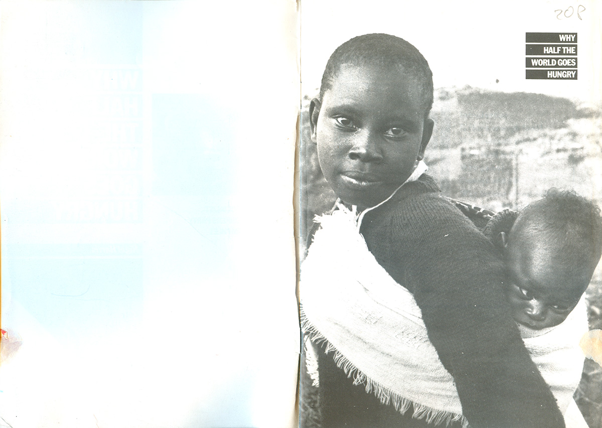
Finally we’ve got Nigel Harris’ Why Half the World Goes Hungry (1987). Here all the bars and text are tightened up, with all text left justified. The odd element out here is the “Socialist Case” banner, mainly because of the sign-painter-type font. It feels like this was added after the fact, maybe onto all the pamphlets, like a demand made from on-high and not part of the original design.
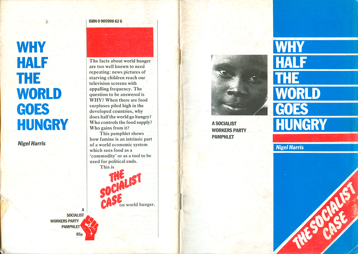
The inset photo of the face opens up onto a young woman with a child strapped to her back. There is a dignity in the woman—she looks straight at the camera—and this is a far cry from the insect-ridden images of Ethiopian children used to collect money for Africa during this period, but there is still something that feels sort of exploitational about the image. On the other hand, the title in the top right corner is wonderful, each word/phrase in the title set in an equal-length bar, but internally right justified. The bars make up a box, and the box reads as a dynamic logo for the pamphlet, clarifying the image and giving it additional punch.