This week is the third installment of my Judging Books by Their Covers posts on the design work of Ben Shahn. For more on Shahn, and to see the other entries, check out weeks 232 and 233! We’ve already gone through the covers Shahn did for three main publishers—Vintage, Doubleday, and Penguin—and today we’ll go through a variety from other presses. Shahn did both contract illustration and design work for dozens of projects, and his work has also been used by other designers both during his life and especially since he died in 1969. I have no idea how many publications bear his work on the covers, but these 19 examples here are the ones I’ve collected over the past decade—and a pretty far reaching selection.
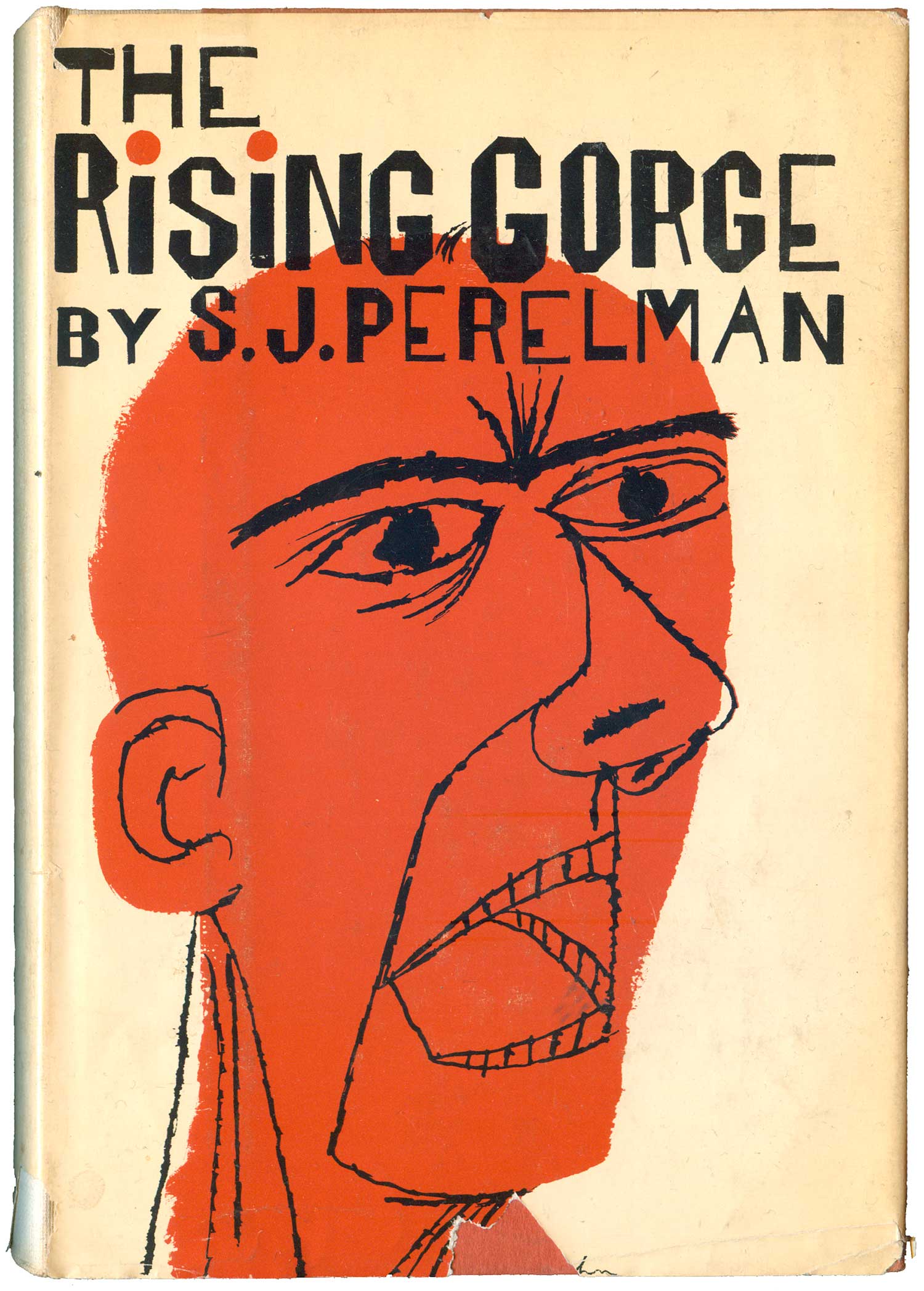
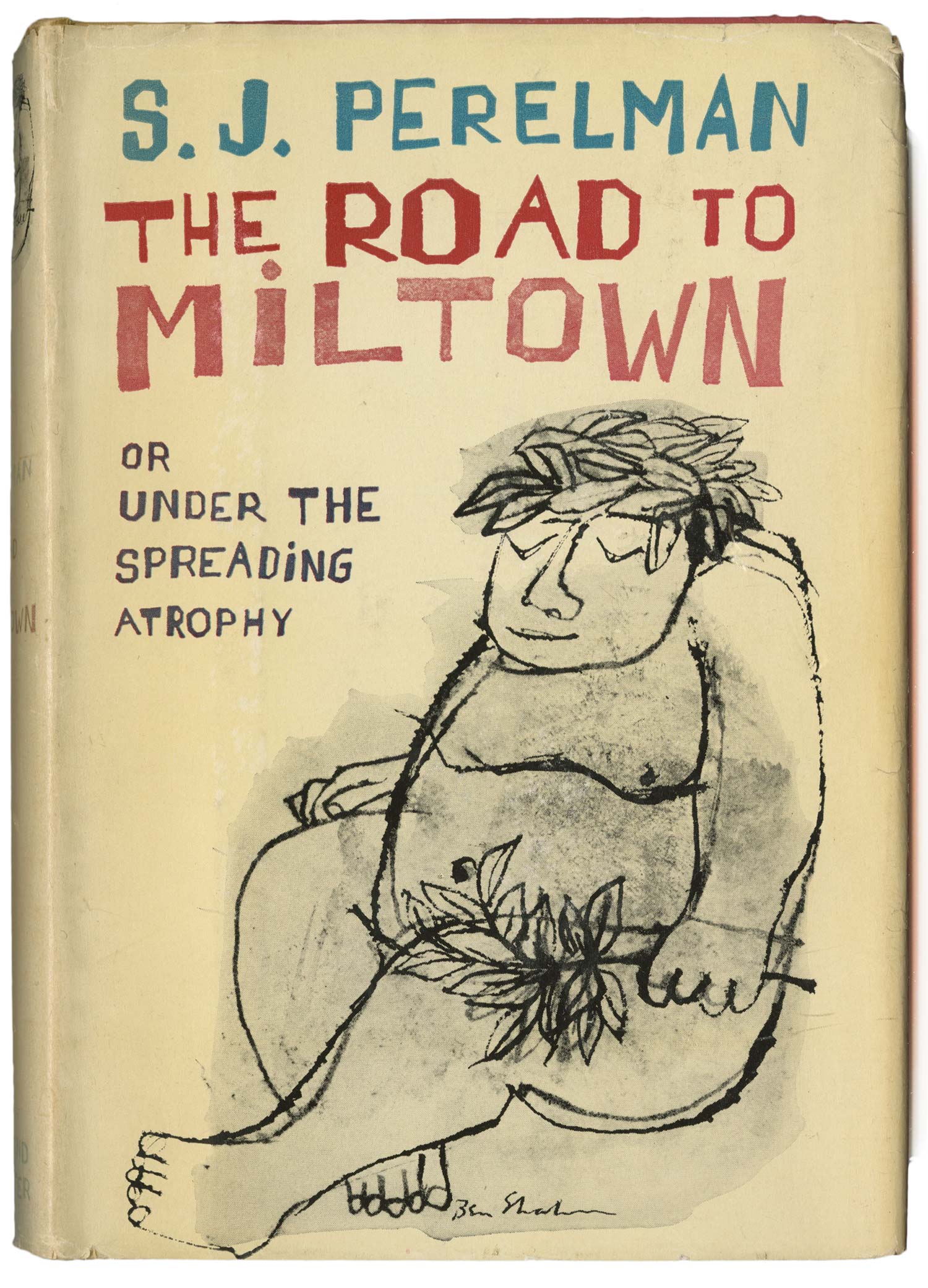
The above cover for The Rising Gorge is prime Ben Shahn graphic design. It features his signature typography, as well as a completely in-your-face drawing of an agro face. It takes a second to see, but one of the great aspects is the lack of black outline around the head, Shahn just lets the background color give the framing definition to the drawing he’s laid on top. S.J. Perelman was a humorist that wrote for the New Yorker, and although I love the above cover, I’ve never read the book, and don’t know if it effectively communicates the content. But on pure design merit, it is much stronger than the cover for The Road to Miltown below. Here Shahn’s work is less graphic, and the design less cohesive.
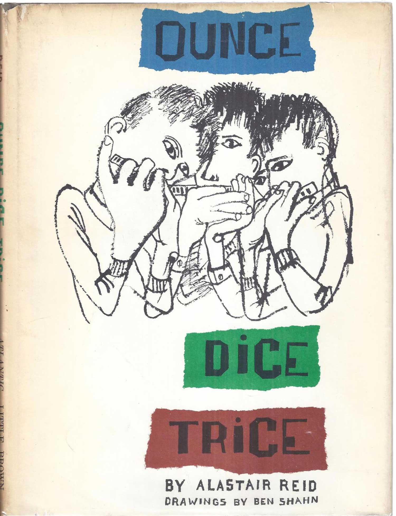
Alastair Reid’s kids book Ounce Dice Trice fares better, the image sharp and tight, echoing the counting and set of three words in the title. This book has recently been republished by the New York Review of Books Press, and they smartly left the cover alone.
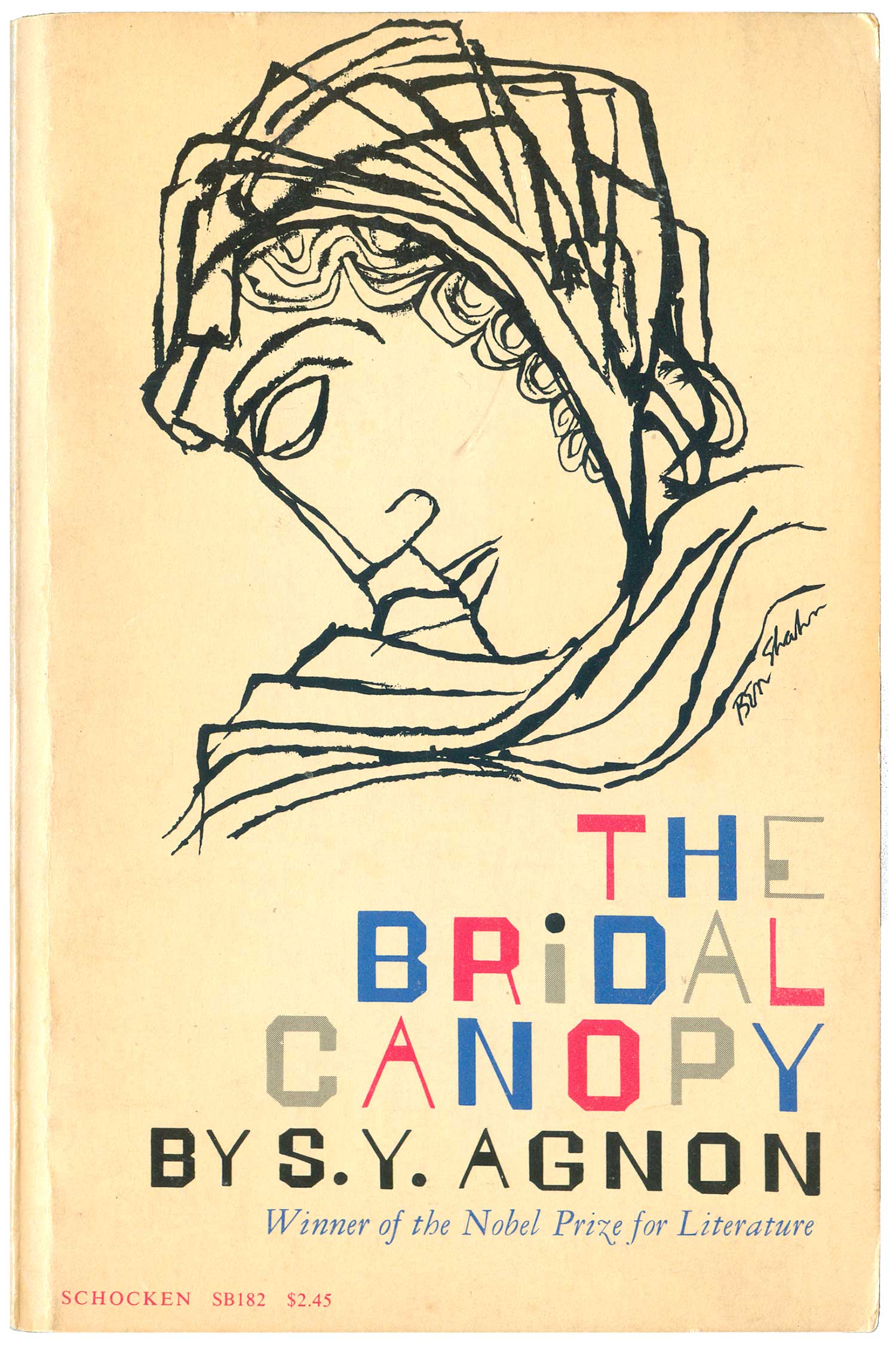
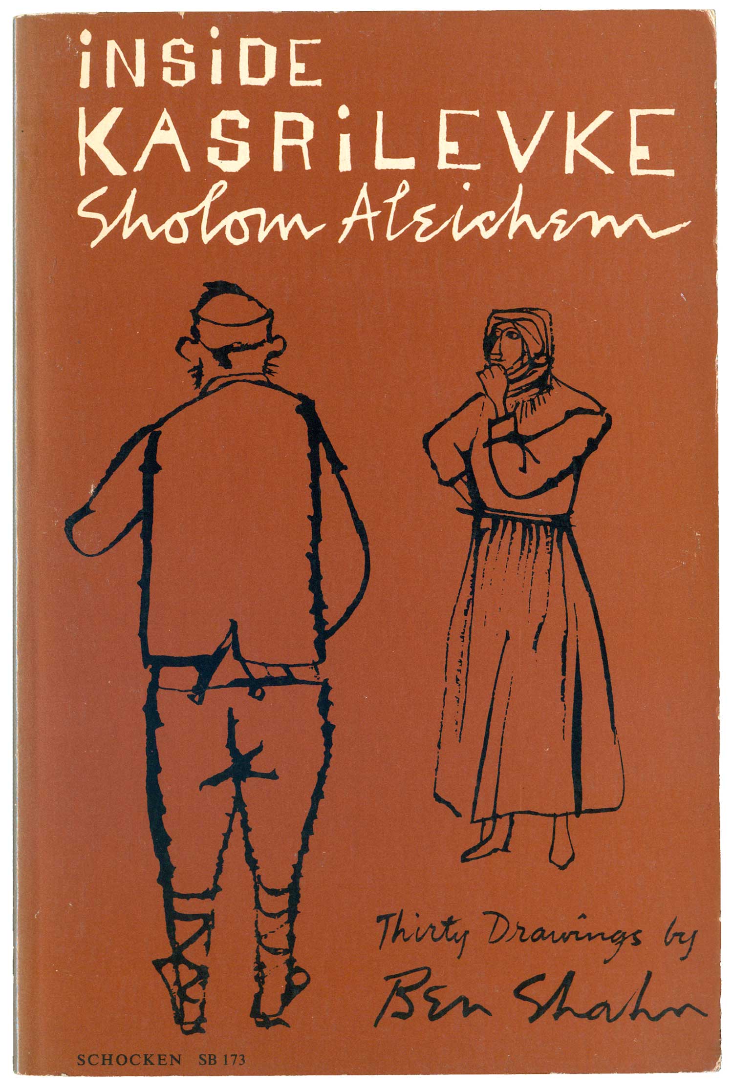
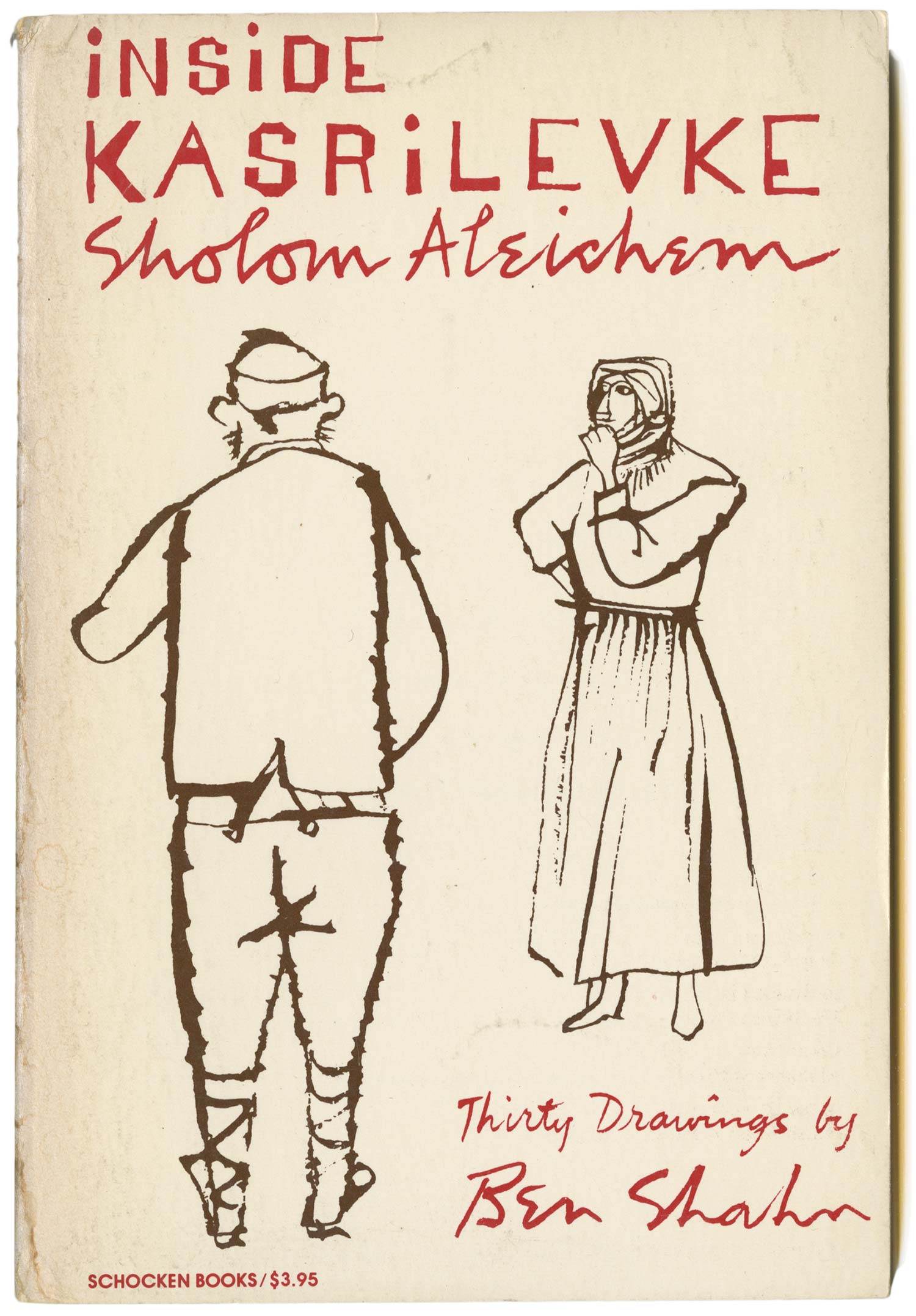
Shahn was Jewish, and it seems he was often called upon (or desired) to design and illustrate books by Jewish or Yiddish authors. He did a handful of these titles for Schocken Press, including The Bridal Canopy and Inside Kasrilevke, both below. The drawing featured on the former isn’t my favorite, but the red, grey, and blue type goes a long way to warm me up to the cover anyway. I have two different editions of the later, both are two color, and I’m not sure which came first, as the printings aren’t listed on the inside. The all brown cover is the one I’ve seen more frequently, which makes me guess it is the more recent printing, but I’m unsure why they would have switched from the cover on the far right. I like the white background better, it gives the images more breathing room and the red and brown of the type and illustrations complement each other more.
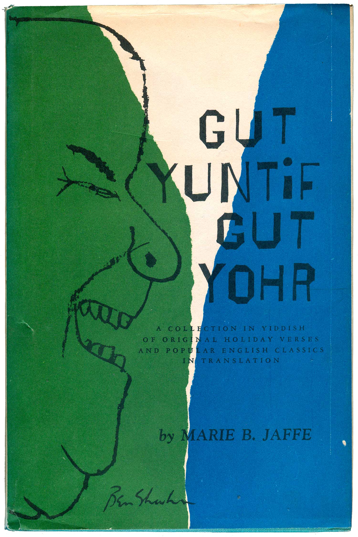
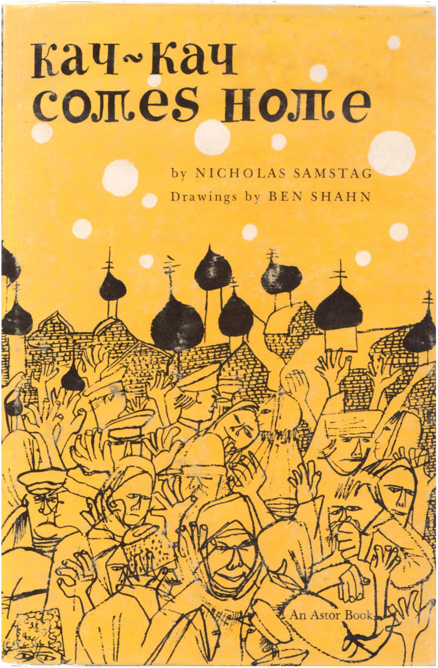
Here’s a couple more volumes of Judaica: Gut Yuntif Gut Yohr is a ’60s book of Yiddish poetry on the small publisher William Frederick and is another good example of Shahn animating his drawings with color backgrounds. Kay-Kay Comes Home is earlier, 1962, and on another small NY publisher, Ivan Obolensky. The type is less distinctly Shahn, and is even a little distracting because of it. The image is a great one, piles of figures crammed in the foreground, with a dozen minarets crammed in the background. This intensive filling of the visual field with objects drawn and redrawn on top of each other is quite common in Shahn’s prints and drawings, but not at all in the imagery he usually chooses for book covers, which makes this a stand out.
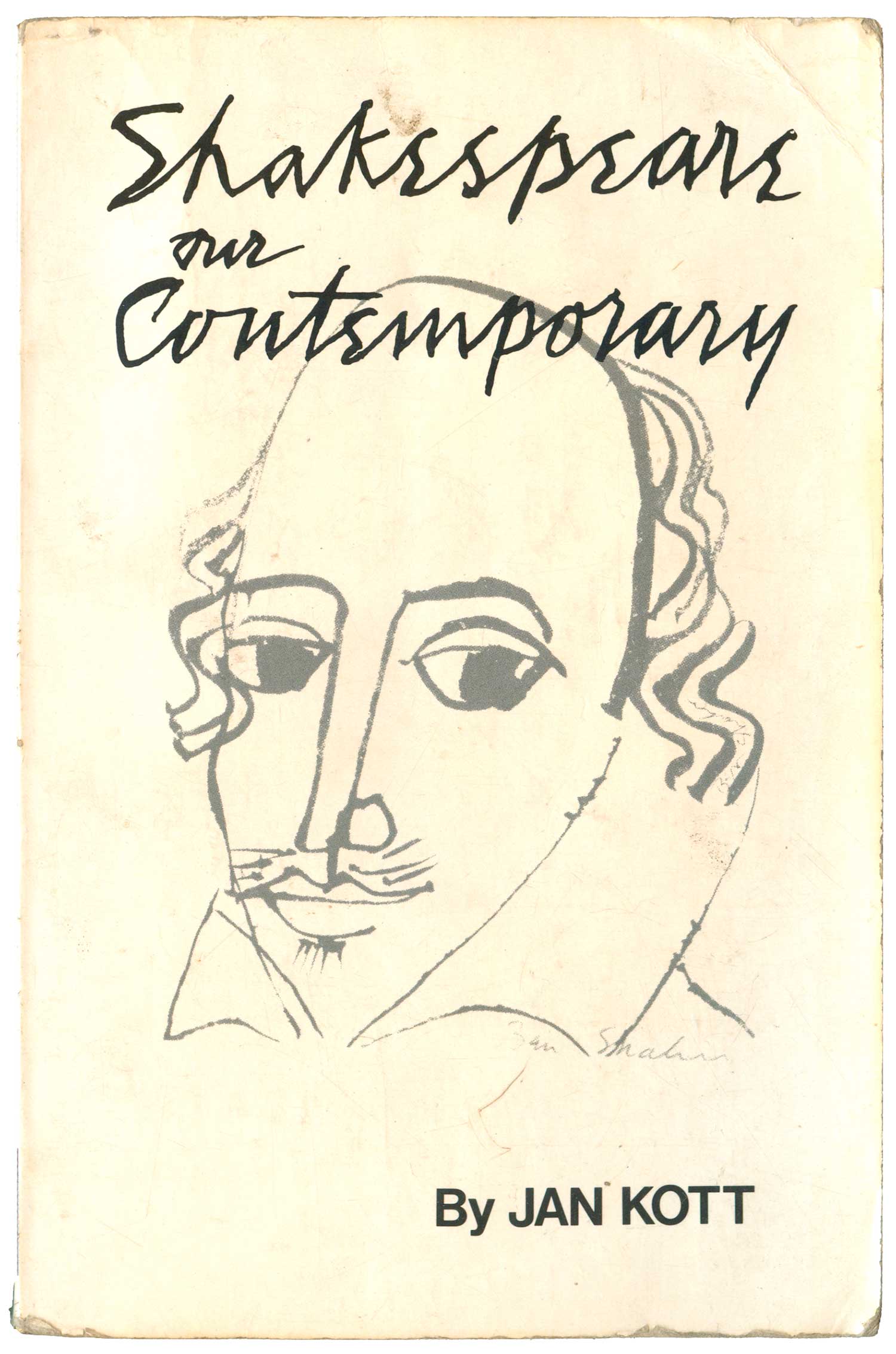
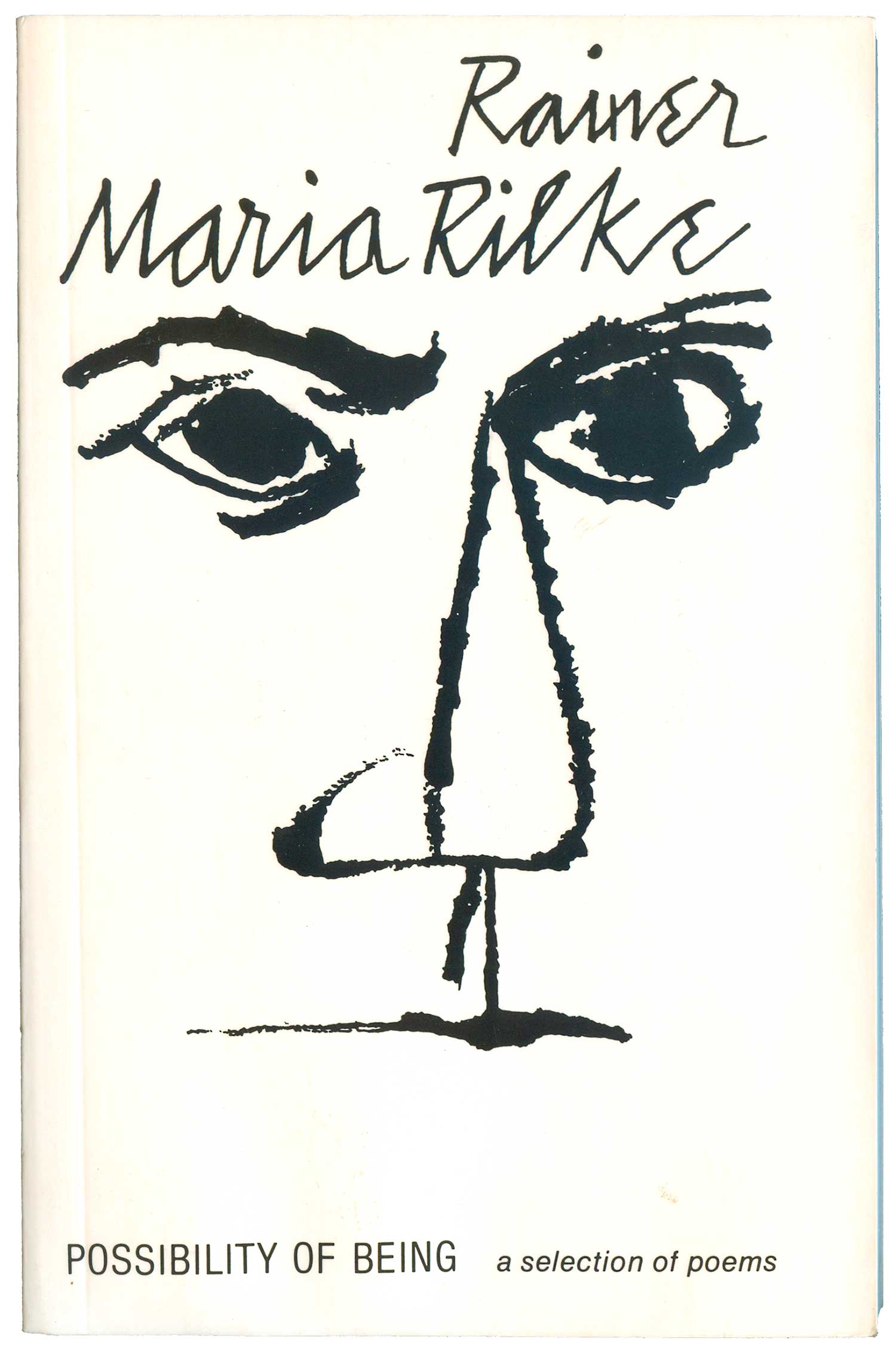
Below are a couple straightforward portraits, Shakespeare and Rilke. Both are created out of limited line work, but while the Shakespeare image feels more like a sketch used after the fact, the Rilke cover is more composed, the face more dominating and piercing. Although a slightly different trick than The Rising Gorge above, once again Shahn uses the background as a key element. But here, rather than fill in with color, he omits the outline of the face, which forces the eye to convert the contours of the book itself into a facial frame.
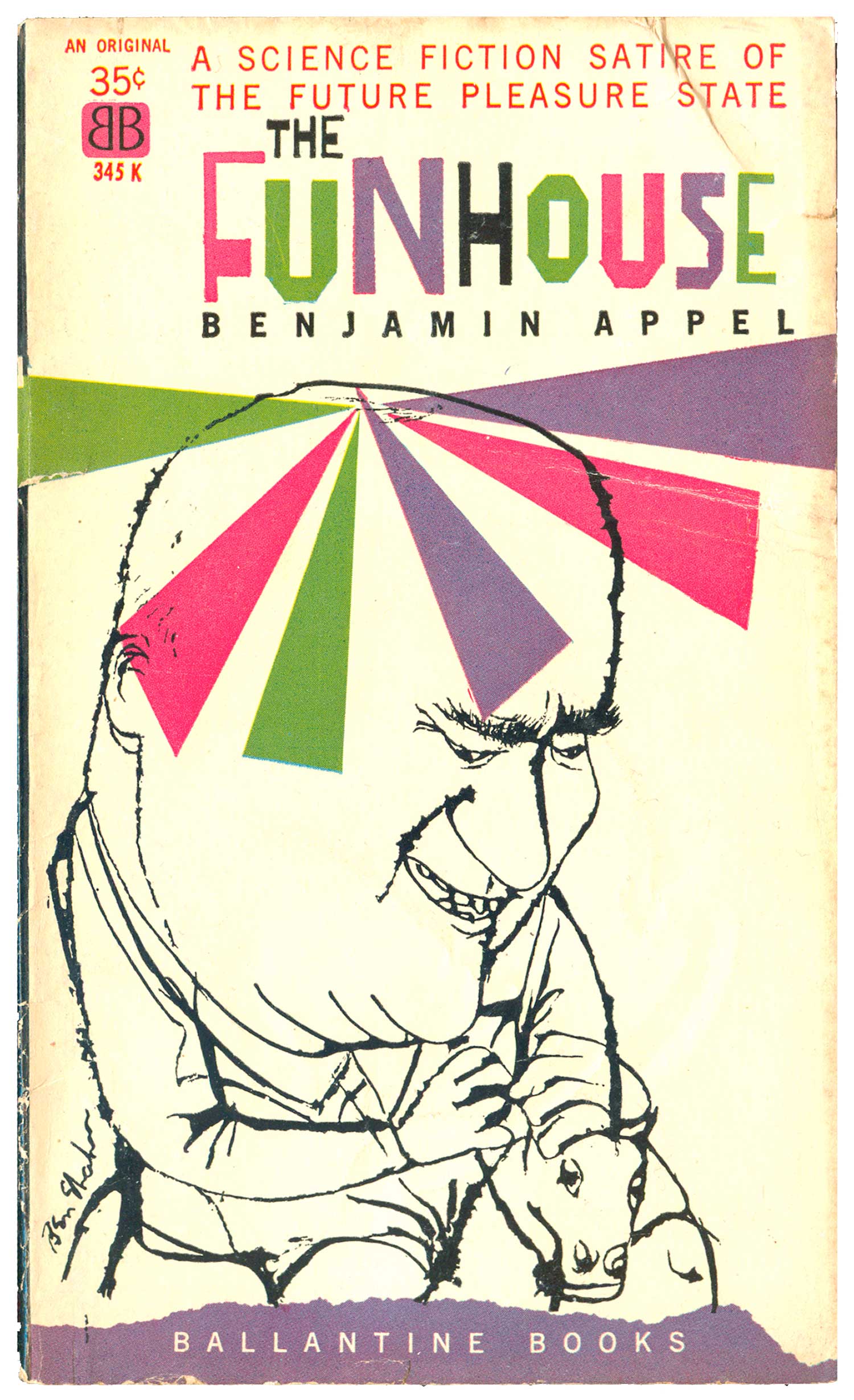
As far as I know, The Funhouse was the only science fiction cover that Shahn designed, and possibly the only one he did for Ballantine Books. This is early—1959—yet he already has in place the multi-colored hand drawn typography, the black line drawing, and the color background to animate it.
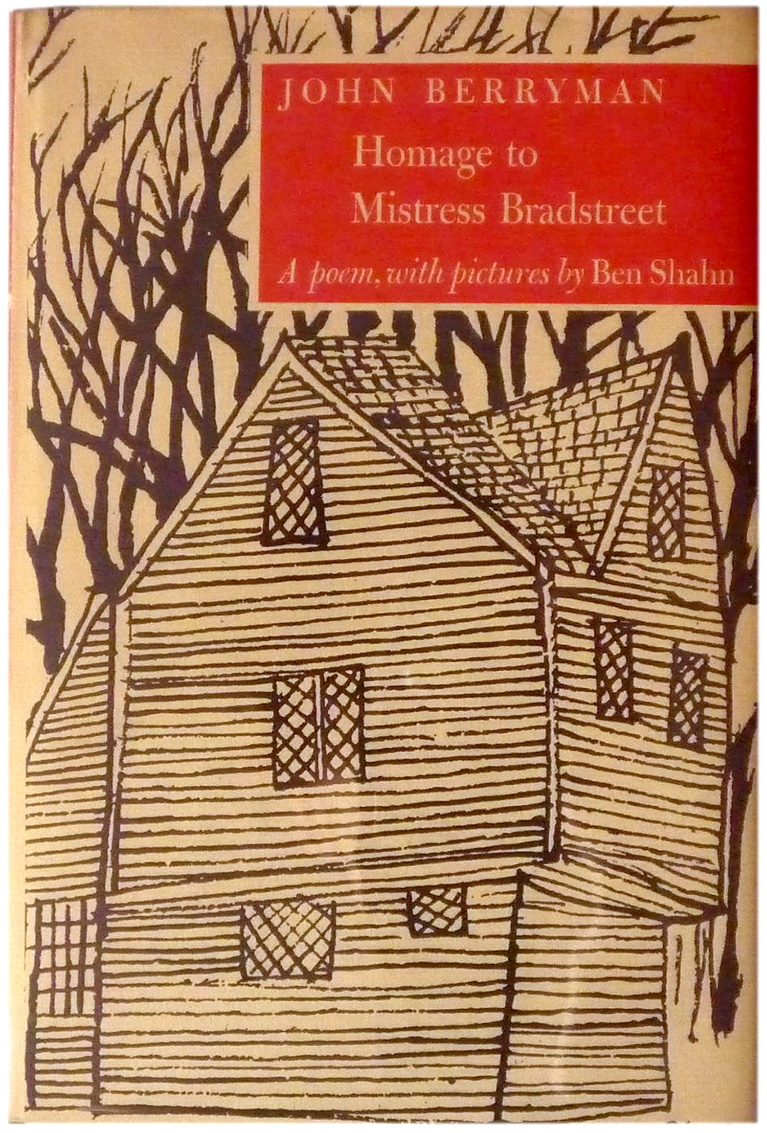
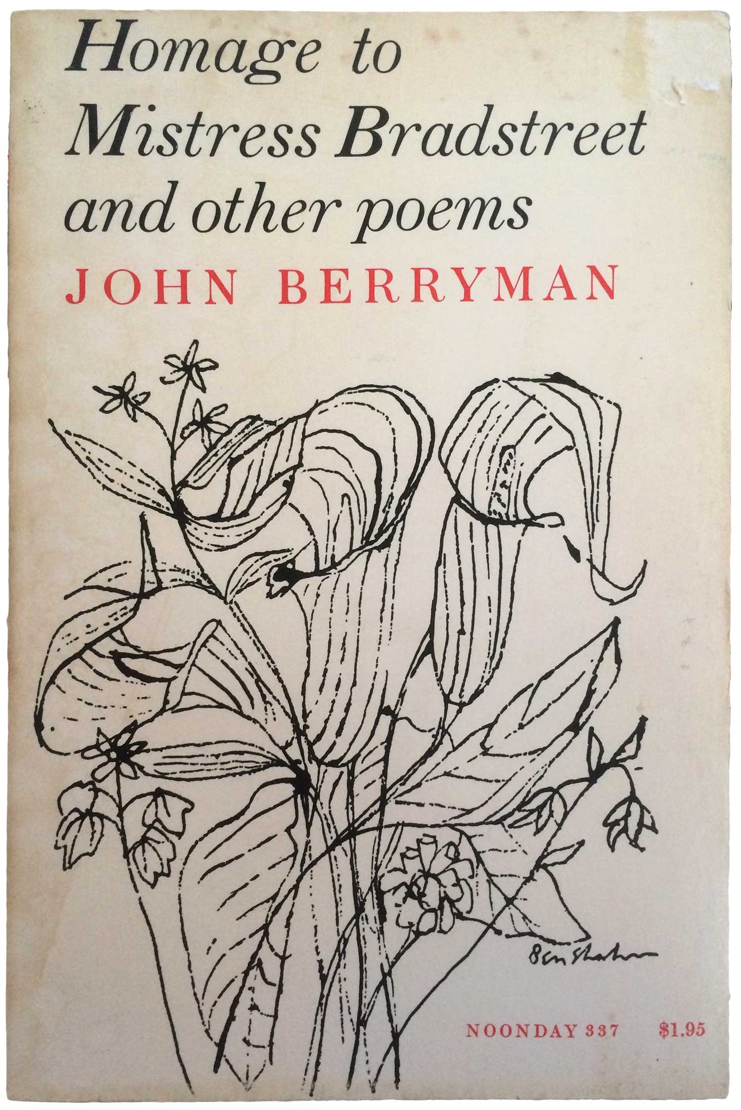
Below are two editions of a book of poetry by John Berryman. The covers both feature Shahn’s work, but are quite different. The original hardback has a architectural drawing with full bleeds, making for a dense, compressed feel. Even the titling is white in a red box, adding to the sense of fullness. The paperback is a complete flip, with the image a group of organic-feeling flowers that sit on the page. They demand attention, but are balanced by the title and contained by the negative white space.
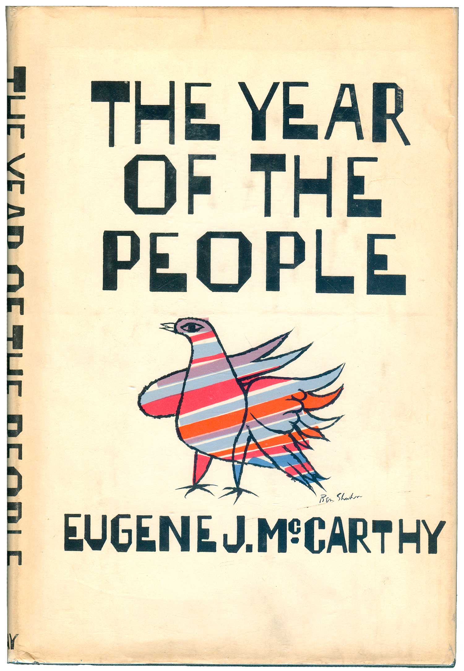
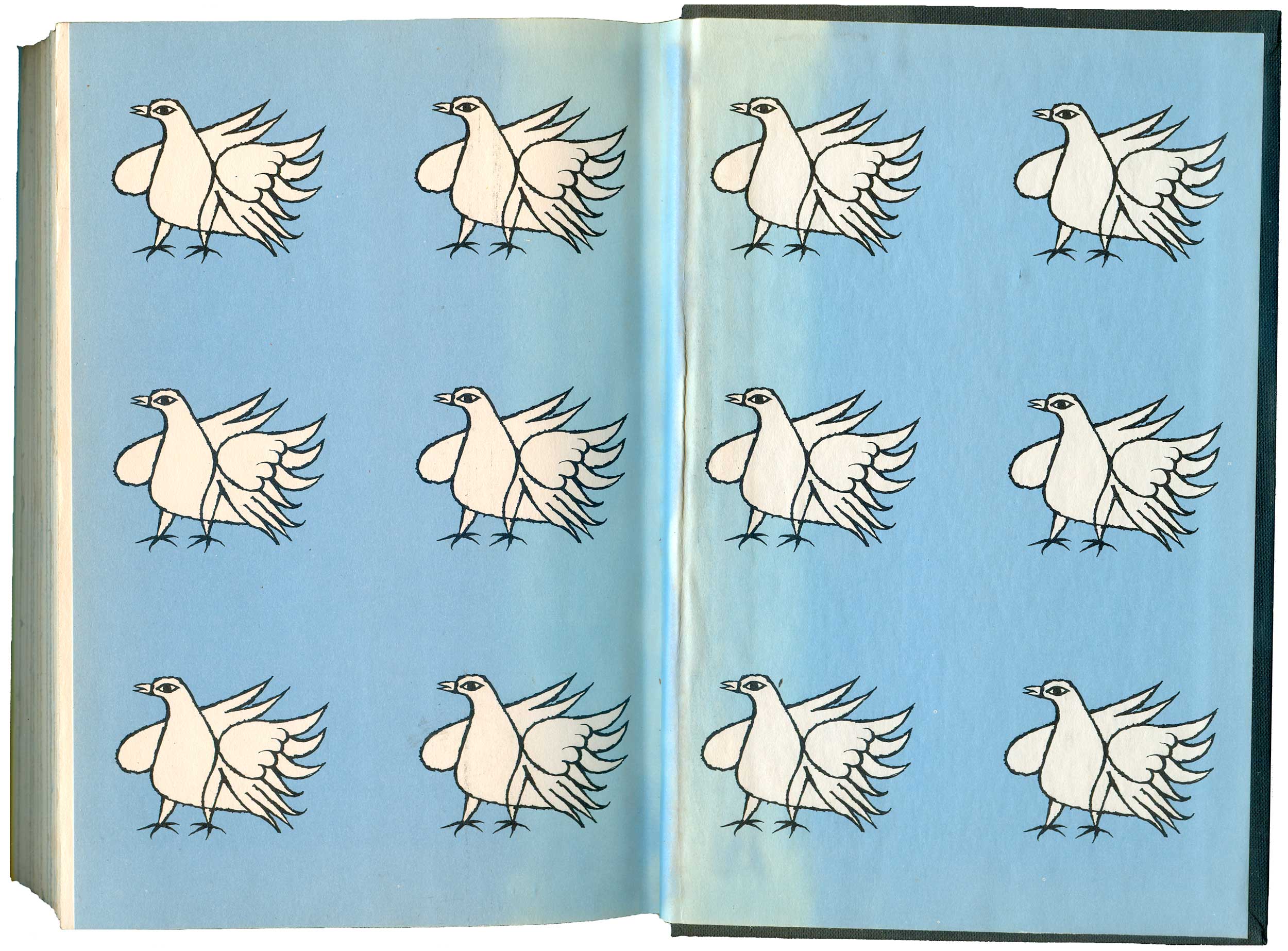
I’ve never been a fan of presidential politics, not a follower of the tomes candidates put out in hopes of proving themselves serious contenders, or presidents release to show how human they are, but I’m guessing this is one of the most handsome. Eugene McCarthy’s Year of the People is a diary of sorts of his 1968 presidential run as the “Peace Candidate,” and Shahn’s rainbow dove illustration and typography captures the dynamism many felt for the candidate. It’s modern, but not soulless. Cool, but not overbearingly hip. The dove pattern on the end papers is great, as well. I’m not sure if this was one of Shahn’s last jobs (there were also McCarthy posters with the bird design, which would have likely been made in 1968, and Shahn died the year this book was published, 1969), or if it was assembled and designed without him. Either way, it seems appropriate as Shahn would have supported the candidate who was against the war in Vietnam.
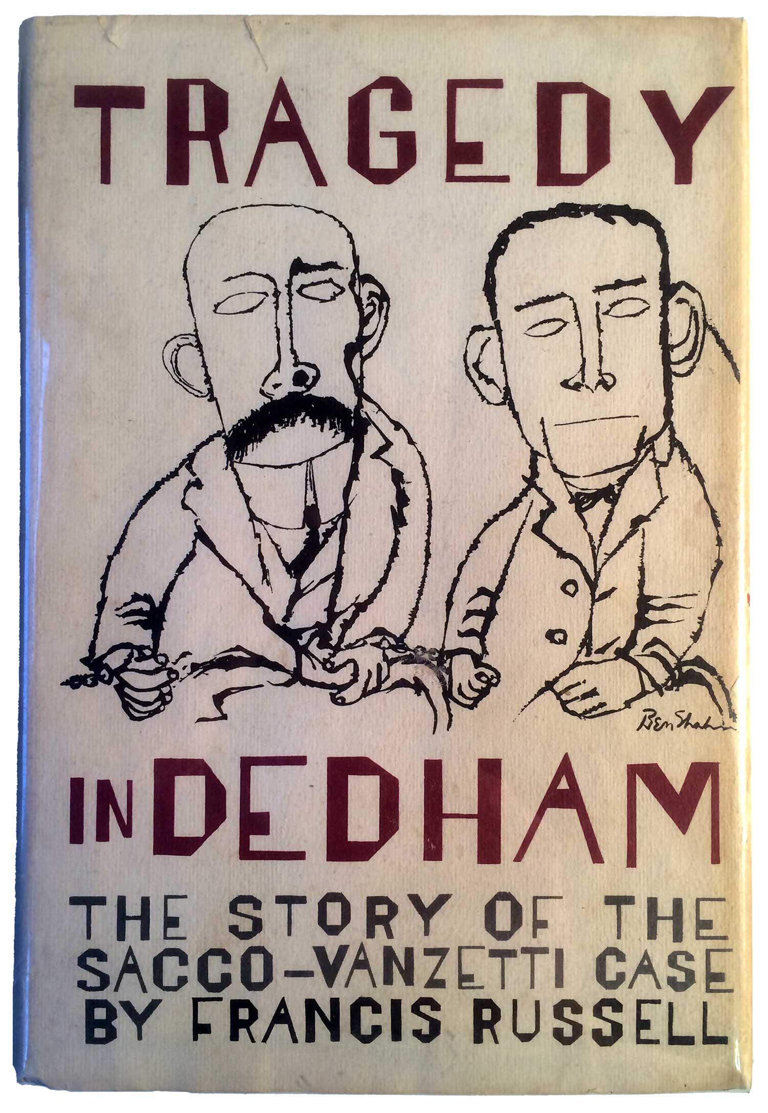
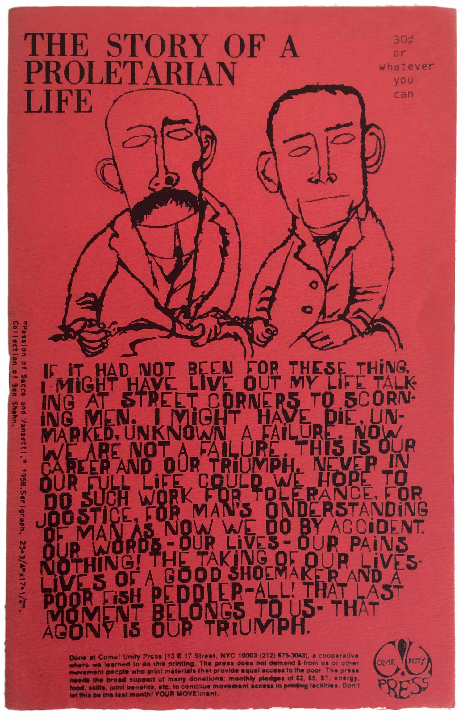
Below are two different applications of Shahn’s graphic of anarchist martyrs Nicola Sacco and Bartolomeo Vanzetti. As I talked about in the first week’s installment, I’ve always been enchanted and motivated by Shahn’s suite of illustrations, paintings, and murals dealing with these two. I grew up outside of Boston, came to anarchism in high school and fueled my fascination with the story of Sacco and Vanzetti via trips to the Boston Public Library to find books on them and other anarchist topics—not exactly common in my small town high school’s book collection. Seeing Shahn’s images drove me to want to make art about history, particularly about unsung heroes, movements, and events that no one bothered to tell me about throughout my education. In some ways Shahn’s work here is a major inspiration for the Celebrate People’s History poster series, and specifically for my poster on Sacco and Vanzetti.
Anyway, both of these covers came out after Shahn’s death, and the type on the Russell book is actually done by someone else “in the style of Ben Shahn.” The graphic is so powerful and humanizing, it works on both designs, on the left holding its own, on the right sitting atop Shahn’s own graphic interpretation of one of Vanzetti’s letters from jail. The cover on the right is actually for a pamphlet produced by Come!Unity Press, a queer anarchist print shop that ran for about a decade in New York City from the early 70s into the early 80s. I interviewed someone involved in Come!Unity, which will be a feature story coming out in Signal:05 this summer, so keep an eye out for that!
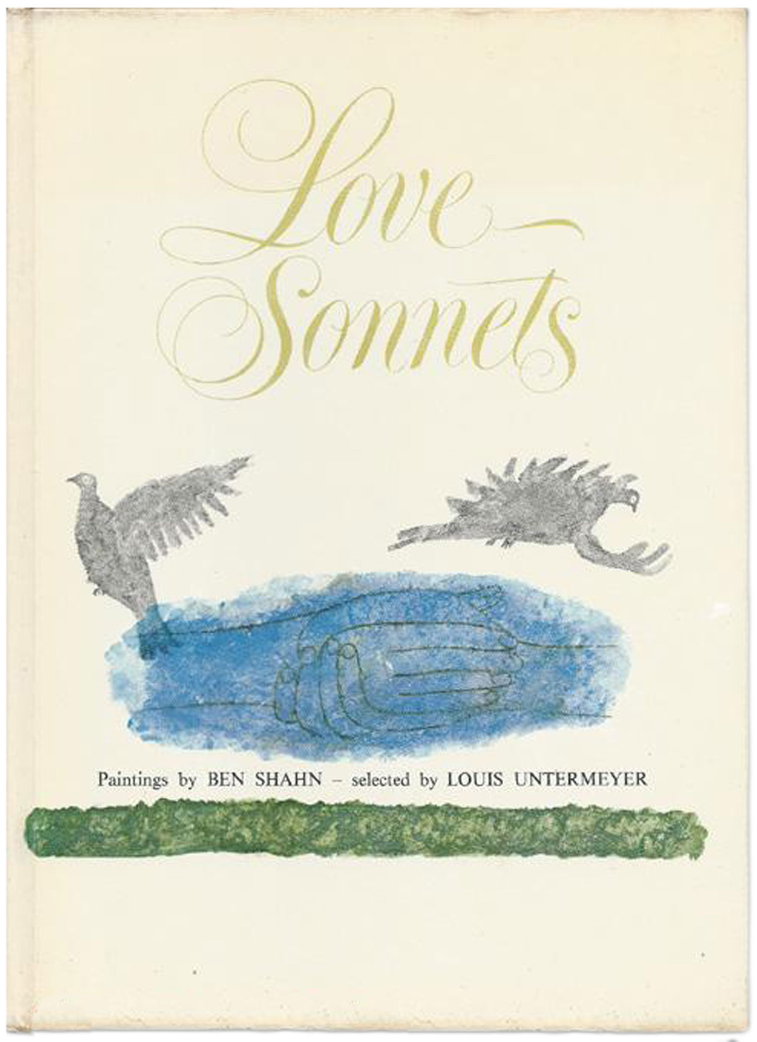
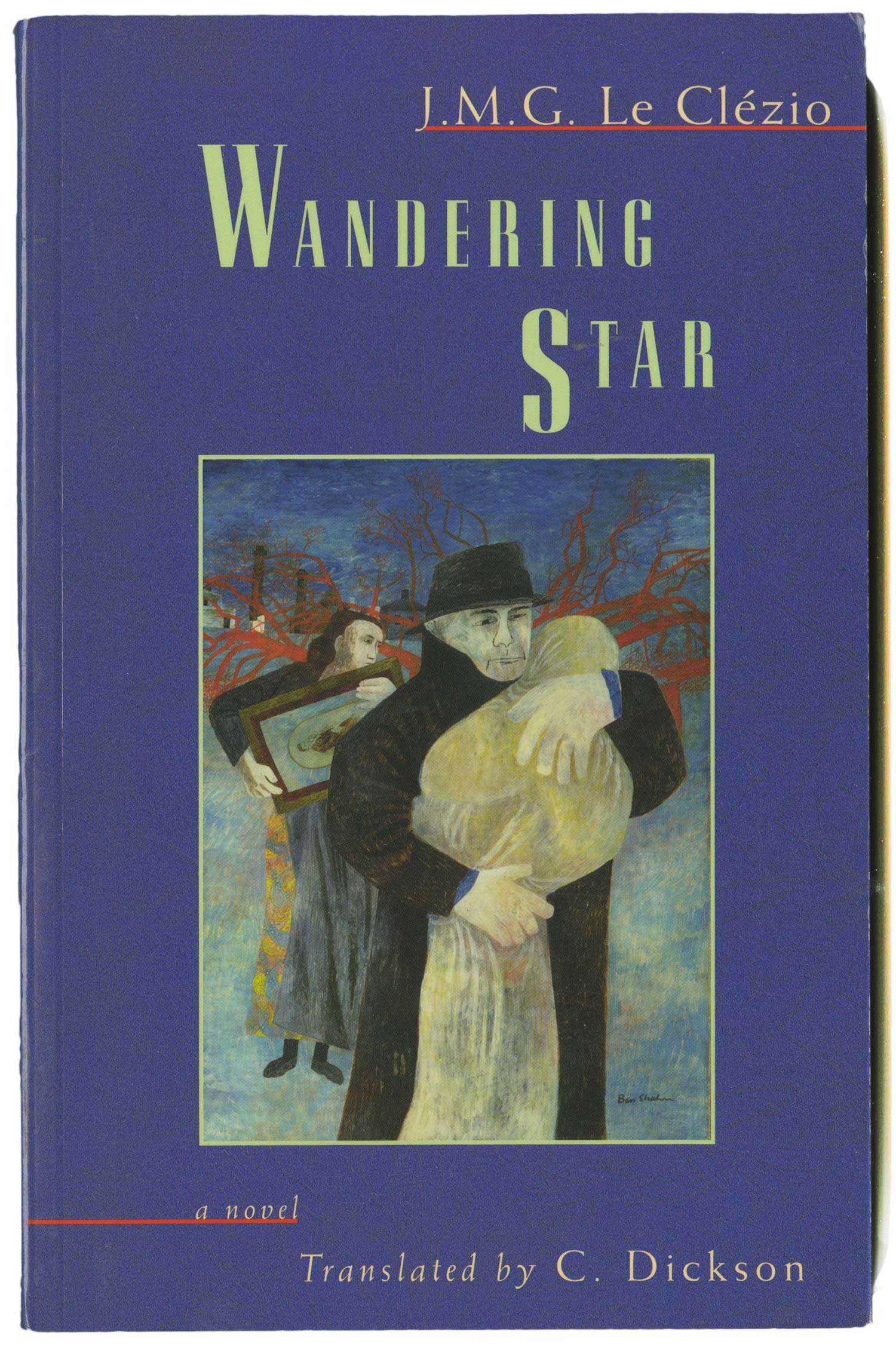
Here are some final bits and pieces for this week. Love Sonnets is a strange cover for Shahn, much more precious than his work usually is. It’s from 1974, so he definitely didn’t do design, someone else has just deployed one of his watercolors. This kind of painting has such a different quality than his graphic work that I almost missed that it was a Shahn cover. The LeClezio title is another re-use of his work, this time a more traditional painting: Father and Child, from 1946. There’s nothing necessarily wrong with this cover, but the design does the painting no favors, and vice versa.
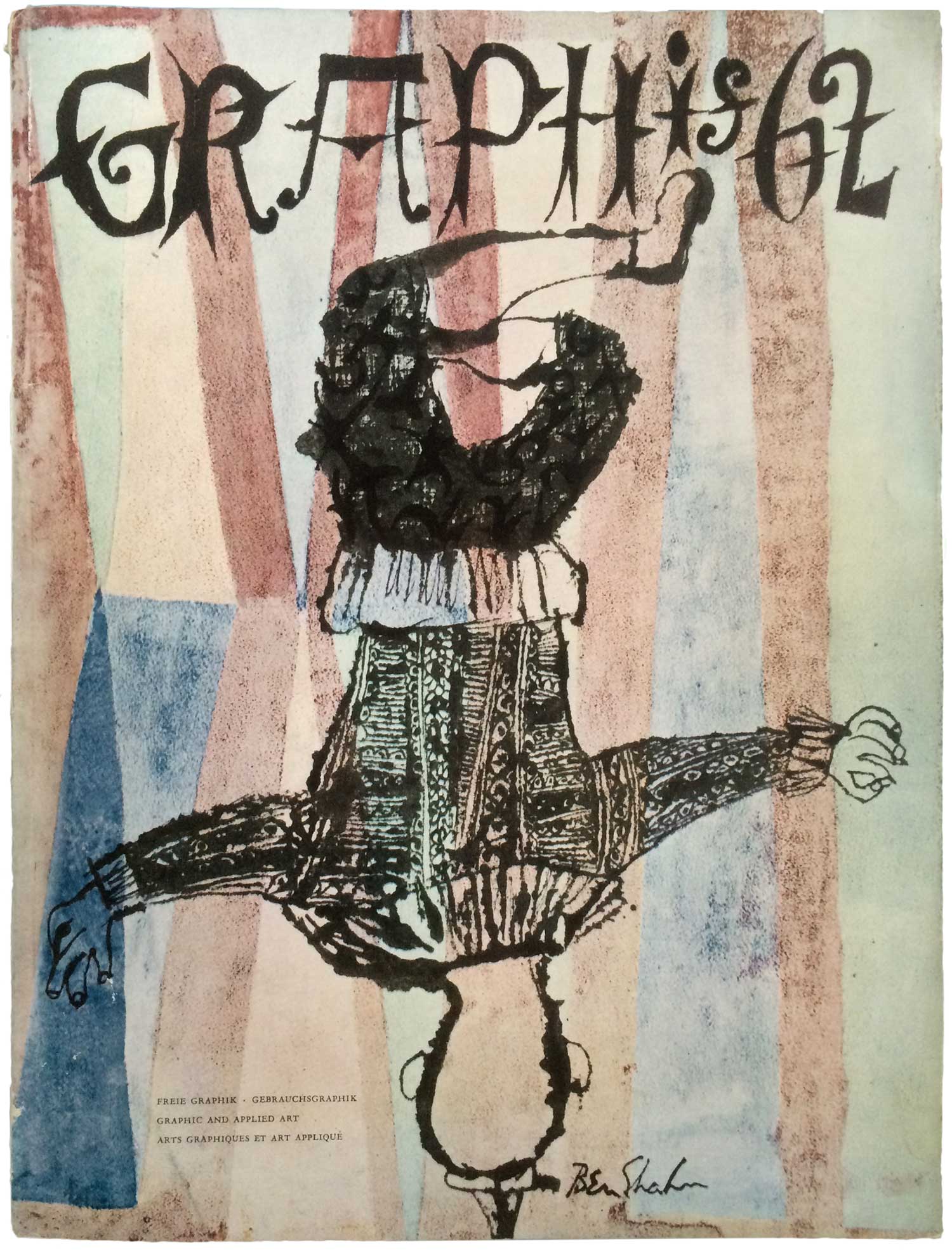
Shahn also did a lot of cover work for a wide range magazines and other publications, from Fortune to Ramparts to The Nation. Since my focus is on books (and sometimes pamphlets), I haven’t done much collecting of these covers, but I did happen upon an old copy of Graphis 62, from 1955. Not only does it have a nice Shahn cover done specifically for the journal, it also has a feature on his graphic work.
Next week I’ll be cleaning up with the rest of the Shahn covers, mostly books specifically by or about Shahn himself. As always, please feel free to comment here, or send covers!