Three or four years ago I was supposed to go to a big book sales with my friends that run Book Thug Nation here in Brooklyn, but I ended up getting sick and not being able to go. A couple years prior I had found some great Czech crime novels in the foreign language section at this sale (always a crap shoot, the foreign language section—sometimes it’s a pile of crappy abridged French classics, and other times there’s a rad stack of Arabic communist pamphlets—you just never know), and was a bit bummed out I wasn’t going to get to check it out again. To my surprise and excitement, Corey picked up an amazing little collection of Czech crime and spy novels at the sale for me! I dug through them, and even scanned covers and insides, but then got caught up in other things and they’ve been languishing in a folder on my computer ever since. Of late I’ve been trying to figure out how to spend more time on the things I want to do (don’t let anyone convince you that living the freelance life means you get to do what you want!), and I dug out these images. So here’s a really cool set of novels published in Prague between 1970 and 1991.
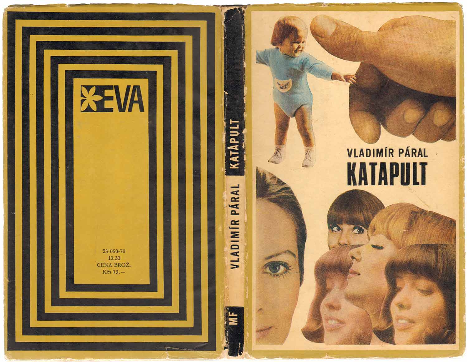
The first two books (above and below) are both from 1970, and might be the coolest of the bunch. Vladimír Páral’s Katapult has one of the strangest book covers I’ve ever seen. Like a demented collage, made from magazine clippings by a 12-year-old. On the top half a toddler is being grabbed—or smudged out?—by a giant hand, while a collection of women’s faces watch on from the bottom half. In my writing about book design I often like to place covers within a context of concurrent art history, but here I have so little to compare this to. While it has a decidedly late 60s feel because of the child’s clothes and the women’s haircuts, it would be hard to classify thi as pop art. It feels both childish and highly compelling—yet I have no idea what the book is about. The back cover has it’s own charm. This is the only title I have from this “EVA” series but I suspect all the books shared this maze/pyramid pattern.
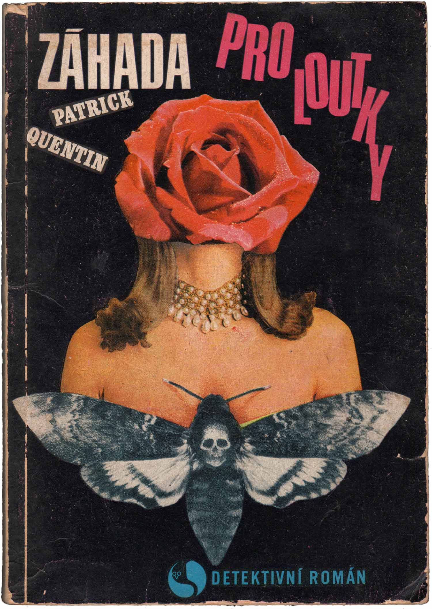
Next is Patrick Quentin’s Záhada pro loutky, a Czech reprint of a 1940s British crime novel Puzzle for Puppets. Once again the cover is a montage (although this book is from a different publisher) but this time it resonates much more with the visual culture of the time. This cover is strange, yet familiar, like a cross between a Polish film poster and a Linder collage for a Buzzcocks 7″. It’s dark and creepy and everything you’d want out of a mystery novel cover.

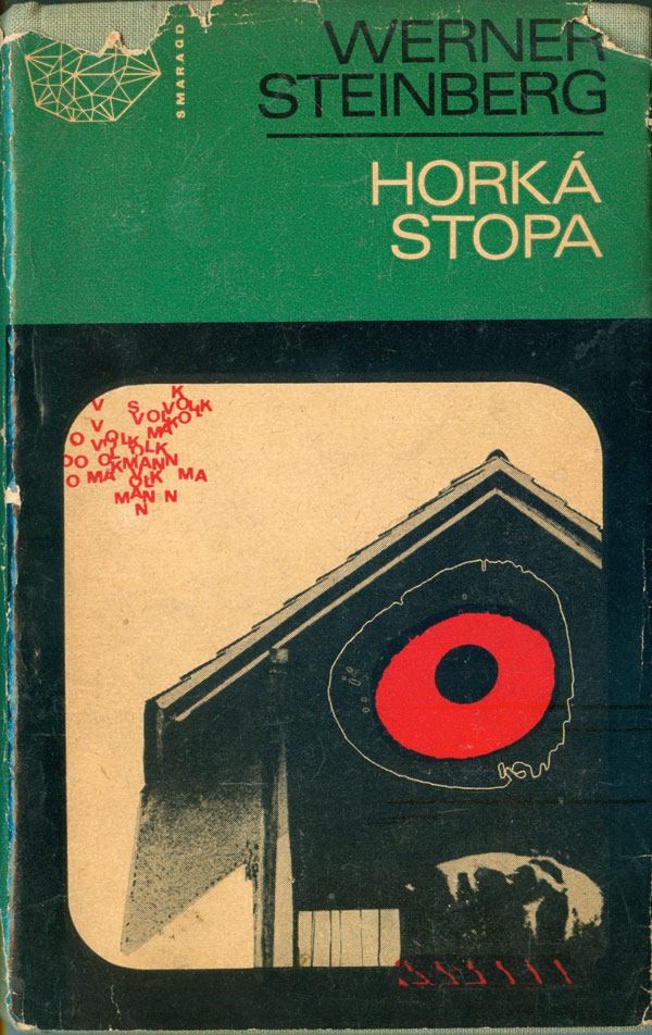
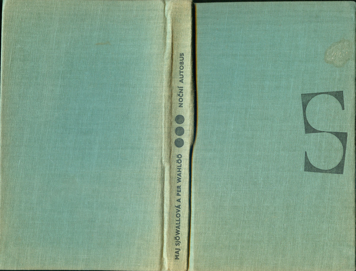
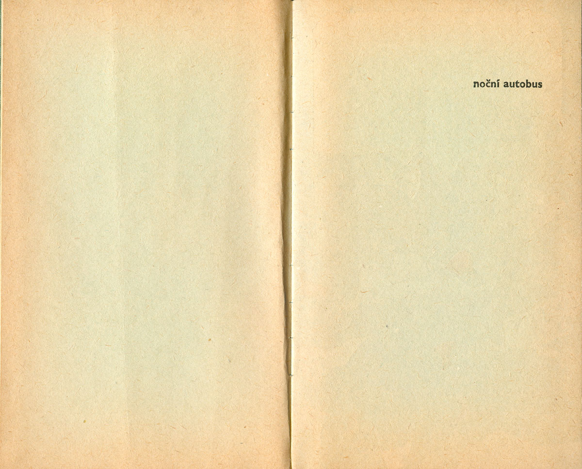
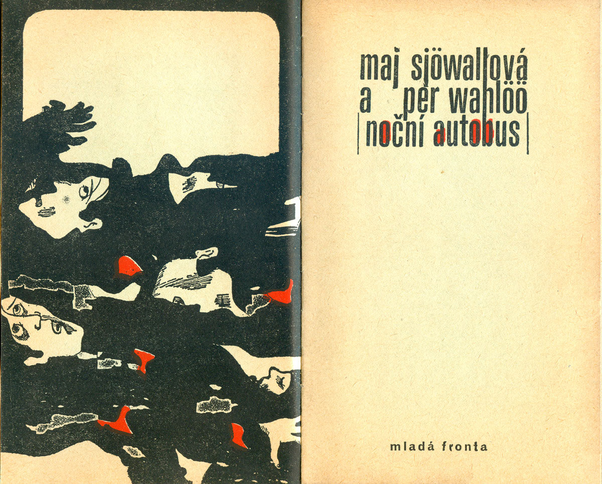
Below are two clothbound crime novels with dust jackets, part of the Smaragd series from the publisher Mladá Fronta (who also published Katapult, above). One of the books is a novel from one of my favorite series, the Martin Beck books by Maj Sjöwall and Per Wahlöö. Sjöwall and Wahlöö were Marxist writers from Sweden who used the form of the crime novel to critique Swedish society and the limits of social democracy. The book, titled Nocní autobus (literally translated as Night Bus, but actually the novel called The Laughing Policeman in English) was originally published in 1968, and is the fourth in the Beck series. This edition was published in 1974, and is the 69th book in the crime imprint Edice smaragd svazek, or Green Emerald Editions. The other book is Werner Steinberg’s Horká Stopa. I know a lot less about Steinberg (other than he was a German communist writer), but this was #67 in the Green Emerald series and has all the same great design elements.
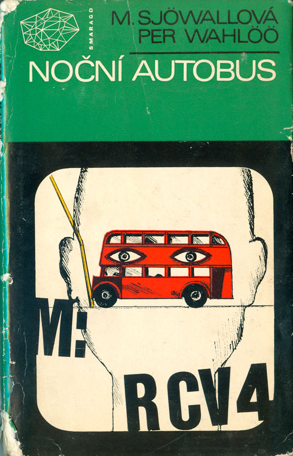
The series is beautifully designed, with every element consciously created. The dust jackets are smart, with quirky and suggestive illustrations. They read like Eastern European film posters from the same period (and the designers very well may have been doing film poster work as well). The Green Emerald logo is a fabulous, sprawling crystal illustration, placed on the covers and the frontispiece of each book. The cloth under the dust jacket is also cool, with a great spine and nice “S” logo for Smaragd. And to top it all off, each book has a second significant illustration (each uniquely duotoned), opposite the title page. Nocní Autobus‘s is a gruesome pile of bodies.
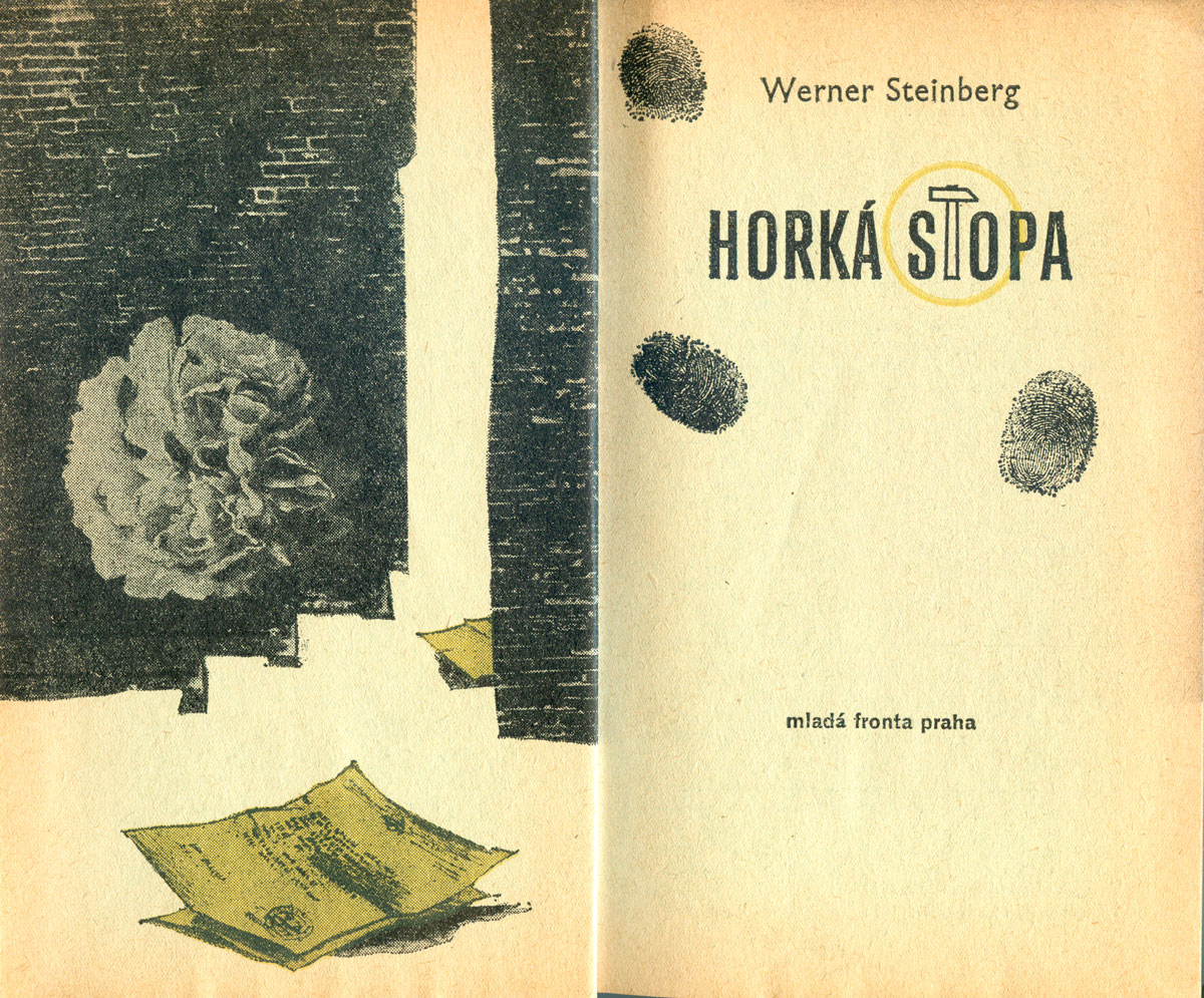
The cover illustration on Horká Stopa is a strange montage, with a house made creepy by the giant red eyeball, and the scattered letters in the top left corner adding a completely different vibe. The title page illustration is yellow and black this time, and much more cryptic than the one above. A white rose floats on a brick wall, documents seep out from the cracks, and smudgy fingerprints surround the title, with the T in Stopa a hammer, circled, referencing the Soviet hammer and sickle.
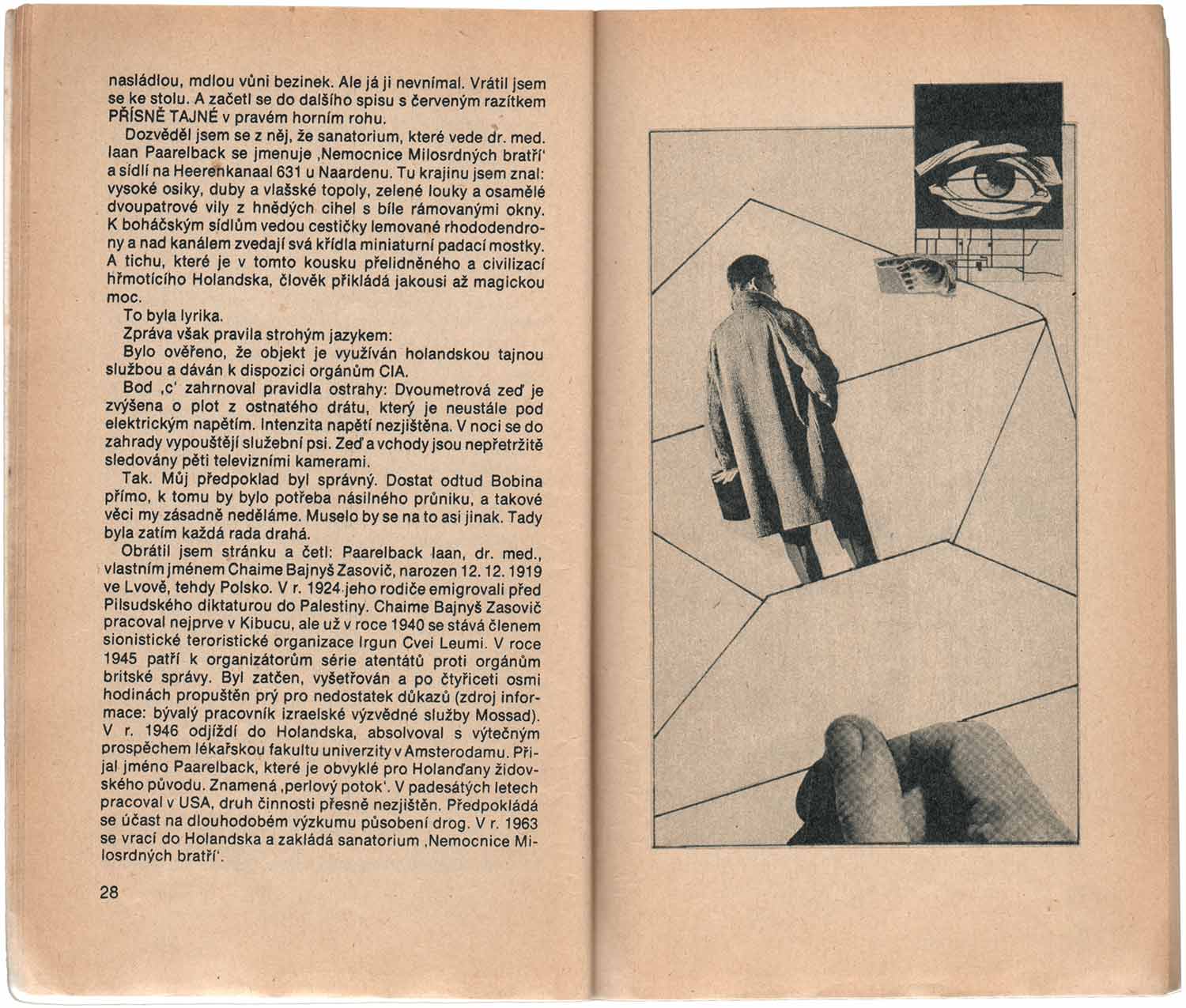
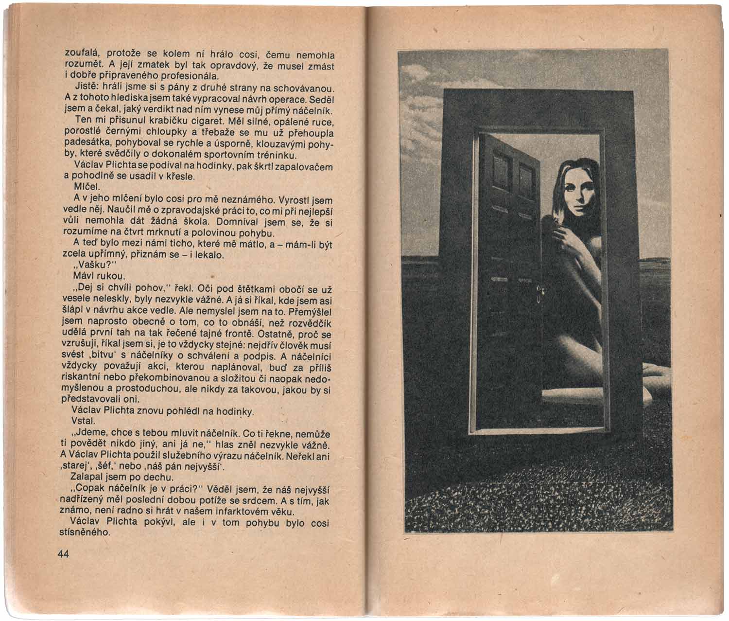
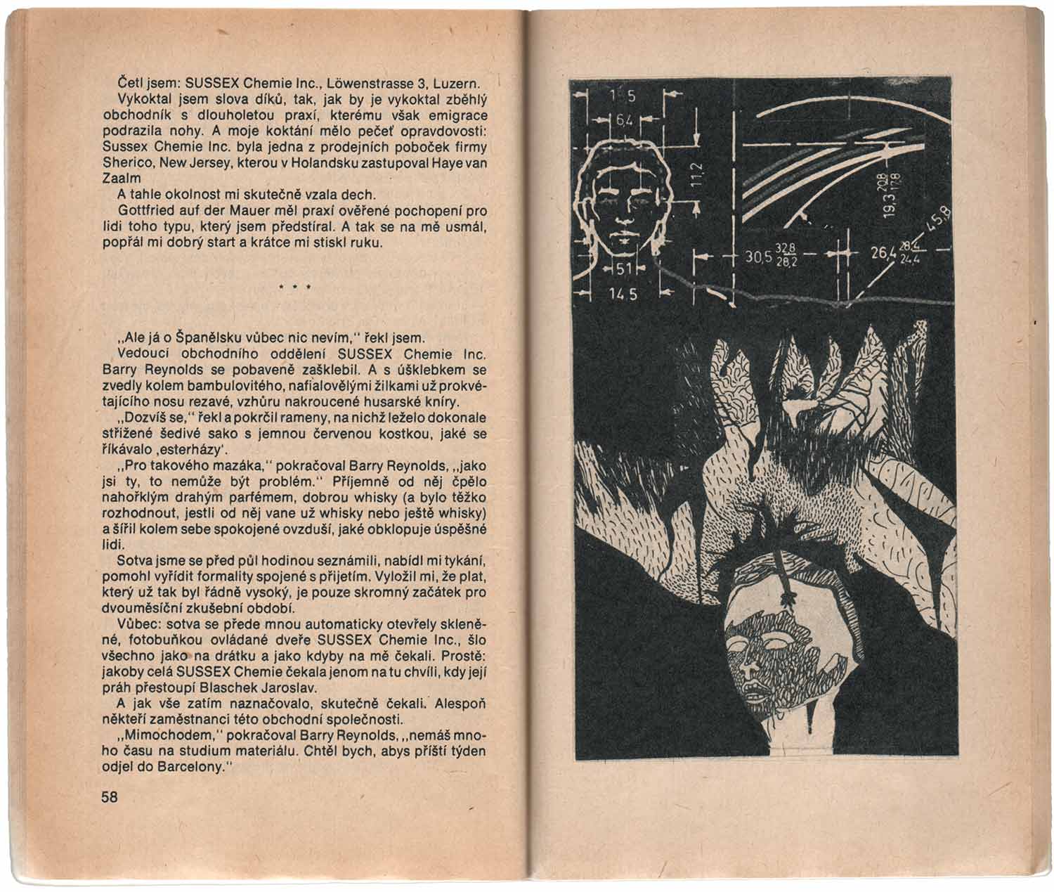
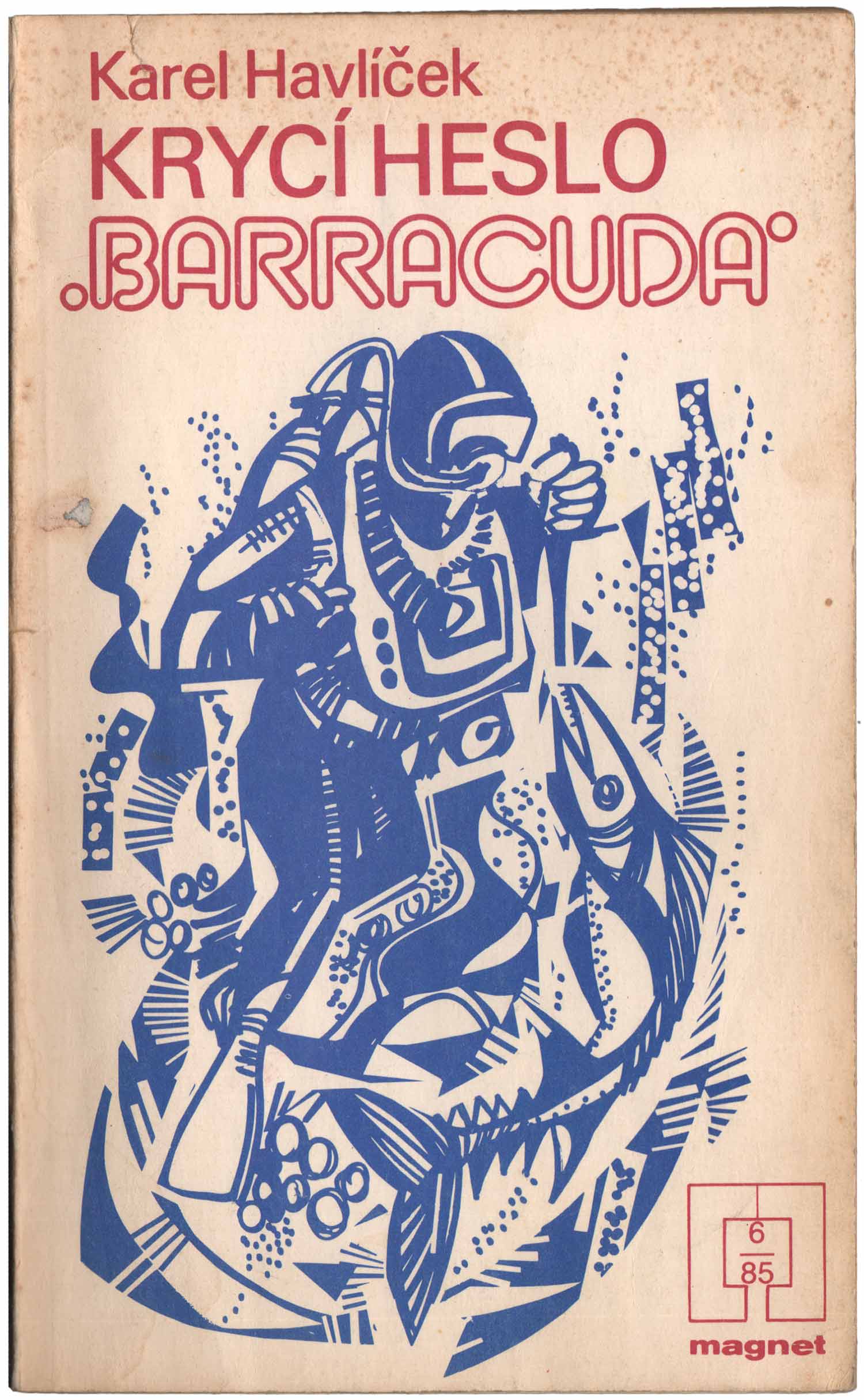
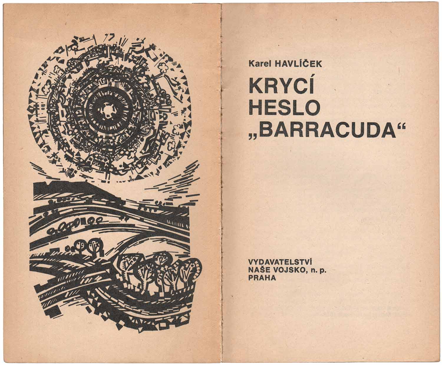
Next is a series of three short, illustrated crime/mystery stories from the 1980s. They are all “Magnet” books from the publisher Vydavatelství Naše vojsko. Being short and heavily illustrated, they seem like they were made for young adults, but I think that’s simply a cultural bias on my part. Based on the numbers on the covers, it looks like one of these was published each month, possibly through some sort of subscription service.
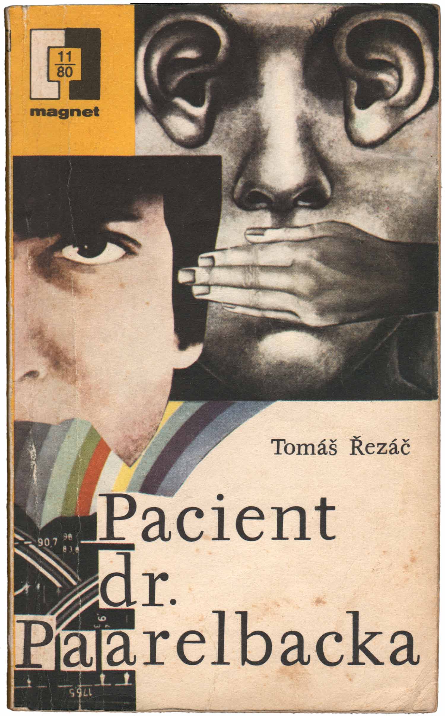
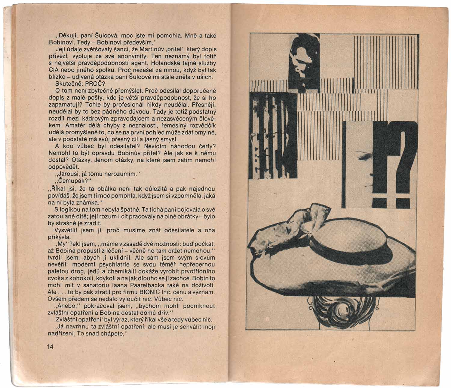
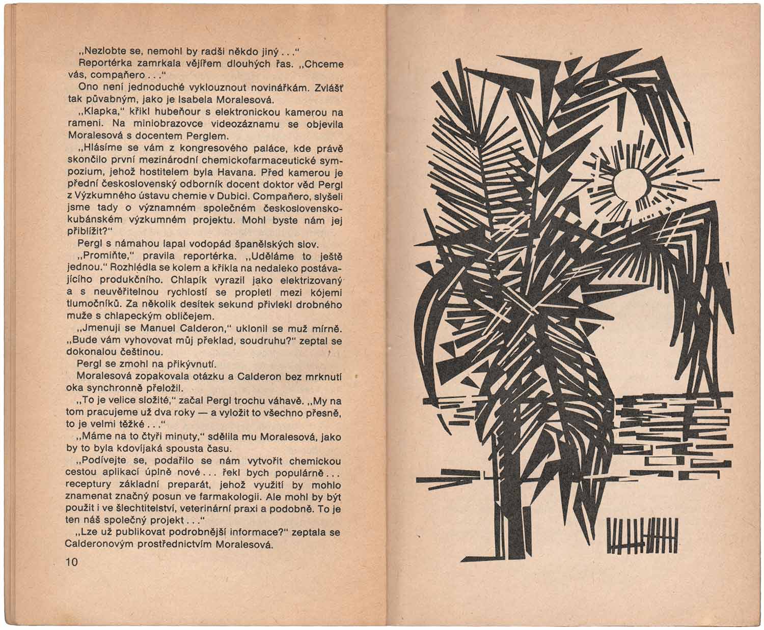
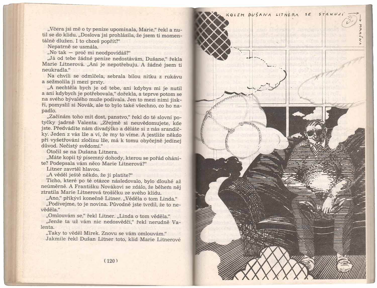
They’re each slim volumes, printed on inexpensive paper, but a huge amount of effort clearly went into the illustrations. There are over a dozen images in each book, with each volume down by a different illustrator in wildly different styles. This first one, which looks like it was the 11th book of 1980, was illustrated by Miloš Vrbata with quirky collages, many drawn over or intervened in by other types of mark making. They are crisp and articulate, with lots of thin line work. Without being able to read the novel it’s hard to tell how much they hew to the story, but they appear to be able to function as both directly illustrative and largely abstract. I’m so not used to reading with this type of imagery along side the text, it’s hard to tell what it would feel like, although it seems like a cool concept in the abstract.
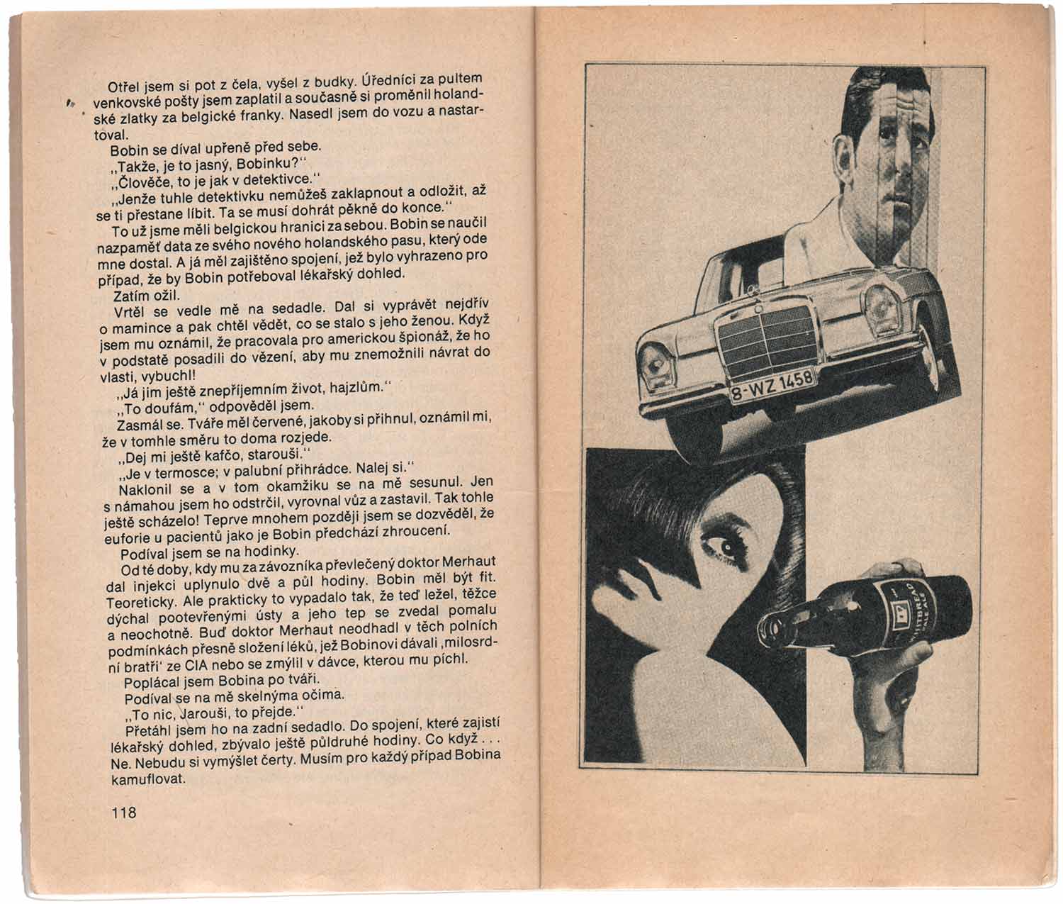
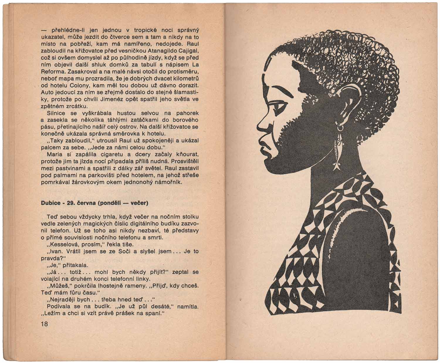
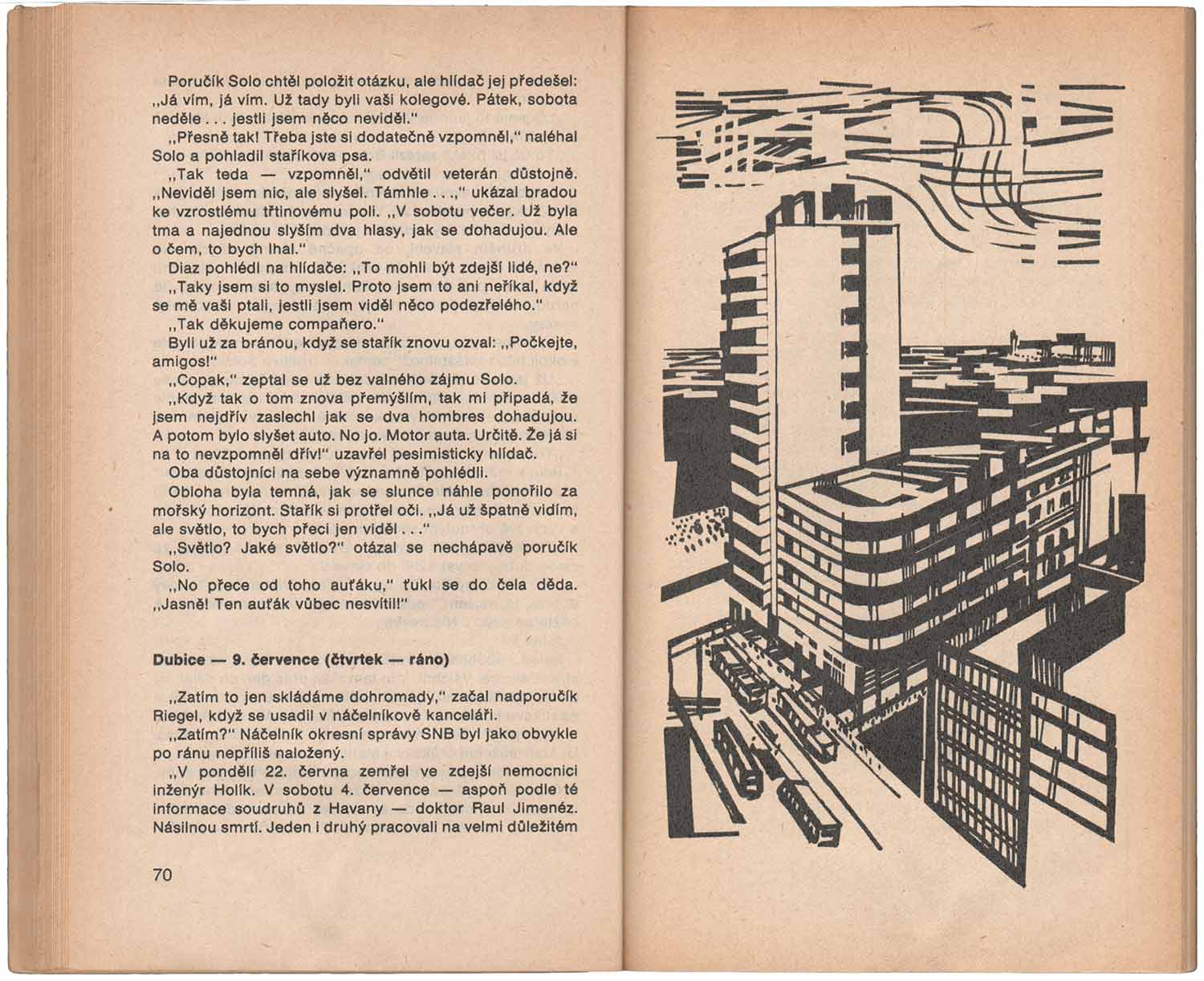
As you can seen below, the illustrations in the next book are wholly different. They have a choppy, block-print feel, and seem much more direct, letting us know the story takes place in the tropics, and revolves around a series of characters of African descent. I can’t say I like these, although they seem the most accomplished of the three Magnet books here.
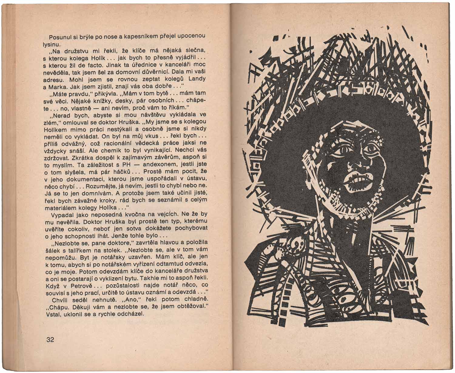
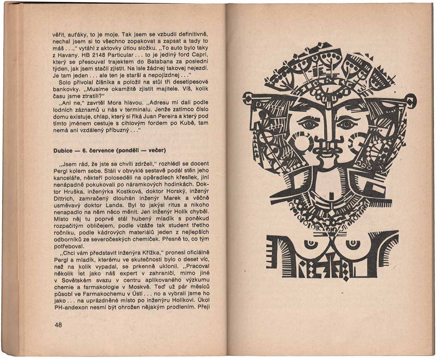
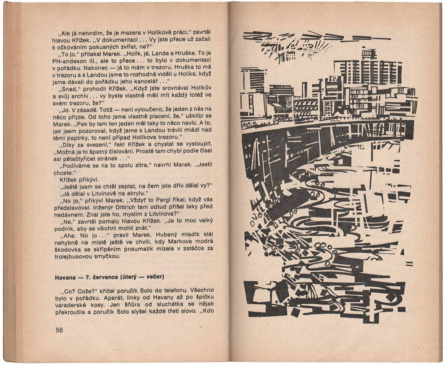
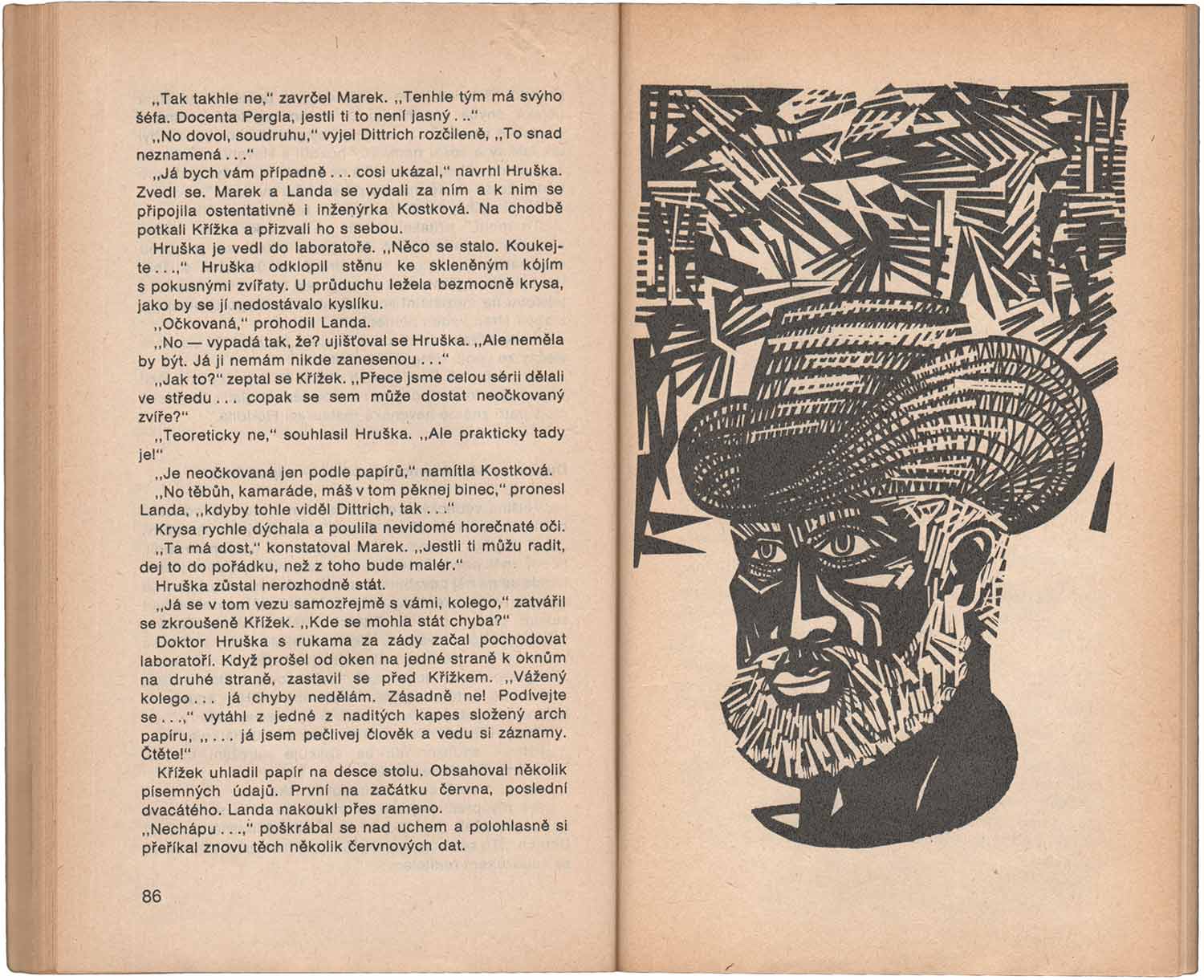
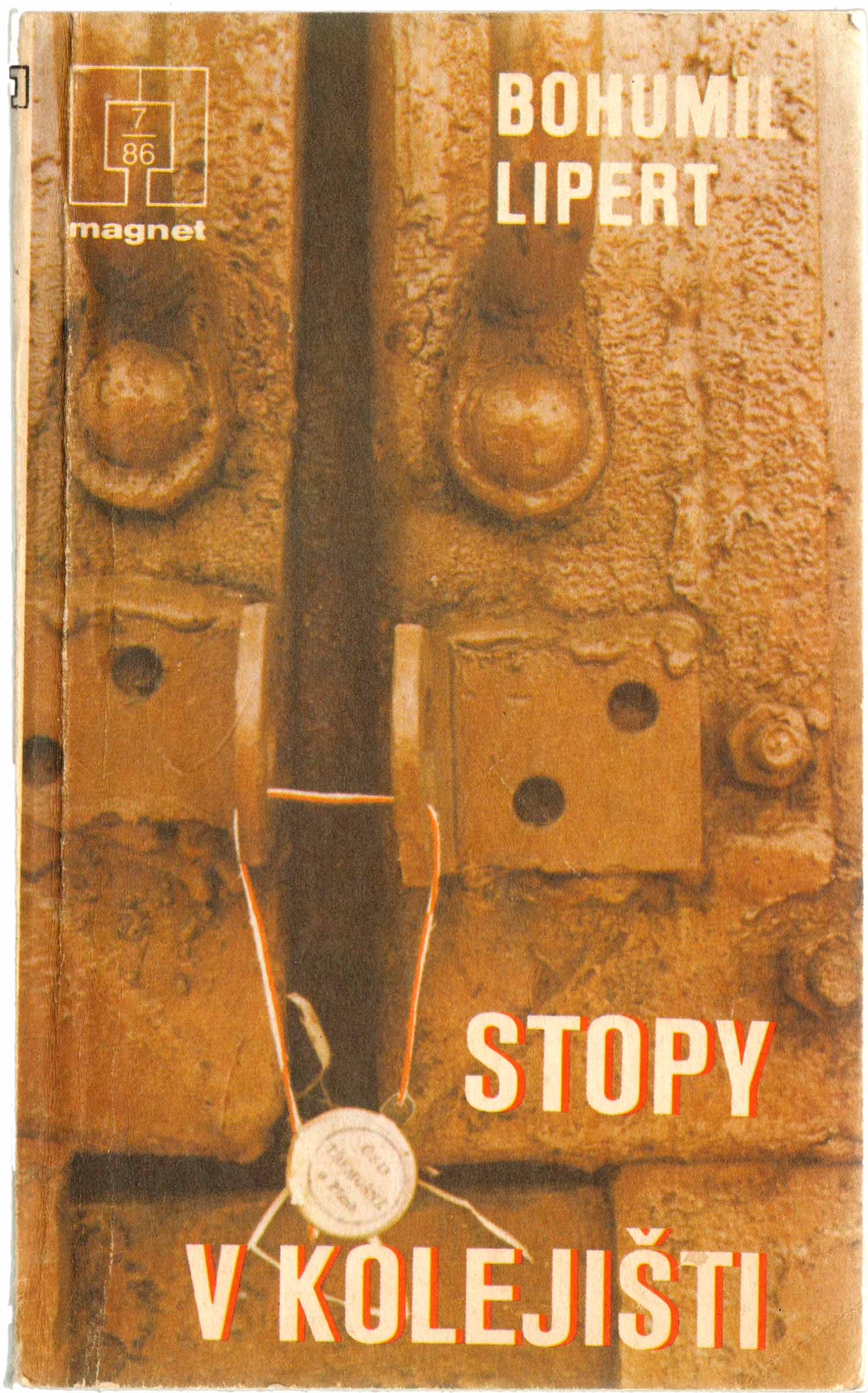
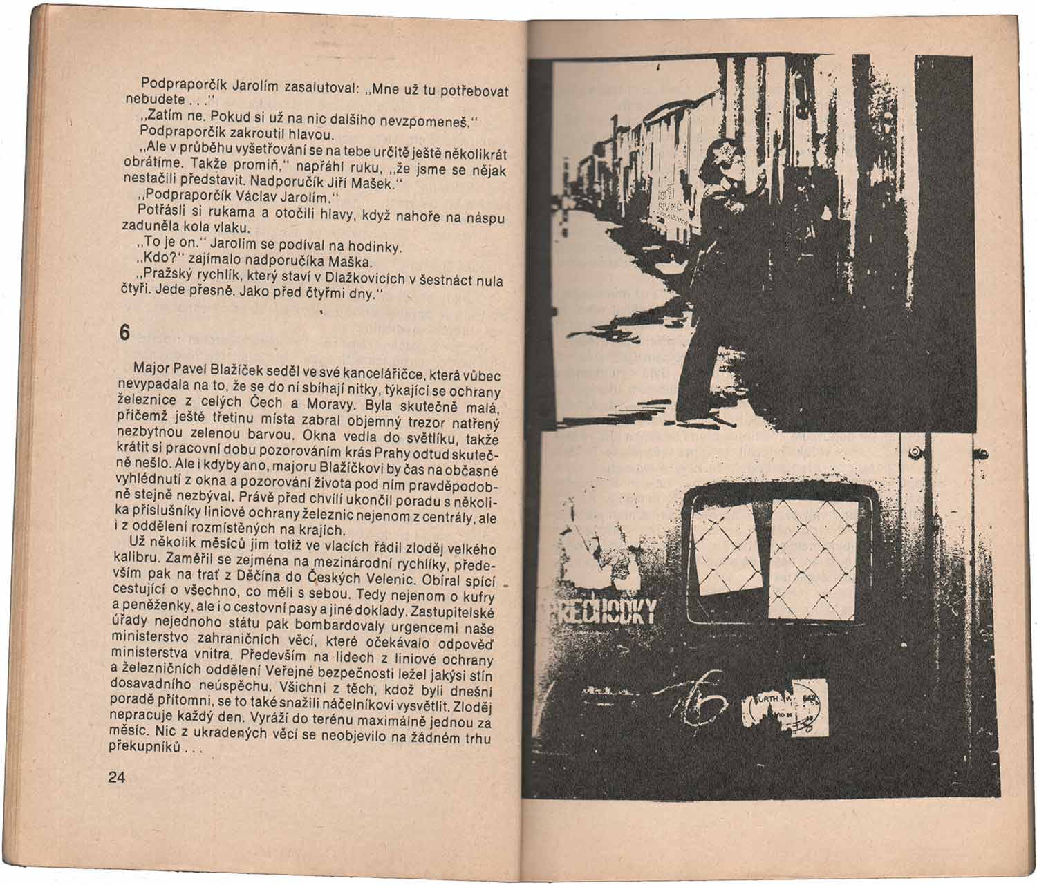
The final Magnet book is Bohumil Lipert’s Stopy v kolejišti [Footsteps in the Railyard], with illustrations by Milan Branšovský. These are collages again, but much more dense. Rather than feeling clean and open, they are dark, rich, and all have the vibe of having been photocopied over and over again too many times. It gives the pages a claustrophobic feel. This imagery also feels scrappier, more thrown together and haphazard—almost as if they were rushed to get them finished by deadline, giving the entire book a hurried and cheap look.

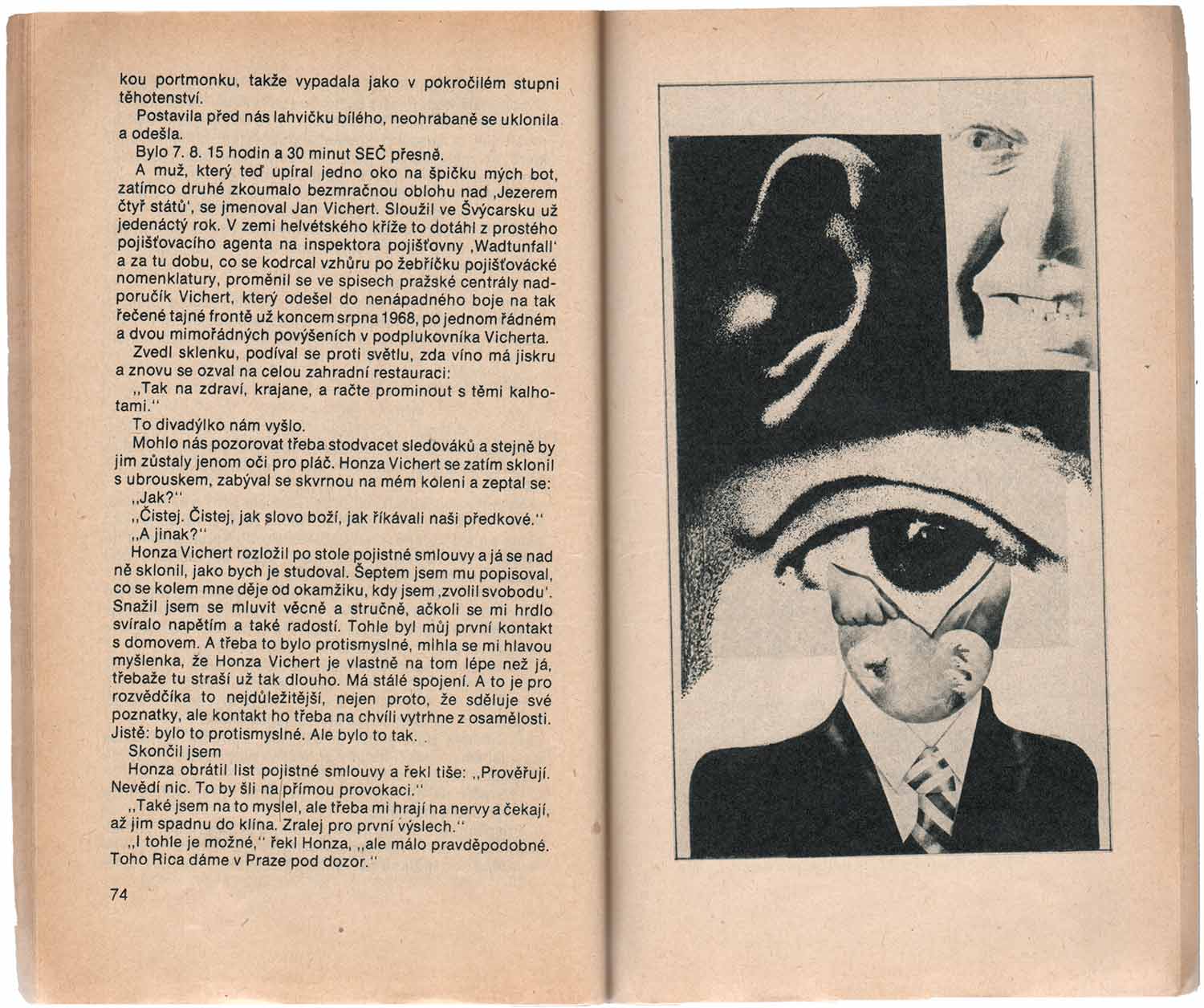
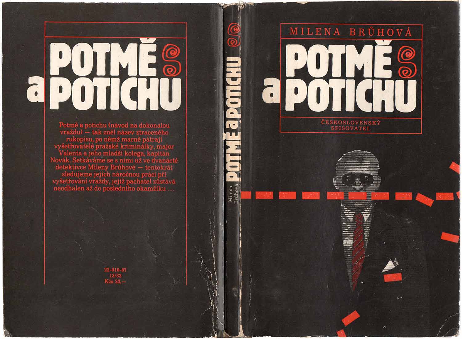
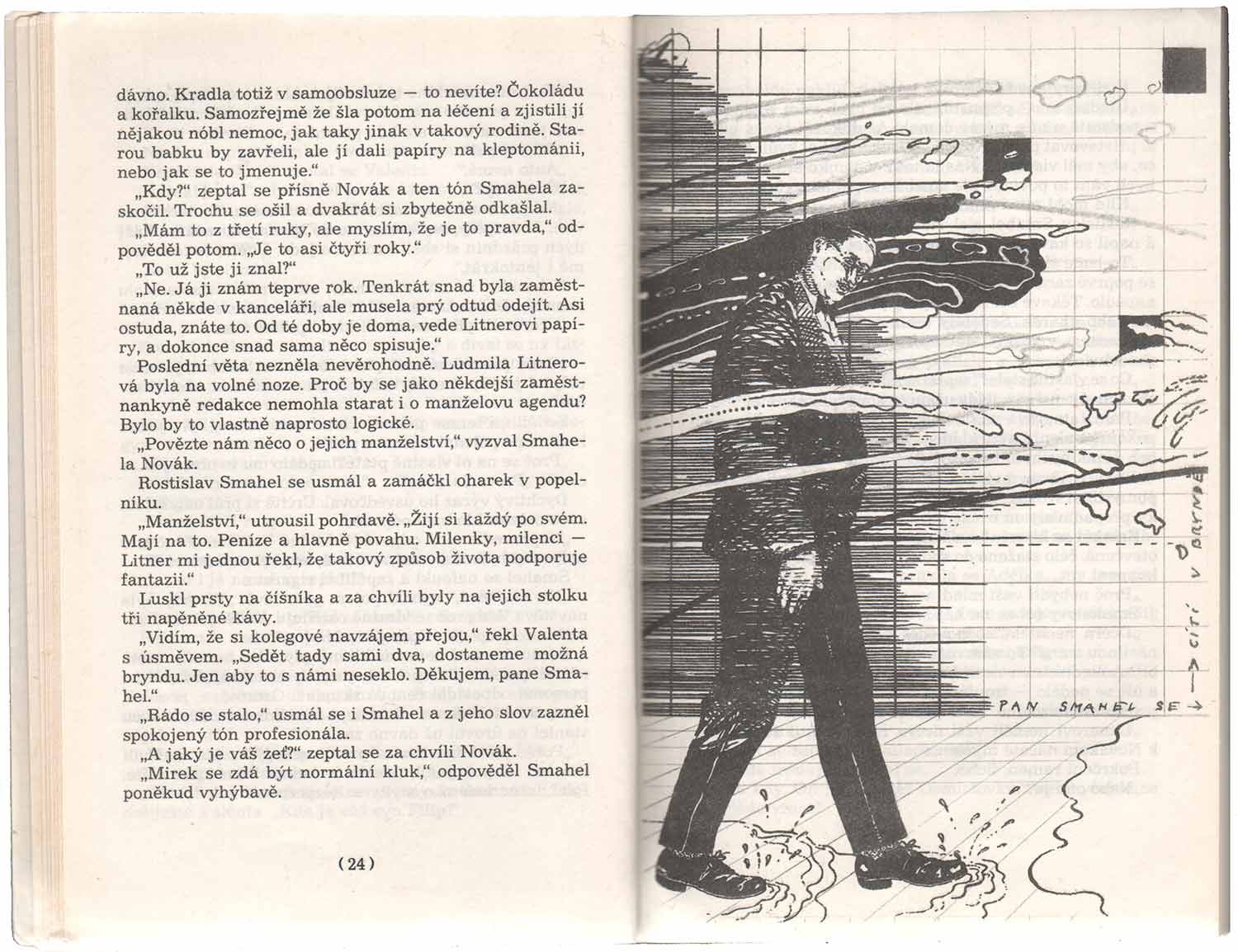
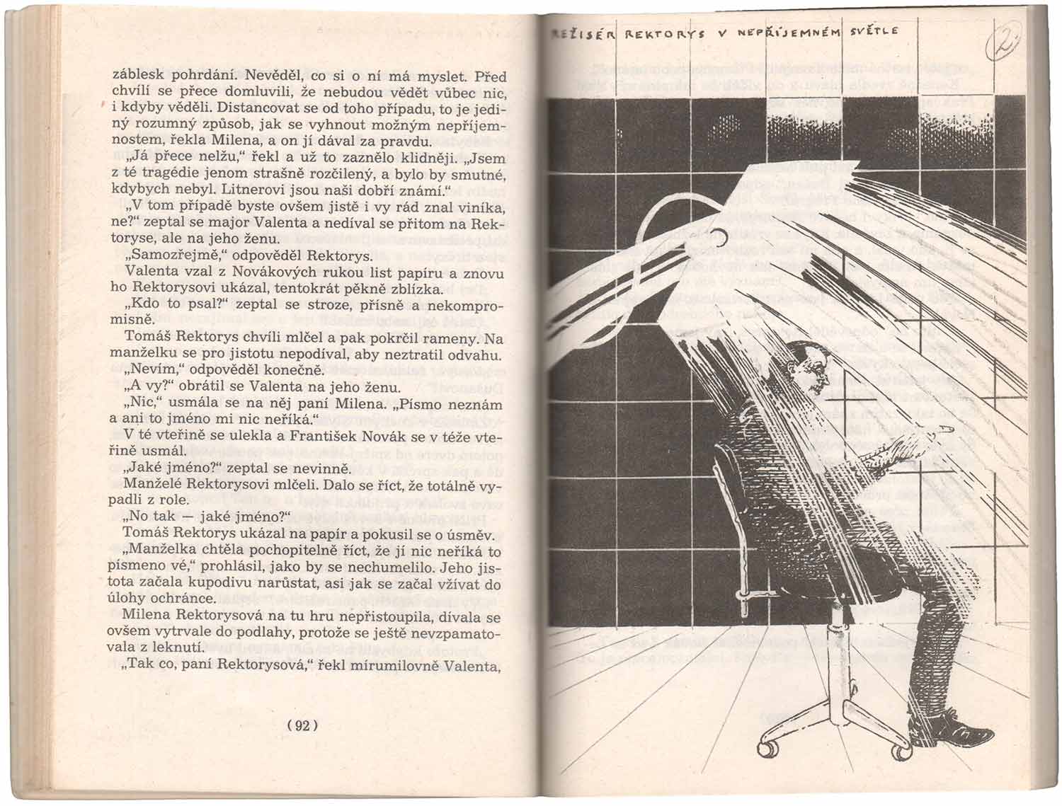
The cover and internal illustrations from Milena Brůhová’s Potmě a potichu [Dark and Quiet] are by Karel Haloun and are my favorite here. This is not a Magnet book, but one from Edice Spirála, a competing series out out by a different publisher. But like the above, it is heavily illustrated. This imagery has a more punk feel, like these could have come out of an early 80s Europunk zine. Line drawings with an architectural feel, but the formal structures of boxes and grids are immediately transgressed with scratchy marks and text written literally around the images—up the sides, along the top and bottom. Much more so than the above books, these seem like the kind of imagery which does not simply illustrate, but actually adds something to the text—they certainly make for a richer viewing experience, so I suspect that might be true of reading as well.

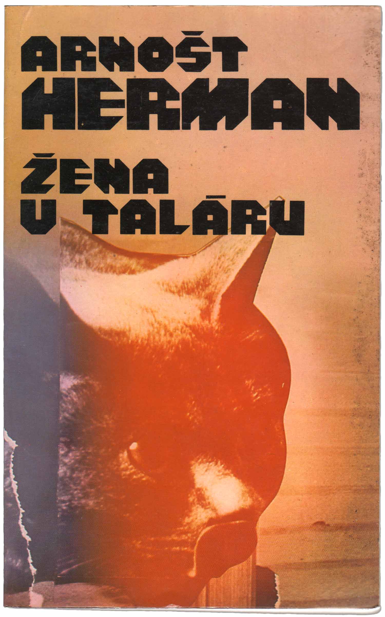
The cover of Żena v taláru has a more contemporary feel, with the color fade and the computer/space-age typography. While I don’t dislike it—and at its core it is a montage, like so many of the other covers here—it does feel out of place with the rest of the books, as if the designer was from a different generation than all the rest.
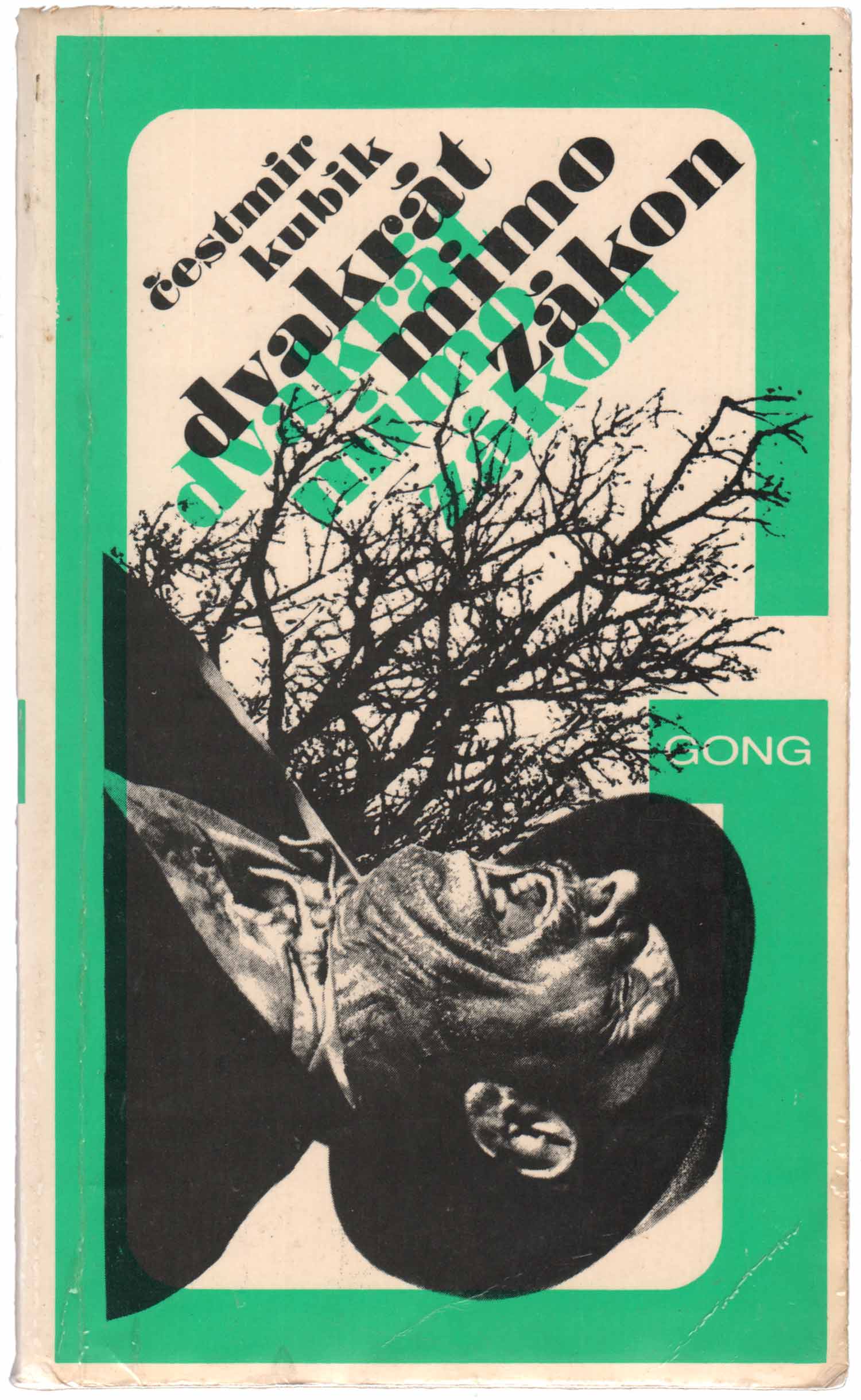
Čestmír Kubík’s Dvakrát mimo zákon [Twice Outlawed] appears to have that rare quality of a cover which has both a successful series design (Series Gong, in this instance) and is strong in and of its own right. The big green G successfully frames the cover illustration, but partly because it is translucent, it doesn’t dominate or get in the way. And the illustration itself is great. An amazingly simple collage of a dead man from the shoulders up and a tree in winter, it is intricate enough to draw in the eye yet simple enough to give the whole cover a really creepy essence.
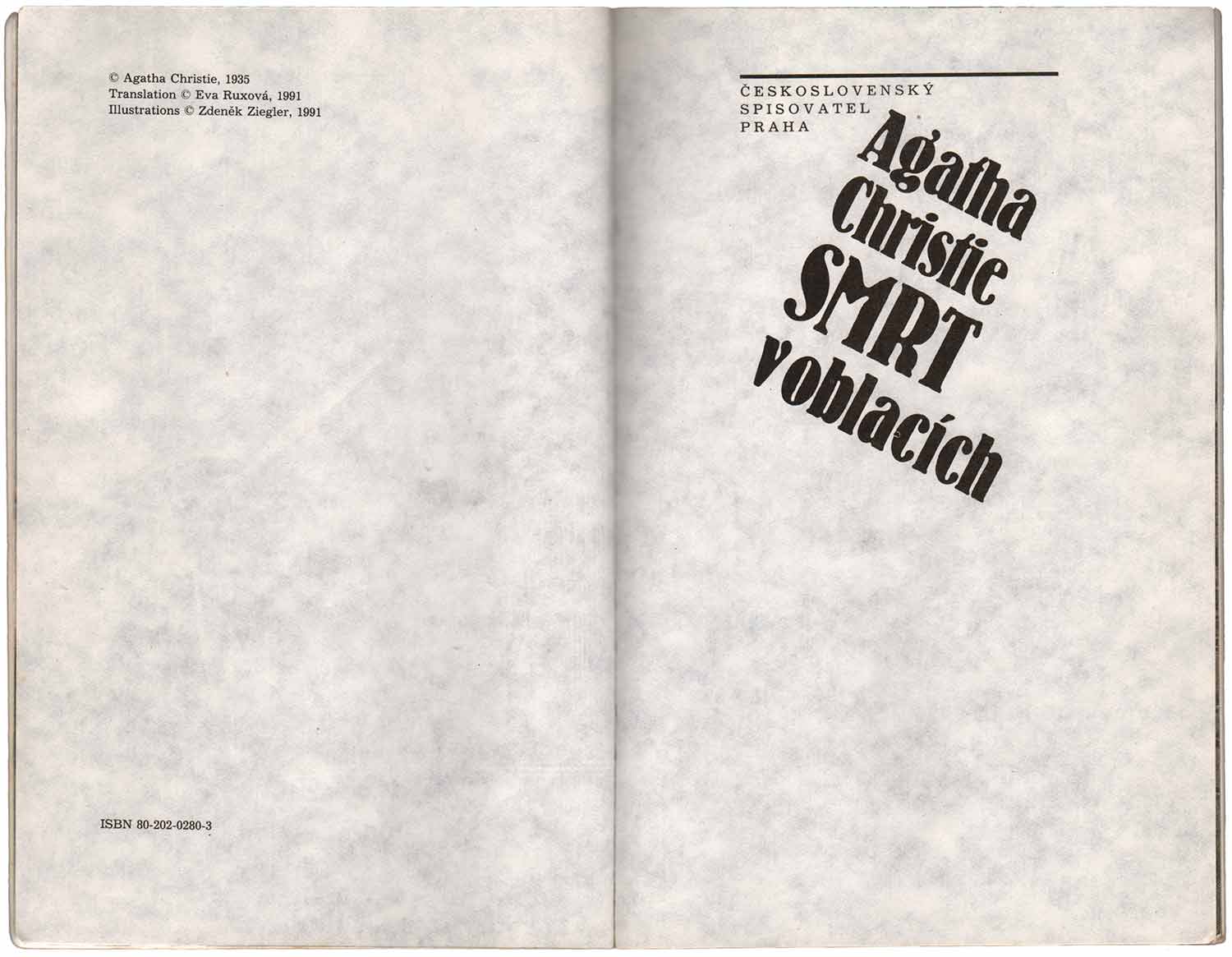
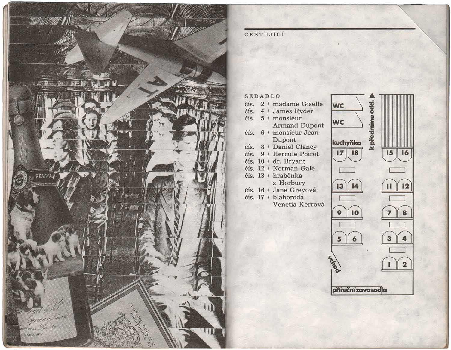
The final book here is a 1991 Czech printing of a 1935 Agatha Christie novel staring her famous detective Hercule Poirot. Smrt v oblacích [Death in the Clouds] is another title in the Edice Spirála series, like Potmě a potichu above. It has the same precise attention to detail, but with a completely different atmosphere. While Potmě a potichu was dark and comic, the cover here is bright and colorful (if creepy on a second look).
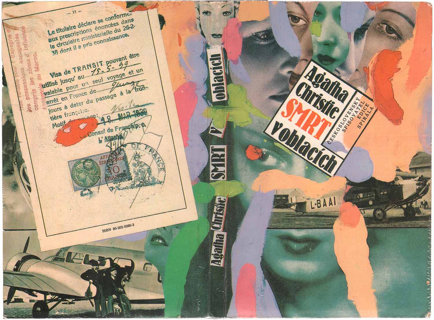
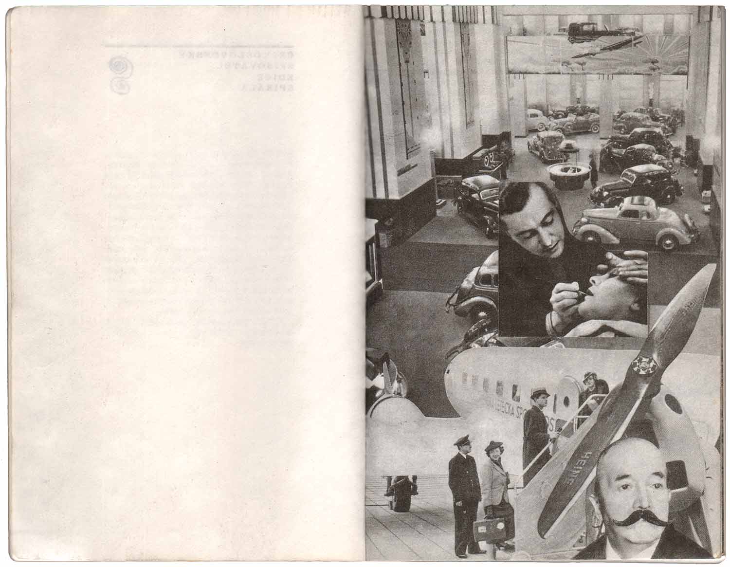
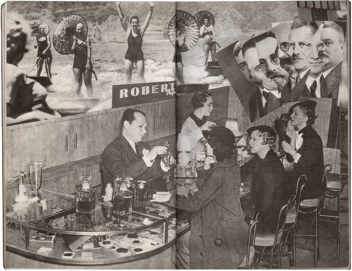
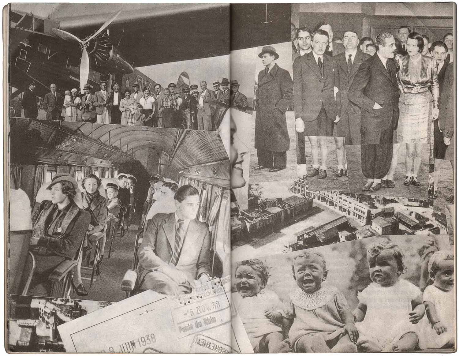
The cover and internal illustrations (by Zdeněk Ziegler) here are like montage on steroids. The book is very consciously designed to draw the reader in, with a clean page noting the publisher, then an overload of dense collaged page spreads, leading you to the title page. Unlike the other illustrated books above, the collages are all pressed into the front matter, nine pages of illustrations before the actual written book even begins.
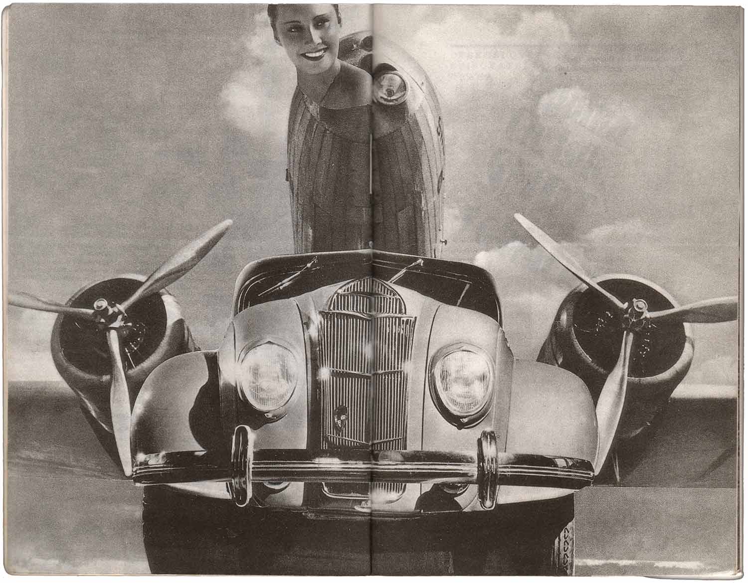
At first glance the illustrations just seem like piles of bodies and machine parts, but looking again they’re a complicated commentary on wealth, leisure, and travel. Fashion models, airplanes, and cars merge into objects both desirous and repulsive. Giant propellers run close to people’s necks, passengers are cut up and repeated, and the whole ensemble ends in a line of distraught and crying children. Ziegler has gone way beyond illustrating a then 50-year-old Christie novel, and instead created a visual mystery in its own right—strange, engaging, and open to interpretation. This is much more compelling than the straight foreword illustrations in Krycí heslo “Barracuda”, and makes a strong argument for why these illustrated books would be popular with wide audiences.
I’ve been slack in getting these posts done, so many other jobs to do! I wish I could keep up the pace of one a week, but it’s just not possible. I’m hoping to move forward with at least one a week, and have them be a bit more in-depth, like this one here. If you like the series, please leave comments, or get in touch (josh at justseeds dot org). If there is anything you’ve been hoping I would cover but I haven’t, let me know. Or if you’ve got great covers to share, please do!
[Two of these books were previously included in post 121.]
Bibliography (in order of publishing date and discussion above):