The Penguin Special ran for about fifty years, from 1937 through 1989 (although the latest date I’ve seen on one is 1986). Specials covers were red, one of army of different-colored series that Penguin began publishing in its early years. Specials were related to, but different than, the other main non-fiction line, the Pelican (covered in light blue). Some 350 “S-numbers” were published, 143 of them before 1945 (generally considered the Special “First Series”) and the rest after 1949, generally considered the Special “New Series.” While they came out of the gate with a bang (more on that below), they died with a whimper. By the end they no longer had a unique visual identity, and a number of scheduled titles were ultimately never even released.
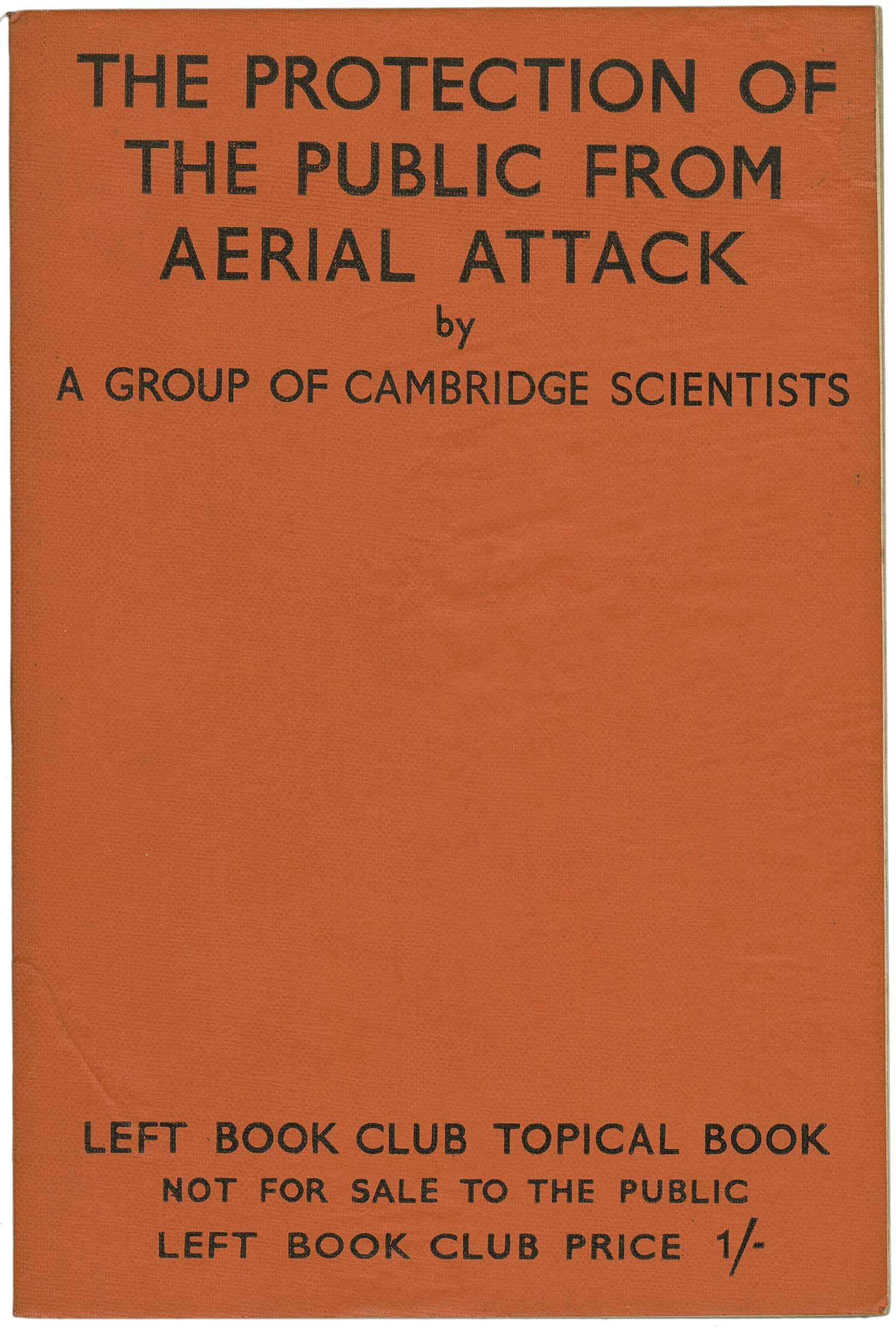
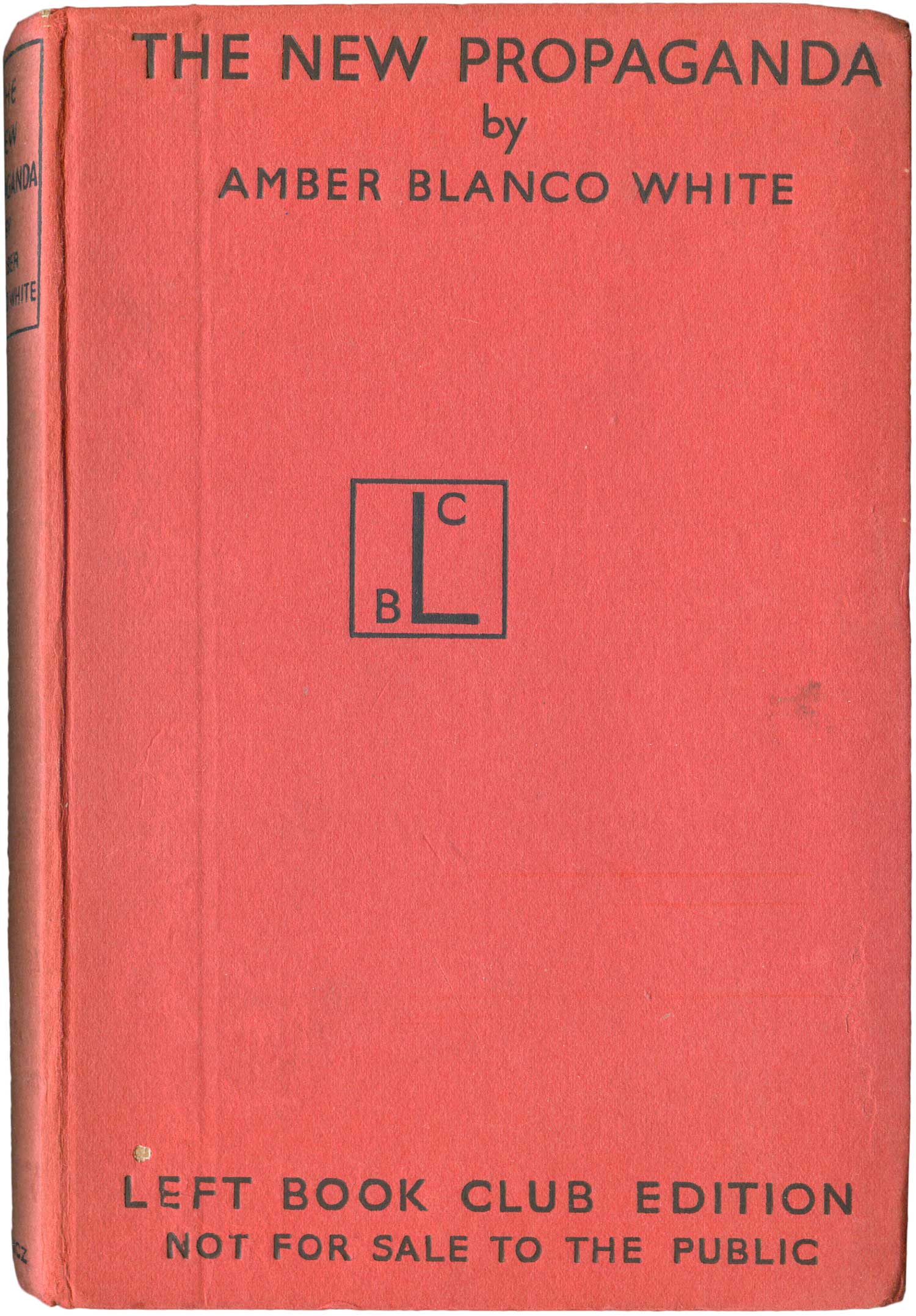
Penguin founder Alan Lane conceived of Specials in the mid-1930s as a response to two things: the developing Second World War on the international front, and domestically as a competitor to Victor Gollancz’ Left Book Club. Gollancz was a staunch Stalinist (as opposed to Lane, a left liberal with socialist tendencies) and the LBC was set up in 1936 to help promote the United Front in the UK and educate the Left in a form decidedly sympathetic to the Communist Party. Within months of it’s launch, the LBC had 40,000 members and wasn’t just educating, but pulling in some serious cash. LBC books had two different formats, many titles were wrapped in a thick, orange cover with the title stamped on it in black sans serif; others were released in an cheap hardback edition with pinkish covers. Neither ever featured imagery other than the LBC logo, itself entirely text based. And LBC was a Book Club in the old school tradition, it’s titles (in their LBC printings) were only ever available to club members. None were ever distributed through the book trade.
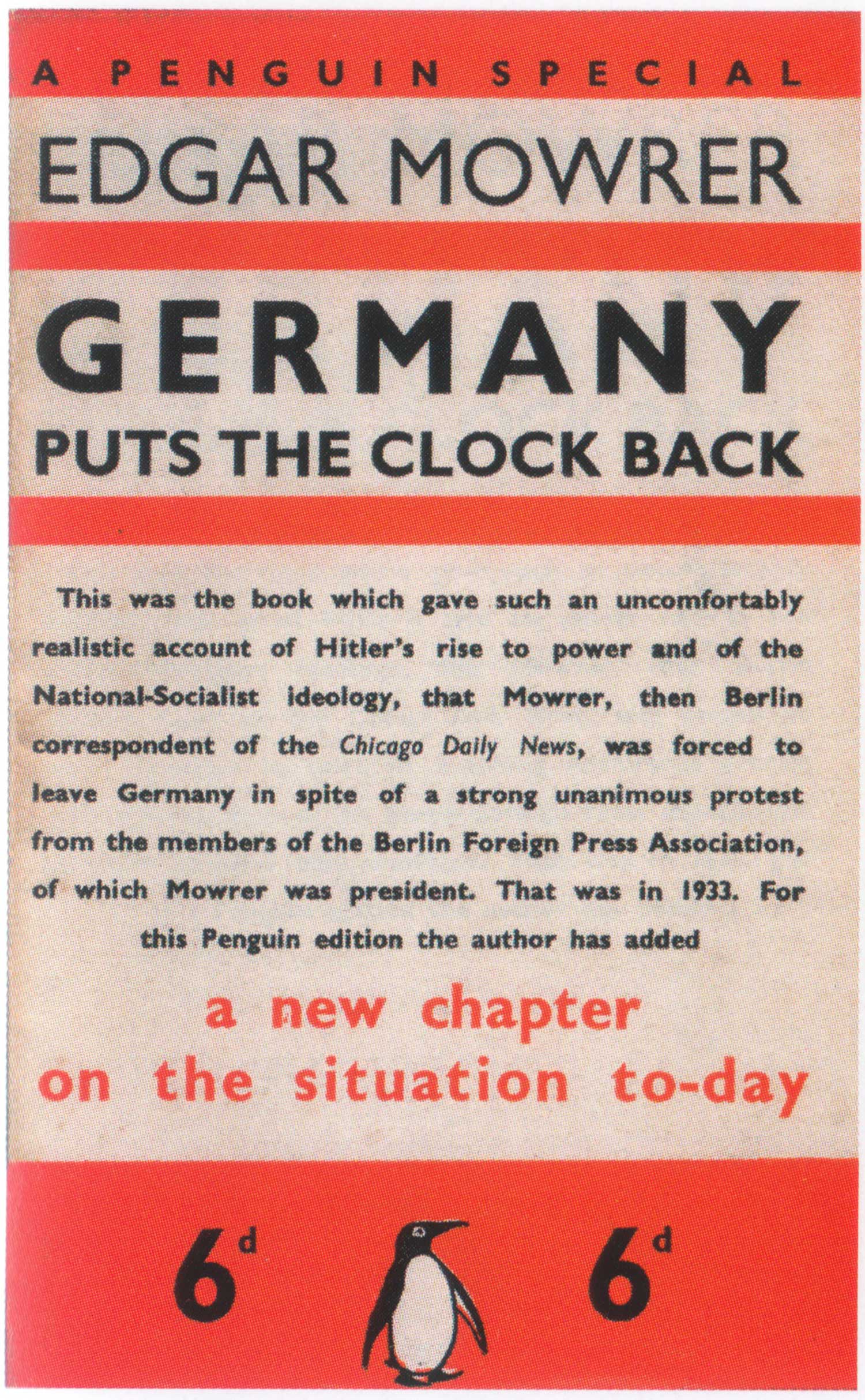
Lane never missed an opportunity to make a buck, and within six months had launched his equivalent. The first Penguin Special was Edgar Mowrer’s Germany Puts the Clock Back. The Penguin Special was much more broad reaching than the LBC’s output, with many of the titles filling the role of the short pamphlet more than then place of the book (i.e. H.G. Wells’ The Rights of Man, or Harold Nicolson’s Why Britain is at War). Unlike the LBC, Specials were intended to be sold retail, but like other early Penguins, a significant portion of sales happened at newsstands and other retail outlets, not just bookstores. Most early titles were extremely timely—being conceptualized, commissioned, printed, and out for sale within a month, expected to sell out quickly and not be reprinted.
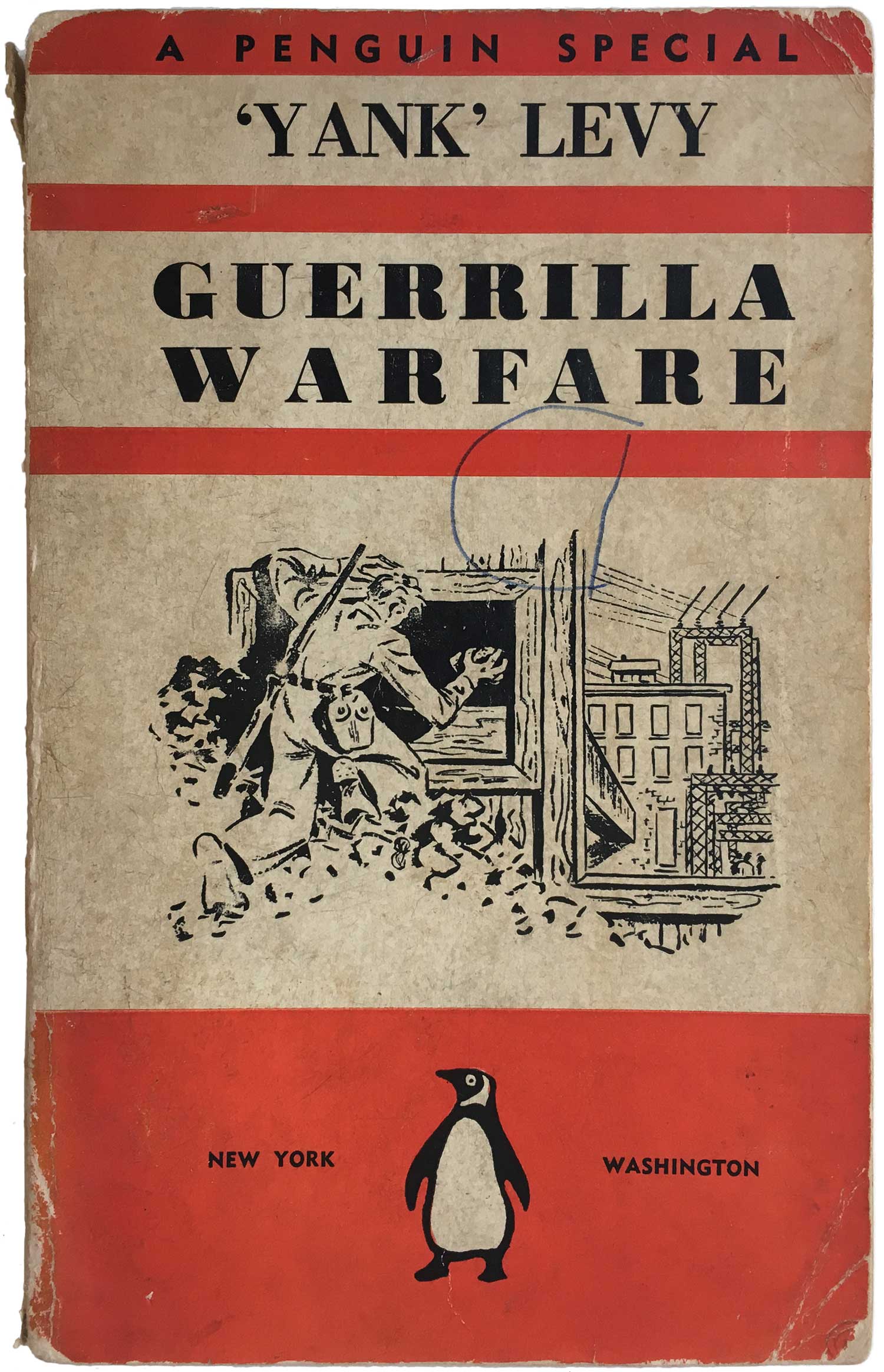
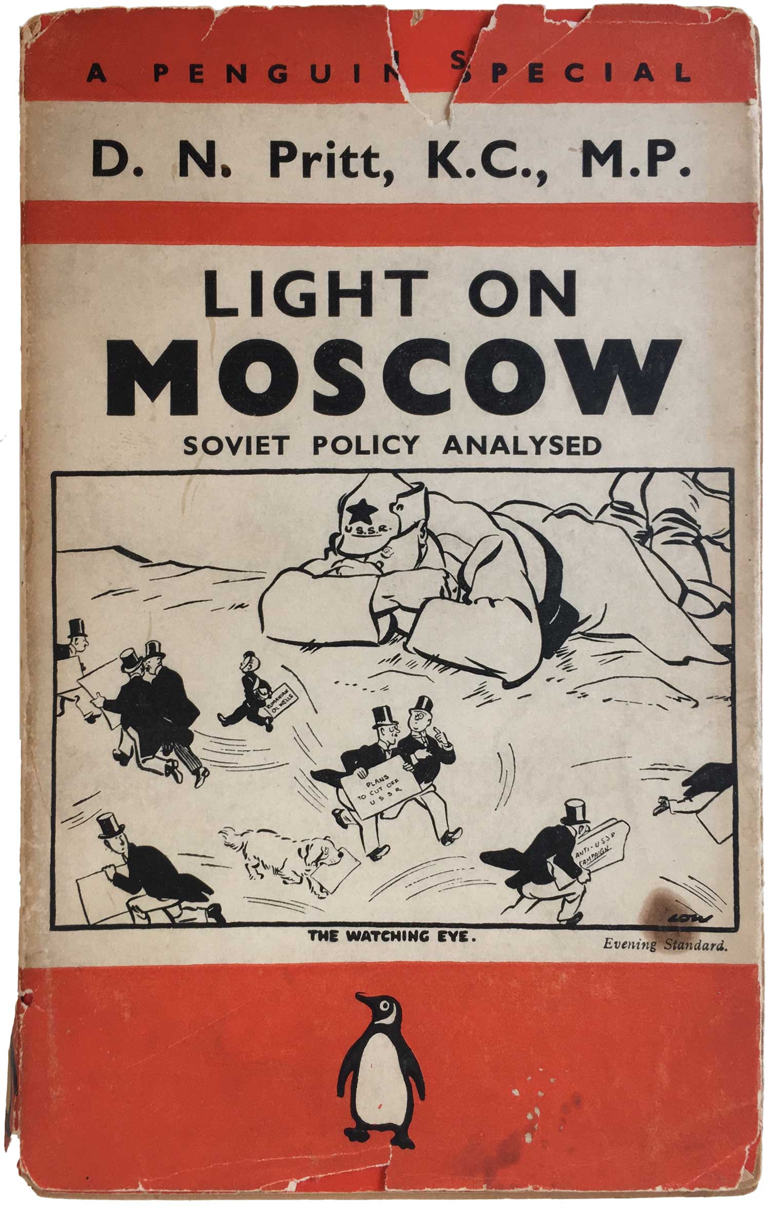
The early titles look much like other Penguins, although there was more flexibility in the design grid, allowing for a lot more type experimentation than your standard Penguin novel. In doing this, the covers started to look more like newspaper hordings or broadsheets, the text calling out to an audience. This also adds to the sense of them being urgent political pamphlets—the information you need, right now! Early editions also carried dust jackets, exact replicas o the covers below—a strange convention for paperbacks these days, but not all that uncommon in the ’40s. You can get a peek at one of the jackets on the copy of Light on Moscow below.
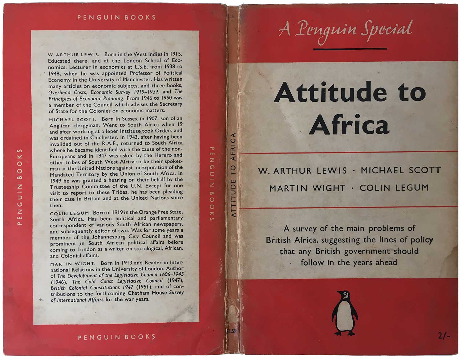
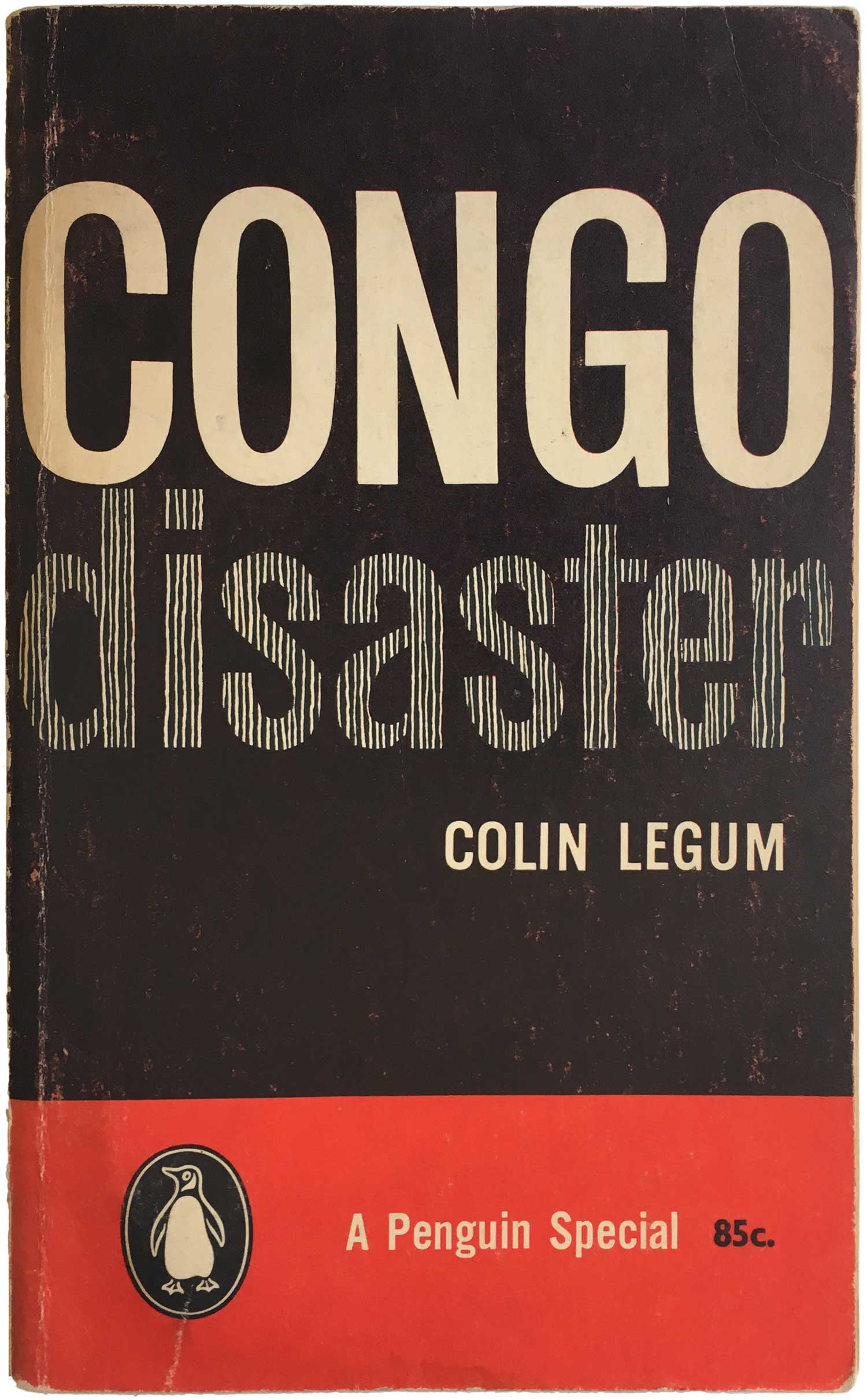
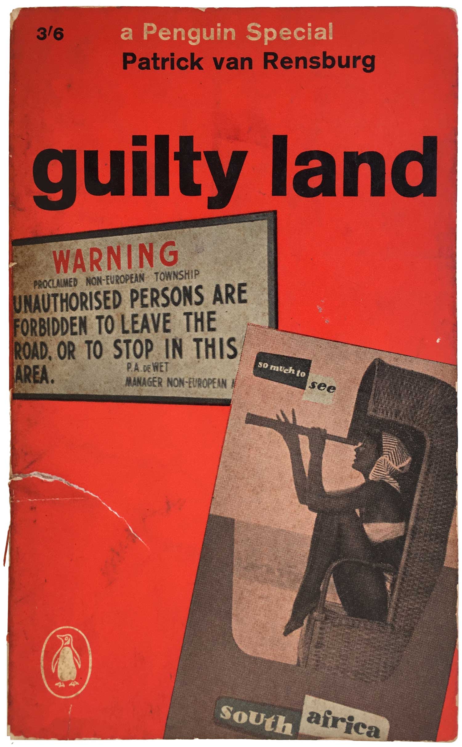
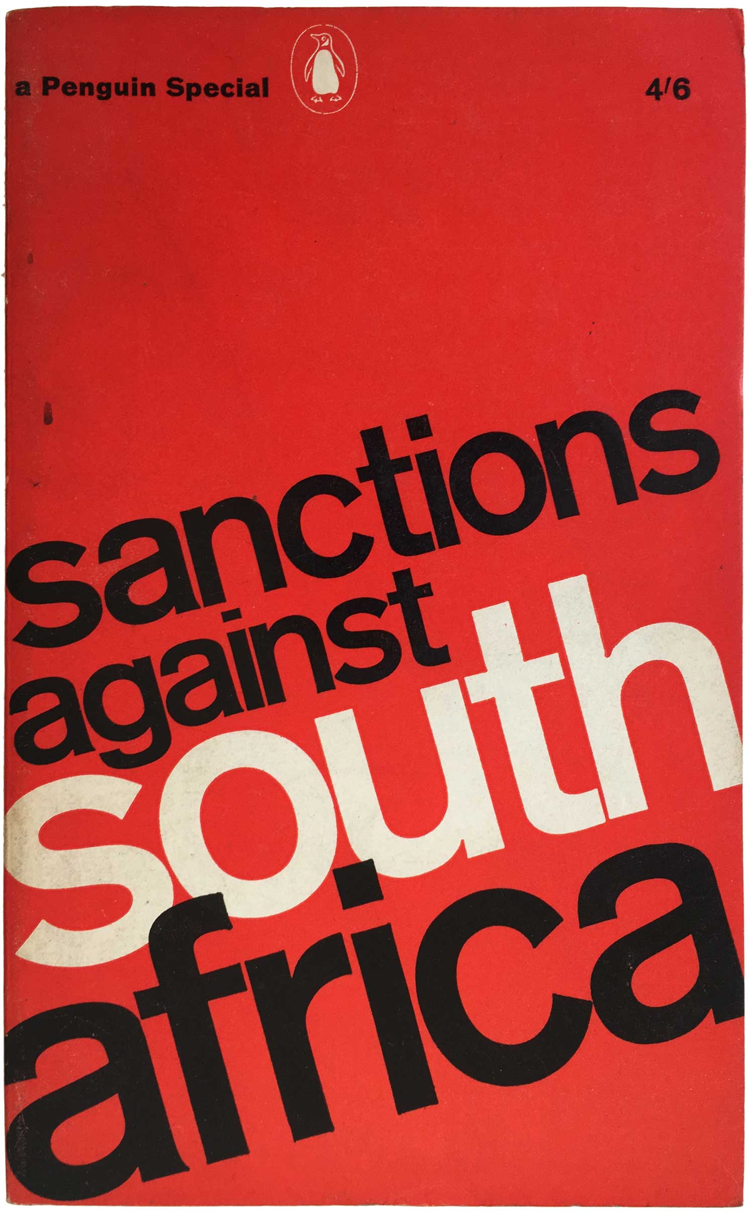
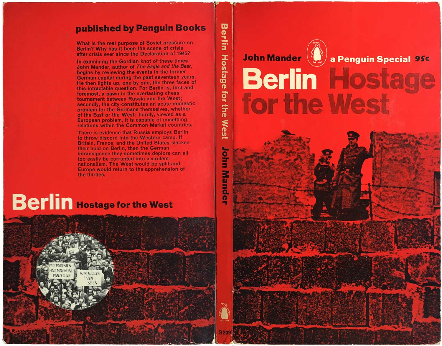
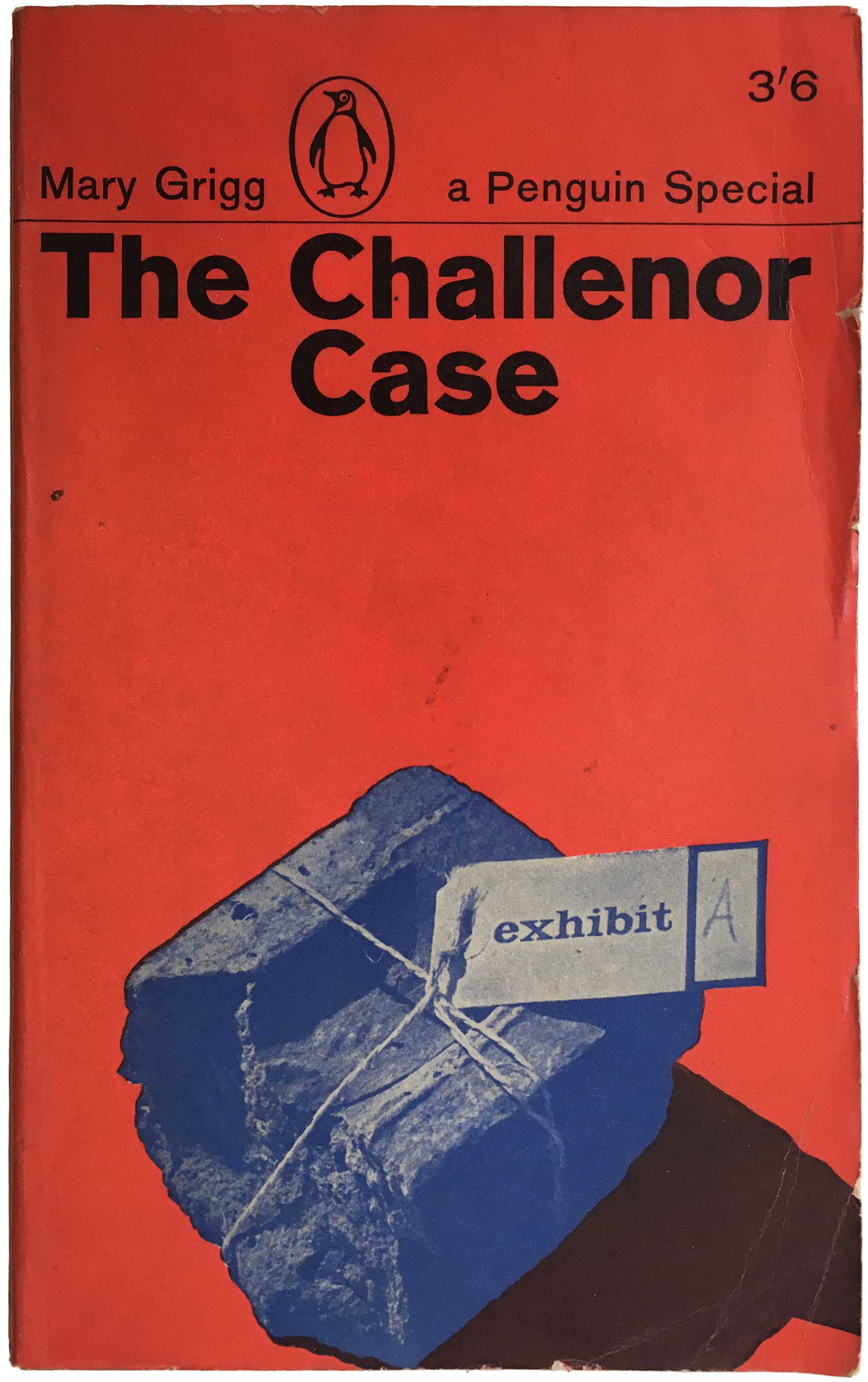
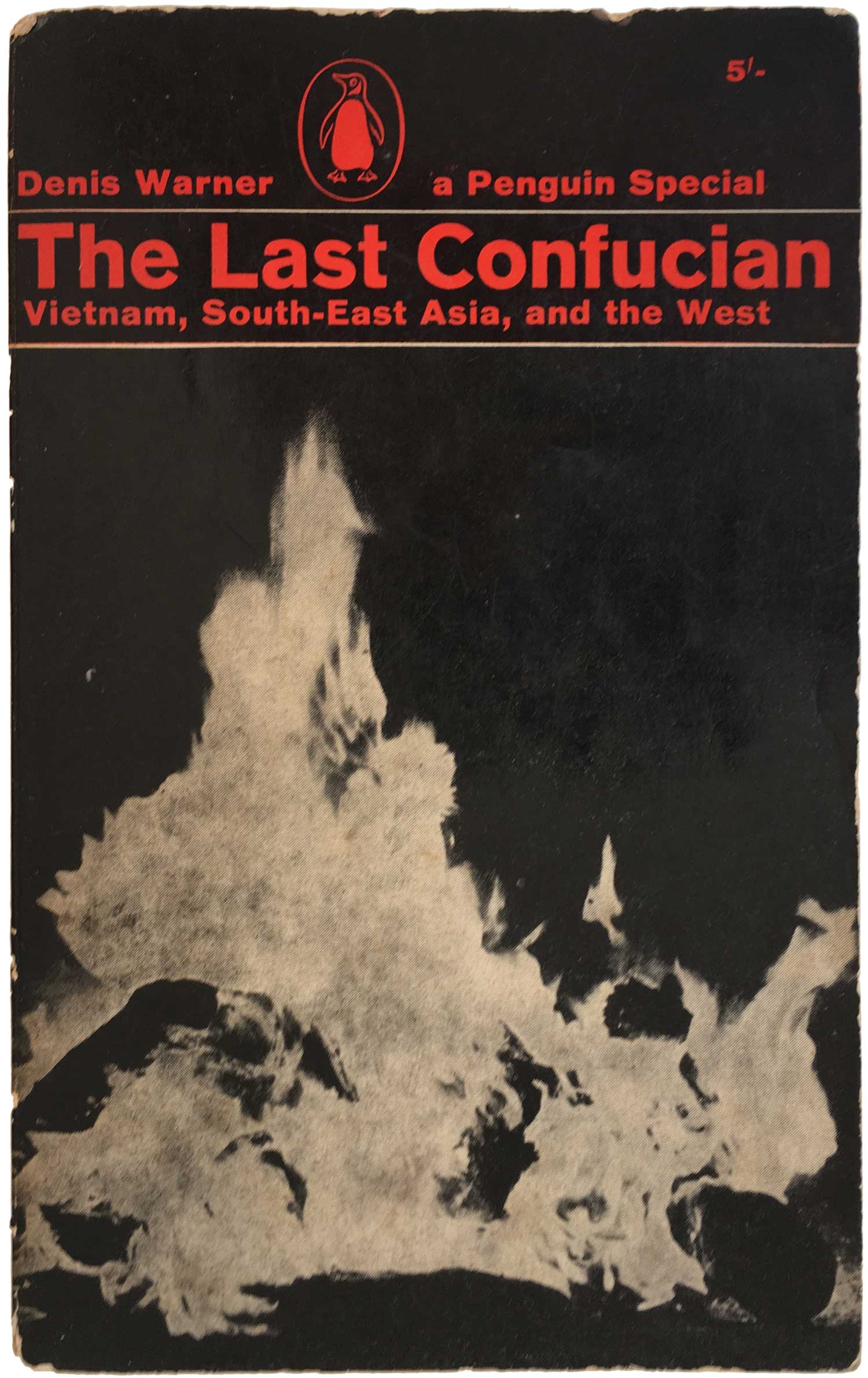
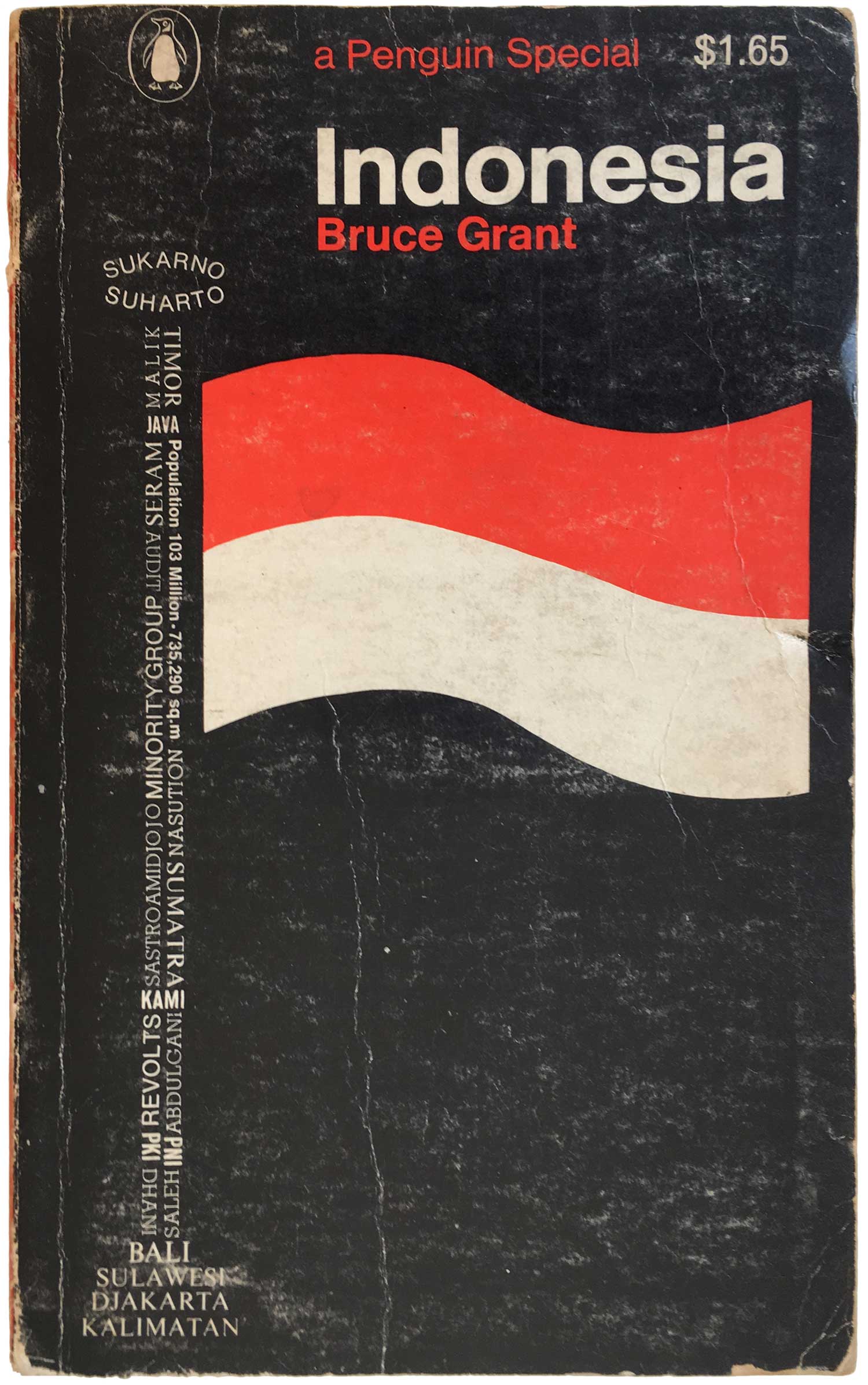
After the war Penguin allowed the Specials to languish for awhile, but then in 1949 started releasing what is generally considered the “New Series.” These started with catalog number S156, William Gallacher, M.P.’s The Case for Communism. These began with a design similar to the First Series (see Attitude to Africa, above), but eventually evolved to using full page illustrations (Legum’s Congo Disaster, also above) and by 1964 was brought inline with the “Marber grid”—the overall cover design template generated by Romak Marber for all Penguins in 1961. These 60s covers are much more dynamic and attractive, using photographs, successful duotone experiments with the black and red, and something that was relatively new for Penguin, allowing multiple sizes and non-standard registration of the typeface (Intertype Standard) in the titles (Segal’s Sanctions Against South Africa is a great example of this).
Some kick-ass designers started doing covers for the Specials at this point. Germano Facetti did a fair amount of the covers (he was then head of Penguin’s design department), and Richard Hollis—one of the best and most influencial British designers and an avowed socialist—did a number of them (he also did some fabulous design work for lefty UK publishers Pluto Press and Writers and Readers).
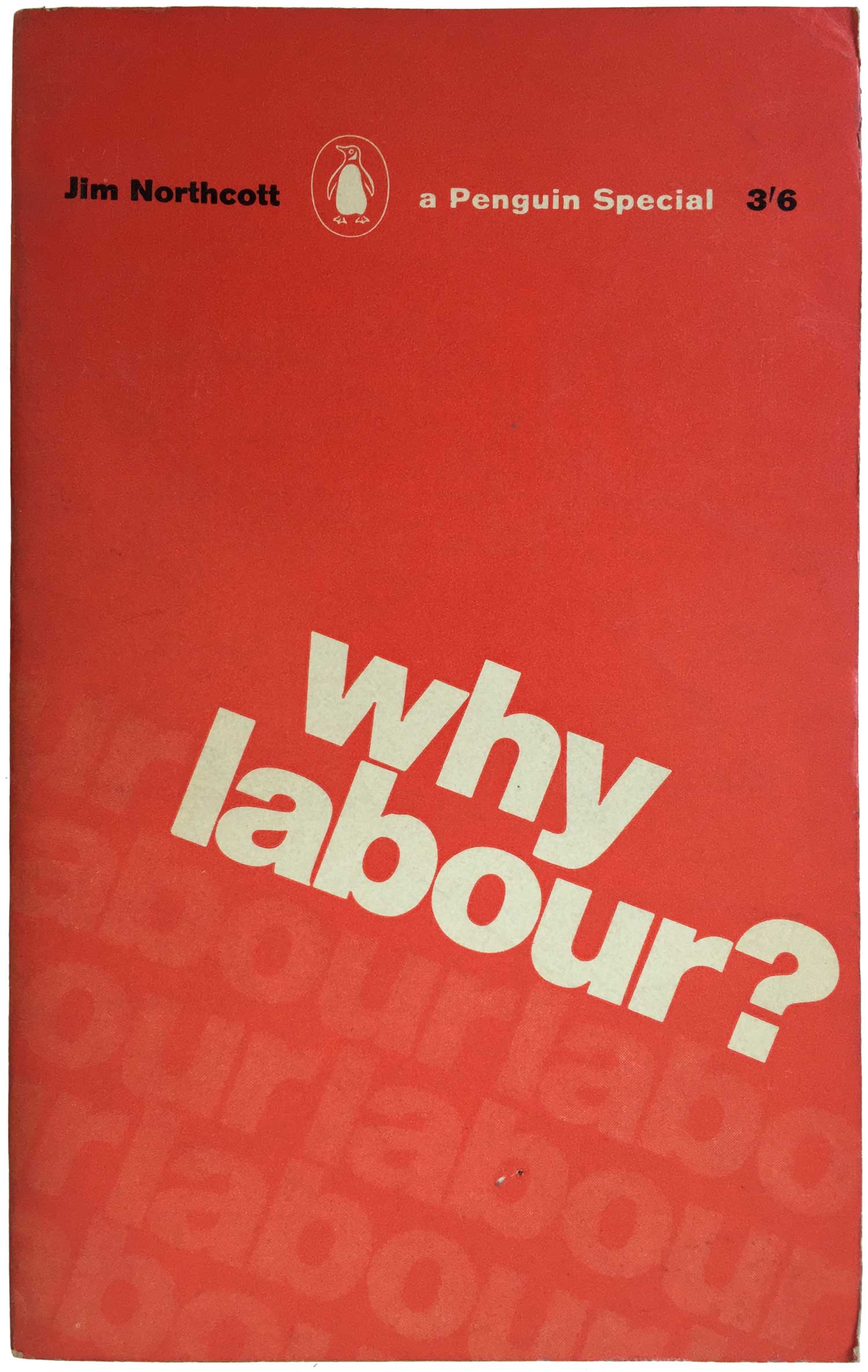
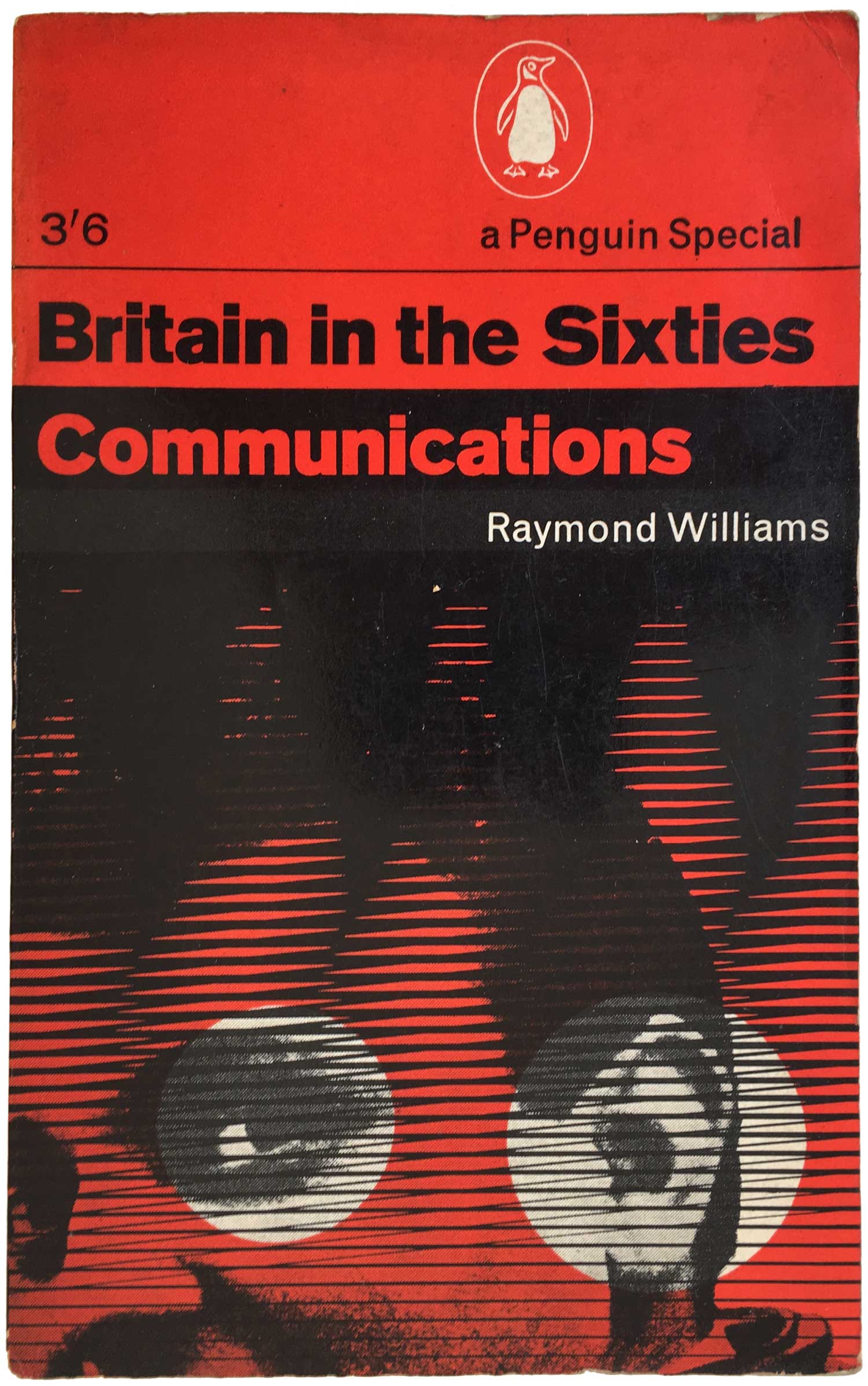
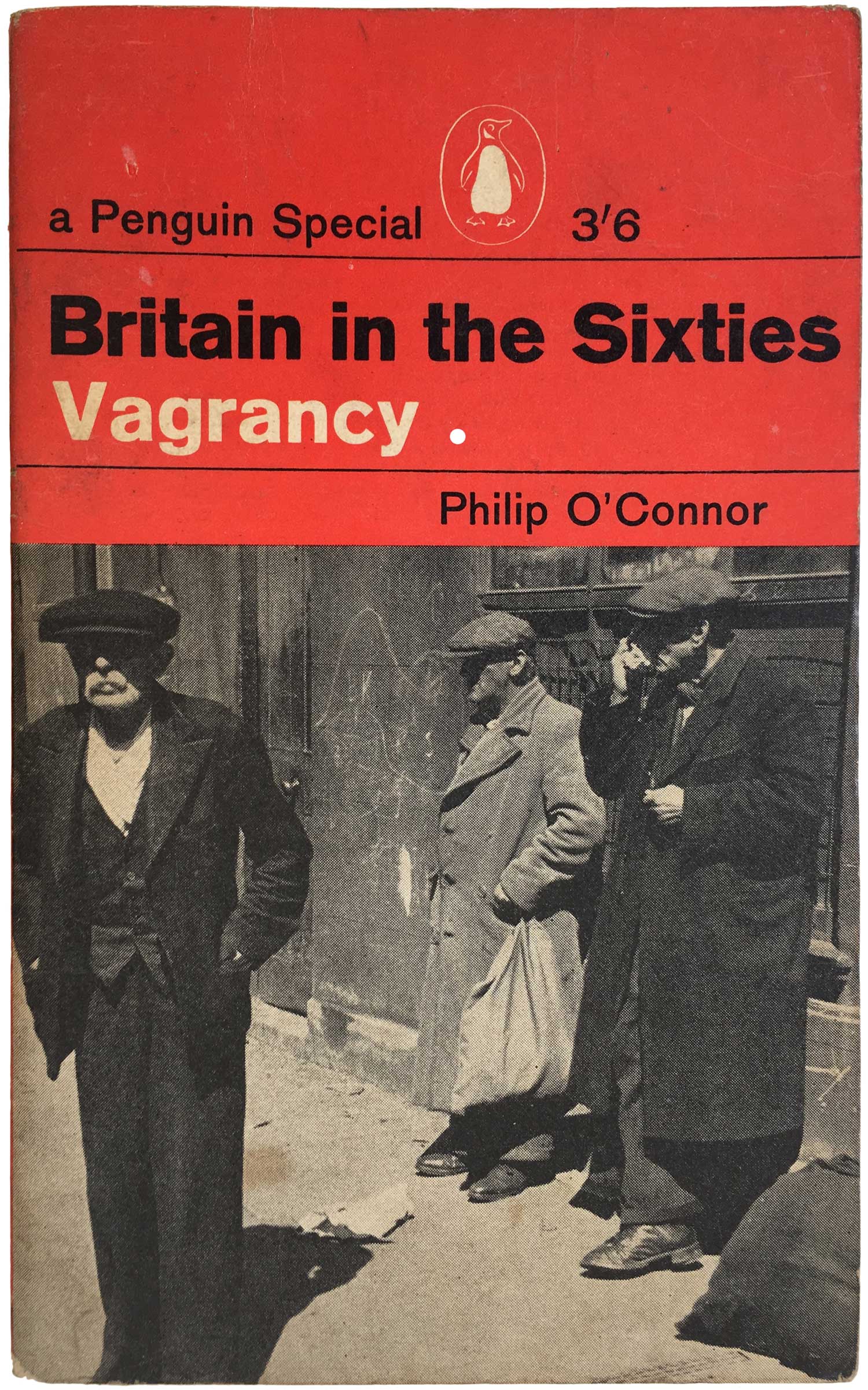
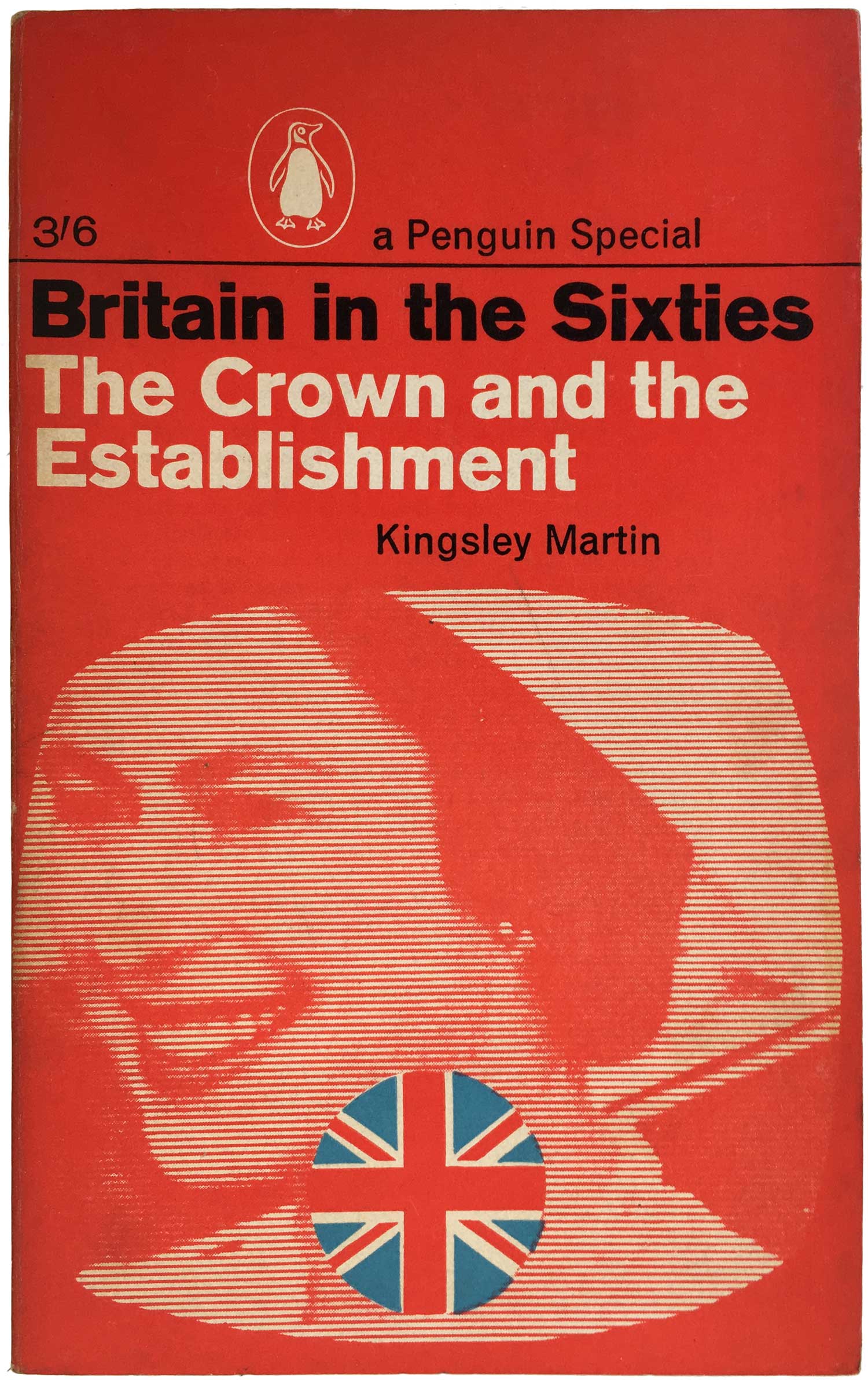
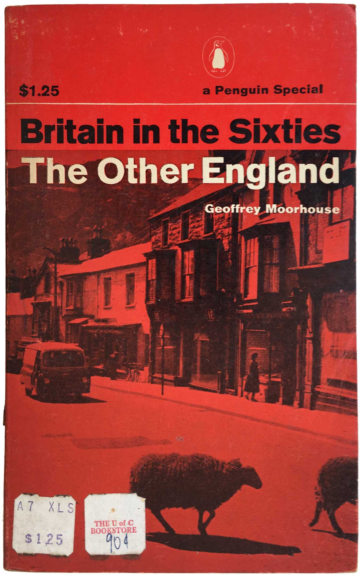
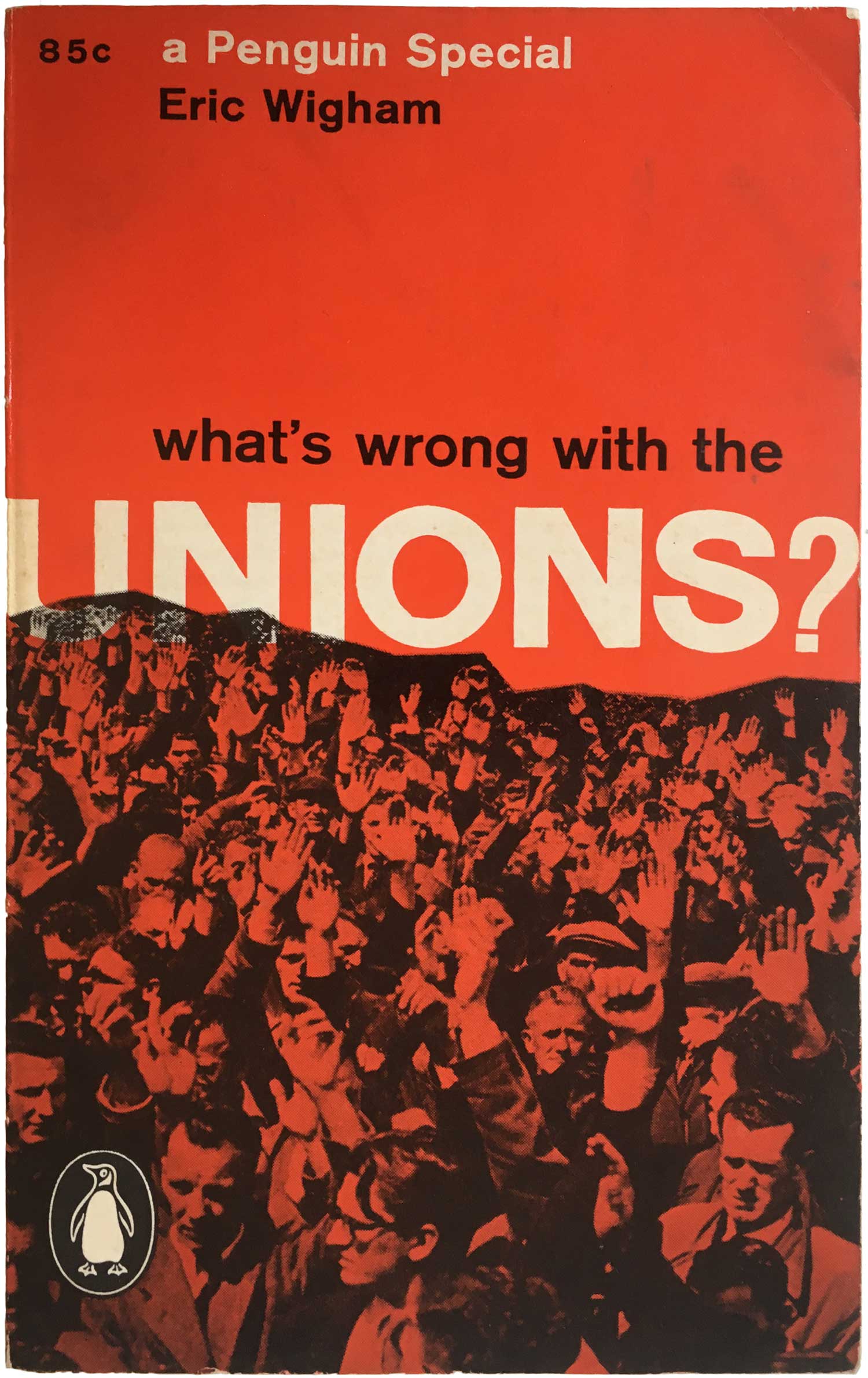
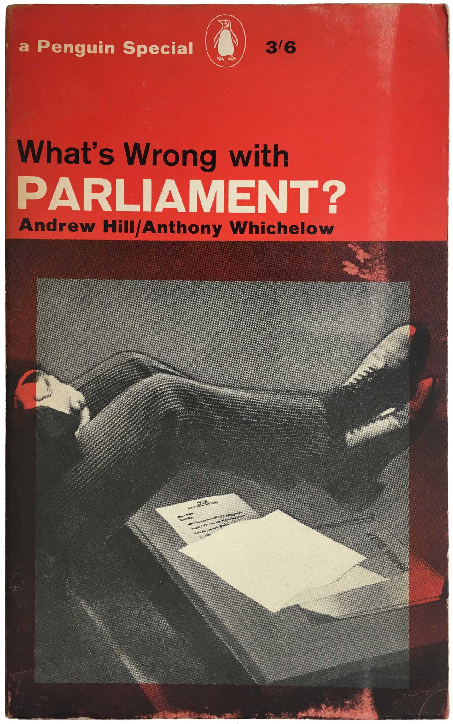
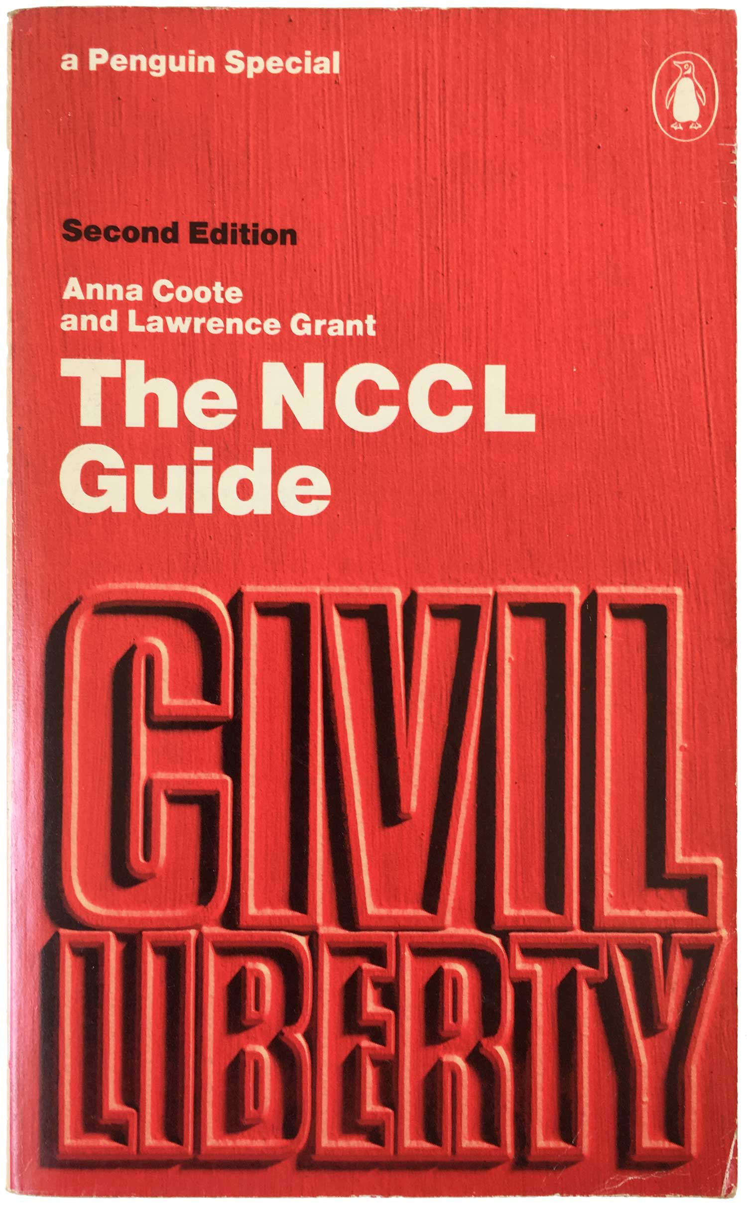
Within the overarching series of the Penguin Specials, there were also a number of notable sub-series in the mid-60s, particularly a cluster of books published under the heading “Britain in the Sixties,” and another was the “What’s Wrong With…” titles. Although the editorial concept seems cool, the covers themselves are uneven. Some, like Hollis’ design for Raymond Williams’ Communications, are quite stunning, while others, like the cover to The Crown and the Establishment don’t do much for me. The design of What’s Wrong with Unions is quite compelling, with the mass of union members overprinting on the title, while the red box around the image on What’s Wrong with Parliament seems both visually meaningless and ineffective at making the illustration interesting. The use of blue also starts sneaking in to the covers, mostly to illustrate the Union Jack. This seems like unnecessary transgressions of the nice restraints put on the series design, especially since we would all still recognize the UK flag even if it was rendered in black instead of blue.
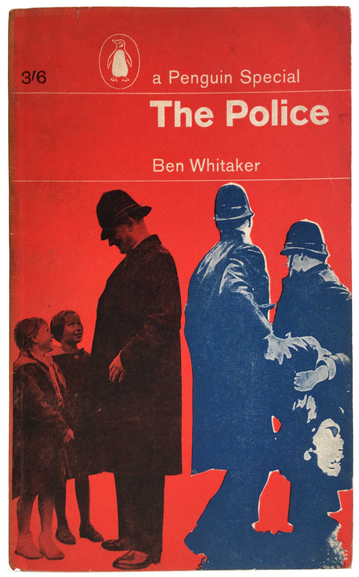
In contrast, a handful of covers use blue instead of black, which demands more design creativity and seems to have lead to better results (if the two covers above are a fair example). Here the blue overprinting on the read creates something close to black, and makes for rich looking designs.
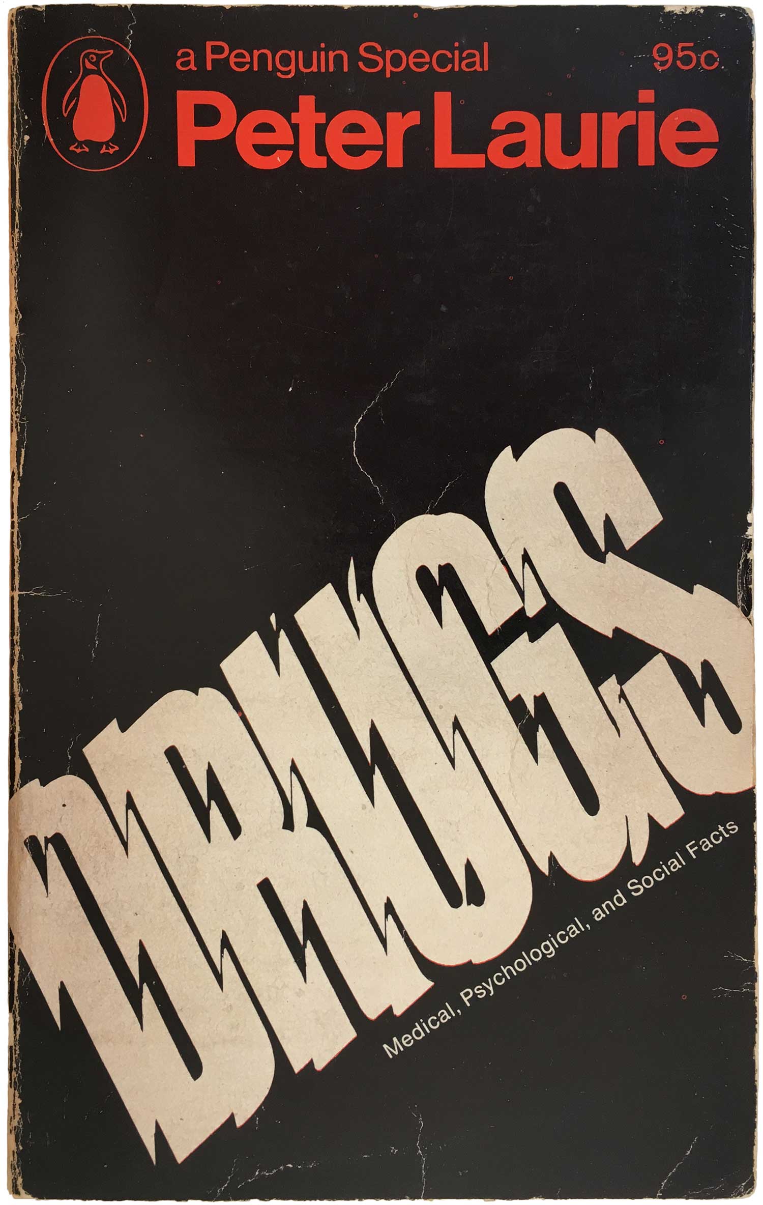
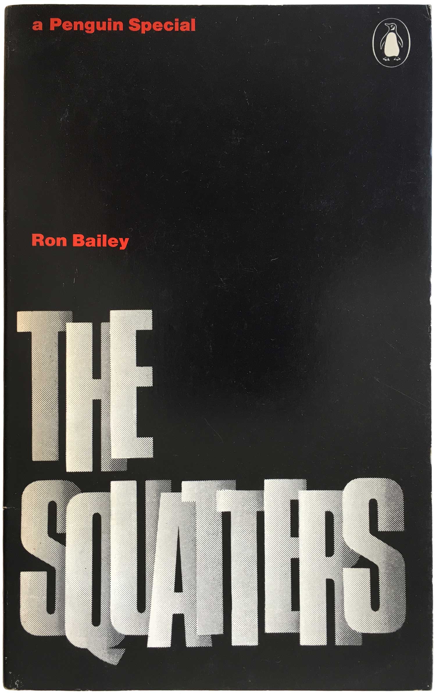
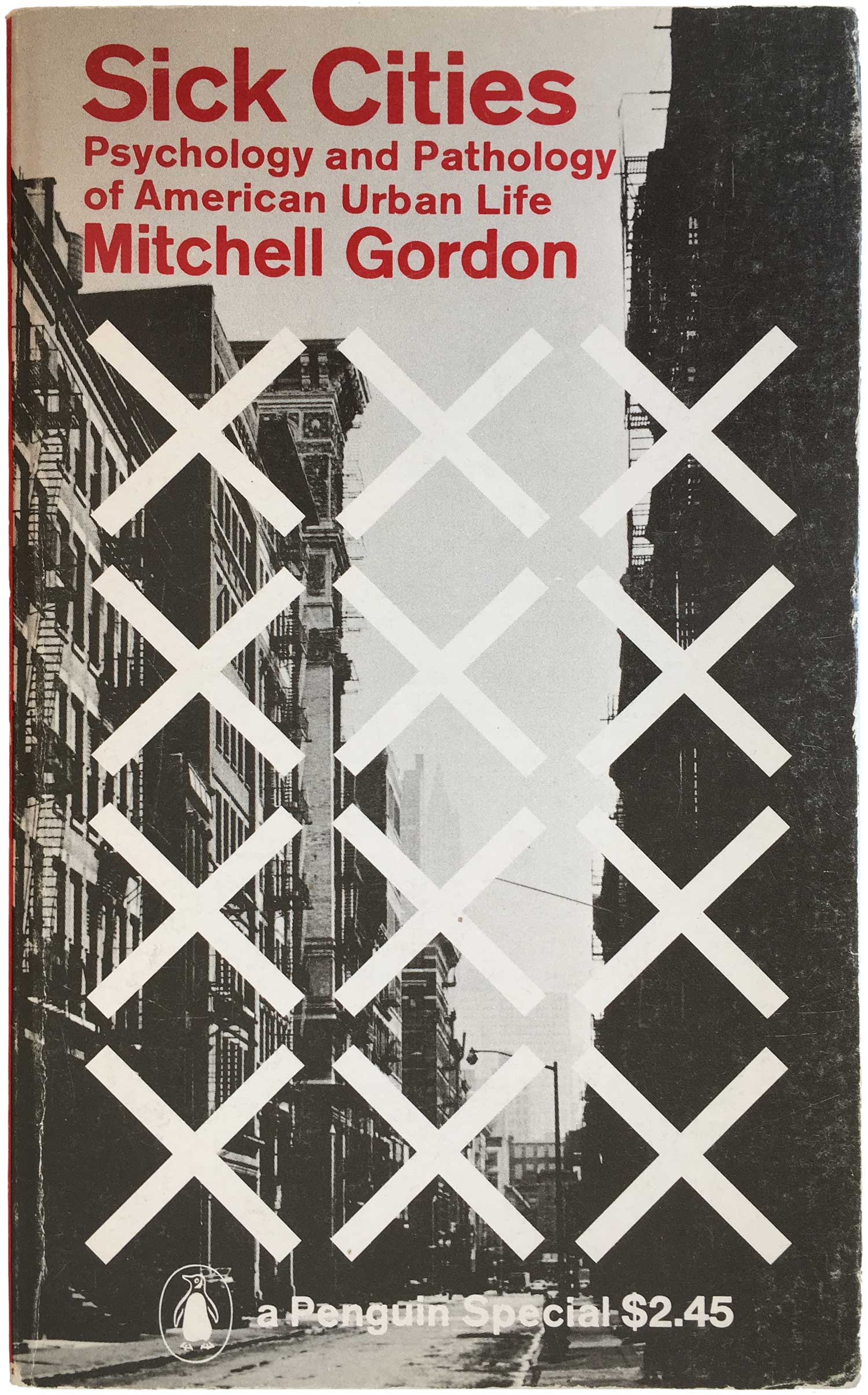
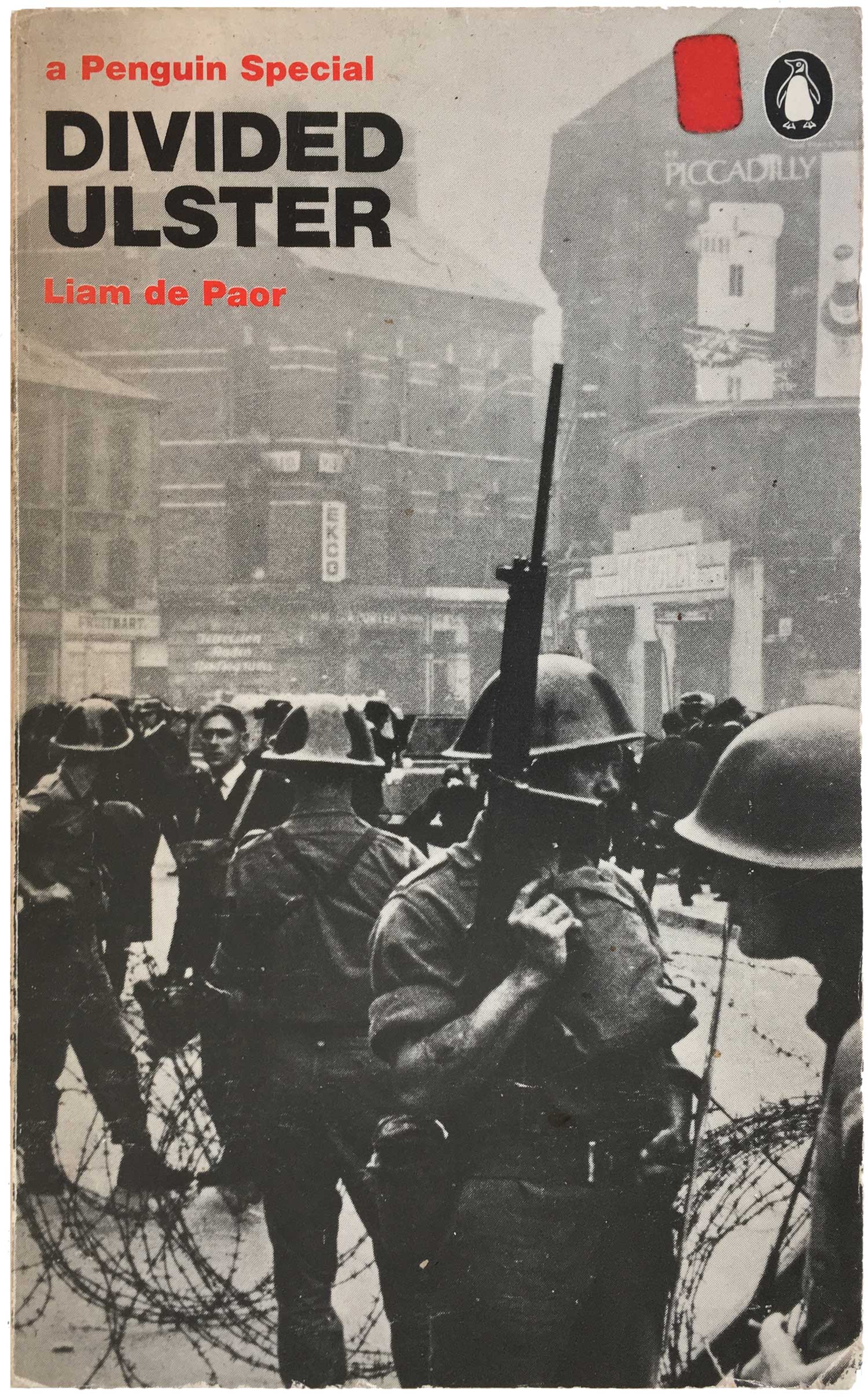
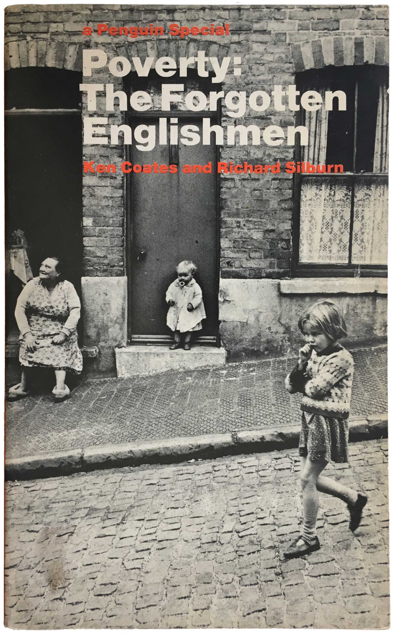
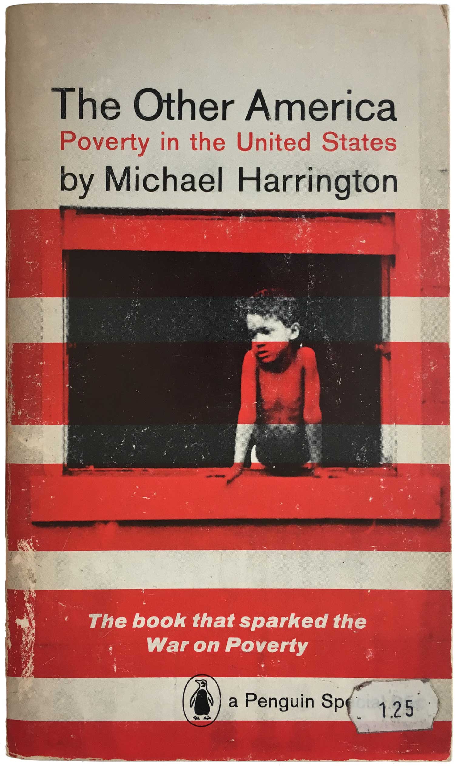
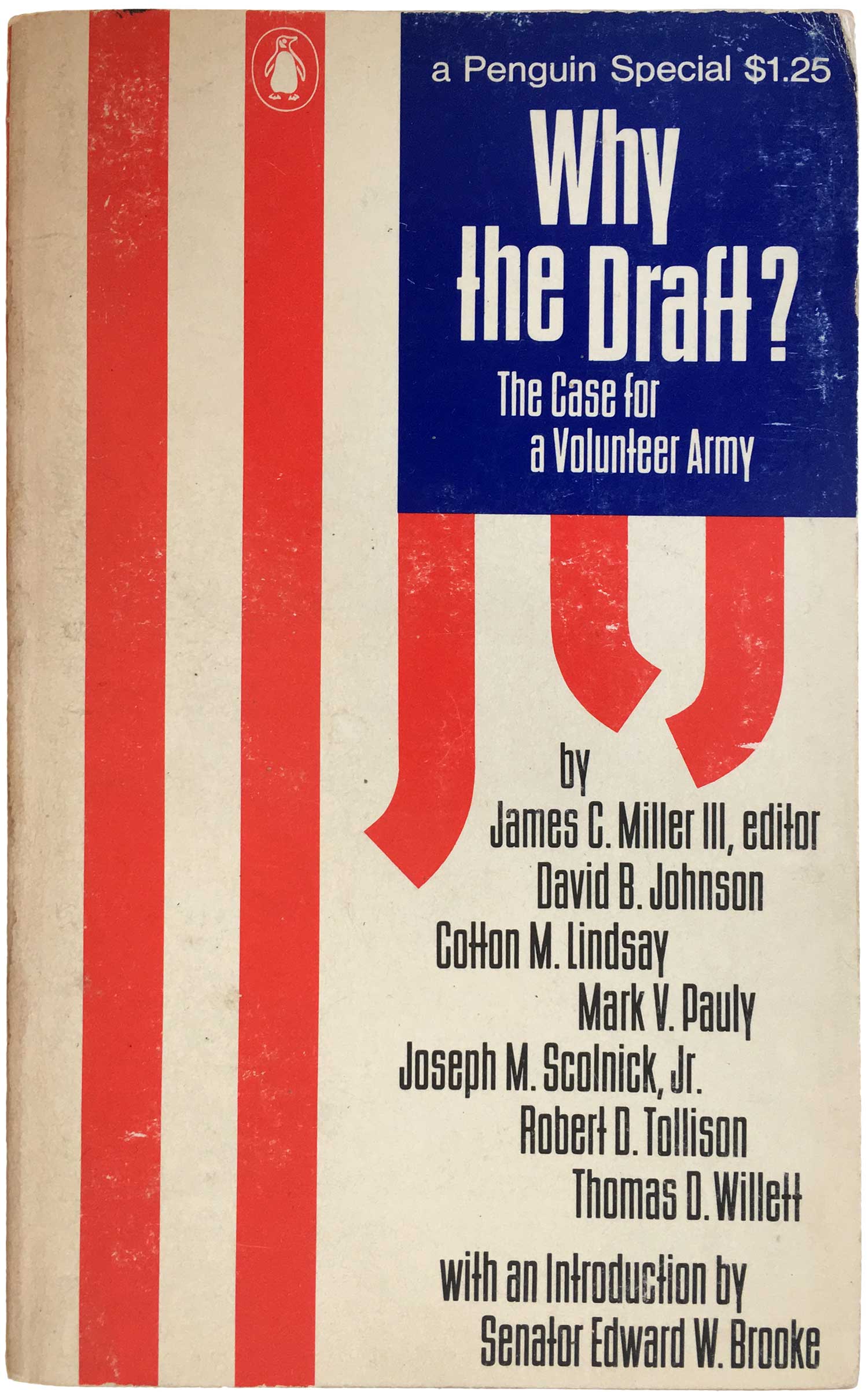
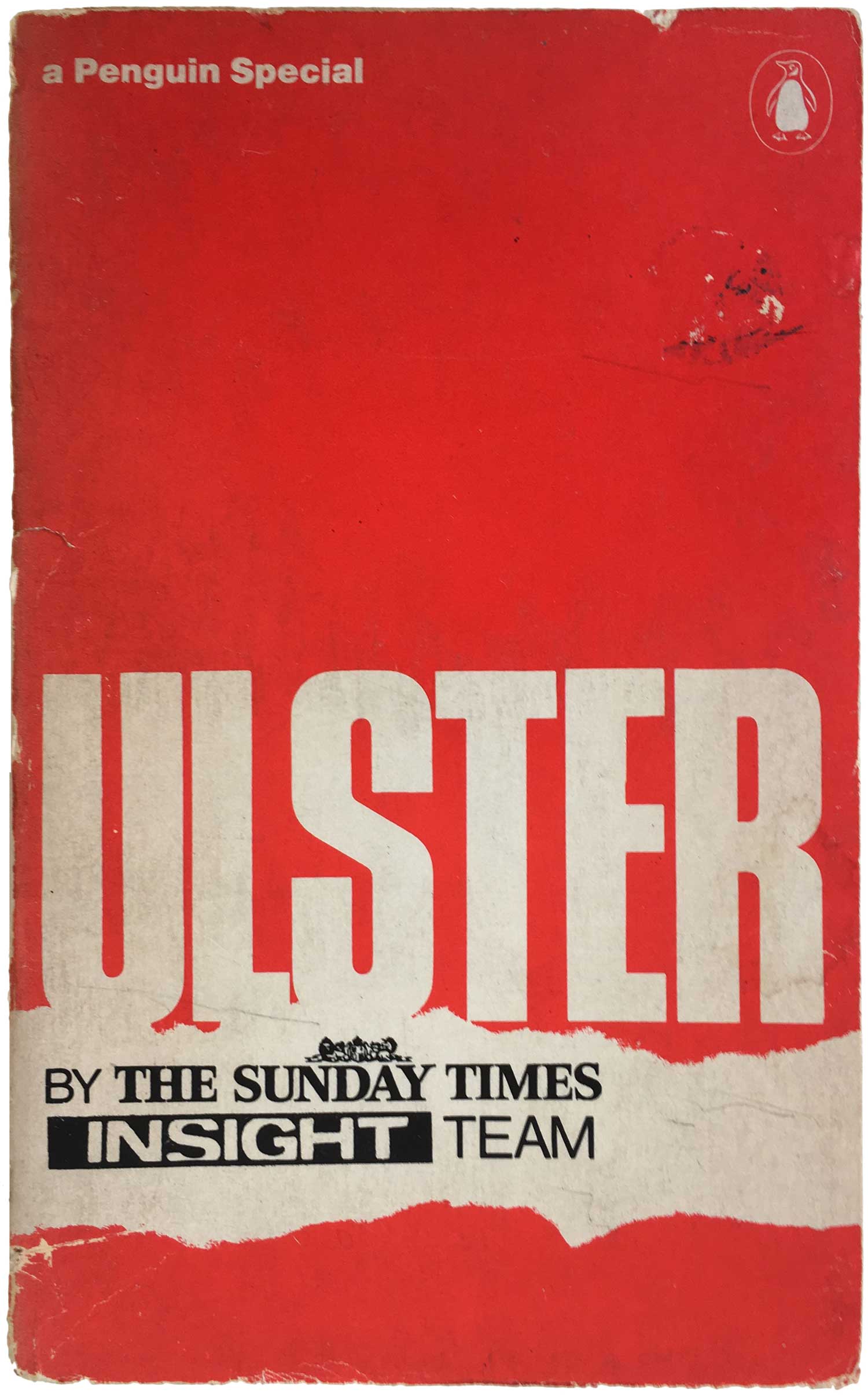
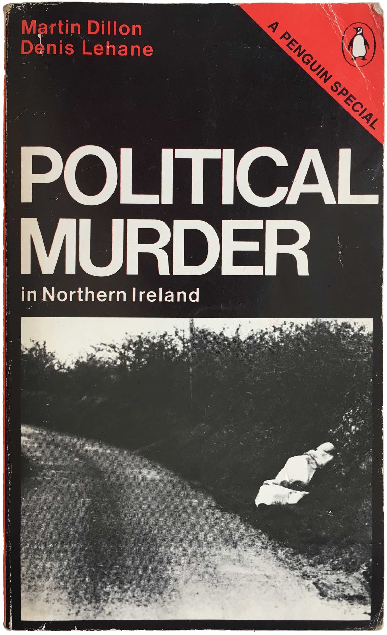
The mid-60s heyday of Specials starts to peter out by 1967, with a move towards covers that are dominated by black instead of red. I suppose the idea was the keep the duotone convention but shake things up and use the red mostly as a highlight color—unfortunately it rarely works as well as the earlier covers. Overall they tend to look more flat and dull, and repel the eye instead of attract it. There are some exceptions, in particular the text only covers such as Drugs and The Squatters do well. Even when the covers are overly dark and black, they tend to depend too much on a single photograph. I’ve collected three examples below that I think pull it off: Sick Cities really works because of the white Xs, which say so much with so little; the photo on Divided Ulster is strong enough to carry the lack of other ornamentation; and the dominant angle of the street in the photo on Forgotten England is so powerful that it really keeps the eye engaged and hovering over the cover. Roy Kuhlman’s cover of The Other America, likely one of the best-selling of all these Specials, is pretty unique in the series. While it is still black and red, the typography is different and the general grid structure is completely abandoned. The red bars (of the US flag) are a powerful obstruction over the photograph of a lone, impoverished child. The cover next to it, for Why the Draft, is also quite unique, yet not soo much in a good way. Both covers reference the US flag, but while the former does it subtly and powerfully, here it is much more unclear what the intended message is. Both of these editions were created for the US market, which might be why they fall so far outside the general series aesthetic.
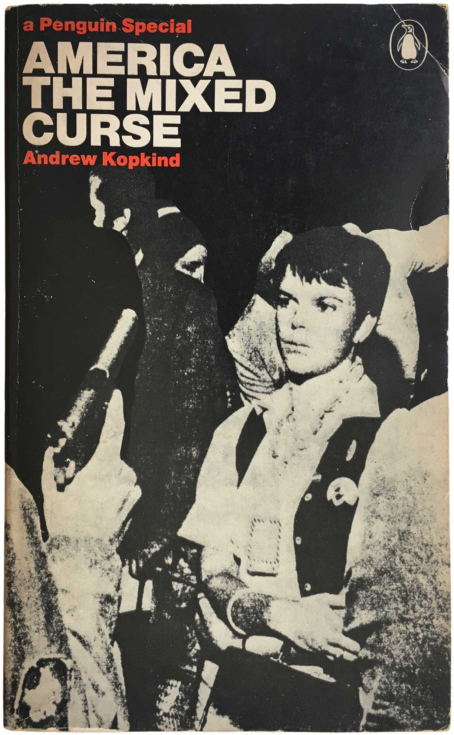
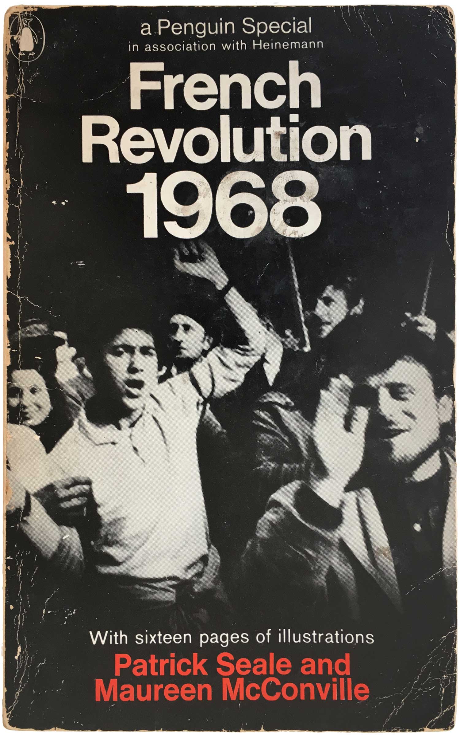
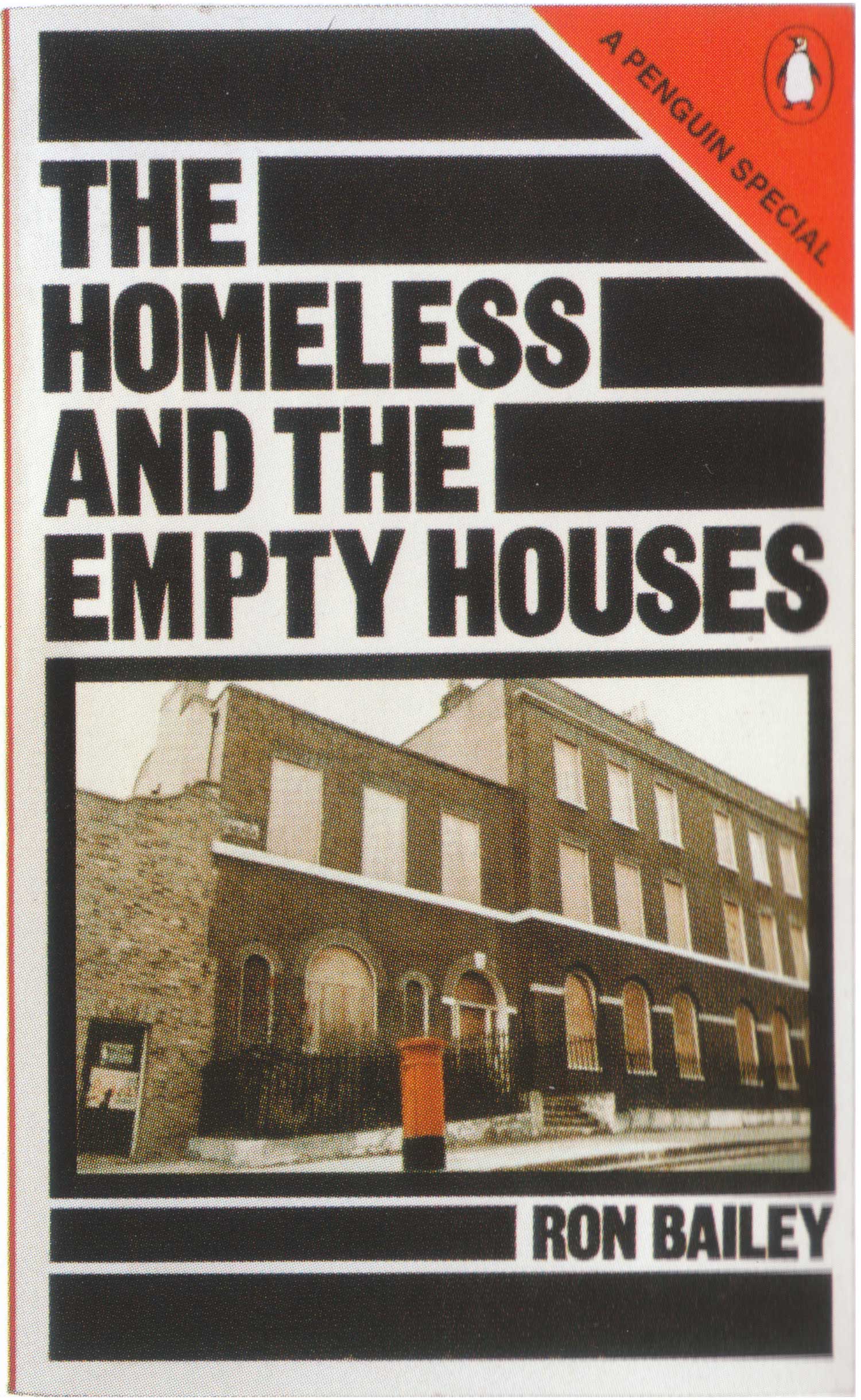
That said, by the late 1960s the series design starts disassembling anyway. There is a return to red, but not in a good way. Creative covers retreat into fields of red with inert type-treatments. I mean, there’s just about nothing interesting going on on the three covers below. And sadly the design continues to dissolve. Starting in 1970, the clean, innocuous, tagline “a Penguin Special” is replaced with a wholly unnecessary red triangle in the upper right corner of each book. This might have made some sense if the rest of design conventions had been abandoned, but instead we see a bunch of the black-saturated covers but with a glaring red triangle added on, completely tone deaf to the rest of the design.
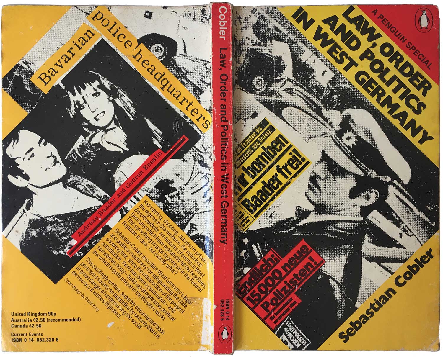
The only designer that really makes a cover that can withstand the triangle intervention is David King. His black bars on The Homeless and the Empty Houses are strong enough to pull the eye away, and keep the focus on the title itself. He actually effectively builds the triangle into his angular composition for Law, Order, and Politics in West Germany, creating a cover that technically follows the series design, but also completely stands on its own. Eventually the triangle is abandoned, but at that point the overall Specials series was so editorially adrift that it became a strange mix of eclectic non-fiction titles with little to nothing holding them together, and certainly not their design. But it was a great project while it lasted, as shown by the dozens of covers in this post!
When researching and writing about Penguins, I have three go-to references: First is Phil Baines fabulous collection, Penguin by Design: A Cover Story 1935–2005 (Penguin, 2005); second is Jeremy Lewis’ long but informative Penguin Special: The Story of Allen Lane, the Founder of Penguin Books and the Man Who Changed Publishing Forever (Penguin, 2006); and finally The Penguin Companion, a all-things Penguin reference book published by the Penguin Collectors’ Society (my copy is from 2006).
Bibliography of the books in this week’s post:


Killer collection and a killer post-!
This is a fantastic study of this book series. I will be referring to this for a while now. Thank you!
Helen Solei