Back in the late 1980s, early 1990s it was difficult to be a young radical in the U.S. and not come across “The Pathfinder Tendancy,” a international group of Trotskyists embodied here as the Socialist Workers Party. I sharply remember running many a gauntlet of red-faced paper sellers trying to get into political events. Usually pushing their paper The Militant, SWP cadre seemed most notable for what seemed to be a complex hazing ritual, in which older members would push younger ones to declaim their most extreme positions, usually in your face, in hopes of provoking arguments. I assume the plan was that this would build the young members capacity to spout the party line in increasingly adverse contexts. This was a similar strategy and affect to other communist cadre organizations such as the Spartacist League (a split from the SWP), and Workers World.
But I could never figure out how they recruited the young people to scream with the papers? There was absolutely nothing attractive about the process to me, and the paper itself was boring at best. A red masthead followed by a wall of 10pt type exhorting anyone and everyone to support Castro’s right to nuclear weapons or some such rubbish. While I rarely, if ever see any copies of the paper anymore, I’m now continually stumbling on pamphlets published by Pathfinder Press. Most are either from the 1970s and 80s, or are reprints of material originally published then. Somehow I ended up with a dozen or so in my collection, even though I barely—if at all—remember how I acquired them. Interference Archive has over fifty different pamphlets, many in multiples, and if one is to believe the publication lists on the back covers, this is barely a drop in the bucket of hundreds of unique political pamphlets they published from the 1960s through the 1980s. Almost any collection of 60s/70s material that is donated to Interference contains at least one or two Pathfinder pamphlets, yet I don’t think any of the donors were ever SWP members.
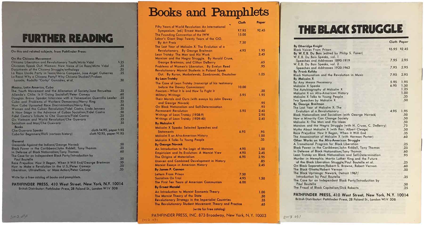
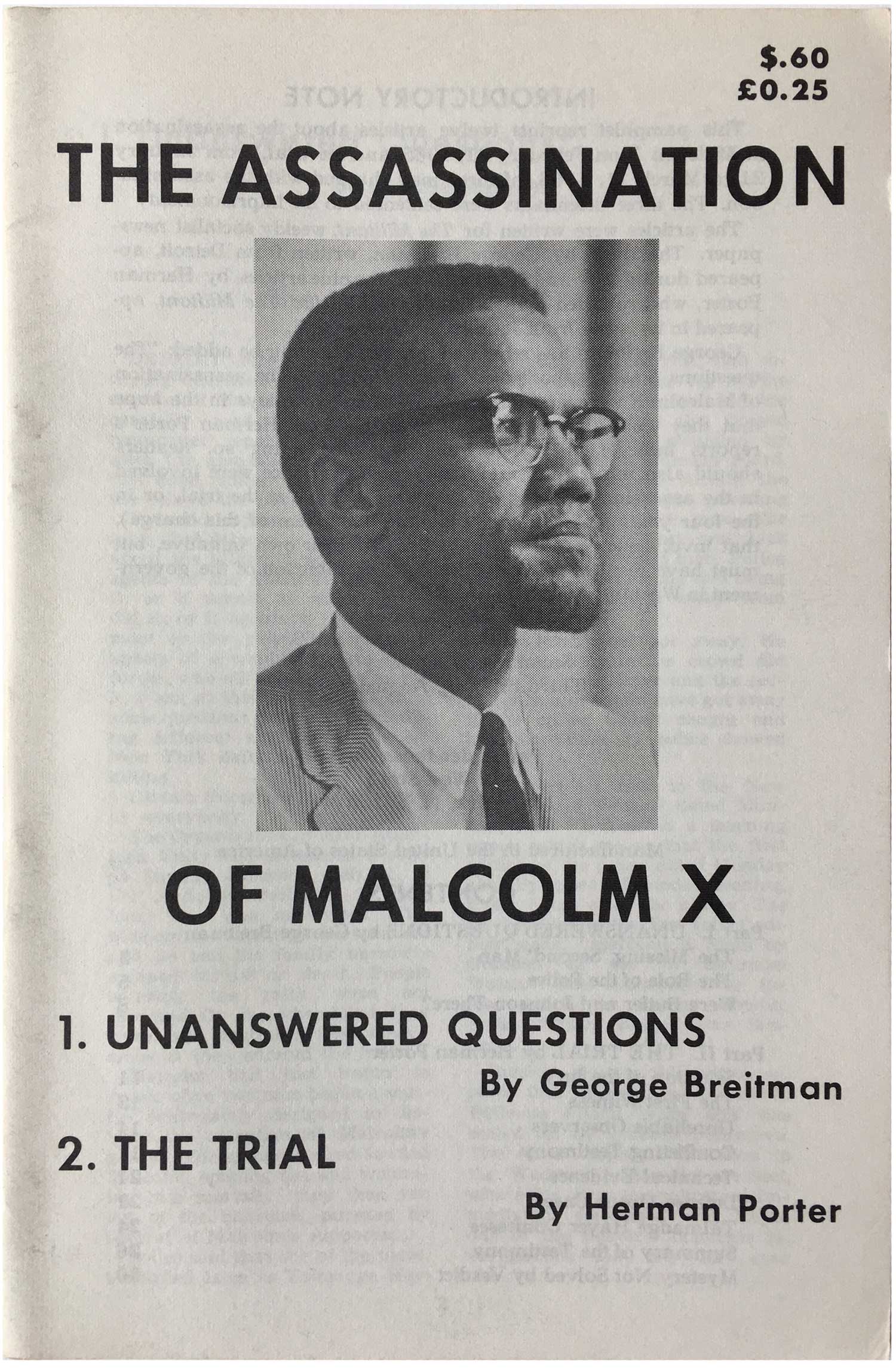
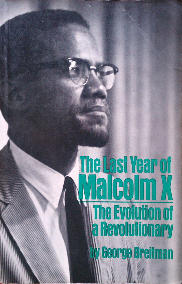
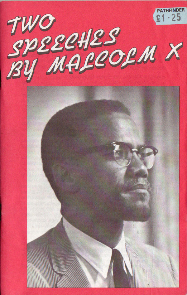
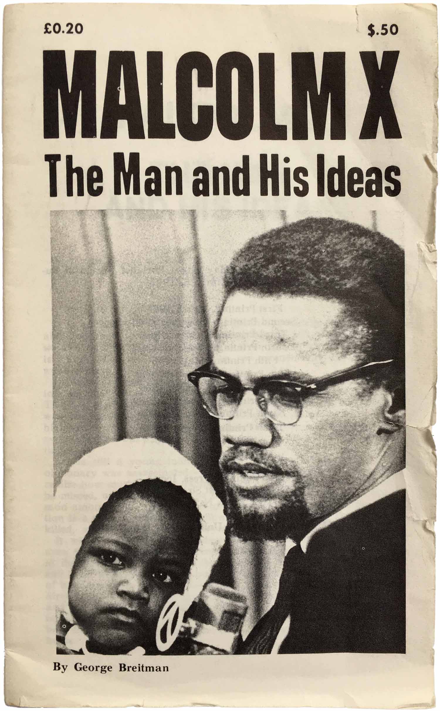
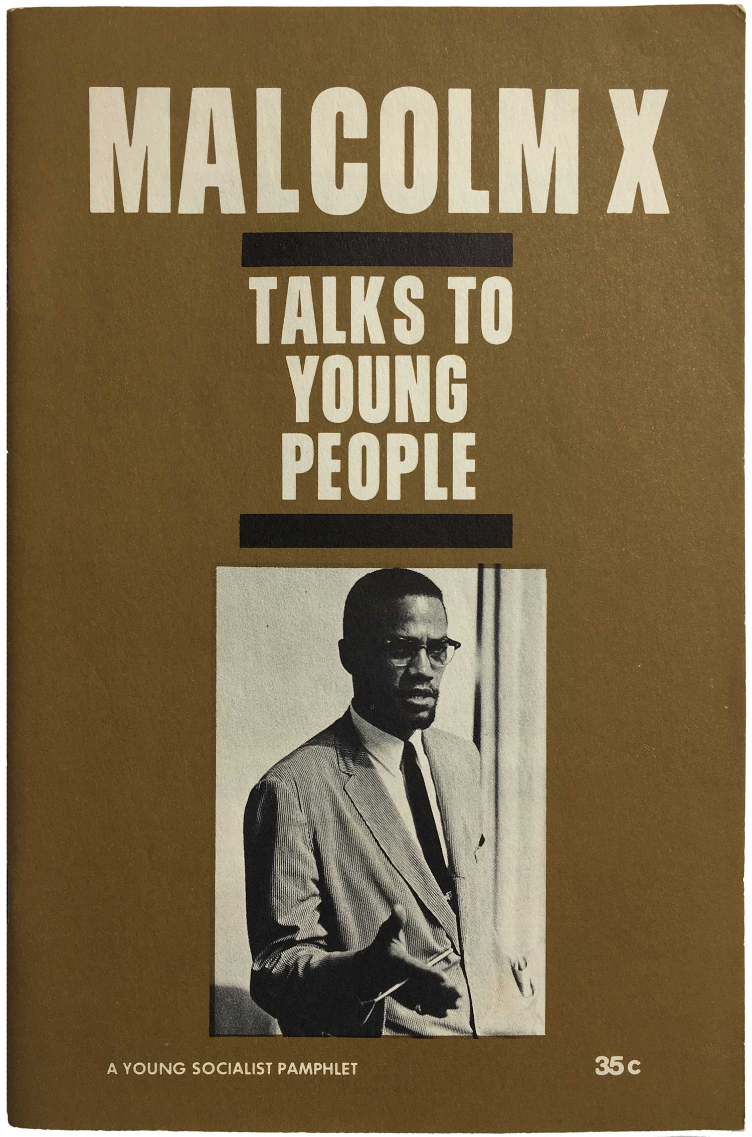
I find this publishing trail fascinating, especially because outside of actual work of Trotsky, and a handful of pamphlets by or about Malcolm X (SWP leader George Breitman had some sort of connection and relationship to Malcolm, editing his writings as well as publishing a number of volumes about him and his transition to revolutionary socialism—these Malcolm X titles alone have likely kept Pathfinder in business, in all probability outselling everything else they’ve published combined) almost their entire output consists of unreadable diatribes from the likes of Castro or wonky internal left analysis of various political ideas and positions. I’ve never actually read any of these pamphlets, and I don’t know many who have, although every lefty I know is certainly familiar with the idea of them. Like much Trotskyist lit, they tend to read less as interventions into active issues, but instead as strident claims to being historically correct, as if the battle today is already lost, so what is really at stake is how people will understand the politics for prosterity’s sake.
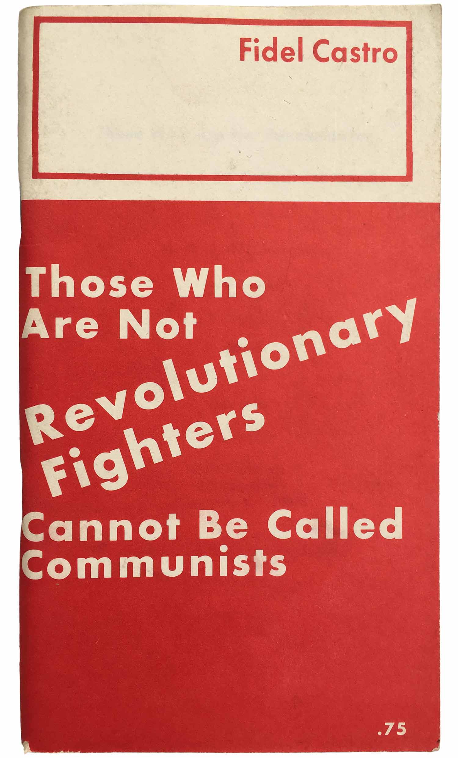
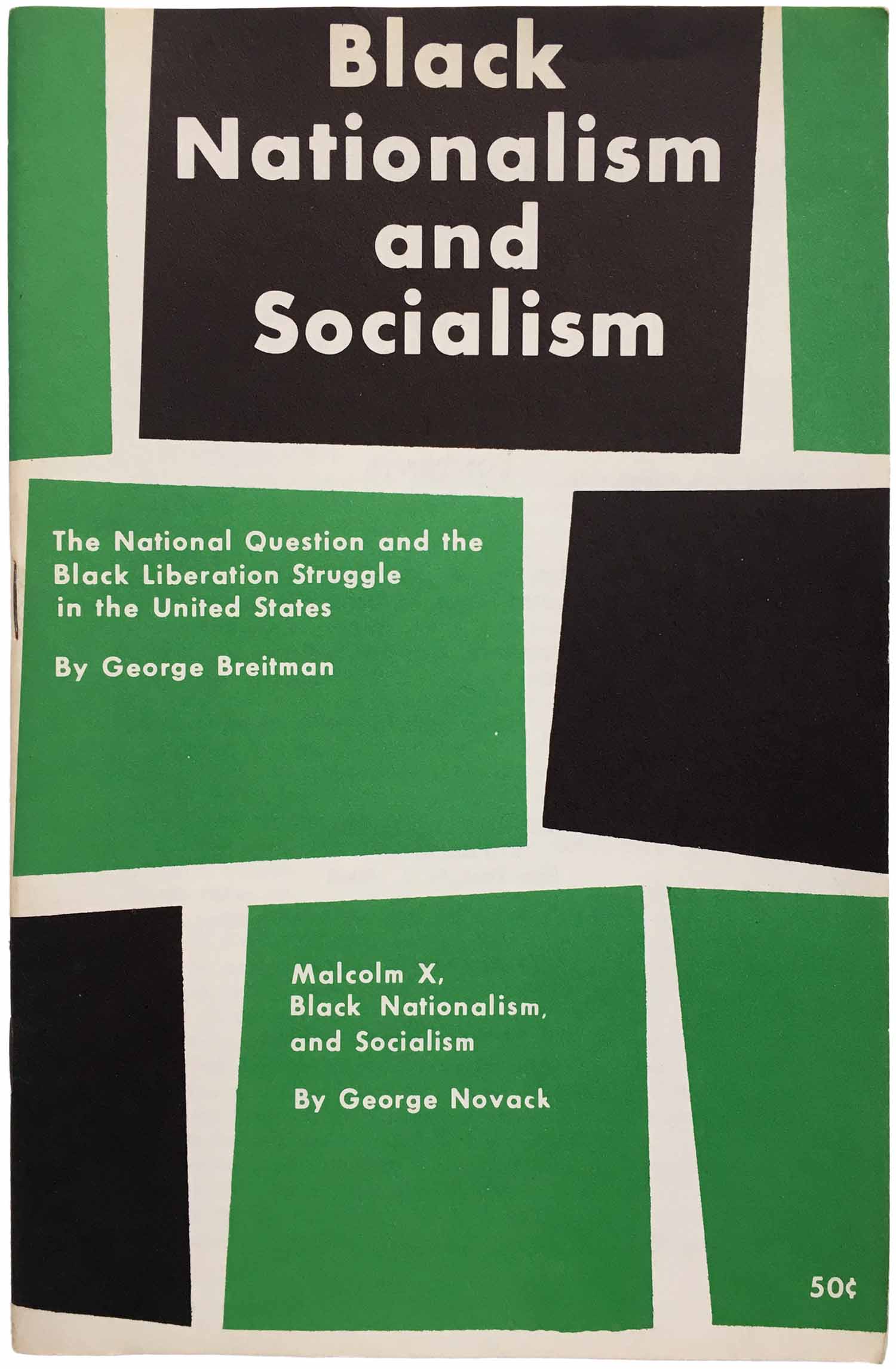
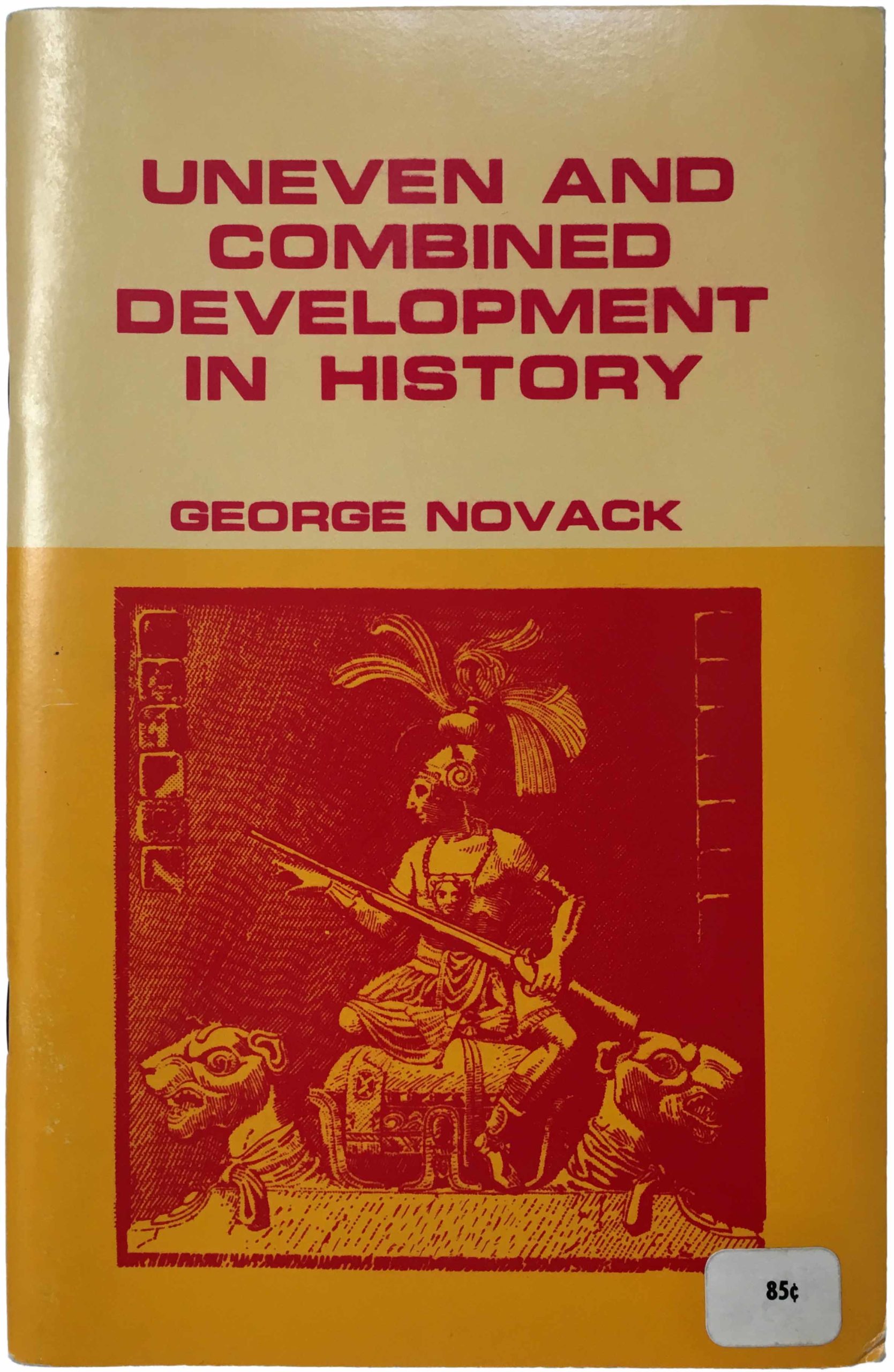
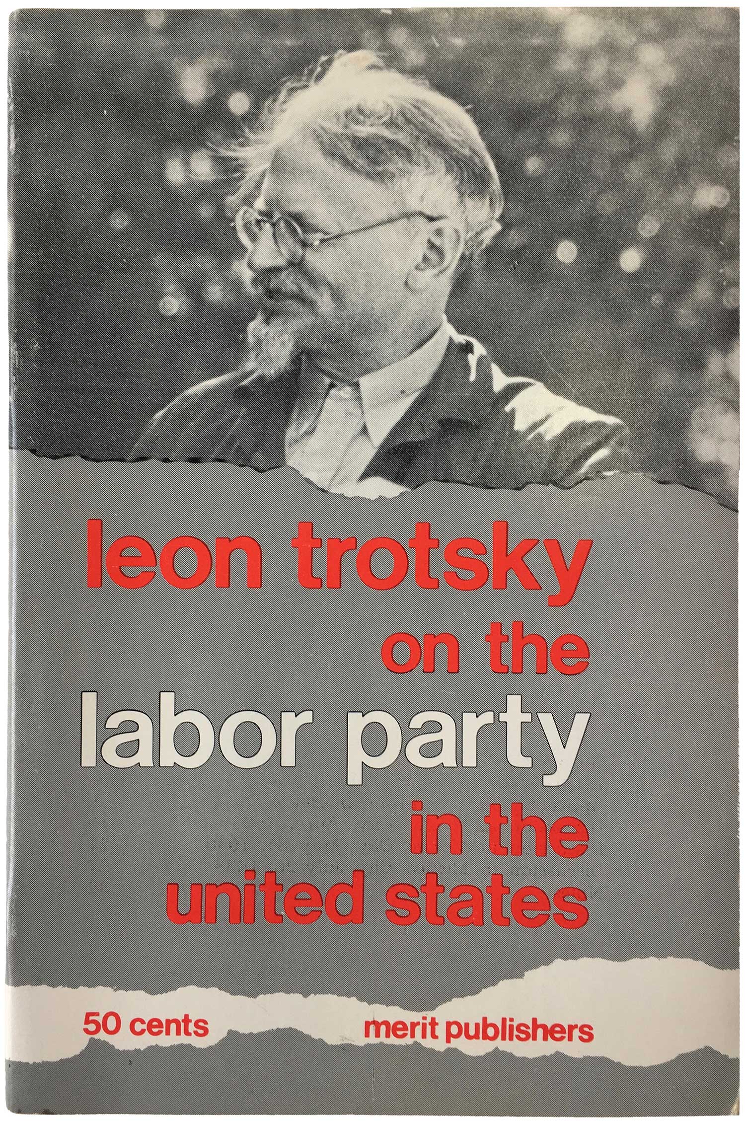
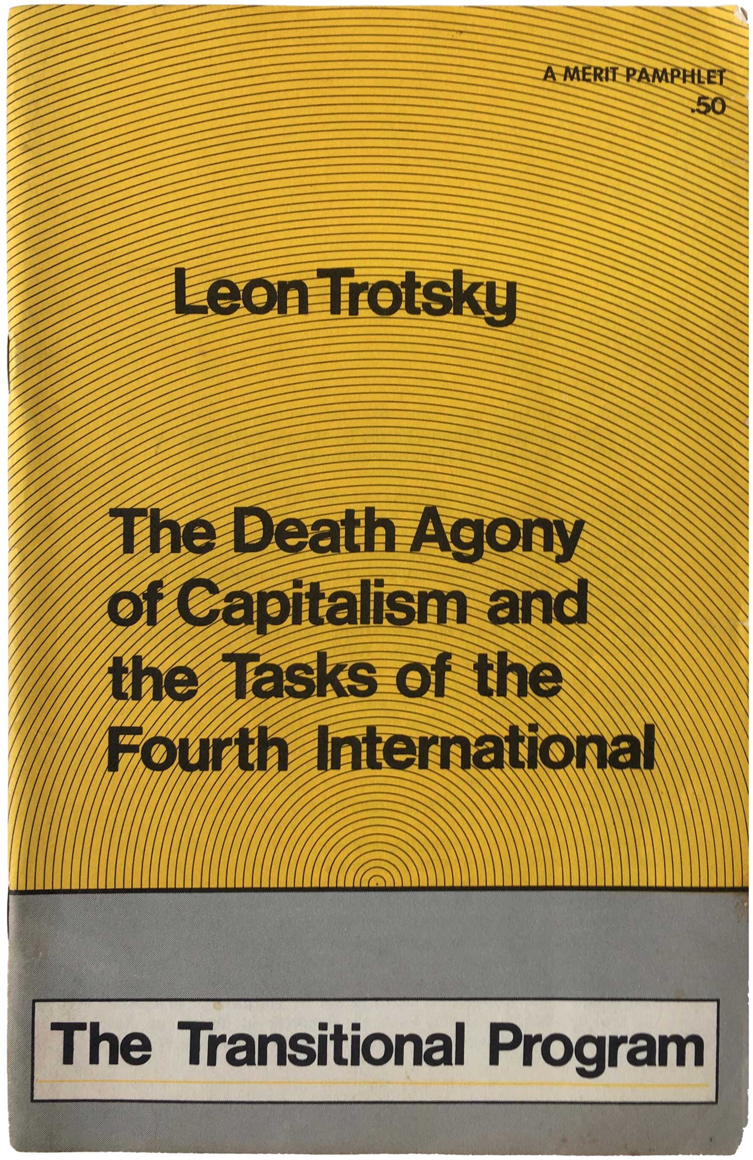
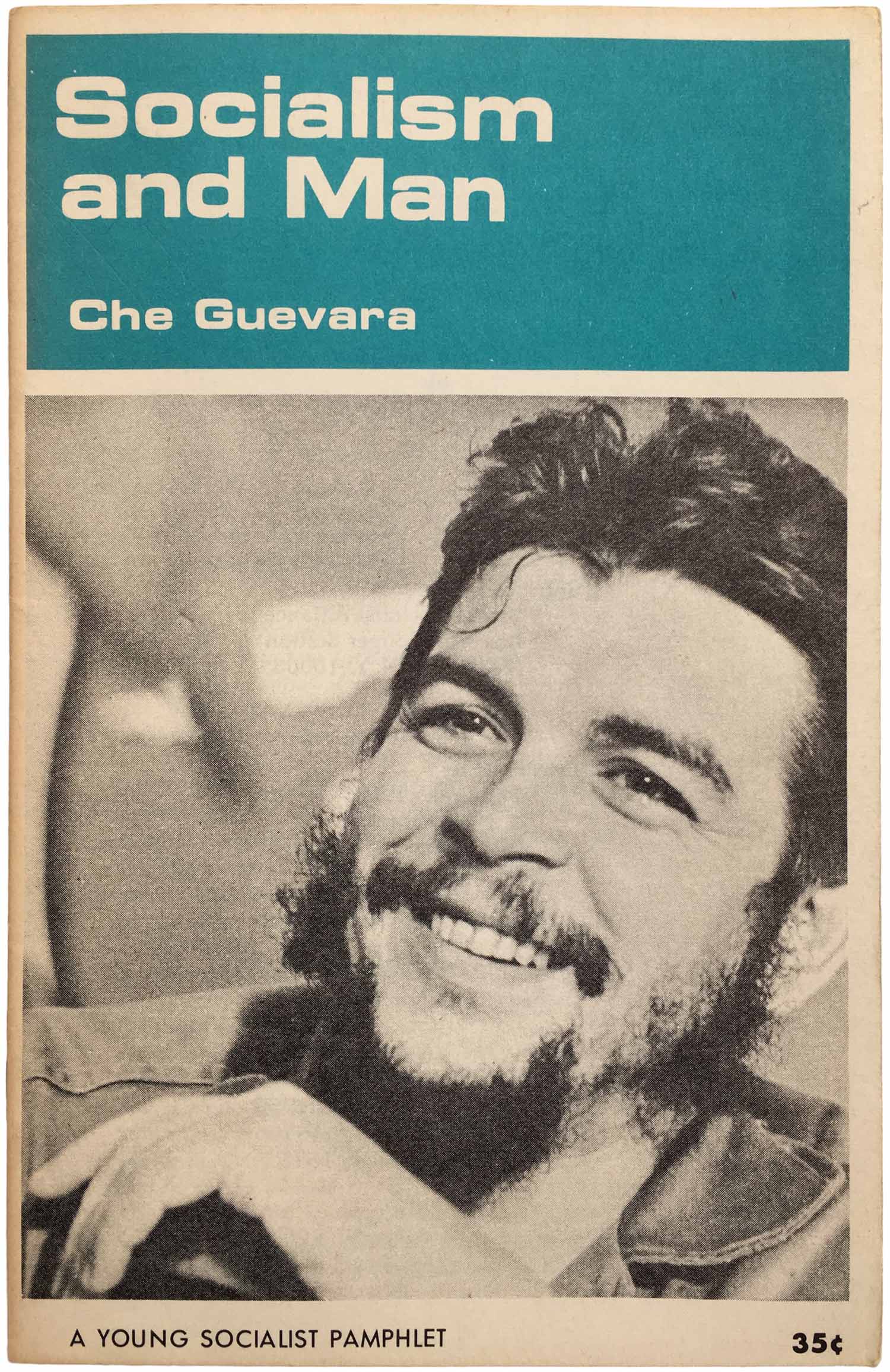
[Prior to 1970, the SWP’s press arm was known as Merit Publishers. Most of the pamphlets here at the top of this post were put out under the Merit banner in 1966–1969.]
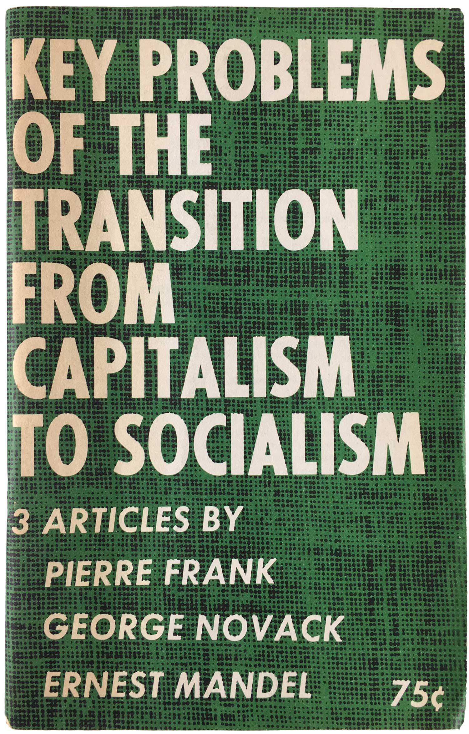
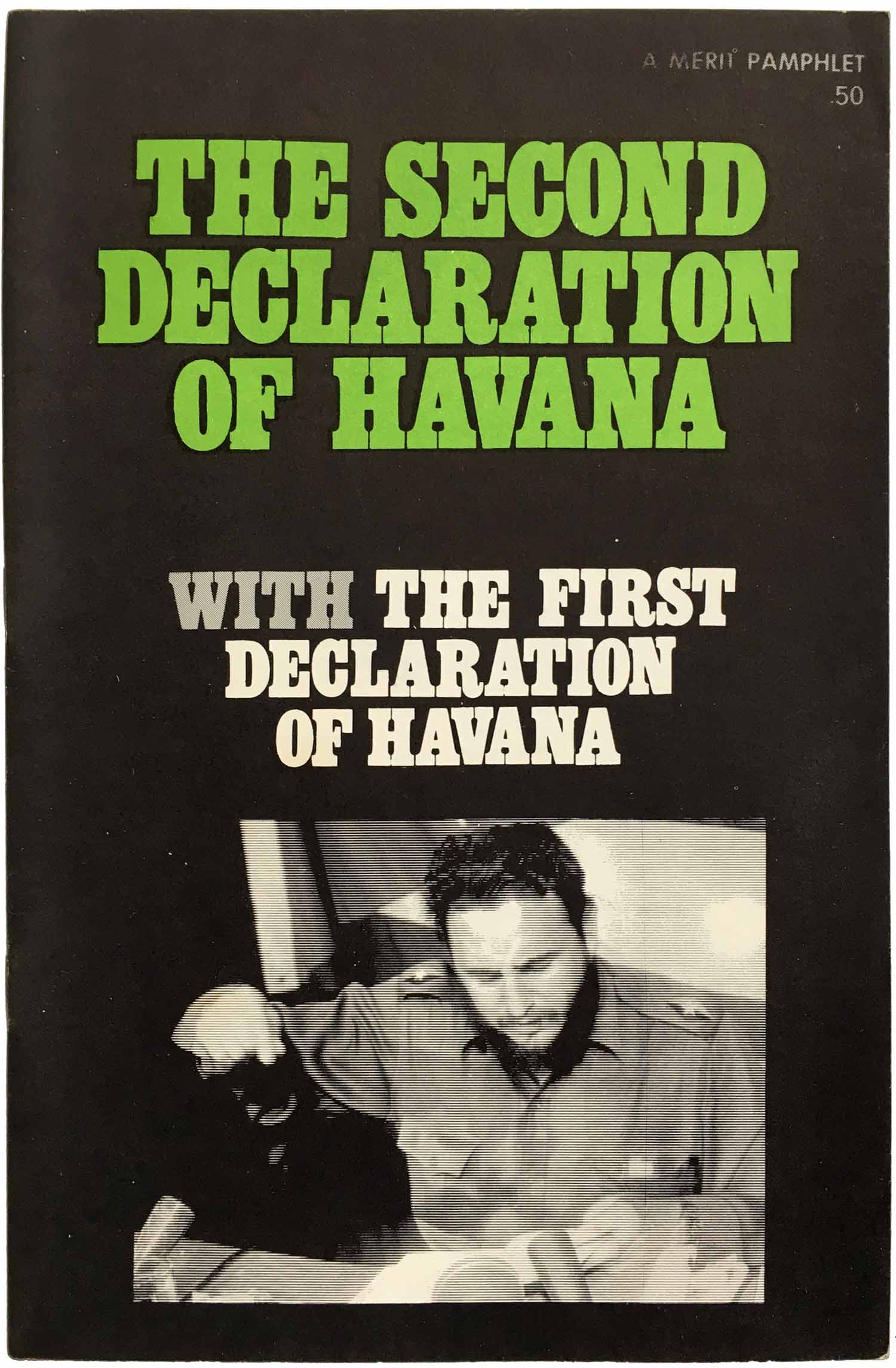
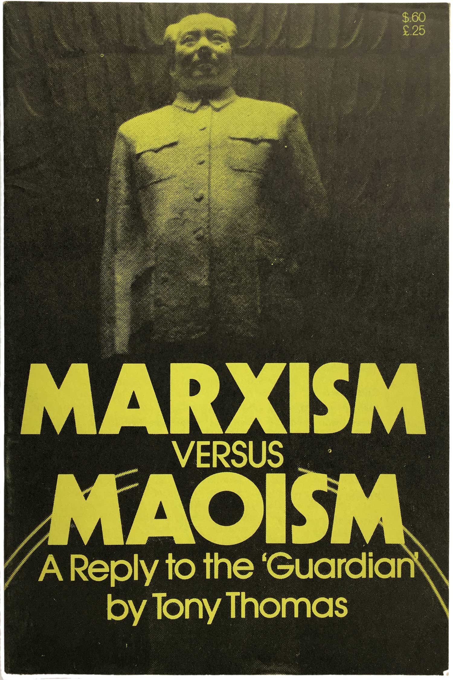
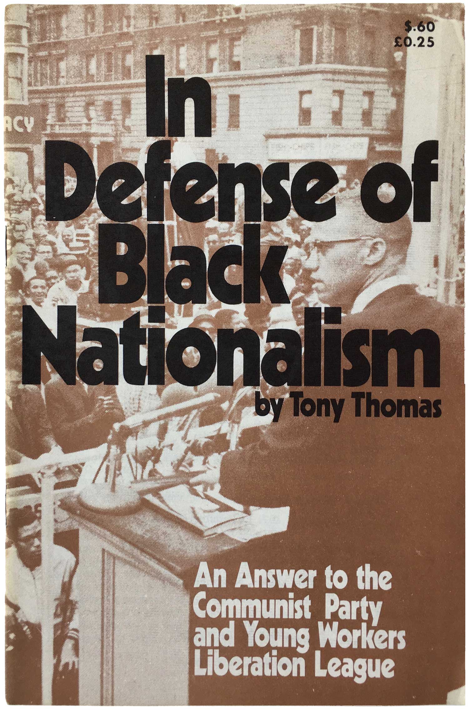
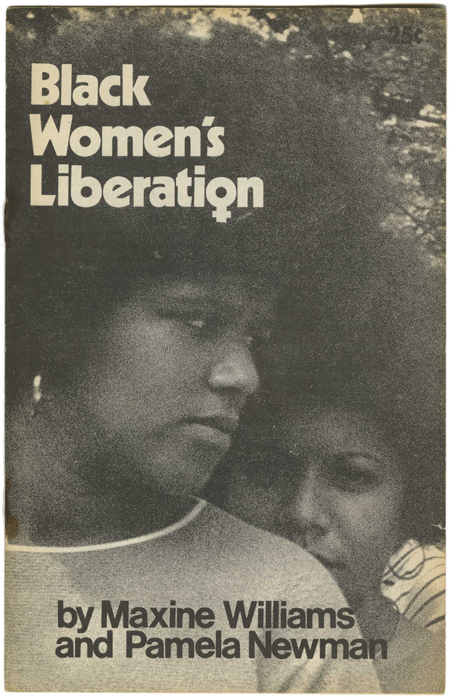
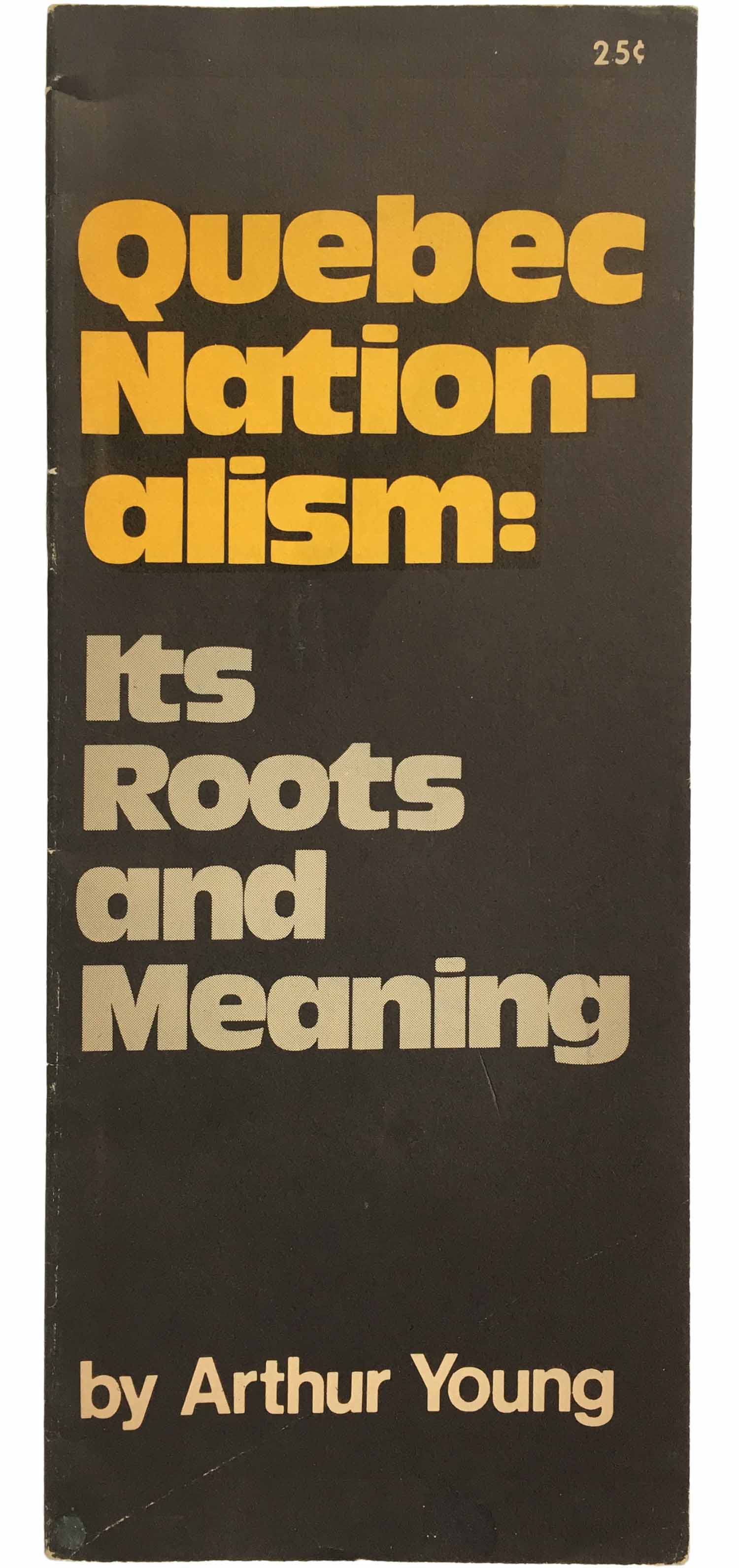
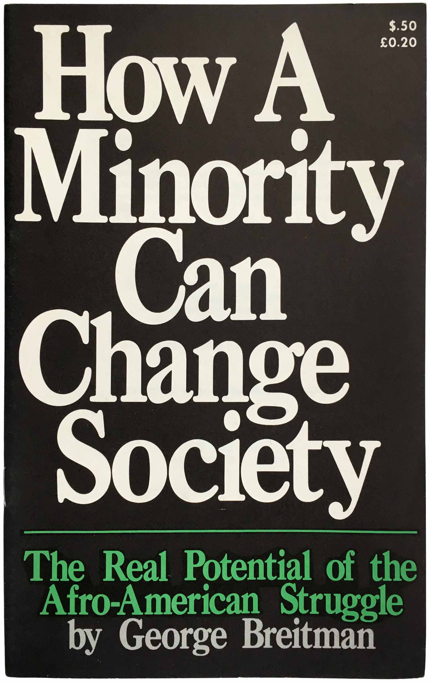
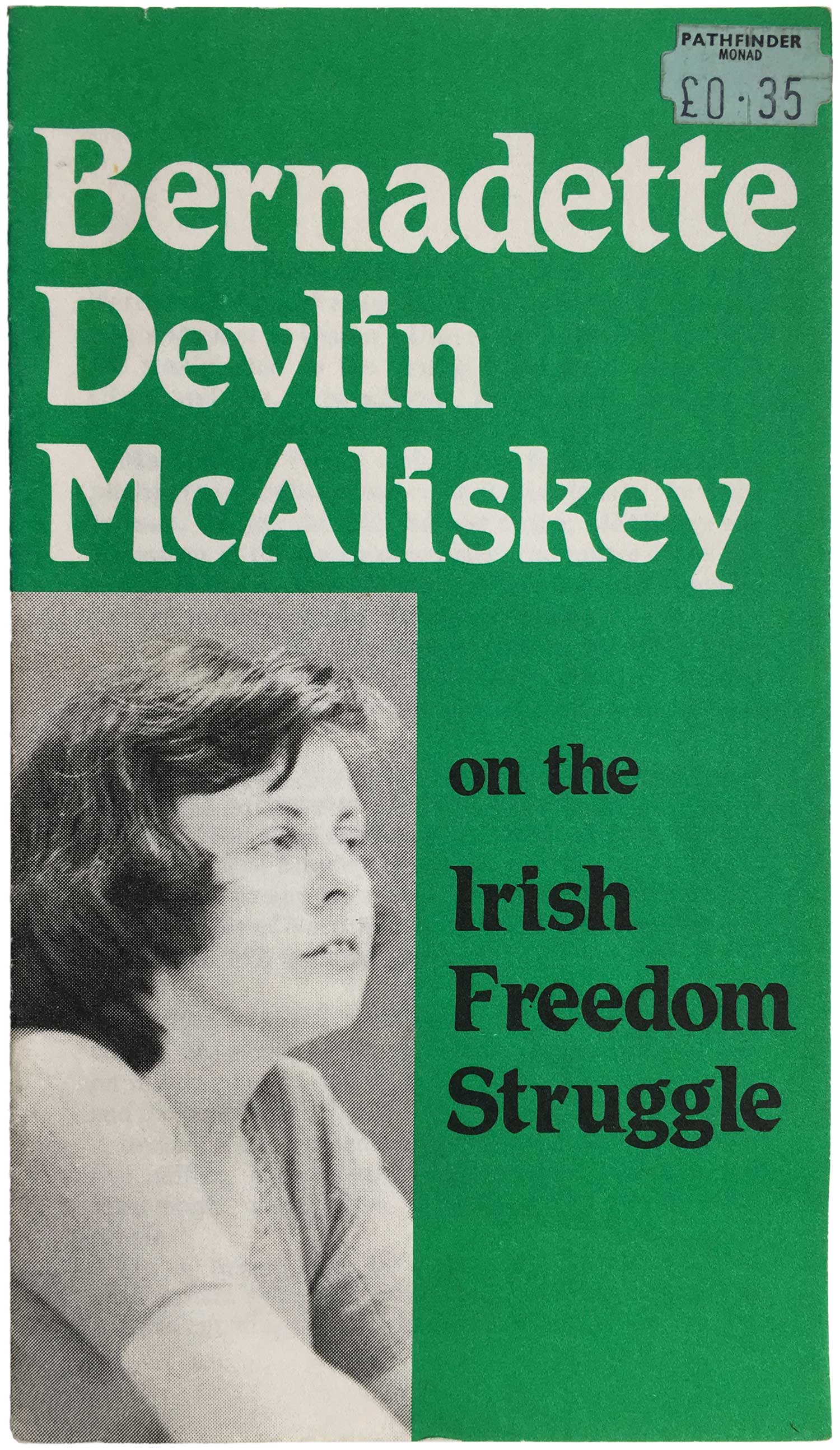
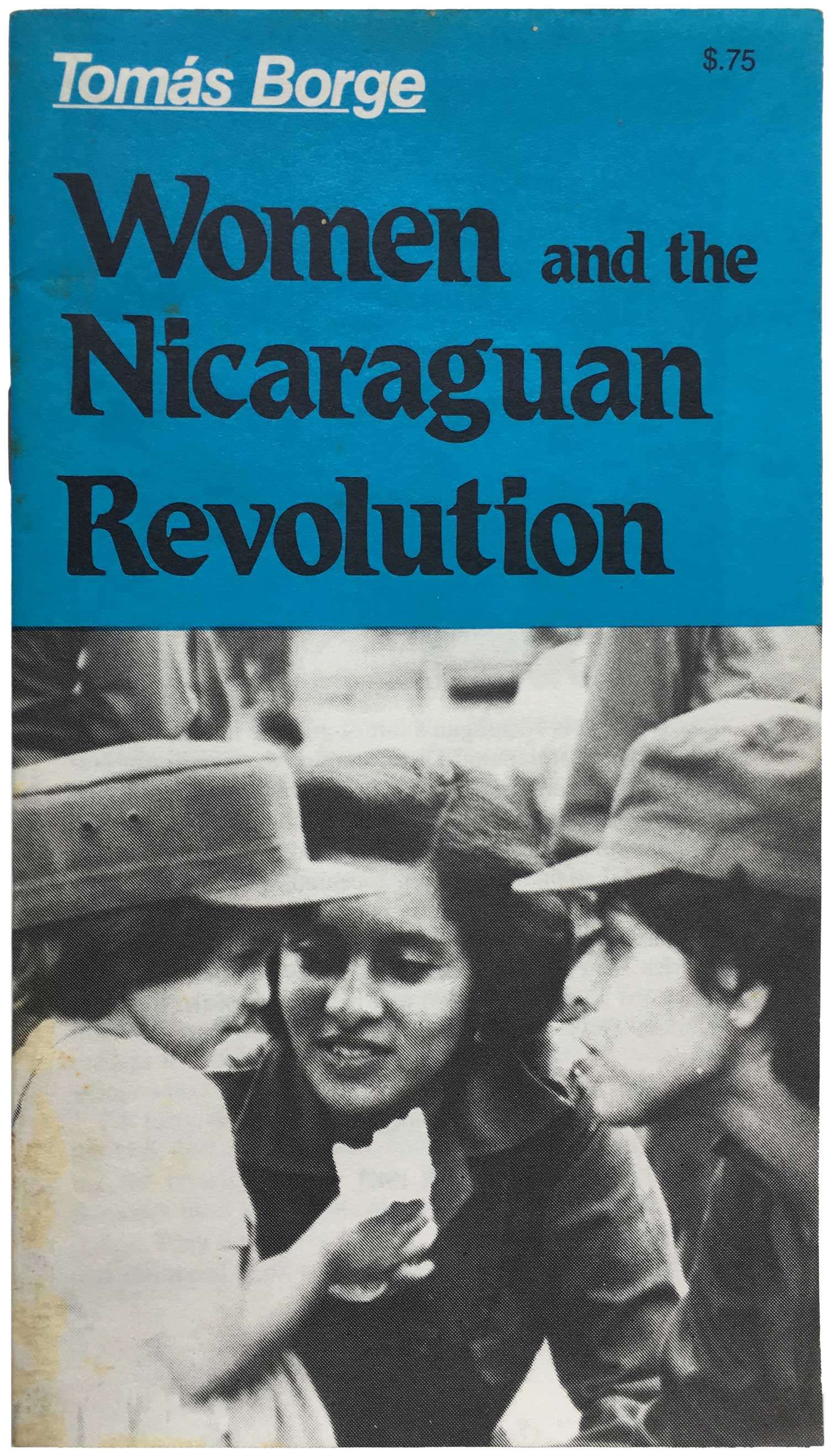
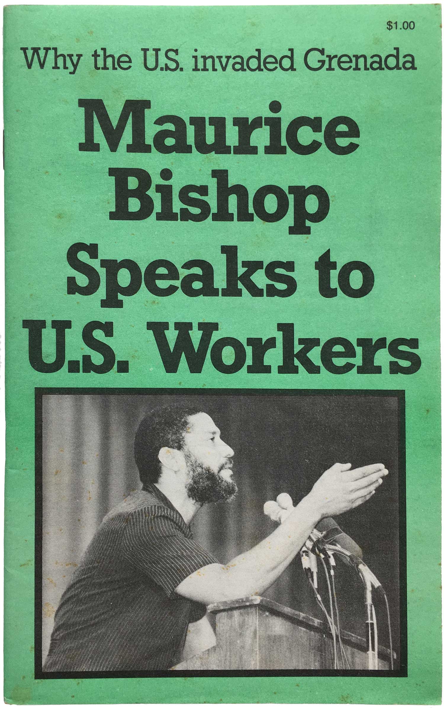
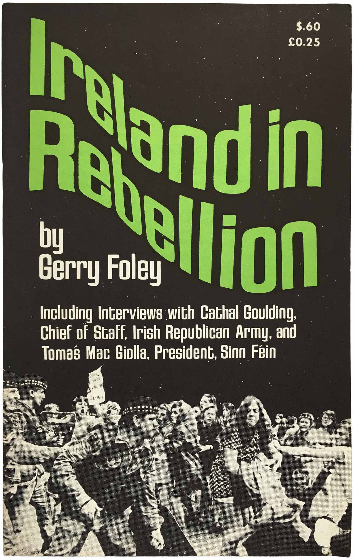
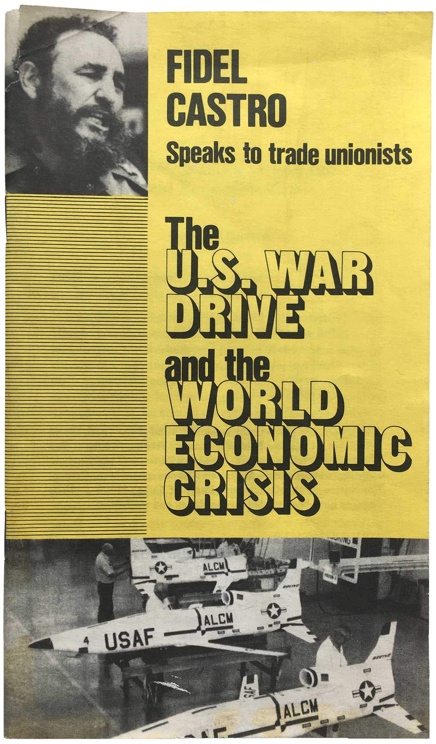
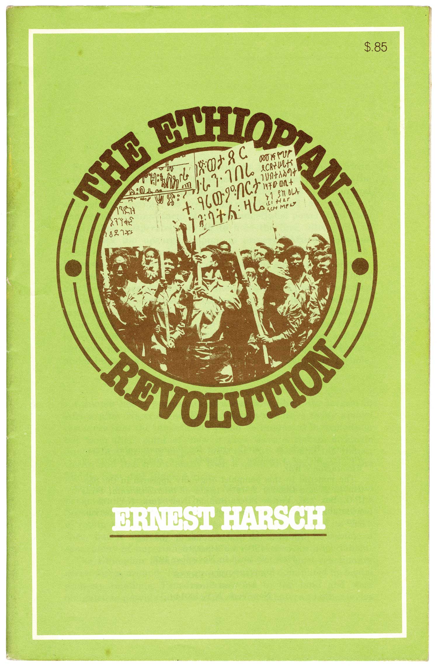
I’ve been wondering what it means to have such an amazingly intense and verbose output, but to have so very little of it read, especially by people outside the party? Is this what we could call a “hermetic literature of the Left”? Another interesting aspect is that there is a clear design development you can see here, from the very rudimentary type-set covers on these early works to a very developed aesthetic by the mid-1970s, with the use of bold titling in a small set of fonts, usually in red, green, orange, or blue on a solid black background, sometimes with a small inset photograph. They are so clean and staid that they feel like the corporate design of Left publishing. No designer is ever named or listed, and they almost feel like they follow a basic-template, as if the role of the designer itself has been replaced by some sort of historically-determined aesthetic.
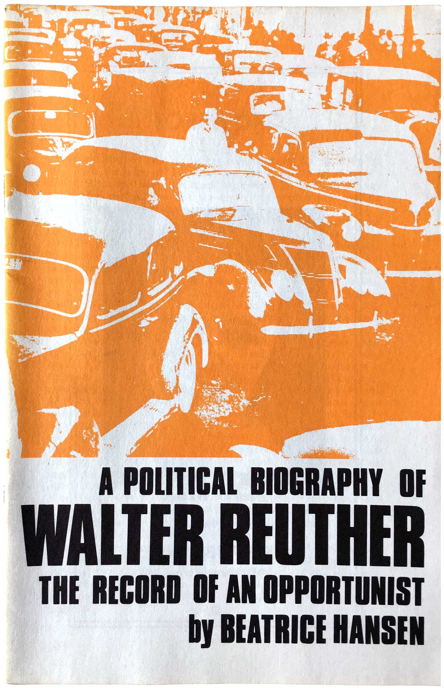
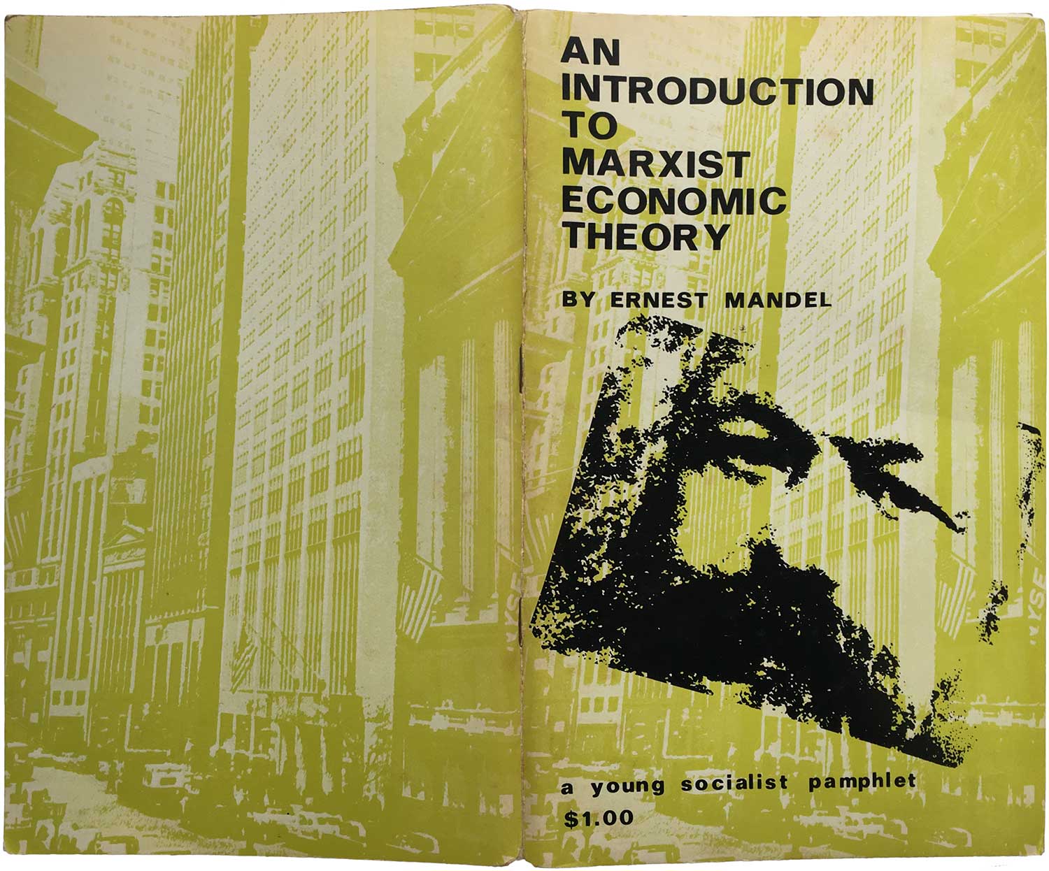
For more background, in many ways the party’s politics are relatively benign, generally an increasingly soft Trotskyism (outside of a rock hard anti-Stalinism) mixed with seemingly blanket support for the Castro, the Cuban Communist Party, and the remnants of Nicargua’s Sandinistas. They generally have strong pro-immigrant positions and run an anemic presidential campaigns every four years, usually garnering between 5,000–10,000 total votes each election since the mid-90s. At this point they barely exist beyond their Pathfinder publishing wing.
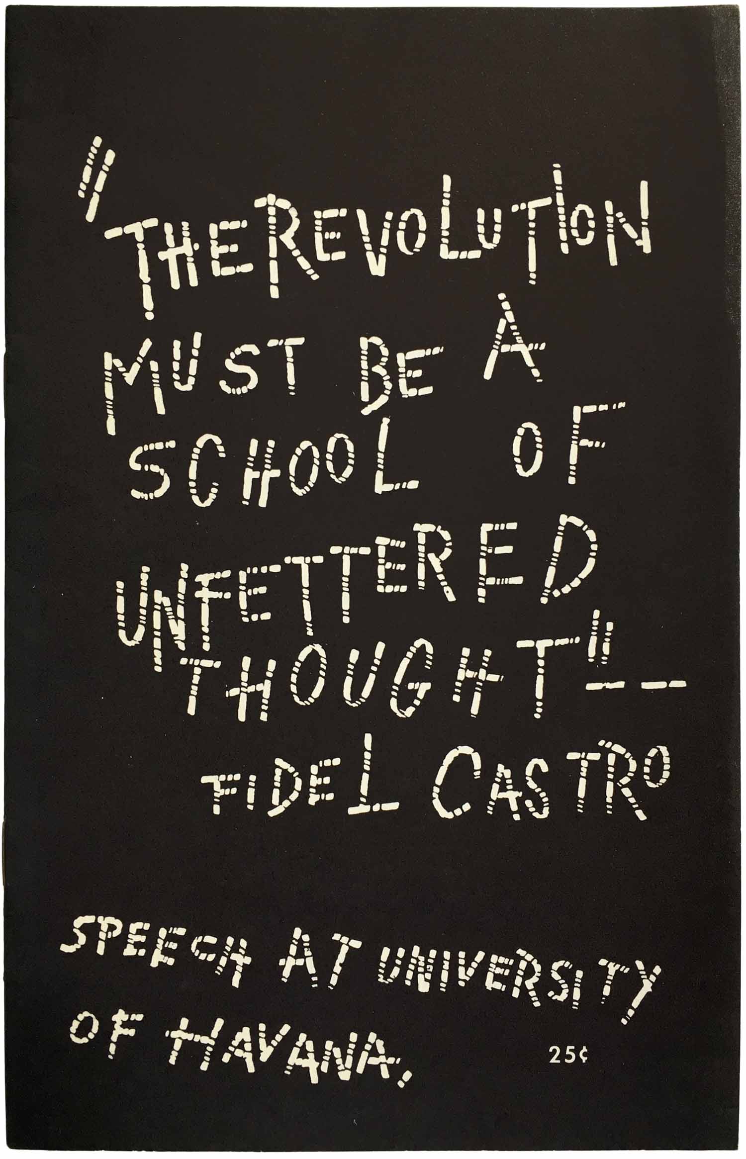
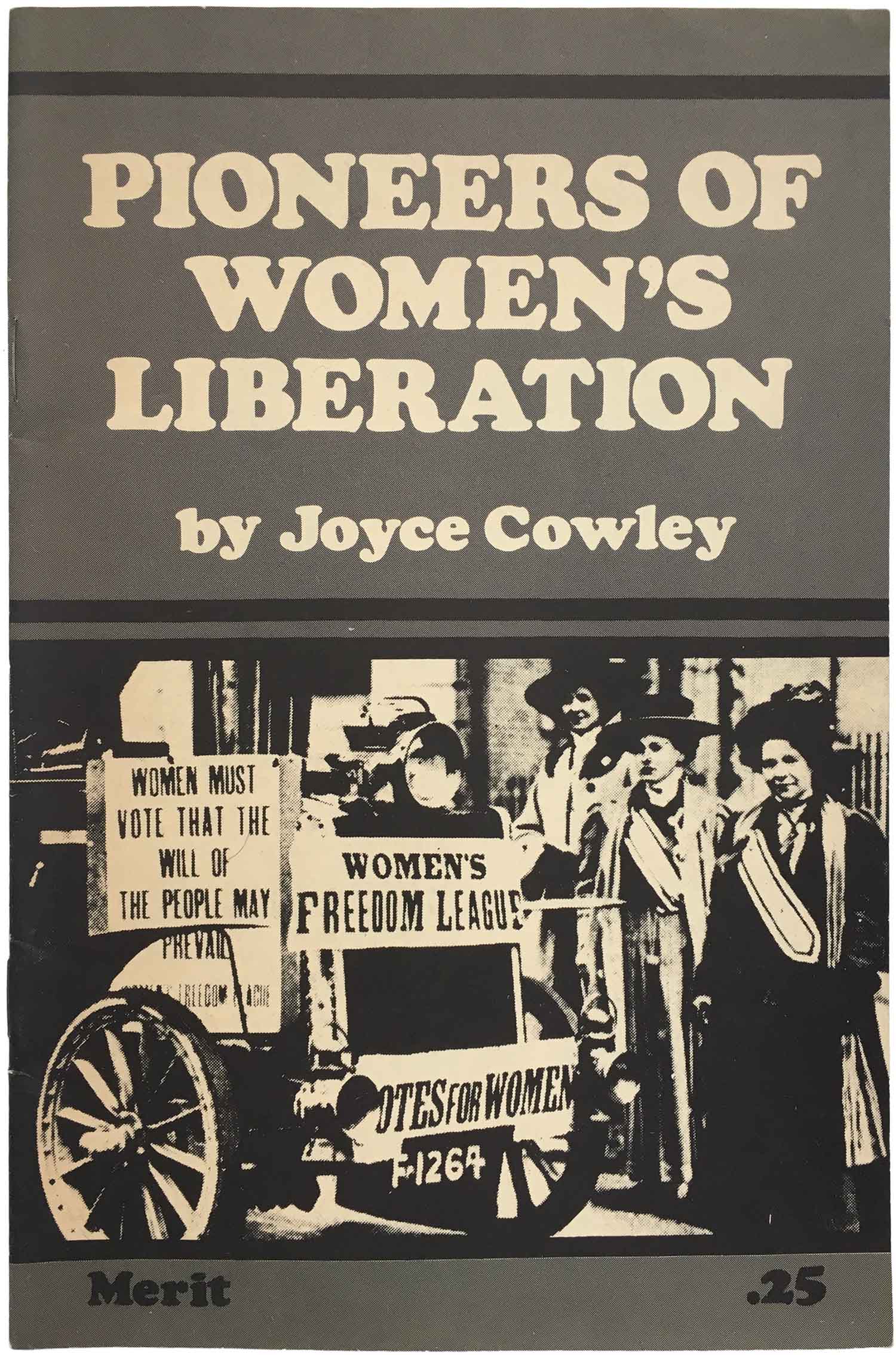
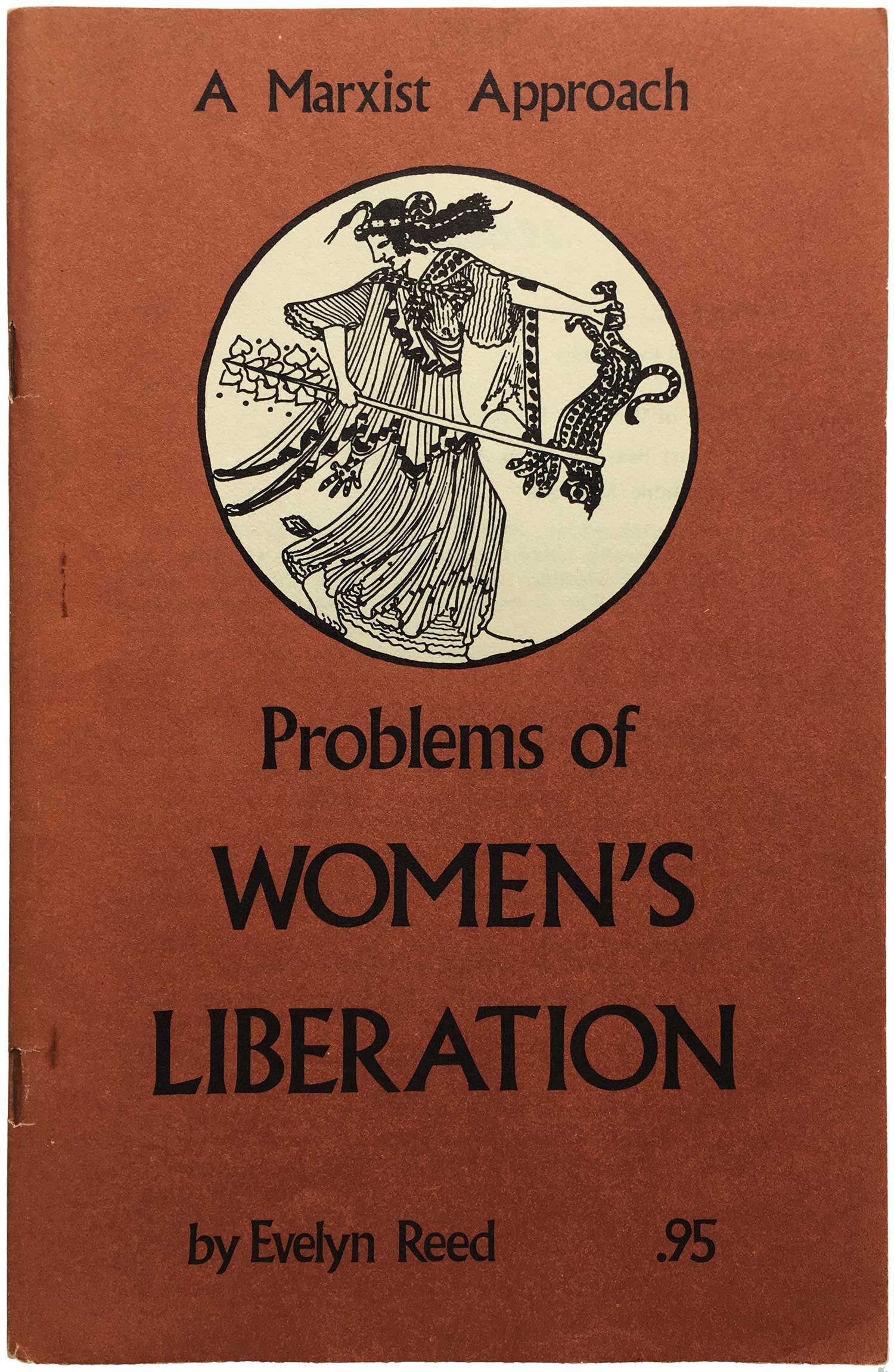
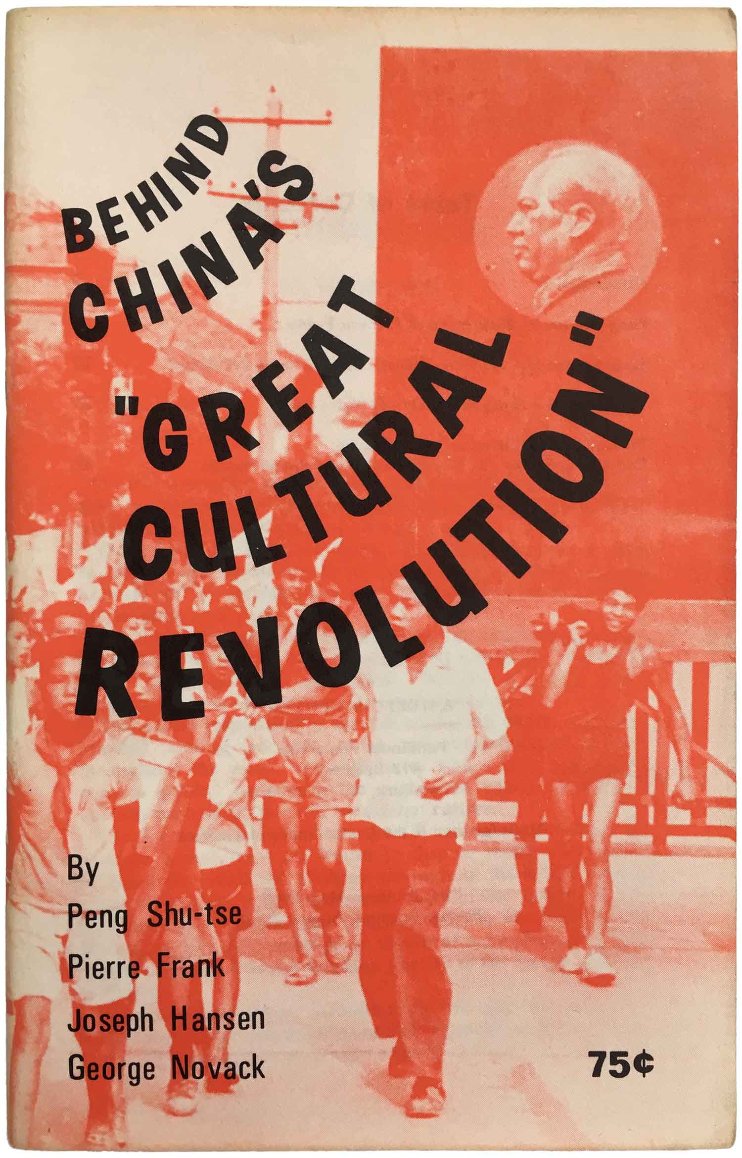
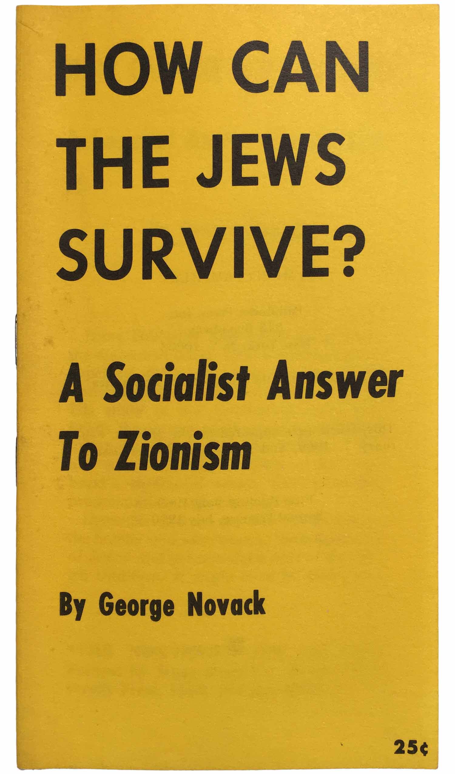
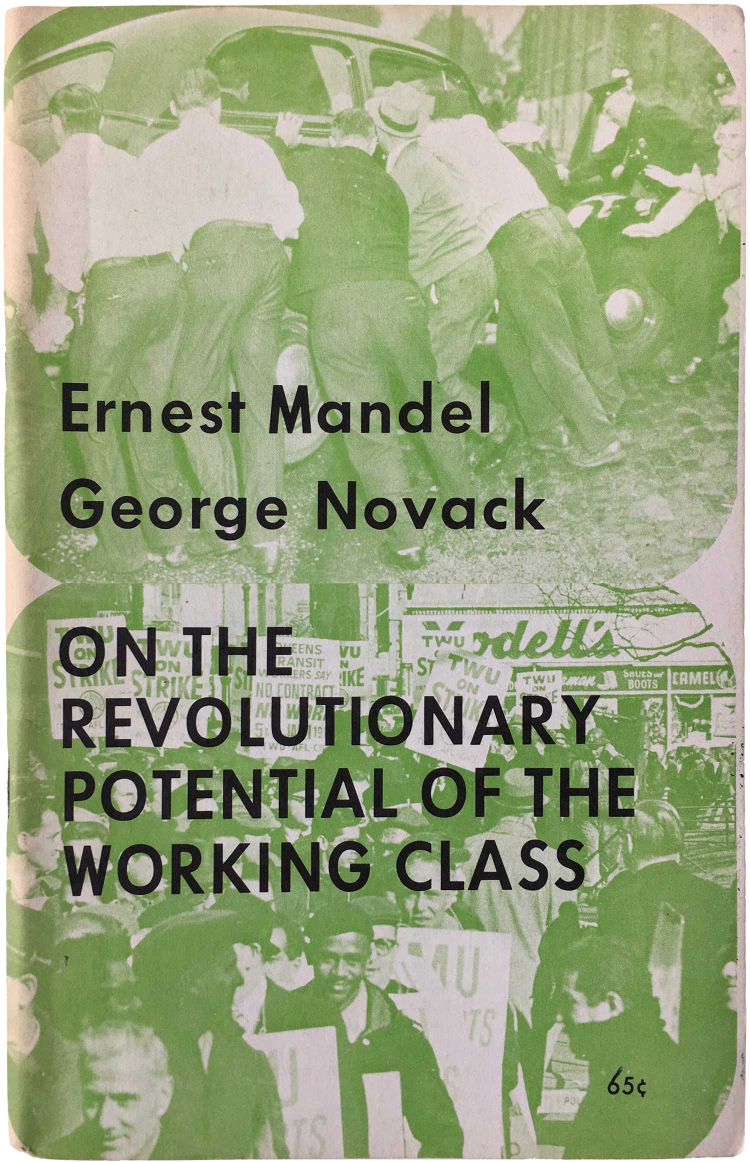
Rather than simply a split from the Communist Party USA, like much of the far left in the U.S., the SWP can claim to actually be a split from both the CP and the US Socialist Party, leaving the former in 1928 and the latter in 1937. I’ll avoid most of the lefty alphabet soup, but feel confident in the general knowledge that the next fifty years was a long trajectory of one split after another, generally settling in to the contemporary version of the SWP in the mid-1980s. A number of luminaries have been members of the SWP, both figures that moved to the left (CLR James) and those that moved to the right (Lyndon Larouche). The main intellectual architects, outside of Trotsky, have been Jack Barnes, George Breitman, and George Novack.
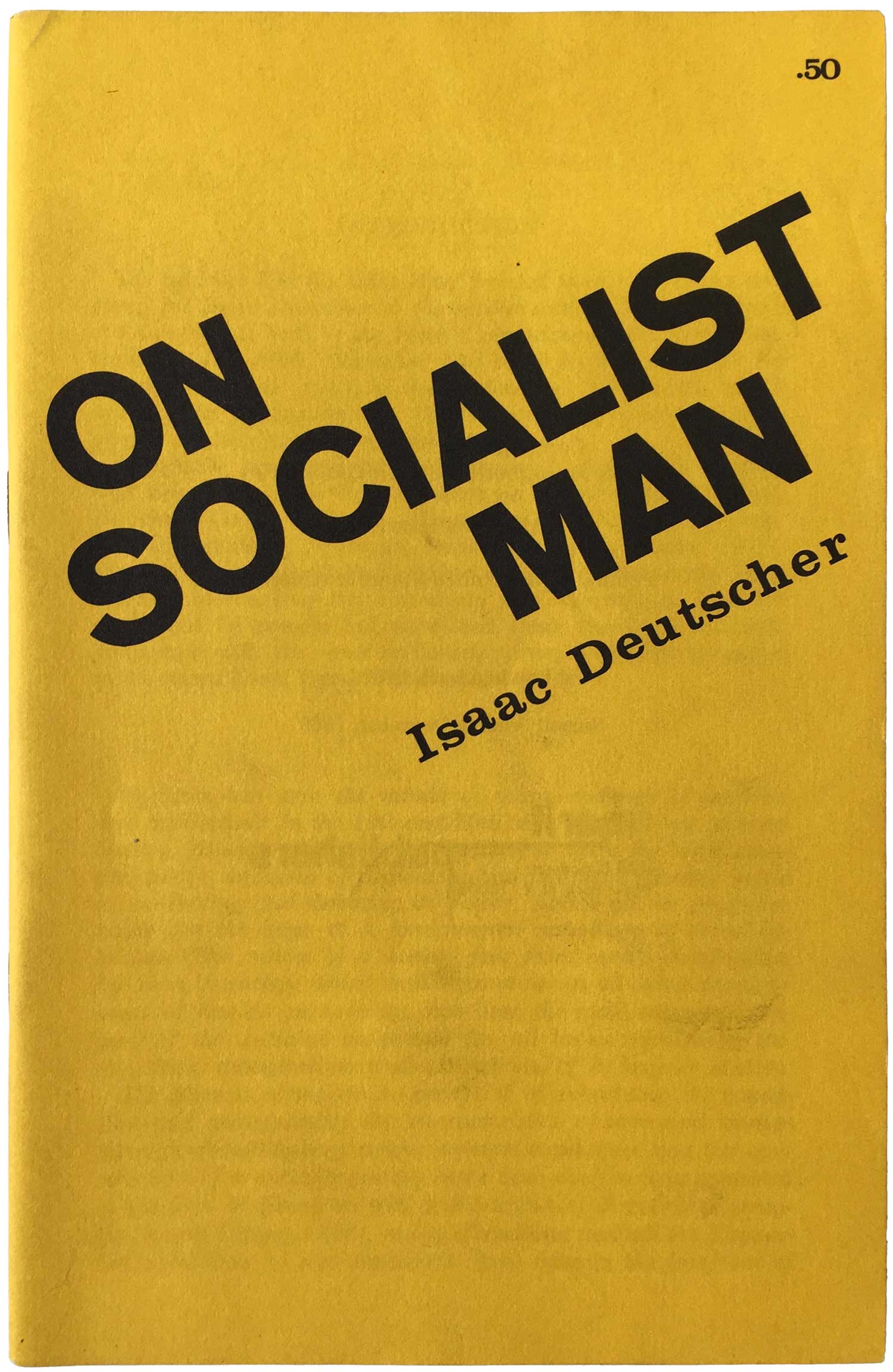
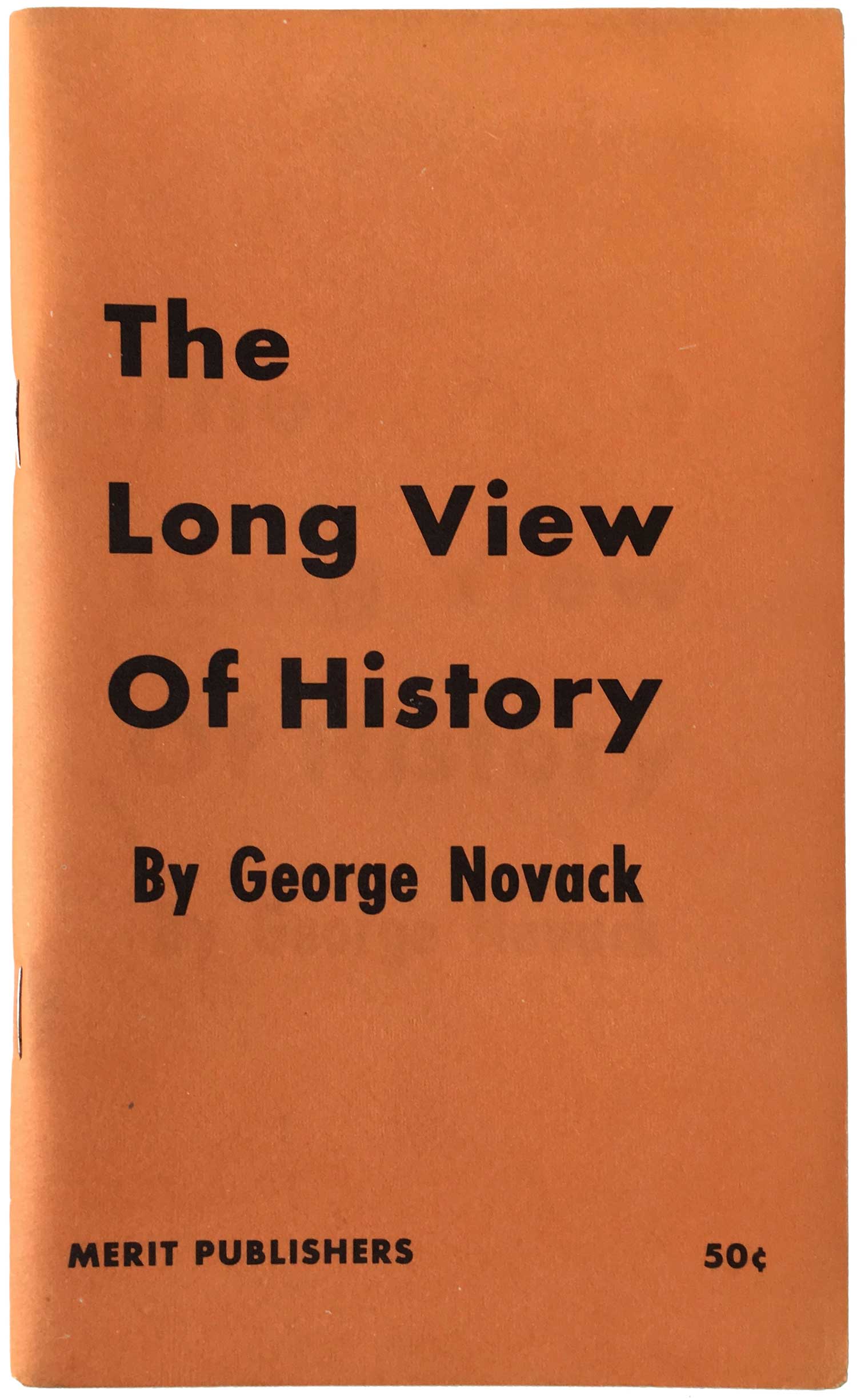
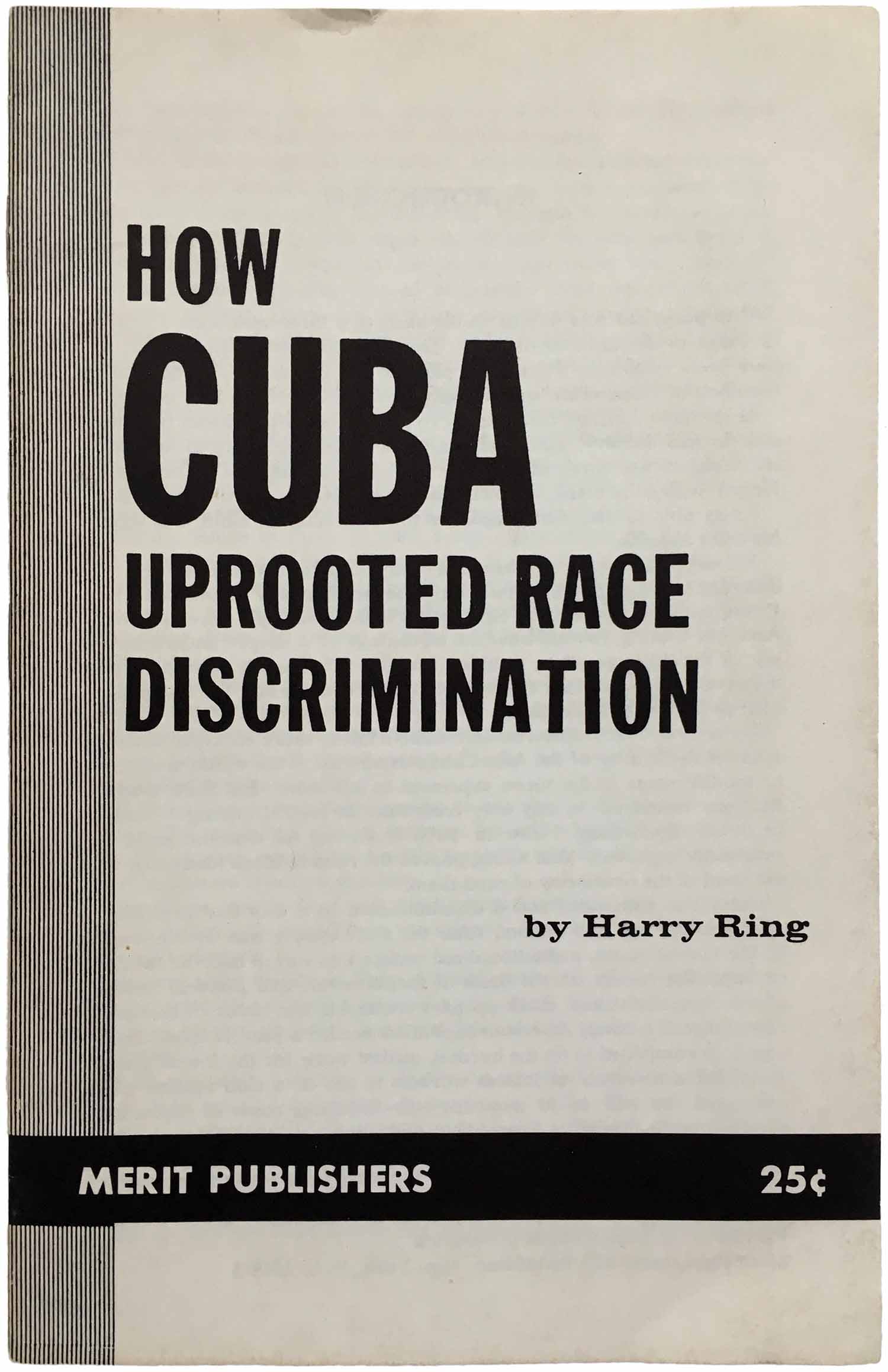
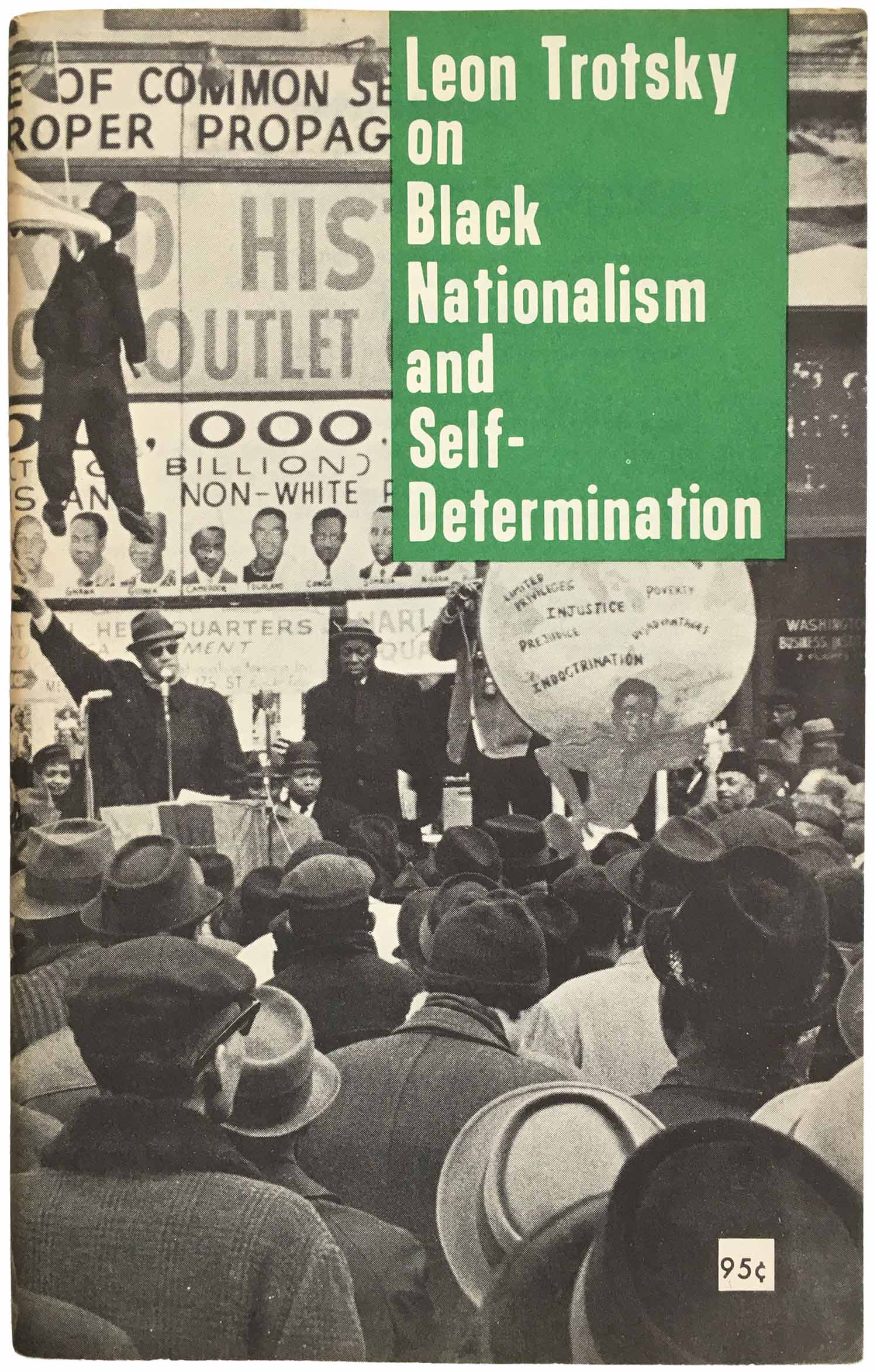
In general the Merit output is relatively dull design-wise, but there are a couple of publications that have some life in them, and show a direction that Pathfinder could have gone. Black Nationalism and Socialism (far above) is quite nice, the green and black shapes giving tension to the clean sans serif type. Trotsky on Black Nationalism (below) is also cool, a green drop-down square containing a sharp DIN-style font, offset with the full bleed black and white photo. And finally Malcolm X Talks to Young People (also below), clean and efficient, white type and black bars. I would have chosen a different background than brown, but all-in-all its a strong design.

Although they have the rights to some of Malcolm’s writing, it appears as if the same isn’t true for his image, as the majority of pamphlets bear the same basic photo, re-purposed with little flair.
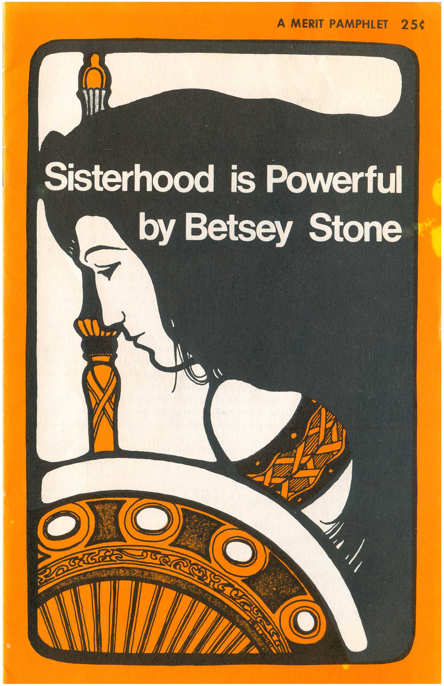
A sizable chunk of the early 1970/71 Pathfinder titles seem to be in a design transition, in between the overly simple layout of the Merit days and the more advanced font and image usage from the mid-70s. All of the five below stick to thin sans serif titling and pretty basic images, other than Sisterhood is Powerful, which interestingly is the only title in the whole bunch that has an artist attributed: “Bobbie Bagel.” The art deco design really stands out from everything else here.
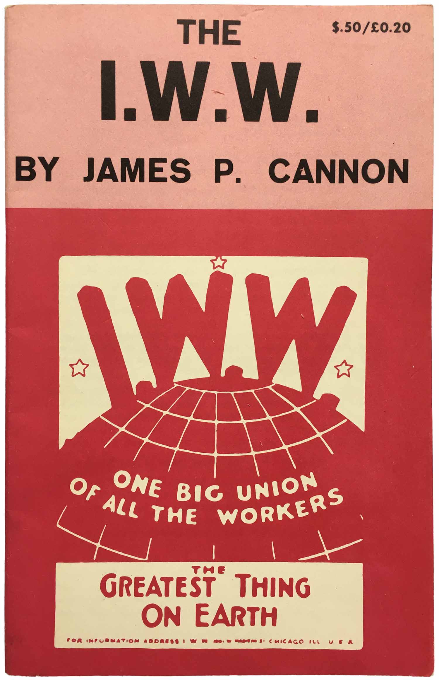
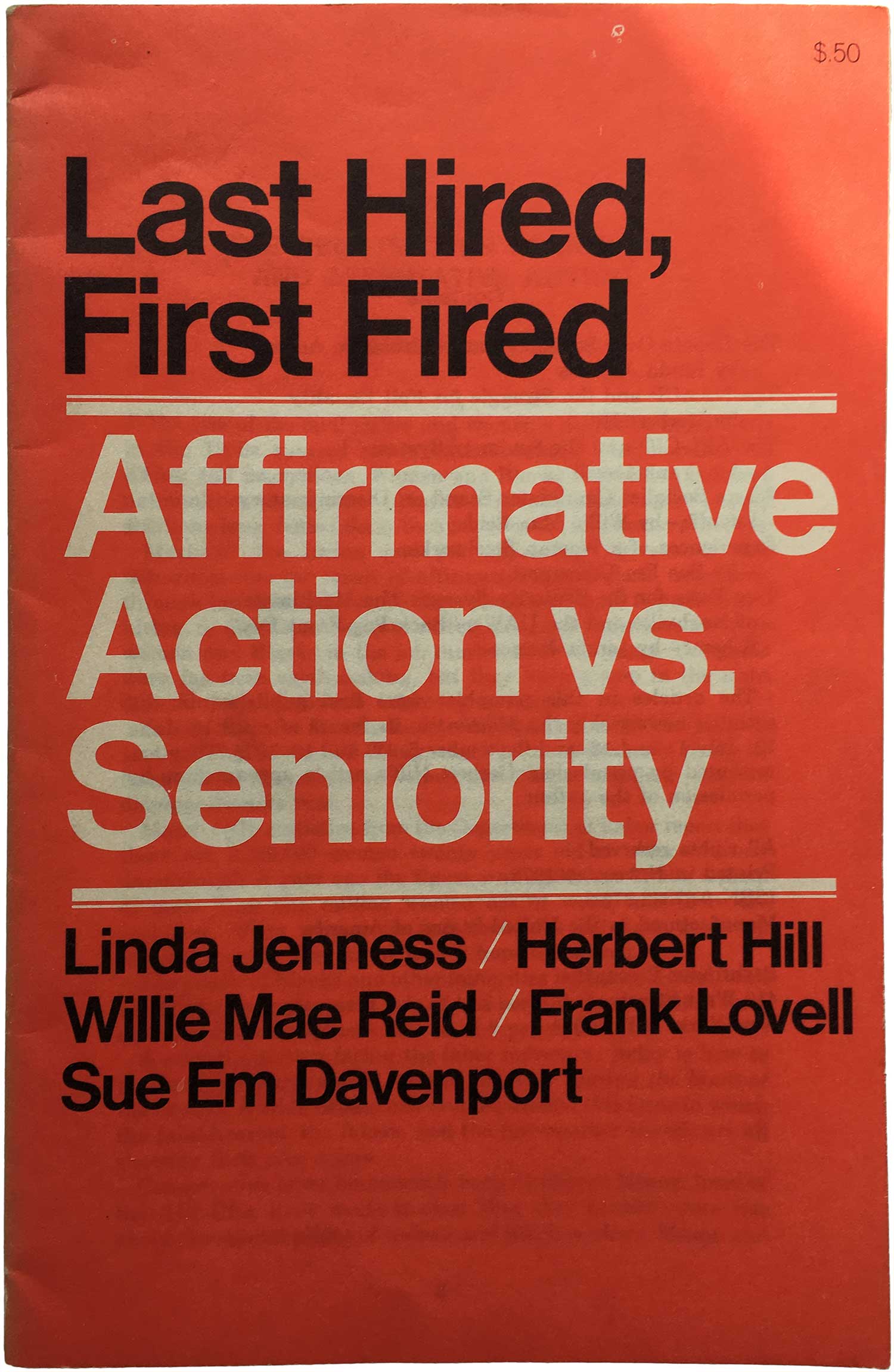
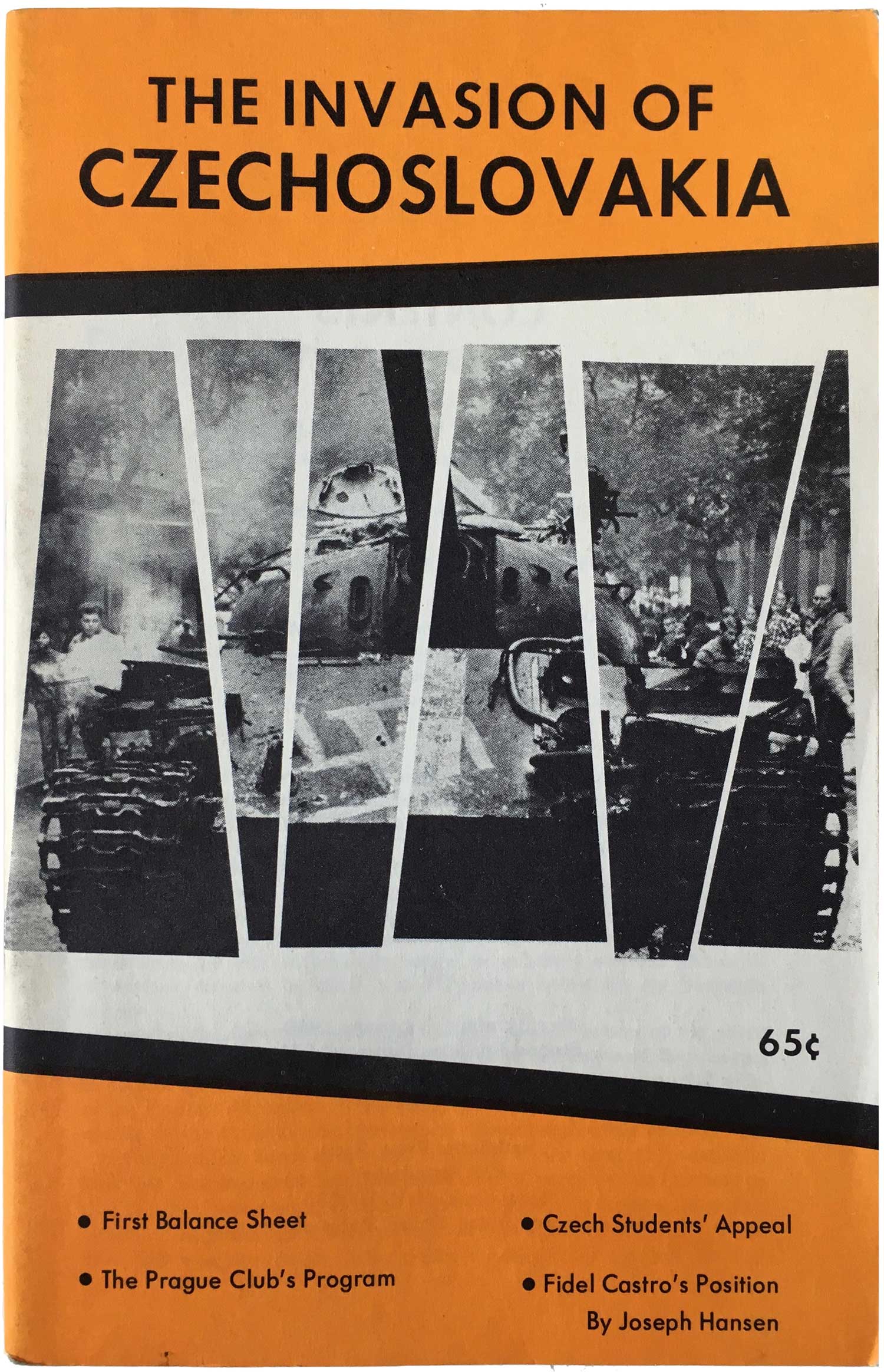
Starting below you’ll find a wide selection of what is the dominant design, mentioned above—colored text in one of a small handful of fonts, black and white photo, black background. I wonder what led to the decision to lean so heavily on black, its interesting because they almost inadvertently stand out from most political pamphlets of the time, which tend to be covered with white, light, or bright colors. The black really holds them together as a set, even if it it doesn’t quite make them attractive enough to want to read. All of the pamphlets are printed on the same medium weight newsprint, most likely on a web (or newspaper) press. This means that they were printed in huge volume, minimum of 10,000 copies per print run, and many of these are listed as the 3rd or 4th printing, sometimes on a 2nd or 3rd edition! So we’re looking at hundreds of thousands of copies of these pamphlets being produced. Which maybe speaks to why they are so ubiquitous. But given that volume, I would expect to see even more of them around than I do…
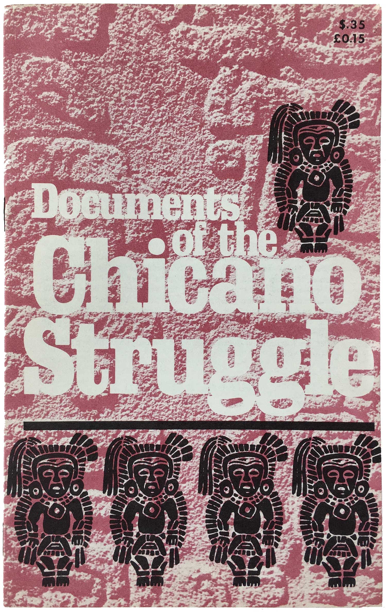

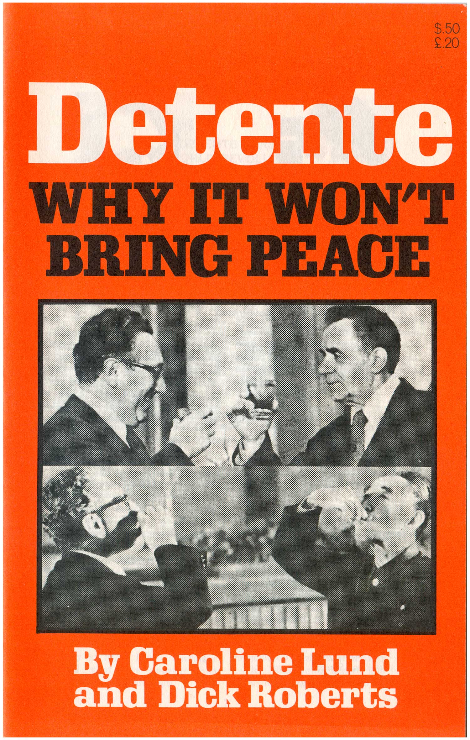
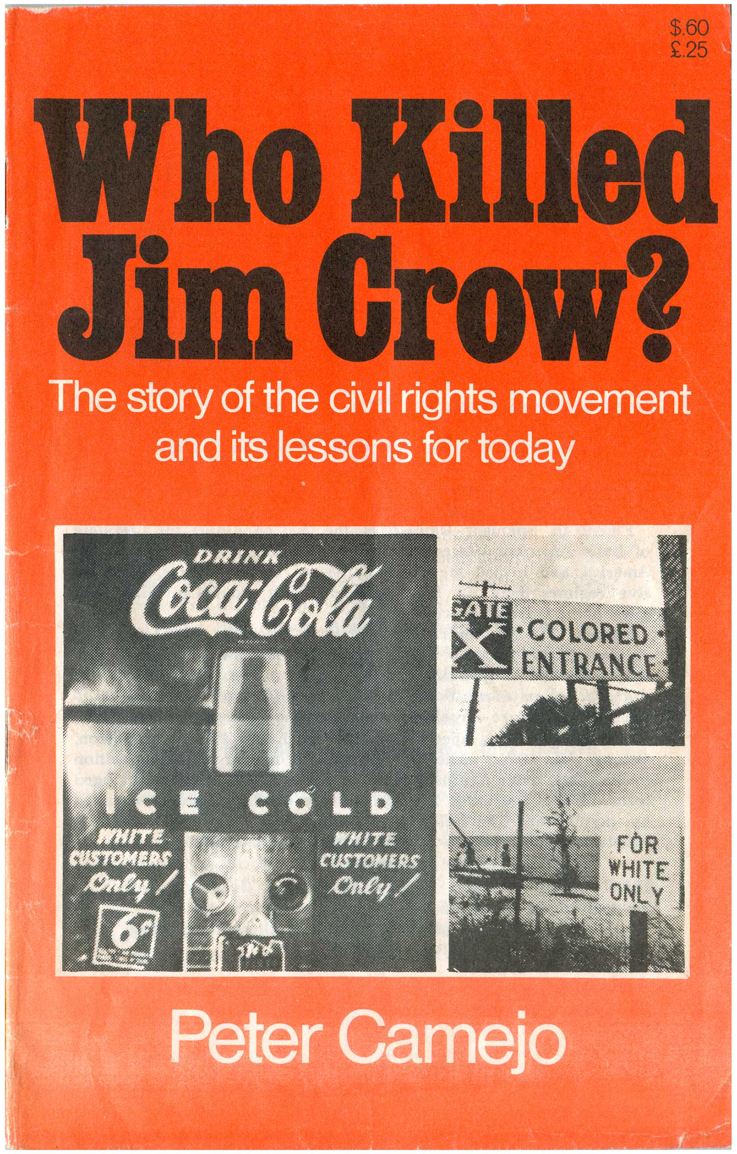
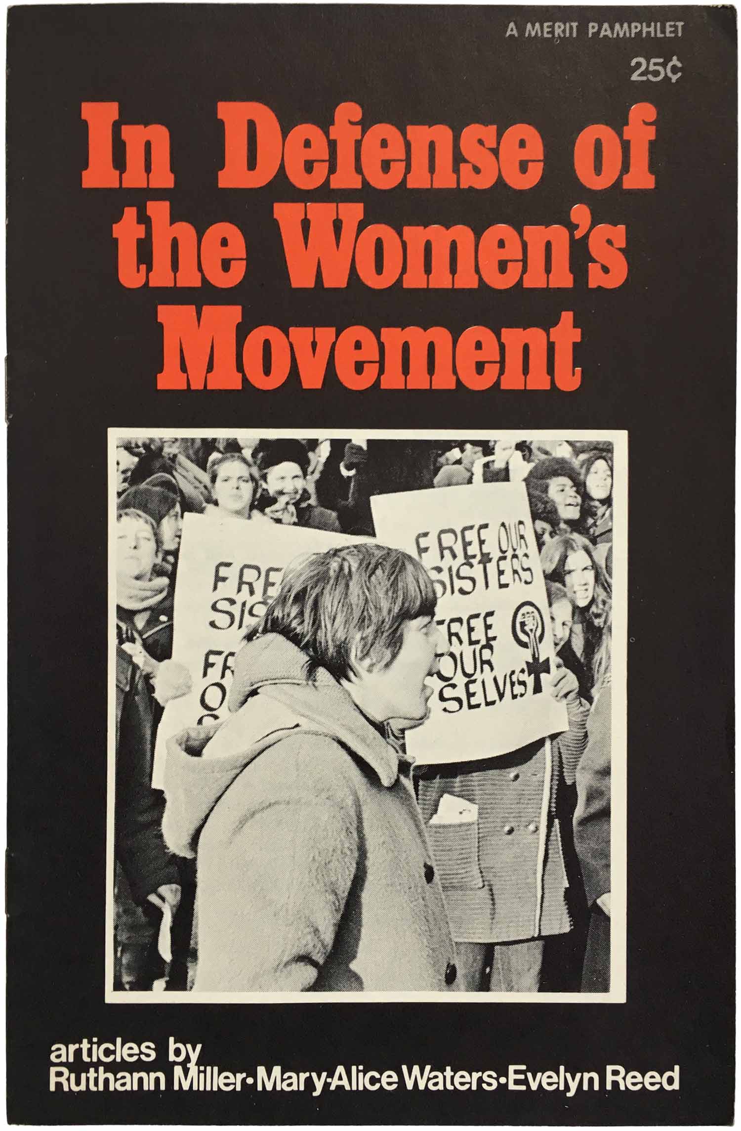
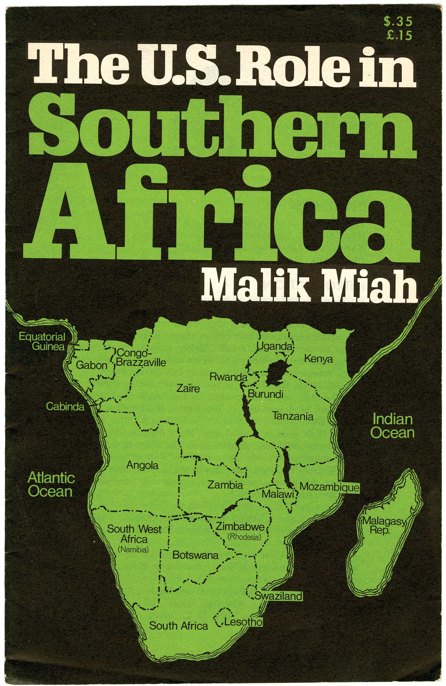
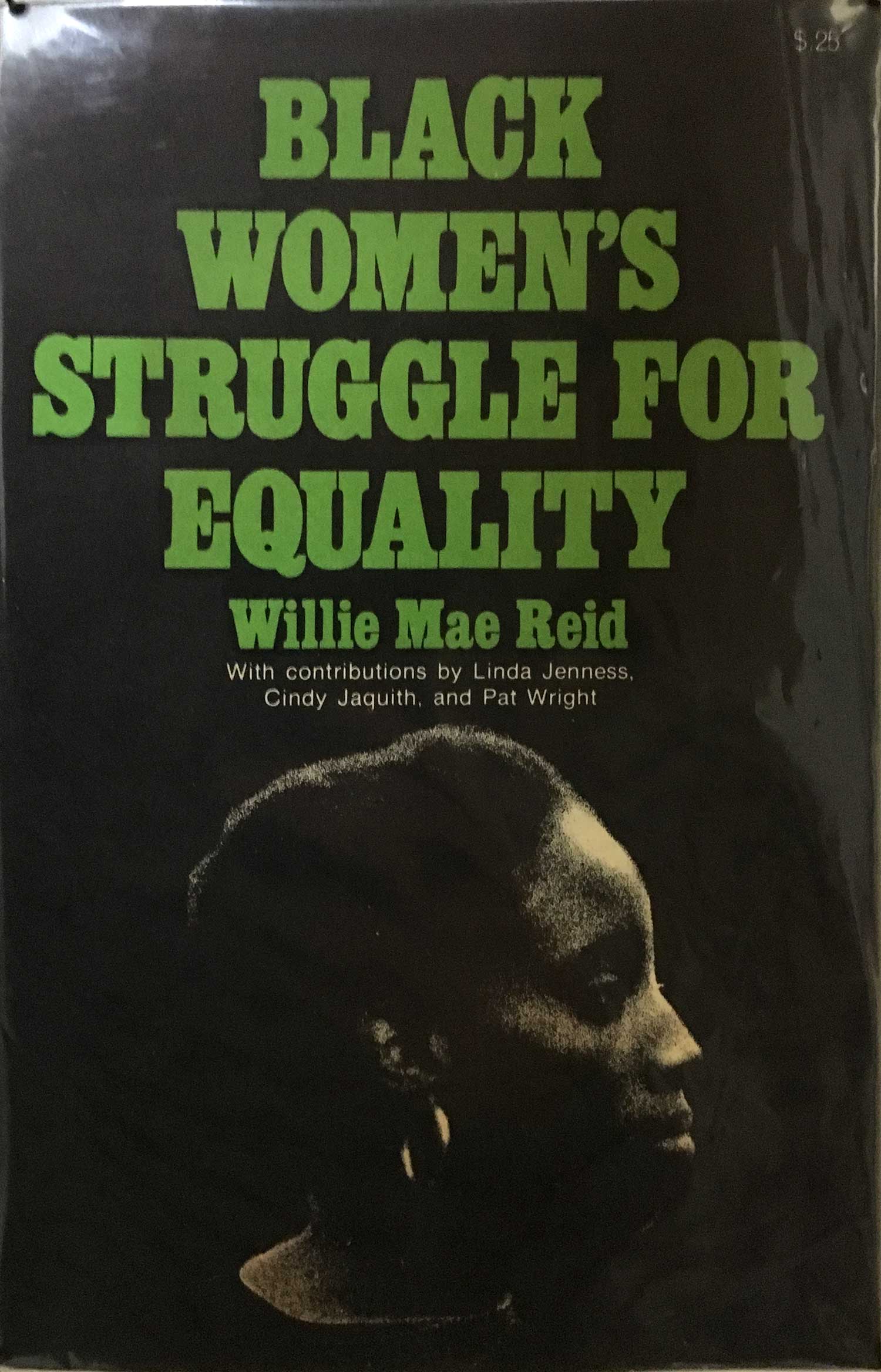
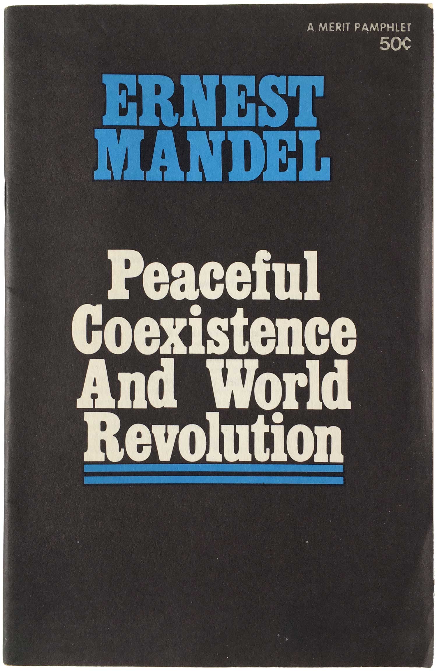
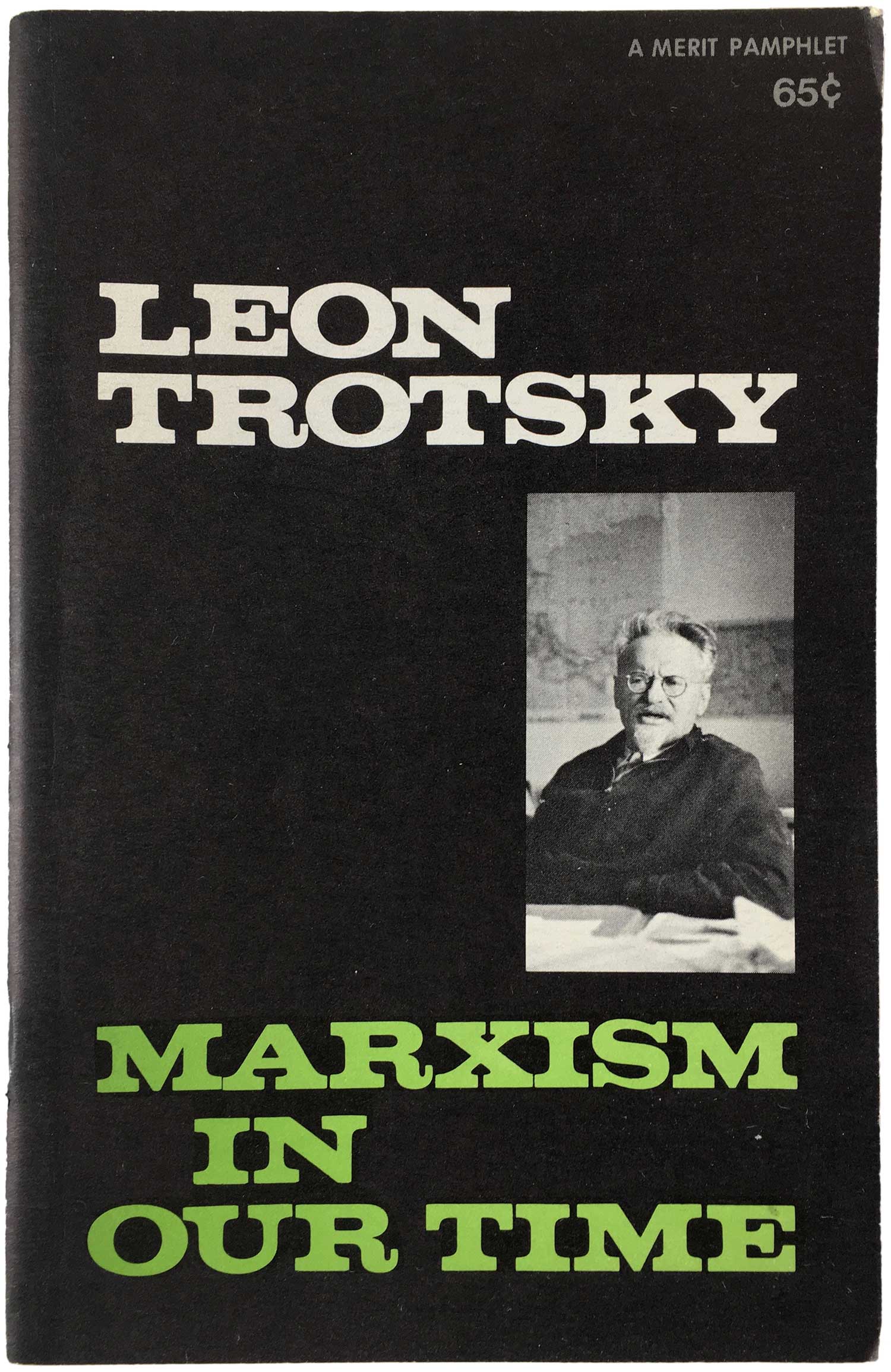
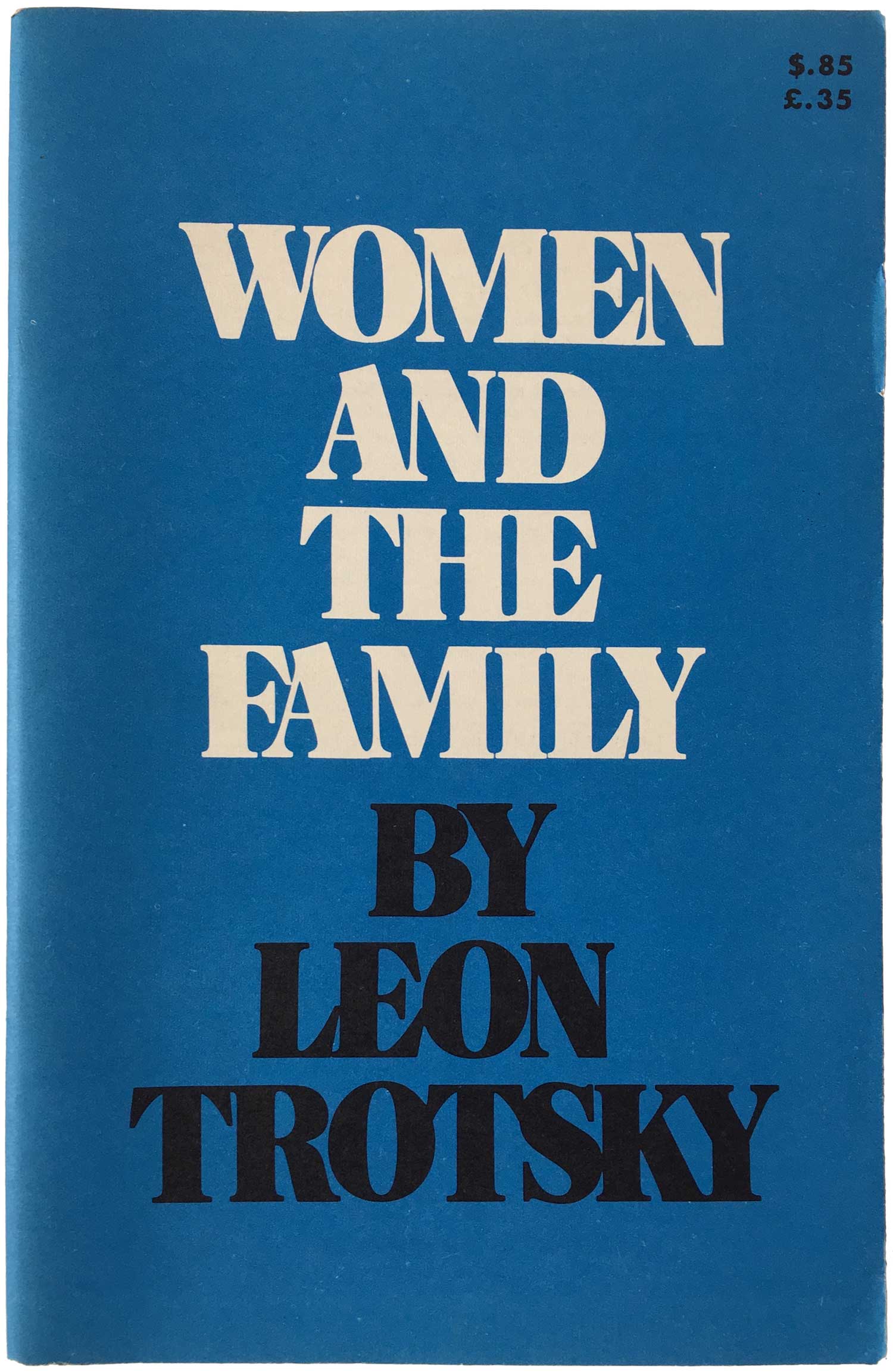
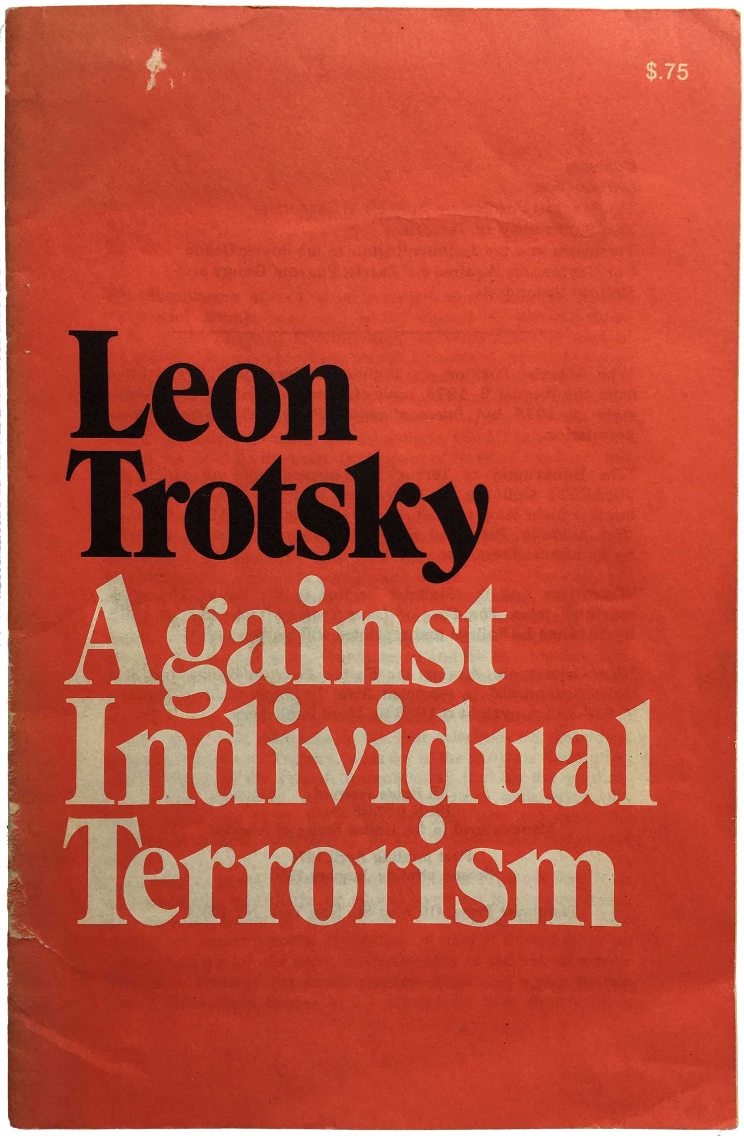
I’m a big fan of Kabal font, and it’s used to good and varied effect on the four pamphlets below:
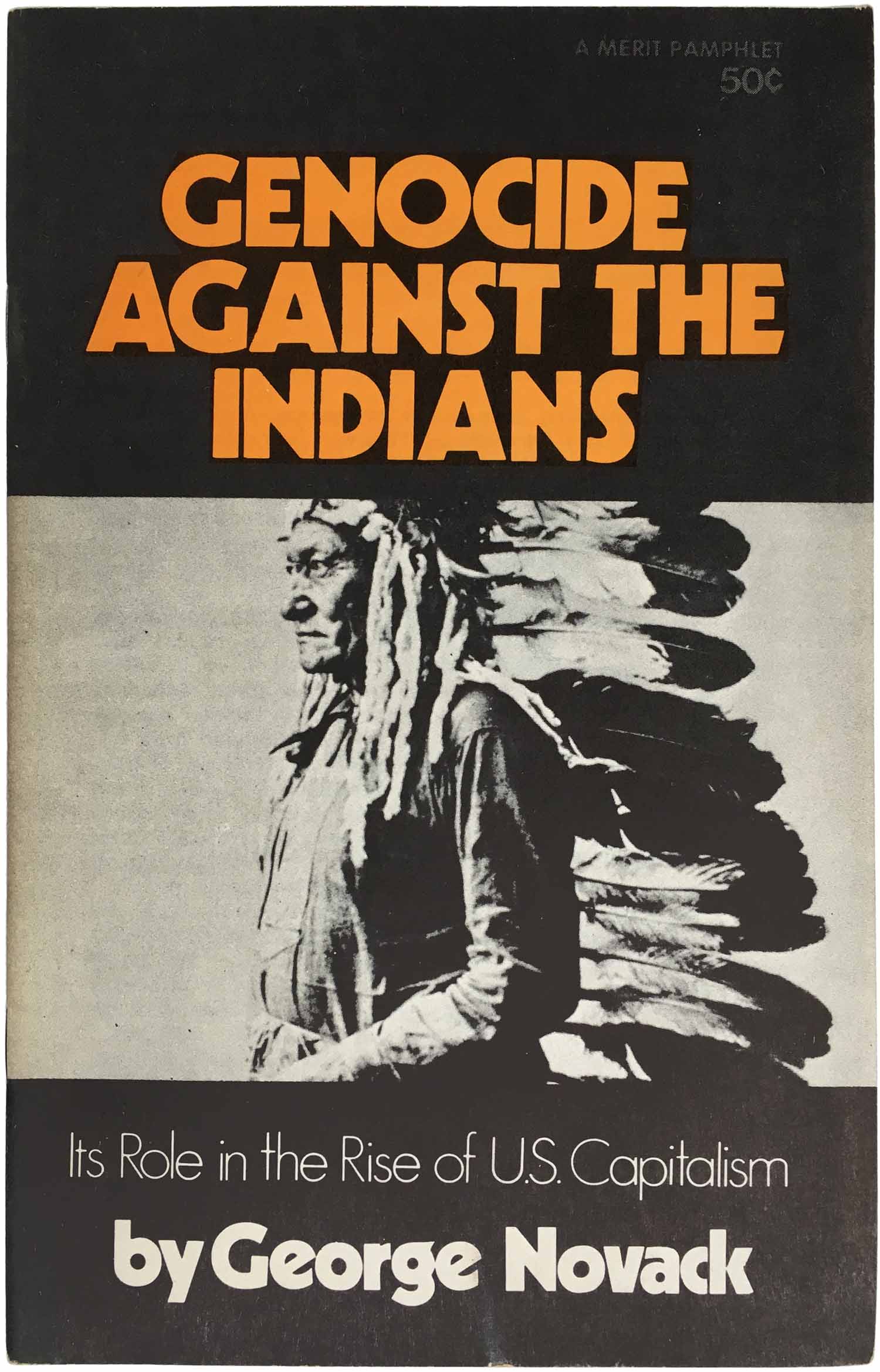
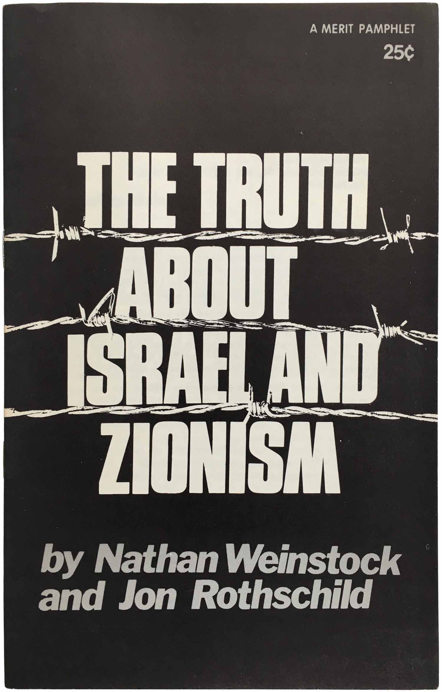
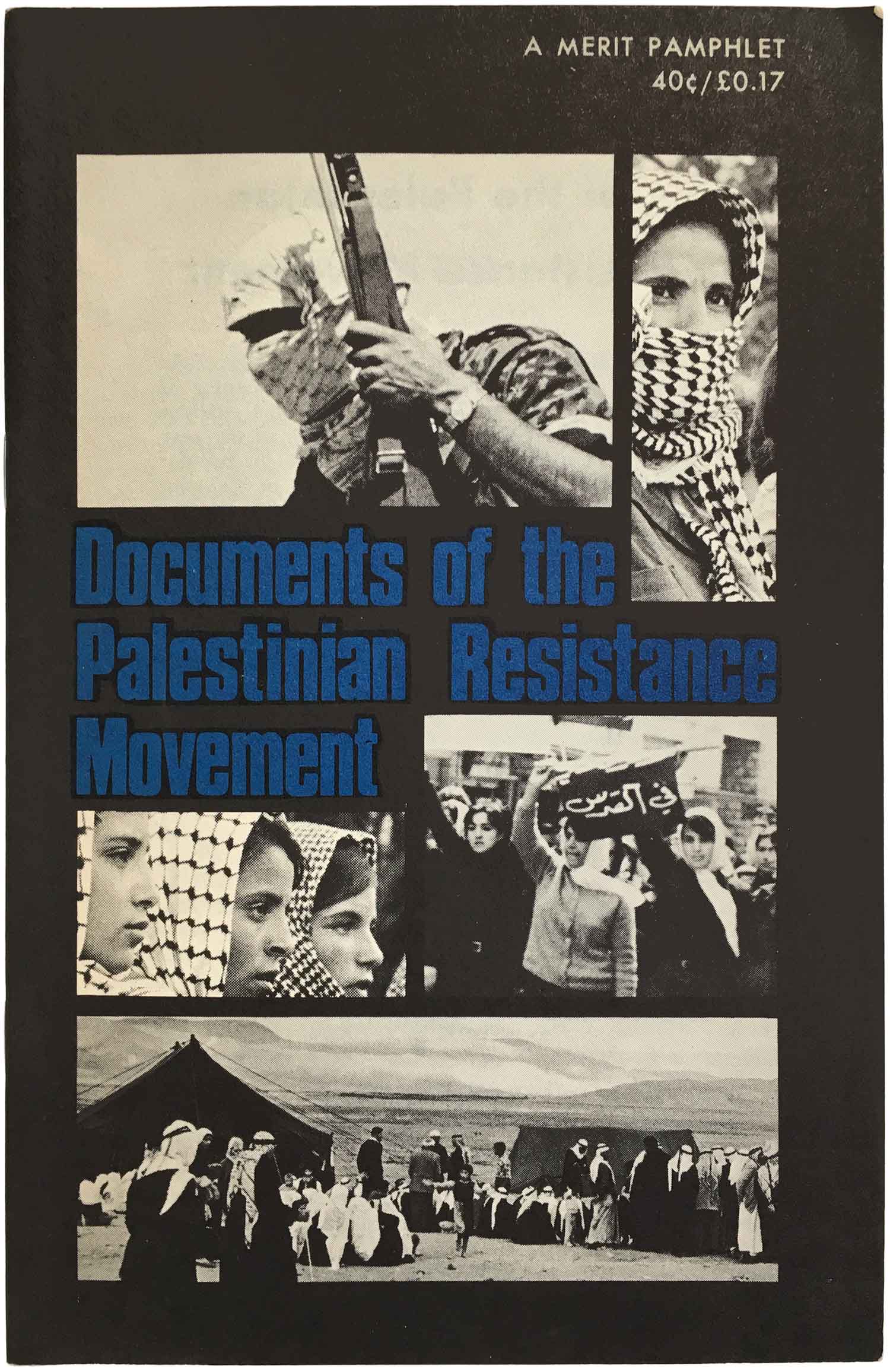
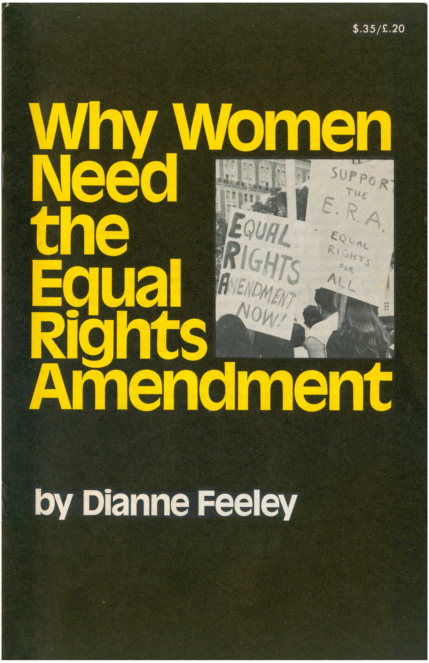
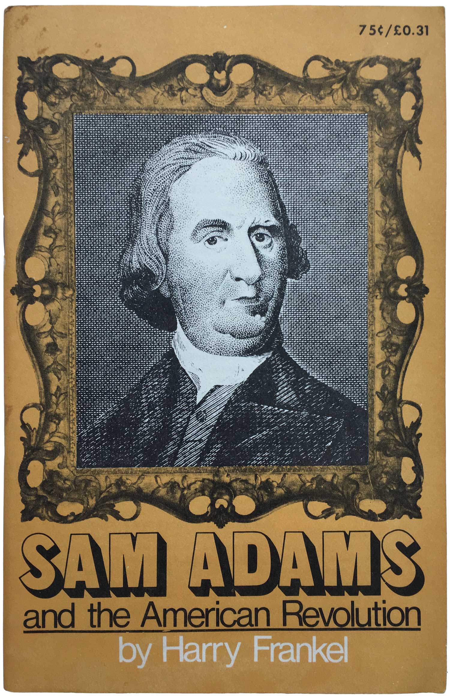
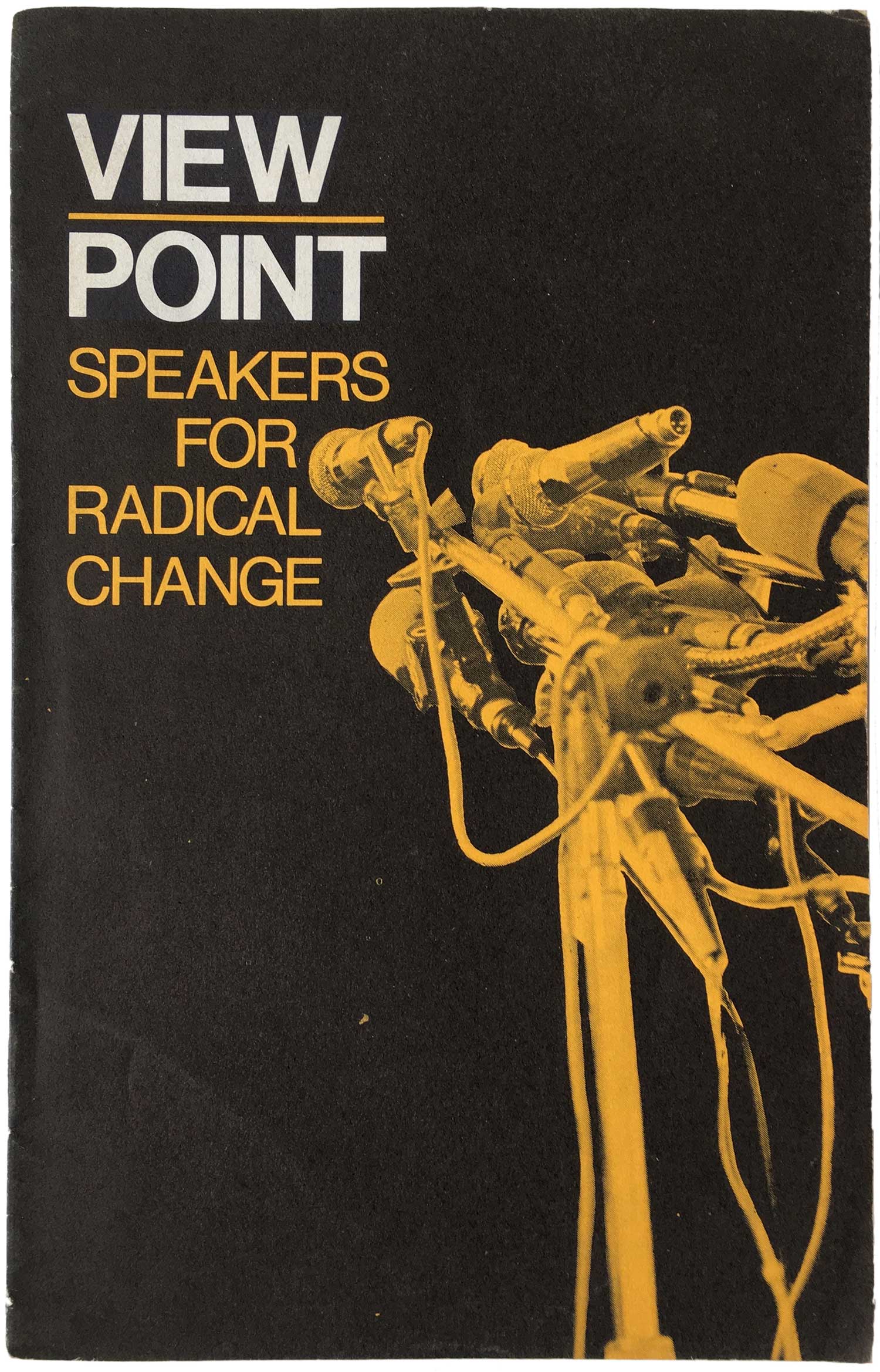
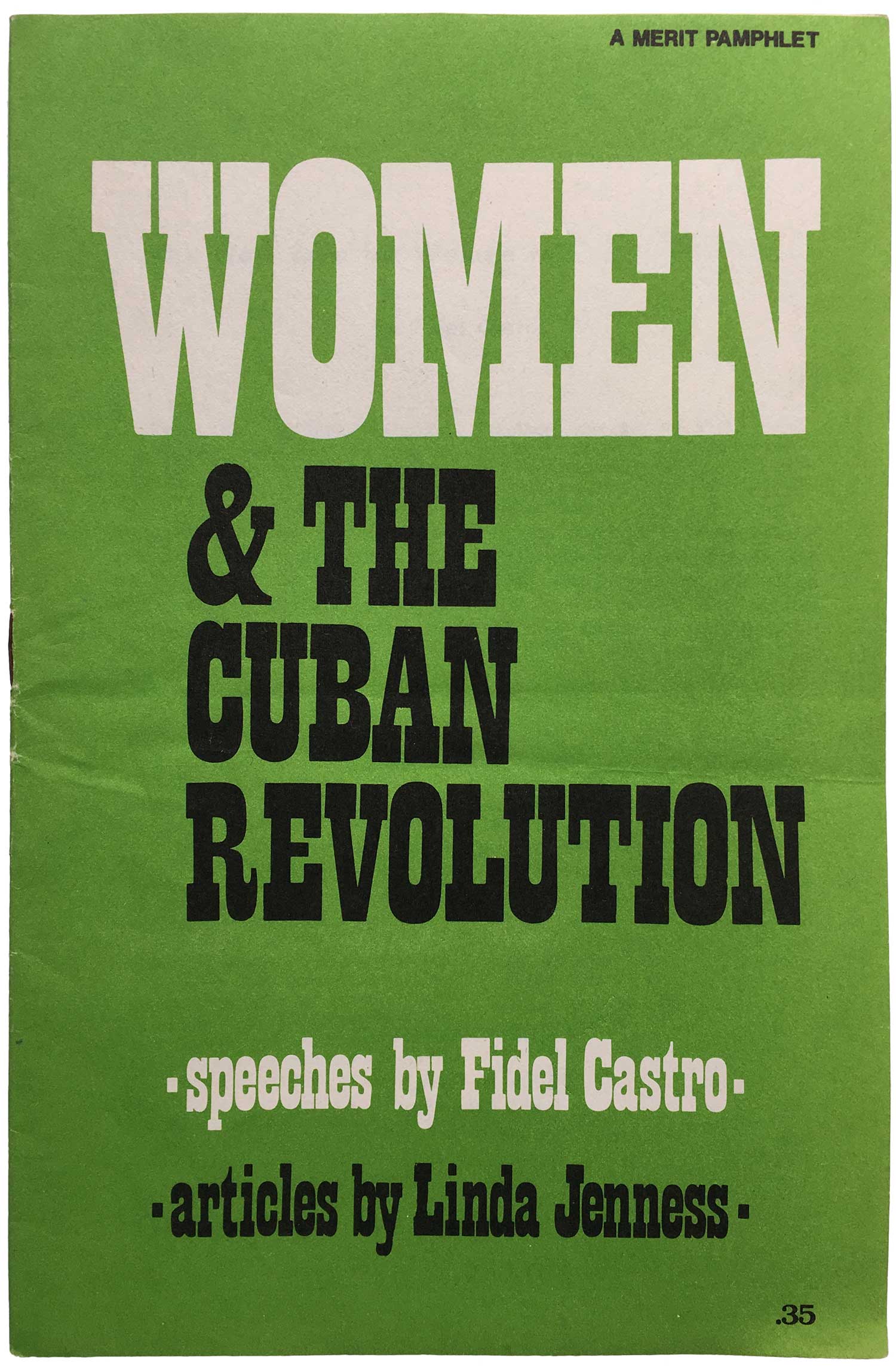
I love the three designs below. First, the Sam Adams piece is so strange and dorky, it looks like a middle-school civics text. The Viewpoint speakers list is just an overall nice design, and given the SWP’s hard-on for Fidel, the pile of mics is a nice nod (likely unintentional) to the great scene in Chris Marker’s Grin Without A Cat where he just moves the dozens of mics in front of him back and forth, back and forth. And finally, there’s something about the use of the Western-flavored cowboy font on Castro’s treatise on Women and the Cuban Revolution that just cracks me up.
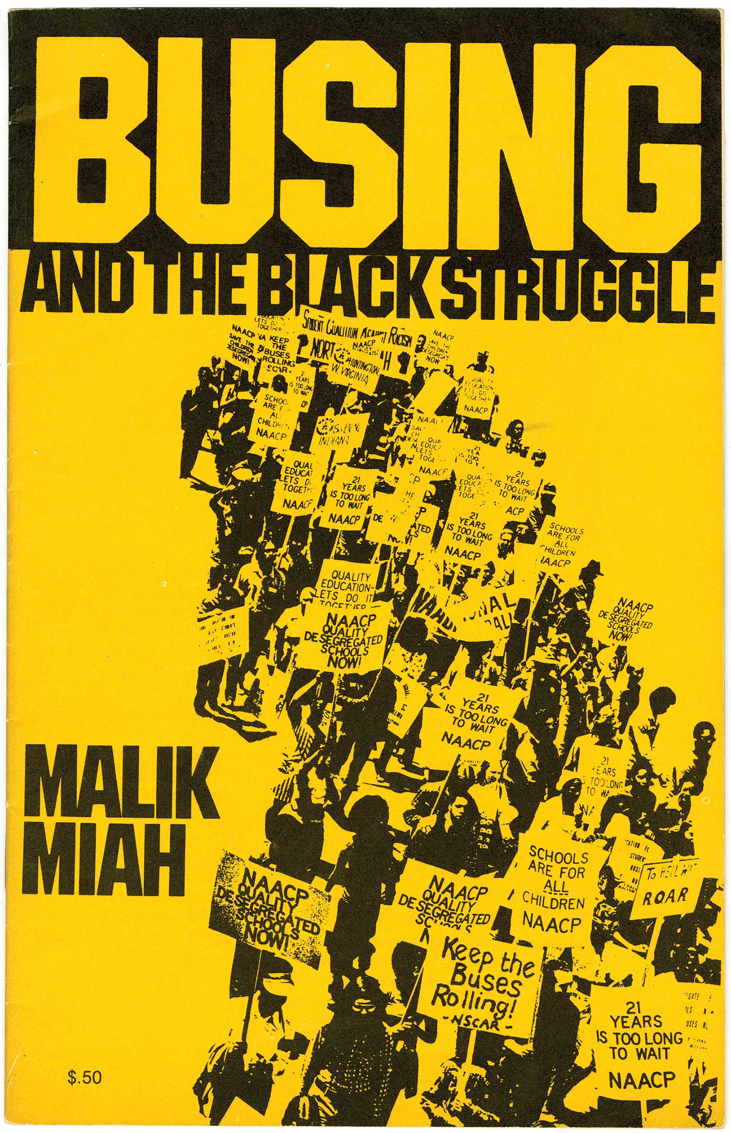
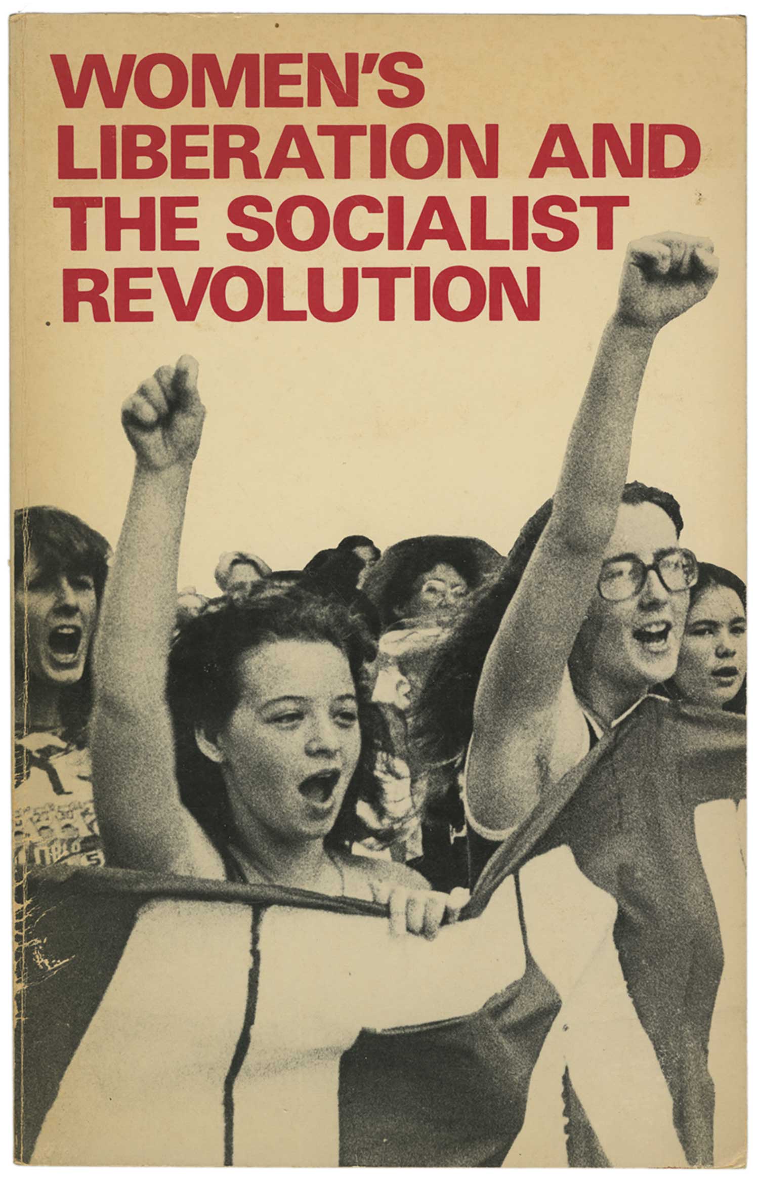
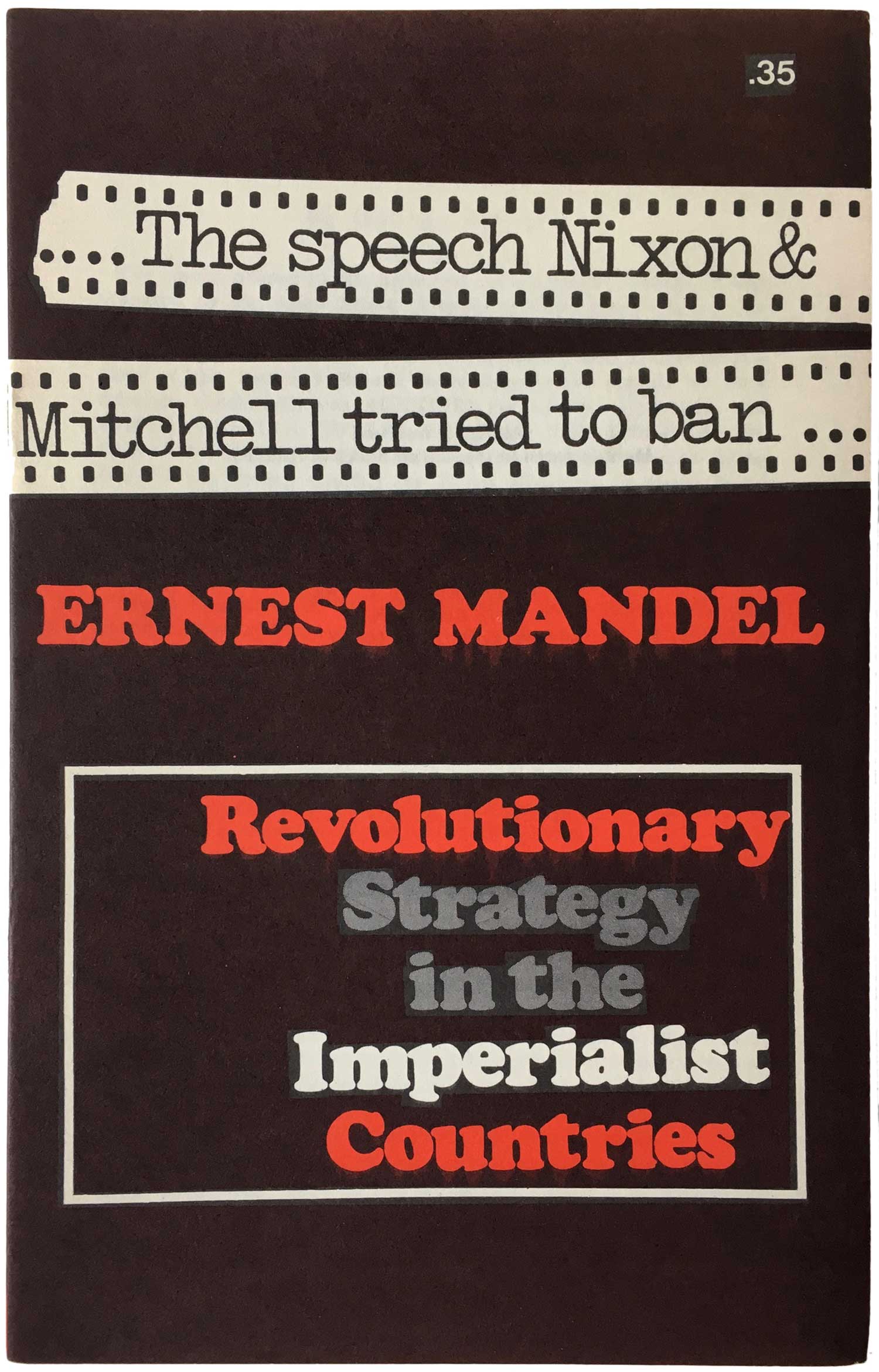
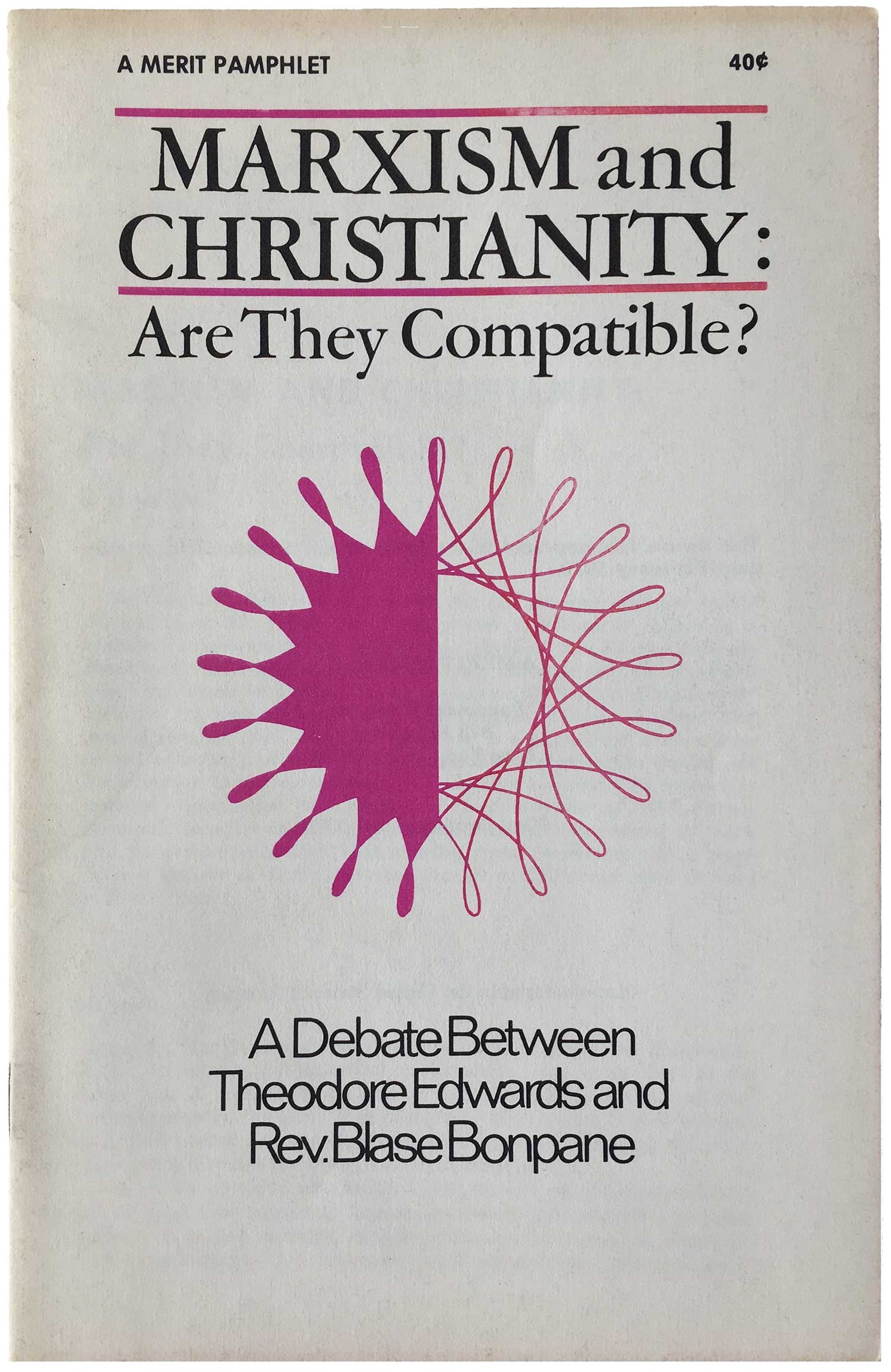
OK, enough yammering. I really don’t have much more to say about these, other than I find it interesting to look at which groups adopt what aesthetics. Back in week 214 I looked at the pamphlets of the UK SWP, so I suppose this is a companion piece. The British designs are much edgier than these, which leads to the idea that the US SWP was much more interested in trying to mainstream their politics. I suspect some of this is a product of the 70s back-to-the-factories faze, when all the commie groups sent cadre to organize in the last gasps of US industrial factory work. All the reds got their hair cut short and made their literature look as mainstream as possible to appeal to working class, meanwhile all the working class youth were smoking dope and listening to Led Zeppelin and Black Sabbath. Oh well.
Bibliography:
