Three of the most significant social realist printmakers working in the US in the second half of the 20th Century were Leonard Baskin, Antonio Frasconi, and Ben Shahn. While all three created prints (and painting, artist books, etc.) within an art world context, each also had a career doing commercial illustration work within the publishing world, and in turn, each racked up quite a collection of book cover credits.
While a huge favorite of many Justseeds members, Baskin (more HERE) is the one I’ve always been the least familiar with. I started noticing his work on book covers a couple years ago with this striking cover for Ortega y Gasset’s The Dehumanization of Art (1956). A basic drawing of a column sits in a black field, squeezed between two white stripes. The lone column aches of alienation, yet the human hand visible in the drawing’s details belay the “dehumanization” of the title. This tension gives the design a level of strength unexpected for its simplicity. This is one of almost two dozen covers Baskin designed for Doubleday Anchor mass markets in the 1950s and early 60s. I’ve tracked down the twenty-two presented here, but I suspect there are more (if you happen to have one, send me a photo and bibliographic information!).
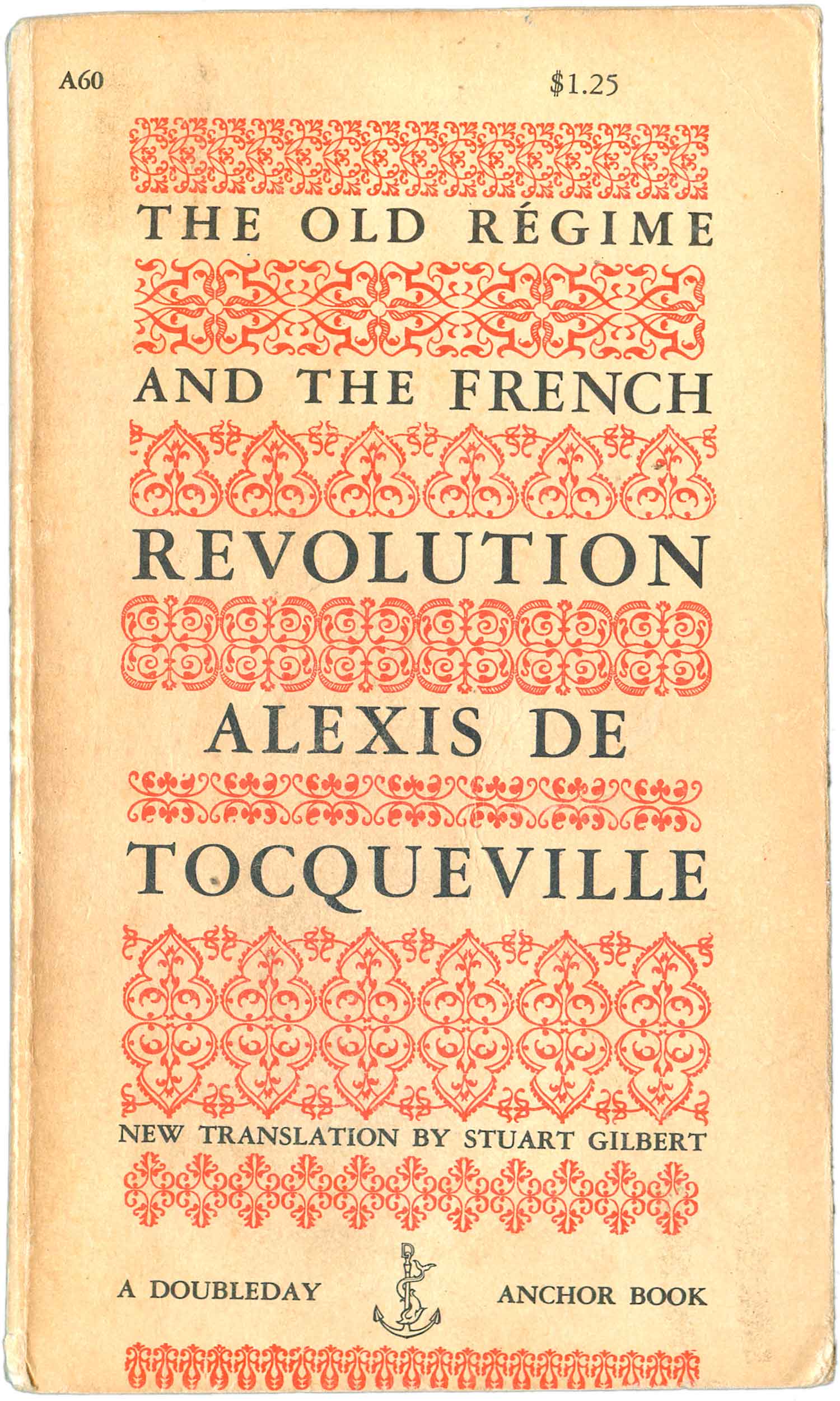
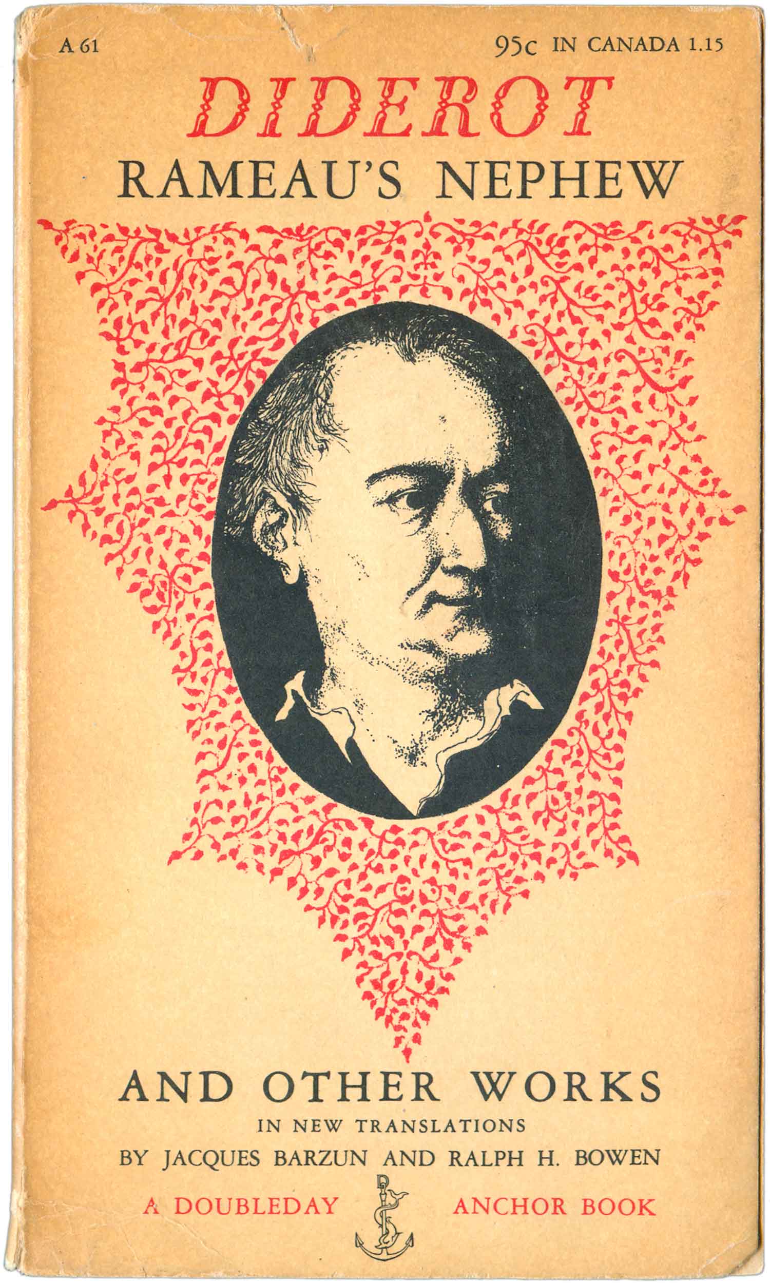
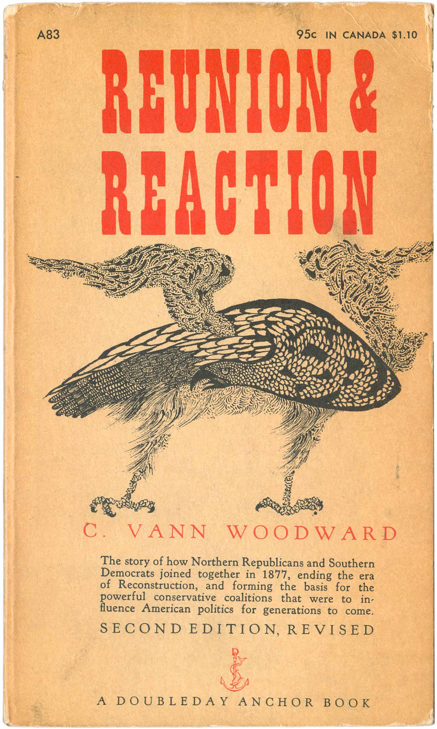
For the DeTocqueville and De Rougemont, the red wood type ornamentation and floral patterning are central features, rather than Baskin’s actual print work. For the two covers below those, the wood type and patterns are mixed with his prints as illustrative elements. The portrait of Diderot is fine, a little dark and macabre, but it is the diamond of red leaves that pulls the cover together. While the eagle on Reunion and Reaction is an awesomely patterned and detailed image, it is poorly used, being stuffed between the blocks of text above and below. I want to see the image bigger, commanding the page.

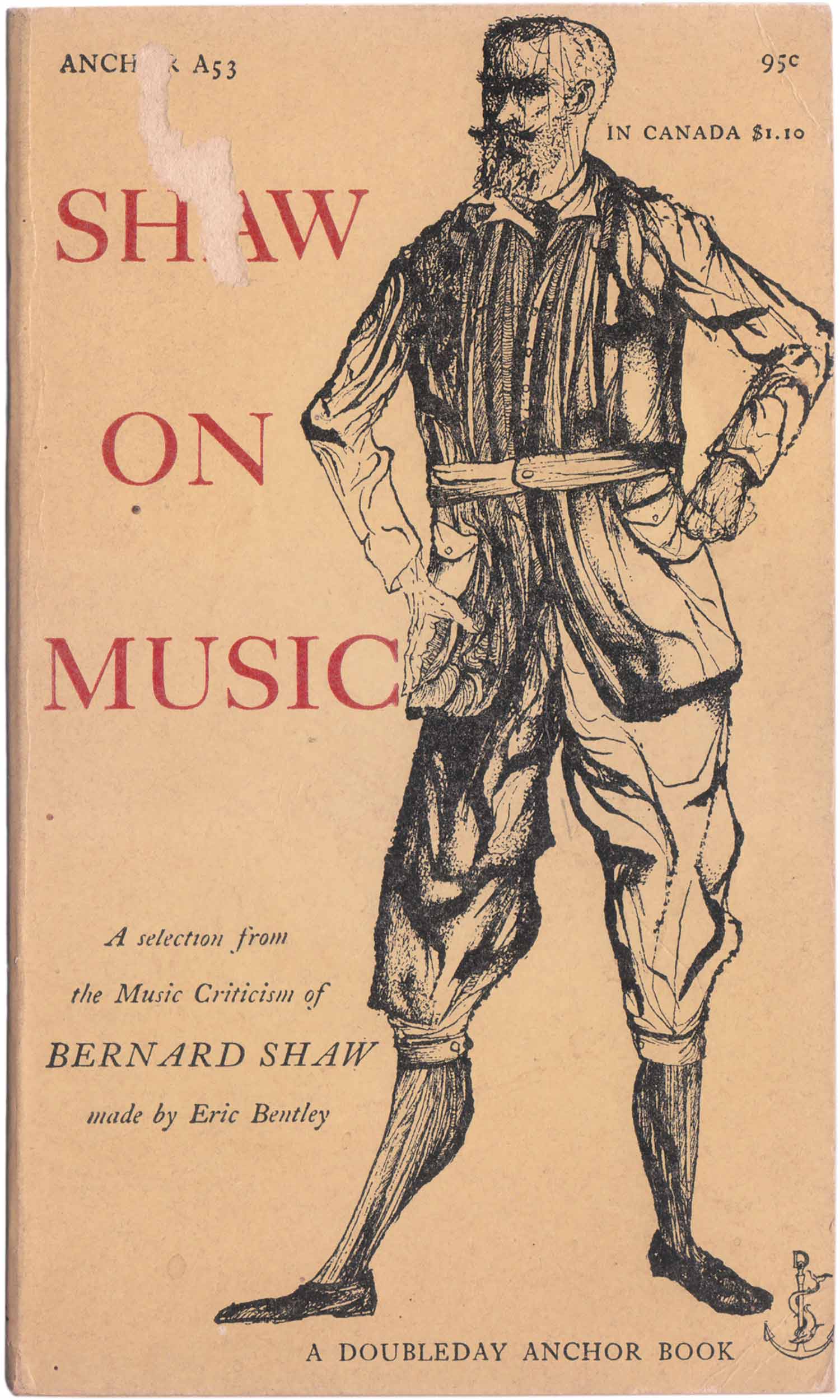
In comparison, the lifesize illustration of George Bernard Shaw on the cover of Shaw on Music is much more Baskin-esque, and aligns far closer to Baskin’s fine art than any of the above covers. The inset illustration on The Classic Theatre is also much more like his non-commercial print work. This is generally so on most of the covers in the below set. The imagery is strong, and suffers for being a subservient design element in a number of places, particularly with the clown/fool figure on the Fergusson cover and the awkward text placement covering the tree on the cover of Richard Chase’s The American Novel and Its Tradition. That said, overall it is a nice design. It’s interesting in the context of all these Anchor books because while it is still subdued, it uses so much more color, including the comparably bold magenta of the title and logo.




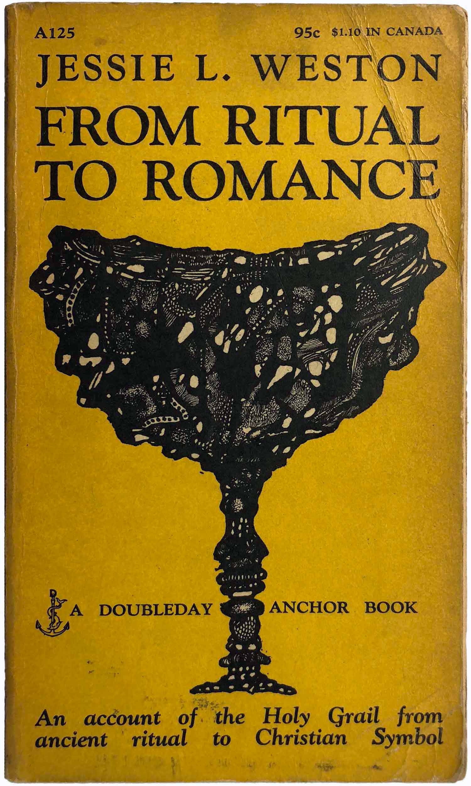
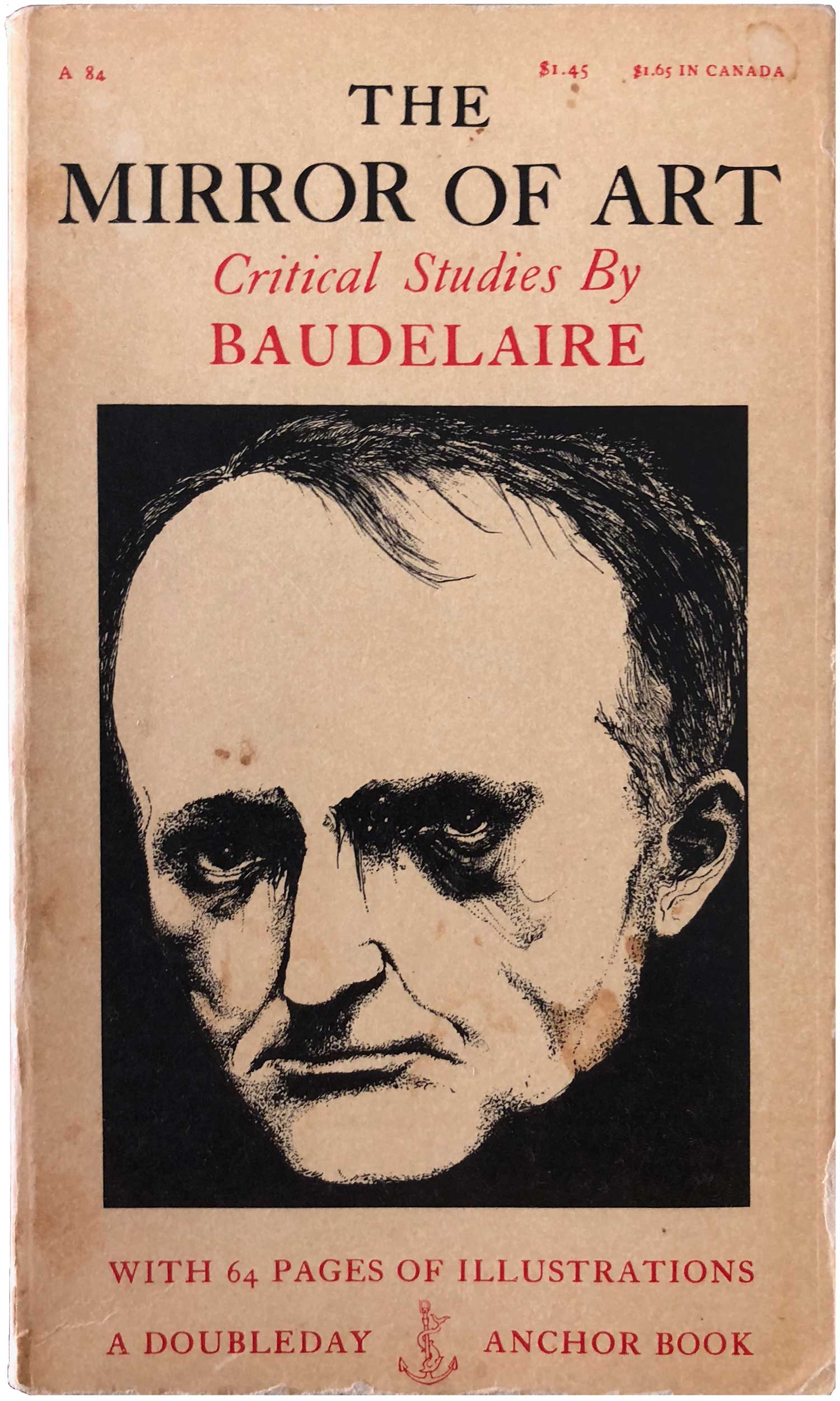
Portraiture is a strength of Baskin’s, and is used to good end on the next set of covers. Baudelaire is appropriately creepy, and Dickinson enigmatic. And then we’ve got a couple triple portraits, which is an interesting motif to work with multiple times. The Barzun cover illustration is quite exacting, and similar stylistically to some of the other portraits (Baudelaire, Voltaire), but then the Leff illustration is much looser, and gives the book a more open, less precise feel.



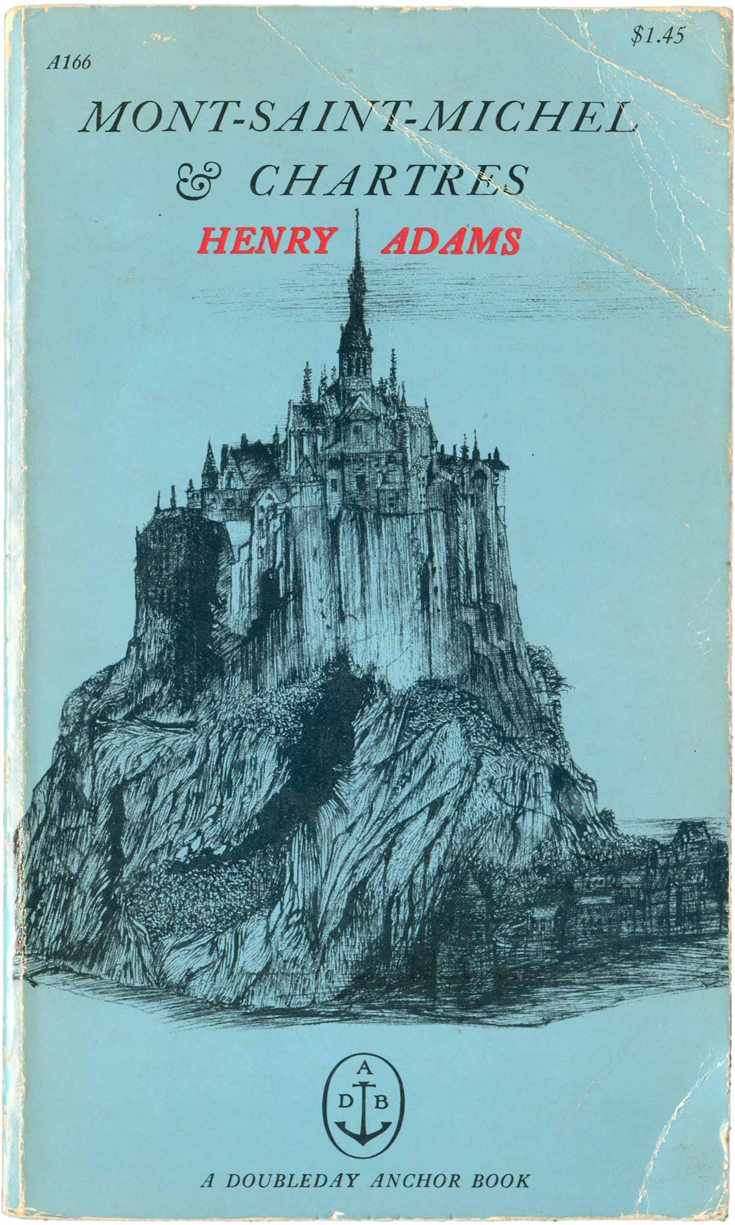
The cover of Henry Adam’s Mont-Saint-Michel & Chartres is a rarity here, a heavily detailed illustration which doesn’t feature the human figure or form. I assume the illustration was done for the book, as it is dead on for the island castle in Normandy. It’s difficult to say much about many of these covers, as they are either completely direct, the subject of the book duly depicted on the face, or almost entirely abstract patterning. The Jung cover is another anomaly, a beautiful, detailed icon generated in black with the three primary colors pushing and pulling in the background. This is likely my favorite of the whole set this week.

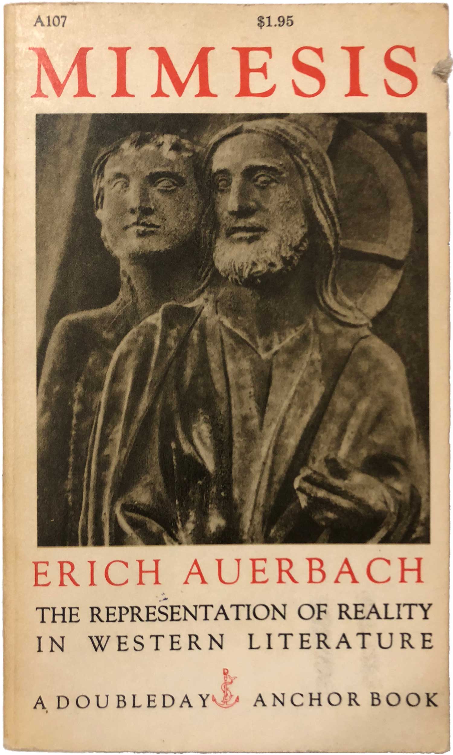
Baskin’s hand completely recedes in a series of covers with photo-based designs. Given that Edward Gorey did the typography on most of these, it’s actually difficult to tell what role Baskin even played as the “designer.” On some of the editions on Roman Imperial Civilisation the classical statuary on is printed so light as to be almost invisible, as if the past is fading away with the cover. The Fry cover is feels downright un-Baskin-like, just a simple striped layout with no human hand. It’s from 1956, and might be one of his earliest covers. Almost all of these Anchor covers use extremely classical fonts for the titling, either variations of Garamond or Times New Roman, so the Fry cover stands out for that as well, with its slab serif and gothic fonts. The final book in this set of Doubleday Anchor editions is a strange design for a book of Milton’s poetry. It’s not strange in and of itself, but in the set, as it’s nothing like any of these other Baskin covers.




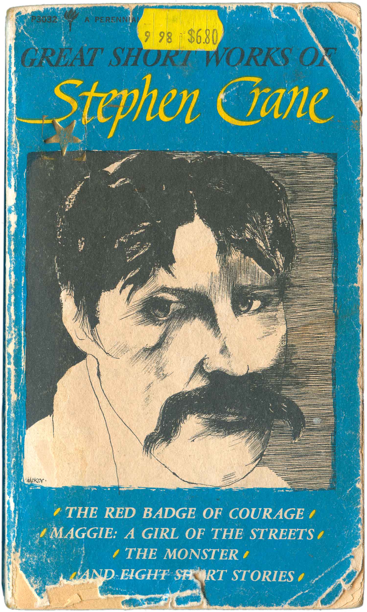
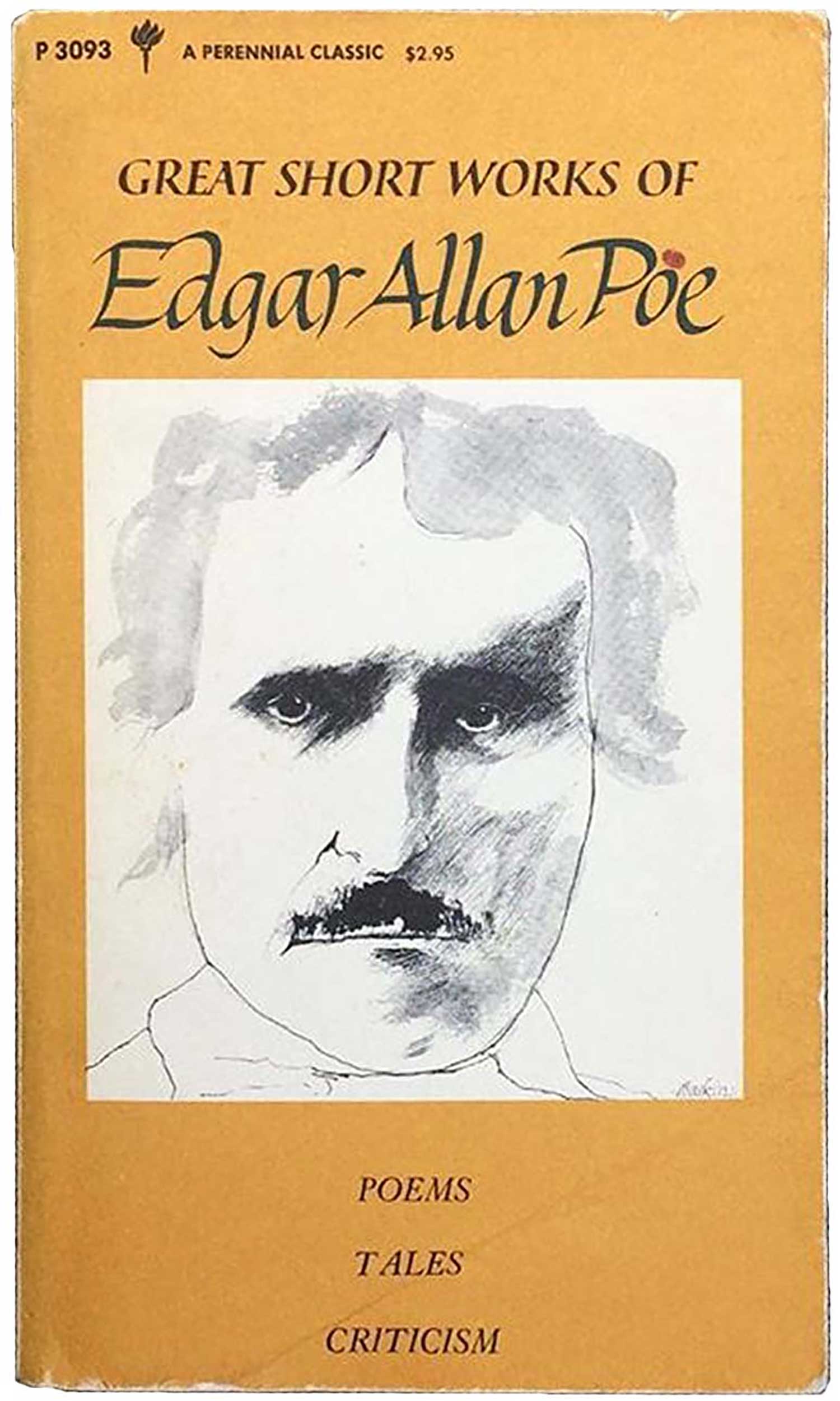
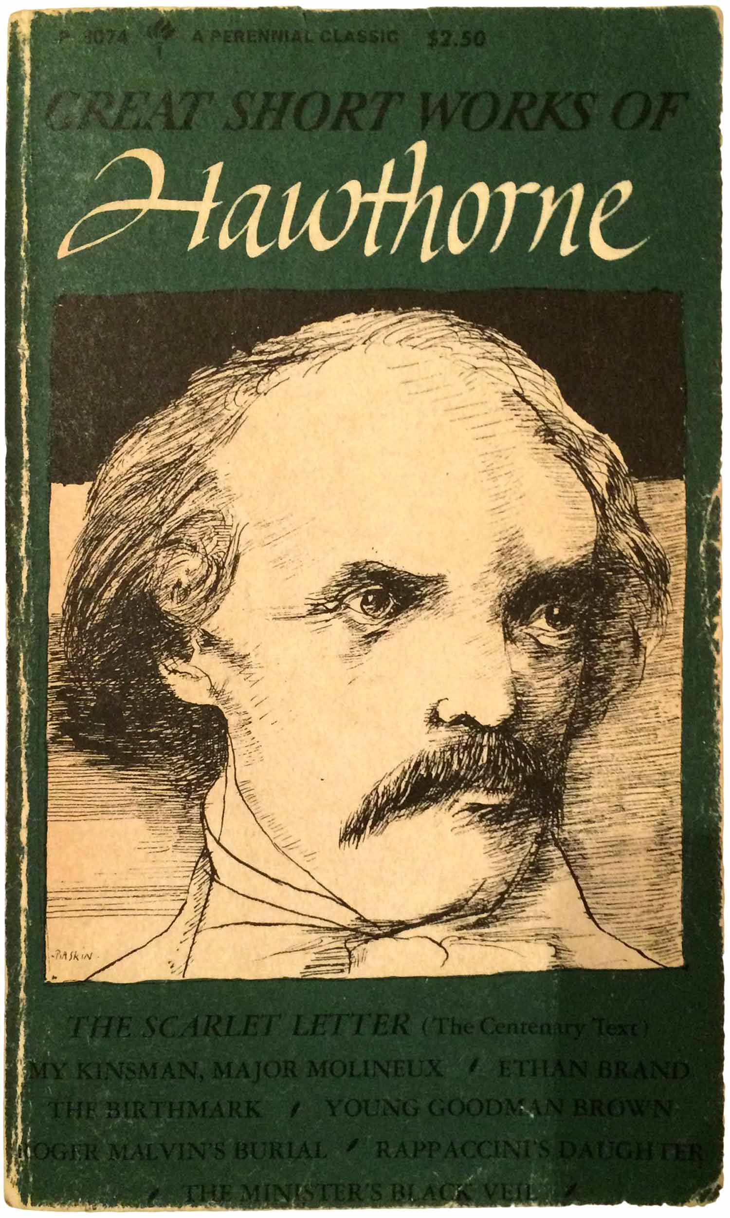
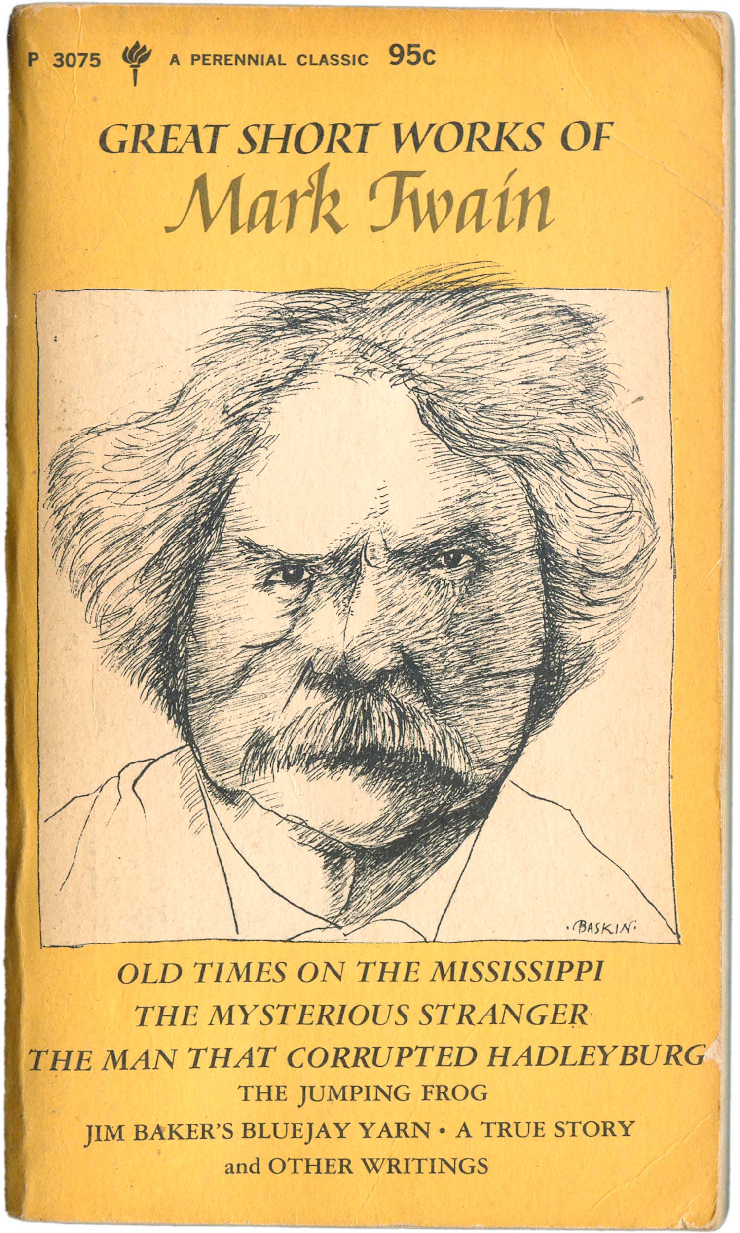
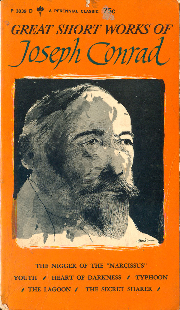
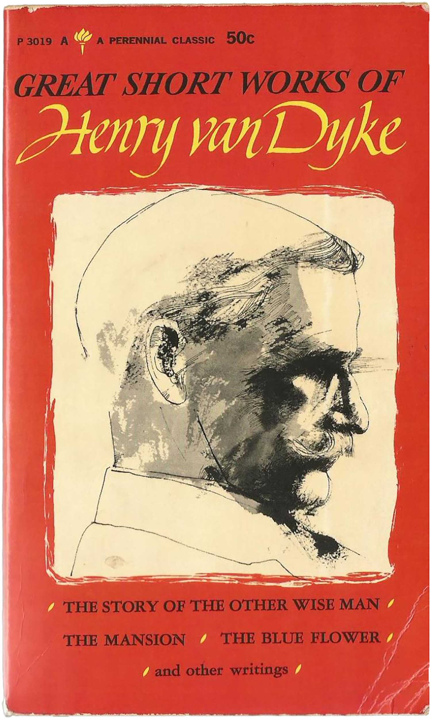
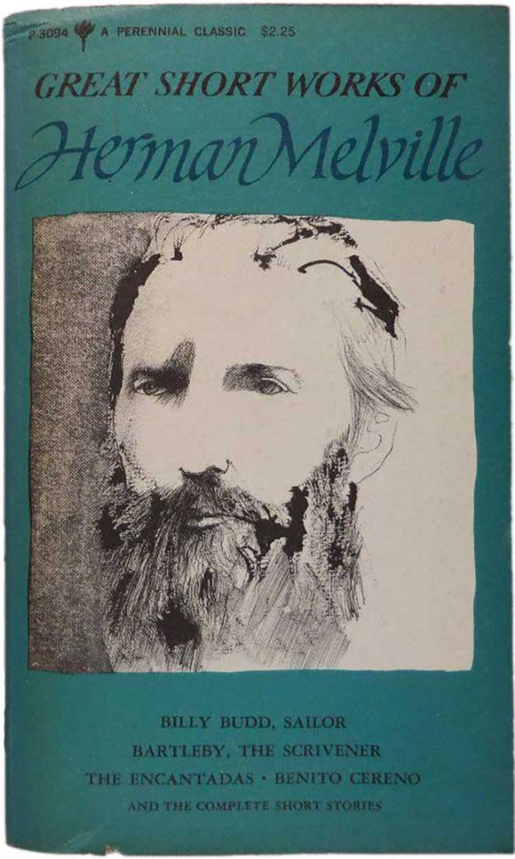
The second half of Leonard Baskin’s book cover output can be split into two distinct bodies of work. First, a series of author portraits he created for the Perennial Classics’ Great Short Works series. Each of the eleven that I’ve found have the same basic design—varying solid color backgrounds with an inset portrait by Baskin, capped with the authors name in a script font. While all the illustrations feature recognizable Baskin aesthetics, they also are broad in their styles, from the almost editorial cartoon-ish Mark Twain to the very serious Henry James and Henry Van Dyke. My favorites are the ones with a little quirk, but that aren’t strait comic, like Stephen Crane and Dostoevsky. The dates on these range from the mid to late 1960s, and seem to have mostly been done after the Doubleday Anchor work above. As an aside, it’s shockingly noticeable that all these books are by male authors, and that outside of the Emily Dickinson portrait above, all the portraits Baskin did on all the covers here are of men. That’s not Baskin’s fault, but says so much about the publishing industry until recently, and arguably still today.




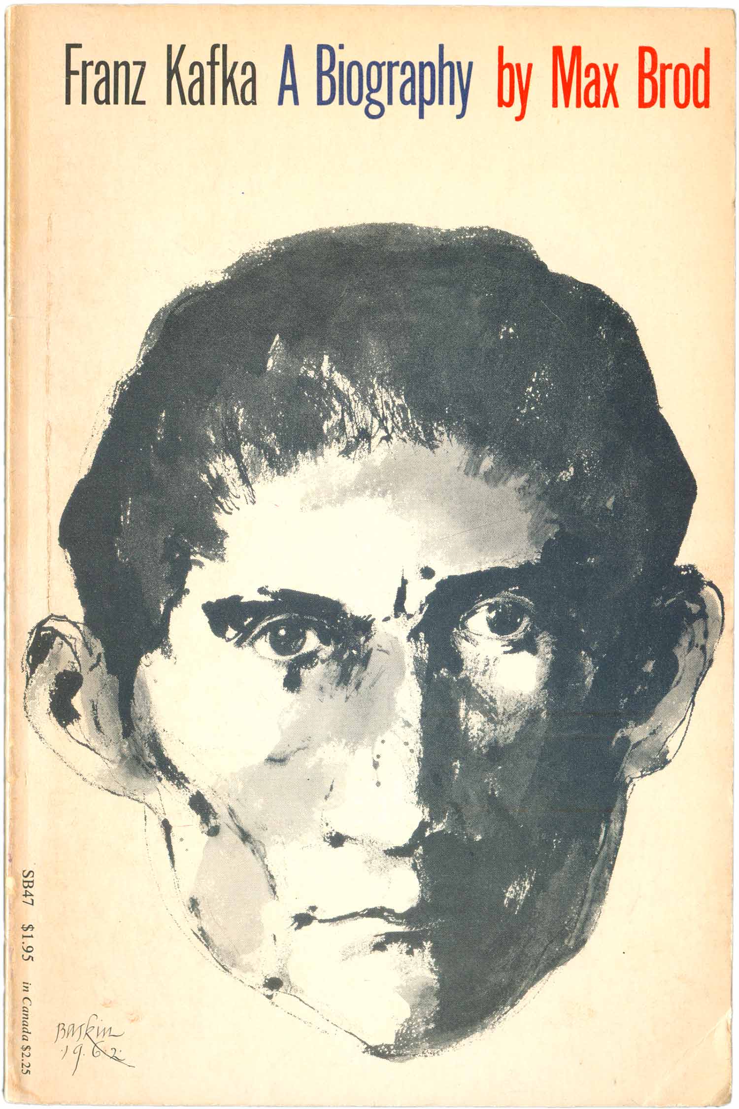
Second is a small collection of work he created with others publishers. I’ve found a single Vintage paperback, a couple Schocken covers, and a more recent book published by Ecco Press that Baskin did a series of internal illustrations. The Vintage cover is for a collection of Joseph Conrad stories, and the image is one of the most printer-ly of any here. The bald head is certainly not Conrad’s, more likely Kurtz from Heart of Darkness. But it’s open to interpretation, with my main impression being that the head is flattened like the flowers, as if both were crammed into a scrapbook. I suspect this is a reworking of a pre-existing Baskin print, but I’m not familiar enough with his work to immediately recognize it. The two covers he did for Schocken books are both great. Martin Buber’s Tales of the Hasidim (Schocken, 1980) is one of my favorites of the lot. Baskin’s alternately scratchy and splashy illustrative style works perfectly here, capturing a deep sense of ferver in the face. The decision to print the image black over a solid reddish orange background was smart, giving a sense of full saturation and power. The title stamped out in small white letters is clean and handsome, and does nothing to detract from the compelling portrait. The portrait of Kafka on Max Brod’s biography is also exceptional. The picture feels like it is a biography in and of itself, with the tight face, cropped hair, sense that the face is simultaneously both inward and outward looking. The direct stare and filling of the entire visual plain are commanding. The tight, tall Gothic titling at the top conveys what the reader needs to know, but doesn’t get in the way of the image at all.


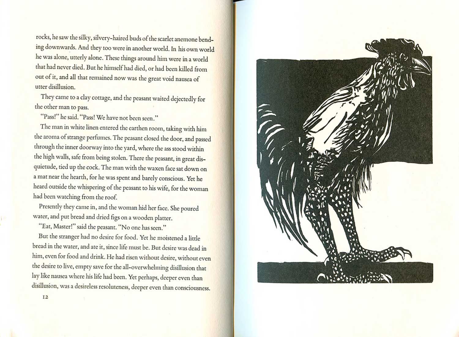
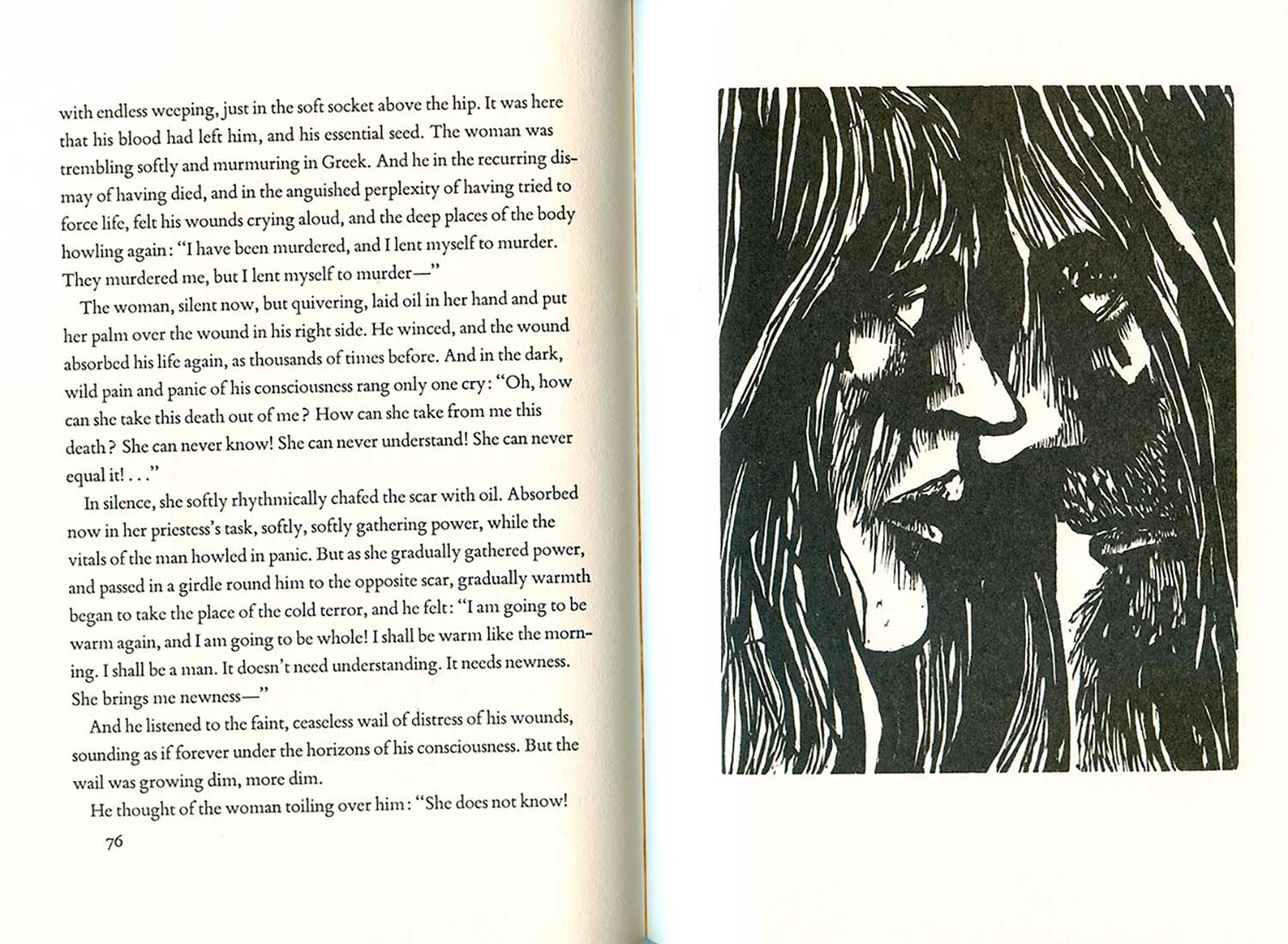
Finally, Baskin did a lot of book arts and internal illustration work. Most of his artist books are quite rare, and even those published in larger editions on major publishers can be quite expensive. That work felt a little far afield from the commercial cover images, so I’m not going to focus on it. But I did find this copy of D.H. Lawrence’s The Man Who Died for $1, which contains a nice set of Baskin block prints as illustrations. The cover is actually designed not by Baskin, but around a Georgia O’Keefe painting. While I really like the painting, the design it’s embedded in does little for me. I could imagine blowing up the image to bleed, and setting the title and author in small type in the top of the right wing of the cross. But they didn’t ask me, and I suppose there is something irreverent and unacceptable about tinkering with an O’Keefe painting. But Baskin’s illustrations are great. Raw and intense black and white wood block prints, largely of chickens and faces. These are much heavier and graphic than much of his more detailed and spindly large-format portrait prints.


This post is a collection of two earlier posts (202 and 203) plus considerable new material.
Partial Bibliography:
- Henry Adams, Mont-Saint-Michel & Chartes (Garden City, NY: Doubleday Anchor, 1959). A166. Cover design by Leonard Baskin, typography by Edward Gorey.
- Eric Auerbach, Mimesis: The Representation of Reality in Western Literature (Garden City, NY: Doubleday Anchor, 1957). A107. Cover design by Leonard Baskin, typography by Edward Gorey, photograph: “God, crreating the birds, envisions Adam” from the North Portal, Chartres Cathedral, 13th century.
- Charles Baudelaire [edited and translated by Jonathan Mayne], The Mirror of Art (Garden City, New York: Doubleday Anchor, 1956). A84. Cover design by Leonard Baskin; typography by Edward Gorey.
- Max Brod, Franz Kafka: A Biography (New York: Schocken, 1964). Cover drawing by Leonard Baskin.
- Martin Buber, Tales of the Hasidim: The Later Masters (New York: Schocken, 1980). Cover design by Leonard Baskin.
- Richard Chase, The American Novel and Its Tradition (Garden City, NY: Doubleday Anchor, 1957). A116. Cover design by Leonard Baskin, typography by Edward Gorey.
- Joseph Conrad, Great Short Works of Joseph Conrad (New York: Perennial, 1966). Cover drawing by Leonard Baskin.
- Joseph Conrad, Three Great Tales (New York: Vintage, nd). V155. Cover design by Leonard Baskin.
- Stephen Crane, Great Short Works of Stephen Crane (New York: Harper Perennial, 1968). Cover drawing by Leonard Baskin.
- Denis de Rougemont, Love in the Western World (Garden City, New York: Doubleday Anchor, 1957). A121. Cover design by Leonard Baskin; typography by Edward Gorey.
- Alexis De Tocqueville, The Old Régime and the French Revolution (Garden City, New York: Doubleday Anchor, 1955). A60. Cover design by Leonard Baskin, typography by Diana Klemin.
- Diderot, Rameau’s Nephew and Other Works, translation by Jacques Barzun and Ralph H. Bowen. (Garden City, New York: Doubleday Anchor, 1956). A61. Cover design by Leonard Baskin, typography by Diana Klemin.
- Fyodor Dostoevsky, Great Short Works of Fyodor Dostoevsky (New York: Harper Perennial, 1968). Cover drawing by Leonard Baskin.
- Francis Fergusson, The Human Image in Dramatic Literature (Garden City, New York: Doubleday Anchor, 1957). A124. Cover design by Leonard Baskin; wood engraving by Daumier; typography by Edward Gorey.
- Roger Fry, Transformations: Critical and Speculative Essays on Art (Garden City, New York: Doubleday Anchor, 1956). A77. Cover design by Leonard Baskin, typography by Diana Klemin.
- Sigmund Freud, Civilization and its Discontents (Garden City, New York: Doubleday Anchor, 1958). A130. Cover design by Leonard Baskin, typography by Edward Gorey.
- Nathanial Hawthorne, The Great Short Works of Nathanial Hawthorne (New York: Harper & Row Perennial Classic, 1966). Cover drawing by Leonard Baskin.
- Henry James, The Great Short Works of Henry James (New York: Harper & Row Perennial Classic, 1966). Cover drawing by Leonard Baskin.
- C.G. Jung (Violet S. de Laszlo, ed.), Psyche & Symbol: A Selection from the Writing of C.G. Jung (Garden City, New York: Doubleday Anchor, 1958). A136. Cover design by Leonard Baskin, typography by Edward Gorey.
- D.H. Lawrence, The Man Who Died (Hopewell, NJ: The Ecco Press, 1994). Cover design by Russell Gordon; cover painting by Georgia O’Keefe; internal woodcuts by Leonard Baskin.
- Gordon Leff, History and Social Theory (Garden City, New York: Doubleday Anchor, 1971). A781. Cover design by Leonard Baskin.
- Jack London, Great Short Works of Jack London (New York: Perennial, 1970). Cover drawing by Leonard Baskin.
- Herman Melville, Great Short Works of Herman Melville (New York: Harper Perennial, 1969). Cover drawing by Leonard Baskin.
- José Ortega y Gasset, The Dehumanization of Art and Other Writings on Art and Culture (Garden City, NY: Doubleday Anchor, 1956). Cover design by Leonard Baskin.
- Edgar Allen Poe, Great Short Works of Edgar Allen Poe (New York: Harper Perennial, 1969). Cover drawing by Leonard Baskin.
- John T. Shawcross, ed., The Complete English Poetry of John Milton (Garden City, NY: Doubleday Anchor, 1963). AC-2. Cover design by Leonard Baskin.
- Leo Tolstoy, Great Short Works of Leo Tolstoy (New York: Harper Perennial, 1967). Cover drawing by Leonard Baskin.
- Mark Twain, Great Short Works of Mark Twain (New York: Harper Perennial, 1967). Cover drawing by Leonard Baskin.
- Jessie L. Weston, From Ritual to Romance (Garden City, NY: Doubleday Anchor, 1957). A125. Cover design by Leonard Baskin; typography by Edward Gorey.
- Henry Van Dyke, Great Short Works of Henry Van Dyke (New York: Harper Perennial, 1966). Cover drawing by Leonard Baskin.
- C. Vann Woodward, Reunion and Reaction, 2nd ed. (Garden City, NY: Doubleday Anchor, 1956). A83. Cover design by Leonard Baskin, typography by Edward Gorey.





Very interesting post, wonderfully illustrated with the old paperback covers. I found your article in the course of searching for information about the cover of the Conrad selections (Vintage). I have the book, and was curious about the cover design by Baskin, whom I was not familiar with as far as I remember. Thanks for taking the time to put this together.