I excited that I’ve just had a piece I wrote on the social and design histories of Heinemann’s African Writers Series published on the Lapham’s Quarterly website. I’m planning on following it up in the next month with a full visual bibliography of the series here on Justseeds. In the meantime, here are the first couple paragraphs of the pieces:
It wasn’t long ago that pocket-sized orange books, slightly larger than old Penguin paperbacks, were a ubiquitous presence at university bookstores and used bookshops across the country. These books—featuring authors such as Chinua Achebe, Ngugi wa Thiong’o, Ayi Kwei Armah, Buchi Emecheta, and Nuruddin Farah—were part of the African Writers Series, published by Heinemann Educational Books in the mid-twentieth century. Now these brightly colored volumes are hard to find. When you do track them, it’s often for $8, $10, even $20 or $30—a far cry from the small stacks to be had for $2 or $3 a book back in the 1990s and early 2000s.
With the exception of Penguin, I can think of no other English-language publishing venture that so consistently developed and stuck with such a signature series design. This speaks both to the flexibility and dynamism of the overall design framework as well as its power and effectiveness as a visual signature. Because of the ambition of its editors, cover design was used as much as a tool to create an indelible series aesthetic as a cover’s more standard role making each particular title stand out. While there have been a number of other book series of African writing, including Longman’s Drumbeat, Fontana’s Africa series, and Oxford’s Three Crowns, all were relatively short lived or changed their design too frequently to make much of a visual impact. The African Writers Series’ aesthetic remains eye-catching, an artifact of an important moment in literary history.
And you can read the rest HERE
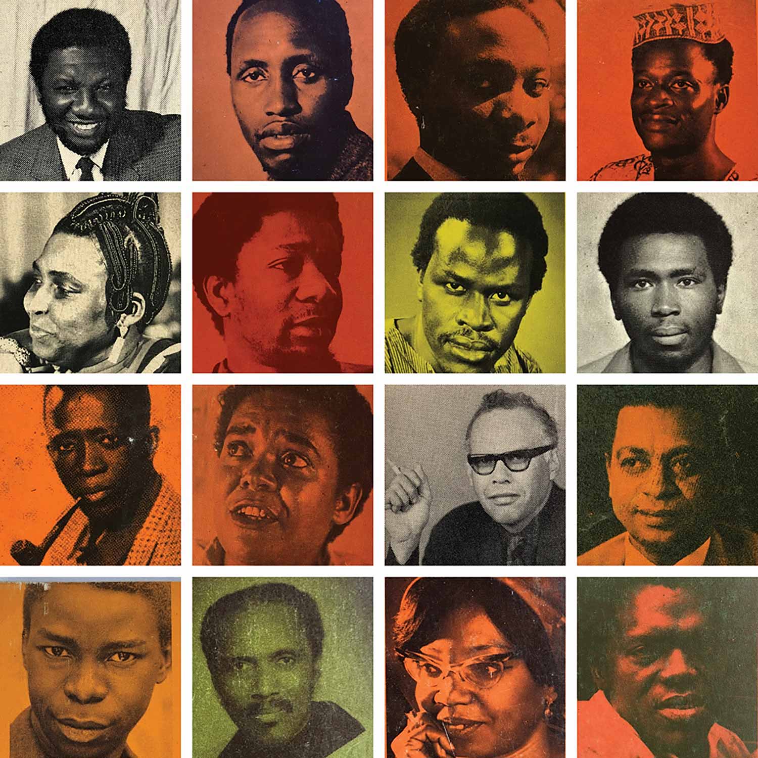
Authors above (each from from top left): Lenrie Peters, Ngũgĩ wa Thiong’o, Robert Serumaga, Nkem Nwankwo, Mariama Bâ, Wole Soyinka, Taban Lo Liyong, Meja Mwangi, Sembène Ousmane, Bessie Head, Alex La Guma, Tayeb Salih, Luis Bernardo Honwana, Joe de Graft, Flora Nwapa, Onuora Nzekwu.
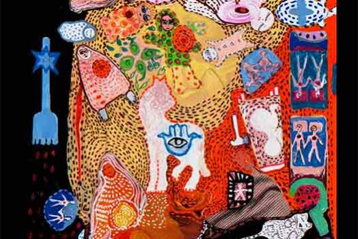



Bessie Head! Flora Nwapa!
Josh, really interesting article. I just wanted to make one small point: you mention that in 1965 the design was revamped and Origin East Africa (AWS 15) no longer has the heavy black on the cover. I’ve seen covers of this book with the same design elements as earlier titles in the series. Unfortunately, I don’t have a copy but I found an image showing what I mean:
https://pictures.abebooks.com/BERNIE1956/md/md20204864501.jpg
I believe all the titles up to this one followed the same design with the exception of Equiano’s Travels (AWS 10). I’ve never seen a copy of this in the earlier design, but then it appears to have not actually been published until 1967 for some reason.
Wow, thanks Andy! I had thought AWS13, Beti’s Mission to Kala, was the final title released in the original design. Until you sent that link I had never seen any later titles with that design. As you know, clearly from the Equiano’s Travel situ, how books were numbered and the order they were released in was not at all parallel, in some cases years apart, which seems to have led to these examples of the design of the first printings of some titles being out of step with the rest of the titles before and after them.
As an aside, have you seen Rive’s Quartet (AWS14) in the original heavy black design? I have what appears to be a first printing of Achebe’s Arrow of God (AWS16) and its cover has the revamped design style…