About a month ago I came across a clutch of these great old anti-communist pamphlets at Book Thug Nation. Touted as the “Democracy versus Communism Series,” they are an amazing collection of anti-communist myths, conspiracies, and general cold war wackiness. And the covers are totally killer!
I’ve only got five (and then found images of 3 more online) but they were originally produced in a set of ten, assembled by The Institute of Fiscal & Political Education (IFPE) and published by the D. Van Notsrand Company in Princeton, NJ in 1959. Each one is an abridged section of a larger book-length anti-communist screed by Kenneth Colegrove, who was a right-wing political scientist who taught at Northwestern and Queens College and was associated with a number extreme right organizations, included the IFPE and the John Birch Society.
While I have to admit a general fascination leaning towards fetish around the design of extremist politics across the spectrum of left and right, I also think it’s very important to recognize that the rhetoric and aesthetics used by the right to convince and mobilize have been profoundly under-studied by the left. This seems especially important with the continued popularity of the alt-right and various other trolls that have crawled out of Trump’s asshole. The illustrations on these pamphlets (unattributed) presage many of the popular tactics used by the right today.
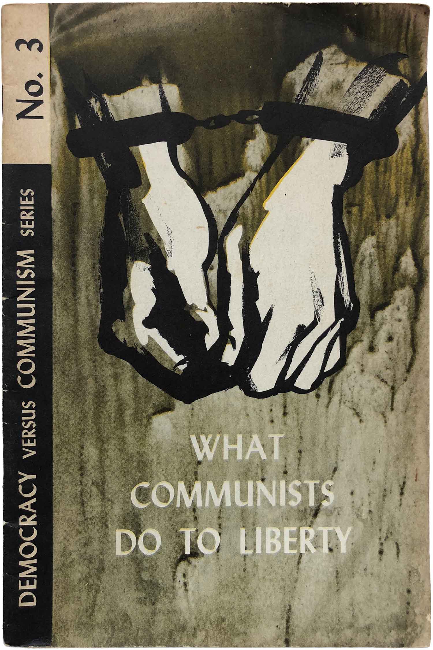
First off, while titled “Democracy vs. Communism,” the true intent of these pamphlets is about capitalism vs. communism. This reveals the first slippage of language—and hints at the extent to which Colegrove plays loose with the truth. Equating democracy and capitalism (and posing all forms of communism as inherently anti-democratic) is a time-honored tradition among various elements on the right, allowing them to side step an arguably a more profound conflict, the one between authoritarianism and collective autonomy. This is profoundly (and completely unintentionally) illustrated on the cover of No. 3, where a set of cuffed hands emerge from the grey gloom. Given that the United States has the largest prison population in the world, both per capita and by sheer numbers, it’s a little questionable to represent communists as the primary purveyors of shackles.
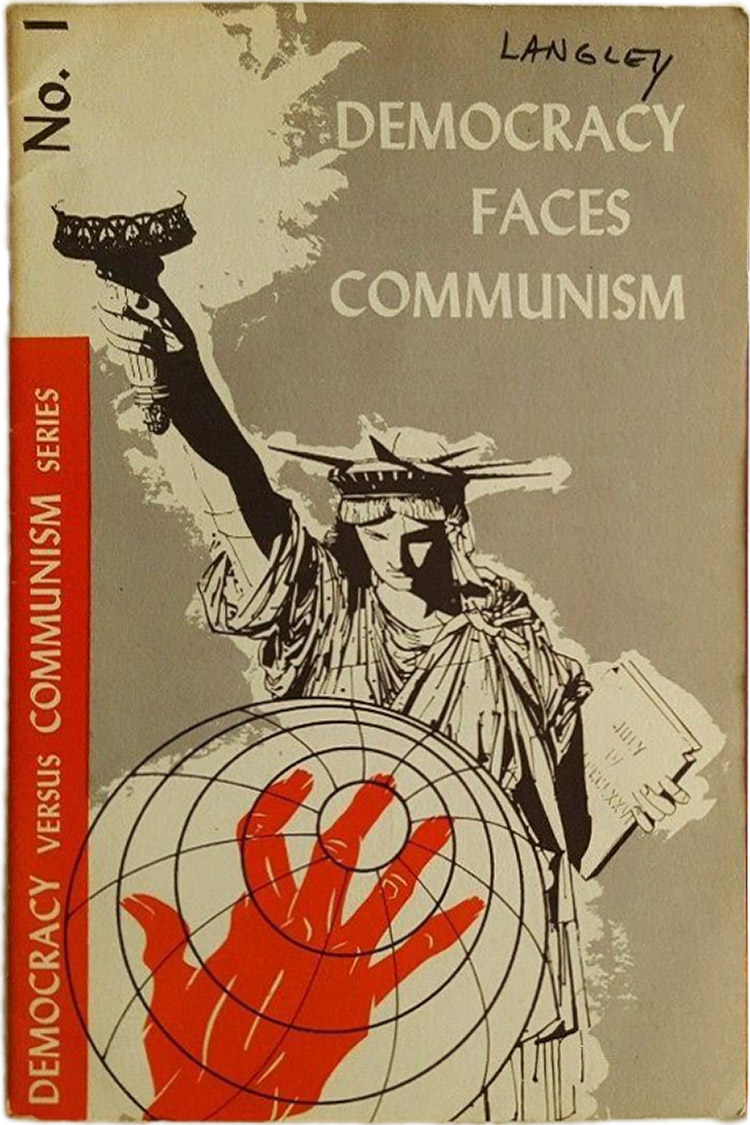
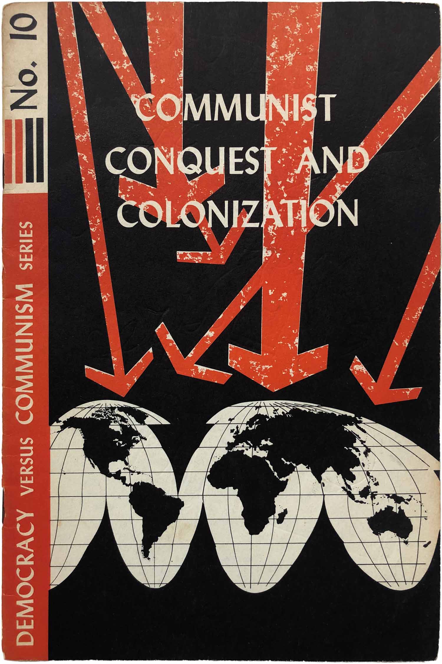
Second, these covers are masterful representations of accusing your enemy of the very thing you are busy doing. The cover of No. 1 above and No. 10 below both represent communism as a dire threat to the globe, either in the form of a grabby red hand, or a meteor shower of red arrows set to strike. While I’m not an apologist for Soviet expansionism, or Chinese internal colonization (never mind Tibet), its hard to not laugh at the audacity of the claim given the role U.S. was actively playing in destabilizing Latin American regimes, plotting to undermine around the Cuban Revolution, and assessing and planning possible intervention in Vietnam, just to name a few examples of the long reach of the red, white, and blue hand across the world.
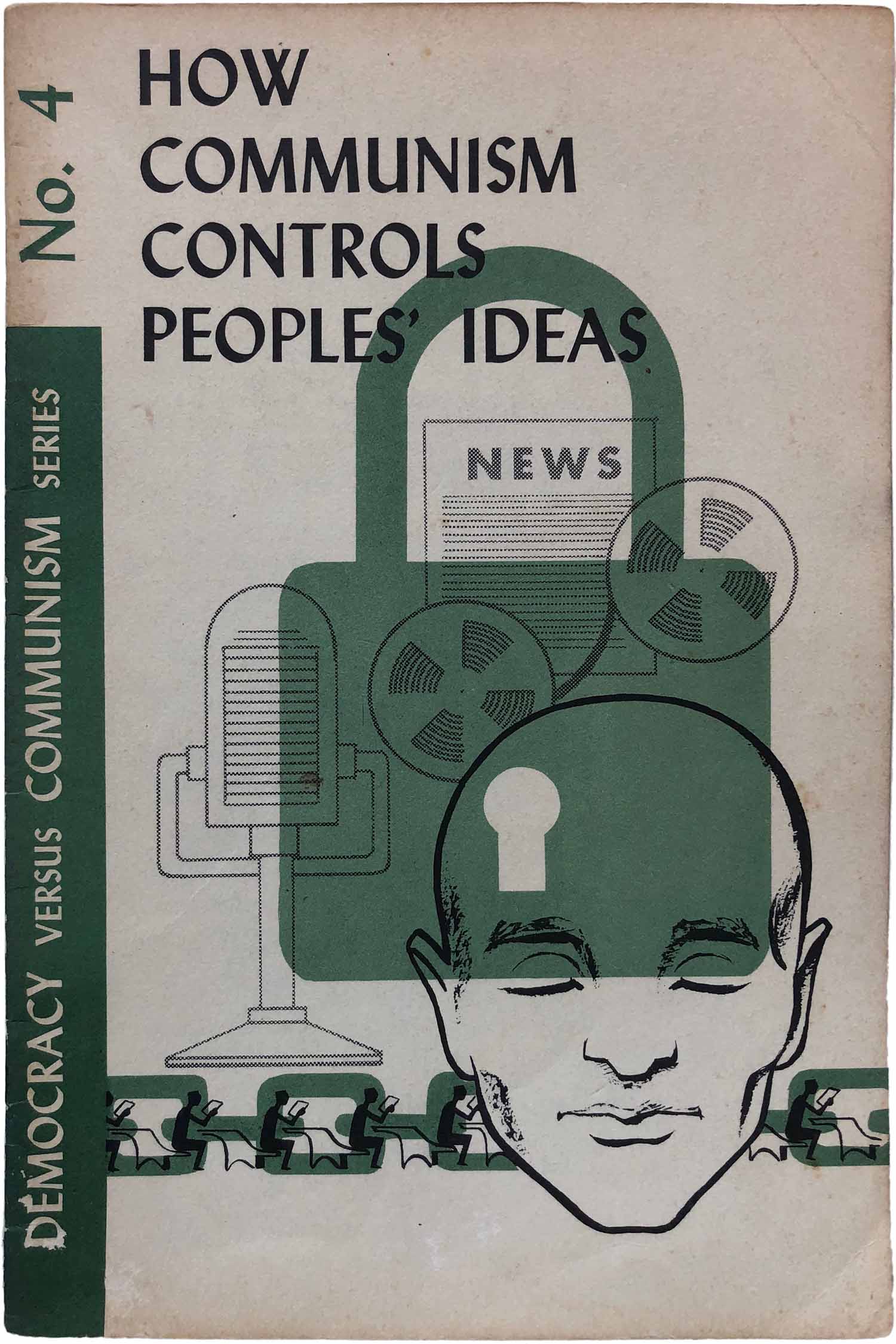
The cover of No. 4 functions similarly, presenting communism as a chain and lock around the media, and thus people’s minds. And while it is true that existing communist regimes have not had the most liberatory relationships to the press, as Chomsky and Herman have shown in Manufacturing Consent, the U.S. doesn’t need direct censorship because it has developed a system which simply and profoundly marginalizes almost all critical viewpoints, functionally creating the same locks of the mind decried here.
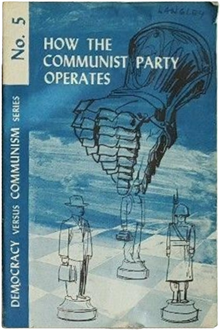
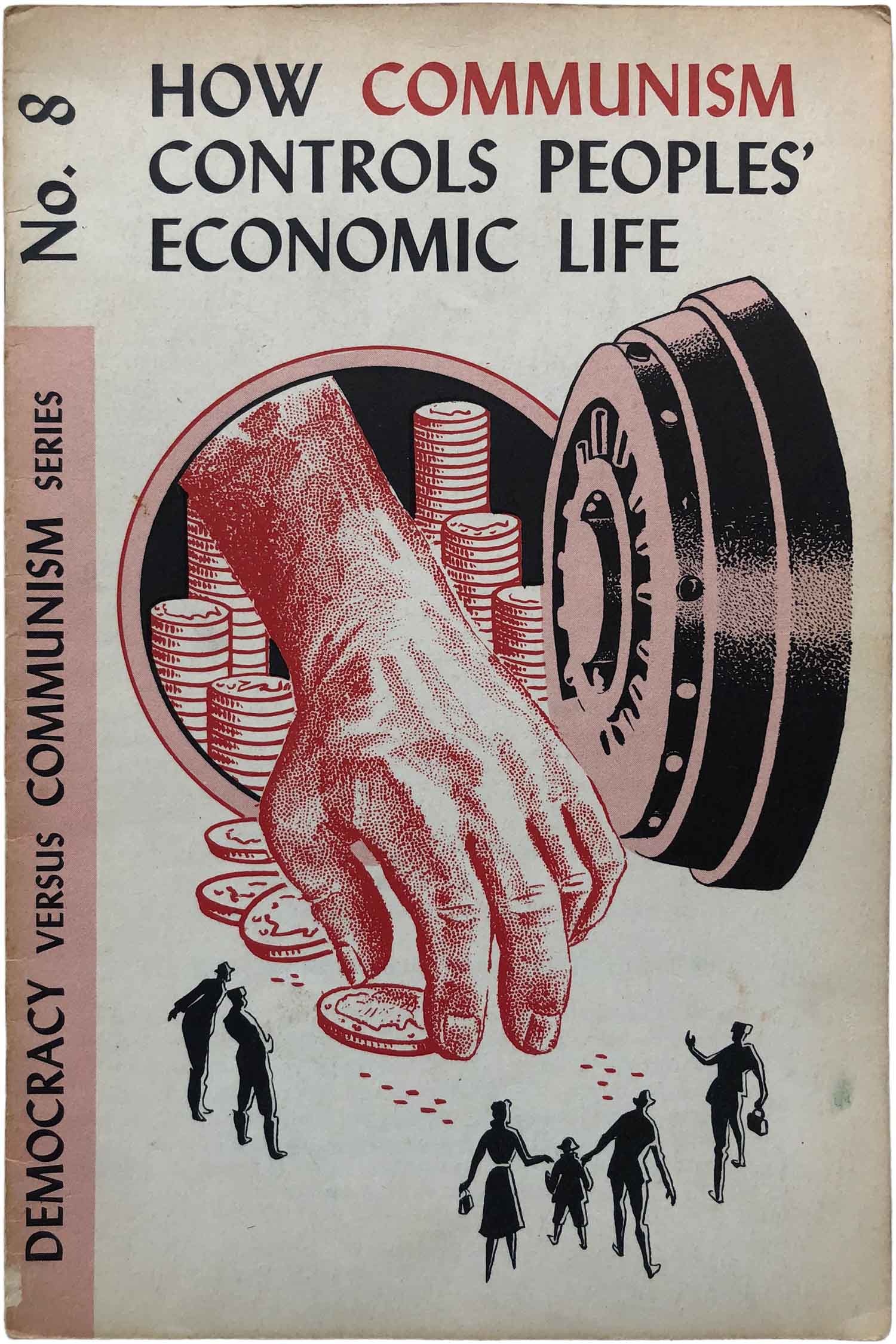
No. 5 and No. 8 both represent communism as a giant hand, either moving people around on the chessboard or taking your money. I have to admit to absolutely loving the cover of No. 8, the giant red hand taking the last quarter for the poor little people! But isn’t this exactly how capitalism is argued to function? An invisible hand what we can’t see moves economic pieces around, ensuring that markets work for us (or at least the rich)? How is that one set of giant hands are evil, yet another are the harbingers of freedom?
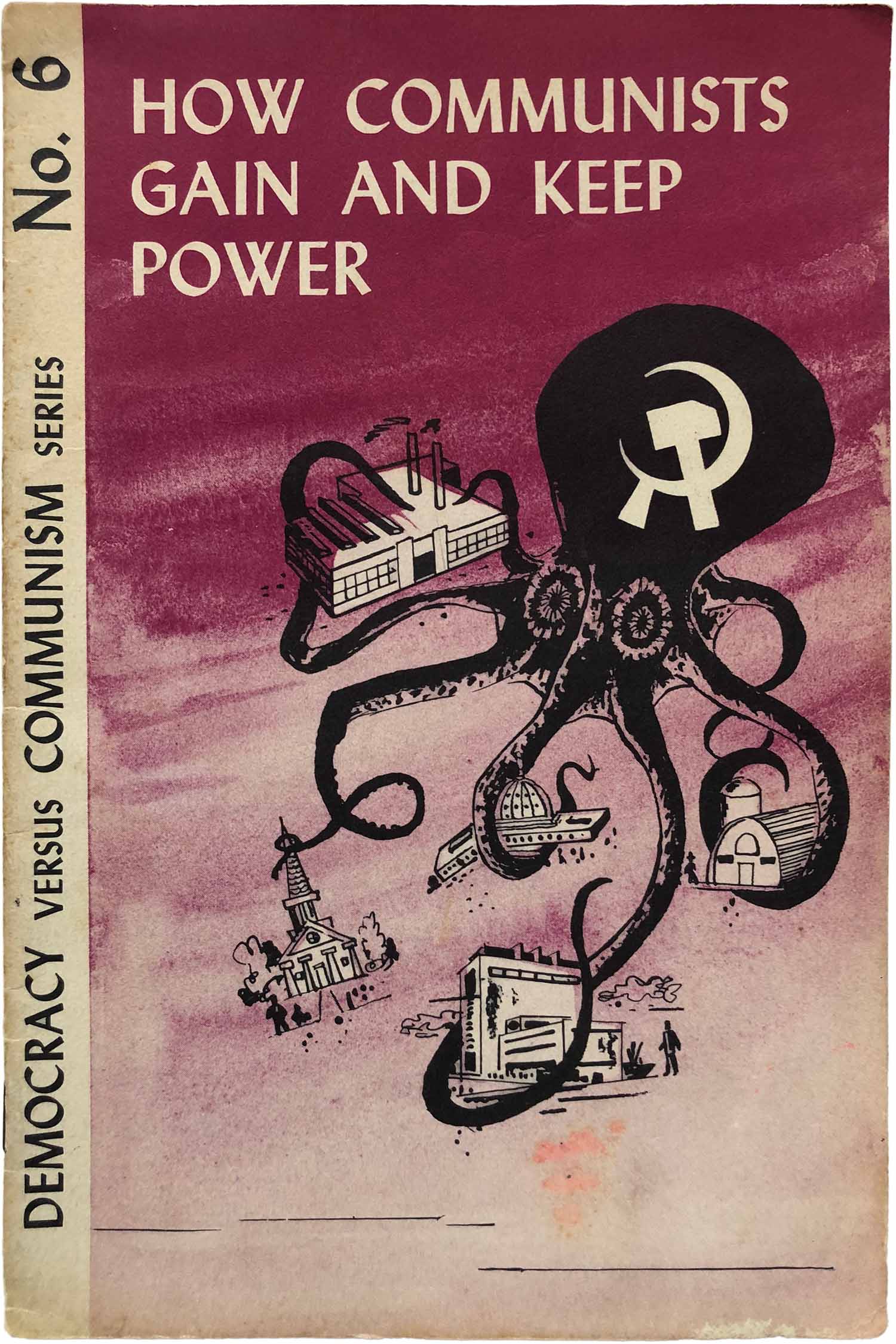
Finally we have the cover of No. 6, and the dreaded communist octopus. Colegrove fails to mention that the symbolism of tentacles reaching into all aspects of our lives and taking over is a time-honored way to represent the conspiracy theory that Jews rule the world, and that within the propaganda of group like the John Birch Society it functions as a dog-whistle to anti-Semites.
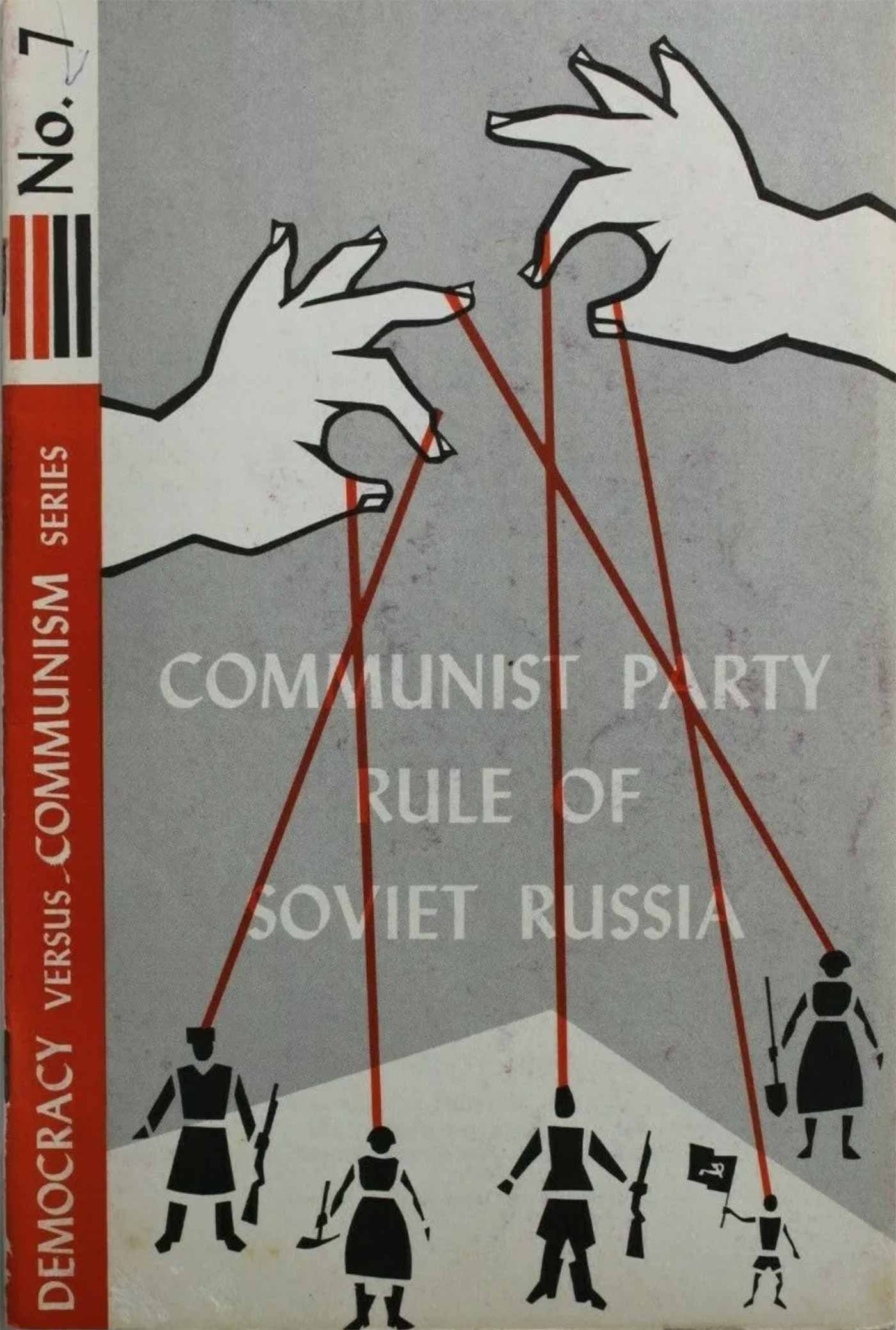
UPDATE (March 13, 2024): Thanks to Ulrich Heinen for sending me links to the two missing books here. Below are the covers for No. 7 and No. 9. Both fall into the general series design, No. 7 is notable for the nice Soviet puppetry illustration, which is much bolder and more stylized than the representations on No. 6 or No. 8.


What is that font? TIA.
That’s a good question. It’s similar to Linotype Nautilus or Goudy Sans, but not that close. I suspect it’s a Linotype font…
I’m pretty sure that typeface is Lydian.
You nailed it, Lydian Bold, created in 1938 by Warren Chappell for American Type Founders. Once the largest foundry in the US, in the 1980s ATF shrunk to 8 employees and eventually went under. The main foundry building in Elizabeth, NJ is now fancy apartments. Ahhh, democracy!
Ran across your article. Do you still need pictures of 7&9?
Absolutely! If you can send them over to josh [at] justseeds. org, that would be great. Thank you!