I just finished up my final project for my mapping class:
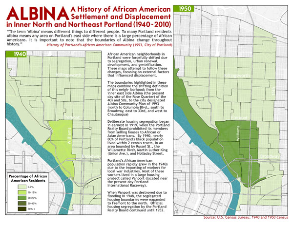
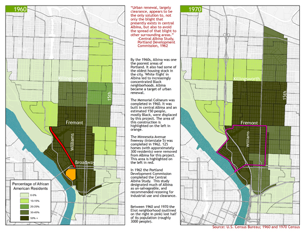
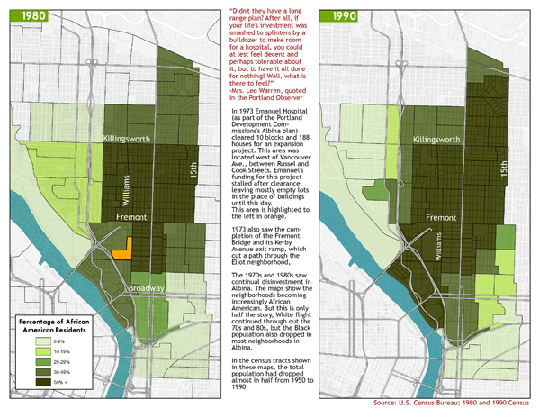
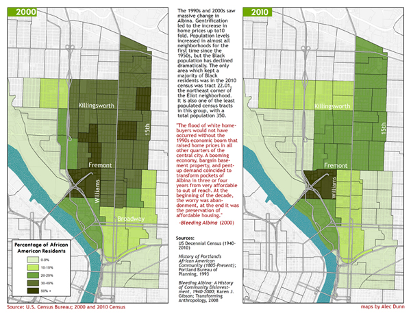
I originally planned to focus on three specific urban renewal projects that happened in North Portland but couldn’t find the specific block data I was looking for. This series of maps developed out of looking for that data, but at a much more general scale.
This is both really awesome and sad. Damn! my eyes hurt from reading the tiny letters.
This looks great! The interaction between the maps and the critical analysis text makes for a great project. What program did you use to make the maps?
I used Arcmap. And sorry about the tiny letters!
wow, nice job. The visual representation of this is very powerful, so much easier to explain the rapid change in PDX using these. 2000 to 2010 is pretty wild to see. Obviously we all saw it happen but interesting to see the actual percentage change. Can you add coffee shops that opened in the neighborhood between 2000-2010, that might help too, ha!
control + zooms it in..