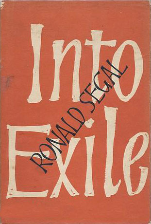
I had been collecting the Penguin African Library books for awhile when I stumbled upon this copy of Into Exile at the local, and very cool, Brooklyn used book shop Unnameable. The cover was interesting and the author’s name was familiar, then it hit me, this is the guy who built the PAL! I bought the book and read it over the next couple days. It’s a great narrative touching on so many of the complexities of growing up, living in, and attempting to be politically active in South Africa. It ends before Segal hooks up with Penguin to start the African Library, but he does discuss publishing Africa South, and tells the harrowing story of sneaking out of South Africa with Oliver Tambo, then head of the African National Congress.
To the right is the dust jacket of the US edition published in 1963 by McGraw-Hill. The concept of the cover is cool, with a wall of type leading to a giant tear in the page, separating the title Into Exile from the rest of Segal’s life. With the type so crammed it is a bit overwhelming and hard to read, but the enlarged title does provide eye relief, and visually carries the cover.
The British edition was also published in 1963, by Jonathan Cape. It’s much simpler, with a large hand-lettered title overstamped with Segal’s name. It’s clean and works, but carries none of the potential meaning that the American design has embedded in it. It doesn’t appear as if a paperback ever came out on either side of the Atlantic, which is a bit surprising, I think it’s definitely a good read.
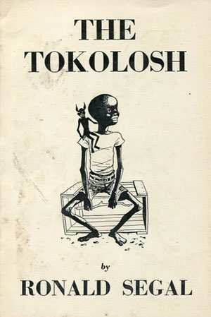
To the left is he cover of The Tokolosh, a book of children’s stories published by Sheed and Ward in 1960, prior to Into Exile. Segal makes no mention of it, so it’s a bit of a mystery.
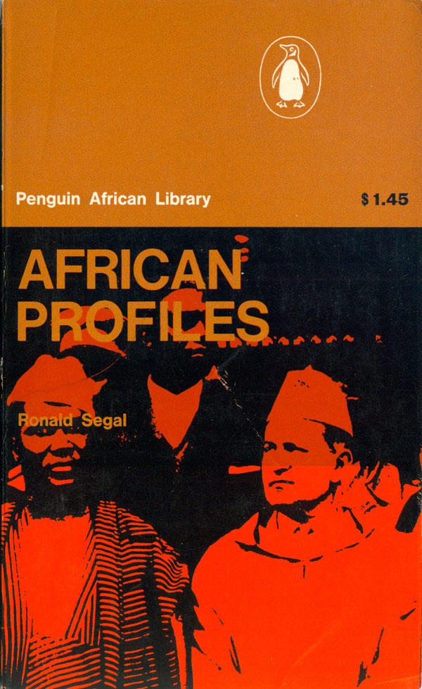
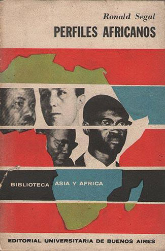
One of Segal’s first books was African Profiles, also the first book in the Penguin African Library. I already discussed it weeks ago, but I recently dug up a Spanish language edition of the book published in 1964 in Argentina by the Editorial Universitaria de Buenos Aires. It’s a great cover, with the map of Africa dissected horizontally, creating a framework to introduce the four spot color scheme. The bars and color make for a very active image, and the designer was smart enough to keep the text simple and subdued.

In 1964 Segal published a Penguin Special (in the early 60s, these were almost always red in color, with black and white images and text) entitled Sanctions Against South Africa. The cover design is by Germano Facetti, and displays his usual ability to accomplish much with very little. The only design element on the cover is the four words of the title, yet he uses them with precision and clarity. Three of the words are black, with only the word “south” in white, visually representing apartheid. He places the words tight together, and tilts them up, creating a sense compression, movement, and tension. And finally, he places the word “africa,” in black, on top of the word “white.” A brilliant cover made out of almost nothing.
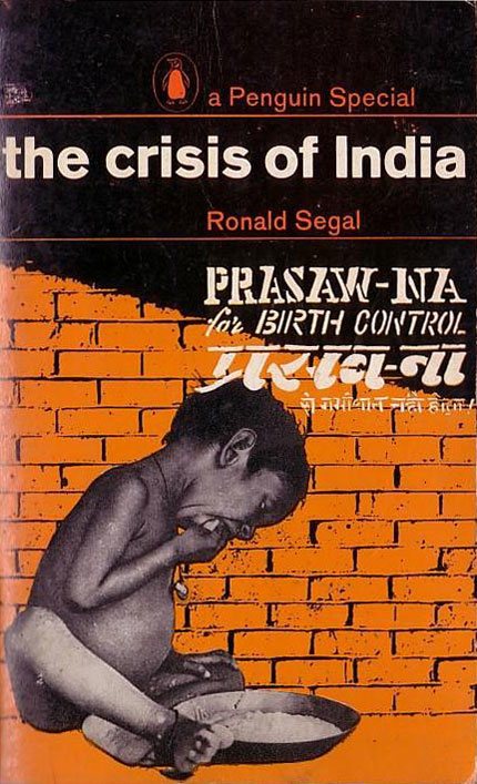
Segal clearly was a polymath, with books coming out a broad range of topics in quick succession. Along with a series of books about Africa, he quickly penned volumes on India, America, race in an international perspective, the Middle East, and Trotsky. His first branch out into broader territory was The Crisis of India, another Penguin Special from 1965. This cover is a montage, with a photograph of a child imposed on a brick wall, with super-imposed text which looks somewhat like graffiti on the wall. The typical Penguin design elements are laid on top, including the logo, and the Segal’s name, in the red of the Specials. The cover works almost the opposite of Sanctions Against South Africa above, with too much going on. The photo and the orange wall look almost like they have been yanked from a Cuban poster but the wall text competes with the title, and although balanced in some ways, the cover feels cluttered.
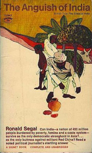
The same book was released a year later in the US by Signet, under the alternative title The Anguish of India. Although I don’t really like it aesthetically—and almost prefer the Penguin cover with its faults—this cover does work better, with a more coherent illustration of the poverty and conflicts in India. I’m not sure why the title change, maybe “Anguish” is more compelling to US audiences than “Crisis,” given that crisis seems much less editorial and emotional.
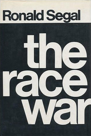
One of Segal’s more popular titles was The Race War, initially published by Jonathan Cape in London in 1966. Written just as the Civil Rights Movement in the US was reaching its peak, and the shift to Black Power, his book articulates the logic of Black Power on a global scale. The dust jacket of the first edition is stark, simple text in black and white, presaging the cover of Black Power by Carmichael and Hamilton (for a full assessment of that cover, see HERE). Maybe it is me looking back from current stylistic understandings, but unlike the Carmichael cover, this one falls a bit flat, with the Helvetica title implying a clean and crisp shopping experience at Bloomingdale’s, not a race war. In addition, the black and white treatment seems completely wrong for a book discussing race on an international scale, and Segal would have known that, given his South African background and experience with Black African, Indian, and Coloured struggles at home.
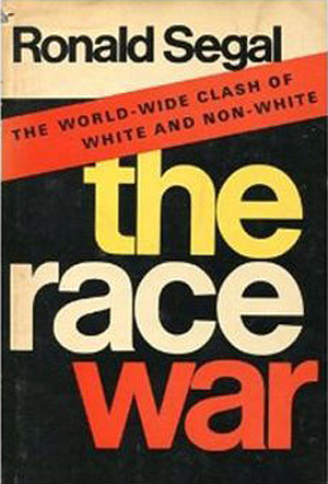
The Viking edition from the US tries to correct the color problem by adding dasjes of yellow and red, which is interesting because one would think a British publisher might be more sensitive to the issue. Either way, the cover still fails to imply much tension, even with the hyperbolic subtitle “The World-Wide Clash of White and Non-White” added into the mix.
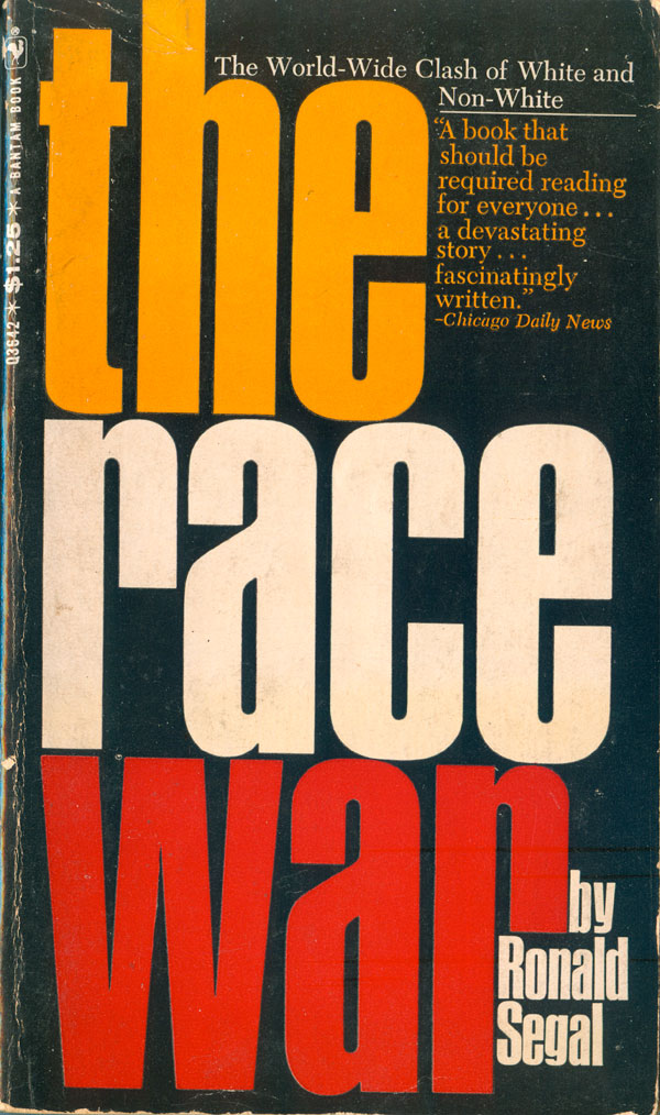
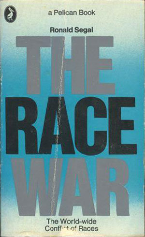
Whether by conscious decisions, or designer defaults, all five covers I found for The Race War are strictly type. The Bantam paperback from 1967 keeps almost the exact design as the Viking hardback, but converts the background to black (a smart move) and changes Helvetica to a tall, bold gothic, stacked tightly to fill the entire cover (also smart, creating more tension between the words, activating both “race” and “war”). The Penguin paperback, also from 1967, is the standout of the group. It’s a Pelican, the topical non-fiction wing of Penguin, so needs to follow some style constraints, including the use of light blue. But the blue totally fails in this instance, cooling the title. It might have worked better if the entire title was in black, but the silver/grey adds to the sensation of cooling, like the coming race war will be a lot like being stuck in a freezer with some ice cubes.
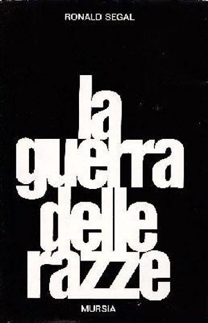
The Italian edition (Mursia, 1968) follows the logic of the Jonathan Cape cover, with white text on black, but works better by compressing the text together, forcing the words to interact.
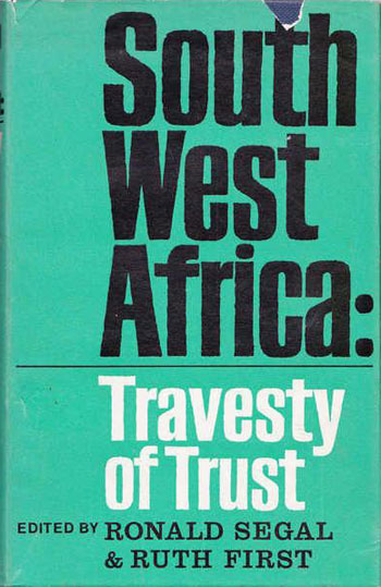
Finally for this week, Segal returns to Africa with an edited collection about South West Africa (which became Namibia with independence from South Africa in 1990). The cover for South West Africa: Travesty of Trust (edited with Ruth First, published by Andre Deutsch, 1967) is pretty straight forward, the words in the title stacked, the country name written in Black, implying the skin color of the majority population, repressed by whites, who have created a “Travesty of Trust.”
Next week I’ll look at another dozen Ronald Segal covers, then in two weeks round out this series with a study of some other Penguin books on Africa.