
For the final installment of book covers from the Penguin African Library (see the first nine posts HERE), I’m going to take a look at the other books on Africa Penguin was putting out during the same time period and a little later, 1961-1979. Some of these books are considered to be part of the Penguin African Library (or the “African Affairs” series, as it became known), although they don’t have PAL numbers and don’t mention the Library anywhere. I haven’t been able to track down the entire story, but it appears that Ronald Segal kept editing a series of books on African for Penguin, even after the PAL moniker was dropped.
You can see from the early volumes that 1961-63 is when Penguin, and likely the broader public, started evolving in its perspective towards Africa. Colin Legum’s Congo Disaster (1961), a critical look at Belgian colonialism, hits the shelves around the same time as Lucy Mair’s Primitive Government, a traditional anthropological look at Africa. But what unites them is that both books have great covers! Legum’s functions like the best of the early Penguin Special’s, integrating red into a simple design mostly dependent on type to do the communication. The field of black is ominous, with Congo jumping to the foreground, and “disaster” hanging back, and becoming that much more intriguing because of it. The handdrawn vertical lines and all lowercase simultaneously seem to diminish the word yet increase the sense of tension and loss.
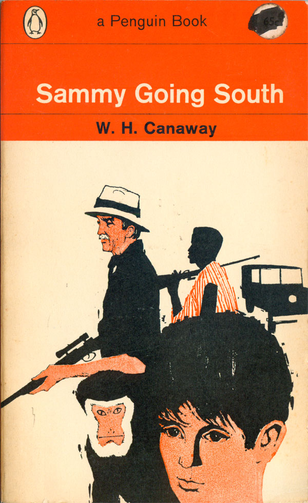
W.H. Canaway’s Sammy Goes South (1963) is a very different take on Africa, an adventure/travel novel about a ten-year-old white boy making his way from Egypt to South Africa. The cover has a nice 50s feeling illustration by Adrian Bailey embedded in the Penguin orange grid for novels. The images in the illustration are based on the characters from the film based on the novel. Like many early image-based Penguin covers, it has a classic and clean style, one that seems both specific to its early 60s moment, yet also timeless.
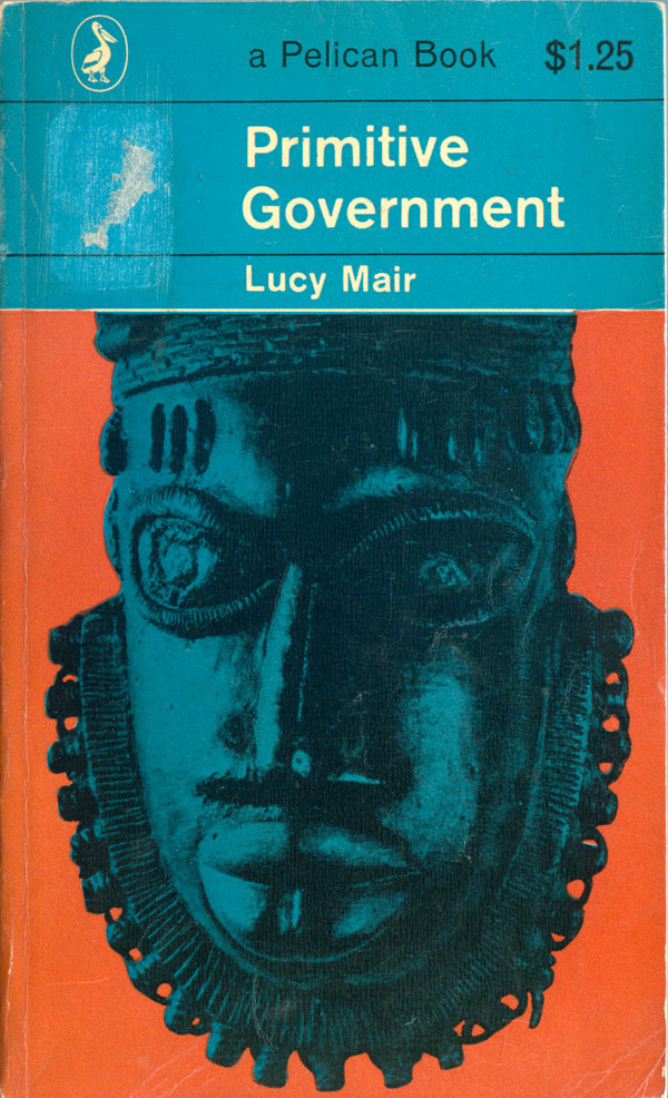
Lucy Mair’s Primitive Government (1962) come from yet another position, a much more traditional anthropological angle. Regardless, the cover is completely arresting. The blue and orange color combination is sheet genius, the mask just jumps off the flat plane. And the classic Penguin grid is so unassuming and quiet that it comfortably sits up top, and it doesn’t bother me at all that the image gets squeezed in the bottom 2/3rds, it almost gives the mask even more visual power.
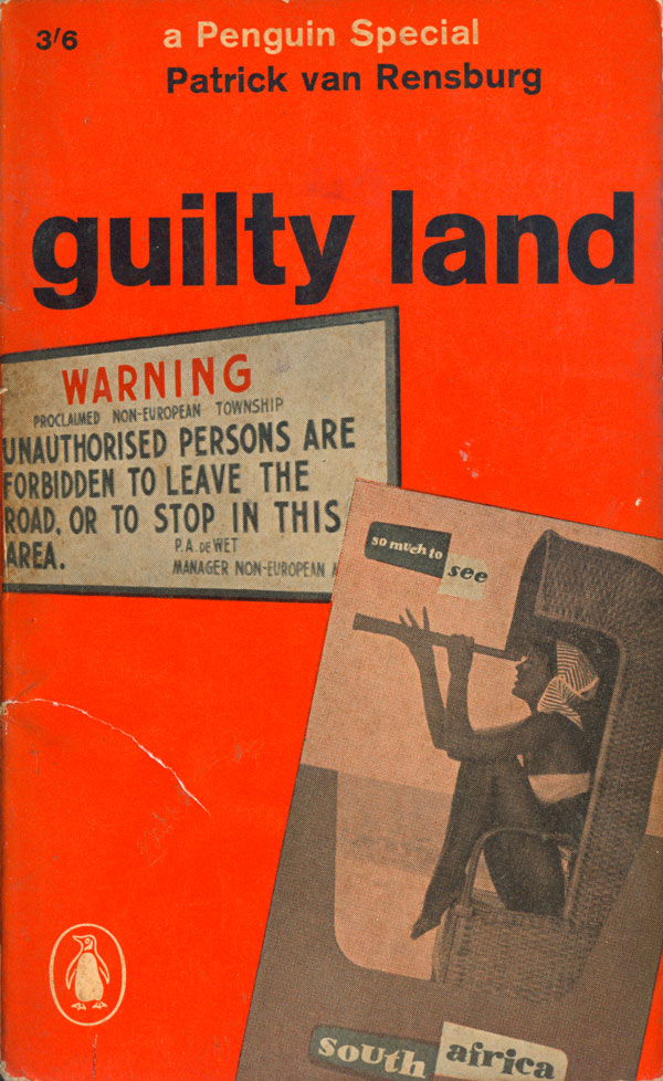
I’m generally a big fan of the design of the early 60s Penguin Specials, with their walls of bright red and interesting type treatments. Patrick van Rensburg’s Guilty Land (1962) is a bit of a disappointment. The contrast of tourism poster and racist signage falls flat, it just demands too much reading within the cover, and doesn’t really deliver the strong punch in the gut I expect the designer (Frederick Price) was angling for. I like the strong lowercase title across the top, and wonder if a stronger cover would have dumped the tourism image and simply squared the sign in the middle of the cover field?
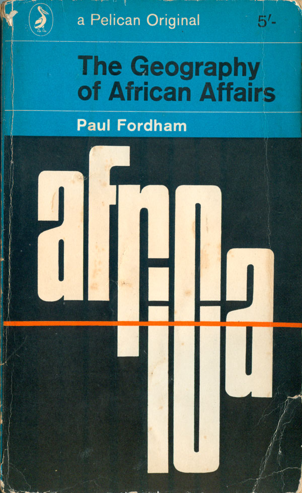
Although coming out three years later, Paul Fordham’s The Geography of African Affairs (1965) has a much more classic early 60s Penguin feel, with it’s almost entirely type-driven cover. The letters of the word Africa build out into the shape of the continent, with the simple red line of the equator pulling the design together. A work of simplicity and efficiency, which communicates clearly and directly.
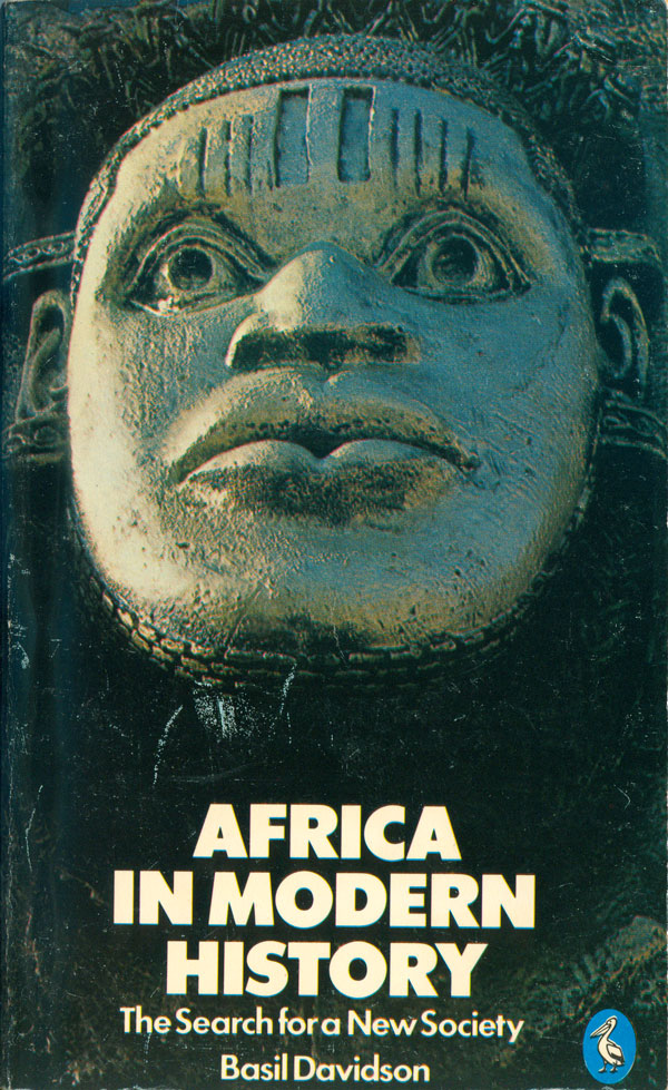
The cover of Africa in Modern History (1978) by PAL mainstay Basil Davidson is an interesting comparison to Primitive Government above. While both are largely composed of an African mask, this cover—with its full color, content, and more unique typographic treatment (for Penguin, at least)—is so much weaker than the earlier cover, which does so much more with so little. This is a great lesson in how technology, a fancy budget, and better printing won’t necessarily produce a better cover.
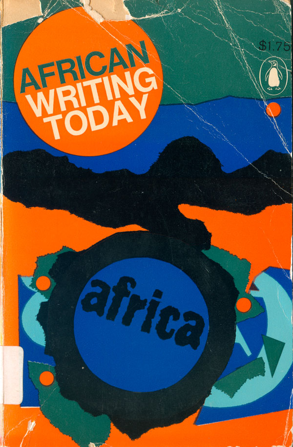
Ezekiel Mphahlele’s fiction collection, African Writing Today (1967) is also a bit of a mess. I assume that the designer (John Sewell) was going for a colorful and layered reflection of African fabric patterns and other African design elements, but instead it doesn’t really all add up. The title is already at the top, so it is unclear why the blue circle at the bottom needs to repeat the word Africa, and all the elements imply some sort of order or meaning, but I just can’t add it all up.
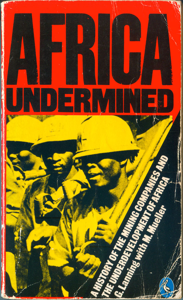
Below are two great covers, the first by one of my favorite book designers, David King. With a heavy constructivist/Soviet influence, he has the ability to do a lot with a handful of tools and tricks. This cover, for Lanning’s Africa Undermined (1979), is pretty classic King, with the title type so tightly kerned it almost makes black bars, and the subtitle cocked at an extreme angle. A closer look shows that the typeface is slightly stressed, with eroding edges—a nice detail.
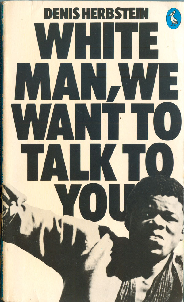
Denis Herbstein’s White Man, We Want to Talk to You (1978) has a bombshell of a cover, to go along with a great title. Herbstein, a South African reporter, tells a first hand account of the Soweto uprising of 1976. And the cover hits you like a riot, giving the viewer a small visual taste of that moment. The text jumps in your face, pushing its way off the cover into your field of vision, and rather than giving your eyes a break, the bottom of the page is filled with a young Black South African swinging a fist at you! The entire design exudes power, and fits perfectly with the content.
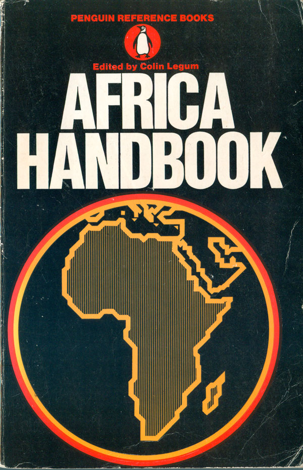
To round out this entire ten week series, lets look at two reference-type books, general Africa handbooks that would be useful in school libraries or for activists, but likely had a limited general audience. Firs we have Colin Legum’s Africa Handbook (1969) where the designer Ian Escott does a pretty good job given the universality of the content. The type is bold and pops off the black, and the map is chunky and sharp, strongly stylized but still clearly Africa. Roger Omond’s The Apartheid Handbook (1985) doesn’t fair so well. Whether due to a specific designer problem (unattributed, which is rare for Penguin), or speaks to a broader crisis of book cover design in the mid-80s, this cover is terrible. The title is already so generic, the cover just makes the entire project seem greased down in boredom. Pity the South African’s that could have really used a book that sparked true interest in their struggle.

Here’s a bibliography of the books from this week, in the order I’ve discussed them:


really interesting designs that could allude to vernacular sign painting for commercial purposes at the time of these publications. Also, some Romare Bearden references and Italian Futurist design. Definitely in conversation with US Black Arts Movement design and intent. Didactic and affirming themes that directly engage the reader while reaffirm the context of material. Very much in tune with Third Cinema concepts of the late 1960s and early 1970s.
Only a Caucasian would find this”….didactic and affirming”. As an African, I found the covers racist and offensive. Caucasian authors have not the authority or right to write about Africans, nor do they have the authority to use the artwork which Europeans stole form Africans during colonization as front covers for the books. And obviously, unless you are blind or ignorant, it should be obvious that African art and culture and completely distinct form US Black American art and culture, unless when the latter is attempting to imitate African art