With issue #10, Anarchy comes into it’s own, settling into a fixed masthead and confident enough to continue to eschew the traditional anarchist red and black and experiment with deep blue and lilac. The collage of interior and exterior spaces is contrasted with the bleeding body at the bottom, raising questions about the nature of this “new” city Craigavon being advertised. Although undated, I believe this issue came out in late 1972, and thus the images and assembly appear to presage the design work Jamie Reid would do for 1974’s Leaving the 20th Century, an early English-language Situationist anthology, never mind the more well known Sex Pistols period. In other words, Anarchy continues on in that interesting space between the psychedelia and underground comics of the 60s and the aggressive, neo-Dada cut-n-paste of the coming Punk era. With this issue the magazine changed addresses and there is also a complete and clean break from the earlier issues which were still connected to and being produced by Freedom Press. (See the two previous posts about Anarchy covers HERE.)
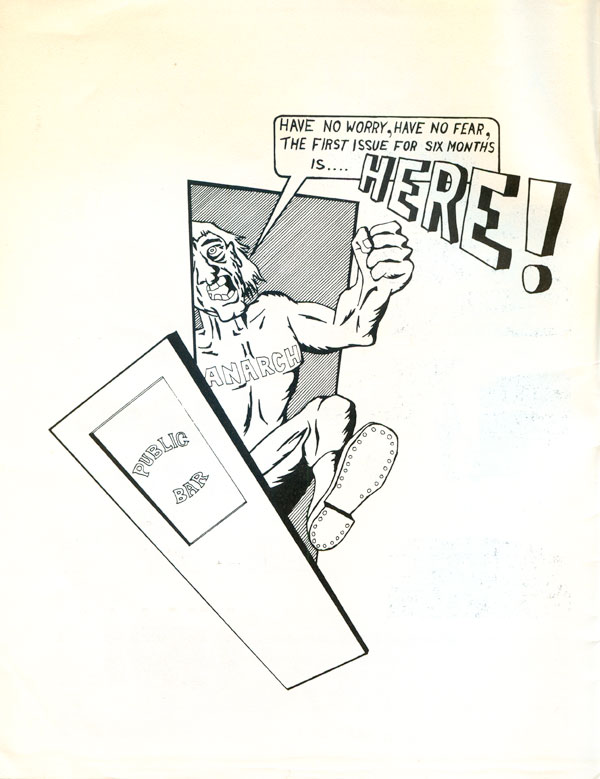
The front and back covers of #10 embody this tension, switching from collage to a straight comic (by “Ged”) which is part Skip Williamson and part Vaughn Bode. It would have been nice to see the comic in the same duo-tone as the cover, but its unclear if the pedestrian color work is intentional or simply that anything more complicated might have been beyond the editorial collective’s skill set. Although using multiple colors on the covers, the plates of color are always placed on top or next to each other, never integrated to effectively make use of the overlap and duo-tone’s potential. This also distinguishes the design work from the earlier, more creative design of the hippie-inspired underground press and pushes more toward the bold design work of punk.
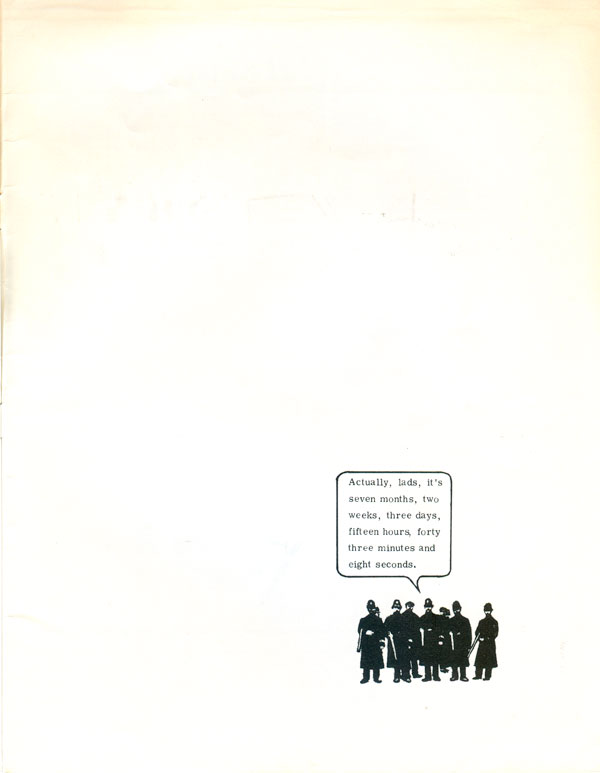
The inside covers show a strong knowledge of comics, but also an open mind to more sparse design and a willingness to use comic book elements outside of traditional narrative frames and boxes. The inside back cover is an exemplary use of white space, something quite rare for wordy leftists and anarchists with a design sense that tends far more towards clutter than efficiency and openness. Content-wise we also first see a self-consciousness from the magazine about its inability to come out of time (as well as a lack of funding), something that will come up over and over again in the future.
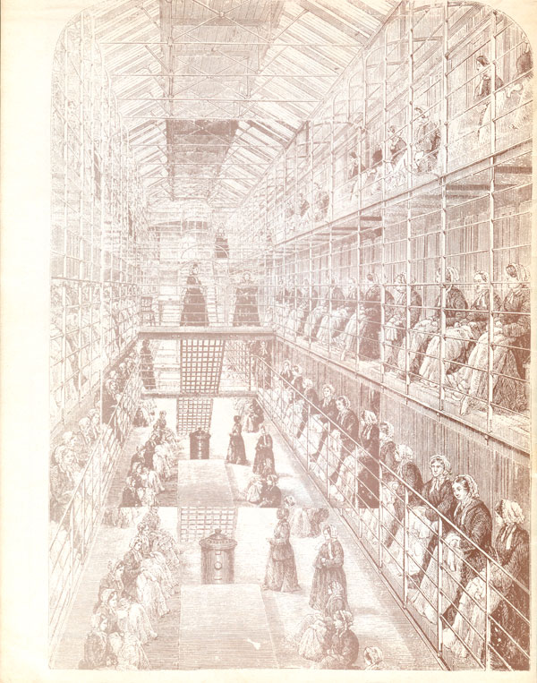
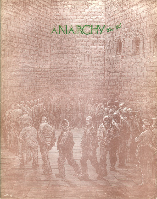
Anarchy #11 is the prison issue, which is made perfectly clear by the full bleed reproduction of Gustave Doré’s 1872 engraving “Newgate Exercise yard.” The designer was smart enough to let the image do the heavy lifting, and shrunk the masthead to a small and unobtrusive green line in the top center of the cover. There is an interesting tension between the image of men shuffling around in circles in the prison yard and the word “Anarchy” hovering above them. One of the prisoners on the right side of the clutch turns to us the viewers with a difficult face to read, neither broken nor clearly defiant. Does the promise of anarchist revolt lie in the center of this circle? Are this engine of shabby human refuse on the verge of rebellion against their sharply dressed warders, looking on from the right hand side?
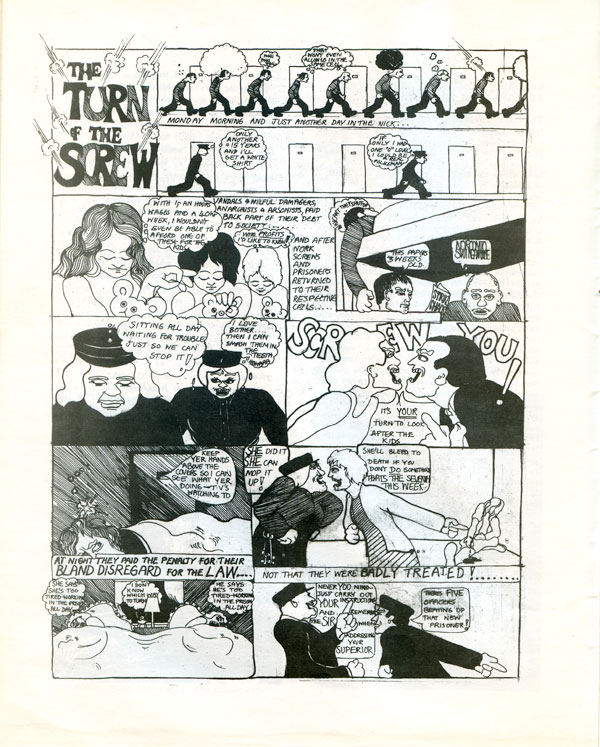
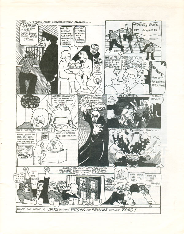
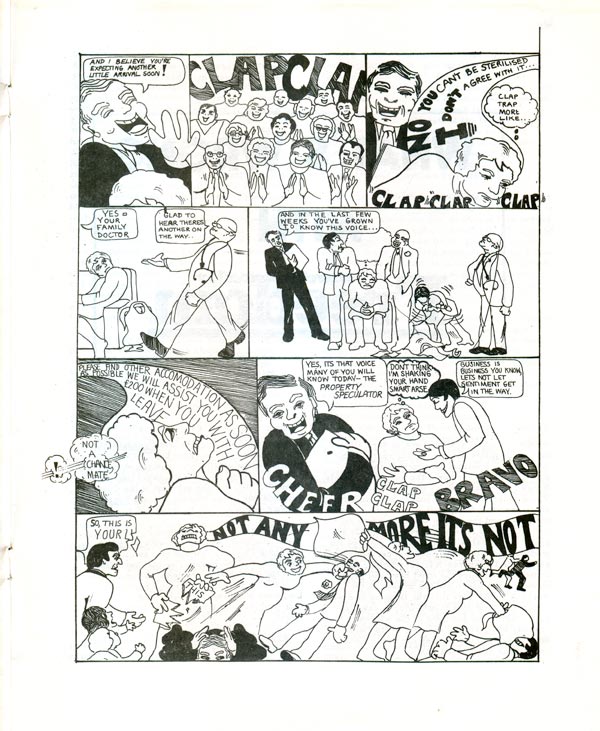
The use of comics continues in this issue, with an anonymous and amateur two page effort titled “The Turn of the Screw.”
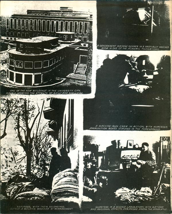
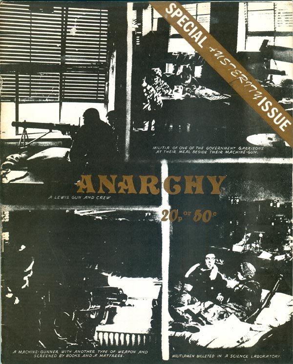
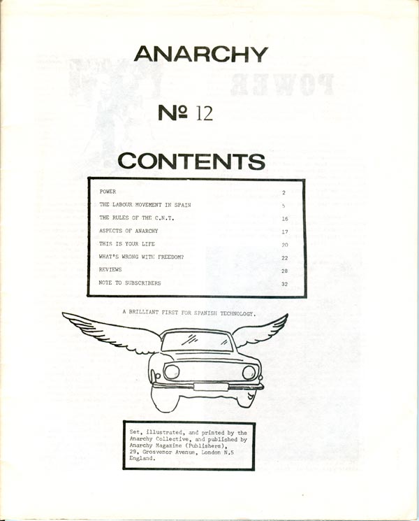
With the next issue (#12) Anarchy ditches the masthead it had been using for the past half dozen issues and returns to a more classically ornate title, this time printed in gold. The images are all dark muddy interiors of fighters in Spain, which recalls the collage of images on the cover of #10, but I also assume is intended as a call to struggle against Franco and his continued fascism.
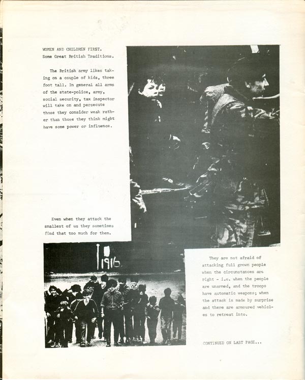
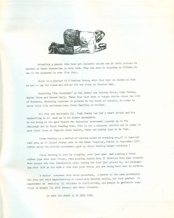
Although the issue is largely focused on historical concerns related to Spain and its civil war, the inside front and back covers promote both an attention to current events and a broad internationalism with an extended screed against the force-feeding of hunger strikers in Northern Ireland. Aesthetically these pages sum-up much of the interior of this period of issues, with a mix of type-setting, poorly printed photographs of resistant comrades (in this instance, masked kids), and old-style clip art.
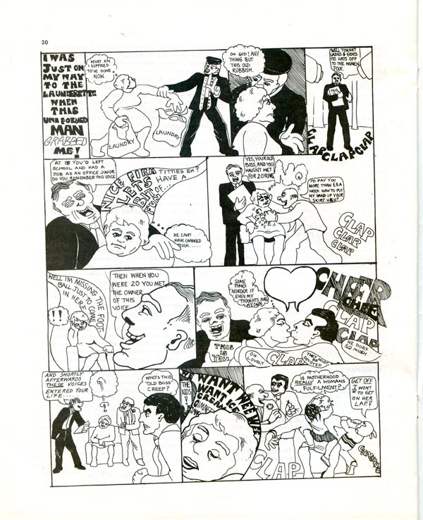
The table of contents page continues in this vain, with three different type styles, rough-drawn boxes, and a cool hand done image of a car with wings (likely a jab at Spain’s not so successful auto-industry). Inside is also another comic by the same anonymous illustrator. The style is similar to “The Turn of the Screw” above, but this entry is entitled “I was just on my way to the launderette,” and has a decidedly feminist bent. Anarchy was increasingly a melting pot of the ideas swirling around the far left in the UK in the 70s, a mix of old-school class-based syndicalism, excitement around armed struggle, an openness to liberation movements, whether women’s or Northern Ireland, and the DIY/direct action collectivist politics that would come to define the punk-inspired anarchism of the 80s and 90s. In this issues editorial, there’s a statement that the collective does “the typesetting, layout, platemaking and printing ourselves and we even lick the stamps for you.”
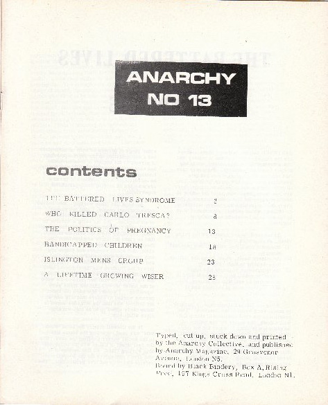
With issue #13 we reach some of the holes in my collection. I’m missing a half dozen issues, but thankfully Phil Ruff—Anarchy collective member from 1973 on—has scanned and sent me the covers of the issues I’m missing. Phil is a long time UK anarchist agitator, artist, and designer, who not only worked on Anarchy but also was a regular at Cienfuegos Press. (Thanks for all your help, Phil. And please let me know if I’m getting any of this terribly wrong!)
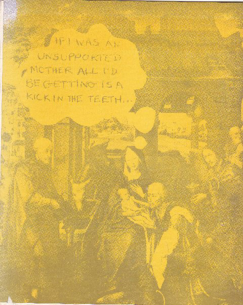
This issue’s cover maintains the titling font of #12, and is printed in 3 colors: red, black and yellow. The detourned religious images succeed at being simultaneously feminist, anti-clerical, and funny. It’s a nice shift adding the word bubbles to bodies not normally allowed independent voice (religious icons) instead of the same old comic book characters who would be speaking anyway. Based on the table of contents, the issue is largely focused on gender, and the attack on religion on the cover was just thrown in for good measure.

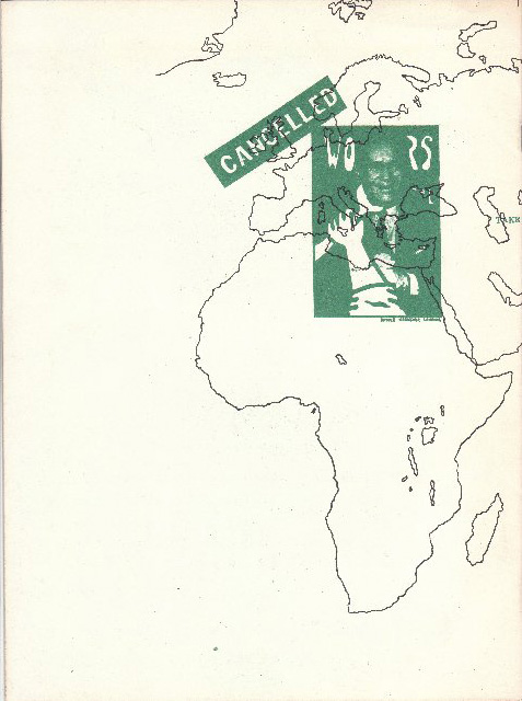
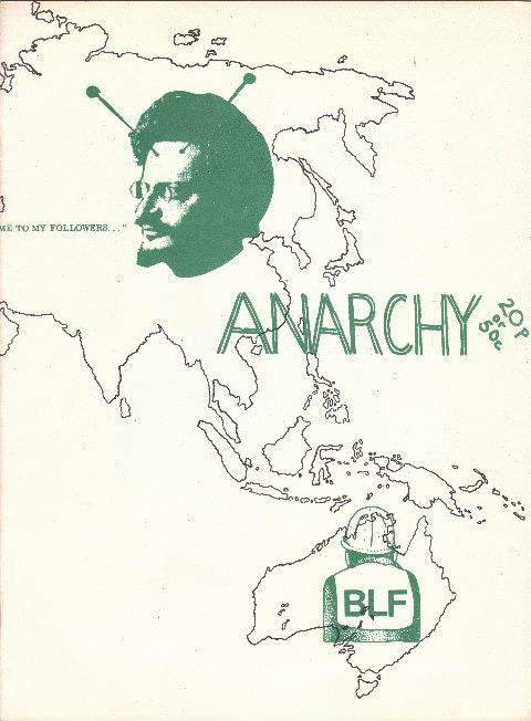
The cover of #14 goes for an entirely new angle, with a hand-written masthead and a wrap-around cover attempting to address much of the content in one swoop. We quickly move from Trotsky as alien-bug to the Australian labor federation, and on to workers control and a big “cancelled” stamp across the UK on the back. The image of the wrench around the bosses neck on the back is of interest because the drawing part is taken directly from an earlier screenprinted, British political poster produced by the Poster Workshop in 68 or 69 in the spirit of the posters of May 68 in France.
Next week we’ll see yet another format change and some more anarchist comic strips. . .