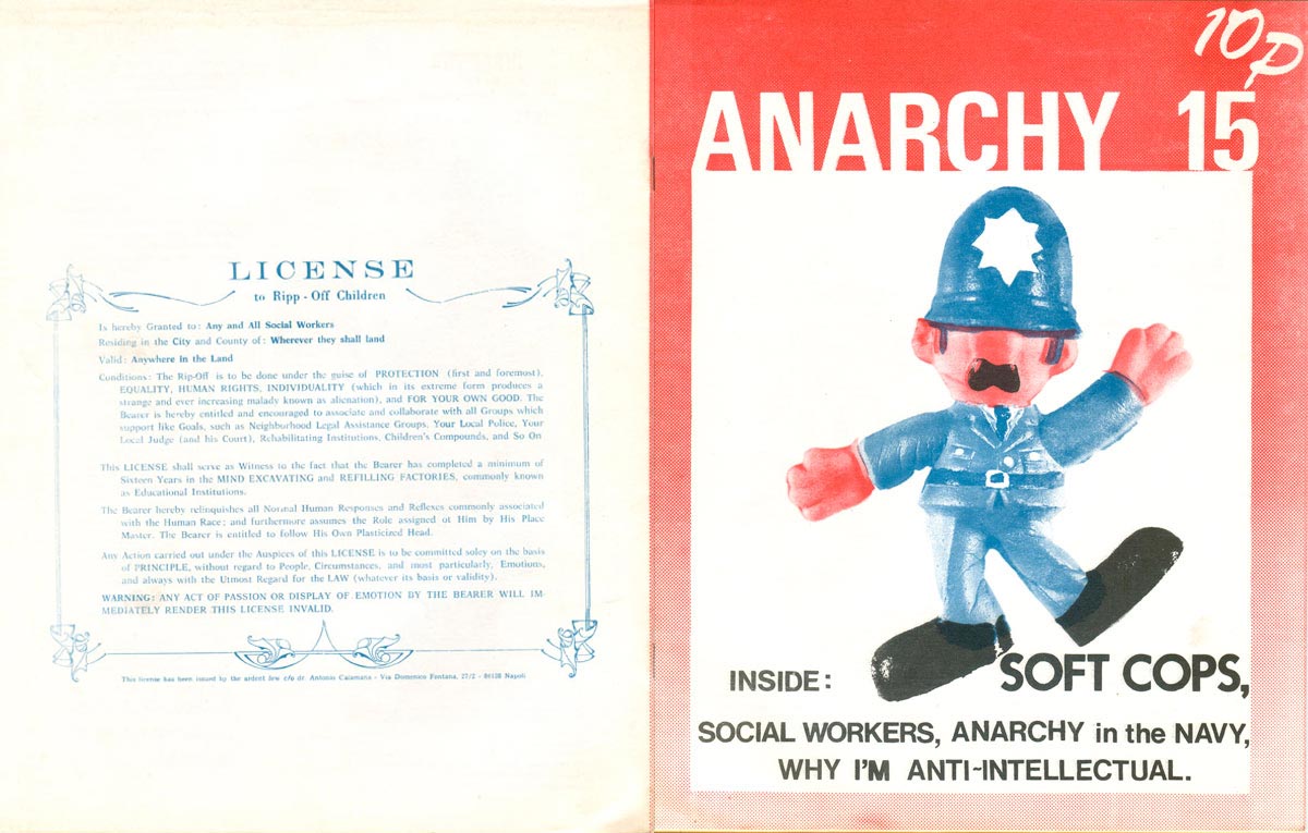
With issue 15 Anarchy goes through another facelift. For this, and the next three issues, we’ve got a straight sans serif masthead in white on a fading, dark to light, half-toned background, with a central box featuring an image and the contents inside. This return to set style is intended to help increase sales, as the price has also been lowered and issue numbers are once again placed on the cover. The image on this cover features a toy police officer (“Soft Cops”) done up in a nice red and blue duotone. Sadly the use of black for the text at the bottom is wholly unnecessary, as we can see from the overlap of blue and red in the cops moustache that overlapping the colors to render the type in the dark purple that combination produces would have made for a more cohesive and pleasing design. But all in all it’s not so bad, and the toy cop floating in the white box makes for a compelling image.
The back cover is printed solely in blue, and reproduces a fictional ad satirical “license” to social workers, relabeling social work as the emotionless and heartless “ripping-off” children, “mind excavating,” and “filling factories, commonly known as Educational Institutions.”
According to Anarchy Collective member Phil Ruff, this is around the time that significant internal changes were happening. Anarchy had moved out from under the shadow of Freedom Press and into a squatted commune on Grosvenor Avenue. While previously the publication had used commercial printers (primarily Express Printers, which was owned by Freedom, and may have been the predecessor to Aldgate Press, which currently resides right behind the Freedom Bookshop off Whitechapel). now it had its own printing and production equipment. Chris Broad and Charlotte Baggins were two of the most solid and staunch collective members throughout this period and over the next 20 issues. Chris had bought the press with money from an inheritance and Chris and Charlotte would go on to turn the press into the Little @ printing, a small printshop in Wapping that would end up printing Anarchy as well as a number of other anarchist publications in the early 1980s (including many of the Cienfuegos Press pamphlets).
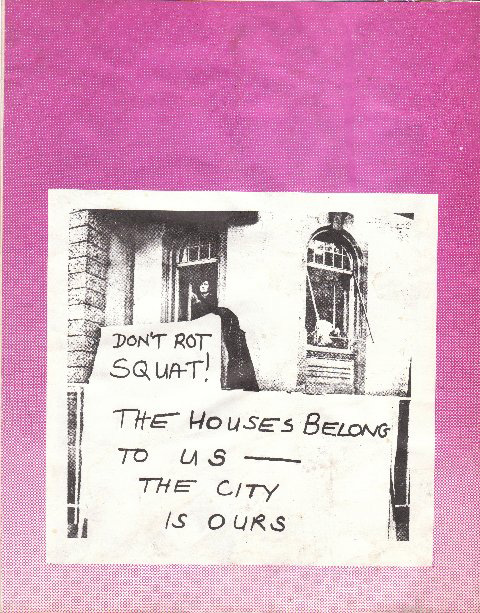
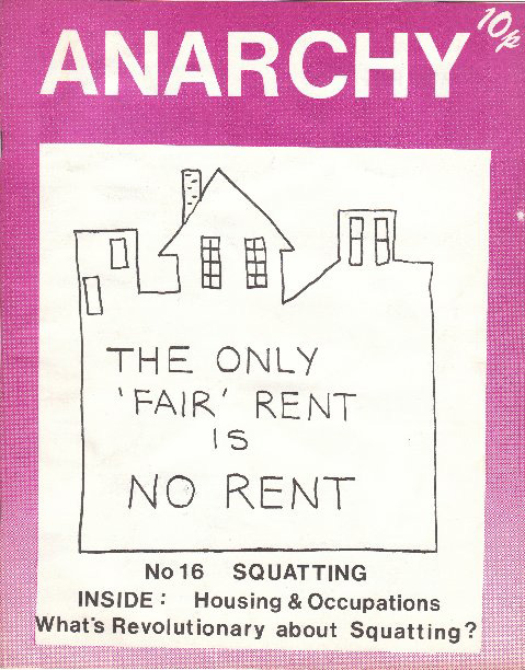
Anarchy 16 focuses on squatting, and the cover features a crude drawing of a building and squatting slogan, possibly a re-interpretation of an existing political poster. This cover is a good example of the weaknesses of series design, because without the strength of a powerful central image, the white box and simple titling fail to make a compelling cover. Although this issue clearly “belongs” to the same design arc of the last, and regular readers would likely associate them together, on its own it doesn’t do much to make someone potentially interested want to pick it up. The back cover doesn’t activate either (leaving the text from the original sign and banner might have been more effective), although it might be the earliest example I’ve seen of a variation on the slogan “Squat or Rot!”
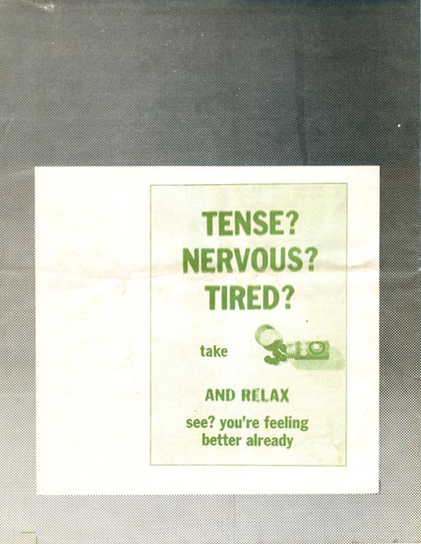
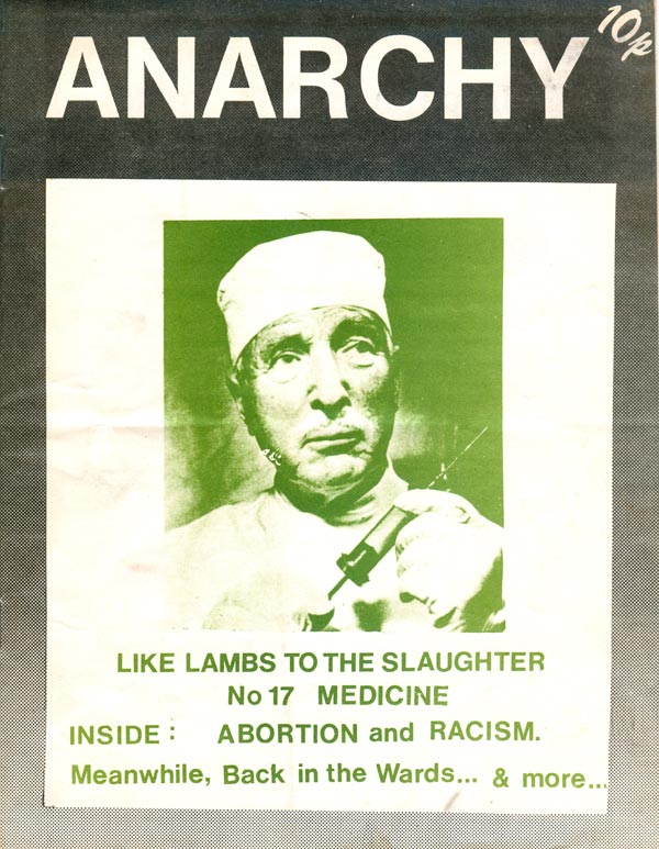
Not much to say about issue 17, the “Medicine” issue—same basic design but with creepy green doctor, who is very, ummm, creepy.
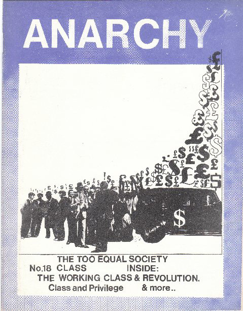
The cover of the “Class” issue (#18) is more interesting, with a cool montage of bankers, workers, and all kinds of money symbols. That said, I’m not sure I can interpret what it’s intended to mean, other than a broad reference to money, and therefore class. The back cover has a cool comic about class aspiration.
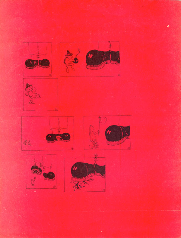
Issue #19 might just have the ugliest cover yet, with a boring black and red diagonal split filled with a sloppily written list of revolts over eight decades. We’ve returned to the convention of no issue number on the cover, but unlike other covers, this one at least gives us a date (albeit unintentionally). The back cover has a great little comic of a bomb throwing anarchist failing to crush the black boots of repression, but successfully getting a peacenik squashed! Like many of the comics, it would have been much better larger, it seems silly that these back page strips are always so small on the page.
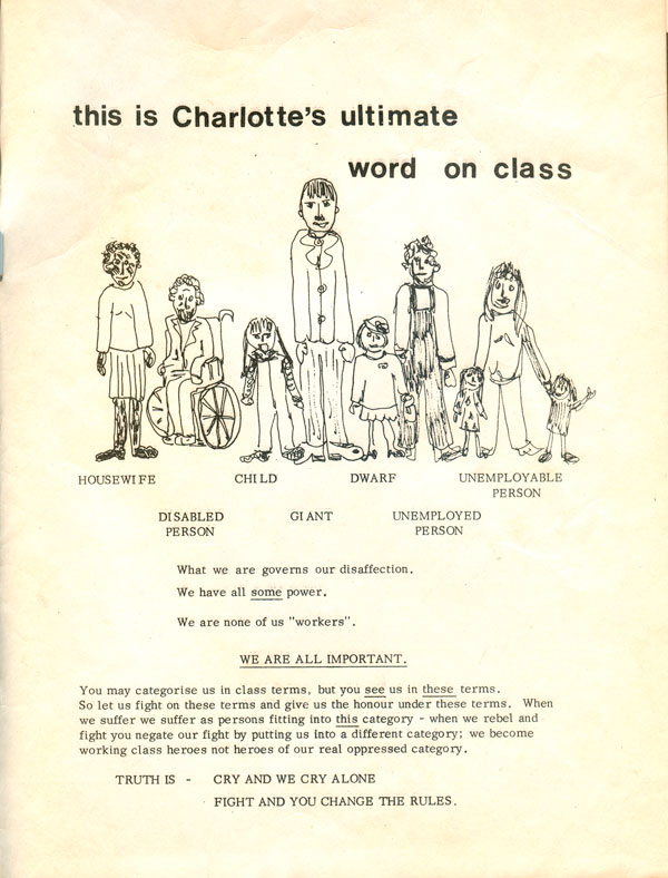
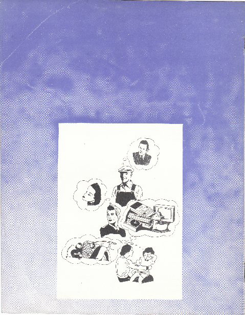
The inside back cover has this interesting illustration/polemic. The image is a naive drawing, but it is really unclear if it was drawn by the listed “Charlotte,” or even who Charlotte is? The claim seems to be that people are often oppressed by categories other than class, or traditional work.
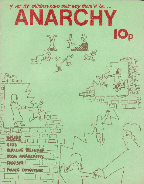
Anarchy #20 has a nice pro-kid cover. Brown and red ink on a green stock, the image is a really nice break some previous efforts because finally we have a drawing that fills the entire page, and isn’t crammed up in a small inset box. In fact kids are breaking out of boxes all over the place, and the jagged lines of their youthful transgressions echo each other nicely, and smartly frame the open, liberated space that makes up the center of the cover.