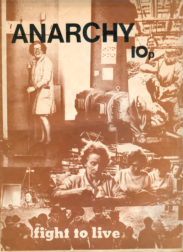
This week we’ve got some great covers! To the right is Anarchy #21. I actually should have included this issue—and the next one, #22—with last weeks entry, as it fits better within the design arc of issues 19 and 20 then most of the ones we’ll look at this week. The cover is composed of a half dozen images of people at work, printed in a rich brown. The work is varied, from the factory floor to the home, the office and the market. The bottom strip, in contrast, is a group of masked people (maybe in Italy?), with the words “fight to live” superimposed over them. The images are intended to illustrate the lead article inside, “The Right to Work or the Fight to Live.” This would have been more effective if the bottom photo had been printed in black, setting it off clearly from the work images.
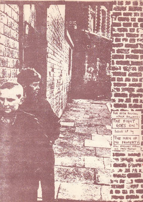
Anarchy #22 features more schizophrenia in brand identity, with an abandonment of the Helvetica of the past seven issues and a return to the titling style of issues #12 & #13 (see HERE). The front cover by itself (on the right, below) doesn’t really stand out, but unfolded with the back, it makes more sense. The fake graffiti is still a little awkward, but the figures in the foreground pull the design together.
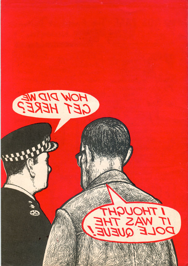
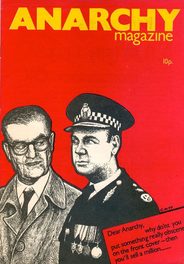
With its 23rd issue, Anarchy gets yet another makeover. This time by a set of hands with some serious experience. It looks like with this number Clifford Harper took over the reigns of the cover designs, and it makes a world of difference. While previous issues hit on some compelling compositions and images, it often felt that it was almost by accident. Harper on the other hand really knows what he’s doing. To start with, the masthead is bold and really confronts the viewer. The yellow helps, plus running it across the entire length of the cover and a smart switch to an extra bold version of Arial for the type. In fact all the type on the cover is a clean sans serif, which is part of what makes the hand drawn illustrations really pop. Sitting on the clear red field, the cops look creepy yet all too comfortable on the cover of a magazine entitled Anarchy. The back cover is a strong tie-in with the front, where we get to see the offhand knucklehead banter of the cops, painting them as both stupid and corrupt.
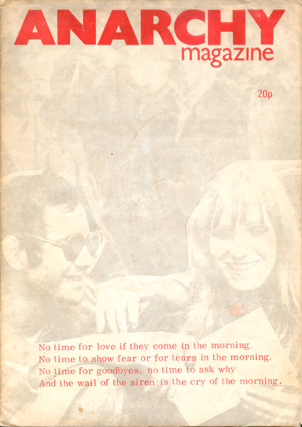
This next cover is an homage to the members of the Red Army Faction (RAF) who were killed (or committed suicide?) in Stammheim prison in West Germany in October 1977. Andreas Baader and Gundrun Ensslin smile and laugh at us, as they fade away in light grey ink. Song lyrics sit are printed on top of them, four lines from “If They Come in the Morning,” a song by American folk singer Jack Warshaw. He wrote the song in 1977 while in Belfast. Unintentionally both the images and lyrics let us know that this issue was likely produced at the end of 77 or early 78, which isn’t otherwise listed anywhere inside or out. Although the masthead is the same as issue #23, I doubt this front cover was designed by Clifford Harper, as his initials aren’t on it, and he had actually created drawings of the RAF martyrs, so if he had done the cover it seems likely he would have used his own images.
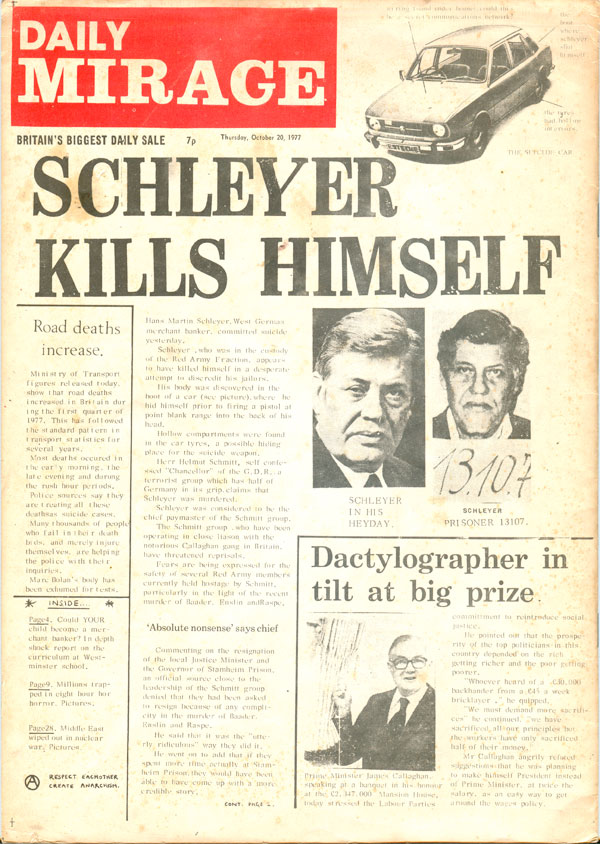
The back cover is actually a lot more technically savvy, and it is possible Harper had a hand in it. Harkening back to the first couple issues of Anarchy where the back covers were reproductions of foreign newspapers, here we have a mock edition of UK’s Daily Mirage (nee Daily Mirror). Hans Martin Schleyer was a German industrialist whom the RAF kidnapped in an attempt to free their leaders imprisoned at Stammheim (including the aforementioned Baader and Ensslin. When the prisoners died (or were killed, it has never been cleared up as to what actually happened in the prison), the RAF murdered Schleyer. The headline here stating that Schleyer killed himself is a direct rebuke to the German state’s claim that they did not murder the prisoners, but that all of them had committed suicide.
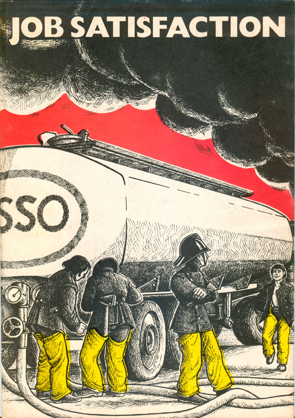
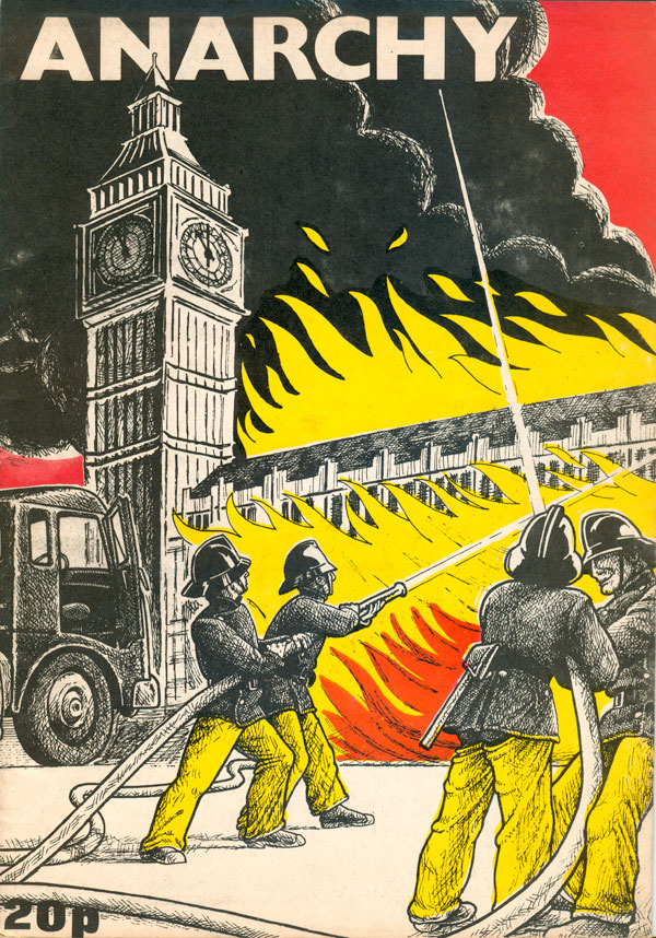
Everyone should just take a moment to bask in the sublime awesomeness of Clifford Harper’s cover for Anarchy #25. Genius! On first look, firefighters appear to be putting out a fire at Westminster, but then you open the magazine and look at the back cover. They’re not putting the fire out, but spraying it with gasoline (notice the “sso” of the Esso logo on the back of the gas truck). The back title “Job Satisfaction” matches the grin on the face of the firefighter walking towards us. On the surface it’s just a great gag, and done in Harper’s strong, scratchy late 70s style, bold and bleeding off the edges. But it’s not just a joke, it’s actually a solidarity image, done to support the firefighters on strike in London at the time.
The punk rockers reading this might recognize the image, as it was later re-purposed (and re-painted) by Harper for the cover of the UK anarcho-punk band Zounds’ album, The Curse of Zounds (Rough Trade, 1981).
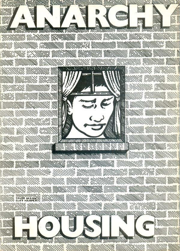
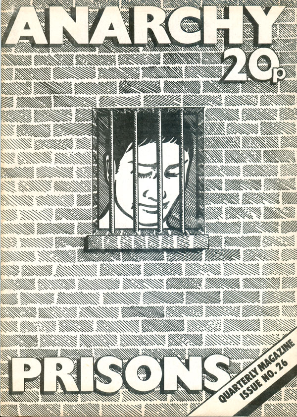
Anarchy #26 is another smart Clifford Harper cover. This time only in black and white, the imagery is strong enough to carry in one color. The small barred window is a simple but effective way of letting us know this is the prisons issue. But we can flip the magazine over and get the almost exact same cover, except the window now has curtains, and is illustrating housing. Not only does the cover communicate the contents (which are roughly split between various housing and prisons issues), but intelligently and simply illustrates the profound and troubling similarities between the two.
For those not familiar, Harper inherited the creation of interconnected front and back covers rooted in visual puns and image play from the designer of the original Anarchy series, Rufus Segar. His genius and creation of similarly sharp covers can be seen in Signal:01 (and some of his covers can be seen online HERE).
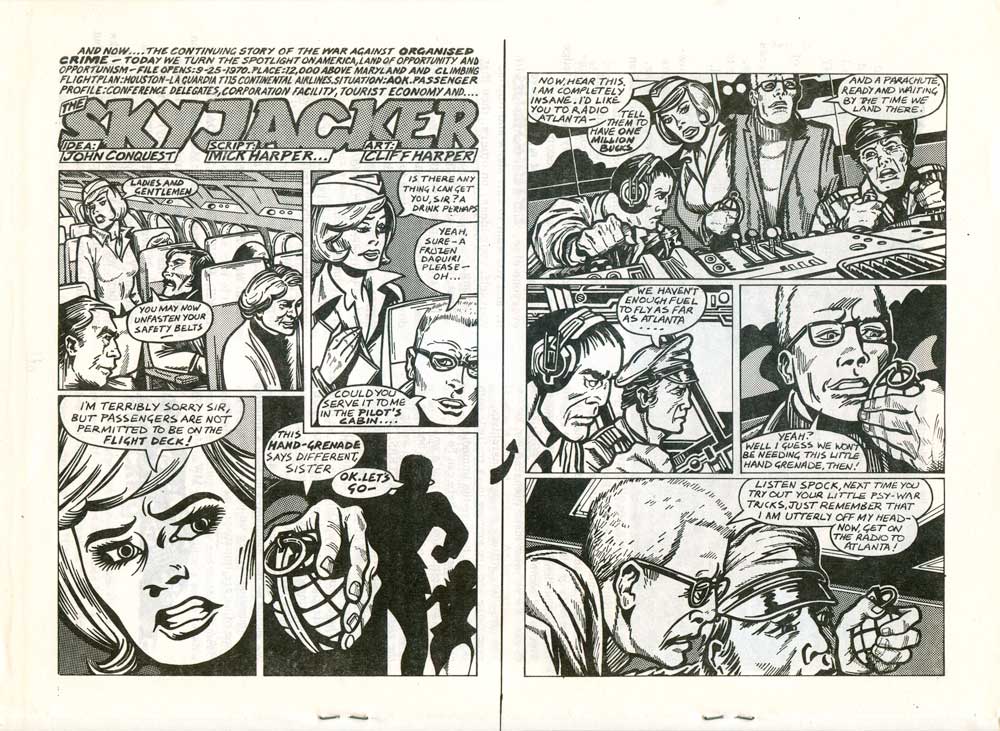
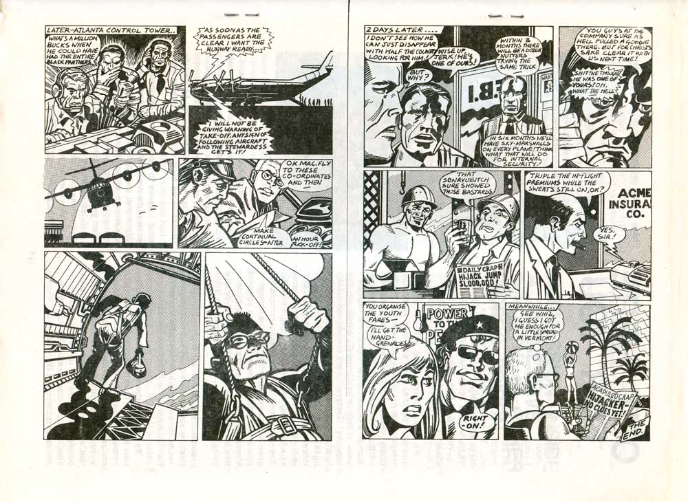
Also inside #26 is a special treat, a 4 page comic by Harper called “The Skyjacker.” It’s a little hard to follow, but Harper’s copying of that classic comic book style is pretty impressive.