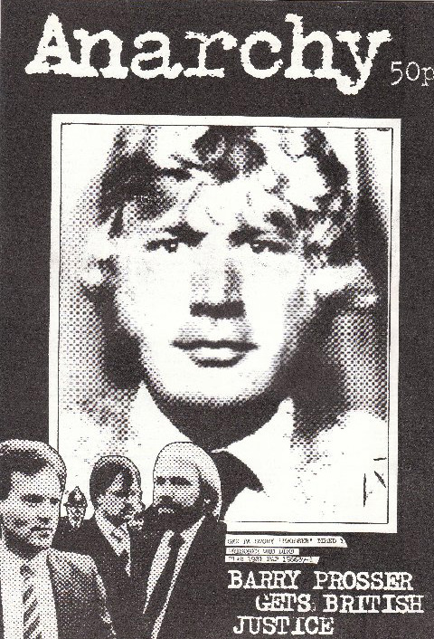
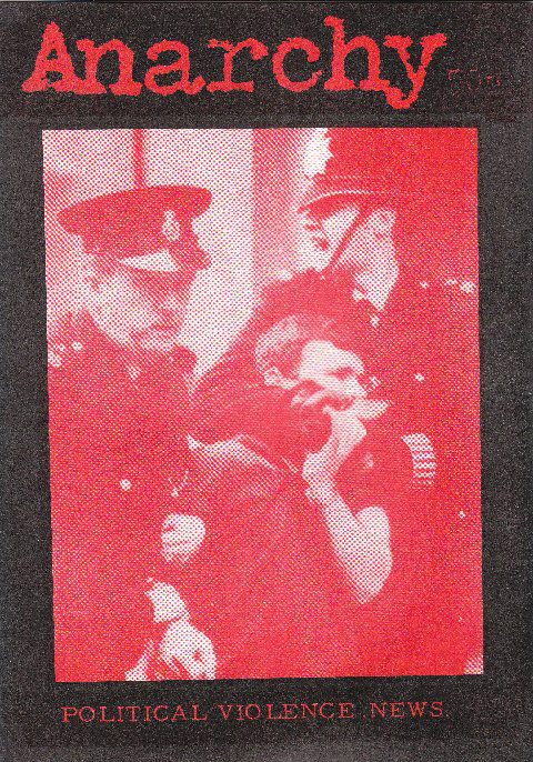
This week is the last installment of covers from the second series of Anarchy magazine from London, which ran for 38 issues from 1971 to 1985 (see the previous entries HERE). As we have seen, that fifteen year stretch was a bumpy road, with dozens of different editorial members, directions, designers, and cover artists. This week we’ll look at the last six issues. To the right is the cover of #32, a great follow-up to the cover of #30 which captured the explosiveness of the Brixton Riots. Here we have the response—repression by the police. The shadows and craggly lines give the face a deeply sinister look, this is not your friend. And once again the designers employ visual tropes which will later become extremely popular among anarcho-punk bands. A different version of this same idea found itself on the cover of Doom’s 1989 single, “Police Bastard.”
And the back cover is a reprinting of the brilliant “We Want to Riot Not to Work” flyer produced by the London Workers Group during the riots. It’s a great piece of propaganda, and really seems to capture the spirit of the time, or at least the spirit anarchist and antiauthoritarians were feeling and wanting to promote. It also echoes the cover slogan of issue 21, “The Right to Work or the Fight to Live.”
Issue 33 is a full comic cover (similar to issue 31, but even less graphic than that one). This is one of the issues we don’t physically have at Interference Archive, so this is a scan from Phil Ruff, and not large enough to really read the content. Sorry about that.
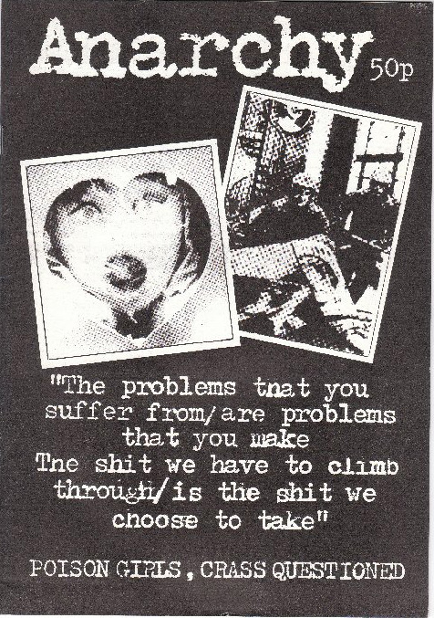
This next issue actually illustrates the growing intersection of the punk scene and the anarchist movement by focusing on the conflicts between two anarcho-punk bands, Crass and the Poison Girls. The cover borrows heavily from the Crass Records and general UK punk aesthetics, but as we’ve already seen, the opposite is also true. Both front and back covers read like they could be covers for punk fanzines, back in the early 80s, or even today. It also seems only appropriate that this issue focuses on the schisms between elements in the punk scene because it is the last issue put together by the broad Anarchy magazine editorial collective, which collapsed with this number. The publication was passed into the hands of Phil Ruff, who kept it going for the final four issues.
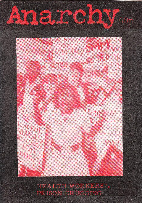
The cover of issue 35 continues with the distressed type-writer lettered masthead, which keeps up the rough punk feel. The large blown out dot pattern on the photographs complements the typeface nicely. The same basic design on front and back works well, opening up the possibility of people stocking it on shelves with either cover visible. Police repression for the hardcore, striking nurses for those more attracted to the social aspects of anarchism.
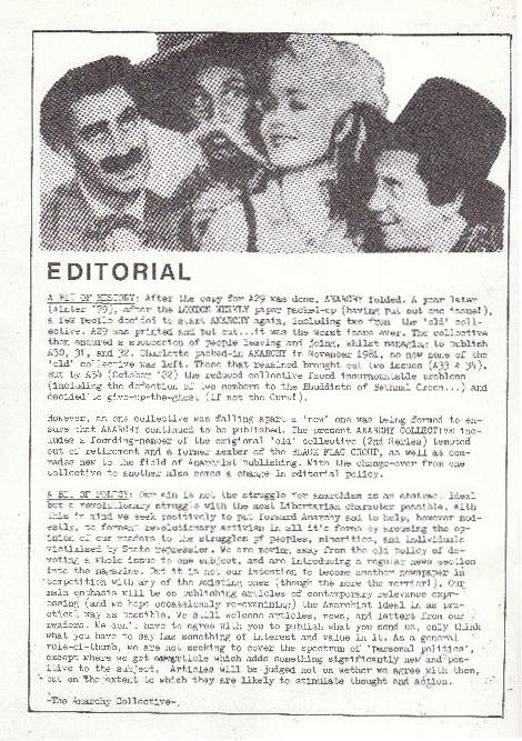
For those that want to know more on this history of the collective and this transition, there is a bunch of info in the editorial from issue 35, below. Once again this is a scan I was generously given by Phil Ruff, so I apologize that it is difficult to read.
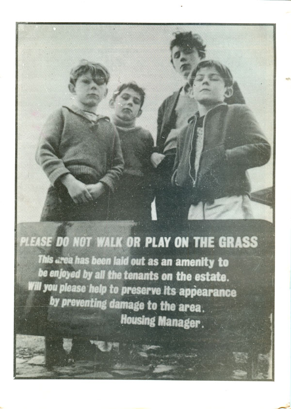
Anarchy 36 reins in the punk a bit, going for a different font (a version of Caslon perhaps?), although it is still blown-up on a photocopier and distressed. The image is also much more traditionally photographic, and the corner text bar gives the entire thing a more professional feel. The back cover is a cool photo of young toughs, I can’t help but smile when I look at it.
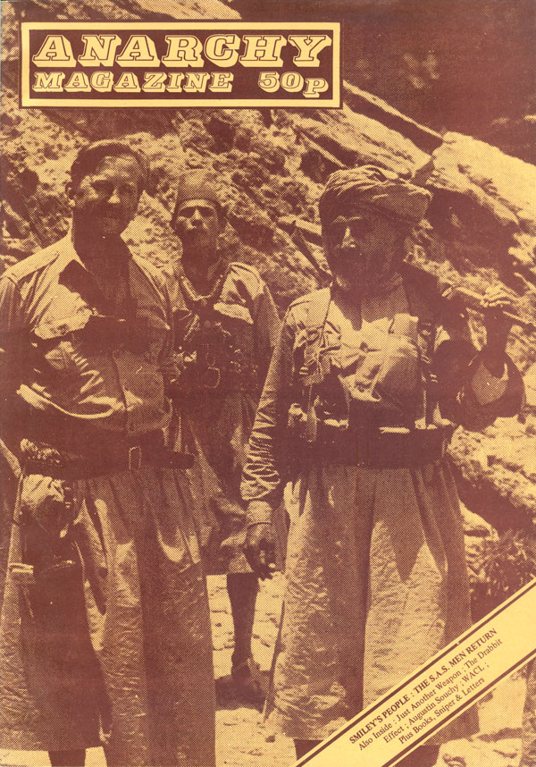
Anarchy 37 takes the direction the design of the previous issue was going, and brings it to its next logical, and stronger, step. The full bleed photo of the British Special Air Service (specifically Colonel Smiley) intervening in Yemen in the 1960s is an indictment of continued British imperialist (and covert) maneuvering in the Arab world. The new masthead is strong, and the deep brown ink on rich yellow paper helps cohere a minimal yet striking design.
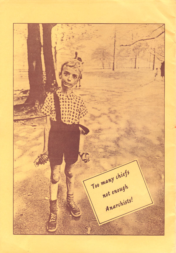
The back cover is somewhat incongruous and a bit incomprehensible—a reprint of Diane Arbus’ well known 1962 photograph “Child with Toy Hand Grenade in Central Park, New York City.” The added tagline “Too many chiefs, not enough Anarchists!” is possibly intended to turn the image into a call for direct action, but it reads strange today, especially after the rise of suicide bombing. A kid in a public park threatening violence is hard to interpret as liberatory.
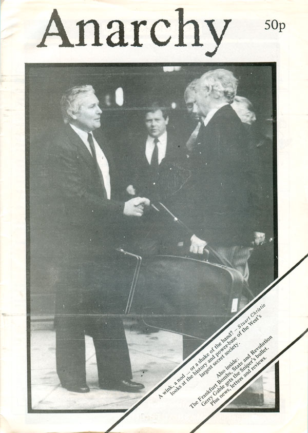
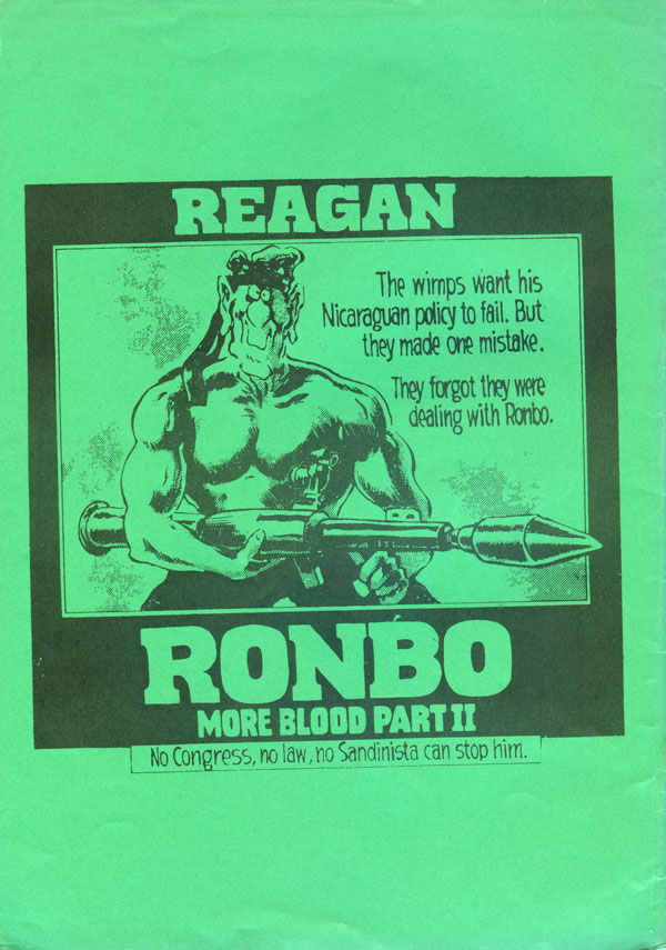
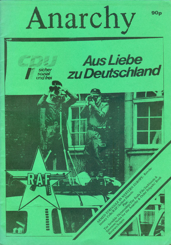
With the final issue we sadly loose the previous masthead and return to the much more staid version from #36. The photo is also less interesting, but that might be because extreme police surveillance has become so common place today that few even notice. The implication that they are watching us, the readers, likely had much more impact in 1985. The back cover reprints an anti-Reagan graphic that looks like an editorial cartoon yanked from a left-leaning newspaper. It’s an interesting choice for such a staunchly British publication (not to imply any nationalism, but the focus for most of history of the publication had been very much on the UK, or it’s role internationally).
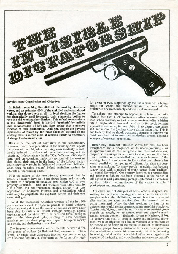
You can see below that the inside design has gotten much sharper at this point, without giving up on the pictures of guns. The use of type is strong (likely pre-computer Presstype, the face was called “Profil” sans e), and the composition is tight. Overall this looks similar to the layout of the Cienfuegos Anarchist Review, which was coming out roughly the same time, and likely also being laid out by Phil Ruff (at least in part).
So that’s it for Anarchy. I wish I had some pithy words to tie-up the aesthetics of a fifteen year long labor of love by a committed group of anarchist agitators, but that might be too much to ask. Unlike the first series of Anarchy, it’s clear there was never a consistent and committed design concept. Instead the magazine twisted and turned depending on who was leaning on the rudder at any particular moment. For this reason, at first glance the second series as a whole is less compelling than the first, which had the benefit of its almost infallibly sharp and intelligent covers done by Rufus Segar. But the second series is a product of a different time, and its design in many ways seems to chart the rocky terrain of the UK anarchist millieu, which was deeply influenced and changed by a number of significant forces, from the New Left to armed struggle in Europe, the rise of punk music and the increasing dominance of more lifestyle politics illustrated by the squatting movement. As the movement left the wooly confines of academia, the CND, and the legitimate left, the magazine did too, and it shows. This is the very reason why I keep writing about cover design.
See you next week, I promise a change in scenery!