While hunting for books in the Heinemann African Writers Series (by far the most expansive collection of writing from Africa in English, and interestingly designed covers to boot!) I began stumbling on titles in a parallel series by British mass market paperback publisher Fontana. While the African Writers Series is largely aimed at academic and literary audiences, the Fontana African Fiction collection clearly set its mark at a broader and more populist audience. This will become clear very quickly when you look at the majority of the covers!
Over the past couple years I’ve found 19 books in the series, but there are at least another half dozen I haven’t been able to find. I have found images of some of these, and when possible cleaned them up and included them here. That said, it’s pretty clear which those are, as some are completely shitty reproductions, so I’m still on the hunt for the actual books. If you have any and want to send me scans (or books!), that would be great. I’m going to include a bibliography at the end of the series, but I’m only including the books I have, where I can confirm the correct information.
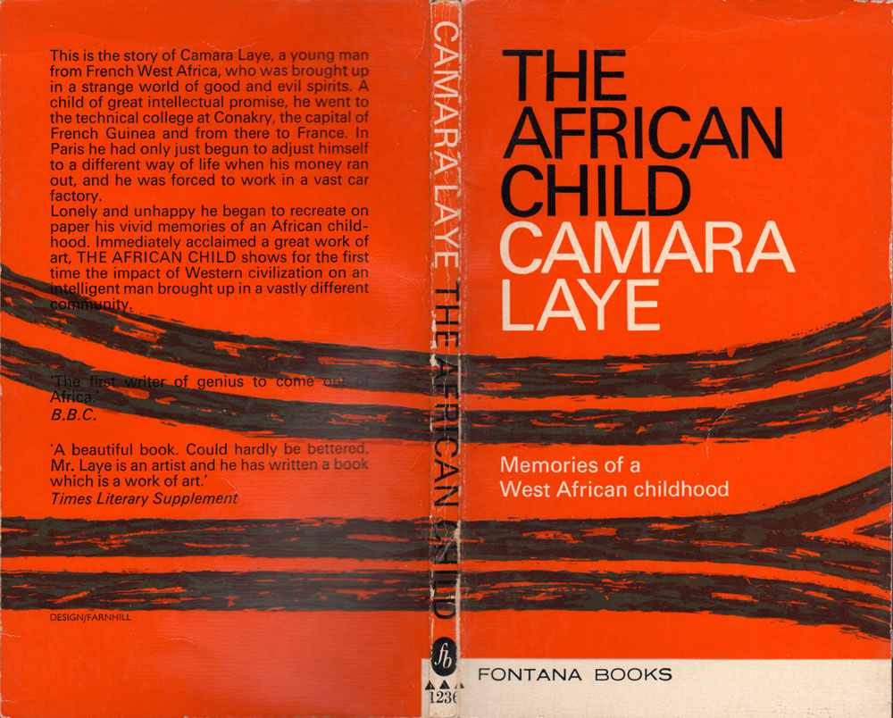
The first title I found is a bit of an anomaly, it is a 1960s edition of Camara Laye’s autobiographical The African Child. Laye was a Francophone Guinean author who was extremely popular in the 1950s and 60s, but has since been eclipsed, at least in English, by Achebe and Ngugi as the heavyweight African authors. He is the anchor for the Fontana series, and they published four of his books in multiple, inexpensive paperback editions. I’m going to focus on these this week.
Some of Laye’s books published by Fontana, including the one above and below, actually predate the specific African Fiction series. I’ve found versions of both The African Child and The Radiance of the King which follow the cover design conventions of Fontana’s non-African books. The colorful striped covers of were designed by Farnhill, and are used on other Fontana books as well.
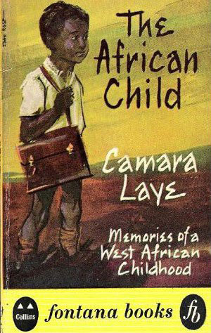
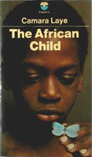
Below is the first Fontana paperback edition of The African Child, from 1959, and to the right of it is the 70s/80s Fontana version. It is the general design of the 70s/80s books that interest me, or to be more specific, the photography featured on the covers. All of these titles feature bright, saturated photographs of Africans. Most are clearly staged, but attempt to appear candid, like a window into other’s lives. Some, like the cover for The African Child, are sweet and generous, while others are aggressive, vaguely erotic, or simply strange. While most publishers of African fiction take the subject very seriously, Fontana appears to be promoting these books the same way they would sell other genre books, like romance novels or crime fiction.


The photographic cover for The Radiance of the King is less schmaltzy than the picture of the kid with the butterfly, but it is still heavily genre, with the gold armlets evoking a time past, a “tribal Africa.” The same is true, and more so, for the cover of A Dream of Africa, with the scarred portrait of the young man imposed on the tribal mask. The placement of these photos on a clean red background decontextualizes them, they could be anywhere at any time.
The photograph from the cover of The Guardian of the Word is much goofier than the previous ones, and definitely approaches what you could imagine the cover of an African romance novel might look like. The recreation of “traditional” dress and clearly staged posing of the model rings funny. It makes me wonder how covers like this were received by general audiences, both African, and non-African people in the UK? Did anyone pick this up and think, “wow, that looks cool?” Were Black and African people in the 70s simply excited to see images like this on news stands and in bookshops, or were these covers seen as hokie, condescending, or even slightly racist?
It is so hard to tell from this historical distance.
In the type treatment we also see the transition from the 70s, with it’s clean sans-serif type and thin white line between author and title (seen in the above covers), and the 80s, with serifed titles and a more flexible general design. But throughout it is the photographs that are used to drive the design, with the type doing its best to communicate yet stay out of the way.


I’ll stick to Camara Laye this week, and get into the rest of the authors and books in the next couple. There are some amazingly funny photographs on the covers of other books in the series.