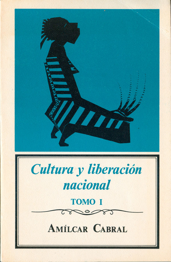
Last week I looked at the covers of books by African revolutionary and theorist Amilcar Cabral that were in English. This week lets take a peek at his books published in other languages. Cabral wrote and spoke Portuguese, but the Portuguese book trade is quite small, so his works in his native language aren’t particularly easy to find. I haven’t been able to track any down, but I have found one of his books in Spanish, Cultura y liberacíon nacional (Culture and National Liberation) published in 1981 by the Escuela Nacional. It doesn’t seem that the contents of the non-English books graft directly onto any of the English titles.
This book has the most distinct cover of any of the Cabral books, forgoing photographs or likenesses of Cabral himself. Instead we have a highly stylized—and highly cryptic—female figure, kneeling in a prayer position, face and palms upturned. Extending from her fingers are a series of marks which could either reference motion, energy leaving her hands, or simply extremely long fingernails. Even though there is nothing special about the typography or the rest of the design, ultimately the figure is unique enough (the fingers, the patterned spine, the striped dress, sharp mohawk-like hair) to carry the cover.
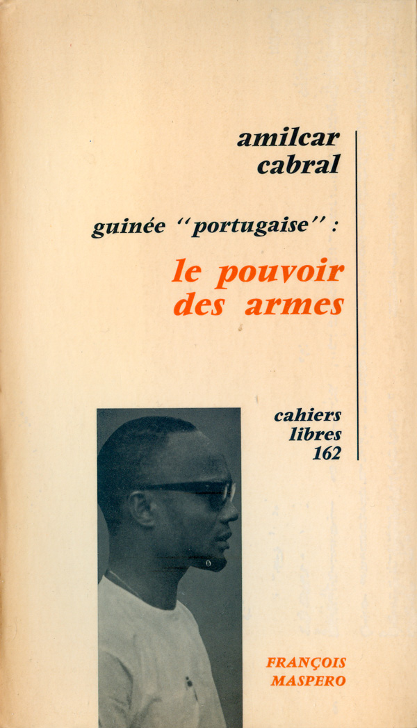
The next book is Le Pouvoir des Armes (The Power of Weapons) published by Maspero in Paris in 1970. The cover is a variation on the classic conventions of continental/French book design, with the titles small and low key, all lowercase and right justified against a hanging line. All this is balanced by a rectangular bar on the lower left featuring a young looking Cabral staring out to the right. The right justification and his gaze confront each other, making a surprisingly dynamic composition.
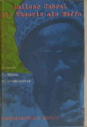
I suspect that the same book in German is titled Die Theorie als Waffe (The Power of Theory) and I’ve found two different editions. The first, from 1968, is by Oberbaumpresse in West Berlin. The cover is a bit muddy, and collages a central image of Cabral with a backdrop of guerrillas in the landscape. I haven’t been able to do too much research, but the press seems to have published works related to the student left in the late 60s and early 70s. A later 1983 edition of the same book on edition Con has a much more streamlined cover, dropping out all background and focusing in on a high contrast photo of Cabral on a field of black. Even though not very creative, it is much easier to read and far more attention grabbing.

And then way up at the top we have another German book, Die Revolution der Verdammten (The Revolution of the Damned) published by Rotbuch Verlag (Redbook) in 1974 in West Berlin. The cover is not complicated, but really strong and effective. Unlike all the other covers, Cabral is not simply a head, but is embodied, and actually in motion (on a boat!). The cover is printed in simple red and blue, but the overprint creates an almost black image on red background. The white box for the text wraps across the spine and onto the back, but doesn’t touch either outside edge, which is not an obvious design choice, but works here. Overall the cover is reminiscent of the stage1 edition I looked at last week. As for the title, It is clearly an attempt to link Cabral to Fanon, and his extremely popular Wretched of the Earth, which could also have been translated as “damned,” as it is titled Die Verdammten dieser Erde in German. This certainly makes sense from a marketing angle, and at this point Cabral has already been assassinated, so he hardly could complain about it.
I would love to see additional international covers, so if anyone out there has any, drop me a note.