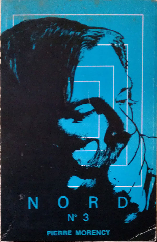
While I was in Québec City two weeks ago I found some nice examples of book covers from Québécois authors. I know very little about the Québec book trade, but it seems like it has as much or more connection to France and Europe than to the rest of Canada or North America. Early examples look similar to French books, with very basic text design, maybe a small graphic element, but no pictures. By the 60s covers are pictorial, but rarely photographic or full color. I found this cool cache of covers in a small bookshop on Rue Saint Jean. These are just quick cellphone photos in bookshops, so I don’t have any additional info about any of these books, unfortunately.
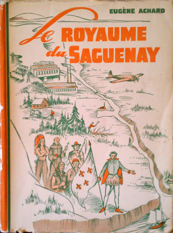
There was a whole set of these late 50s/early 60s books by Eugène Achard that are about Québécois history, but appear to be as confused and colonialist as your average US textbook. The happy priest, “indian,” farmer, and trapper all line up behind the French lord, or whatever he is supposed to be.
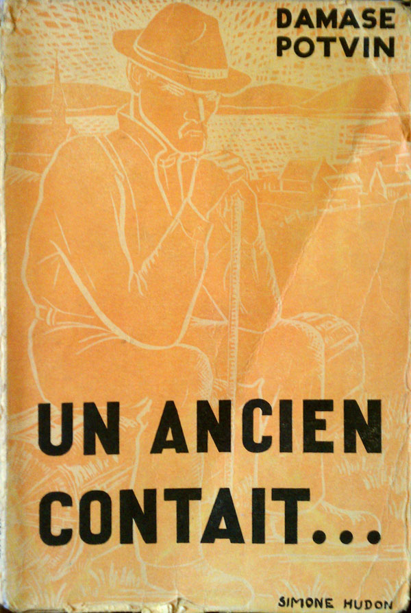
The Potvin book below is the first one I found, and what got me started on pulling these out and taking photos. The raw block print of the old man is so strong, yet the choice of printing him orange on yellow is a strange one. The bold black text makes him almost disappear, and although I suspect this wasn’t intentional, it certainly feels like it was.
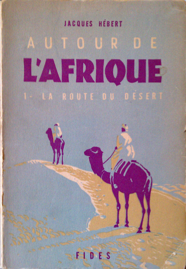
This is one of my favorite covers I found. It appears to be a travel diary through Africa. Only three colors are used here, but they are an unusual combination—tan, purple, and blue—and resonate powerfully on the page. Deciding to fill the page with blue instead of tan makes the desert they are crossing seem almost more vast, conjuring up oasis where they don’t exist. The figures, and even the camels, are so simply rendered that they collapse into abstract shapes the closer you look. And I just love the map on the back, the purple line marking the trail.


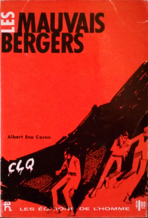
And the whipped cream on top is Les Mauvais Bergers by Albert Ena Caron. The title is taken directly from a 1890s play of the same name (translated as The Bad Shepards) by the French anarchist Octave Mirbeau, and is about a worker’s strike brutally crushed by the army. I can’t read French, and can find almost nothing about Caron online, but the cover is intriguing. The figures seem decidely 20th century, and with the graffiti and dark shadows look more like they are from a 1970s urban guerrilla group than a labor strike. The graffiti says “CLQ,” and I’m unsure what that is referring to, as the main armed Québec independence movement was the FLQ…