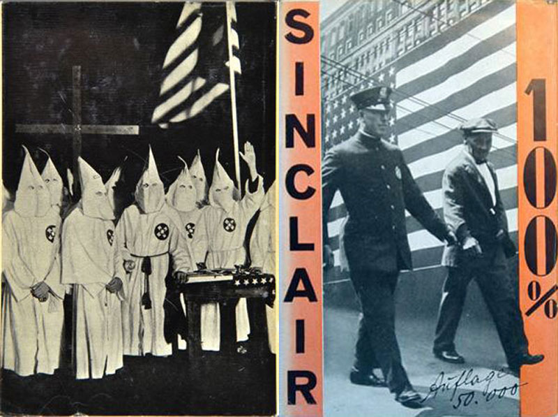
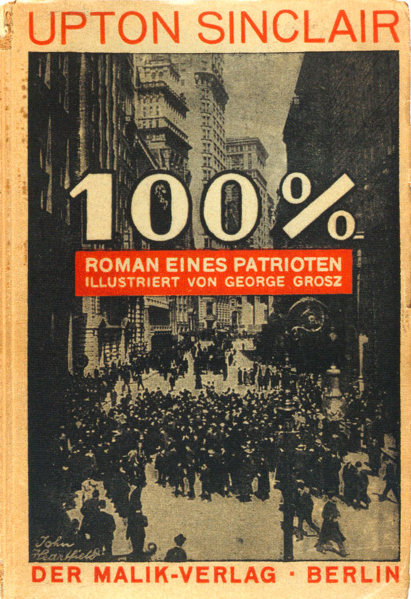
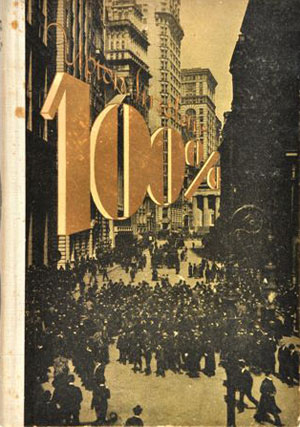
One of the main authors Malik-Verlag published was Upton Sinclair, and Heartfield designed ALL of Sinclair’s covers. This week will do part one of Sinclair, next week the rest. Let’s start chronologically: In 1921 Sinclair’s 100% was published with a pretty clean and straightforward cover (below left). In 1924 it was reprinted with a new cover design, with the same city street image brought to bleed and a more adventurous and effective type treatment (below right). Then in 1928 a completely different cover was produced with a montage and the nice effect of the leg kicking into the frame. This cover also shows an interesting Malik/Hearfield design device, which is the printing of the edition (in this case 50,000 copies) in handwriting on the cover (above right and below). You can also see the spine peeking out, which consists of a tall pile of thin horizontal lines and the title written horizontally. This was the standard style for many of the Sinclair books. The back cover of this edition (and the 1924 edition) is simply a photo of a Klan meeting.
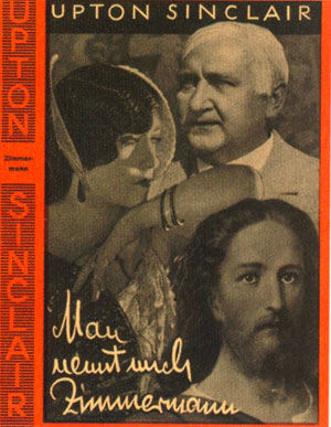
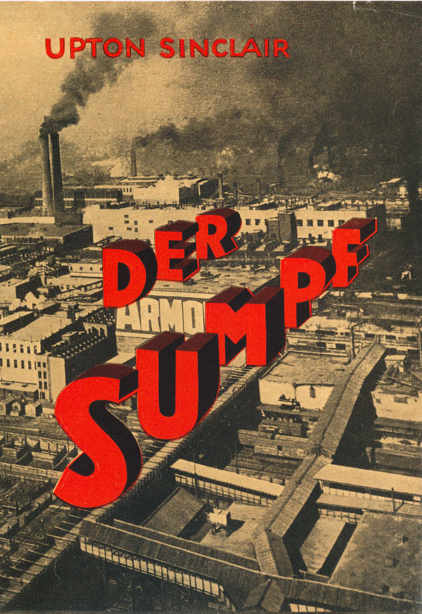
In 1922, Man nennt mich Zimmermann was released, but the cover below is from the 1925 edition (the 1922 is similar to the early 100% design, with the cover image in a white box). In 1924 Der Sumpf was published, on which Heartfield uses 3D type to great effect.
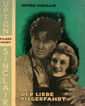
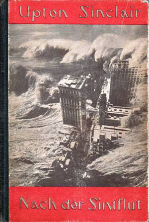
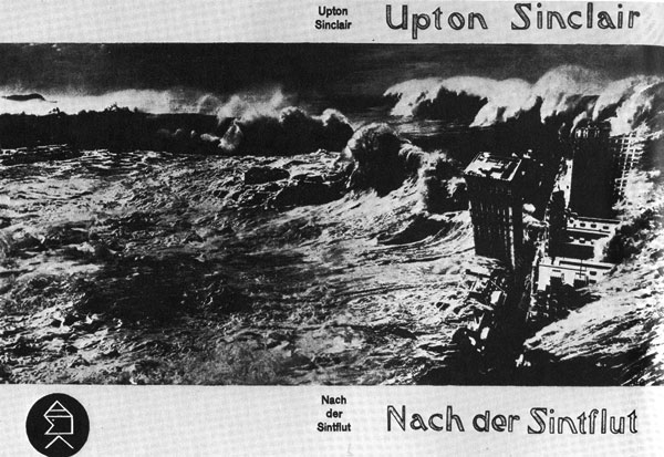
Der Liebe Pilgerfahrt was also put out in 1924 (although this is a slightly different cover used on the 1928 edition, notice the horizontal lines on the spine). In 1925 Nach der Sintflut (After the Flood) was released. The image below right shows the cover in color, below that is a black and white image of the full wrap-around cover (which would have been in color, I just can’t find a color picture of it…).
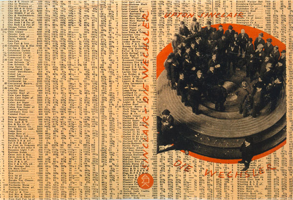
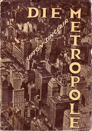
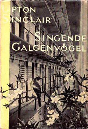
Two additional Sinclair novels were published in 1925, Die Weschler (with another great wrap-around cover, this time the type and montage printed right on top of stock readings from the newspaper, another visual effect which would later be recycled by punk rock) and Die Metropole. In 1927 Singende Galgenvogel was published, and I suspect the actual cover is quite impressive, but the faded photos I could find don’t show us much.
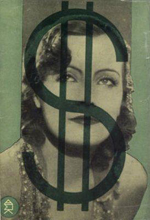
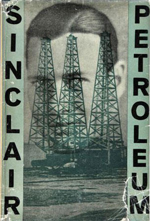
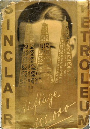
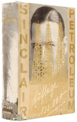
1927 also saw the first printing of Sinclair’s Petroleum, which would become Malik’s best selling book (and the basis for the great movie There Will Be Blood). Petroleum had a number of different covers, all based on the same montage of oil towers and a man’s face. I believe the green version is the first edition, and below you can see the back, with the dollar sign obscuring the woman’s face (with strange echoes of the contemporary discourse of overworked, myopic, unhappy men and gold-digging women). The later editions were printed with gold as the spot color, and the editions once again scrawled by hand and printed on the cover. The 1931 copy was printed in an edition of 125,000, and the image below has a great peek at the spine, with its oil geyser.