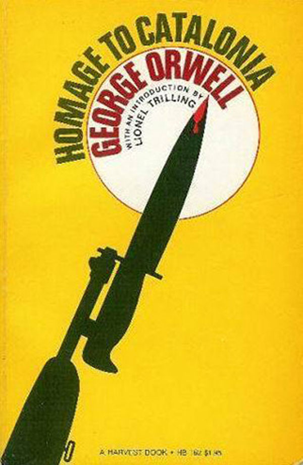
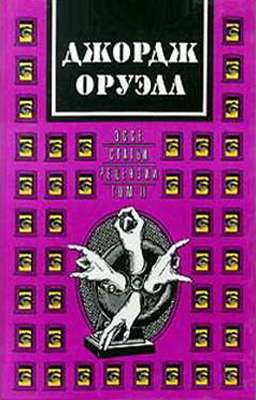
The book to the left is the copy of George Orwell’s Homage to Catalonia that I grew up with (I think I first read it early on in high school). My guess is that a lot of people seeing this also read this copy, the U.S. mass market paperback published by Harcourt Brace Jovanovich under their Harvest Books imprint. The cover was designed by Ken Braren (likely in the 1960s, though I’m not sure), and is strong and striking, yet oddly soulless and hollow feeling. The yellow pulls you in to the bleeding tip of the bayonet, but the best parts of Orwell’s narrative are not about hand to hand combat, but the long boring days of waiting in trenches, or the vibrant culture of liberated Barcelona and political struggles between revolutionaries and the Stalinists.
Here are couple more American editions, both pretty unimaginative. To the left is an early Beacon edition, the flag floats somewhat awkwardly in the middle of the cover. It is the flag of republican Spain, which makes only partial sense politically. Although the POUM (who Orwell fought with) and the CNT (whom he sympathized with) technically fought on the side of the Republic, they both envisioned and began enacting a new revolutionary society. By using this flag, the publishers align Orwell with a soft social democracy, instead of the revolution he describes in the book. To the right is the cover of the current Harvest American edition. It does the job while making sure no one looks at it twice. The title font appears to reference the modernist type of the Beacon cover, but in the most anaemic way possible:
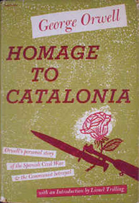
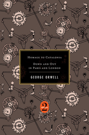
To the left is the 1952 Harcourt Brace cover, and possibly the first American edition. I’ve had a hard time tracking down the exact chronology for this particular book, less attention is paid to it, maybe because its politics are less convenient for contemporary times than 1984 or Animal Farm. This cover is likely where the mass paperback cover at the top came from, with the bayonet and rose. The blood is suggested by the magenta. While not the best cover, I like the overprint, and the text in the boxes, which give it a montage feel. And to the right is the current edition, an odd omnibus with Down and Out in Paris and London, with an equally odd cover that seems to have little to do with either book under its wraps.
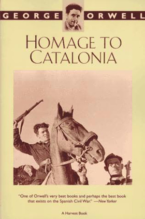
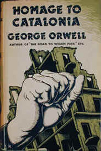
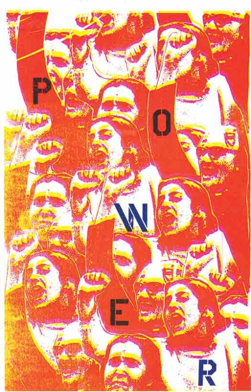
Here is the recent Mariner Books edition, better than the recent Harvest edition, but still pretty flat. The type is a mechanical sans serif, making the book appear contemporary, but Orwell’s name is too small at the top to compete with the photo. Conceptually his name may be equal to the image, but graphically it just floats away. To the right is a mystery dust jacket from a hardback, I haven’t been able to track down what edition it comes from. My guess is British from the 70s, based on the heavy-handed illustration. This seems like a cover that would be produced by a Leftist press, the muscle-y fist a heroic graphic stand-in for the struggle of the Spanish Revolutionaries. Nice in theory, but carries none of the nuance of Orwell’s much more complex reading of the situation.
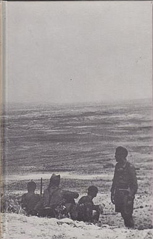
In 1970 the London Folio Society put out a nice collection of Orwell’s reportage, here’s the cover of their version of Homage. The photo chosen nicely captures a sense of both the camaraderie and the isolation of fighting on the front.
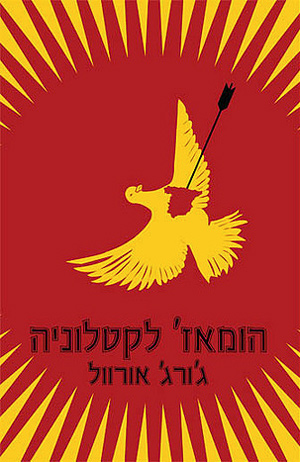
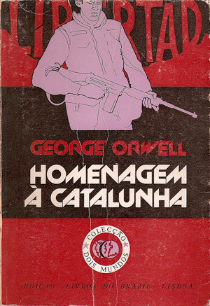
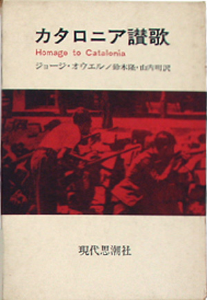
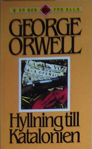
The covers get much more interesting when we range further away from Anglo-editions. At the top, Israel and Portugal, then Spain and Japan, and finally Sweden and a Russian edition from 1989. The Israeli cover is certainly compelling graphically, if a bit unclear (I suppose one interpretation is that the black arrow of the fascist Falange is killing the heart of Spain, but this certainly lets the Stalinists off the hook, which Orwell did not…). The illustration, design, and experimental type treatment of the Portuguese edition is right up my alley, creating a full and compelling cover. The Japanese design is very clean and effective, the Spanish one not really even worth comment. And the Swedish cover awkwardly samples from an illustration taken off a Penguin edition of the book, which will be next weeks entry, all the paperback covers Penguin did for Homage to Catalonia over the past 60 years.


The English language editions are quite boring.
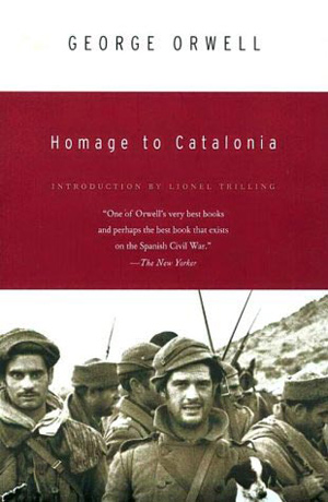
I think I purchased the Mariner Books when I finally read Homage to Catalonia, ten years ago. Its amusing that they use a New Yorker review quote to “sell” the book, and not the authors name as Josh suggests.
I like the lettering of the unknown “British” and Portuguese versions. Yet the cropping of the illustration and the cramming of Libertad, to be balanced by the boring round logo, confused me.
The Japanese version speaks to me the most. I like the field of white, the red and black text, and the treatment of the image.
OK, it turns out that the cover with the fist is actually the first published edition! Secker and Warburg, London, 1938.
.I really like the cover of this books, the images,and the lettering of the unknown “British” and Portuguese versions.Hopefully many are like this.