
Orwell was lucky to be published in the UK by Penguin, one of the publishers with the best record of concern for, and investment, in their book covers. The cover to right isn’t Homage to Catalonia, but a collection Penguin put together of Orwell’s shorter writings on Spain. It carries the silver bottom bar of the 2000-2001 editions of Penguin’s Modern Classics series, and one of a series of images/covers designed by Marion Deuchars for Orwell’s books on Penguin. The montage of a POUM poster and the back of a man in casual dress carrying a rifle do a much better job at capturing the spirit of Orwell’s writings on Spain than the cover I started off last week with (HBJ’s American edition of Homage). The poster creates the sense of an urban wall, and the figure gives us more of the feeling of the struggle being more informal, not the rigid battle lines of conventional warfare.
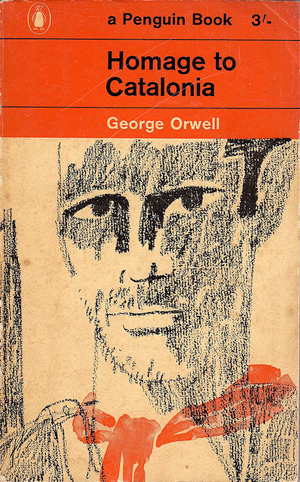
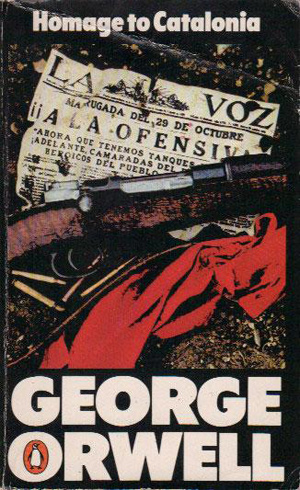
The cover to the left is the earliest Penguin I could find, likely from the early 1960s based on the price and the use of the Marber grid (the cover grid formula designed by Romek Marber in 1961 and used on almost all Penguin titles from 1961-64). To the right is a Penguin edition from 1981:
Next is a 1987 Penguin edition with a nice illustration by Christopher Corr, which has a bit of a scruffy Sue Coe feel to it, it would fit right in with the late 80s RAW comics crowd. To the right is another Penguin edition, likely also from the late 80s based on the black and white box signaling the book as part of their “Modern Classics” series.


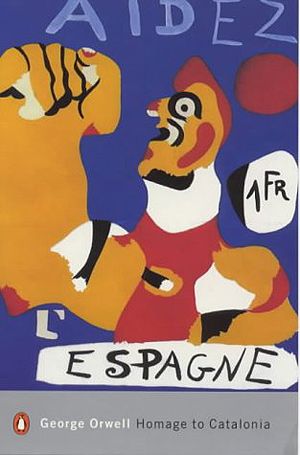
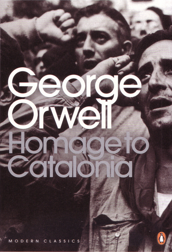
Below is another 2000s Modern Classics edition (later than the series Deuchars designed and discussed above. It has the silver band but the illustration is a re-purposing of Joàn Miró’s famous 1937 print/poster calling for international aid to revolutionary Spain. Next to it is the most recent Penguin cover (as far as I can tell), the title superimposed in bold sans serif on a photo fof the International Brigades. The photo is by Robert Capa and originally ran in The Picture Post:
And finally, a staid cover from 1969, and to the left a book that must be from one of Penguin’s far-ranging 90s cover design experiments. I’m not sure of the designer, but I know they did a whole suite of Orwell books, with different overlapping circles and big halftoned objects. In many ways this cover seems like a postmodern remake of the yellow HBJ cover. A striking gesture towards the content of the book, that although technically accurate, largely misses the point.


Looking a lot better than last weeks!