After filling the last three months with two different five-week series (prisons and Kropotkin), I’m ready to jump into something completely different. For the most part over the past year I’ve been focusing on book covers from the turn of the 20th Century to the 1980s or 90s, so I thought it would be cool to try to look as some more contemporary cover design work.
About five years ago a series of books being produced by a small independent publisher from Canada started catching my eye. The series is named Semaphore, and the publisher is small collectively-run press named Arbeiter Ring. The series kicked off in 2002 with a book by Ian Angus, and reached eight titles at the end of last year with Grammar Matters by Jila Ghomeshi. I haven’t read all the books (though I have read a couple, and they were quite good!), and the insides aren’t my focus here, instead this is a review of the outsides.
I believe all the covers are designed by Michael Carroll, who may be the house designer for ARP (and also designed albums by punk band the Weakerthans). Although when you really sit down and look at all the covers together, there is a lot of diversity (in font, imaging, colors), each cover is designed and printed as a duotone (or close to it), giving the books a strong collective style that really holds them together. My favorite is the cover for Preempting Dissent by Greg Elmer and Andy Opel (2008), to the right. The negative space is brilliantly activated as a simple shape of a dog, with the clean lines of the muzzle knocking the dog to the background. It is an amazingly efficient way to convey the subject matter of the book. The lowercase serifed title is strong by understated, and the dark bar across the bottom half of the page activates the space and is a secondary restraint on the dog. This cover is great!
For the rest of the series I’ll just go through the covers in the order the books were released (which seems likely the order in which they were designed). The first book in the series, Emergent Publics by Ian Angus (2002), sets the style for the rest of the series, but in and of itself isn’t one of the stronger covers. The basic elements are here. Two colors on a white stock, one color light, one dark. There is a strong use of the negative space, a combination of serf and sans serif fonts (the same ones used on Preempting Dissent above, including the title in lower-case), large flat fields of color, and horizontal bars.
The second book, The Party Without Bosses by Gary Genosko (2003), uses a light and dark color, the same fonts, and leans even heavier on the horizontal bars. But rather than bring the negative space to the foreground, Carroll uses stylized graphics of subjects of the books (Guattari & Lula). It works, the cover is successful, but I’m left wondering if there was a better solution, one that didn’t rely so heavily on photographic-based imagery. In particular the background image of Brazil, in a 50% shade of the dark brown, doesn’t really work well at all, and bogs down an otherwise striking cover.


The third book in the series, The Gruesome Acts of Capitalism (2006) is by artist, musician, and writer David Lester, and runs a nice balance between the Genesko and Elmer covers. There have been two editions of this title, and they are primarily the same except for a shift from red to green as the second color on the cover). The majority of the cover is white, and active, with a very, very flat and simple illustration of a man wearing a ski mask and a business suit. Once again, and efficient graphic representation of the subject matter. For the first time the title is in a sans-serif all caps (some version of a Trade Gothic), which seems to makes sense for this book.


The fourth and fifth titles in the series seem to be where Carroll started to experiment a lot more with the formula, and in some places maybe lose some of the efficiency and edge of the earlier covers. The Red Indians by Peter Kulchyski (2007) keeps to the duotone (red and black), horizontal stripes, and active use of the white of the cover stock (the white in the flag really pops). But two new fonts are brought in for the first time, both in the title, and the flag and poll are constructed out of photo-based halftone, rendered in large, visible dots. Like the Genesko cover, this is very strong and works visually, but is also missing some of the subtlety of the other covers.
The fifth book, Dishonour of the Crown by Paula Sherman (2008), has the cover I think is the least successful. Once again, many of the main elements are here, including a duotone of light and dark brown, active white space at the top, a visual pun (the dots on the waves make a crown), and a mixture of sans serif and serif fonts, but they all work to a lesser effect. The horizontal stripes are abandoned, and the duotone has to work harder with less, fading between light and dark browns and oranges. The cover looks murky, which I’m sure is intentional because of the subject matter, but is also unfortunate because it makes for a less attractive cover. The “x” on the fish’s eye also seems like overkill, the fish is already upside down and obviously dead. Maybe the entire fish should have been white instead of dark brown?


The two most recent books return to form. Love the Questions by Ian Angus (2009) uses another murky set of colors (mint and brownish green), but mobilizes them more effectively than above, and activates the cover with the large white rib cage. The standardized test form used behind the ribs works too, even though in the abstract I would have thought it would be too much. I think the mint drop shadowing of the title is maybe unnecessary, but is also not very intrusive. The brain taking the place of the heart makes for a nice visual pun as well.
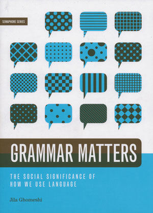
I’m really impressed with the cover of Grammar Matters by Jila Ghomeshi (2010). It is deceptively simple, but has some really nice intricacies. For one, the overprint of the dark grey title bar on the split blue and white background really snaps, and the decision to round the end of the bar to echo the word bubbles instead of pull it all the way across like most of the other books in the series was also a bright stroke. Maybe it is simply where I’m at design wise right now, but I also love the way Carroll was able to use patterns as the focus of the design, but have them compete with each other, so they are active and foregrounded, instead of simply passive wallpaper that falls to the back.

I’m looking forward to future titles in this series!