Continuing and expanding on last week’s post on the covers of Sabat, an ’80s German ultra-left magazine, this week I’m going to go way to the late 60s, and look at some of the covers of one of the publications that was a main organ for the emerging German ultra-left and armed left, Agit 883. Agit 883 published 88 issues between 1969 and 1972. Little is written about it in English, but there is a great book in German about the publication, Agit 883: Bewegung, Revolte, Underground 1969-1972 (Assoziation A, 2006) which includes a CD which contains pdf scans of all the papers, including the covers (which is where the ones here come from). Those scans are also available online HERE. The paper was founded by Dirk Schneider (and possibly others) and had a rotating editorial staff over it’s four years of publishing. It began with a Marxist/critical theory bent, but became more anarchist and anti-Leninist over time. It appears that the paper split and eventually ceased publication because of a combination of internal political disagreements and state repression, both largely related to support for the RAF and other armed groups.
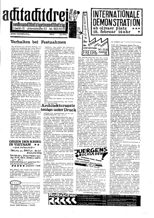
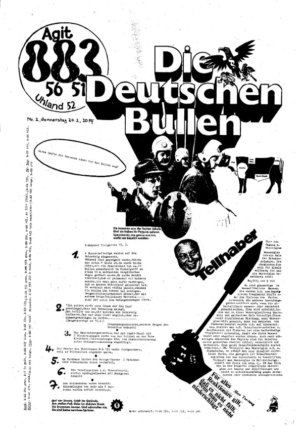
I’m not going to show all 88 covers, but I’ll look at the first 13 issues this week, and then look at more of the run over the following couple weeks. Like many ’60s German counter-culture papers, Agit 883 covers started out as mock versions of existing German publications (this is also true for Linkeck and Fizz, both of which I’ll look at in future posts). The cover of issue #1 (left) looks like a more traditional newspaper with a little Dada thrown in, and issue #2 (below) places the Agit 883 logo behind a clipped out title for Die Deutschen Bullen (which itself is emerging from a clip art pile of riot cops).
Although it appears that many different artists and designers had their hands involved in the covers, throughout the run of Agit 883 there are a series of graphic devices that get used consistently, implying either some consistent editorial control over the covers, or such a singular and pervasive graphic sensibility without the movement that the covers take on this consistency when looked at together 40 years later. Mock publication mastheads show up again in later issues, and other forms of satire show up on many of the covers. Visually, the main styles used are (1) variations on the singular illustration or editorial cartoon as central graphic element, (2) a graphic style that draws directly from mainstream comic book imagery, if not actually borrowing comic book panels, (3) the wholesale pillaging of photographic images from other newspapers, both in a celebratory sense of reproducing images of resistance, and in a critical sense of satirically focusing on politicians and other people in power, often writing slogans over their visages, and (4) a direct collage of various photographic and illustrative elements, sometimes in a very raw cut and paste way, sometimes in an attempt at more photomontage-type refinement.
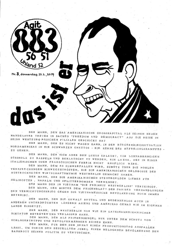
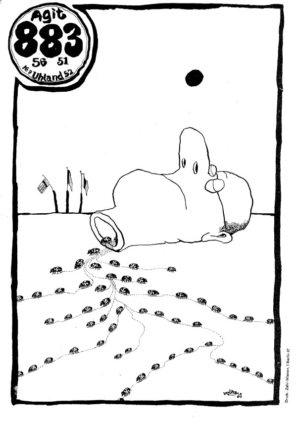
Issue #2 below is a good example of a collage cover. Issue #3 is a good example of cover type 1, a singular illustration holding the cover together, in this case I believe by an artist named Witt (who also did cover #13 below, and many others I’ll look at in the following weeks posts). His illustrations always are drawn with extremely bold line work and outlines and are extremely comic-like.
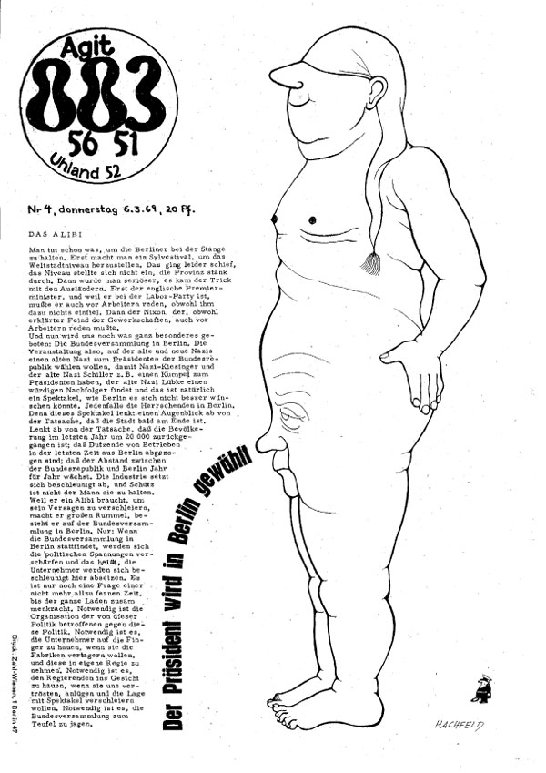
Issue #4 also has a singular illustration-based cover, this time by an artist named Hachfield. The main text reads “The President is elected in Berlin,” a great addition to the creepy and hilarious image! How come no recent US electoral political posters have had a man with another man’s face as a genitals announcing the election of the President!?!?! The style of the image is really reminiscent to the work of Willem, the Dutch cartoonist who did most of the early Provo graphic work (and whose images I would assume many on the German left were familiar with).
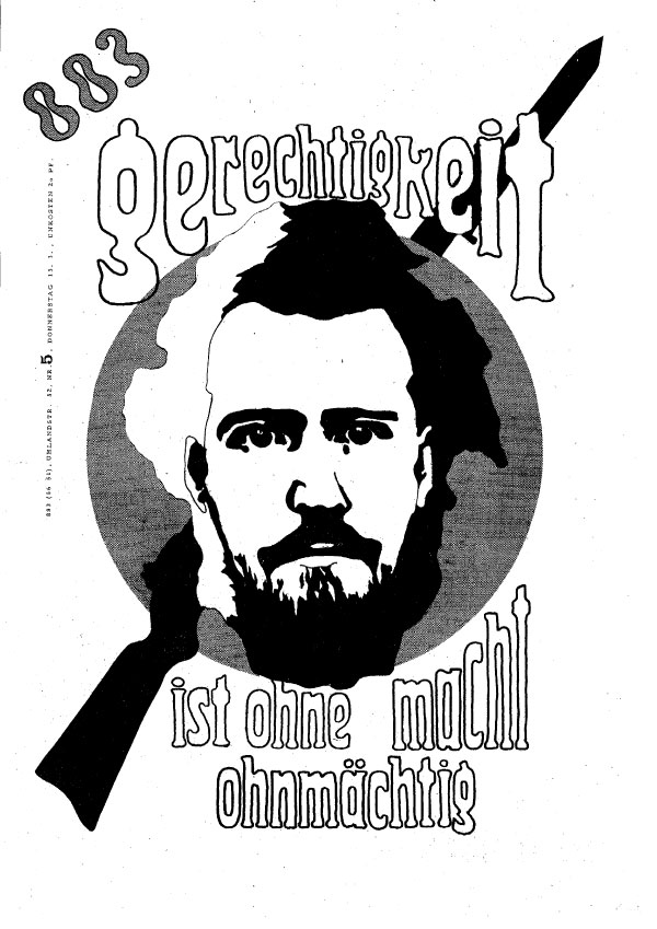
Issue #5 has a singular graphic, which visually sits somewhere between being a logo and a title page for a comic book. The text roughly reads “justice is powerless without power,” and the rifle in the background makes it clear which kind of power is being inferred. Also notice the Agit is been dropped from the title (never mind “56 51 Uhland 52,” other title elements that come and go, and reference the phone number and address of the original office for the paper), this inconsistency and playfulness with the title/logo runs throughout all the issues, with the logo being redrawn multiple times, and the different versions of it being used.
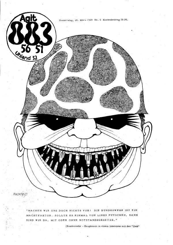
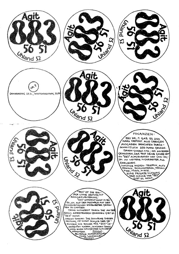
Issue #6 has another Hachfield illustration, not as compelling or weird as the one on Issue #4. I’m in the dark about the cover of #7. I can’t really read the small type, and graphically it actually looks like a wall of labels for 7″ vinyl records, though I doubt that’s what it is actually referencing.
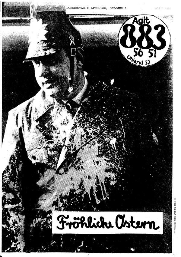
The cover of #8 is a good example of type #3, a picture of a paint-bombed cop with the words “Happy Easter” written on top. #9’s cover is done by another illustrator, possibly “Verlage” (the name is difficult to read). This cover (and the last couple) are a bit of a design advancement in that they were clearly conceived of more holistically, and rather than a mess of disparate elements, everything ties together. This cover in particular, as it is clear that the illustrator also redrew the logo and created the unique border. The image is also really strong, like an anti-fascist Far Side cartoon (remember Gary Larson?). It also echoes the work of Willem.
#10 is a great example of the collage style, with found image, found graphics, and text all integrated. The looks like it easily could be the cover of an 80s punk zine, which goes to show how much punk aesthetics was indebted to the 60s, contrary to all the hatred of hippies and “the past.” The issue number coming out of the man’s ass as a fart is a nice finishing touch.
Issue #11 has another very developed, fully-illustrated cover by “Verlage.” The title says “But after going over there,” and I’m unsure exactly what this is in reference too, given the image, likely something a politician at the time said. The logo is redrawn again, and all the type is hand-done. To me this cover looks shockingly like something my fellow Justseeds member Colin Matthes would draw! (and possibly also is references the German artist Georg Grosz).
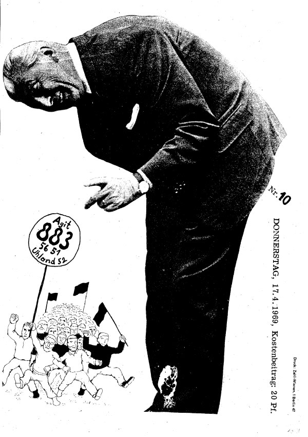
The cover of #12 is the more positivist version of type #3, with the re-use of a photo of a fist taken from a promotional poster for the UK underground newspaper Black Dwarf.
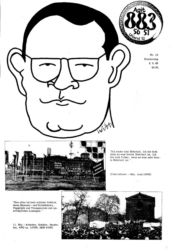
The illustration on #13 is by the artist Witt, but is the most amateur of the cover images so far, which makes it stand out. In general this cover seems rushed, the logo has retained the border of the ring from the previous issue, and two photos with captions sit below the illustration (likely of a person people at the time would have recognized, but is beyond me at this point). None of the elements are strong enough to hold the cover alone, and together they just make a mish-mash.
Over the next month I’m going to focus in each week on Agit 883 covers from each of the 4 types I outlined above. Stay tuned.