
About three years back I bought a small collection of cheap, but relatively handsome, UK Anarchist pamphlets under the title New Anarchist Review. They stretched from 1984 into the early 1990s, and were largely composed of reviews and lists of recently published anarchist books, advertisements from antiauthoritarian publishers, and a short article here and there. I was initially drawn to them because they seemed a humble heir to the Cienfuegos Press Anarchist Review of the late 70s, which had similar content, but was much more comprehensive and completest.
It turns out that New Anarchist Review (NAR) was published by the same consortium of anarchist groupings that put together the early London Anarchist Bookfair, including the publishers involved in A Distribution (such as Pheonix Press, Freedom Press, and Rebel Press), the Anarchist Book Service, and the anarchist bookshops Freedom and 121 Centre. There is a really nice history of the London Anarchist Bookfair and the New Anarchist Review that you can read HERE. I don’t think it is intended to be anonymous, but I couldn’t find an author attribution anywhere!
Like its Cienfuegos predecessor, for imagery New Anarchist Review relies heavily on a couple of the most popular anarchist artists in the UK at that time: Clifford Harper and Flavio Costantini. Harper was also a long time member of the Bookfair Collective, so it seems likely he also worked on NAR, and maybe even did the cover designs (maybe he’ll read this and correct me!) But unlike the Cienfuegos Review, each issue of NAR is small and unassuming, so for the most part they have slipped through the cracks, and are uncollected and uncataloged. It has taken me the past three years to track down additional issues, and a handful more I was able to find and scan at the Kate Sharpley Library. The only images of NAR that appear online seem to be within the bookfair history page linked too above, but those images are very small, and I’ve only used them here when no others were available.
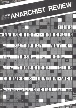
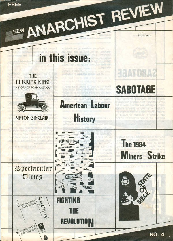
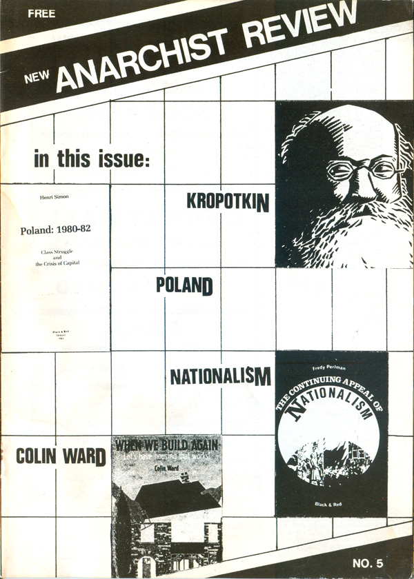
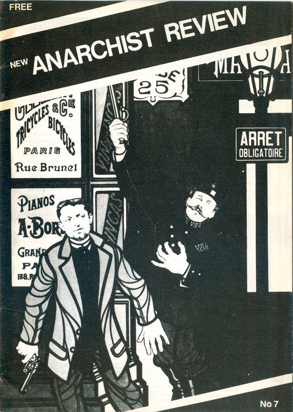
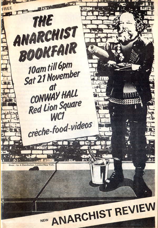
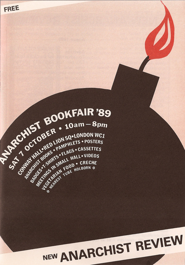
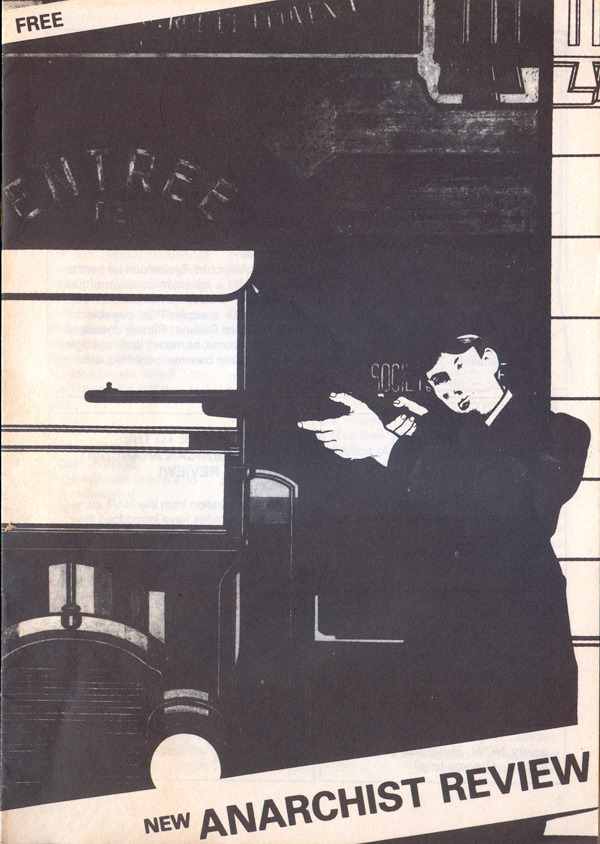
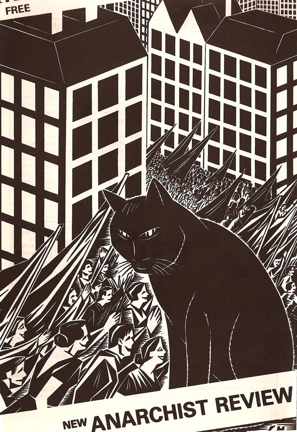
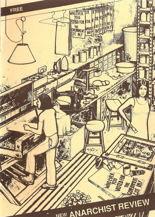
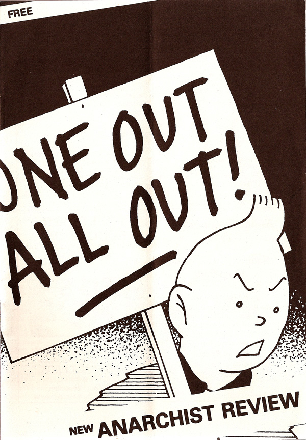
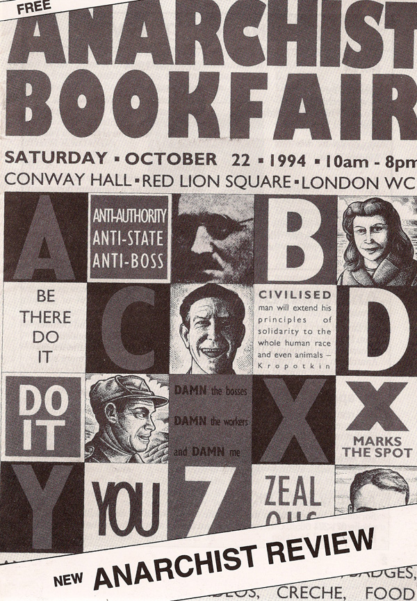
The first four issues were printed at A4 (approximately letter size, or 11×17 folded in half), all but the first issue in black and white. The image of the first issue in the top left is actually only the half above the fold, I never got a good scan of the bottom half. Issue 2’s cover image is functionally an advert for a new (at the time) Freedom Press title, and the cover for #3 is a reproduction of that season’s Anarchist Bookfair poster (designed by Harper). This is a fair representation of cover content, which largely fluctuates between bookfair poster images, illustrations from current anarchist books, and images pulled from Costantini’s book The Art of Anarchy. Beginning with issue 5, all future issues were produced at half that size, or A5. All of the 23 different issues I’ve seen, share the same basic design: a central graphic element, and a diagonal banner with New Anarchist Review written in sans serif across it. The banner is as unassuming as the pamphlets themselves, and although nothing special, it is enough to hold the publications together as a series.
I’ve done my best to reproduce the covers of each issue in order, but as I only have about half of them, and I was only able to scan another 1/3 at KSL, the rest are online images, and later issues do not have the issue number marked on the cover. So this is my best guess as to the order.

Issue 6 (below left) is one of the few issues with original artwork, and since it is pretty uninspired, one can see why the editorial collective stuck mostly to using existent imagery.
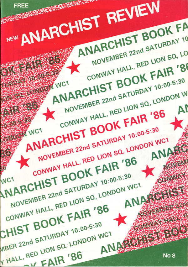
Issue 8 (below left) is one of the few duotone printed covers, and given that the entire front is repeated text, it is unclear why the color was largely wasted on this particular cover. At the same time, I do like the green and red, and there is something about the design that helps it transcend the usual Christmas associations of the colors (which might not be as strong in the UK to begin with?).
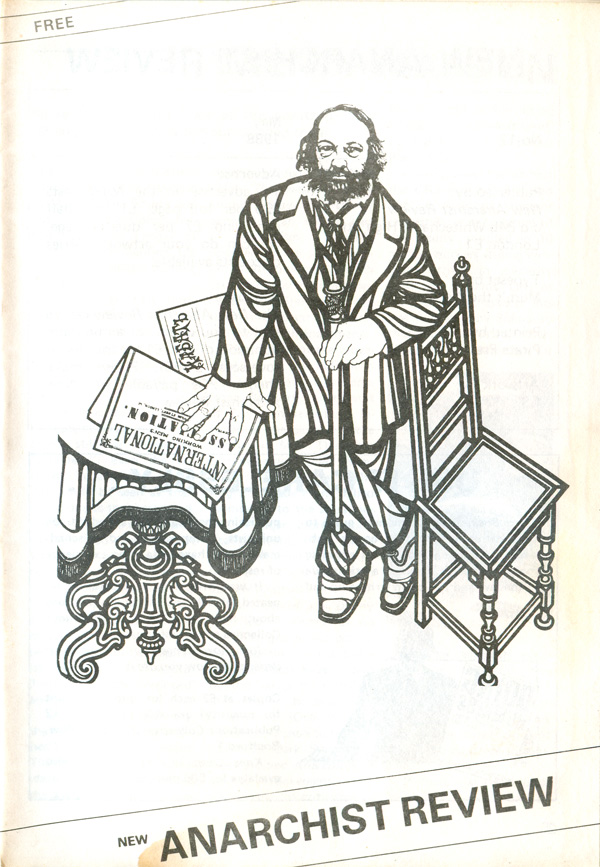
Below are issues 12 and 14, I haven’t been able to track down number 13. I quite like the sparseness of 12, Costantini’s line-based illustration of Bakunin floating in the white space of the cover. The cover of 14 is another anarchist bookfair poster, by stylistically a much cleaner and modernist design than the others. For some reason it seems almost Dutch or Bauhaus-ian to me.
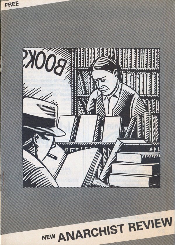
Issue 15 features another Harper illustration, this one about books, but not taken from an actual bookfair poster. I’m not sure the origin of this image, and unlike much of Harper’s work, I don’t think I’ve ever seen it used/re-used in another context.
Below are numbers 17 & 18, and interesting in that order since 17 features a Clifford Harper illustration that seems roughly contemporary within the publication, and I believe is pulled from his Anarchy: A Graphic Guide, while the illustration on 18 is much older, and from Harper’s very early period, either Class War Comix or the series of illustrations he did for the book Radical Technology. (Unfortunately I can’t access my books right now, so I can’t double check!)
The numbering starts to get fuzzy around here, as I don’t actually have most of these later issues. I believe the following four are numbers 19-22. The cover of 19 is pulled from the great anarchist TinTin remake Breaking Free and 21 is an illustration pulled from the Unpopular Editions version of Black Mask & Up Against The Wall Motherfucker. 20 and 22 are reprintings of Harper-designed anarchist bookfair posters.
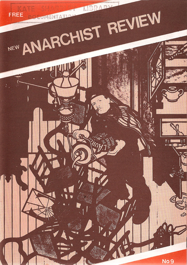
I believe on the bottom far right is issue 23 (or at least the last issue I’ve found), but I haven’t got my hands on an actual copy to check the number or the date, and strangely it uses the exact same Costantini illustration on the cover as issue 9 from 1986, but this time only in black and white and to much less effect than that issue’s nice orange and black duotone.
If anyone out there can fill in the holes here, either covers of issues I’m missing, or a corrected chronology of the issues, that would be awesome, please drop me a line!


It would be interesting to see a post used/reused/then reused again book/journal covers—to view the different treatments artists’, like Harper or Tobocman, get the world over.
I really like the first design, mostly for the tone of blue used.
Otherwise they’re really just utilitarian exercises in promoting the bookfairs. Not a bad approach, but confusing for a regular journal, no?
Wow! Some one has collected them!
Okay… where to start? NAR had a vague and somewhat slapdash origin : nothing was ever really that formally agreed/planned or that organised about it. I ran Anarchist Book Service back then, as well as being involved in a few groups formally and informally, such a A Distribution, 121 Centre and Freedom. In a way it grew out of the Autonomy Centre and the first Bookfairs. When we saw that the bookfairs had a place, I wanted to find a way to promote the ABS and books in general, as did A Dist and others. The big advantage was that I was a printer at a workers co-op so could ‘borrow’ the facilities to produce it. So, with the loose grouping of the like-minded, we started producing it as a freebie, inserted in papers or sent out to other groups/bookshops by A Distribution. The other route was mailed direct to ABS customers where it doubled as a catalogue (check those centre pages!).
So, it kinda took off, serving several purposes, such as organising and promoting the Bookfairs, but always on a shoestring budget relying on ‘borrowing’ equipment. It had two colour covers when I could find the time to print in two colours! The covers (in my time producing it) were images we could find : no computer scanning back then : it was all letraset and pasting up, screening half-tones and expensive camerawork and no money!
I dropped out after maybe Issue 10 as I left the print so lost access to the printshop. Another venture took up.all my time so the ABS was closed down and life takes us all on different paths.
A big thanks to the so many folk who helped us produce and distribute it and those who took it on further.
Salud!
Thanks so much for this history David! This is one of the best parts of these posts, hearing from the creators!!!
No worries!
In these days of desktop publishing, word processors and internet access to millions of images it can be easy to forget that back then the whole process was manual : typesetting was only just moving from hulking great IBM golfball machines to photosetting, pages were made up with cowgum and blue pencils, platemaking needed expensive cameras to make negatives and more kit to expose the plates. So, not cheap if done commercially. A massive amount of stuff was produced on a shoe-string by folk with limited access to all the necessary equipment.
So, it was not always pretty but it got done!
A perfect example is the Brixton squatters paper ‘Crowbar’, of happy memory, which was churned out on a Gestetner duplicator on scrap paper. But it got the word out.
So, to the unsung heroes sneaking in and out of unsuspecting printworks with inky fingers and peeling cowgum off their trousers… cheers!