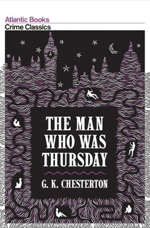
Here is part two of the covers of G.K. Chesterton’s 1908 anarchist exploitation novel The Man Who Was Thursday. You can see the first 17 covers from last week HERE. This weeks first cover (to the left) is from the 2008 edition from the Crime Classics series of Atlantic Press. Atlantic is a young UK independent publisher, and this series of books is generally gorgeous. White borders, duotone printing, and the simple sans serif publisher/line/series name at the top set the style, and then each one is illustrated uniquely. A little digging online shows the designer of the series is Wallzo. The Thursday cover is fabulous, and really captures the spooky, underground adventure aspects of the novel I was talking about last week.
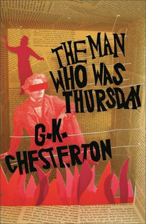
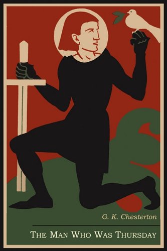
Here are a couple more recent covers with some style, the one of the left is from Headline Books in 2007, and the hand drawn type, flames, and diorama style illustration more than makes up for the use of the obvious Victorian looking figure. To the right is a cover from an edition by Martino Fine Books, who appear to only do full facsimile editions of classic books. That said, I don’t believe this cover is a facsimile, and although very nicely designed, is quite strange for Thursday.
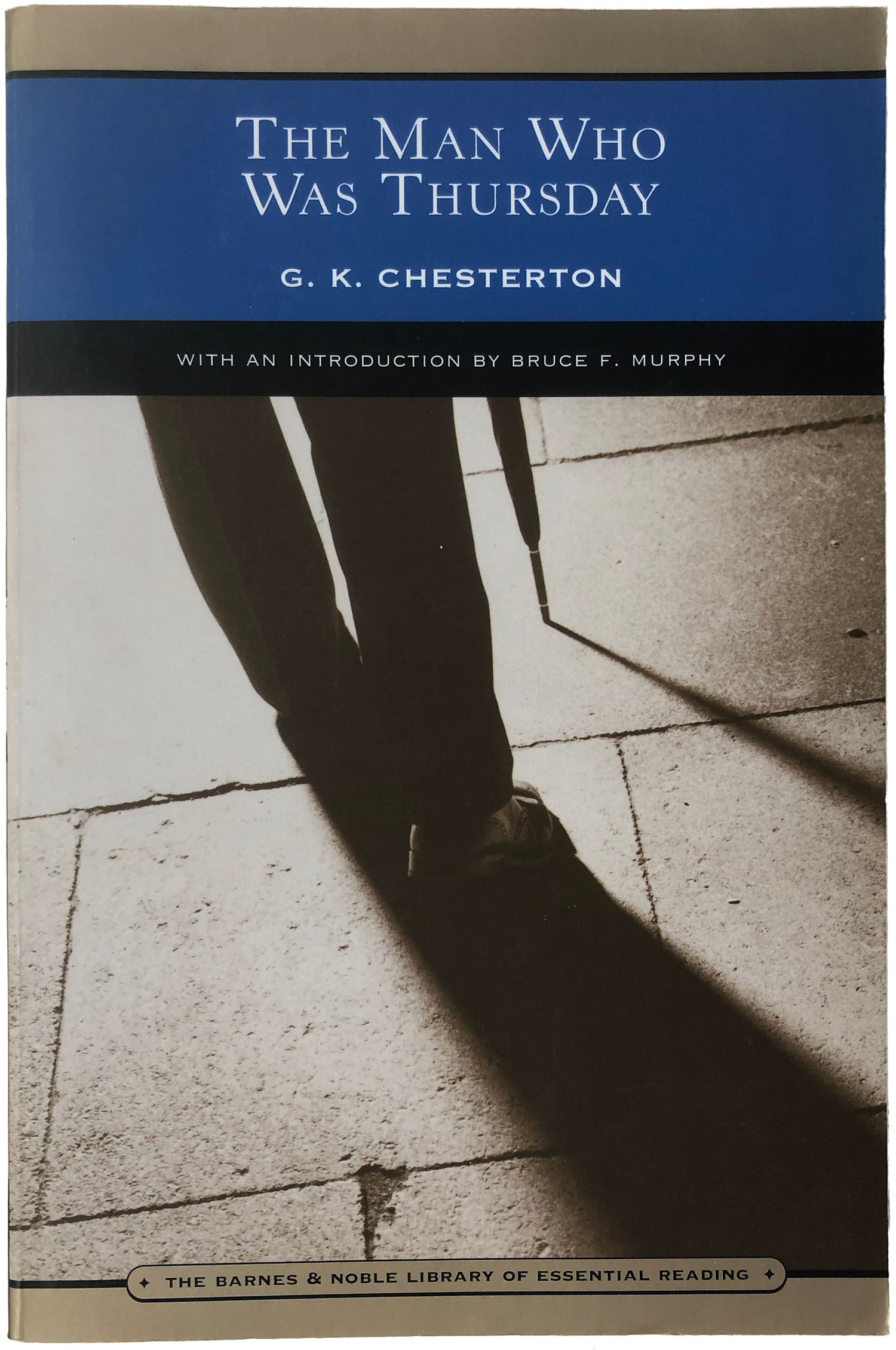
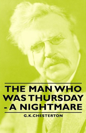
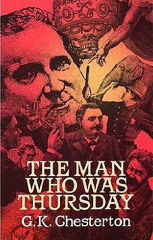
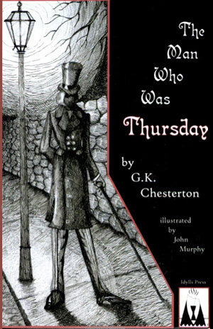
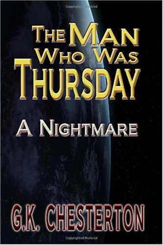
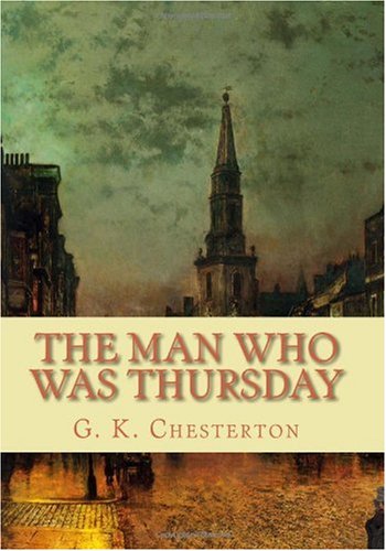
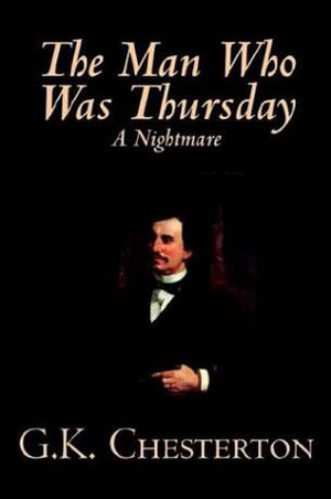
Since Thursday was first published over 100 years ago, it is solidly in the public domain, and dozens of cheap and print-on-demand editions have been published. The publishers that do this with higher standards have made some OK looking books. Below are the more austere examples of this: A Barnes & Noble version from 2004 on the left, and a Pomona Books edition from 2008 on the right. Below those are two significantly more baroque versions, specifically a 1986 book from Dover Press with a cover so overpopulated with figures and images it feels claustrophobic and nauseating, and a recent version from Idyllis Press, who cared enough to create a unique and new cover illustration, but unfortunately one that looks like it was doodled on the cover of an 8th grade Goth kid’s notebook.
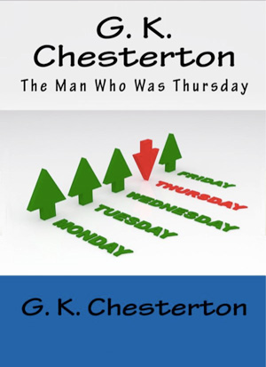
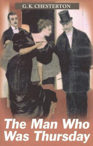
Most of the rest of the cheap and POD editions are even less inspired, but a few are pretty funny. The one to the left below uses a power point graphic as the cover, with all the days of the week happy green arrows pointing up, except Thursday, which is the evil red arrow pointing down! And next to that a 2005 Dale’s Large Print edition with the necessary period illustration of a top-hatted man, but also a woman, which is quite strange since I can’t remember a single woman who appears anywhere in the novel.
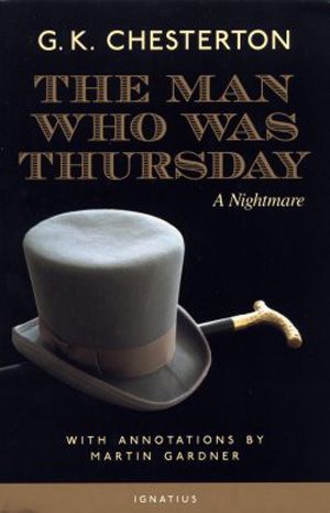
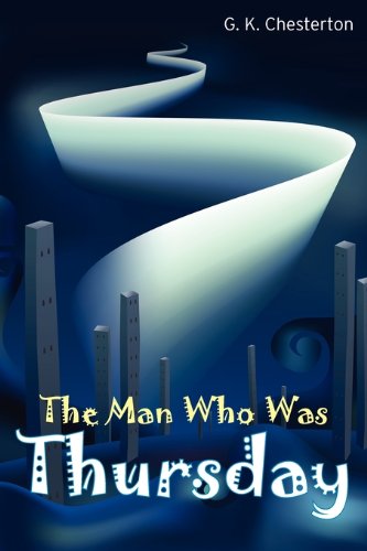
The rest are barely worth discussing, most are bare bones top hats, with the occasional twist, like the hideous “ribbon to heaven from surrealist underwater city” cover on the left of the second row below.

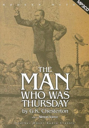
And last, and likely least, are a couple audio book editions.
Sort of a bummer to go out with such a wimper, but I’m working on something good for next week!


Recently discovered that a bunch of art cartoonists had tried to make a complete comics adaptation of “The Man Who Was Thursday” years ago, each artist taking a different chapter. The project fell thru, but recently some of the chapters have started getting released independently. Check out John Hankiewicz’ chapter below:
https://www.etsy.com/ca/listing/865097526/thursday-comic-book-gk-chesterton