I’ve been trying to work through some visual ideas around the Wisconsin struggle, and have come up with some beta designs I figure I might as well test here on the site…below are 3 different designs in progress. They all are based on the same idea, the general strike, but the first is the most developed, trying to clarify that we don’t need a strike to maintain the status quo (losing benefits, pay, and “rights” while maintaining a legalistic definition of collective bargaining), but to exercise the on the ground power of workers and communities. Please feel free to leave feedback, and I can put up high-res versions of these if people are interested:
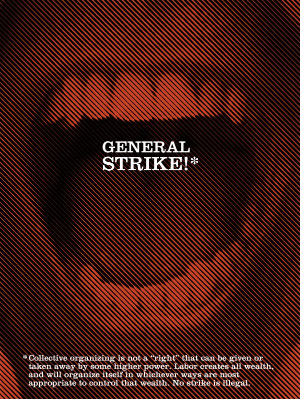

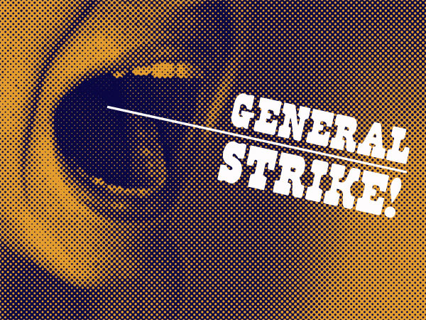
These posters definitely reference Rodchenko and Soviet Constructivism, and the classic images of his used to advertise for a Soviet publishing company. These graphics have a woman holding her hands to her mouth and shouting large-scale words. (These same images have been reworked dozens of times, by rock bands like the Ex and Franz Ferdinand, and also by many, many advertisers). But by cropping the hands and the focusing on the mouths, I like to think that something else is going on in my designs as well. The mouths are saying “General Strike” as an announcement, but the intense close-ups of the mouths and teeth (particularly in the first image) are an implicit threat, We Can Bite You. The text is also understated, it is not being SCREAMED, but spoken, with control and precision.
I started the designs with a classic half-tone, but moved towards the angled line toning because there is something about the half-tone dots that references the past, old newspaper images, and this is a very contemporary struggle. The same for font. Although in the abstract the font in the 3rd poster has more character, it also references a time past, and maybe instead we need a bit of a break from that, and the more “modern” serif-ed font in the first 2 posters is more appropriate to this particular struggle?
And finally, in the 3rd poster I like the possible double meaning of the underline that comes from the mouth. The General Strike is being projected out, but it also could be read as a possible tool poking back in, threatening to choke the person. This reads as politically appropriate right now. There is something very dangerous about bringing out the big guns, major strike actions, to settle what so far has largely been a struggle around very reformist demands. It could very well backfire. At the same time, I think a strike action could be very powerful, both as an self-educational tool for all those involved, but also as a way to keep the struggle on the streets, and out of the courts and election boxes, where the union officials and politicians desperately want to move it so they can control it.
I would love to hear other people’s opinions…
the first one is by far the best.. most simple most striking most progressive sexy design … well done josh
#1. Excellent.
Hey J!
My first and strongest impression: I think the top one is hands down the best. It expresses a strong feeling and it directly confronts the viewer.
Josh – They’re all very effective though the mouth in the first image is strongest to my taste. I love the way the angled lines make the teeth sharp on the ends… It also seems the most determined…
#1#1#1!
Lovely…and I’ll take 2 please!
first one the best!
The pure white text is bothering me. Feels harsh, maybe too clinical, esp in relation to the “mediated” and vaguely antiqued look of the tone patterns. Maybe a touch of gray would help tamp down the harshness of the white?
I like the distinguishable different point sizes of the mouth text in the first one. I wonder if the asterisk/note text could be reduced to any one of the lines, or simply the last line, ie “No strike is illegal.” Then it becomes less lecture, more philosophical imperative.
The last thing I’d say is, the moment for a general strike has passed in Wisconsin, at least for now. It was there, and now it’s gone. Therefore, going forward, posters and graphics that spread the general strike message should prepare people to recognize and seize that moment should it arise again. That means asking the question, “When?”, and also resisting the temptation to declare “general strike! NOW!”, which will only push the general strike option back into a fantastical realm.
Thank you so much, Josh.
I actually prefer the second design more than the others. I think that the combination of the image and the text achieves your objectives of making the statement appear spoken and controlled, and the overall feel contemporary. I really like the size/weight of the word/type in relation to that of the image– it is not huge but is certainly not lost or overpowered.
My issue with the first image is that between the colors (red and black), the full frontal view, and the specific mouth used, to me the image suggests vampires. While I know you’re interested in the idea that the collective we can bite back, given the oversaturation of the market with vampires right now, I’m just turned off by it. Not to mention that you don’t want the collective we (unions, state workers, etc.) to come across as blood sucking or parasitic– because that’s how they’re being portrayed by right wing politicians and media. Delicate line to walk.
Good work!
I like the third one the most. The strike is a double edged sword and this risk that the strikers take should be represented somehow. Well thought out concept and design, love it!
Great posters! I can see the constructivism, but definitely in a contemporary vein, and very much
your own- although much more “digital” graphic than I have seen by you… I agree the first one is the most complete, but I have to say I keep coming back to the last one with the text drawn out of the mouth- I think the line is very important as a graphic element to connect the text and the image. The connection is made in the others as well, but the line makes the connection more active for sure… What I am not so set on in the last one is the typeface, it
seems almost too (for lack of a better description) cartoon western, especially with what it is saying it seems to demand a stronger
typeface. Type and font is always the hardest thing for me so I am having a hard time thinking about what exactly I would want to see instead, but it does seem to ask for something with a little more weight and impact. These are great! It’s nice to see some posters in progress- I always love your work!
Oh the last thing I wanted to add is that I agree with the comment (I think by Dan Wang) about the asterisk- I love the idea of the asterisk and how it does direct you from the initial text to something to enhance the meaning of the initial text, but I like the idea of another simple and direct line to complete and enhance the idea…
Awesome!
Josh,
Your three image ideas are graphically strong, but I question the imagery of a single person calling for a general strike. It mirrors the frustrations that many of us have right now in Wisconsin and beyond with the lack of militancy from union leaders and the sad reality that the best opportunity for a large-scale strike was last week on Thursday and Friday when Walker and the Republicans signed away the rights of public employees in Wisconsin to collectively bargain.
This was the moment when Walker dared the unions to strike and dared teachers to walk out – a moment when public anger against Walker was at it’s highest. The lack of militancy by public and private unions to show the Republicans that organized labor could shut down the state for one day or more was a huge opportunity lost.
Your images of a single person calling for a strike represents, at least for me, the reality of people’s frustrations and their discontent with both the power structure of the government and the unions. The image almost reads as a portrait of a person yelling in their home “Why did the union’s not strike!!!”
I might suggest that we focus on images critiquing why a general strike was not called in Wisconsin, images of large groups of people calling for a strike, and/or images of what a general strike could produce.
Good designs Josh.
My interpretation of this gesture from the Egyptian uprising is still in design limbo,
yet could still have utility.
The top on is the most developed. What does it mean when you declare “no strike is illegal” when, technically, many are. Its a moot point, but one brought up by an old friend, now a border patrol agent with regards to Favianna’s Voices From Outside portfolio submission. The design stated “Being undocumented is not a crime”, though it is against the law. I am curious about the intention behind making these statements, because its message can be easily “defeated”. Is there another way of constructing such slogans?
The middle design is kinda weak, something in the size/placement of the letters with the horizontal composition.
The last one I agree with Brandon, the lettering is a little western, and I am curious if it would sit in the image better if the text had a tone to it. Rather than coming out of the mouth it appears to sit on top of it.
If there were multiple mouth designs in the same half-tone, maybe different colors, it could illustrate “the collective”. I think it could be powerful to see groupings of such designs pasted up in ad spaces, walls, billboards, etc…
Hey Josh,
In my opinion the work above is highly emotive and makes for very interesting design, I particularly admire the angled line toning in the first piece. As part of my Art course in school I am attempting to study the idea of “Human Information” connecting this with the idea of signals, through human expression. I have been researching the work of Alexander Rodchenko and I find the pieces above an interesting interpretation of his famous “shouting woman” image. Your designs above for me are very relevant to this idea of “Human Information” through the use of the human mouth and I find the third image in particular relevant to this idea with the bold white line coming from the mouth resembling a sword, signifying some sort of frustration or demand. I was wondering if your work has any connection to this idea of “Human Information” or if you think the role of design like this is to inform? and if you have any other pieces similar to the Rodchenko inspired pieces above?
Thank you,
Lee Kennedy
leefudge@Hotmail.co.uk