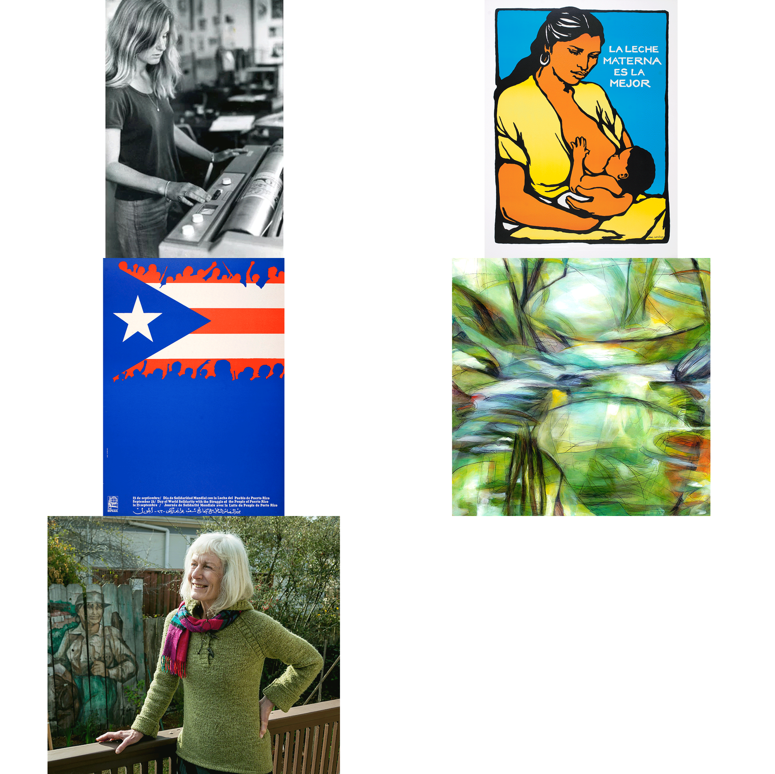
Jane Norling is an artist activist with an inspiring past. For fifty years, as a painter, graphic designer, and public artist, she’s created community murals, graphic designs for social and environmental justice campaigns, and participated in small press publishing that supported human rights movements from women’s rights to international liberation struggles. In 1972 she worked in the design department at the Organization of Solidarity with the People of Africa, Asia and Latin America (OSPAAAL), in Havana, Cuba. She is the only U.S. American artist to do so. During her time there she designed the solidarity poster “Day of World Solidarity with the Struggle of the People of Puerto Rico.”
Recently, Jane’s work was featured in the traveling exhibition Women’s Rights Are Human Rights: International Posters on Gender-based Inequality, Violence and Discrimination, and in Get with the Action: Political Posters from the 1960s to Now at the San Francisco Museum of Modern Art. She is also a contributing artists for the forthcoming Justseeds Poor People’s Campaign portfolio.
Aaron Hughes (AH): Your work “La Leche Materna Es La Mejor” is featured in the traveling exhibition Women’s Rights Are Human Rights organized by Elizabeth Resnick. You helped bring the exhibition to Chicago in fall 2017 where it was hosted by Art Works Projects and National Public Housing Museum. In light of all that is happening in this political moment, what significance do you see the Women’s Rights Are Human Rights exhibition having?
Jane Norling (JN): The exhibition Women’s Rights Are Human Rights illustrates the moment with its range of uplifting and brutal descriptive imagery that, as art, illustrates much of women’s experiences around the world as subservient to men. It is a traveling exhibition of 80 posters conceived and curated by Elizabeth Resnick, Professor Emerita of Graphic Design at Massachusetts College of Art & Design in 2016 and 2017. The exhibition opened in Boston and has shown in Taiwan, Mexico, Greece, Poland, and recently in Chicago.
Elizabeth began her project in the context of the Hillary Clinton campaign where we observed Clinton’s opponent’s assault on her status as woman. From the campaign into the presidency, Women’s Rights Are Human Rights’ imagery showed gender discrimination subjects forbidden by patriarchy to be taken seriously. Today, in a framework caused by the so-called president, women are grabbing the public platform in which we can be heard, supported, and move forward. As celebrities said ‘enough’ in 2017, describing sexual predation by men in control of their careers, the broader population of women in this country was empowered to say ‘enough’. That sex crimes appear in today’s media identified as “criminal behavior” is remarkable. The exhibition, Women’s Rights Are Human Rights, is part of this profound change.
AH: There is a synergy between the Women’s March, the #MeToo movement, and the Women’s Rights Are Human Rights exhibition. How has this synergy and these movements inspired you?
JN: As an activist artist for fifty years, I’ve directed my art skills, collectively and individually, toward economic, social, and environmental justice—working for equity across different economic, race, class, gender, and global origin backgrounds. Key in developing my consciousness was the women’s liberation movement, the struggle to end the U.S. War in Vietnam, self-determination movements for people of color in the U.S., and support of liberation struggles in Latin America, Africa, and Asia. Yet, despite the activism of those years, while identifying as an anti-imperialist feminist, I could not imagine patriarchy going out of style, globally or personally. The persistent architecture of humanity would not change. Patriarchy just was.
Until maybe now. Perhaps because the current U.S. president is so repulsive, dangerous, and such a misogynistic manipulator, we who are not moneyed powerful men feel our numbers and new vehicles for truth telling. Perhaps because Black Lives Matter pulled a new urgency into the streets, broader populations of women are motivated to take action in the streets, secure elected office, and broadcast truth. And one visual voice for this truth is Women’s Rights Are Human Rights.
AH: How did you first get involved in the exhibition?
JN: Elizabeth contacted me in early 2016 for permission to include my 1980 poster “La Leche Materna Es La Mejor” after finding it on a web search. I followed the development of the exhibition and thought the show would be well received in Chicago, given the breadth of politically active artists, arts & architecture institutions, and history of dynamic activism for political change.
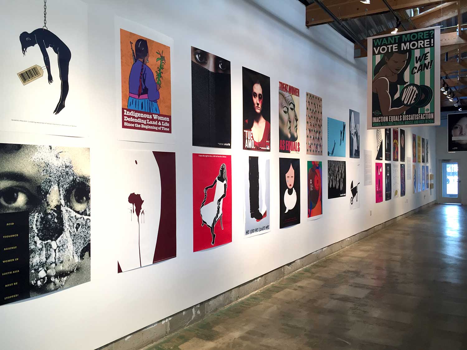
Women’s Rights are Human Rights at Art Works Projects in Chicago, 2017, detail.
AH: And it seems like you were right. From what you’ve told me, when you proposed the exhibition to your Chicago contacts there were a lot of positive responses and institutional support with Art Works Projects and National Public Housing Museum jumping on board to host the exhibition.
The exhibition opened with a lot of public support and I imagine some of that is because your inspirational print “La Leche Materna Es La Mejor” was used on a good deal of the promotional materials. What is the background of this print?
JN: In 1980 I was commissioned by Food & Nutrition Services of Santa Cruz, San Benito, and Monterey Counties, a social services organization in northern California focused on migrant families with whom I designed posters and education materials. I was asked to design three screenprint posters connecting the work families performed in the fields with the food we all eat. I drew and lettered the illustration with black ink, using overlays for color. The posters were then printed at La Raza Graphics in San Francisco.
I was pregnant with my son when I made the art for these posters. I was thinking about how mothers are a system with their offspring, and that food from their bodies is the best infant nourishment. A mother feeding her infant is an eternal beauty, an image with strong cultural and historic roots, a human truth.
I loved this project because I could affirm to mothers, with my art, that they don’t need to purchase a corporate product to feed their baby. Mothers maintaining their health, when possible, and breastfeeding are the best way to infant health.
“La Leche Materna” was then picked up by Syracuse Cultural Workers as a calendar page and printed as a stand-alone offset poster in 1987. For Women’s Rights are Human Rights, a single copy of the poster image was printed digitally.
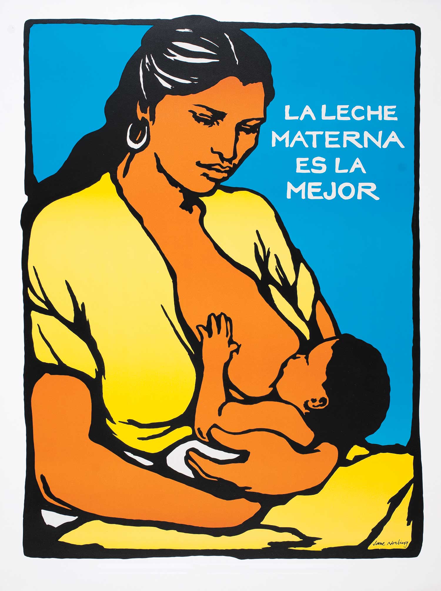
“La Leche Materna Es La Mejor,” 1980, screenprint.
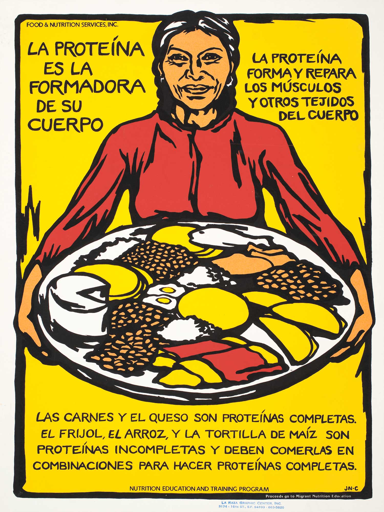
“La Proteina Es la Formadora de Su Cuerpo,” 1980, screenprint.
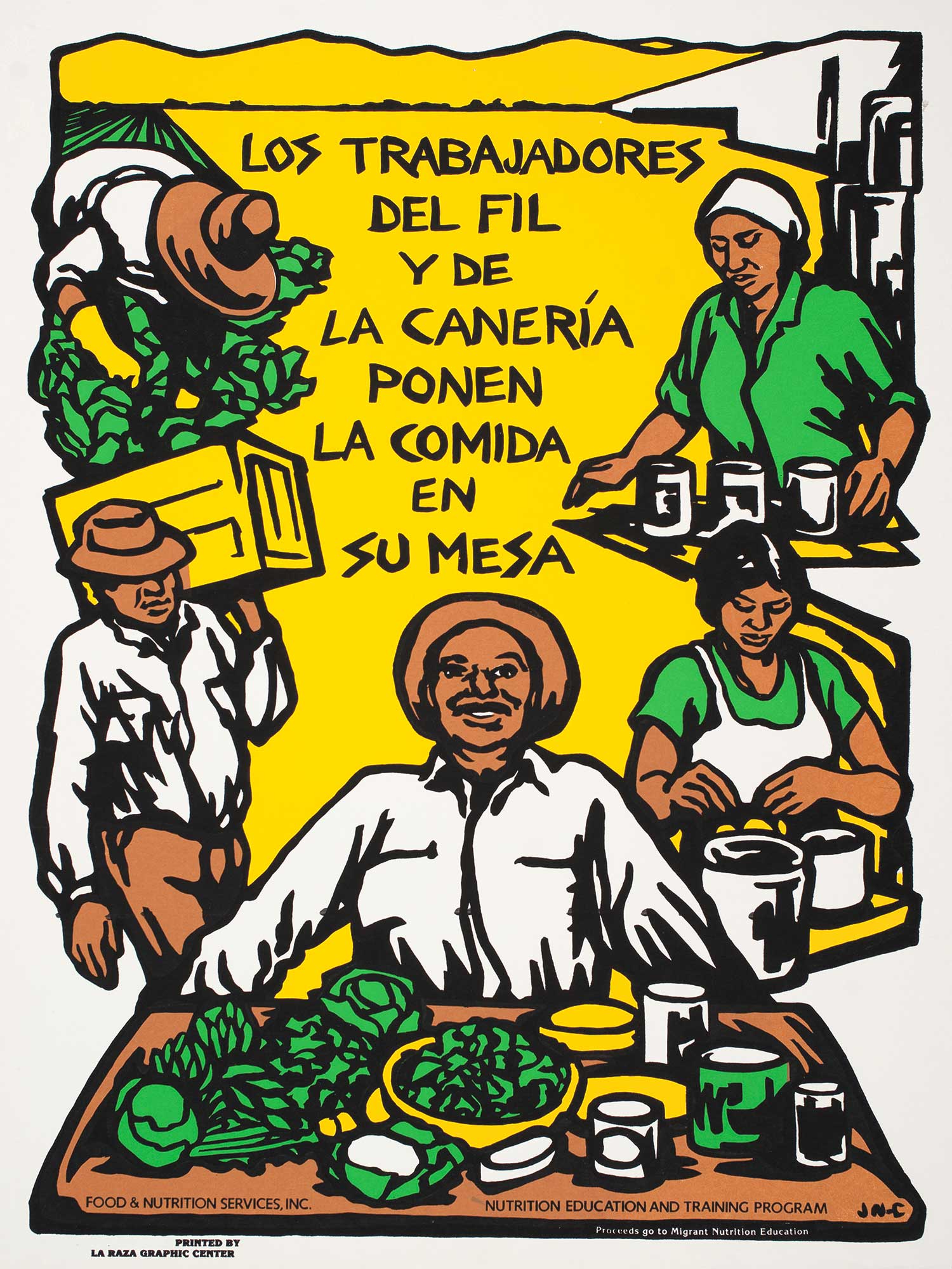
“Los Trabajadores del Fil y de la Canaría Ponen la Comida en Su Mesa,” 1980, screenprint.
AH: In your eyes how does that print connect back to the theme of the exhibition, Women’s Rights Are Human Rights?
JN: I believe our first right as a newborn human is to receive nourishment from the body in which we developed, a woman’s body. A woman’s right upon gestating and giving birth to a child is to feed the new human, a right that’s denied both infant and mother by extreme poverty, global corporate food domination, and patriarchy. My statement accompanying “La Leche Materna Es La Mejor,” selected by the National Academy of Medicine for their permanent online exhibition Visualize Health Equity launched 2017, addresses this:
“Mother’s Milk is Best” means the best food for a newborn baby comes from the same source as the baby’s nourishment before birth. Health equity begins with the intimate community of mother to child as she provides for her baby from her healthy body. Breastfeeding is an act of self-reliance. No commercial products needed except in emergency. Health equity lives in community as breastfeeding mothers over the world have shared this basic practice in their local environments over eons. I feel health equity grows from intersecting communities practicing economic and racial justice, providing engaged employment, broad education, cultural and religious understanding, health practices free from manipulation, open public spaces, environmental preservation, building toward the public good.
AH: “La Leche Materna Es La Mejor” is an inspiring print full of dignity and love. Other work in the exhibition is full of the horrors women face in our society. What are the strengths and weaknesses of these different strategies of image making? Why did you choose to focus on the positive?
JN: It’s all true. The strength of Elizabeth’s choices for this show is exactly its mix of horrific truths and nurturing truths. It was Elizabeth’s decision to include my poster, broadening the use of the poster from its immediate application with migrant families in early 80s and movement press connections in late 80s, to give the poster greater depth as a global human rights image.
AH: How do you see the Women’s Rights are Human Rights exhibition evolving and moving forward?
JN: I think it would be important to expand the poster show globally to include as many as possible self-identifying entities, countries, regions, peoples, so forth. I imagine, aside from obvious differences, similar content would present itself across thousands of images building unity and awareness.
AH: Beyond this one exhibition, you have been active as an artist and activist since 1970. How did you first come to identifying as an artist? Was there a specific role art played in your daily life?
JN: I was always an artist, holding pencil to paper, drawing to interpret my world, dreaming of the shapes out the window, gazing at clouds, in grade school, complying with kids’ requests to draw pictures for them because I was good at representation. In high school I had jobs as a furniture decorator, holiday window painter, sign painter, and a tile setter for business owners in the small town I lived in. I’m fortunate to have had solid encouragement from parents and grandmother for making art.
I was admitted to a liberal arts college based on my art portfolio, and majored in painting and traditional printmaking in 1968. I decided against graduate school because I was to shy to teach and wasn’t up for fighting for positions in the male-dominated New York art scene of the 1960s. Graduating in 1968, instead I turned to design and to politics. Fortunately, I was able to get an entry-level position in book design at Random House New York and paid on-the-job-training. At the time books were still set in linotype, predigital. It was the beginning of a promising career in 1969.
I loved book design and learning a skill, but was also hearing the voice of people demanding justice, an end to the war, and for a society truly based on civil rights. In 1970, I quit planning the marriage my partner at the time and I basically didn’t want and headed to San Francisco where I joined like-minded people determined to make political change. My one year at Random House gave me the basics of book design that became a foundation for my fifty years of work in graphic design. A time period that saw profound changes in the production process of visual information. Good design is its own truth.
AH: At that time, how did your politics fit into your work as an artist?
JN: In 1970 when I left life as I knew it in the East, I moved into San Francisco, a city vibrant with political activity and art expression across previously disparate communities. We all were learning from each other’s life experience and making art from that experience with an ethos of each one teaching one.
Shortly after I arrived in San Francisco, I was pulled in by activists forming the collective Peoples Press. Based on how we saw collective production, we set about learning how to run a printing and publishing shop, all of us learning all the tasks needed to run a small press operation with local and national distribution. The bold lyrical lines I use in my poster making comes directly from addressing the limitations of the Multilith 1250 press, a process in which flat colors are printed in succession, lighter colors first, then darker. Because the small presses had frequent misregistrations, I developed a design style in which I made the black lines of the main art wide and interesting enough to cover misregistrations of colors below.
In other words, my need to make political expression through printing and publication directed how my artistic hand developed. Well into the days of large offset printing and digital output, my campaign signs and social justice design illustration reflected technical decisions from the storefront shop in 1970. A shop where we had egg cartons on the walls that we believed would keep down the sound for the apartments upstairs when we printed at night.
During that time I was also part of the Haight Ashbury Muralists, painting justice and anti-war themes on city walls. The work was very representational, with local people lending images of their faces while we painted them into history. This work included the block-long educational mural “Our History is No Mystery” created in 1975 – 1976. The mural tells the hidden story of San Francisco, beginning with early native populations, and goes on to include the 1934 waterfront general strike, Japanese Internment, and other subjects not appearing in textbooks.
AH: You were enmeshed in a community of political artists and activism. That must have helped you sustain your practice. I know a lot of artists, including myself, struggle to balance their art practice and their activism, both overlap, but are often siloed into different communities, institutions, networks, etc.. It seems like for you these came together through your community and daily practice. In your experience how did art and activism weave together?
JN: As artists each of us kept our eyes and hands practiced. The positive energy of the times, fresh off civil rights and self-determination movements of the 60s, drew us together into collaborations based on our drive to express ideas about positive change to the public. People felt empowered, filled with possibility. U.S. activists contributed to ending the Vietnam War. There were jobs to support our work. Corporations had not so thoroughly controlled every aspect of life, nor neoliberalism. Benefits of the New Deal were still in place. It was cheaper to live. Not all artists chose political activism, of course, and expressed their activism as teaching artists. The power of activism was the undercurrent of those years.
I also believe, art and activism both come from the heart, and are natural human expression. Art gives a person voice, bringing forth one’s interior world and sense of justice. In terms of contributing to social justice movements, I was a designer; design is balance, and understanding comes from balance. Additionally, art takes imagination; imagination unites with people’s interior and cultural universe through which understanding and compassion can emerge.
AH: You have such a positive spirit and set of ideals on art’s roles in social justice movements. Is that why you are the only U.S. American artist to go work at the legendary OSPAAAL design studio in Cuda?
JN: OSPAAAL is the acronym for Organization of Solidarity of the Peoples of Africa, Asia, and Latin America, the international solidarity organization begun in 1966 after the Tricontinental Congress of nations fighting colonialism. The organization, headquartered in Havana, became known in this country for clever, outrageous, lyrical posters made practically from thin air due to lack of materials from U.S. blockade, and for the monthly journal Tricontinental which focused each edition on a region of the world represented by the organization. Peoples Press published a quarterly digest of Tricontinental articles, which I designed and for which I made cover illustrations. Through this association, I was invited to work in the OSPAAAL design department in Havana for two months doing designs for magazine illustration in the morning and visiting communication production centers in afternoon. I went alone, stayed in Hotel Habana Libre, became close friends with Margaret Randall, a U.S. American poet and photographer living in Mexico who had arrived in Cuba from Mexico after escaping repression following the 1968 student massacre. (Her poetry and arts journal, El Corno Emplumado, published in Mexico, was the first bilingual journal to bring together North and South American writers and artists, and as such, was seen as a threat by the repressive government.) Cuba was a haven for exiles from Latin America in the 60s and early 70s. It was a time of intense learning for me having only recently been exposed to the concept of U.S. Imperialism and everything flowing from that.
AH: You were also given design assignments while you were their. Specifically, you developed the design for the “Day of World Solidarity with the Struggle of the People of Puerto Rico” solidarity poster. Please share a bit about this assignment and any other assignments you had at the time.
JN: In each copy of the monthly Tricontinental was folded a solidarity poster, many of which I’d seen on friend’s walls after Venceremos Brigade or other visits to Cuba. I was assigned the “Day of World Solidarity with the Struggle of the People of Puerto Rico” because of my obvious connection as U.S. American to Puerto Rico. Cuba and Puerto Rico are close, like two wings of the same bird.
In regards to assignments, I remember working on the “Day of World Solidarity with the Struggle of the People of Puerto Rico.” Others illustrations I’ve forgotten. This design was significant for launching my discussion with Alfredo Rostgaard, the studio director and one of many fine art students stepping up in the late 60’s to defend the Cuban Revolution with their brilliant imagination and problem-solving skills. He insisted my name be on the poster. I’d told him I never signed my posters because I didn’t believe my name should be on the piece if the printer, stripper, platemaker, copy camera operator names weren’t visible, which is how we at Peoples Press believed collective production to function. He said, “but people want to know who did it.” If Cuban revolutionary artists signed their work “because people want to know who did it” then I agreed to have my name on the poster, which I am sure they would have done anyway, and I’m glad they did.
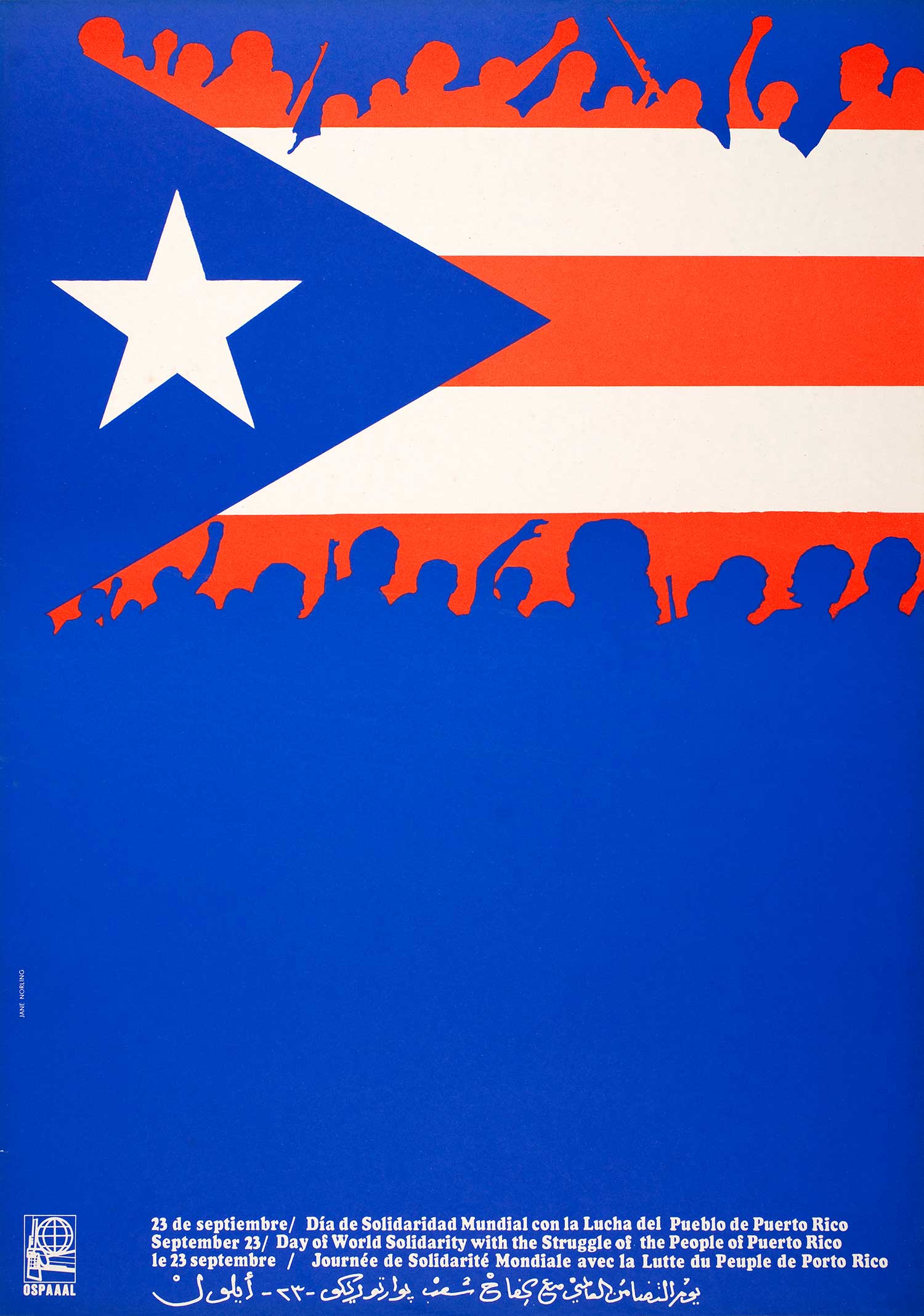
“Day of World Solidarity with the Struggle of the People of Puerto Rico,” 1973, offset print.
AH: OSPAAAL prints are really beautiful and inspirational. I imagine it must have been really exciting to get to work with the other artists and designers at OSPAAAL. What was it like working at OSPAAAL?
JN: It was thrilling to go to the origins of those posters, the extraordinary resourcefulness of marking the Cuban Revolution in practice in that studio, the brilliant wit. Design preparation practices we took for granted in the U.S. were often hand-drawn in Cuban design studios. As I was the only female in a studio of men; a 26-yr-old from the U.S. among artists working for continental revolutionary change and an ending to U.S. imperialism, the dynamics were often hilarious. The Cuban men I worked with were adept at practical jokes, so I was useful for that. A few were friendly mentors. A residency, really, though it never occurred to me to use that term. More, I felt a solidarity exchange. Part of my witnessing responsibility was that when I returned to the states I would do educational talks about the Cuban Revolution.
AH: In addition to your political prints you have a large body of paintings that focus on the beauty of the environment. Do you see a connection between your less overtly political landscape paintings and your political prints and overtly social justice work?
JN: While producing both, I kept “fine art” and “political” art separate in my thinking and project organization. This was particularly true when I began studio painting in earnest in 2000 after acquisition of a shared painting studio away from my home graphic design and painting studio which I used for business. My business was graphic design for social justice, specializing in electoral campaigns and ballot initiatives throughout California, public health and occupational health informational materials for California Department of Public Health, cultural materials for organizations such as San Francisco Mime Troupe, so on. The separate studio meant I could paint portraiture, abstraction, landscape, and be a fine artist. My political art was something else, consisting of posters and murals, but always alive in my heart.
But really, it all starts from one person, me, with big heart and careful eye for shape, design, color, and the expansive feeling when a person looks, sees, and takes in the the world before them, whether landscape or city or peopled.
As humans we all make things, whether called “art” or “cuisine,” or something else. For people to be motivated to investigate an unknown idea, belief system, location…, something has to wake up their innate sensitivity, often long deadened.
AH: Creativity in itself seems to be a positive and often political act. As the world is confronted with climate change and continued resource extraction it seems like your environmental work has a great deal of poetic political content. I wonder if you then see a connection between your environmental work, your women’s rights work, and your other political work?
JN: My deepest passion is for justice and true equality. Environmental justice, women’s rights, and other political concerns in which I make artwork to express feelings, persuade or agitate for change are areas I care deeply about. They are part of me and I go toward all of them, on an unconscious level, for understanding.
Women’s Rights and environmental justice work are foundational for survival and I believe must be considered one. I’m particularly pleased these concurrent directions have emerged in my work. For example in “Clean Water,” a campaign sign I designed that contributed to a win that provided Oakland with needed infrastructural changes that will improve people’s lives.
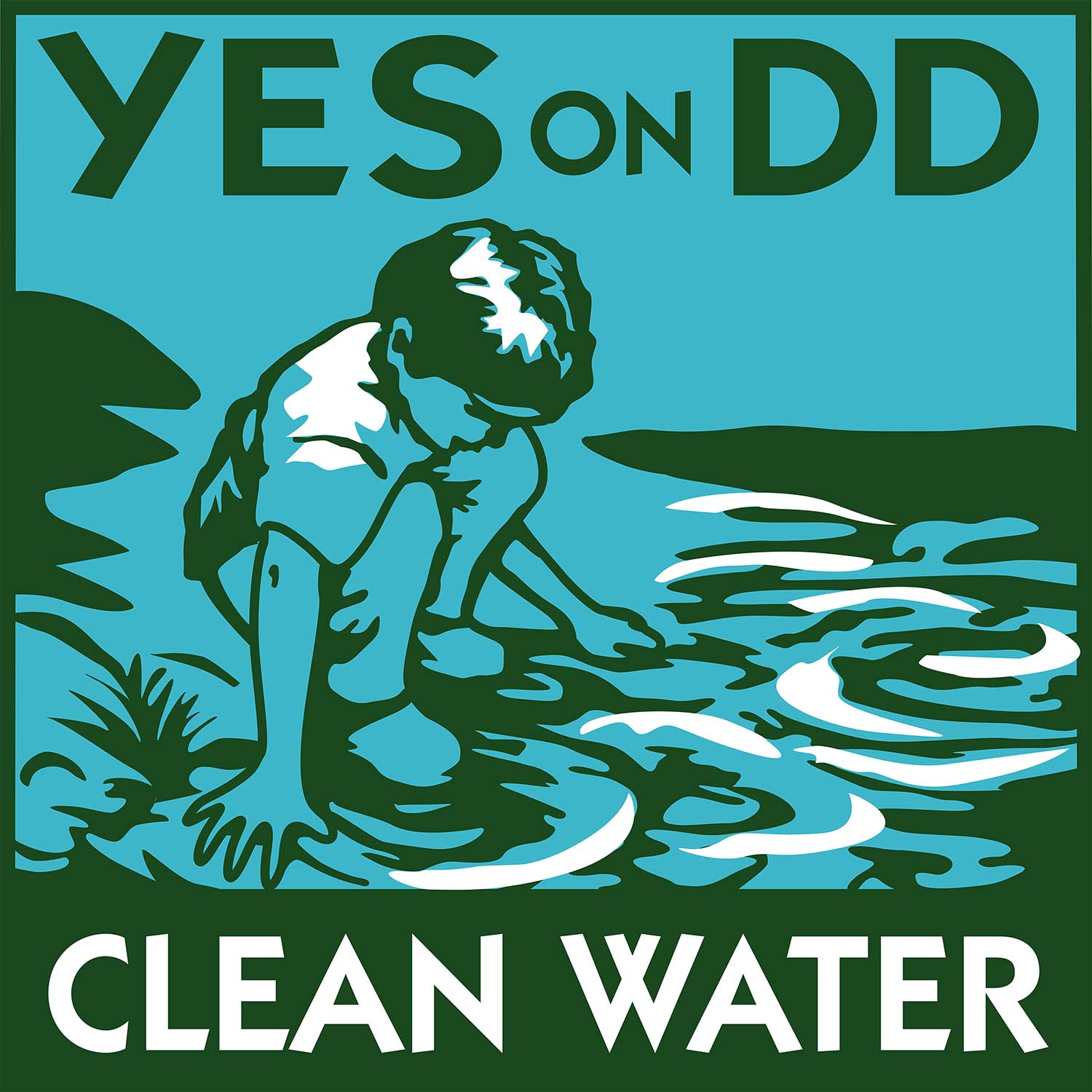
Measure DD, “Clean Water,” Oakland CA, 2002, campaign identity image–one of six artworks illustrating water-quality needs addressed by the ballot measure–screenprint yard sign, print materials.
AH: Going forward what are your hopes for the interplay between artwork and social justice?
JN: I expect more creative work beyond our wildest imagination to rise up in response to maniacal oppression. I’m thrilled by design, communication, and structural innovations of the generations after me along with my generations’ drive to keep creating new cultural response to mass corporate domination of every facet of life. People will always make art and I sense a greater willingness to understand each other’s personal call for justice.
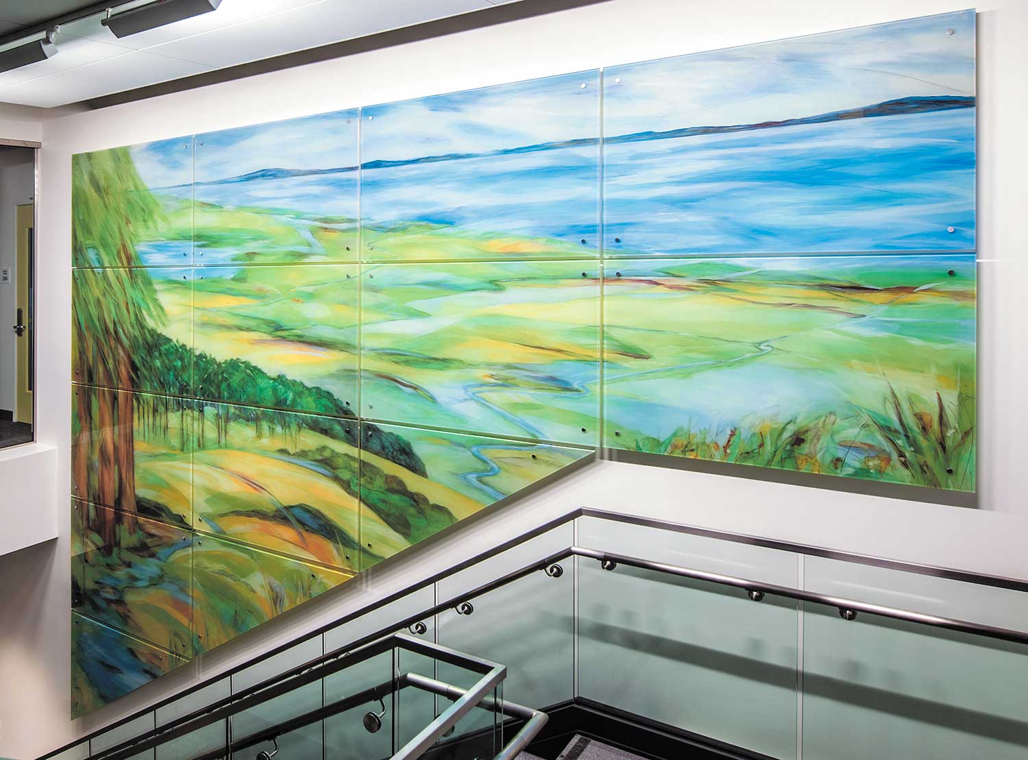
“Alameda County Water” (primary artwork of six), 2016, digital ceramic print to glass, permanent installation, commission of Alameda County Art Commission.
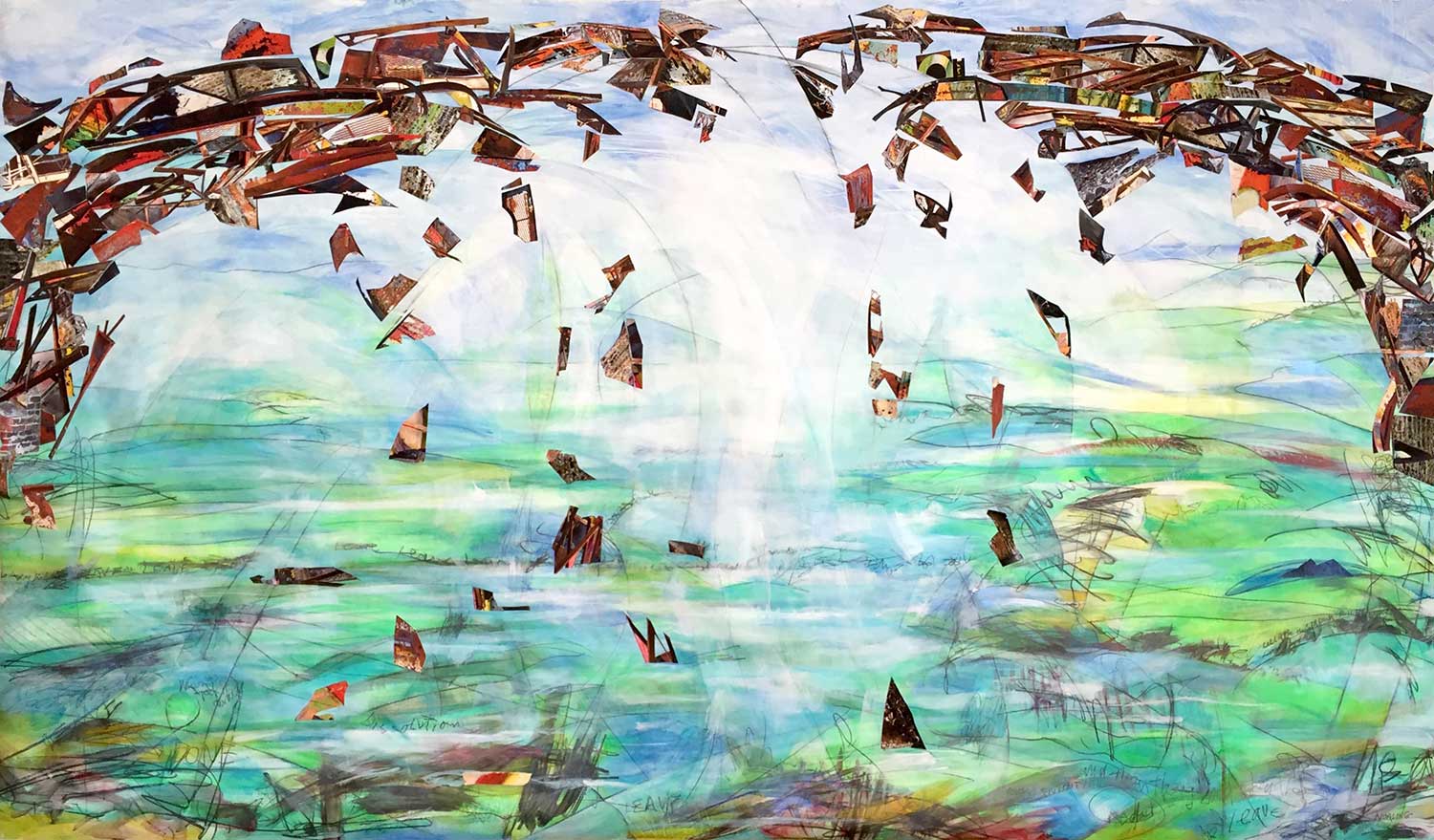
“Trouble Bridge,” 2017, acrylic paint and digital-print collage on tyvek.
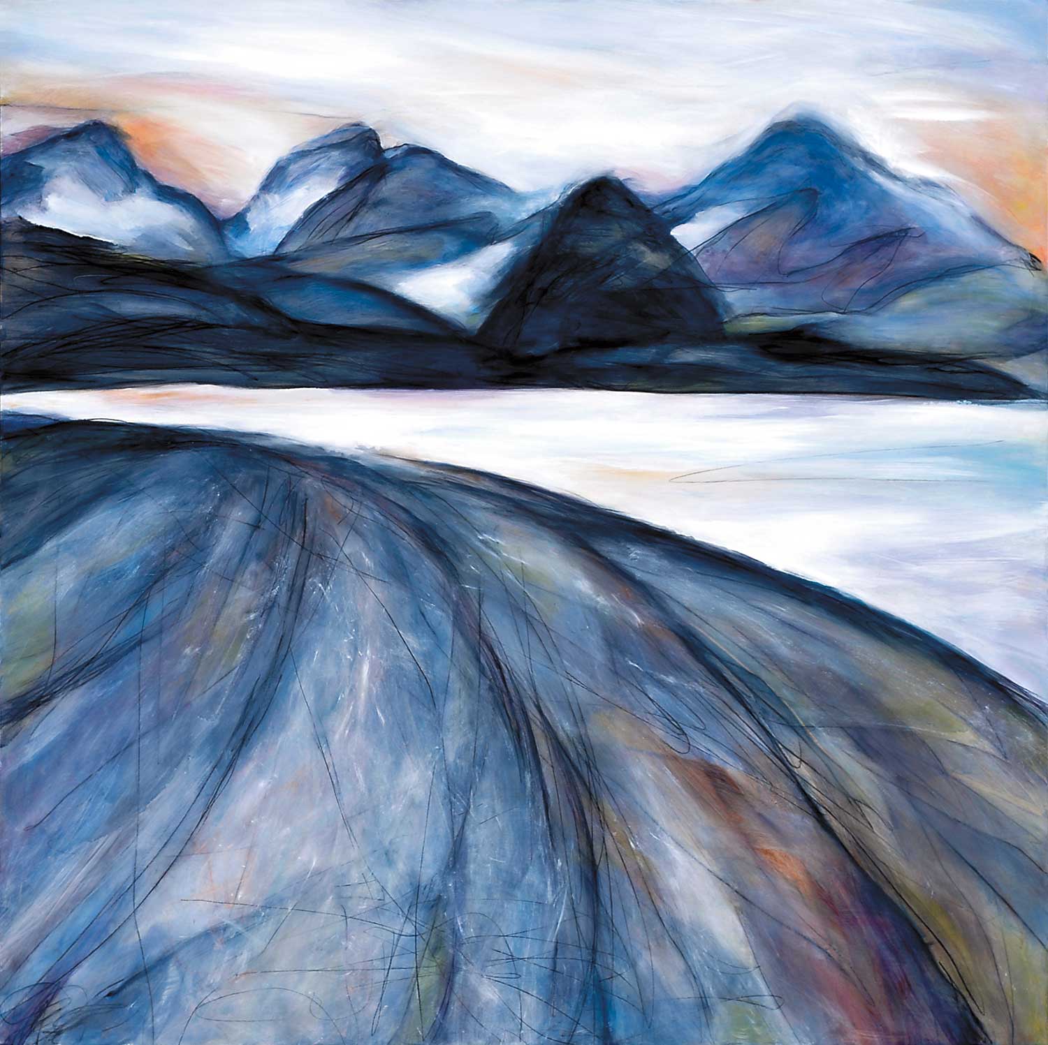
“Muir Inlet,” 2011, oil & graphite on panel.
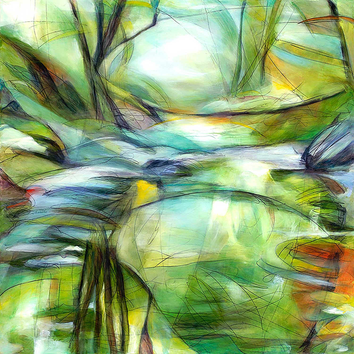
“Love the Woods,” 2011, oil & graphite on panel.
Jane Norling is a visual artist active in San Francisco Bay Area cultural venues since 1970. Her work addresses social and environmental justice, and aesthetic concerns through public art installation, community murals, graphic design, studio painting, printmaking, and small press publishing. At the heart of her expression is her love of the natural environment and the ever-transcendent power of humanity to live brilliantly while creatively challenging oppression. She currently lives in the San Francisco Bay Area and Chicago.
You can see more of Jane’s work and contact her through her website: http://www.janenorling.com/
Final photo of Jane Norling featured in the thumbnail and lead Gif is by John Storey.
