
I recently had the opportunity to design logos for two great organizations, Fight Back Pittsburgh and the Rebellious Nursing Conference. The creation of a logo is really difficult process! Both of these groups have different needs (based on their activities and intentions) but there were a few ideas that I thought both logos should have:
- Indication of what the groups were about
- Recognizable at varying sizes
- Reproducible from very small to very big
- Simple
This blog will be about my process for making the Rebellious Nursing! logo. In RN!’s own words, it is “…an informal collective of nurses, at all levels of practice, bonding together to create safe and energetic spaces for engagement in the struggles for liberation, justice, and healthful communities. We are planning a Rebellious Nursing Conference coming up on September 27-29, 2013, in Philadelphia, PA. The conference will be an opportunity to build community and solidarity, share skills and wisdom, find mentorship/peer support, develop ongoing creative projects, and honor nurses past, present, and future who have rebelliously fought for the health of their communities all over the world. We seek to include all nurses, other medical care providers, and allies in our organizing on equal footing, by confronting what divides us. We seek to create a world where all people receive and have a say in competent, compassionate, and respectful care in their communities. We envision a world where caregiving is a communal activity and seek a future where we all contribute according to our abilities, and everyone receives care according to their needs.”
Sounds pretty amazing!! I offered to do some graphic work for them, and my contact with the group wrote back and said they needed a logo. I received an informal list of visual ideas from the organizing group, one list giving adjectives of the feel they wanted to give:
- Bold / Rebellious
- Collaborative / Supportive
- Listening / Open
- Creative
- Resourceful
- Medical / Clinical / Scientific
and then also a list of visual ideas to work from:
- Hot water bottle
- Broken systems
- Anatomical drawings
- EKG reading
- Nursing uniforms…old fashioned ones — with the hats
- Gloves
- Fists
- Masks
- Playing with the medical symbol — replacing snakes with something else?
- Political Organizing
- Humanistic — touching, taking care, having relationships
- Doesn’t fit into the world paradigm of power
- Pressure rising – blood pressure cuff
- IV’s – putting into the system what we think it needs
- Slow drip, fast rush, nourishment
- Rectangle / IV bag
- Syringe
- Nursing being powerful / counter to the traditional images of nurses
- Breast feeding
- Bandaid
- Direct Contact / Hands / Touch
This was a nice way to begin. A lot of ideas there, but enough leeway to make work whatever I needed to do to make it work. I was also, at the time, heavily influenced by an essay by Suzanne Gordon and Sioban Nelson- ‘Moving beyond the Virtue Script in Nursing’ (from the excellent book The Complexities of Care: Nursing Reconsidered), which talks about the way that both nurses present ourselves and the way in which nurses are depicted in the wider media landscape. The essay argues that the portrayal of nurses as angels, selfless, gentle, and caring denigrates the actual challenging and critical work that nurses do. This imaging of nurses (‘the virtue script’- often symbolized by hearts, caring hands, angels, and child-like imagery) has helped to create an environment where nursing work is misunderstood and devalued.
I also had the standard challenges of color scheme, font, and representation.
With all these factors in mind I took what visual ideas popped out at me right away and drew up 5 quick sketches. I did two crowd shots (not my favorite, but it seems like a lot of times that’s what groups want), two detournements of the image of nursing (the hat with the flame and the hat with the lightning) and one with the hemostat (mostly because I love scissors, but also because it is a specific tool of nursing and kind of a strong image). I loaded them into photoshop added some random colors and sent them back.

When Josh and I interviewed the folks from the Taller Tupac Amaru (Justseeds’ Melanie, Jesus, and Favianna) for Signal:01, I was inspired by their approach to working with organizations, and their attempts to work through the design process by treating it like a dialogue. I’ve also found that organizations/clients don’t always know what they want (though they often know what they DON’T want) so it’s a bit easier when there’s some ideas on the table for people to consider. One other thing I’d like to add is that it’s been extremely important to have people to bounce ideas off of, people who I trust to give me honest, often harsh, feedback (Josh thought that the nursing hat with the lightning bolt read ZZ Top, Katie B let me know that my color choices were ‘poor’).
After I sent off the initial sketches of the idea, the concept was still bugging me. It was difficult to think of things that symbolized nursing that weren’t incredibly vague and over-used (eg- the medical cross, the stethoscope). I kept coming back to the idea of hands, of that idea of touch between patient and nurse, but I wanted the hands to be strong, raised in defiance/triumph.
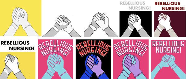
I worked on this idea, symbolizing the public with the patient ID bracelet and the nurse with the nitrile/latex glove, and I really thought I’d hit the image jackpot with this one. I’ve always felt pretty confident with my ability to draw hands doing various things, never felt like I needed a model or an image to work from, but for some reason I could not get these hands right. In fact, from a physiological point of view it seemed I could only get them wrong! What the heck! And they also never looked quite that triumphant to me, they were still a little sad, they looked like holding hands with a dying person. I tried a bunch of different approaches to doing it, from simple line art to attempts at making them pictograms, and finally in desperation I tried to make them cartoony. Not super pleased with any of them I sent these along as well, and thought maybe if the group liked them they might point me in the right direction.
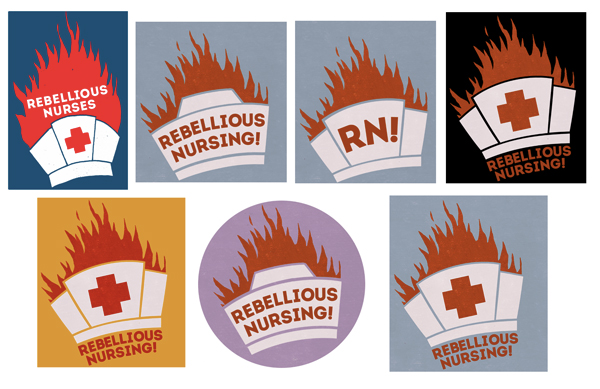
I heard back from the group and they wanted to go with the burning hat. Which was great but I didn’t really like how it looked, so it went back to revising the image and trying to take it somewhere different. I ended up with a ‘medical’ color scheme and picked a font that I thought was strong, modern, and warm.
The Rebellious Nursing Conference is coming up on September 27-29, 2013, in Philadelphia, PA. For more information:
I can’t wait!
Very informative to hear about collective process this way. I’d love to hear more thoughts about how you fine-tune ideas (like font/color selection).