First off, we’ve been hard at work on a brand new Justseeds website, which will vastly transform the experience of both the posting and reading of blog entries like these. That’s been taking a lot of my time, which has made it harder to keep up with these book cover posts. I’m hoping to get back onto a more regular schedule once the new site launches in a month or two. Now back to our regularly scheduled program:
I’ve never been a huge Vladimir Ilyich enthusiast, and even less so of his contemporary fan base. Whether of the newspaper selling or Žižek-ian variety, most seem to oscillate between boring and annoying. Yet some how I have still ended up collecting a Lil’ Lenin Library all my own, without any conscious effort. I was doing some cleaning, and found almost two dozen books with his pointy chin beard featured prominently on the covers. He’s definitely a major trope of Left book publishing, so why not do a post about these covers?
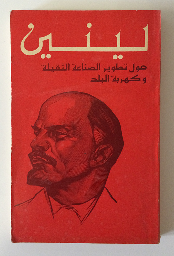
I must admit, he looks good in Arabic. The bright red field of the cover is punctured by his name in long, precise script. His portrait—rendered in block print, or at least illustrated to look like it—is strong, his gaze looking leftward, off the cover and towards the content of the volume (Arabic reads right to left, so the covers open on the opposite side of English books). It’s great propaganda, and intended as such. Although in Arabic, the book was produced by Progress Publishers, and printed in Moscow (in 1970).
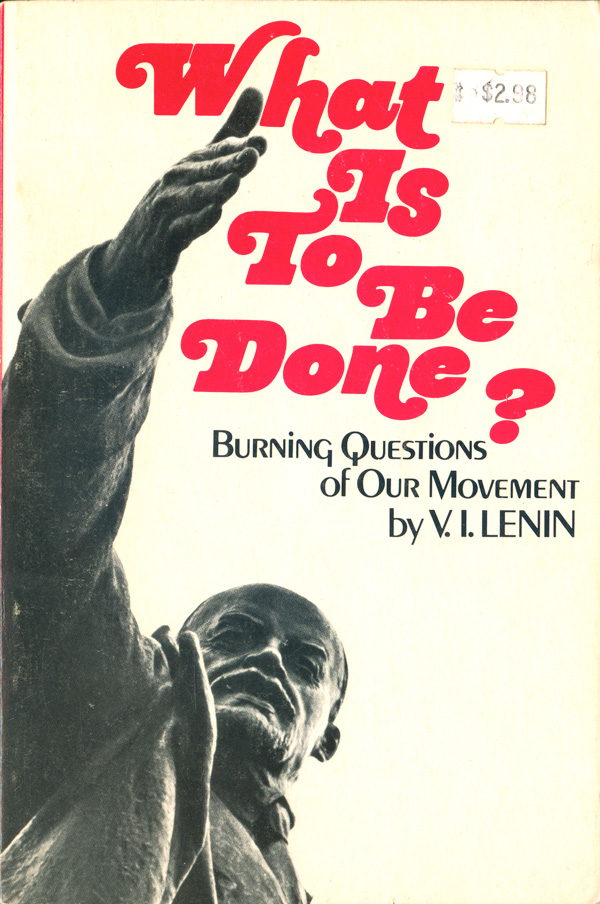
I don’t have much actual Lenin in my collection, but I’ve never been able to resist the cover to the New World Paperbacks edition of What is To Be Done. The powerful slicing gesture of the hand, cutting through the problem, even disturbing the asking of the question. There is something unintentionally honest about using this tight, cropped photo of a statue of Lenin, his ideas calcified into stone, or at least into documents to be published and republished by Communist Parties around the world as if nothing has changed in the 75–100 years since he wrote them.
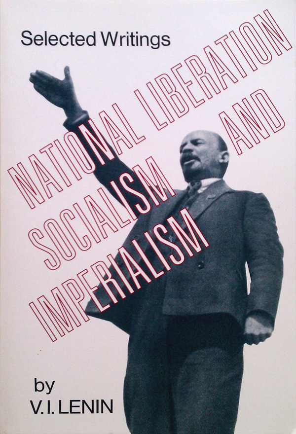
Another Internationalist Publishing book (New World Paperbacks being an imprint of this official press of the Communist Party USA), National Liberation, Socialism, and Imperialism features a similar Lenin, although this one seems like the photo source used to cast the statue of the former. There is something much odder about this hand gesture when seen on the actual man. The hand is almost cut off from the body by the title of the book, and floats there—somewhere between half a handshake and a Nazi salute.
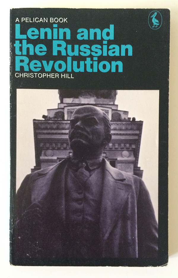
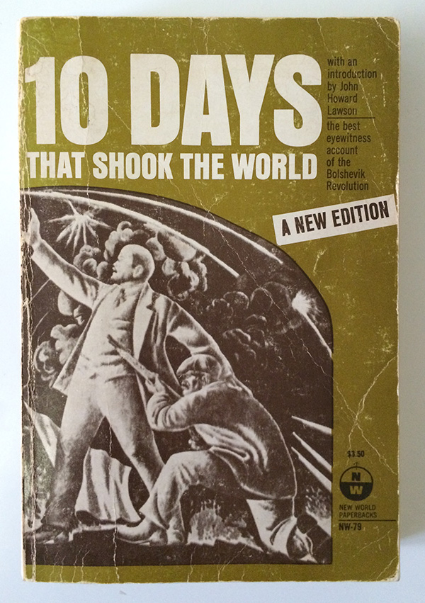
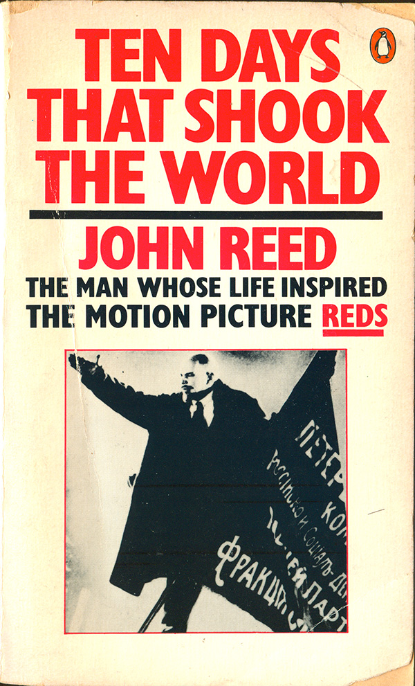
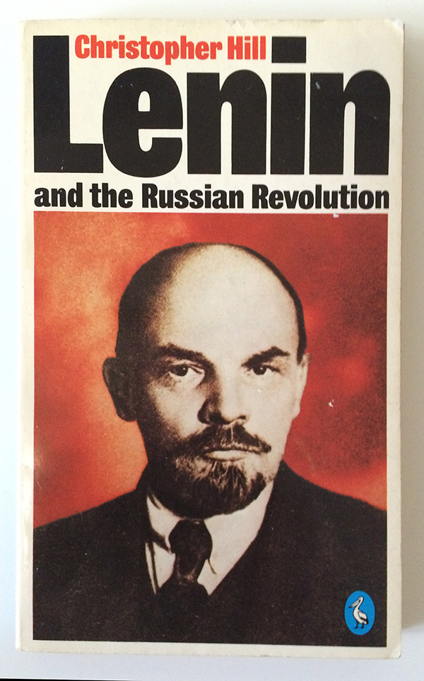
Lenin–as-statue is a popular trope, showing up again on Christopher Hill’s Lenin and the Russian Revolution (Penguin, 1971) and a New World Paperback edition of John Reed’s 10 Days that Shook the World (1974), where he is part of a mural or relief sculpture, more icon than man. This same pointing Lenin, in film version, also shows up on a later edition (Penguin, 1981).
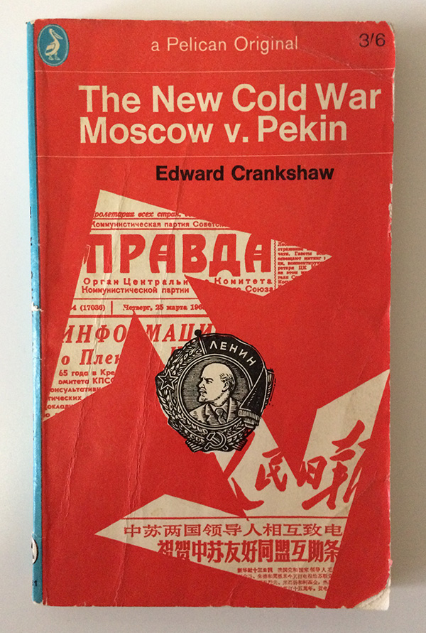
The icon theme is continued on Edward Crankshaw’s The New Cold War: Moscow v. Pekin (Penguin, 1965) where Lenin is no longer man at all, but simply a head on a coin-shaped standard. His image is a stand-in for existing Communism, which is diverging between the USSR and China. This same medal is re-purposed on the cover of Martin Cruz-Smith’s post-Soviet crime novel Stalin’s Ghost (Simon & Schuster, 2007), a scuffed-up copy of which I picked up off the street. It’s not at all clear why the designer uses Lenin as the representation of a book about people in Russia seeing a ghostly spectre of Stalin, other than an American shrug of the shoulders and claim to “what’s the difference?”

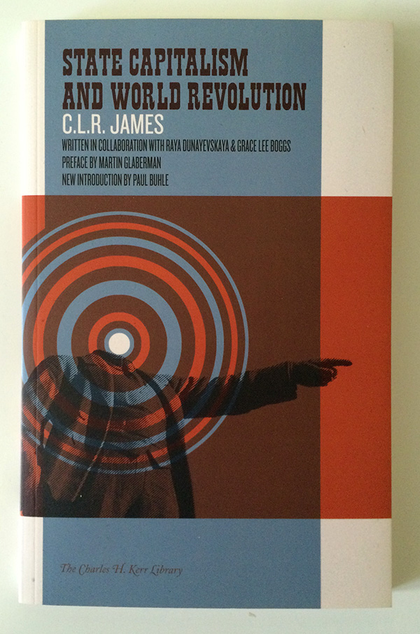
It is this static iconography of Lenin I was playing with when designing my cover for CLR James’ State Capitalism and World Revolution (PM Press, 2013). I wanted my cover to be as trenchant a critique of the failures of state forms of communism as James’ content, so what better way to illustrate that than to remove the head of the visual lionization of those state communist politics? The circles (or revolutions) of potential radiate out of that absence, the beheading—rather than the finger pointing of the static icon—makes way for a different future.
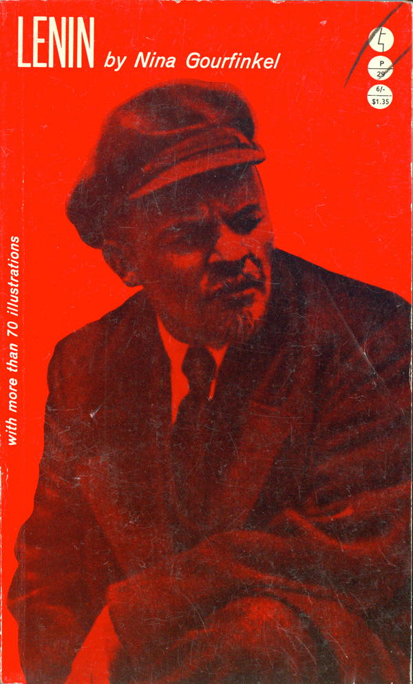
One of the things I’ve noticed about Lenin-related covers is how few image sources are used. You’d think only a couple photos were ever taken of the guy. Fischer & Marek’s Essential Lenin (Herder and Herder, 1972) and Nina Gourfinkel’s Lenin (Evergreen, 1961) use the exact same image, which isn’t quite photograph because it has that airbrushed quality that so many Soviet photos have once they’ve been doctored and touched up (see David King’s amazing The Commissar Vanishes for more).

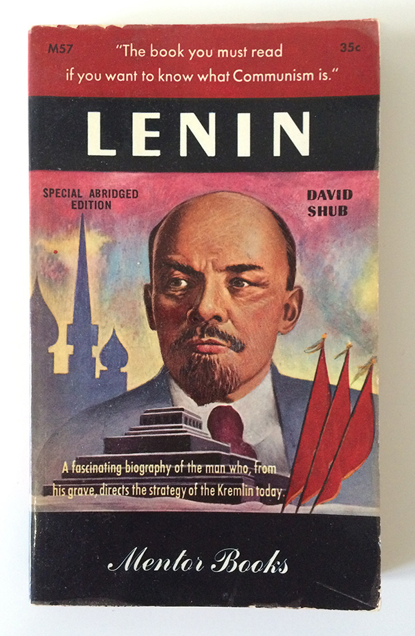
Speaking of David King, the photo he uses on the cover design of the 1984 edition of Christopher Hill’s Lenin and the Russian Revolution (Penguin) is another popular image choice. Here King chooses to colorize Lenin, and back him with an intense volcanic red. This pulls him out of the past and makes him a demanding figure in the here and now. An illustrated version of the same photo shows up on David Shub’s Lenin (Mentor, 1950), along with red flags and onion dome peaks as backdrop. Both of these covers humanize Lenin, he is a man of major import—larger than life—but he is still a man, he wears a suit and tie and goes to work.
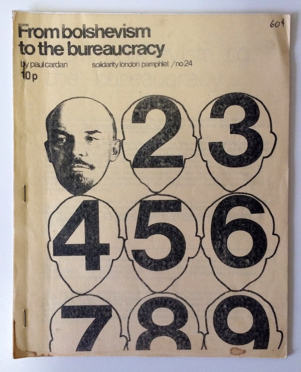
The designer of Paul Cardan’s From Bolshevism to the Bureaucracy (Solidarity, early 1970s) uses the same photo to very different effect. A visual critique of bureaucracy, the reproduction of numbered Lenins piled on top of each other illustrates the failure of the continued reproduction of old ideas poorly understood, doing so merely gets us a calculus of quantity rather than an analysis of quality.
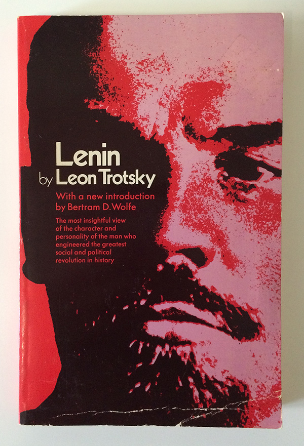
Edward Bohon’s design for the cover of Trotsky’s Lenin (Capricorn, 1971) takes the same image in alternative direction. Blown-up to overwhelm the cover, and broken down into three hyper-saturated layers of pink, red, and black, this Lenin is larger-than-life, he’s no longer a man but an idea, a powerful in-your-face one at that. The title and author are set again the shadow of his left eye, further converting the image into architecture, a visual field rather than a representation of a person.
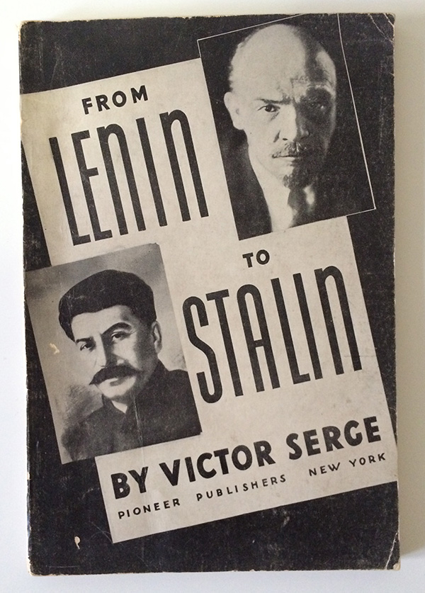
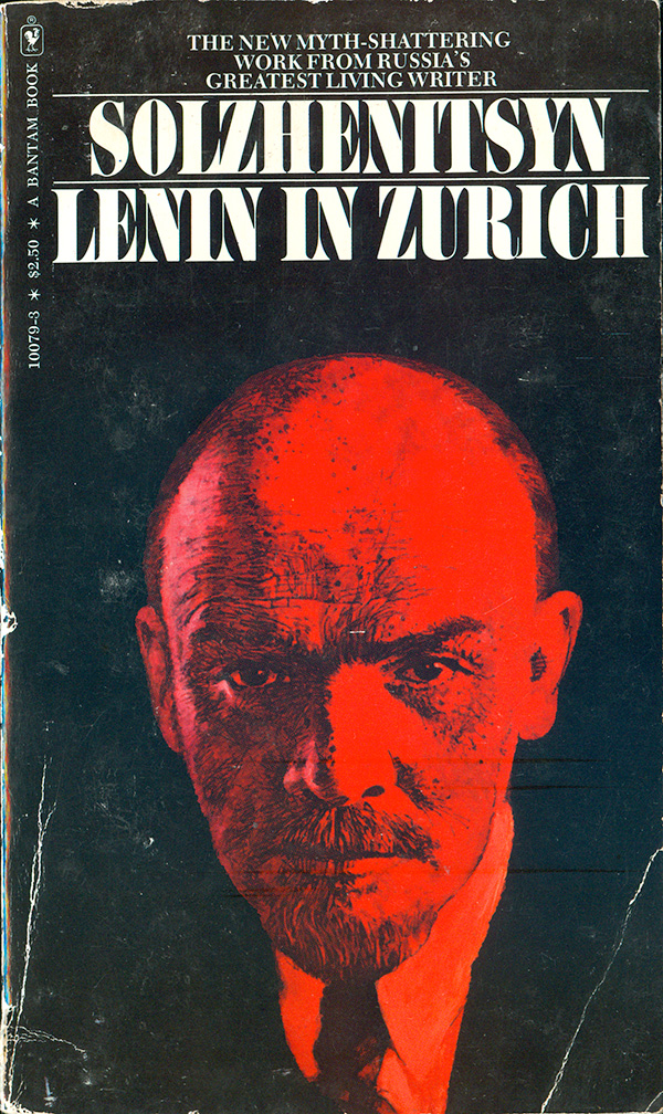
A slightly different photo source is used on the cover of Victor Serge’s From Lenin to Stalin (Pioneer Publishers, 1937). Here the lighting makes Lenin seem even more human. He’s leaning forward, and the wrinkles in his brow haven’t been airbrushed out by Soviet censors or over-zealous designers. His look is inquisitive, and not the rock-solid stare fixed into so many other images. On this cover he seems honest, compared to Stalin, whose smirk seems a bit creepy like he’s hiding something. This same photo is the source for the cover painting on Alexander Solzhenitsyn’s Lenin in Zurich (Bantam, 1977). The cover displays Lenin as a solitary figure, emerging bright red out of the darkness, but marred by shadow and dark age lines. This is Lenin, “wrinkles and all.”
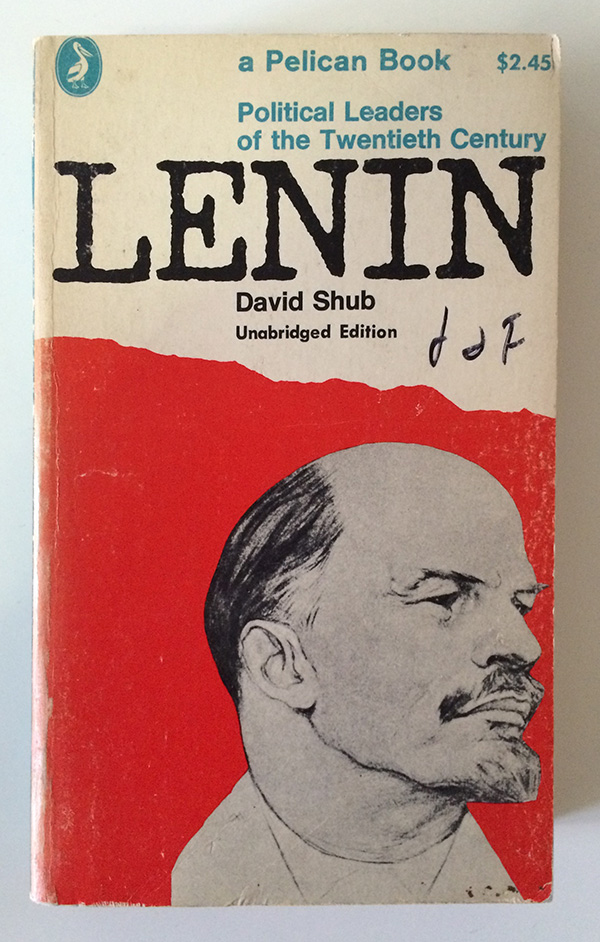
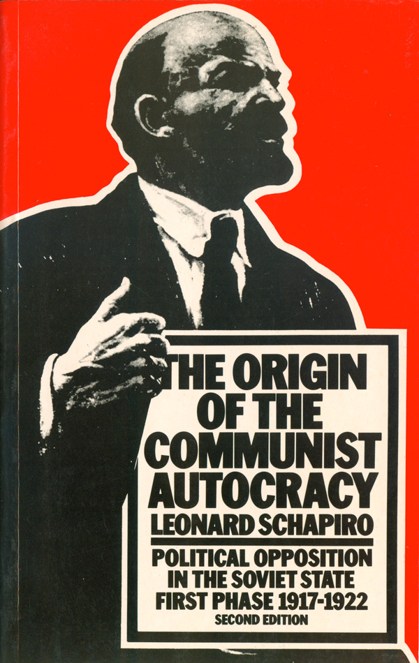
A much pointier version (or maybe it’s just the beard) of Lenin shows up in Leonard Schapiro’s The Origin of the Communist Autocracy (Harvard, 1977) and David Shub’s Penguin edition of Lenin (1967). On both of these covers Lenin begins to return to his statue-state, more stand-in than actual person. With it’s stark image and boxed, bold sans serif type, I would have sworn the Shapiro cover was designed by David King, but it was actually done by Ken Carroll.
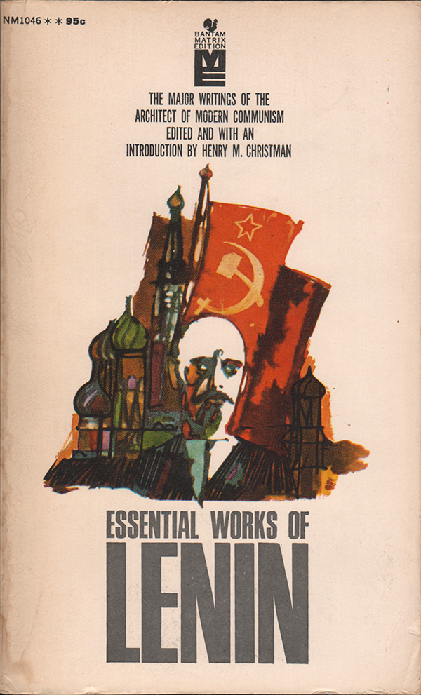
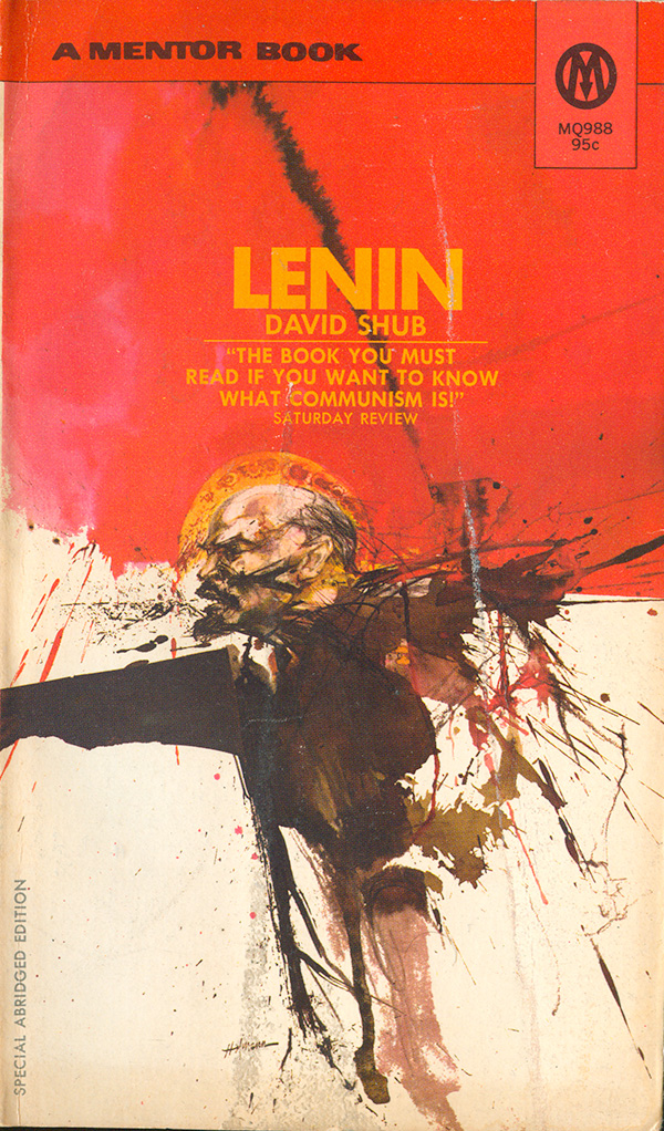
Given how recognizable Lenin is, it’s shocking how few designers have played with his image by either stylizing or abstracting him. I’ve picked up a few, but examples are surprisingly hard to find. On Henry Christman’s Essential Works of Lenin (Bantam), the portrait is scratchy and gestural, Lenin being more recognizable by his billboard-like forehead and sharp facial hair than anything else. The cover of this 70s Mentor edition of Shub’s biography is starting to break the mold, with the golden halo and his body morphing into an expressionist explosion. The cover designer is not listed, but I suspect the painting is by “Hofmann,” who did many similar covers, none of which are attributed, but the signature is visible on some.
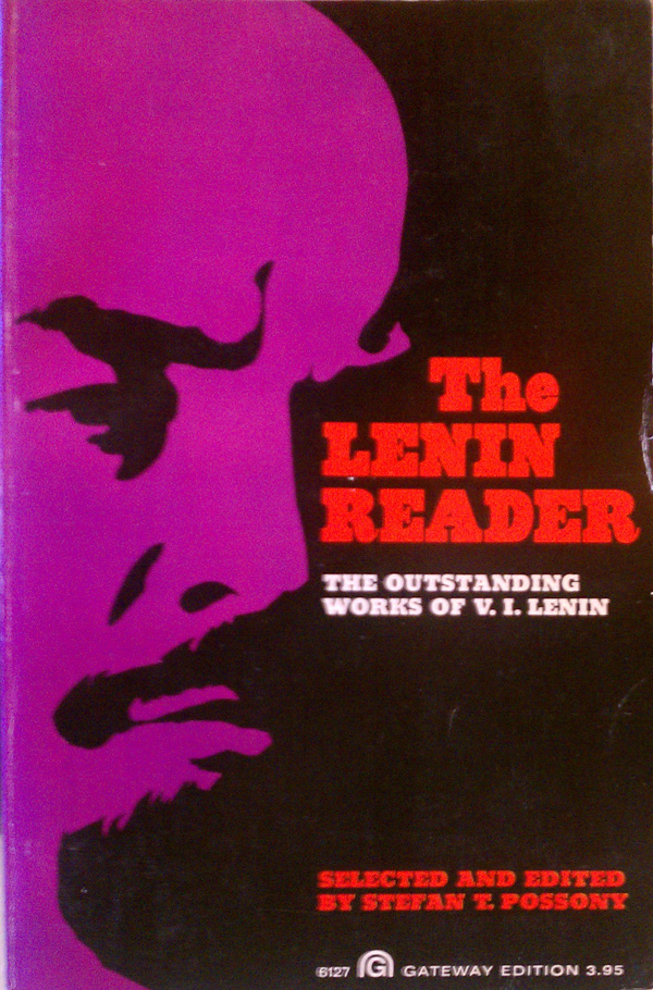
The Lenin Reader sports a duo-toned portrait reminiscent of the book cover work of Roman Cieslewicz or the screen prints of Rupert Garcia. It’s a tried and true way to make a bold image, but it feels slap-dash here, with something missing. Maybe it’s a lack of the care and attention to detail that make Cieslewicz’ and Garcia’s work so successful (check out some of Cieslewicz’ covers HERE).
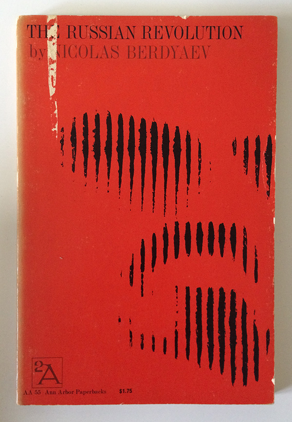
But no need to despair, the best is saved for last. The cover of Nicolas Berdyaev’s The Russian Revolution (Ann Arbor, 1961) is a near perfect abstraction of the visage of Russia’s Big L. The designer, Elton Robinson, has give us the minimal visual information necessary to make Lenin out on a bright red visual field. Vertical black lines shimmer into focus, and after rejecting the idea that you are looking at trees, or buildings, human figures, the eye adjusts to seeing a set of dark piercing eyes and familiar facial hair. While I don’t agree with all of Berdyaev’s deeply Christian critique of communism, I can’t help but read my own feelings into the cover: a little Lenin goes a long way.


I just discovered this page of wonderful analyses of Lenin book covers. I was quit surprised to see my design among them and enjoyed you comment about it.