I’ve been really digging designing book covers of late, which has made me look much closer at all the other covers I come across and already have on my shelf. I’m going to try to start doing this weekly blog series sharing cool book covers I find.
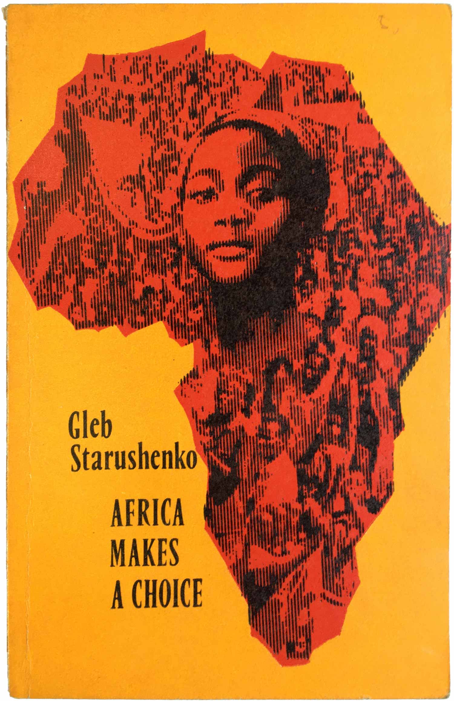
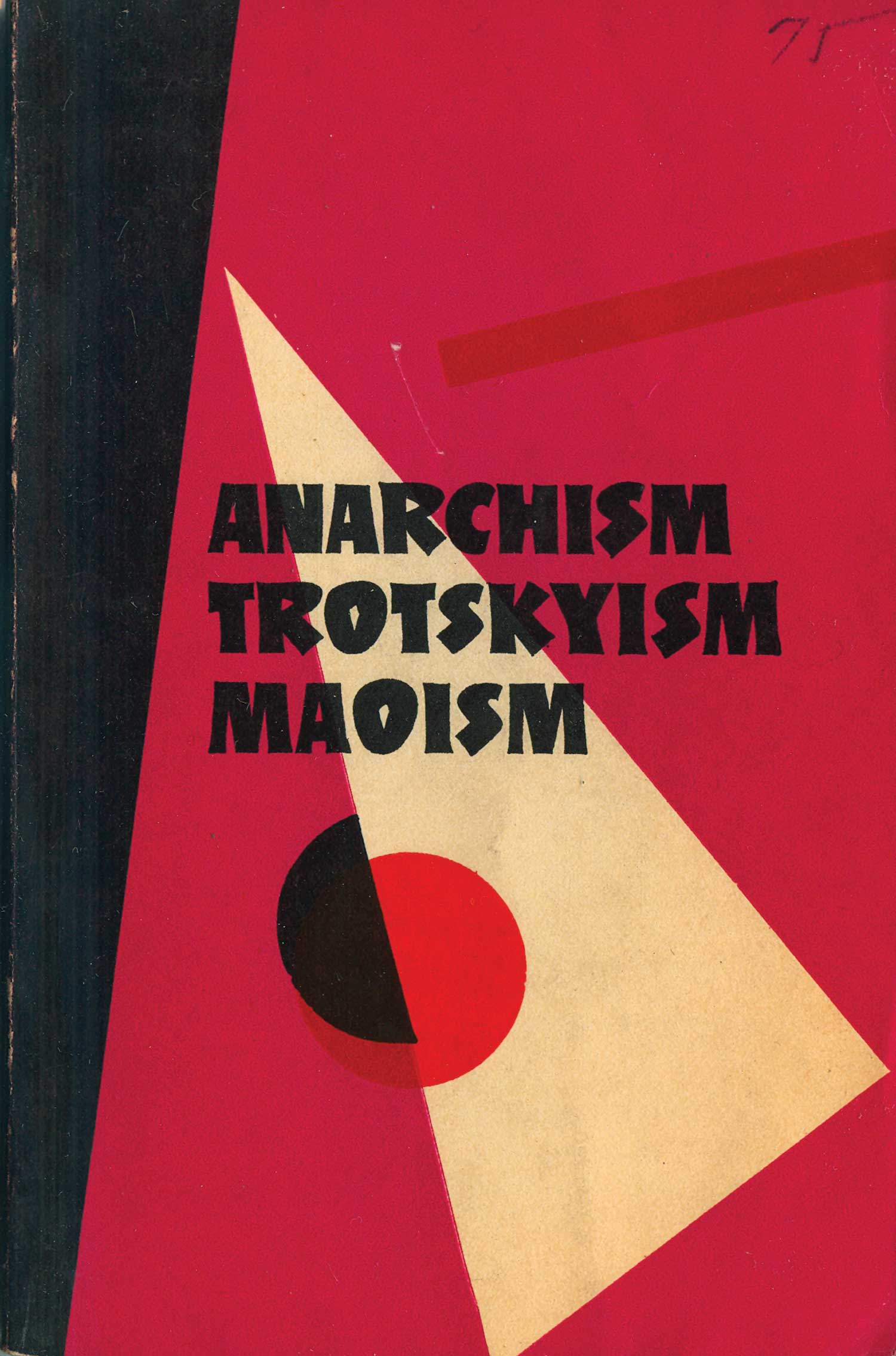
For this first installment, three great covers from a series late-Soviet political books I picked up some years back in Chicago. They are aesthetically amazing, pulling together clean and crisp replicas of different moments of modernist design. And politically, like most late-Soviet material, very strange. It appears that they were produced in 1971 and 72 by the Novosti Press Agency Publishing House in Moscow, primarily to attack Chinese communism, but they are in English, and the text is so dull that they are practically unreadable. I pity the poor Communist Party member that had to read these back in the day. There’s definitely no attribution or clue who the designer(s) is, but they were quite graphicly cheeky, with the “white wedge” of reaction cutting through (or infecting?) the red and black circles of Anarchism/Trotskyism/Maoism, and the “falling” Chinese architectural forms of the Peking Divisionists!
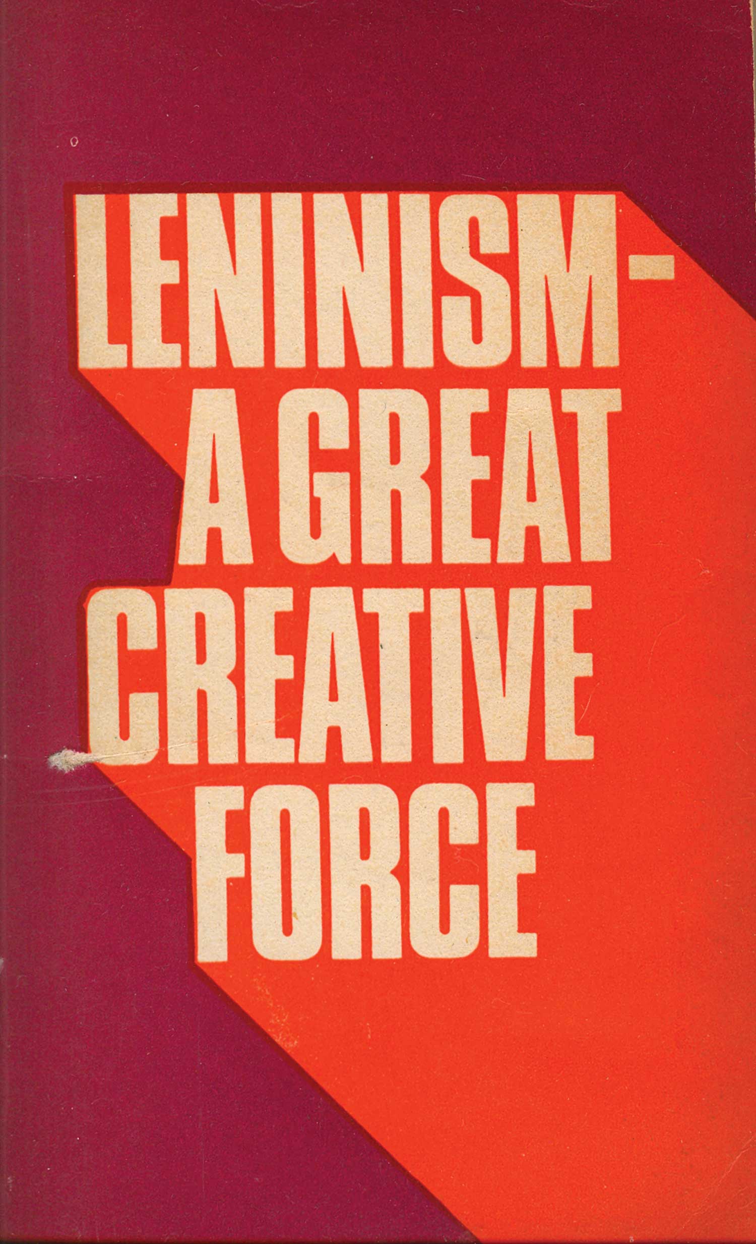
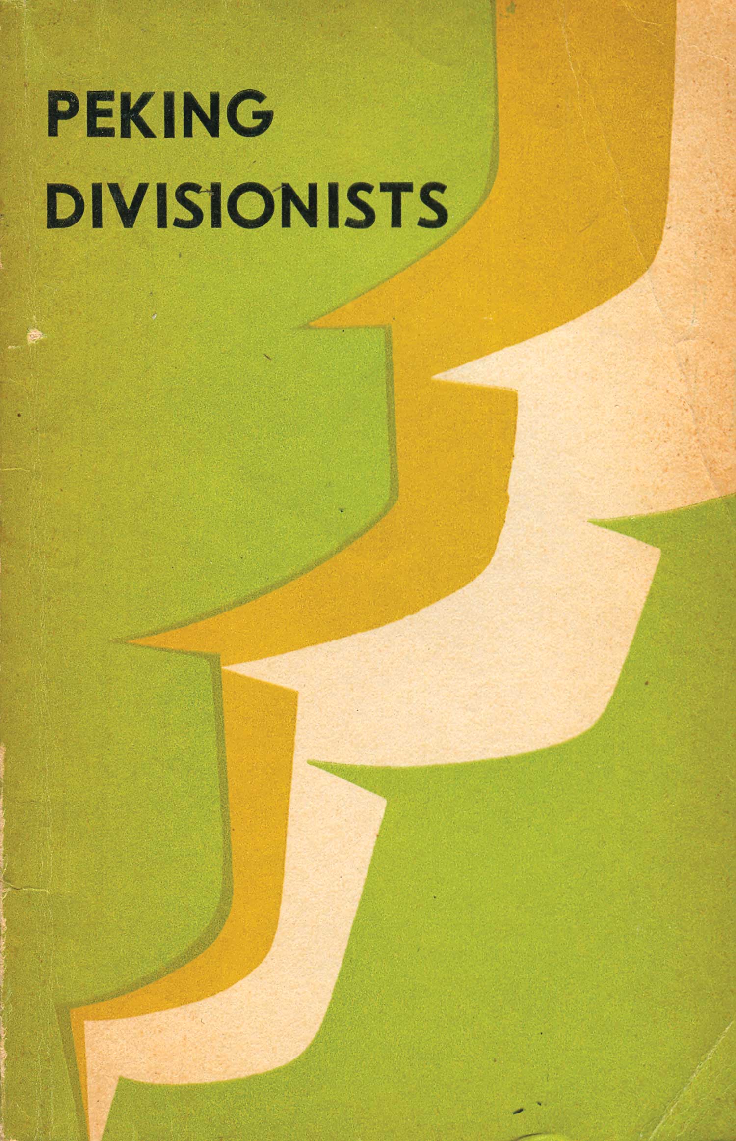
[ed. note: This post was updated on 5/31/16, with the following text and 10 images added.]
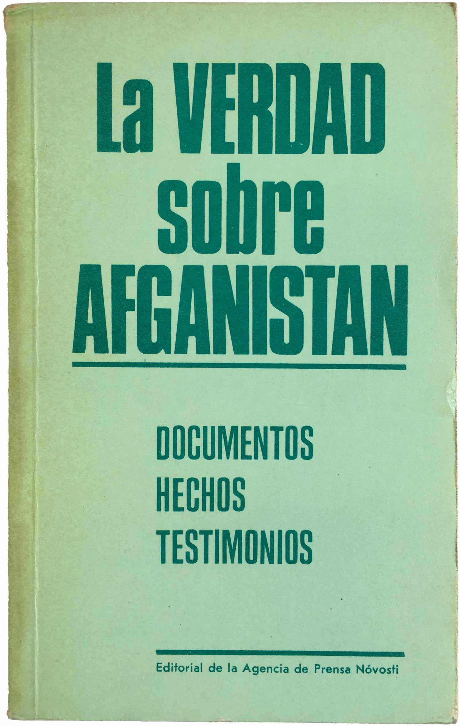
The Novosti Press Agency was created in 1961 as the successor to the previous Soviet news arm, the Sovinformburo. Its primary function was to be the Soviet equivalent of the Associated Press, with offices in over 120 countries, which provided Soviet-angled news stories to any and all magazine, journals, and news outlets. This also included their own publications wing, which as early as 1964 began churning out hundreds of political pamphlets from Moscow to be distributed across the globe. They published in English, French, German, Italian, and Spanish, and quite possibly many more.
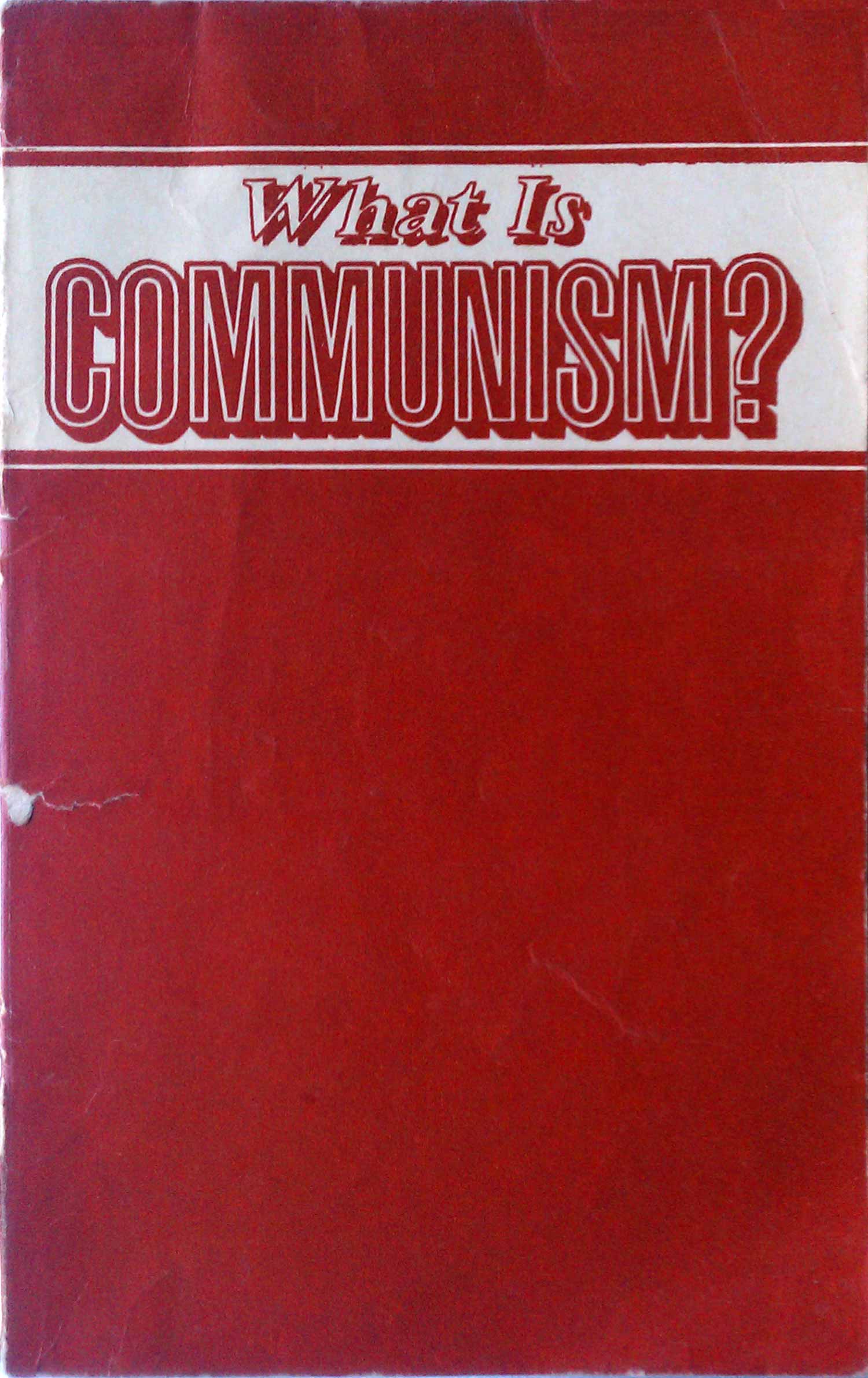
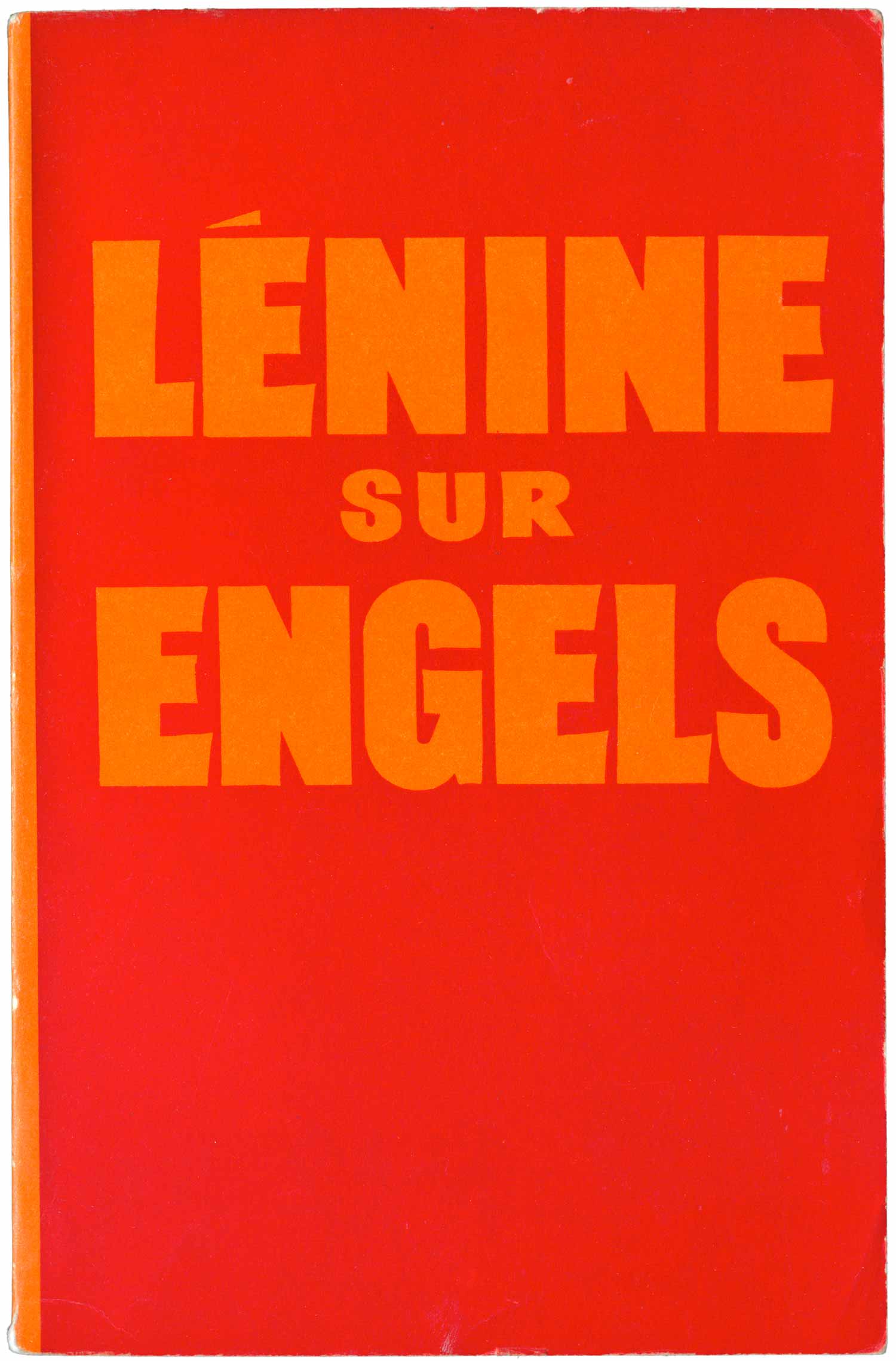
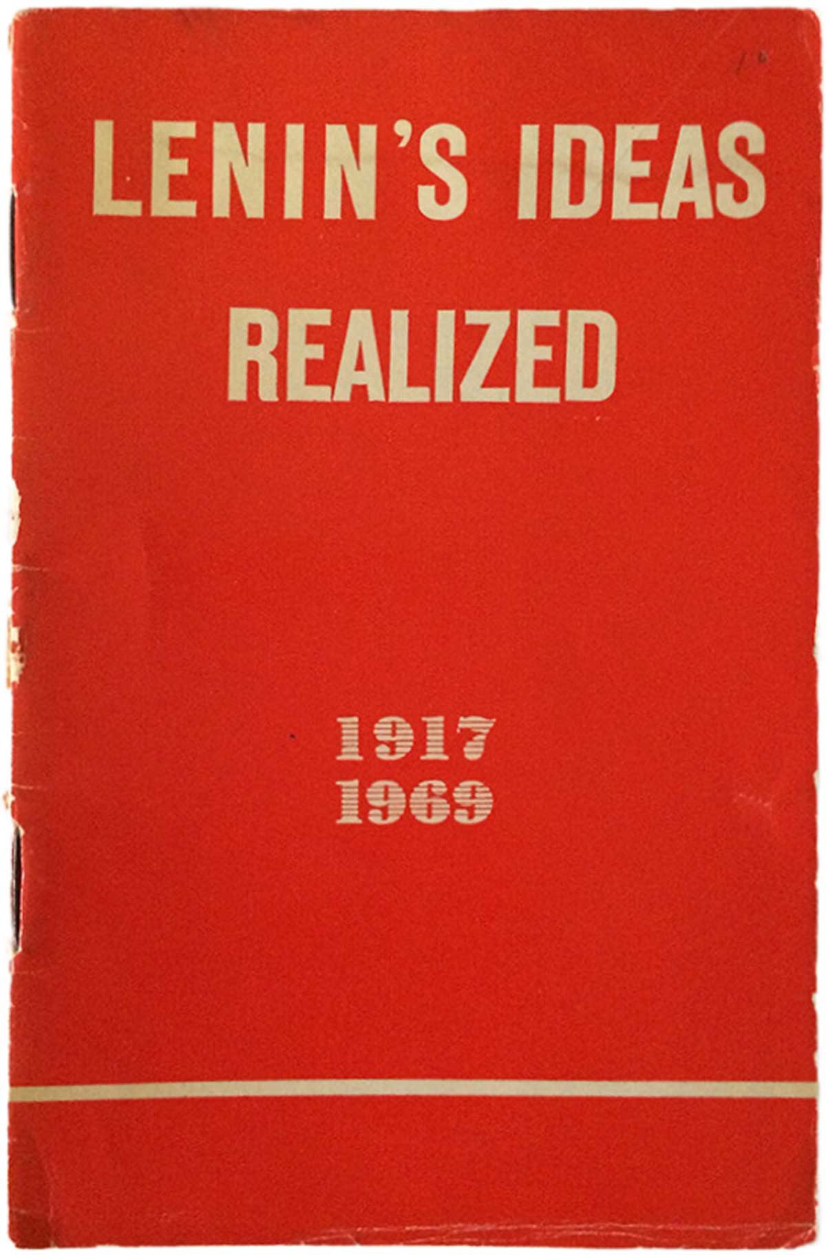
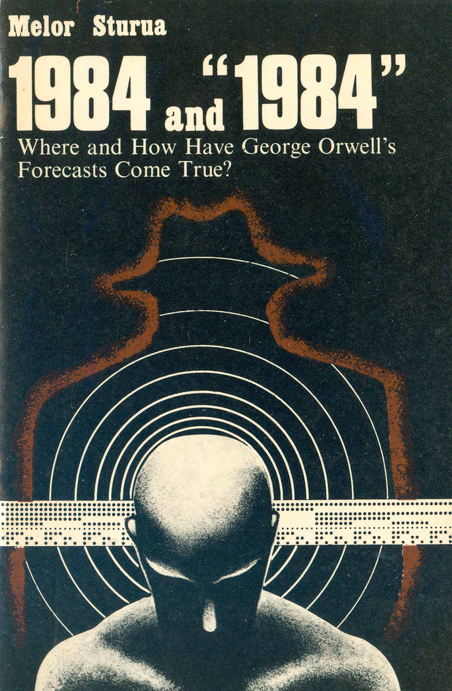
The initial three pamphlets I shared above back in 2010 are all fairly early publications, from the Agency’s first decade. They continued to maintain a number of titles with very austere, simple, and even beautiful covers, but they also began to expand out, adding more colors and detail. By the 1980s booklets like Olimpíada-80 and the USSR Constitution were being published, with their far more staid and conservative design. The pamphlets in this post are just a dozen of hundreds of publications put out by Novosti.
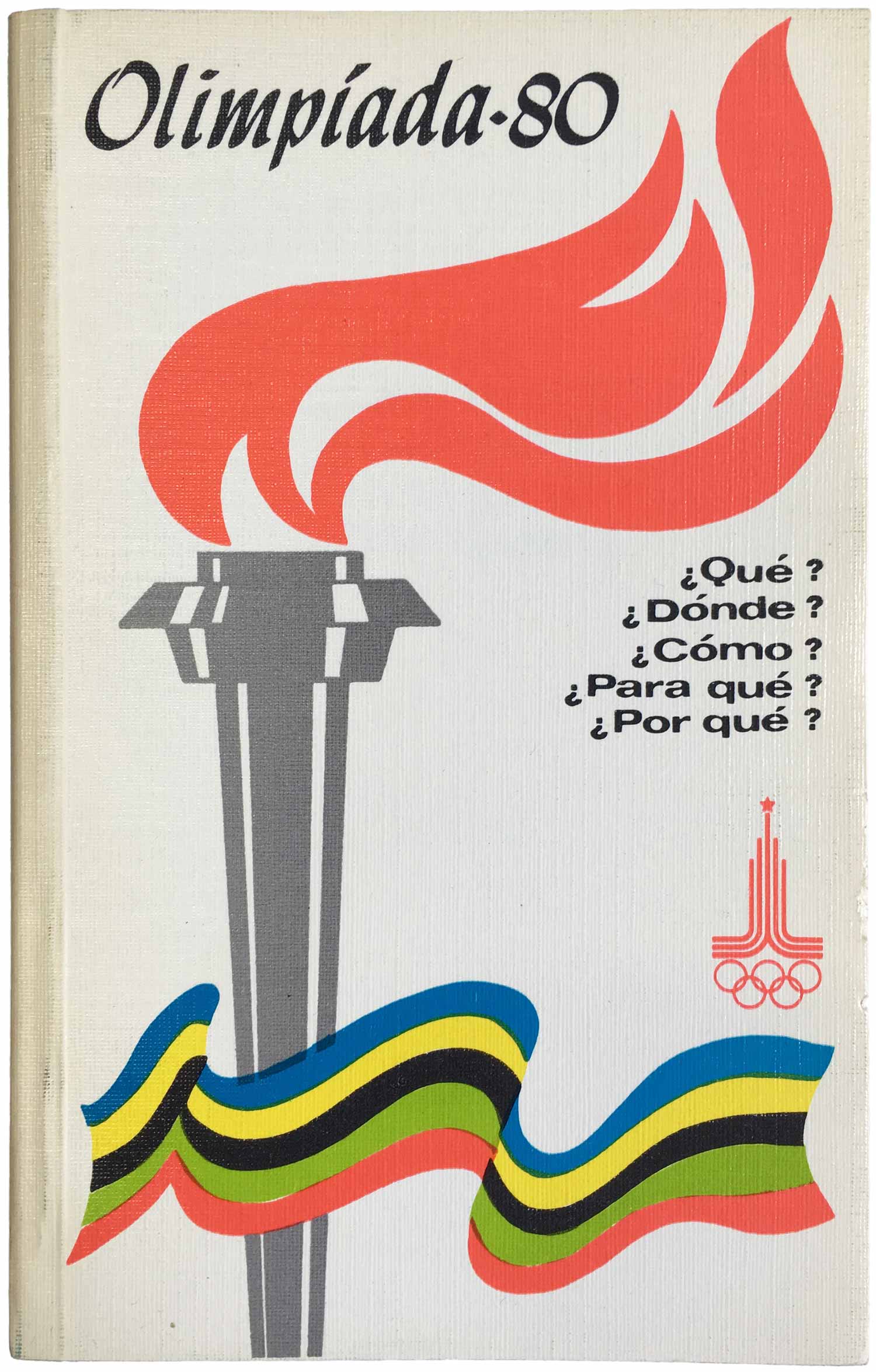
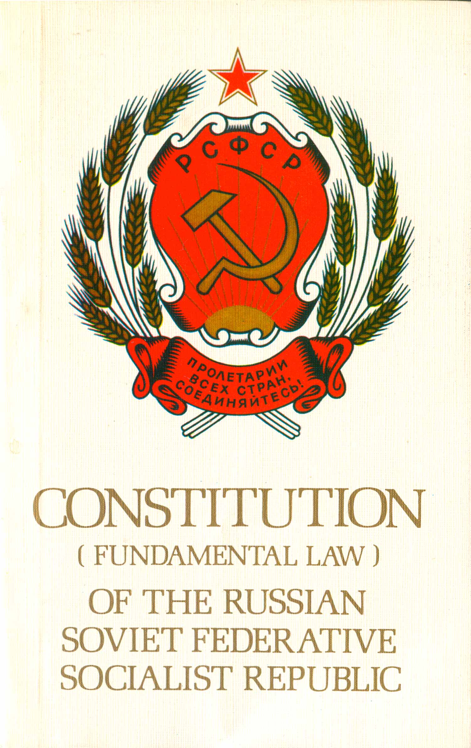
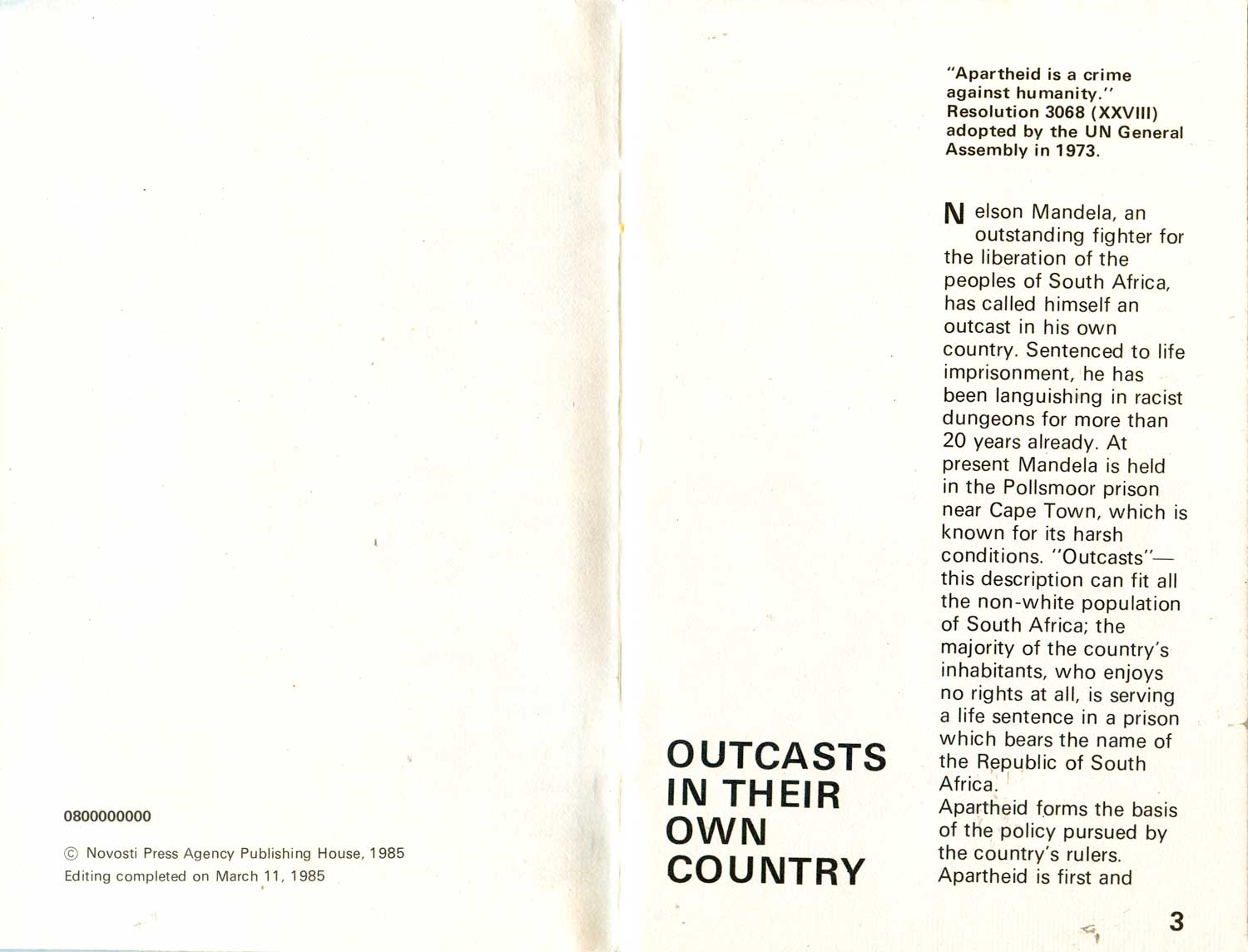
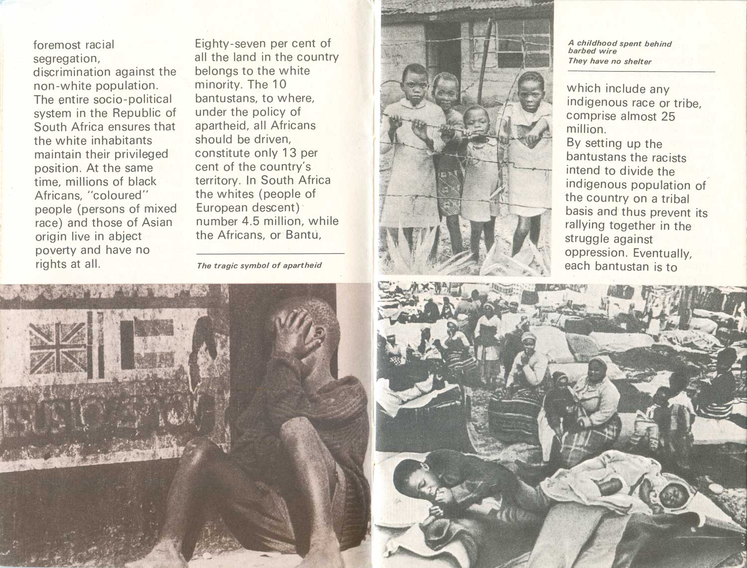
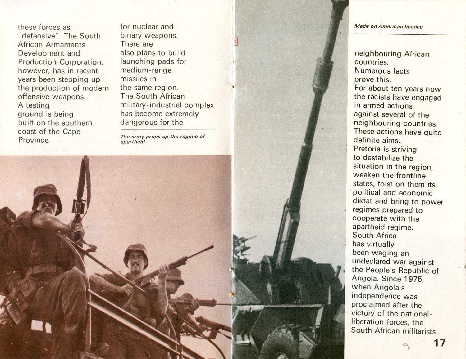
By the mid-80s the insides began to become more designed and detailed as well. While the early books were simple set type, as you can see below within Freedom to the Peoples in Southern Africa, now there was sans serif fonts, modernist layout, and duo-toned photo reproductions.
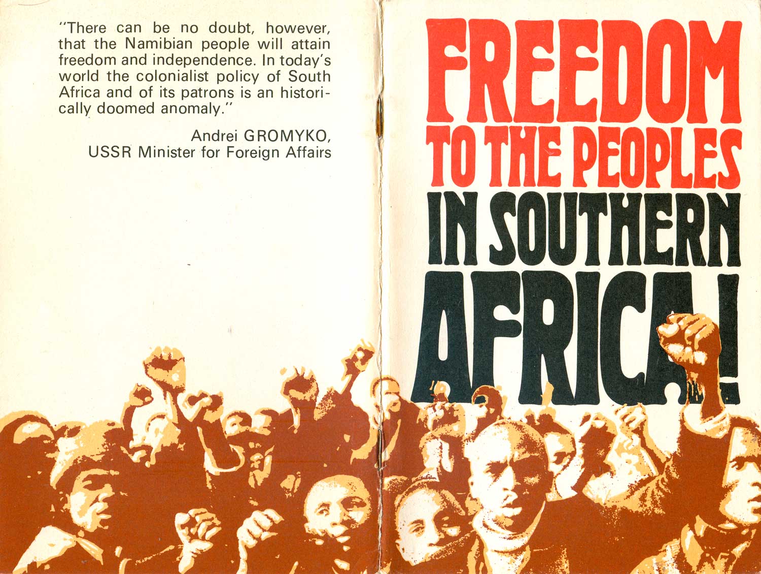
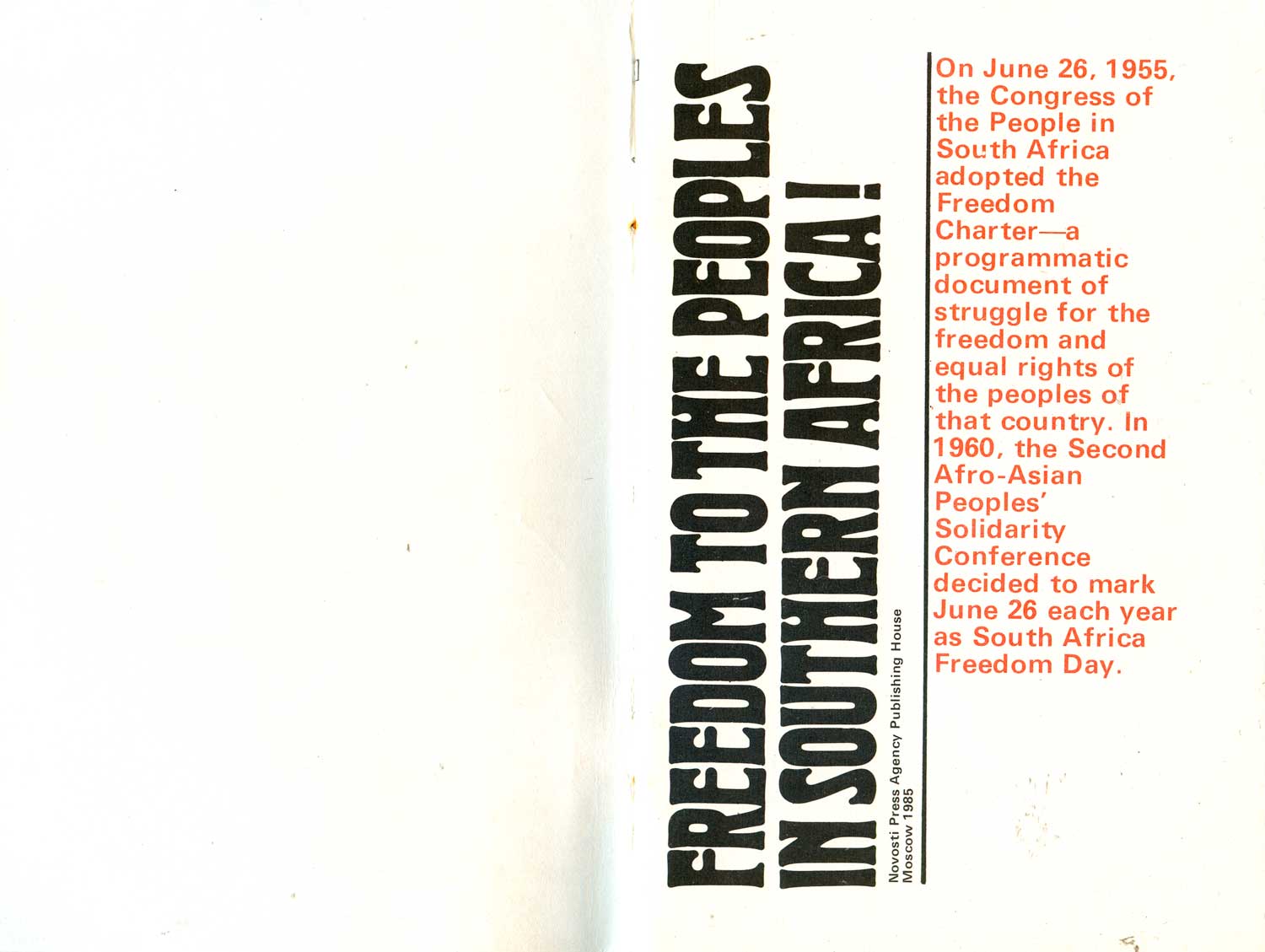
In 1990, Gorbachev converted the Novosti Press Agency into the Information Agency Novosti, which eventually evolved into the current Russian Information Agency Novosti, which produces the popular yet bizarre English-language TV channel Russia Today.
Bibliography:



These are gorgeous! I’m excited about this series.
These are really great, love the lettering and the drop on the Leninism cover.
In addition to the covers are there anything interesting about the spines on these?