Seven Seas also published a number titles related to Africa, in particular novels and short stories by South African writers. I’ve been able to find four of these titles, but the Seven Seas bibliography at 50 Watts (HERE) shows at least two additional novels, Enver Carim’s Golden City (a great book about the working class Indian experience in Johannesburg, published in the US by Grove Press) and Harry Bloom’s Transvaal Episode, as well as James Kantor’s autobiography A Healthy Grave. Kantor was Nelson Mandela’s lawyer during the Rivonia treason trial. [ed. note: I’ve since found the Carim and Kantor books, which are featured in the 7 Seas posts following this one.]
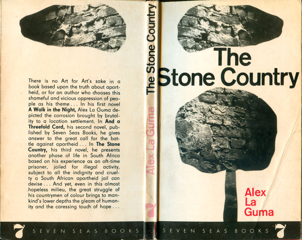
The gems of the lot are the two novels by South African author Alex La Guma. Both sport great montaged covers by Lothar Reher. The Stone Country (1967) cover is composed of black and white photos of a brick wall crop and cut into basic shapes, the top image is cloud-like, yet heavy, and the bottom is possibly intended to be a tree. The title is snuggled between the two, but appears deeply precarious, as if it will soon be crushed between the rock-like cloud and stone tree. The entire cover is black and white except for the author’s name, which sits quietly but proud in red in the bottom right corner.
The Stone Country is a good example to go through to see the overall layout of most Seven Seas books. The interior design of the books is very distinct and largely uniform across titles, but not attributed, so I’m unsure if it is also designed by Lothar Reher, as all the covers are.
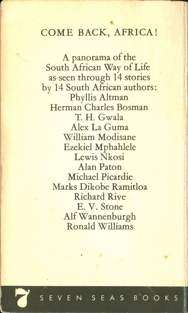
The bottom of every cover has a colored band with the words “Seven Seas Books” in thin sans serif and the bold numeral 7 on the fr right. The spines are almost always in the same font as the dominant type on the cover, usually a variation on Helvetica. The colored band wraps around onto the spine and the back. Above the band on the spine is a repetition of the numeral 7, in bold Bodoni Poster font. The back covers are largely variations on the front, with visual elements borrowed from the cover and expository text making up the majority of the visual field.
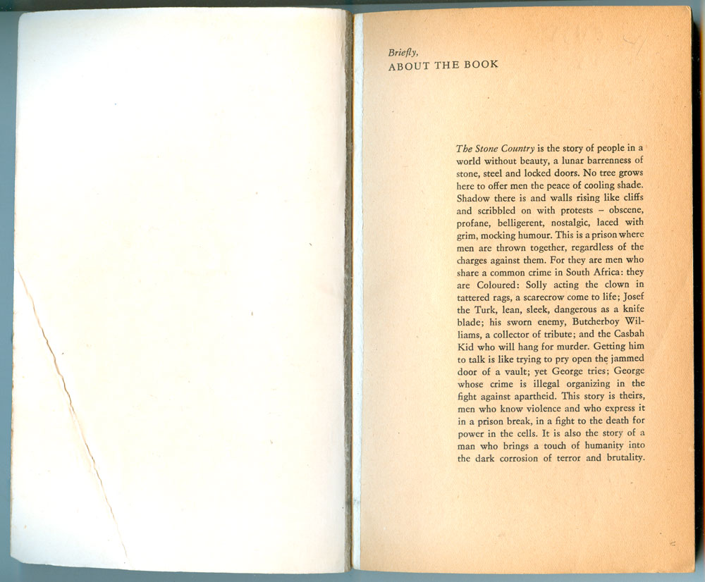
The initial page of each book starts with “Briefly, About the Book”, followed by a solid block of descriptive text, justified hard to the right.
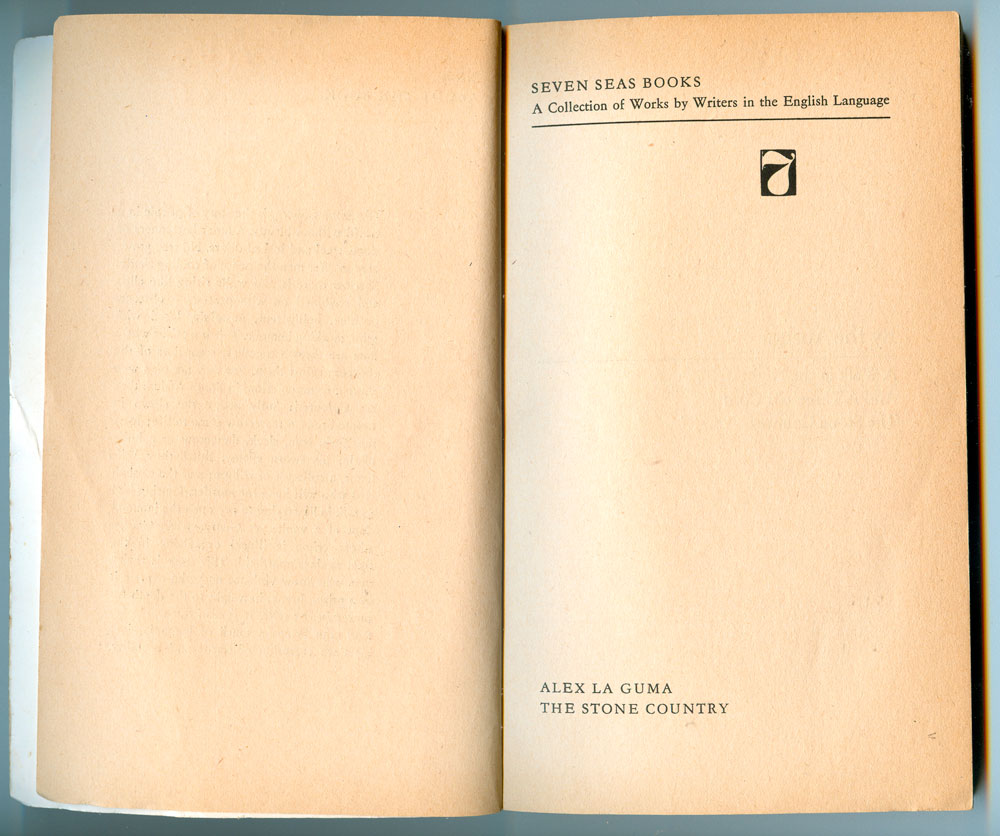
The following spread opens to the half title page, with a standard tagline for the press: “A Collection of Works by Writers in the English Language,” with another repetition of the bold number 7 logo. The book’s title and author are listed handsomely in all caps at the bottom left.
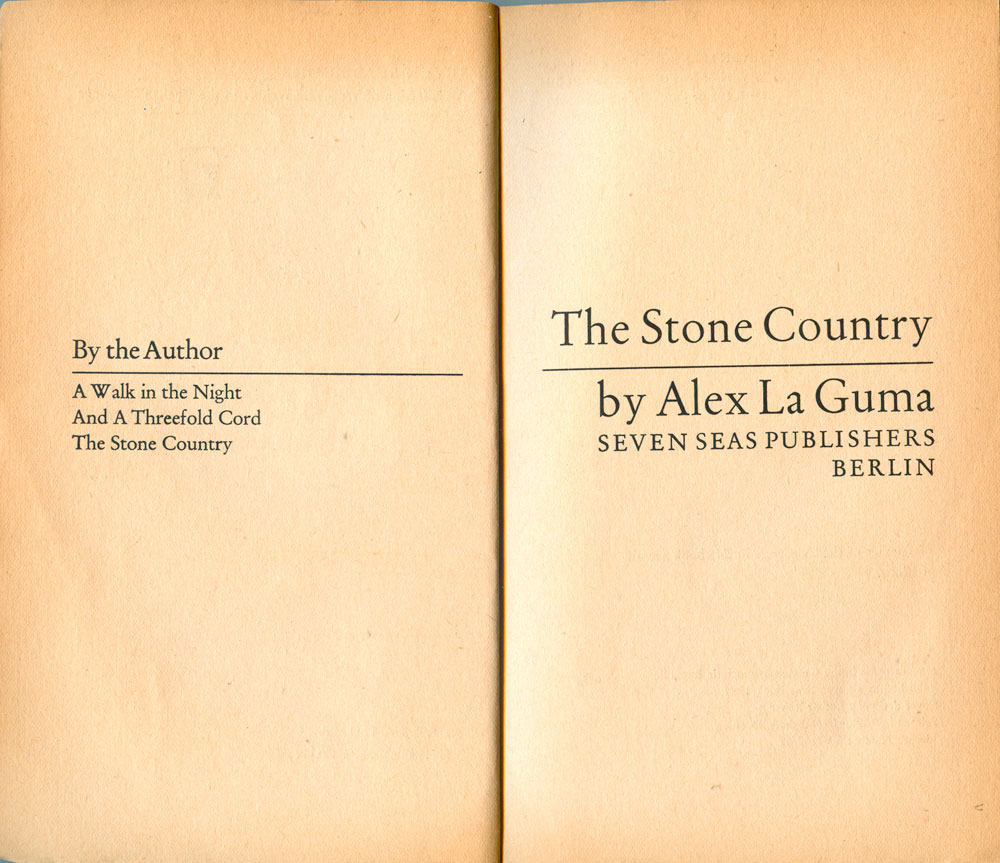
The full title page is on the next spread, with a thin line bisecting both verso (left hand side of the page spread) and recto (right hand side of the page spread); on the verso is a list of other titles by the author, on the recto is the title above the line, with the author and publishing information below. Its a strong opening, classic and comfortable on the eye.
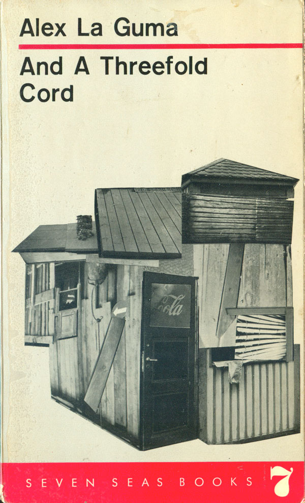
The second La Guma title is And a Threefold Cord. The cover is another montage, this time a pile of clippings of wood and plank imagery imaginatively constructed into a series of shacks. The varied angles and edges of the wood create a cubist mega-shack, one with no clear beginning or end, which appears to both be expanding and collapsing in on itself. This relatively simply constructed image powerfully evokes the living conditions of most Black people in South Africa under apartheid.
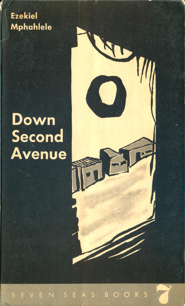
The cover of Ezekiel Mphahlele’s Down Second Avenue (1962) evokes the same sense of alienation, but with a completely different set of formal tools. The illustration is raw and hand drawn, filling up the entire field of the cover. We’re looking at shacks again, but from the window of another shack, in the dark. A dark and wobbly sun bakes the little huts, misshapen and clunky. The sun draws the eye in, and brings us to the center of the image, but is mysterious, almost like the image burned on the back of the eyelids after looking to closely at the light.
The final book in this clutch of African titles is Come Back, Africa!: Fourteen Short Stories from South Africa (1968), edited by Herbert L. Shore and Megchelina Shore-Bos. Reher is back to maximizing the negative space on the cover, and using the white of the page to solid effect. The simple serifed title is strong, but the faded Africa! that emerges from a black smudge in the center is maybe a bit too subtle. It’s hard to read, and although I like the idea of Africa being hard to see—as it obviously is to most of us in the West—it’s not obscured in a way that demands further exploration.

Stay tuned next week for more Seven Seas Books.
