
I’m going to try to be a little less complete-ist than I’ve been in the past, hopefully making these posts a bit easier to compile. To that end, this is hardly the complete output of Ramparts Press, but a dozen covers I’ve found over the years. They published at least double this amount, likely even more. While a fair amount of information about the Ramparts magazine is available (see here), I’ve found very little about the book publishing wing, and I have little knowledge about who the editors were, who decided on design, etc, etc.
Before I was noticing publishers much, I stumbled upon a copy of Majorie Heins’ Strictly Ghetto Property, which is a great, and possibly the only, history of Los Siete de la Raza. Los Siete were a group of seven Chicano youth, mostly activist college students, framed for the shooting of a police officer in San Francisco. As far as I can tell, the book has long been out of print, and although you can find copies online, the only one I’ve ever seen in a used bookstore is the one I bought a decade ago in SF (at Dog Eared I believe, back when they were cheap!). I’ve always loved the cover, designed by someone using the pseudonym MEAT (!), which falls right into the visual trajectory of Chicano printmaking. I have no idea who MEAT is, but the graphic could sit comfortably next to early work by Rubert Garcia, Malaquias Montoya, Juan Fuentes, or any of the Bay Area printmakers of that era.
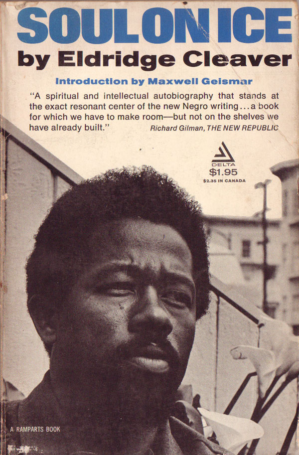
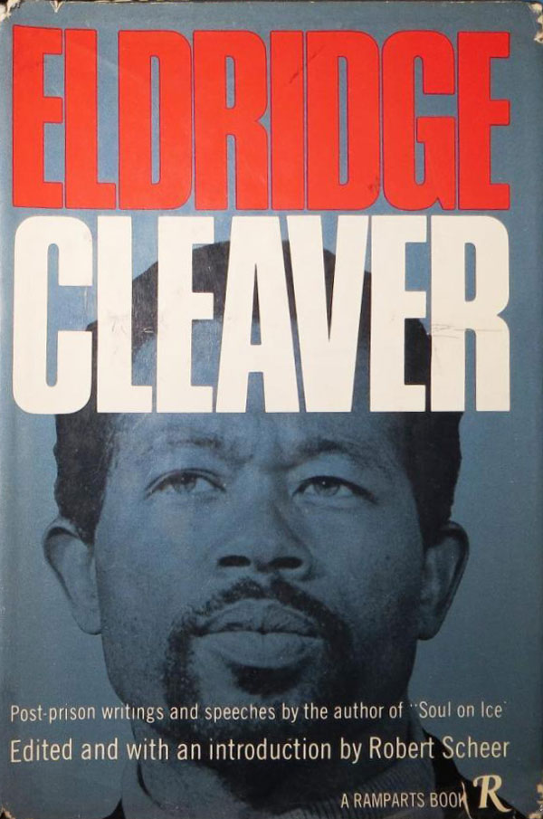
Certainly the most popular and enduring of Ramparts Press output is Soul on Ice by Eldridge Cleaver. Originally written in Folsom Prison and published in parts in Ramparts Magazine, on his release in 1968 Cleaver got a job writing for Ramparts and Soul on Ice was quickly published in book form. It also appears to be one of the first books Ramparts published (a couple edited collections by the editors of the mag seem to have appeared a bit earlier). A year later, in 1969, Cleaver’s Post-Prison Writings were also published. While the cover for Soul on Ice is much more well-known, I definitely prefer Post-Prison‘s design. The titling is bolder, and Cleaver’s face set in the background is more direct and confrontational. It feels more honest, more polarizing like Cleaver was as an actual figure. The portrait is frontal, but his eyes are a bit shifty, and there are none of the flowers and city-scape that litter the cover to Soul on Ice.
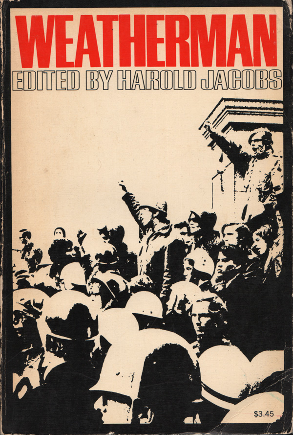
Following Cleaver, the two covers I see a lot are for Murray Bookchin’s Post-Scarcity Anarchism (1975) and Harold Jacob’s Weatherman (1970). On first glance the Bookchin cover (designed by Erika Hamburg) is unremarkable, but the more I look at it, the more inscrutable it becomes. There are no visual elements at all except the coloring of the title, and then there is no clarity as to the choice of red and green. I suppose it might be an attempt at visually articulating Bookchin’s fusion of Marxism and ecology into a new anarchist vision, but that feels like a real reach. I have to admit I like how much of the cover is just left blank, but then again it’s not like that space is very activated by the titling, so it still feels flat. Jacobs’ cover is much more successful in a traditional “Lefty” sense, with the highly contrasted photo of protesting students and a line of cops. The red title pops off the page, and the black border tightens up the entire cover, adding to the bold composition.

A couple years back at Powell’s in Portland I found this great wrap-around cover for Palestine: The Arab-Israeli Conflict. The photo of the fedayeen is strong, and fills the visual field, but the arm swinging across the spine and onto the back is genius. The outstretched hand becomes the perfect frame for the title and content list. The photo was taken by Jeffrey Blankfort, and the cover designed by TAT. (I wonder if there is any relation to MEAT?)

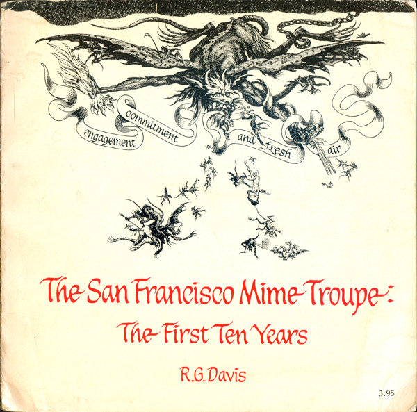
Ramparts put out at least a couple square books, literally 8.5″x8.5″. The cover of R.G. Davis’ The San Francisco Mime Troupe: The First Ten Years is driven entirely by the aesthetics of the Troupe, not Ramparts, and stands out from the rest of the catalog. It’s one of the few professionally produced, non-poetry, books I’ve seen that has it’s title set in calligraphy. The graphic is a tweaking of imagery of the 17th Century printmaker Jacques Callot, and the design is credited to “Rosenkrantz, Lofthouse and Callot.” The Gay Liberation Book is also square, but dominated by a rainbow circle. It looks much more like the cover of an old vinyl LP than a book. The arrow off the circle, marking it as the symbol for “male” is much smaller than the circle itself, and feels trapped between the circle and the frame of the book. I suspect it’s unintentional, but it gives the entire operation a feel that is much more caged than liberated.

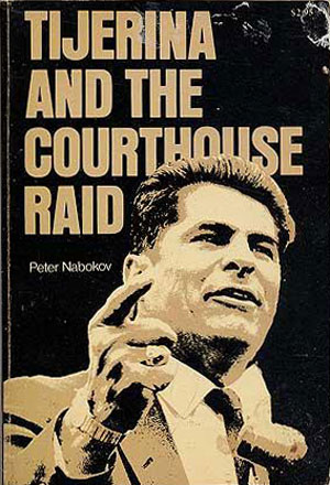
A partner volume to Strictly Ghetto Property in terms of studies of Chicano resistance, the cover of Tijerina and the Courthouse Raid is graphically much less compelling to me. While the former has a unique, hand-drawn illustration that reflects Bay Area Chicano printmaking, the latter depends on a solarized photo rendered in black and tans, which leaves me uninspired.
The cover of Rudich’s Weapons of Criticism (1976) is one of the more interesting of the bunch because it feels so baldly out of time. While published in the late 70s, it has a distinct 50s feel, with its minimal graphic sense and almost unconsidered titling.

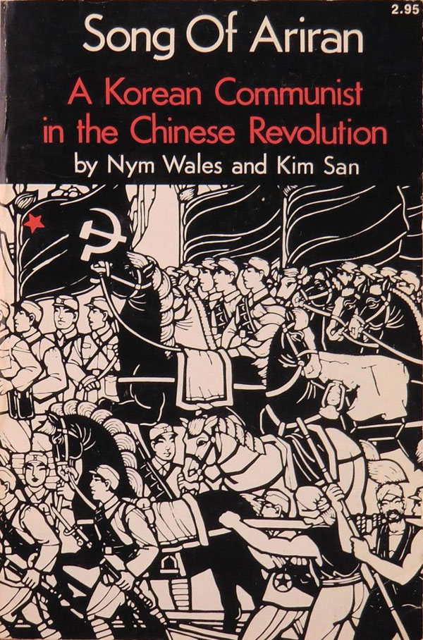
Nym Wales and Kim San’s Song of Ariran has a strong cover, dependent on the illustration which reads like a Chinese Cultural Revolution tableaux, but there is something distinct and unique about it. Unfortunately I only have a scan of the cover, and not the actual book, so I’m not sure where the image is from.
And finally we have a Black Liberation team-up, . . . And Bid Him Sing is a novel by WEB Dubois’ grandson, David Graham Dubois, with a cover designed by Emory Douglas, the Minister of Culture for the Black Panther Party.

Ramparts magazine ceased publication in 1975, but the press seemed to continue on for a couple more years. If anyone has any additional info on the book publishing aspect of the operation (as the magazine seems fairly well documented), I’d love to hear it.


If you would like to know why The Gay Liberation Book’s cover design looks the way it was designed, you may contact me.
FYI- Len Richmond is deceased.
Gary Noguera
San Francisco
The Song of Ariran cover is a papercut produced near Canton in 1949 and is called Crossing the Yellow River. It is one of a series of 24 illustrating The East is Red opera. Ramparts used the papercut courtesy of the Phoenix Gallery in Berkeley. Photo by Nikki Arai
Thanks for the information! Any all contextual info is always appreciated!
Just lucked into your blog while searching for Black Panther history.
My Dad, Larry Moore was the owner and publisher of Ramparts Press. He was also the editor and proofreader. My Mother, Katherine was the typesetter. I’d be pleased to answer any questions you have about Ramparts if I’m able.
Abe Books has several hundred Ramparts Press books for sale at this time. I actually have all but one of the books galley proofs stuck in a box somewhere.
https://www.abebooks.com/servlet/SearchResults?pn=Ramparts+Press&sts=t
Greetings Karl,
Hope you are doing well.
I work with Mahrousa Center for Publishing, a publishing house based in Cairo, Egypt.
I wanted to inquire about the translation rights regarding some of the books Ramparts press published.
Would love to hear from you about this and thanks in advance for all your help and consideration.
Kind regards,
Mostafa
Check out Tom Weber’s ALL THE HEROES ARE DEAD, the ecolong of John Steinbeck’s Cannery Row, published by Ramparts Press in 1974. It’s a photo essay that feels like an illustrated poem.