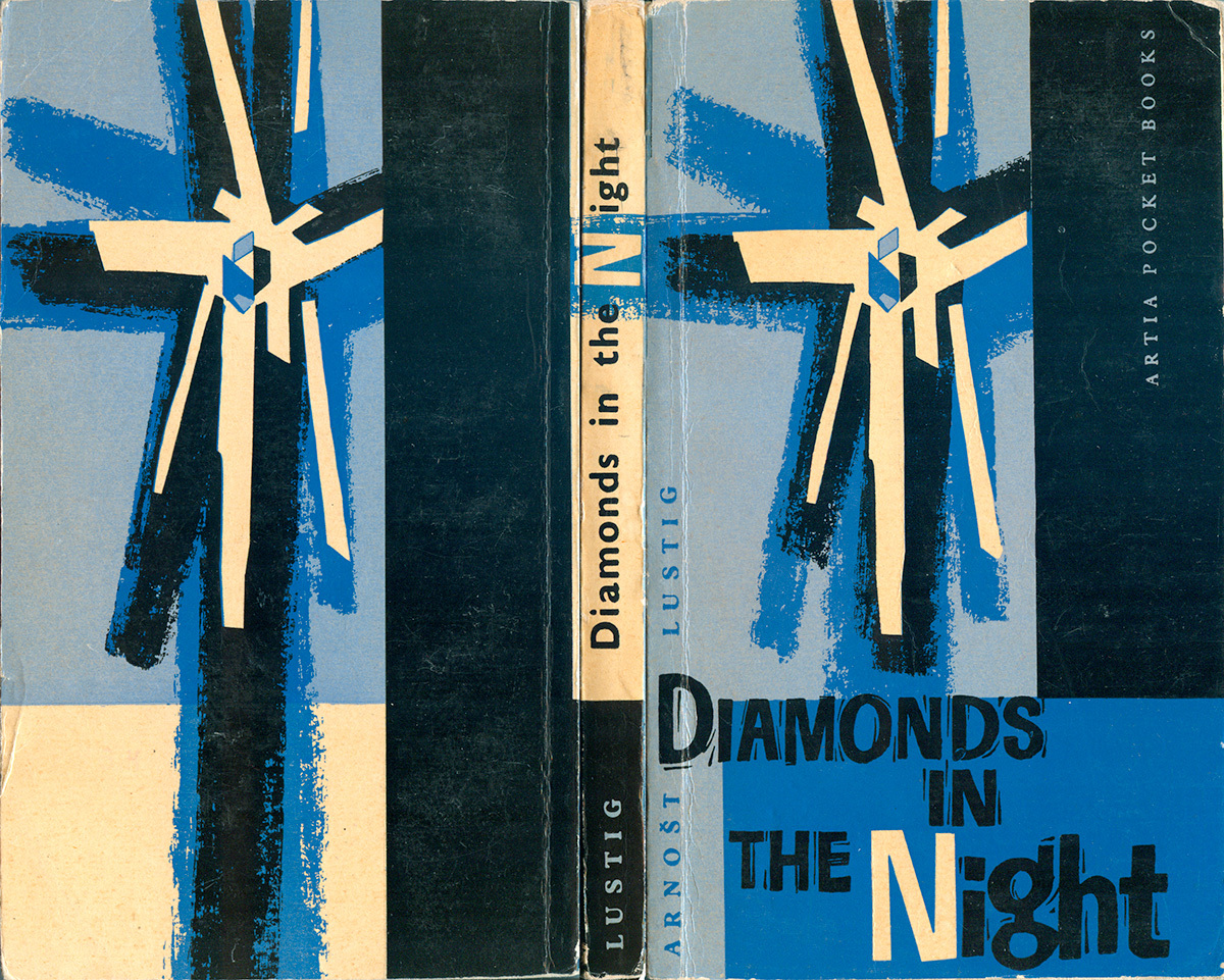
Back in 2012 I slide an eye-catching spine off the shelf at a bookstore in Boston and. It was an edition of Arnošt Lustig’s Diamonds in the Night I had never seen before. 4.75″ wide and 7.835″ tall, it’s a little wider than a mass market paperback, but way taller—a completely unique size. Turns out it was published by Artia, an old Czech publisher active in Prague in the 60s and 70s, and one of the Eastern Bloc publishers that had an export-wing for English-language books, like Progress Publishers in Moscow or Seven Seas in East Berlin (for more on Seven Seas, check out my posts about them HERE). Artia is most known for their children’s books, but they also had this fiction wing under the title “Artia Pocket Books.”
I spent three years keeping an eye out for more Artia books, with no luck until last week, where another one showed up at Human Relations in Brooklyn. Another unique spine called out, and I struck gold with a copy of Jan Otčenášek’s Romeo and Juliet and the Darkness! Further search online found a small trail for a couple other Artia Pocket Books, but not a single image. Although two books hardly seems a big enough set for a post, who knows how long before I find another one!
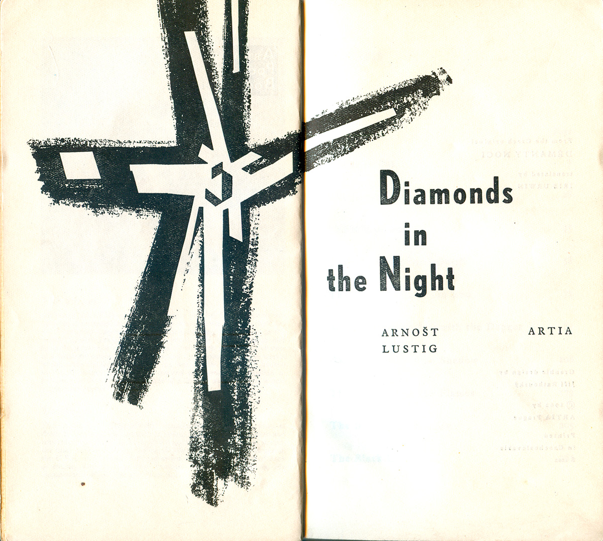
The Lustig book has a striking, expressionist cover. The abstract, explosive diamond is balanced with solid blocks of color and woodblock-style titling, which might not actually be a cut, but it is certainly unique and hand produced. The book feels good, too. The paper stock is matte-coated, so it has a semi-gloss sheen, and each of the colors is struck from a plate, so the design has a real physicality. The design is attributed to Jiří Rathouský, the book published in 1962.
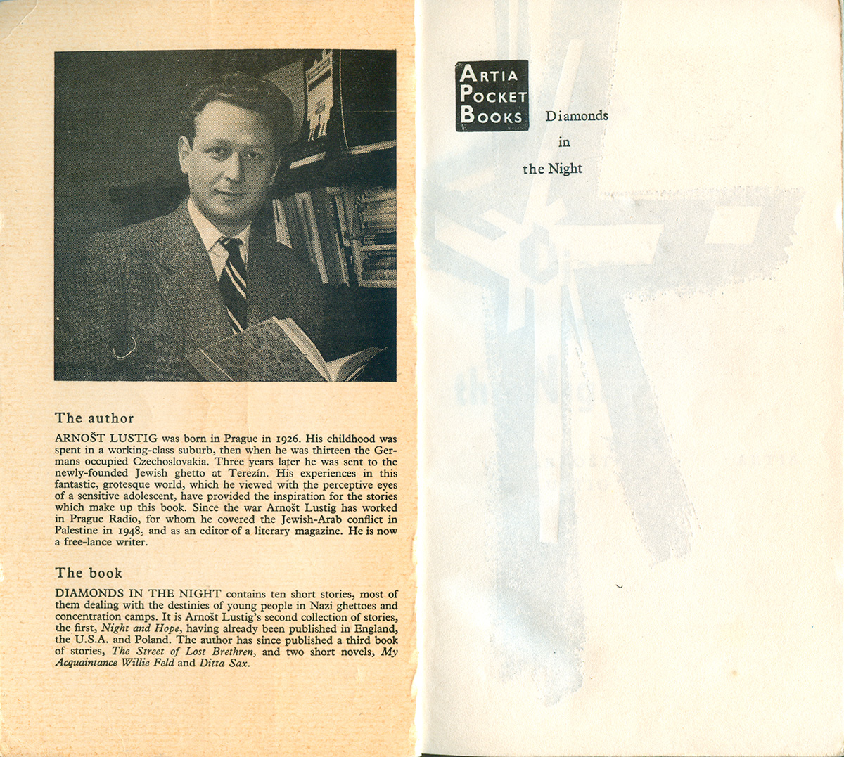
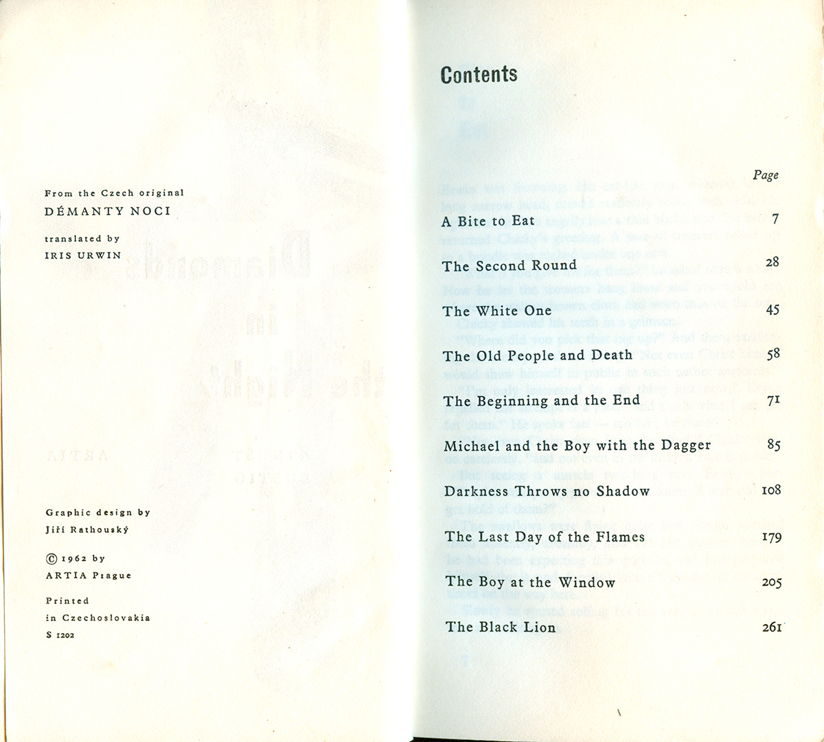
The inside of each Artia title appears to be an author photo, bio, and information about the novel. The frontispiece on Lustig’s book has a nice square Artia logo as well as the title. The title page is a really nice two page spread, with the diamond-motif repeated from the cover exploding across both pages, and the title set in a handsome, tall gothic (echoing the font on the spine).
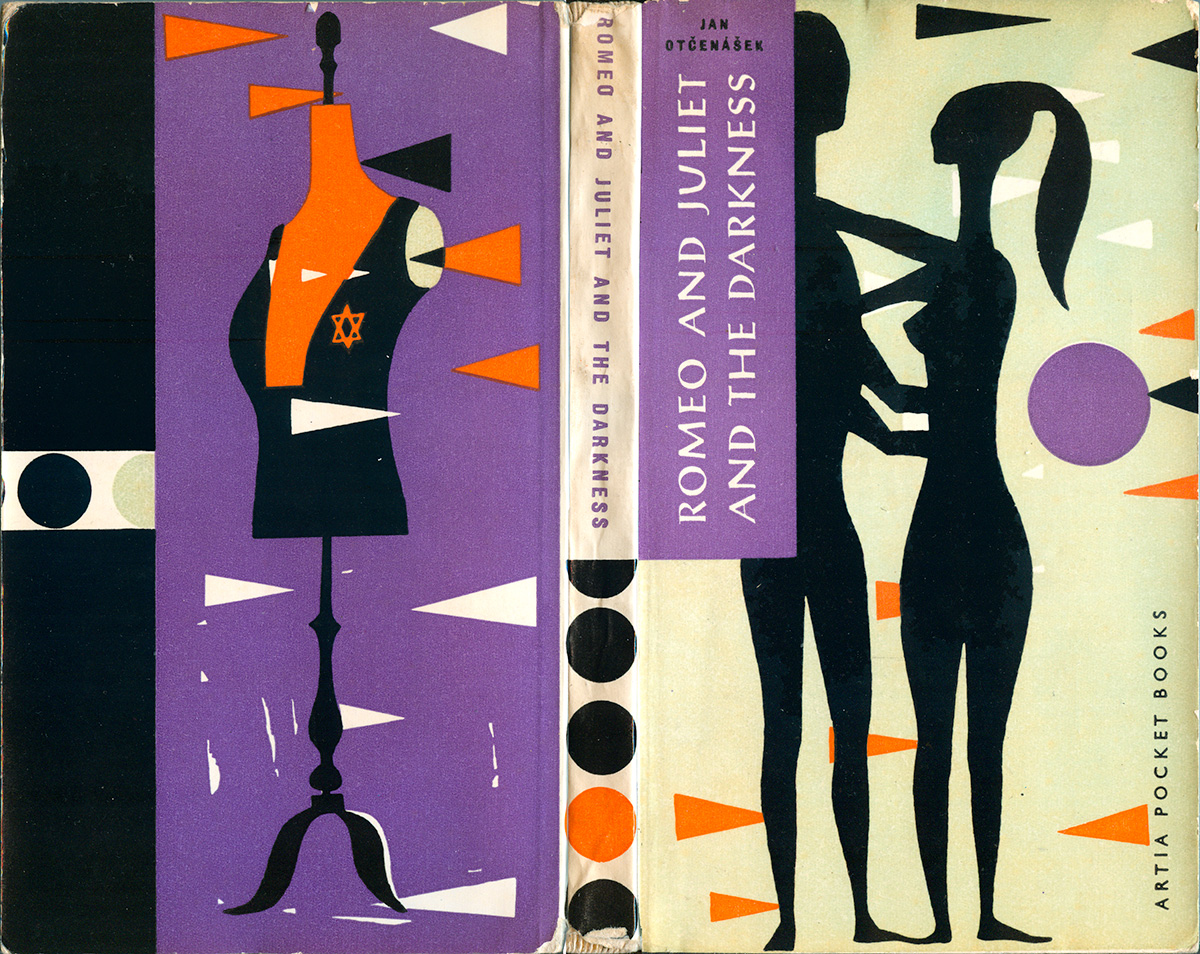
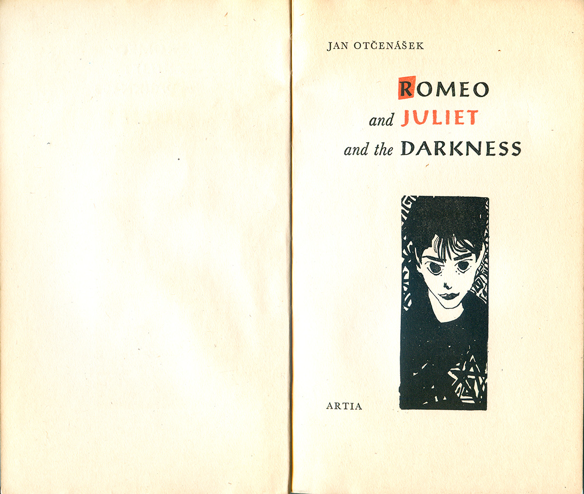
Jan Otčenášek’s Romeo and Juliet and the Darkness is an even nicer book in many ways. The cover is a beautiful clash of modernist shapes and flat visual field with simple silhouettes of figures that seem “primitive” and drawn from non-Western art. The circle is repeated multiple times on the spine, creating a delicious tension with the small, clean all-caps title. The back cover repeats the patterns but has a new illustrative style, with a very modern-looking mannequin. The color palette is also unique, with faded moss mixing with orange, black, and purple.
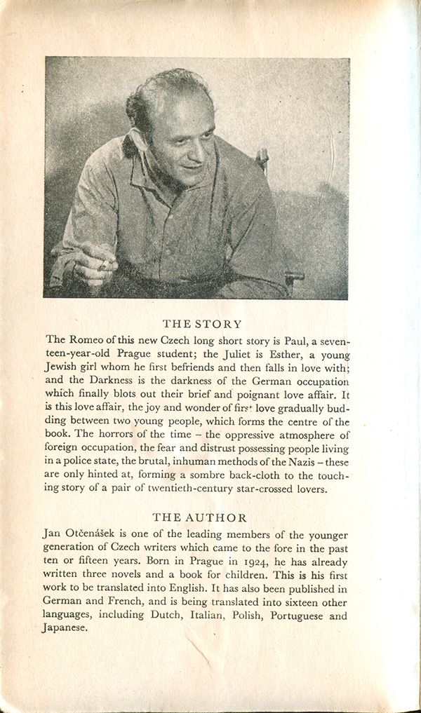
This book is from 1960, and doesn’t attribute the design. The book has a less earthy feel than the Lustig, as it is printed on gloss paper (although I think is was also printed off flat plates, and not on modern offset equipment). The title page takes the design in another direction altogether, feeling much more German Expressionist than either modernist or non-Western.
If anyone out there has more info on Artia Pocket Books, or any other titles in their collections, let me know!