Much of what I focus on in these Judging Books blog posts is cover design that is quite rare, either because the politics are marginal (anarchism! communism! socialism! oh my!), or the books are from regions that themselves are marginalized (anyone from the U.S., how much did you learn about Africa in high school?). But I’m not interested in these things because of their marginality. It’s actually really exciting when cool stuff breaks into the mainstream, which happened in so many ways in the 1960s and 70s.
One of the most interesting experiments in book cover design at the time was in the world of science fiction, on the covers of Ace Science Fiction Specials. While Sci-fi is genre fiction, and was looked down upon by the mainstream literary world, this didn’t mean it was unpopular. Mass market sci-fi novels regularly sold in the tens, if not hundreds, of thousands. Into the early 1960s most of the covers of these books were outer-space versions of pulp novels, with lurid aliens and silvery space discs shooting laser beams at each other across craggy lunar landscapes. Quite funny when you look at them today, but also pretty conservative. By the late 60s all of this changes, and at the forefront are the husband and wife team of Leo and Diane Dillon.
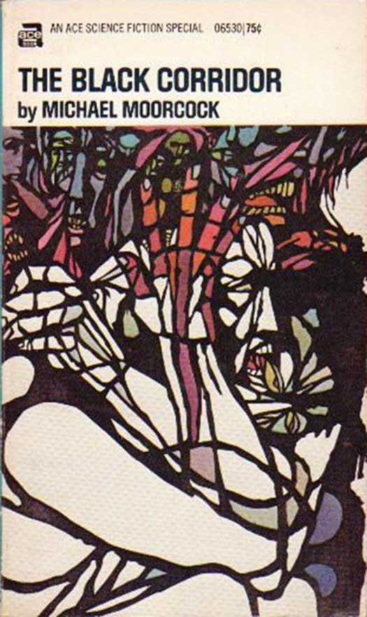
Leo was born and raised by Trinidadian parents in Brooklyn (East New York) in the 1930s. He passed away in 2012. Diane (who is white) was born and raised on the opposite coast, in Los Angeles. They met in 1953 while both attending Parsons, and the story goes that they were inseparable from then on out. Their work appears to be a true collaboration, with no clear style attributed to one over the other, and an amazing range of imagery and aesthetics. I became conscious of their work when I found an Ace Science Fiction Special copy of Michael Moorcock’s The Black Corridor accidentally shelved in the “Black Studies” section of a bookstore in Pittsburgh. The cover, below, is extremely powerful—a demented and demonic stained glass window of anguished faces and hands alternately piled on top of each other and collapsing into one another. It’s terrifying and fabulous. Only after doing some research did I realize I had also loved the Dillons as a kid, in particular their 1975 children’s book Why Mosquitoes Buzz in People’s Ears (turns out it’s only one of dozens of kid’s books the couple illustrated).
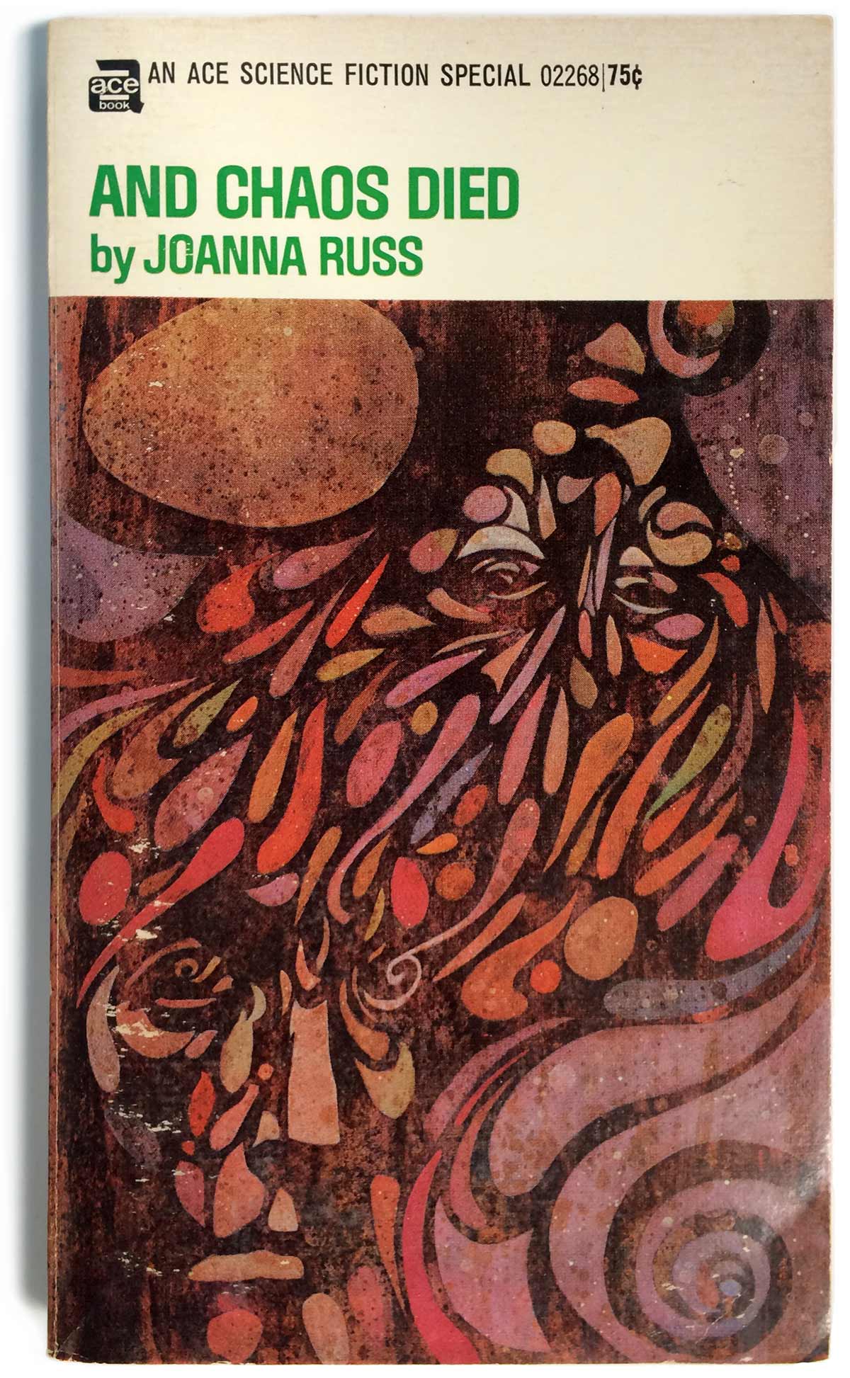
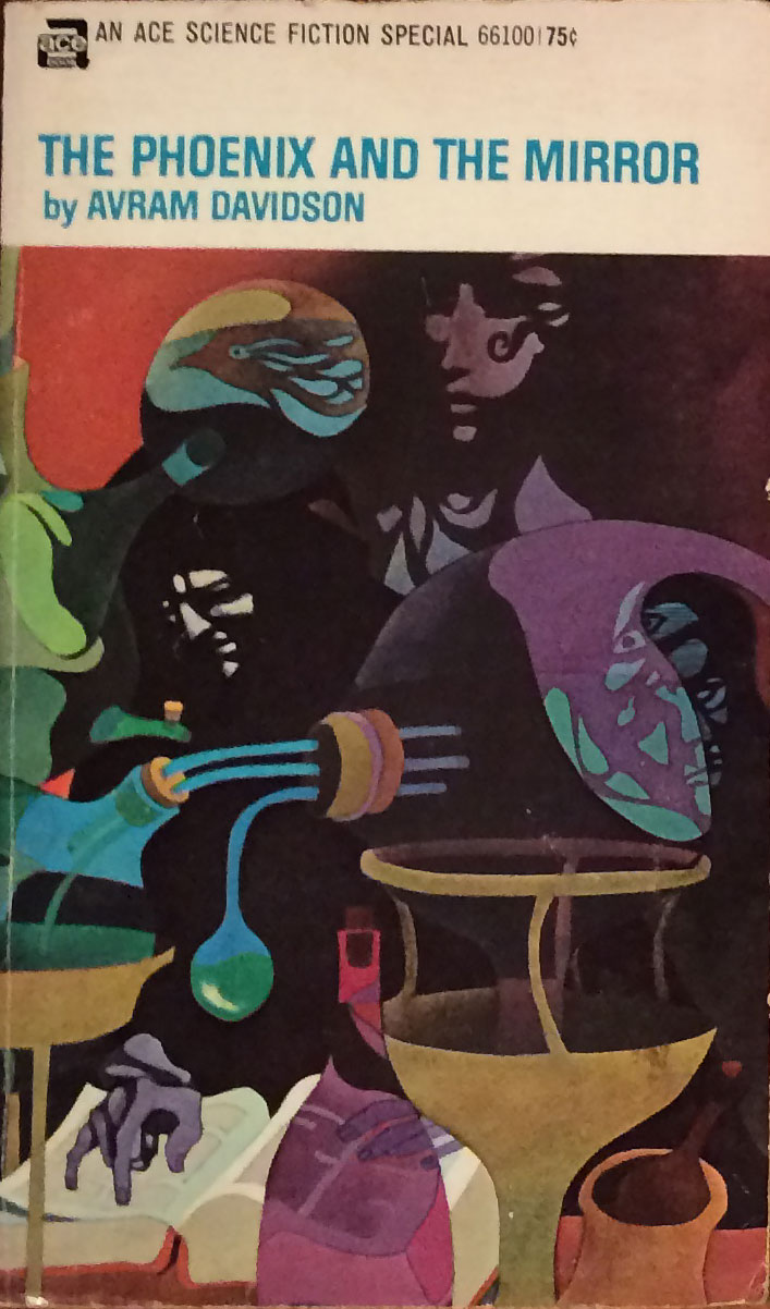
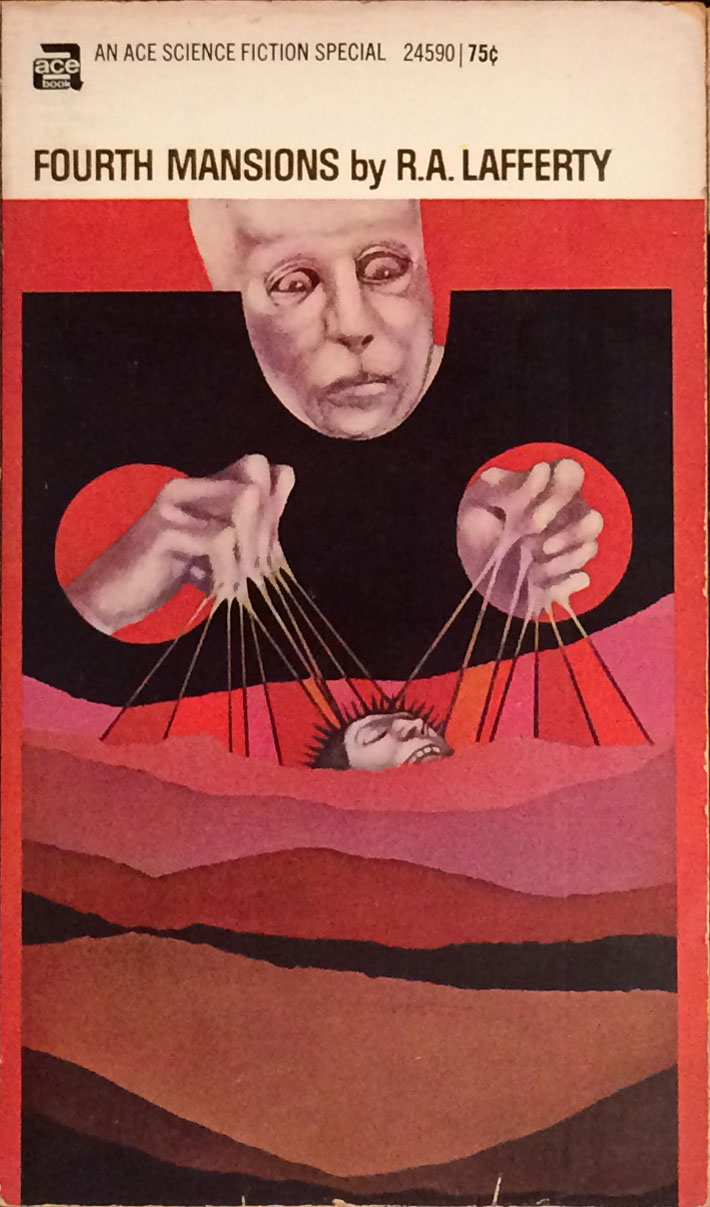
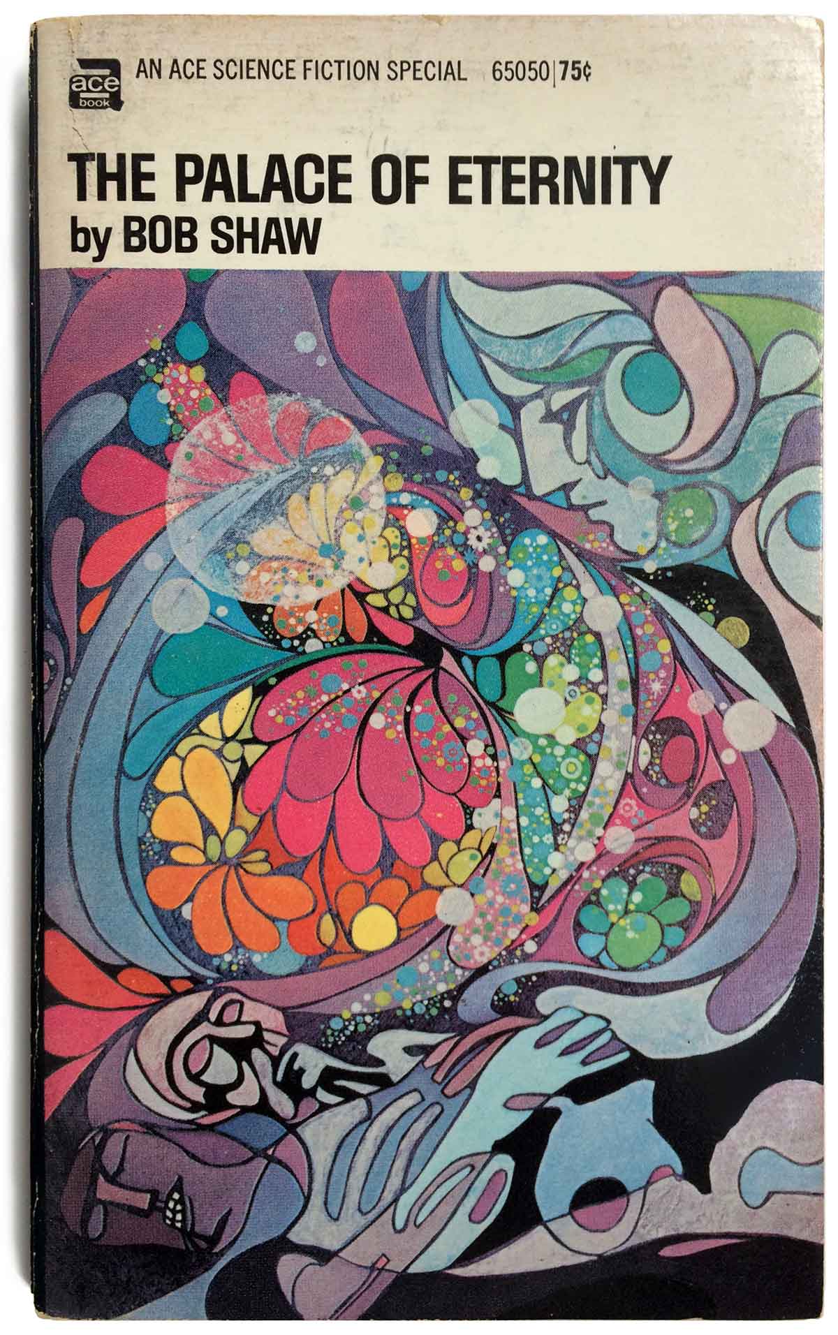
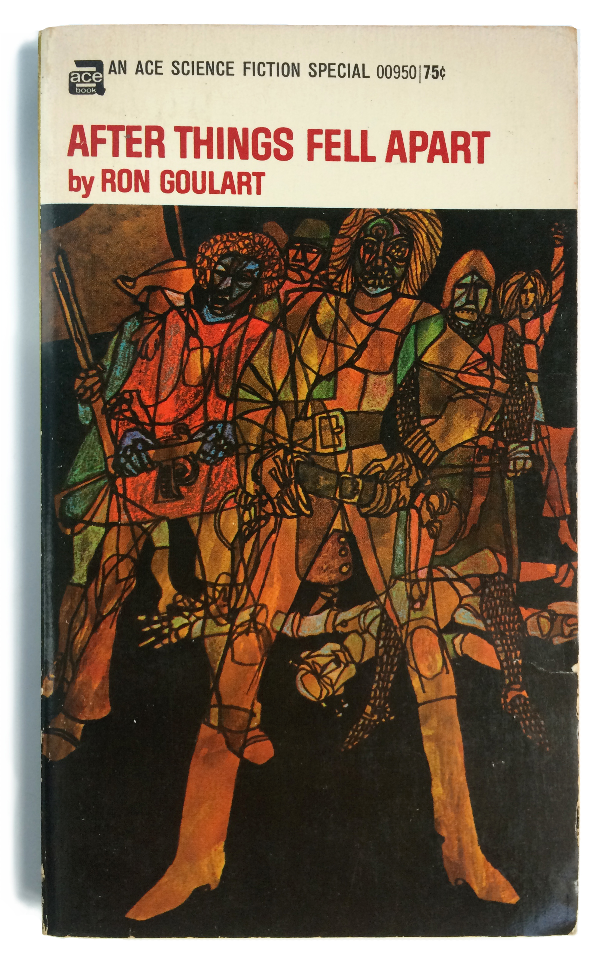
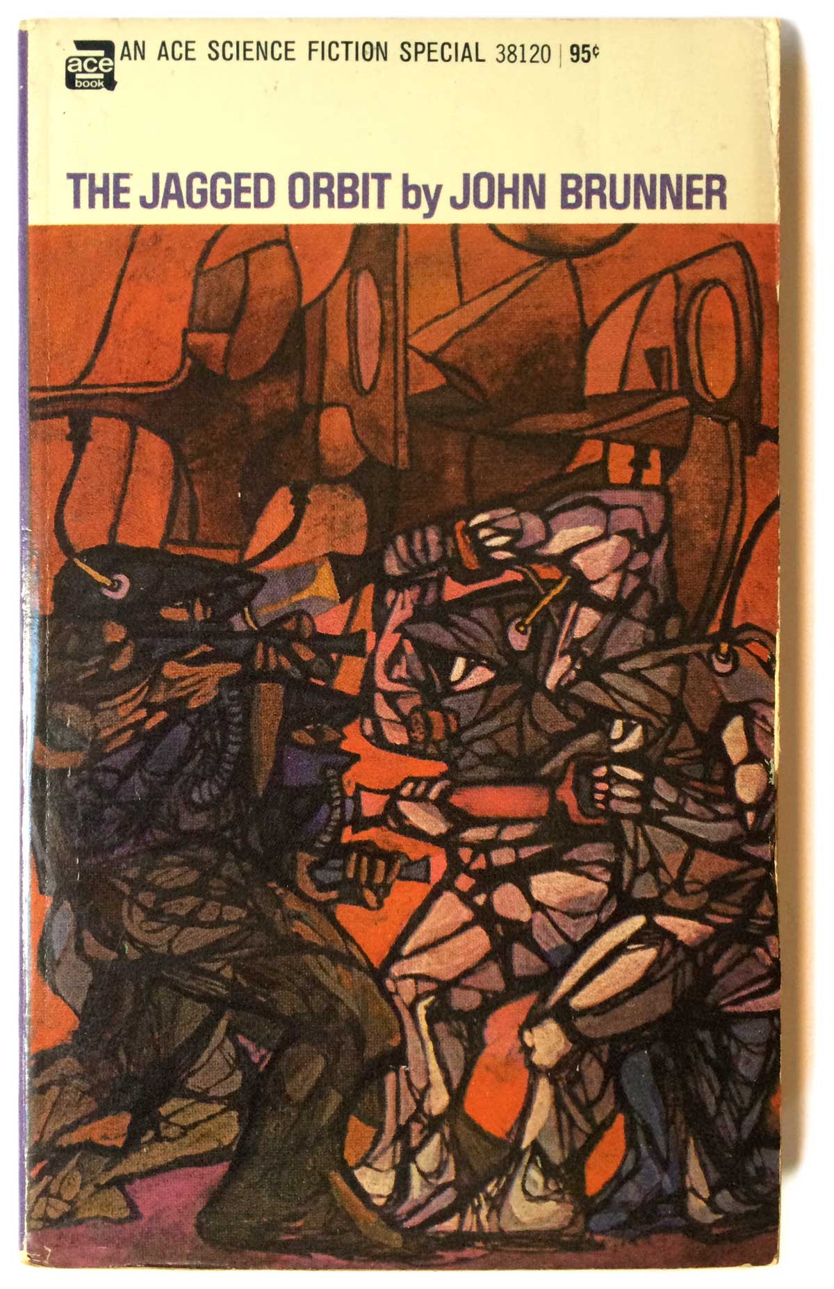
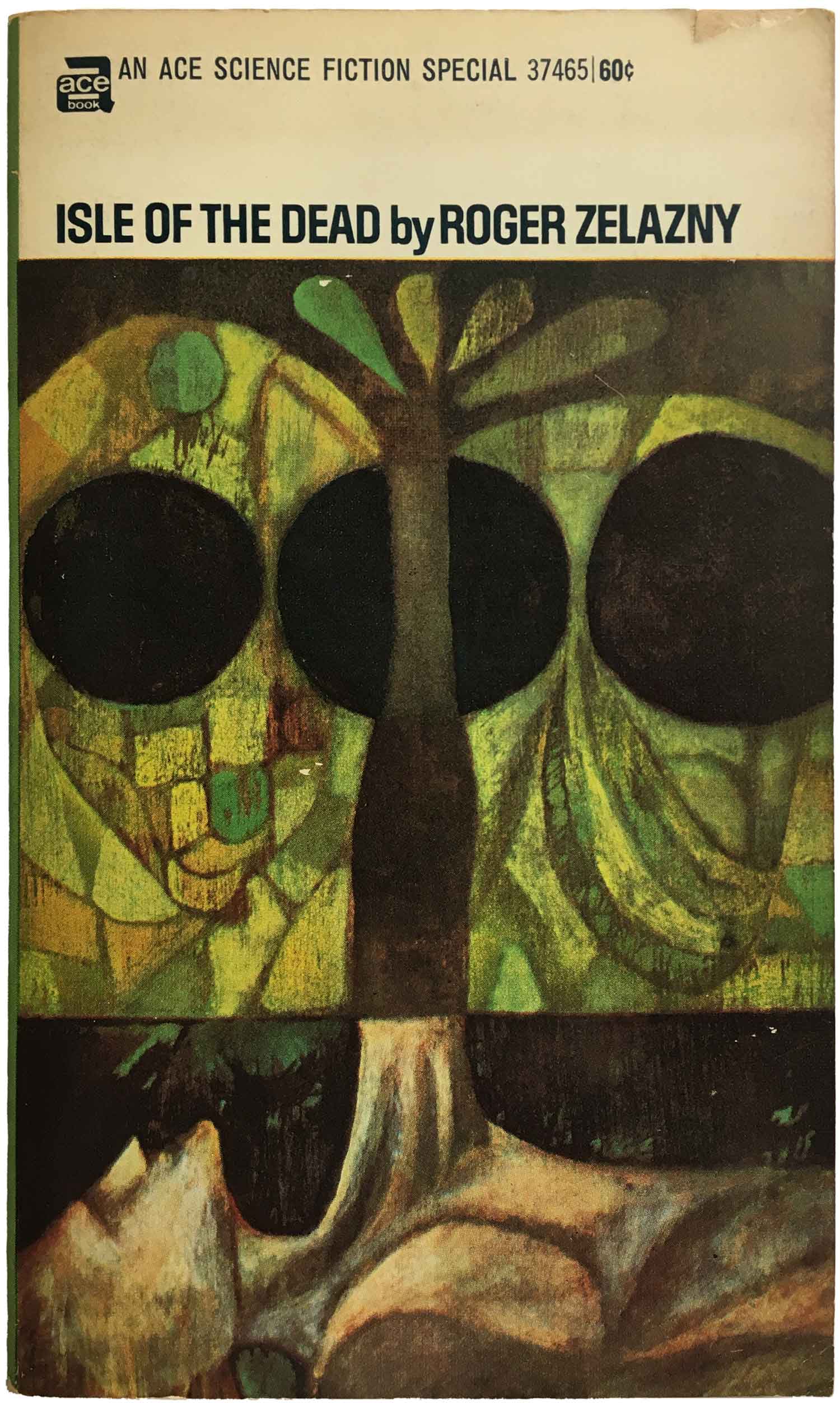
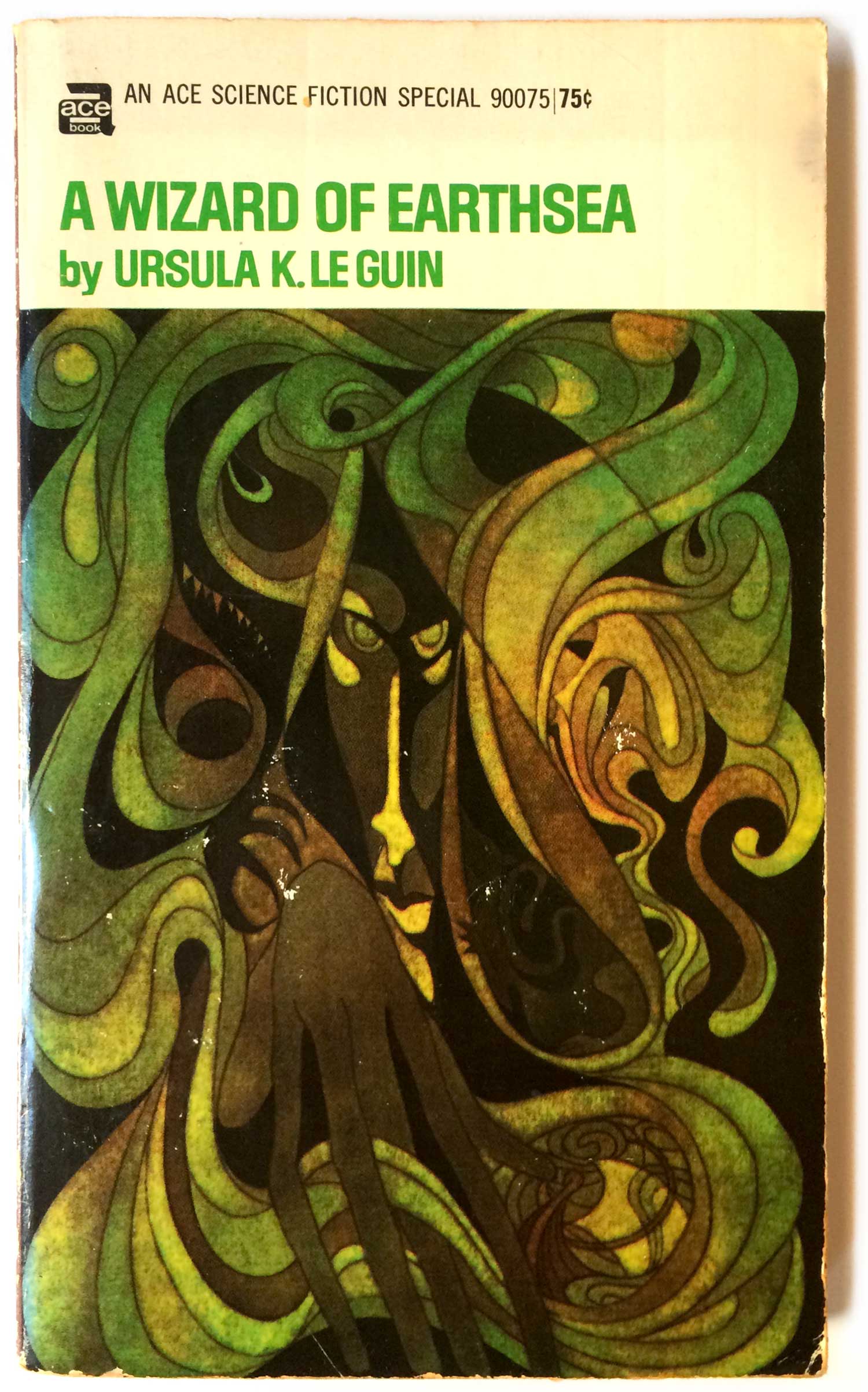
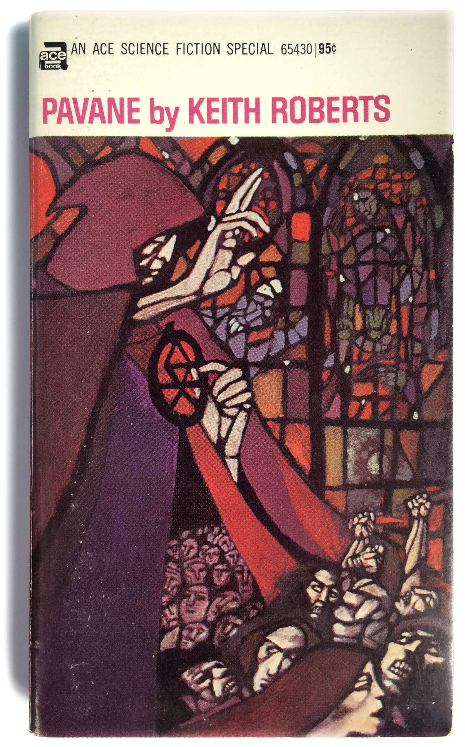
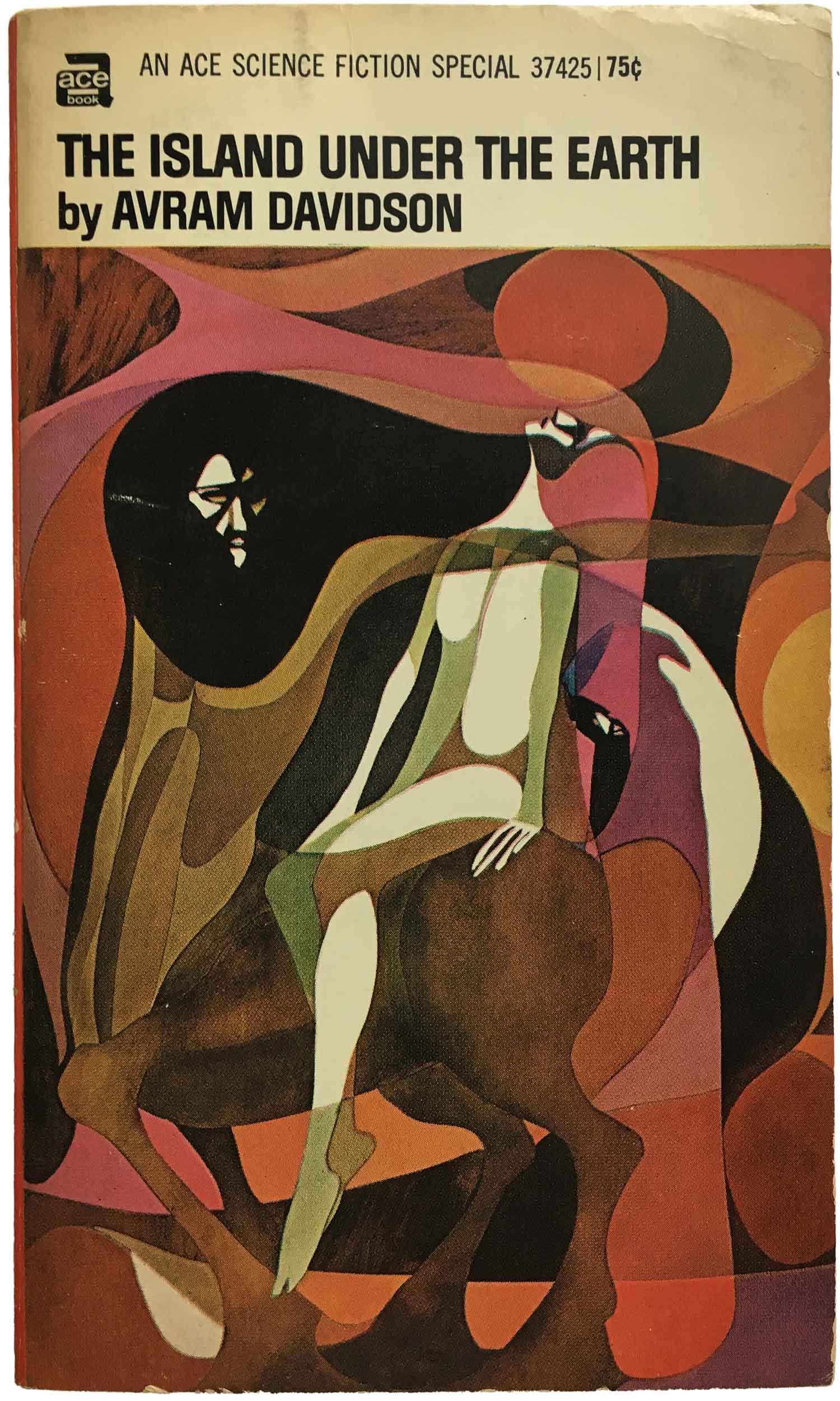
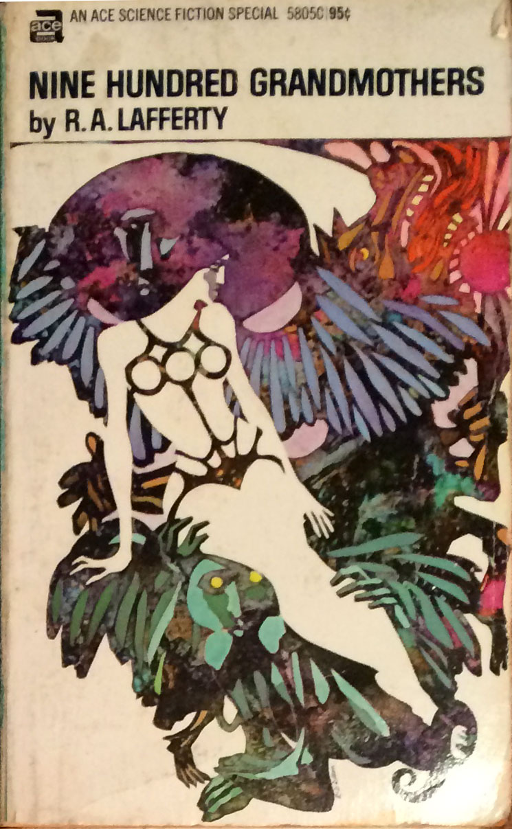
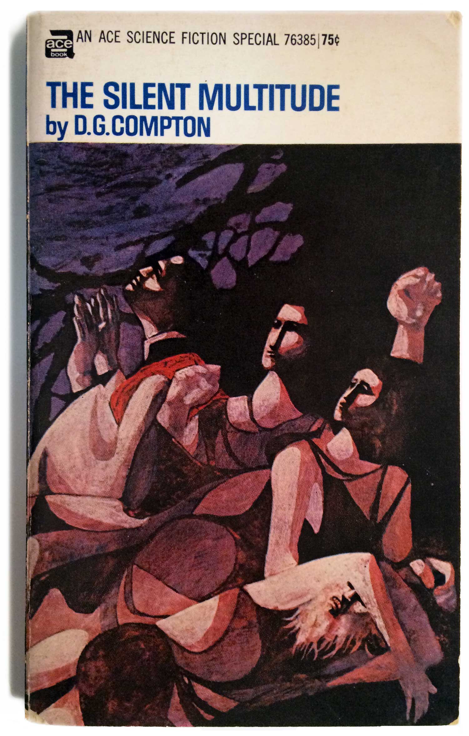
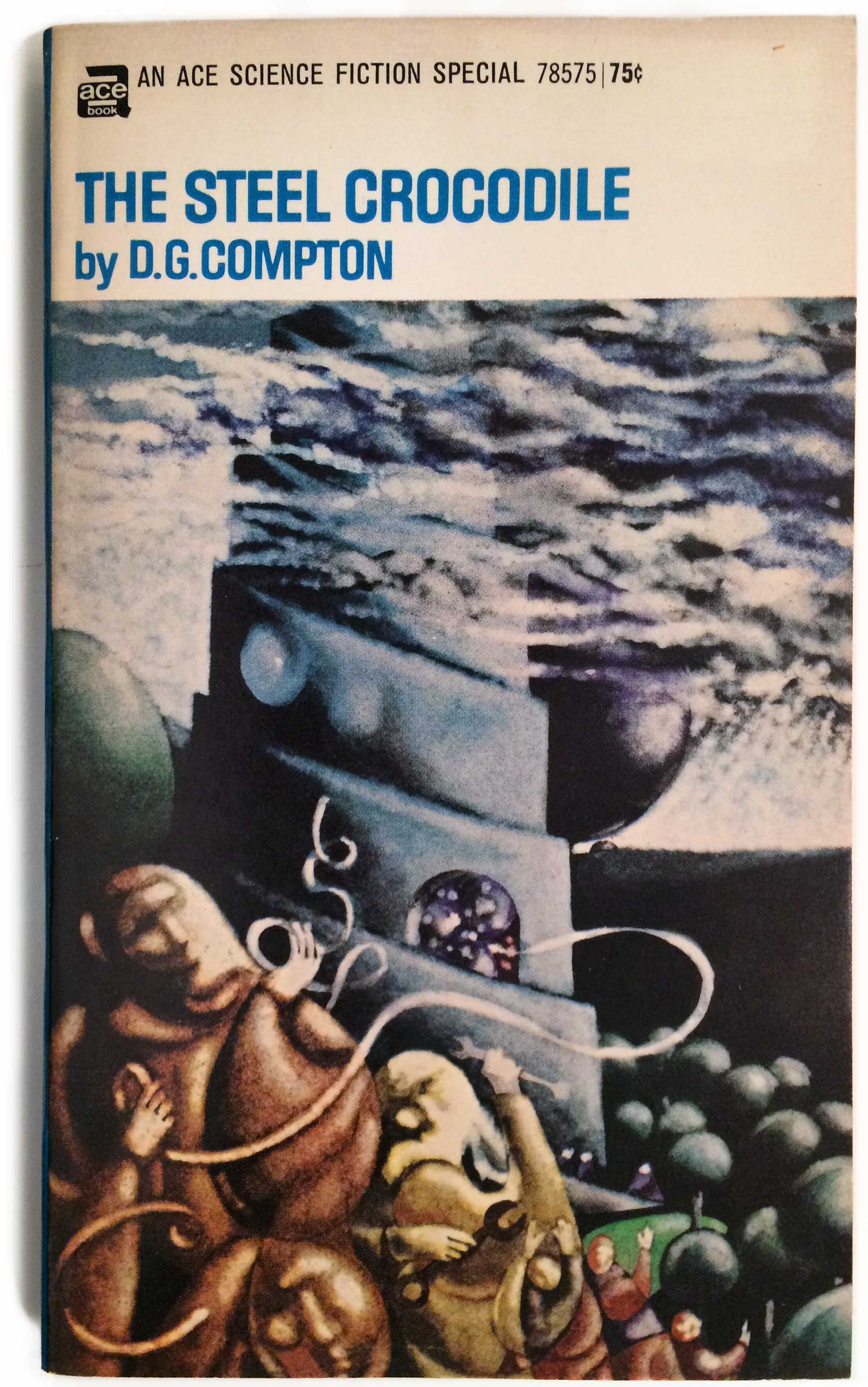
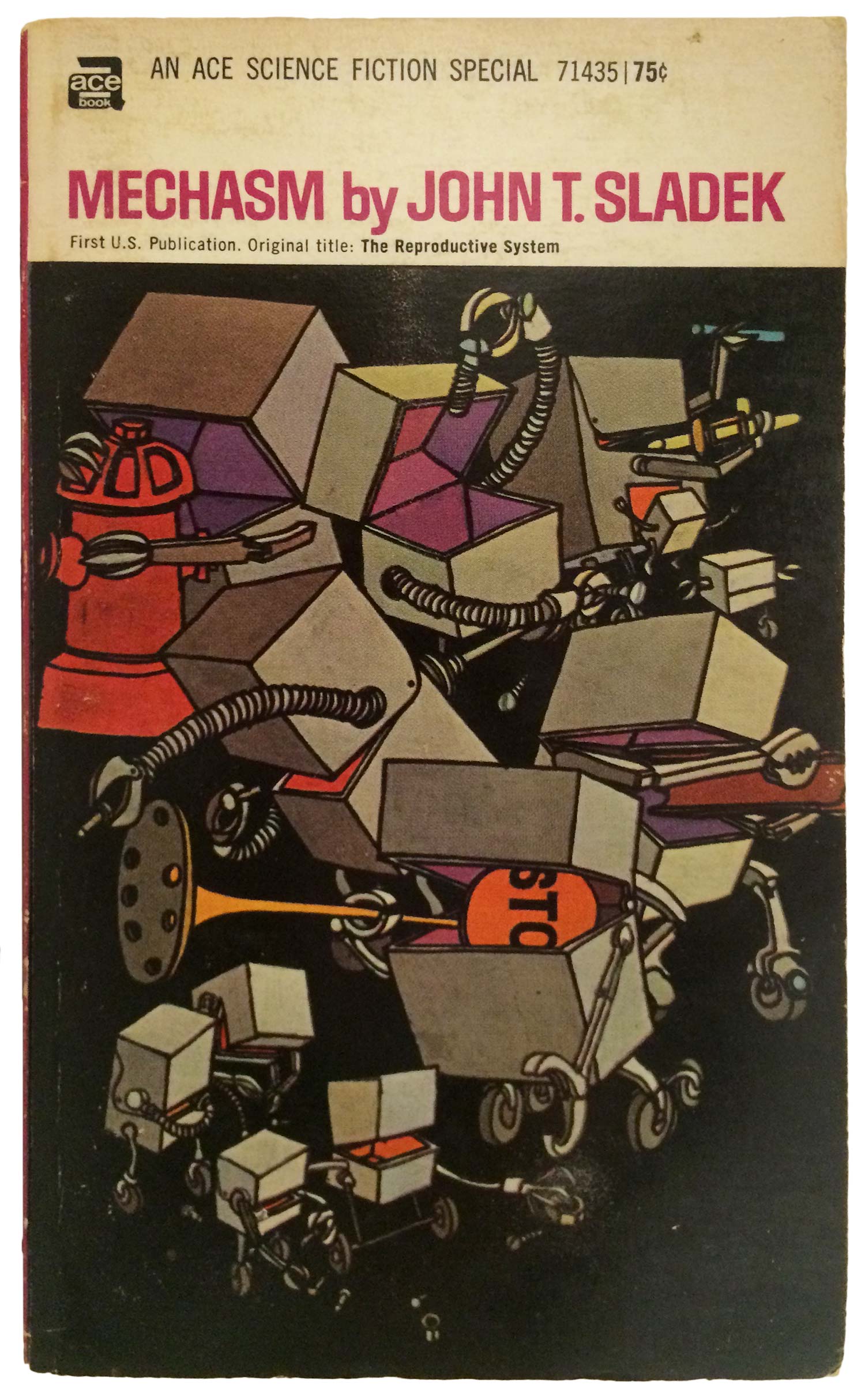
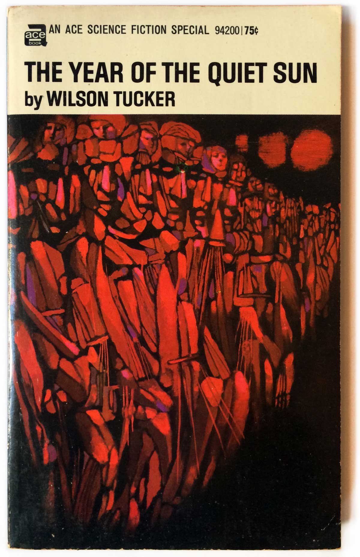
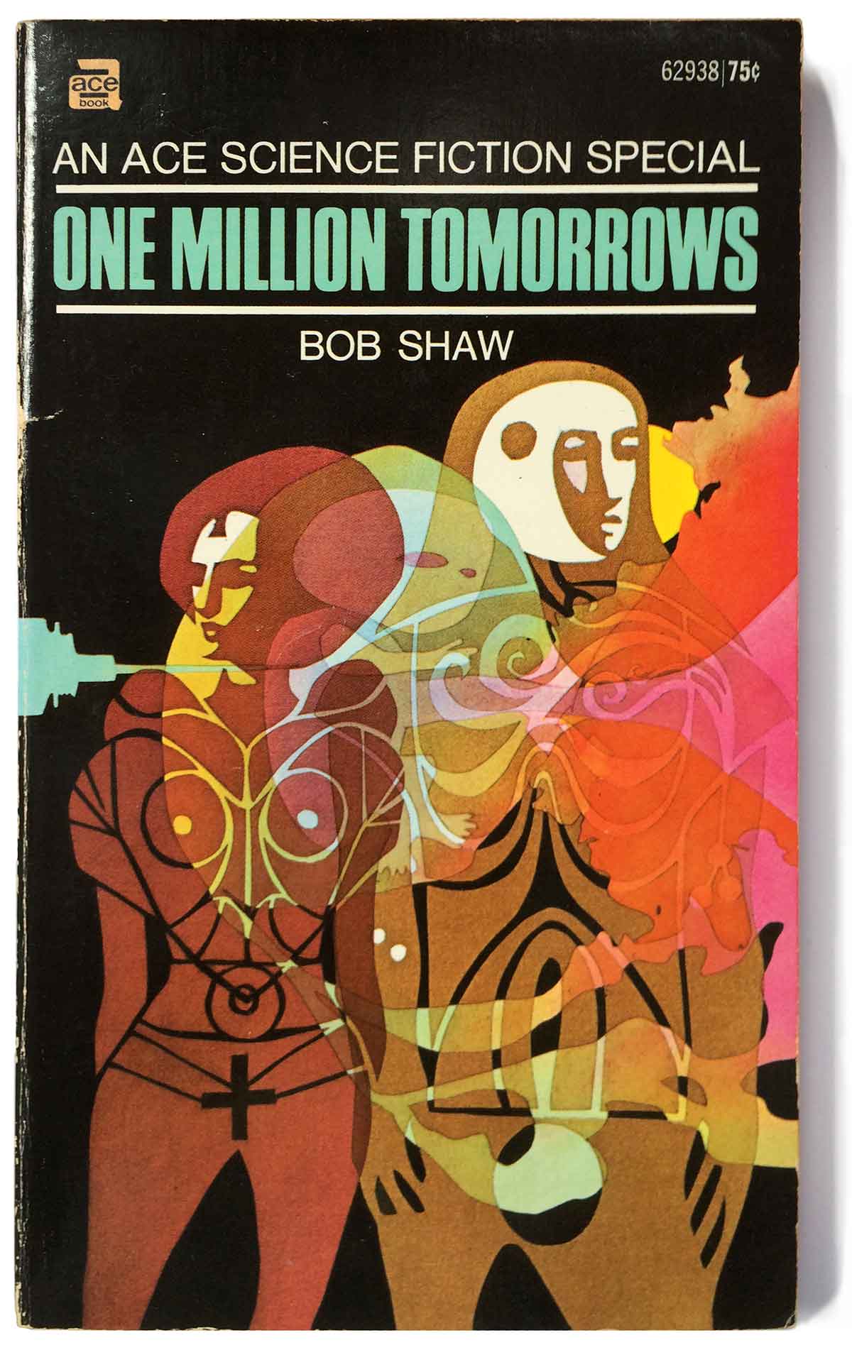
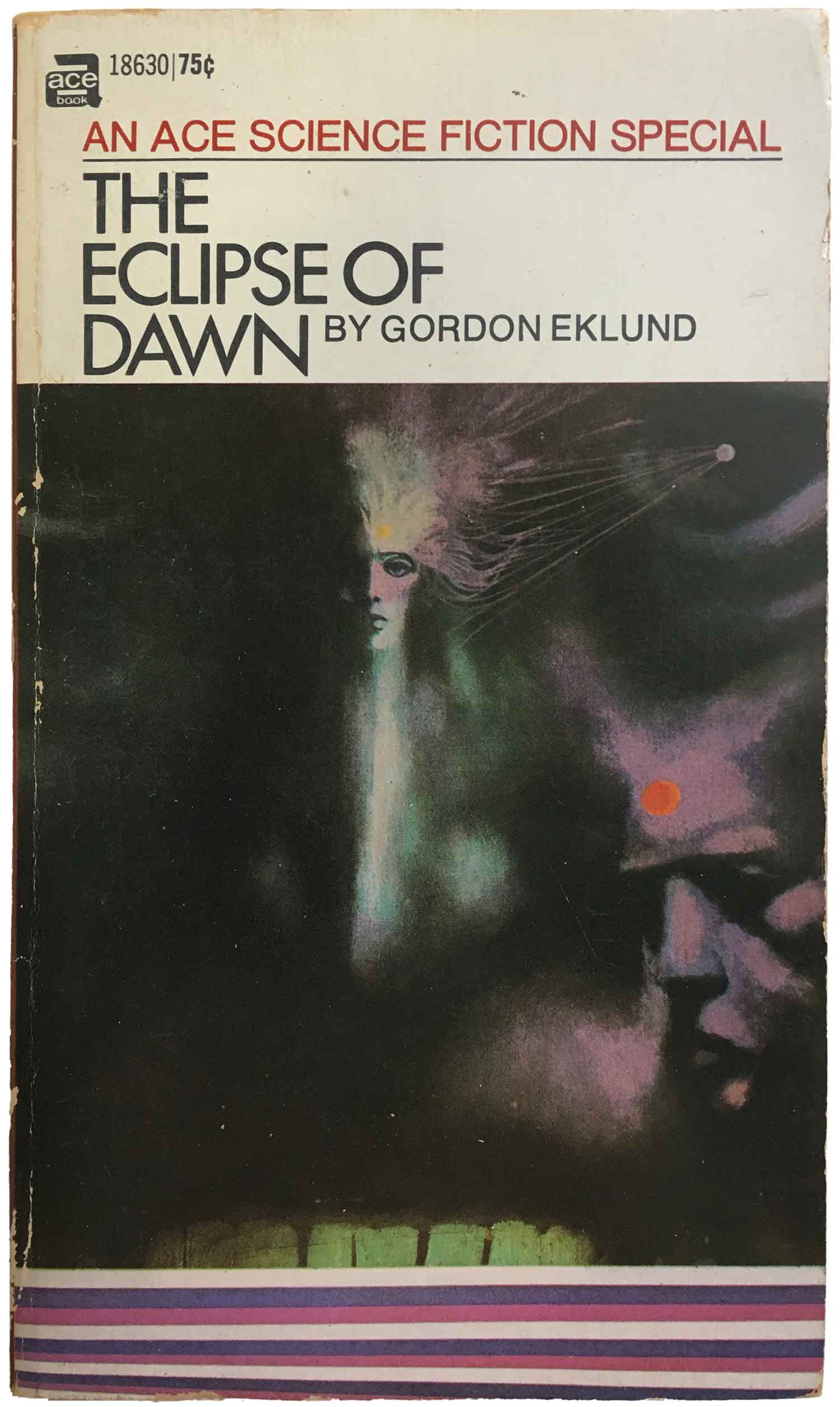
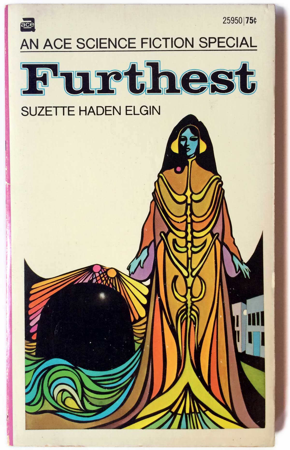
Anyway, to get back to the thread, after finding the initial Moorcock book I stumbled on a couple other cheap Ace Science Fiction Specials (ASFS) bearing their work, and then about six months ago a large collection of mass market sci-fi showed up at Book Thug Nation, including a nice collection of ASFS Dillon covers. I don’t know the whole story, but it appears that when Ace moved from doing double-sided specials into standard single-titled sci-fi mass markets in 1968–1971, they tapped Terry Carr to be the editor and the Dillons to do most (if not all) of the thirty-nine covers. And these weren’t second rate books, but heavy hitters, with award-winning novels and books from Ursula LeGuin, Philip K. Dick, John Brunner, Roger Zelazny, and more. The initial design featured a white box in the top 1/4 of the cover, with the title and author in a bold gothic-style sans serif font. The color of the title fluctuates with the primary colors in the illustration, which takes up the bottom 3/4 of the cover. The images are clearly of a single set, yet individually range across diverse landscapes of colors, shapes, and textures.
The Dillons have completely plundered many of the great artists of the 20th century, reworking bits and pieces of their styles into a new pop-modernist visual language drawing from psychedelia, art deco, gothic, montage, and surrealism. They’re like chameleons, drawing from wide swaths of the history of art, political imagery, and pop culture to render new forms of expression. This is an engaged post-modernism that sits beside the work of design firms like Push Pin Studios, and pre-dates the much more vacuous post-modernism that comes to dominate book cover design in the 1980s and 90s.
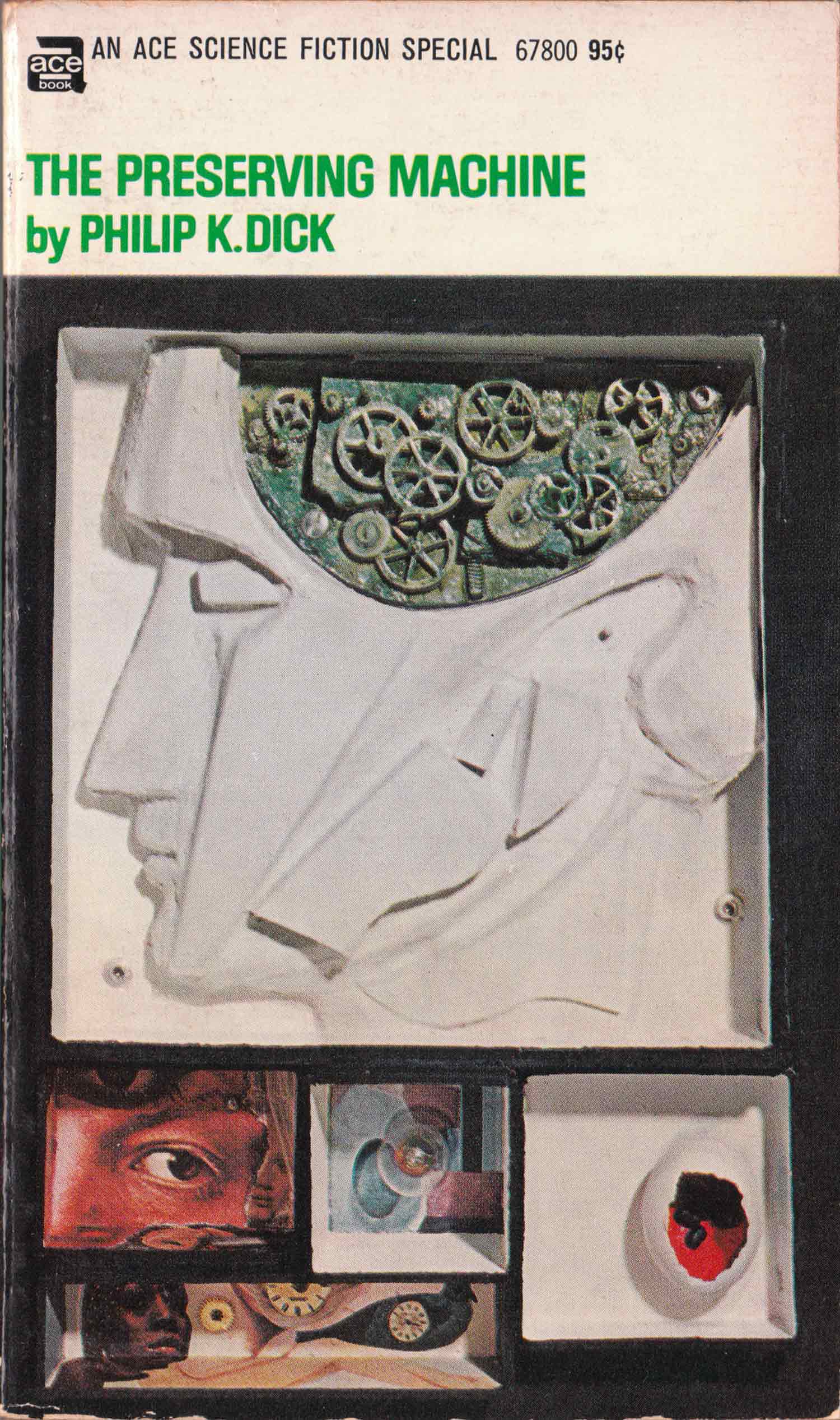
Avram Davidson’s The Phoenix and the Mirror has clear shadows of Salvador Dali, while John Brunner’s The Jagged Orbit reads as somewhere between a militarist Duchamp and a Goya tossed through a fractured window. Roger Zelazny’s Isle of the Dead has echoes of Gustav Klimt, while Philp K. Dick’s The Preserving Machine is a sci-fi rip on a Joseph Cornell box. Somehow they manage to marshal all these different influences while creating covers for which there is no doubt that they were designedby Leo and Diane Dillon.
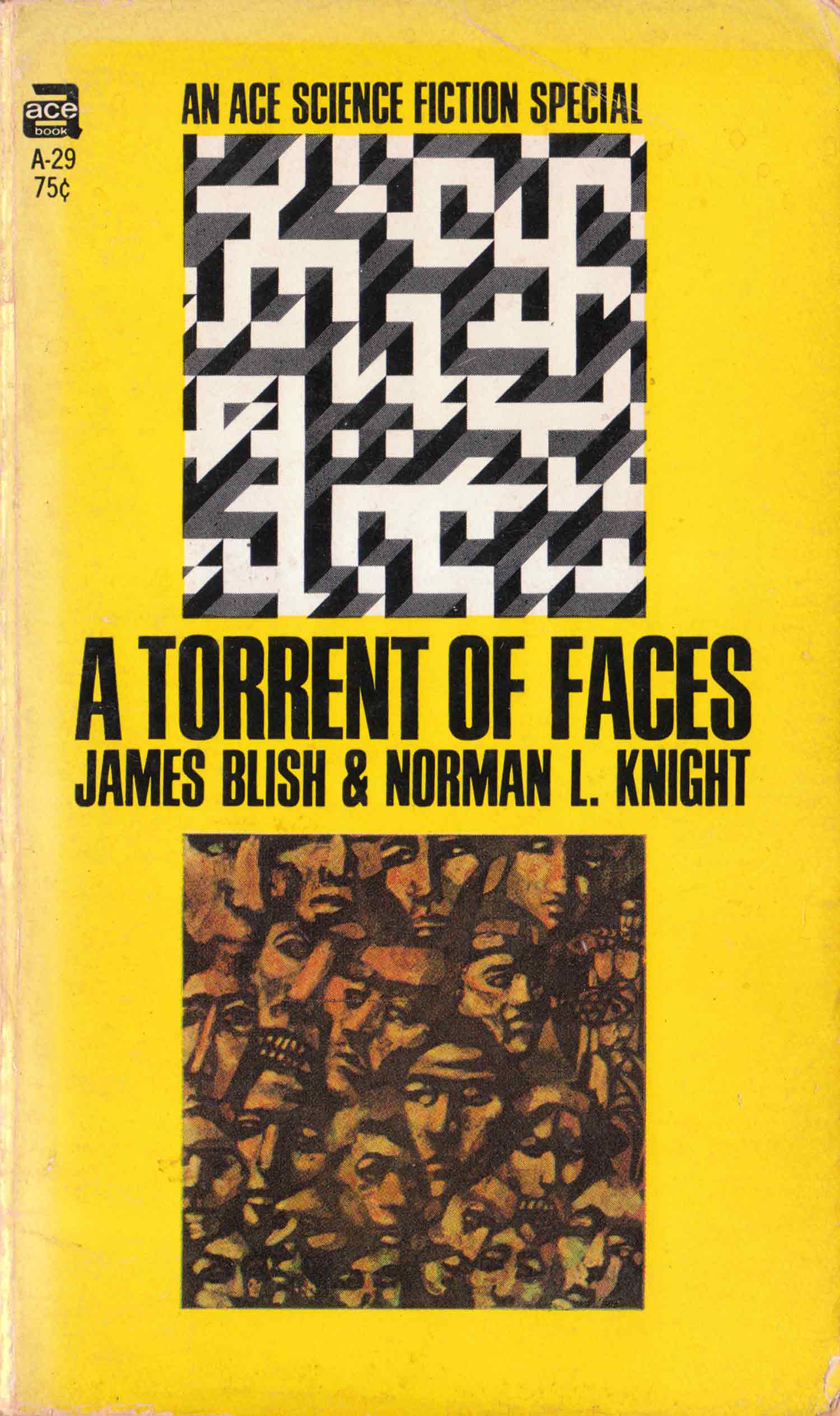
It’s difficult to sort out the exact order that designs on the ASFS covers rolled out. Like many old paperbacks, the dates are wonky, with the book insides staying static (with a single original publishing date) while the covers are changed. The core Dillon illustration stays the same, but the framework it is placed within evolves and changes. One evolution of the Specials is the split cover, with a geometric pattern/maze on the top half of the book, the title and author in the middle, and an inset illustration by the Dillons on the bottom half. I have no idea if the Dillons designed the top geometric patterns, but it seems unlikely. I can’t imagine how stupid someone would have to be to think it was a good idea to shrink the Dillon image into a small square and bury it under a maze and in a solid sea of color, but who knows how these decisions were made.
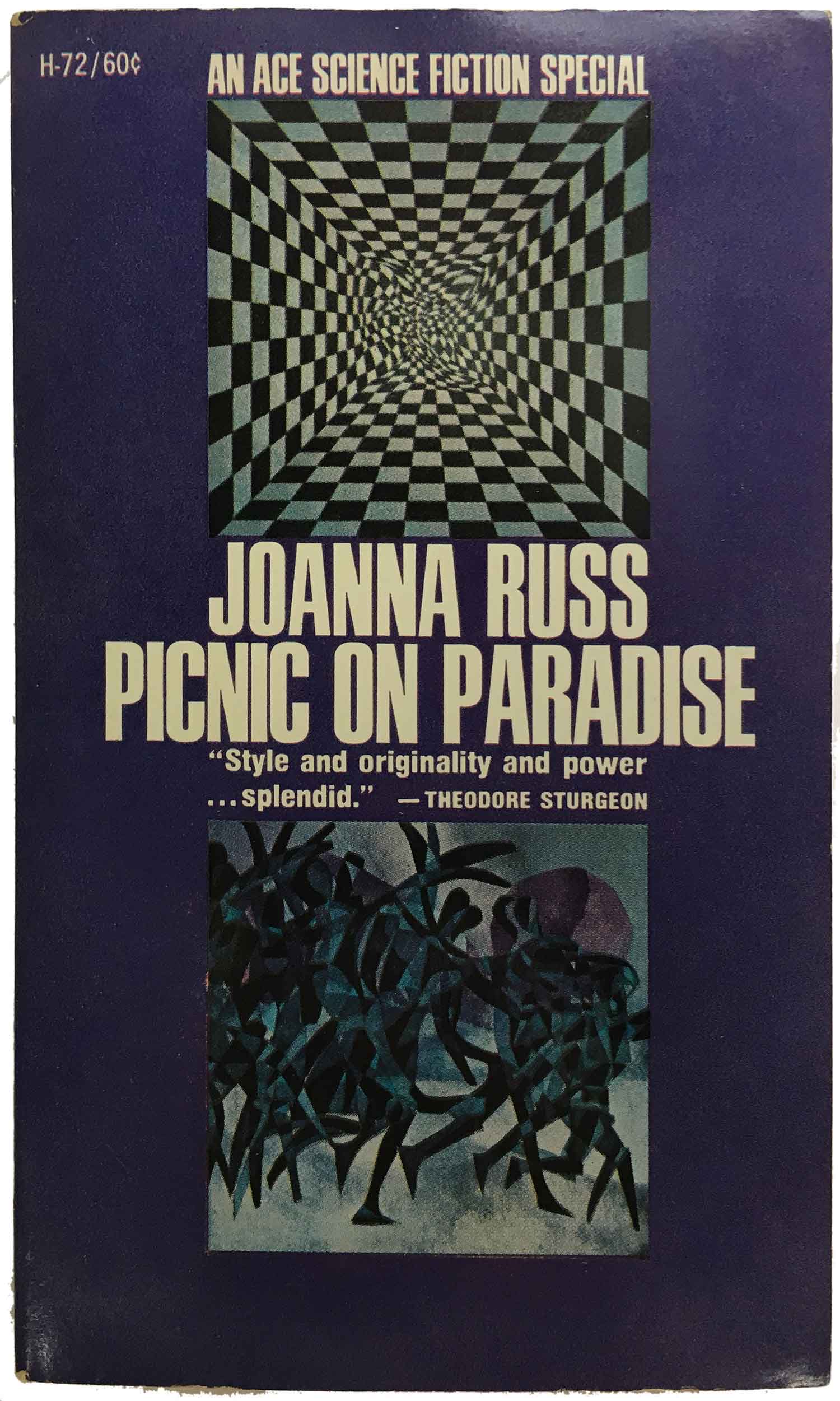
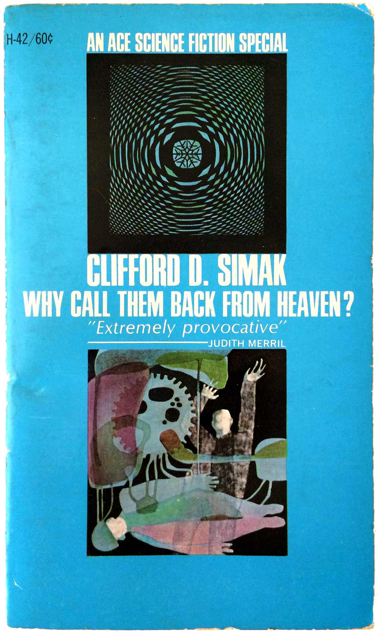
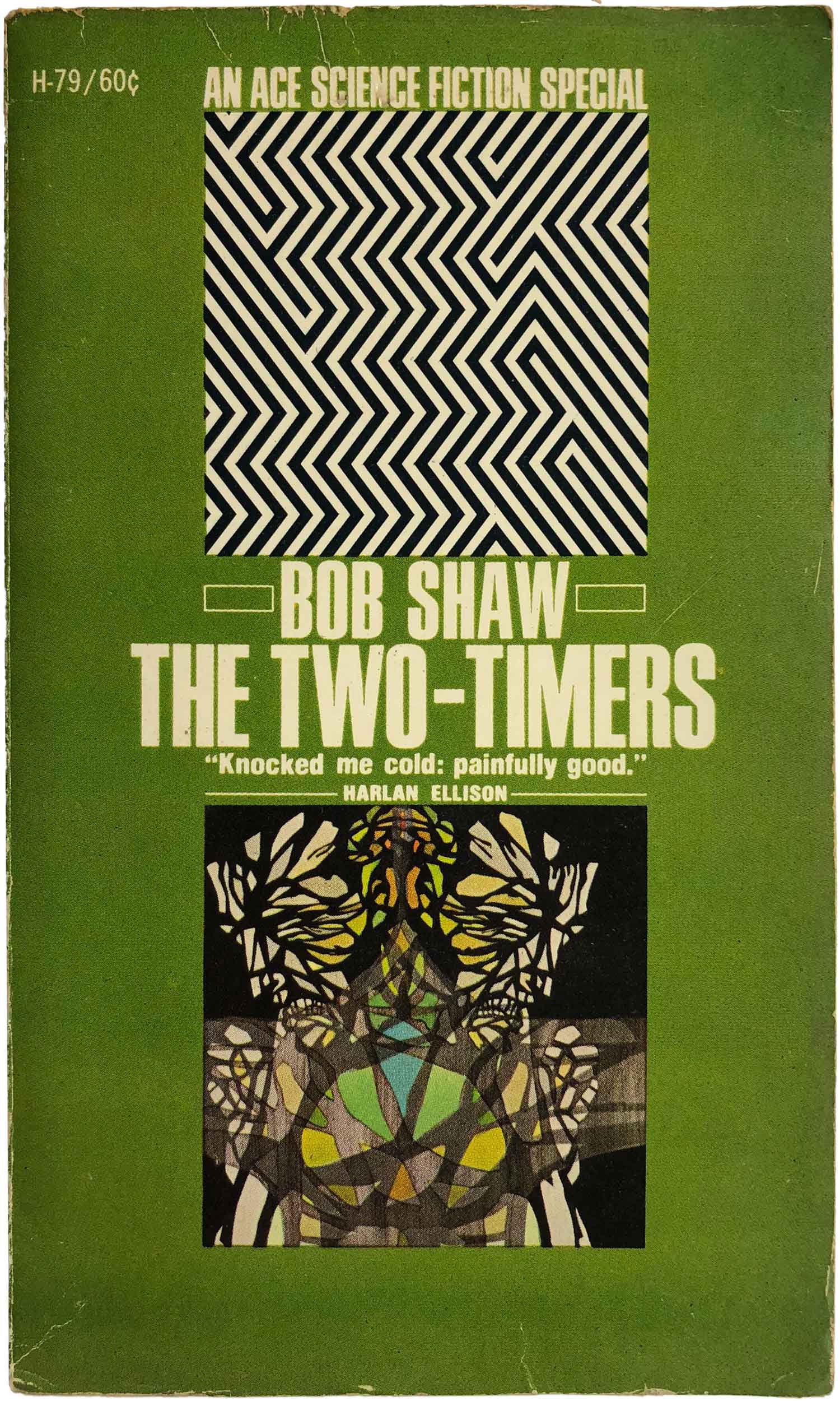
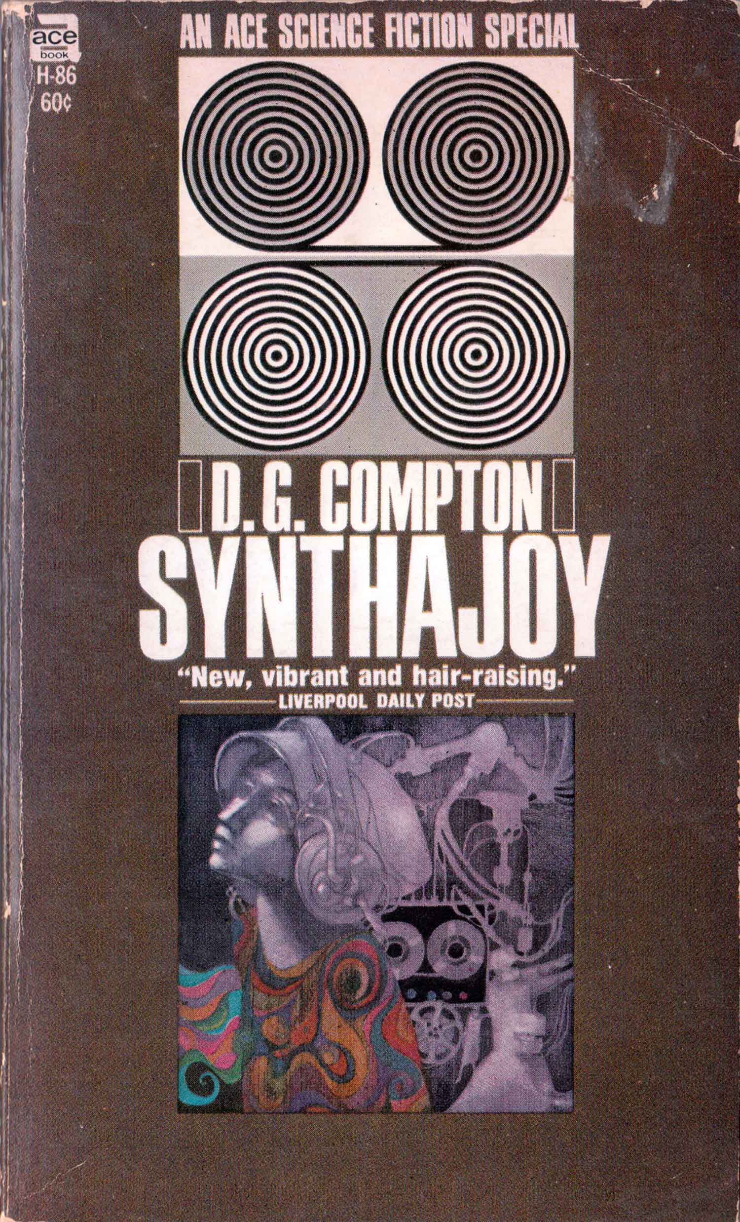
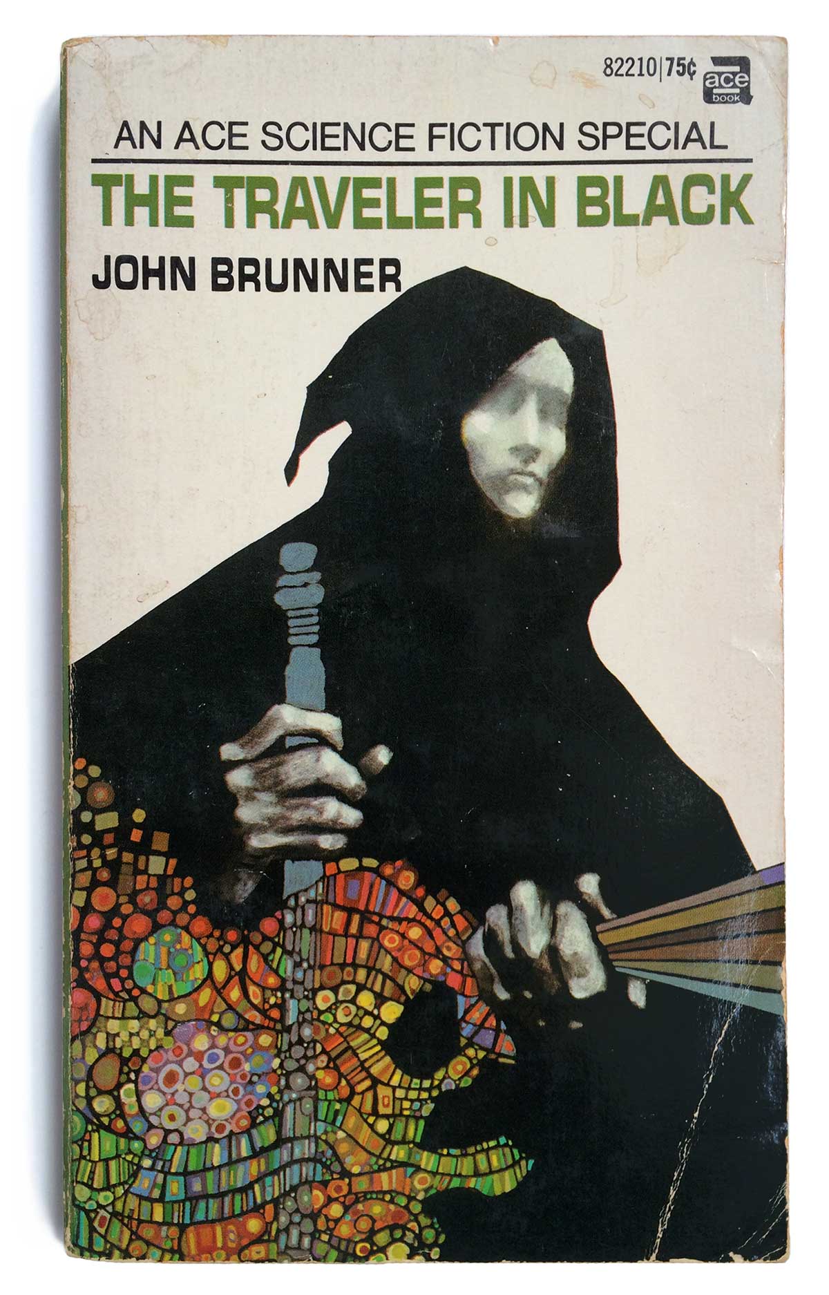
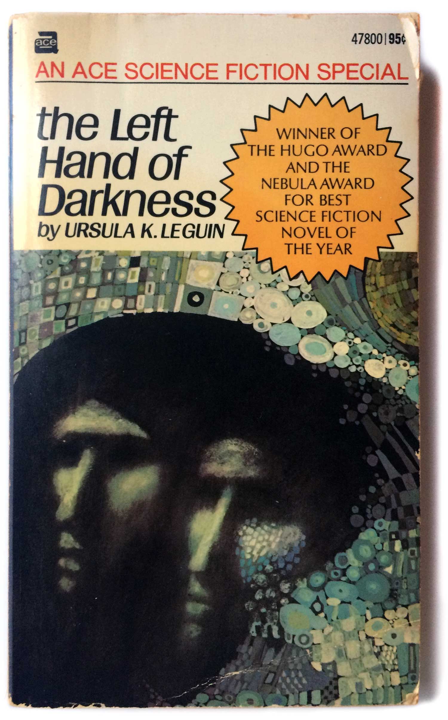
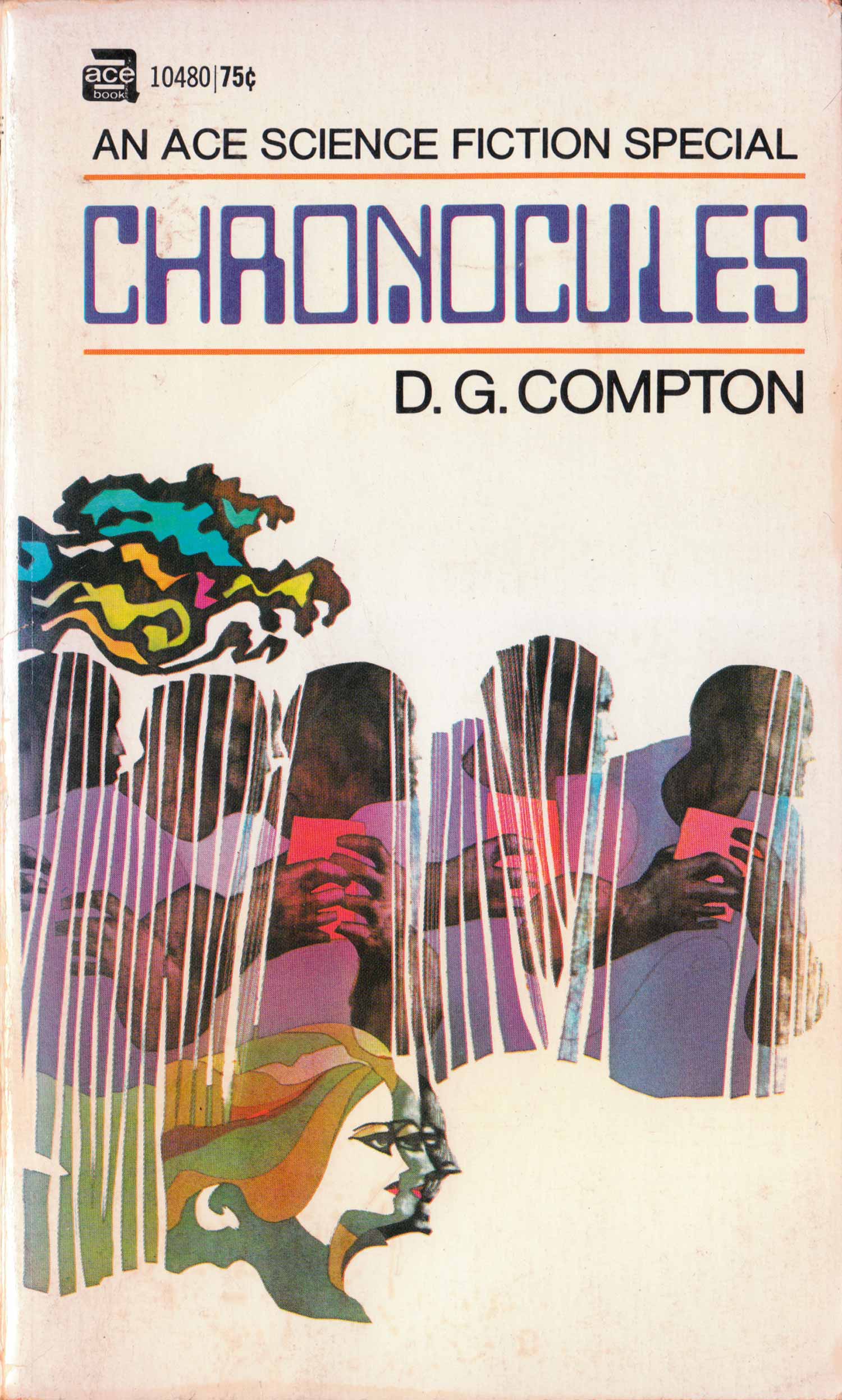
Here are some other cover evolutions. These are more traditional, with the hard white box at the top of the original design giving way to more integration of the title and author information. The Brunner and Le Guin covers are the closest to the initial design, with slight variations on the type. The Left Hand of Darkness has a dazzling Klimt cum Hunderwasser quilted frame encroaching on two central faces, while the hood of The Traveler in Black breaks out of what would have been a fixed illustration box in the original design schema. (Never mind the amazing rainbow landscape/creature creeping out from the bottom left hand corner.) The Compton cover builds on that, getting more experimental with the type, with the illustration refusing traditional shape and boundaries.
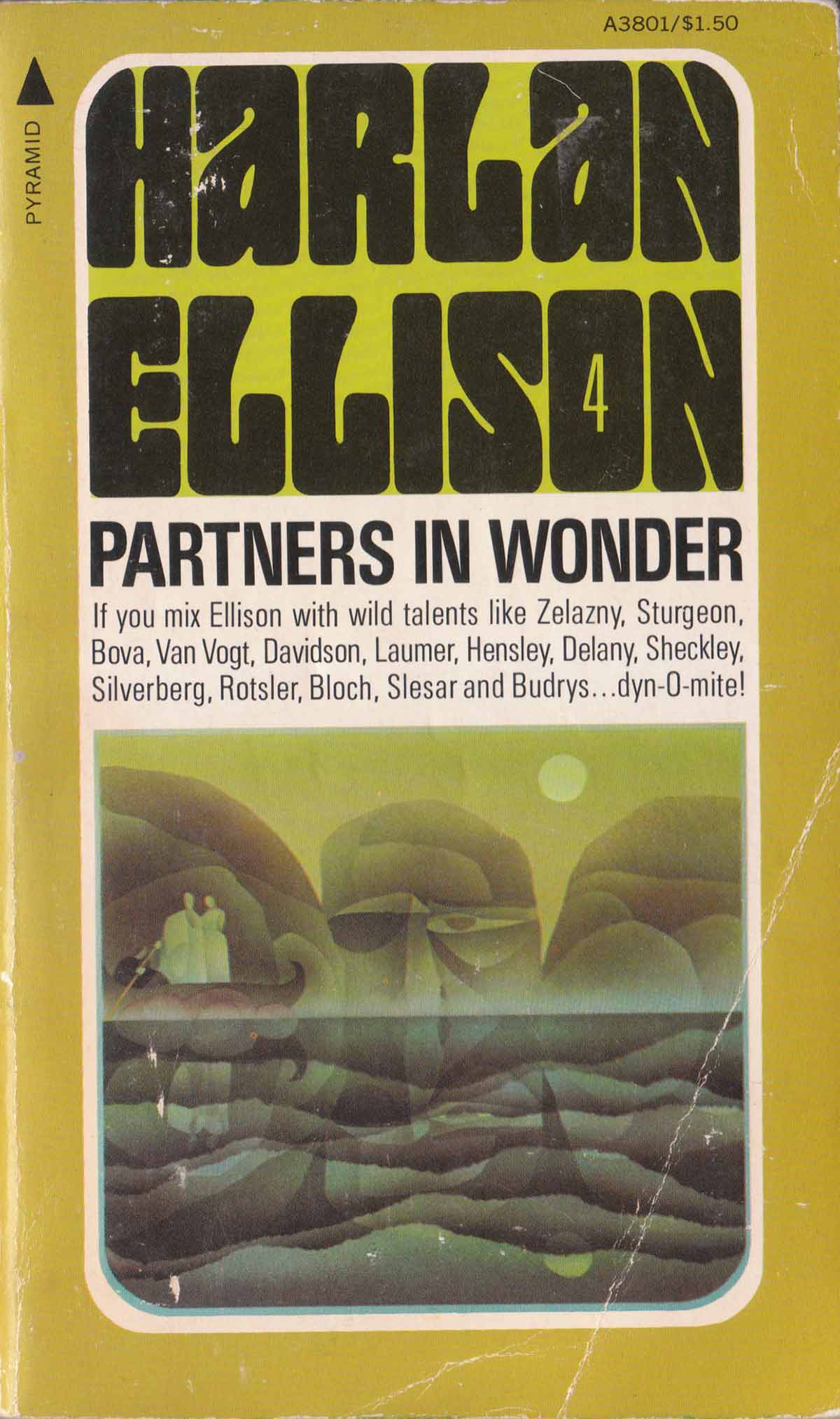
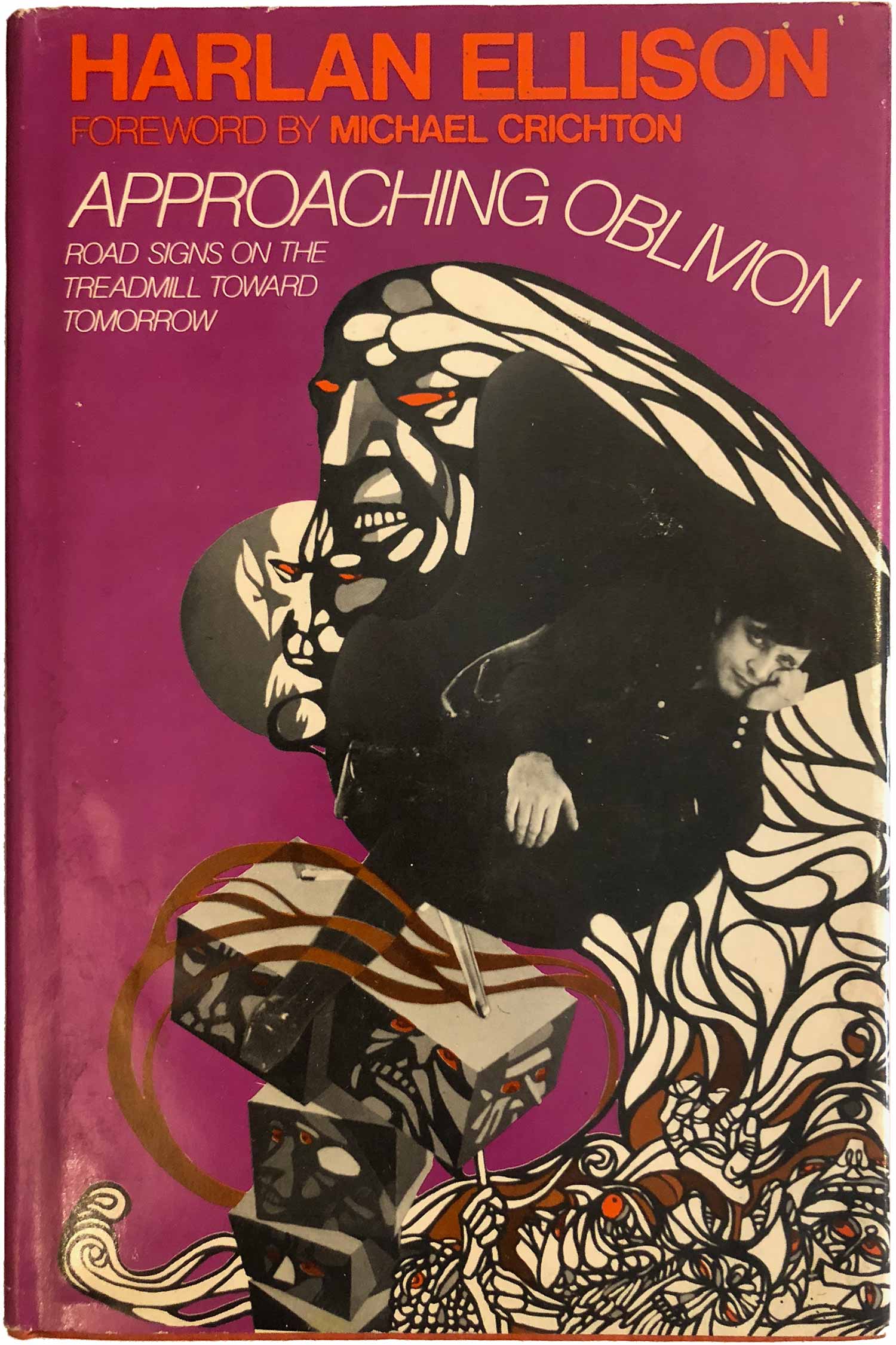
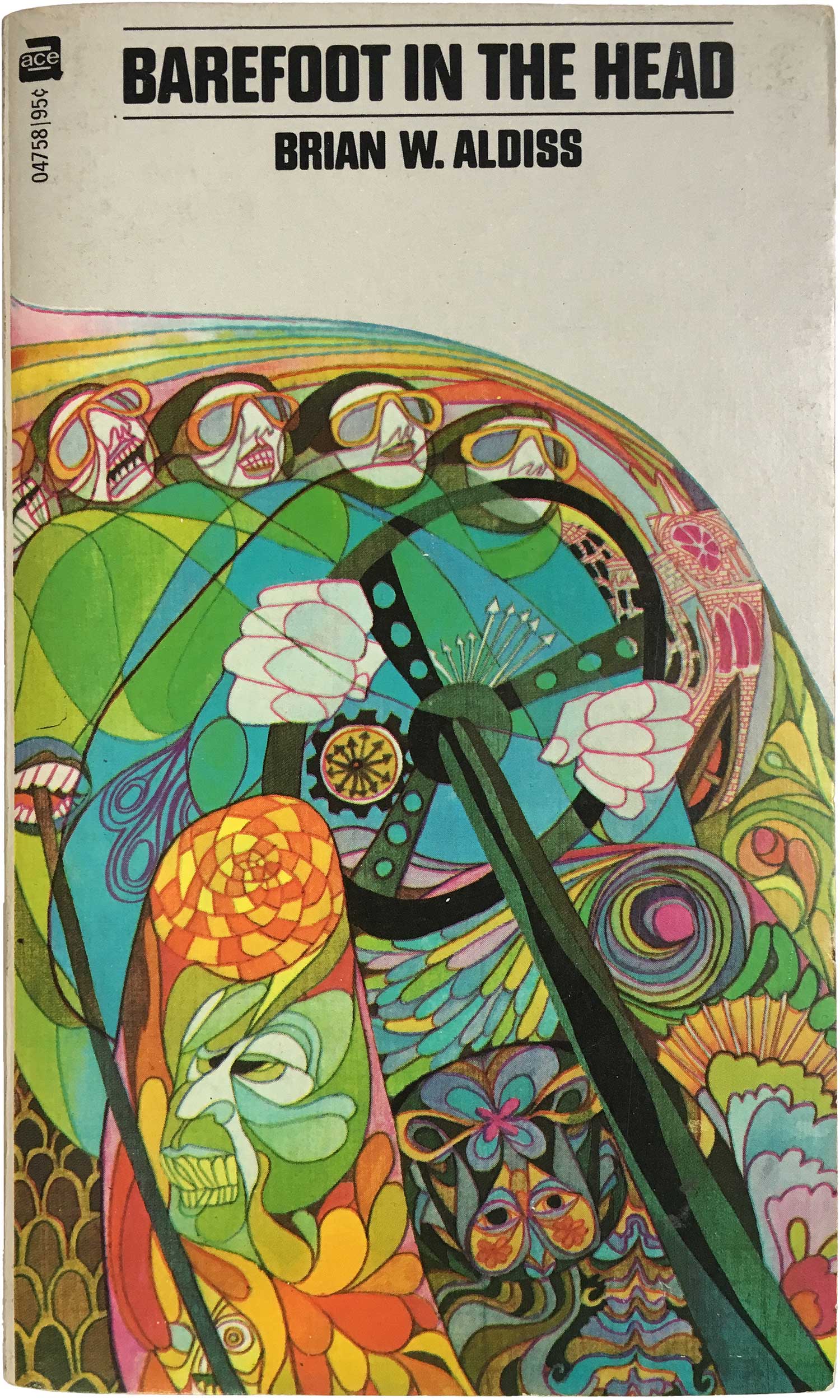
Just to show some range, here are some additional books the Dillons have done that happen to be in my collection. They show even a greater breadth in style and skill, each one completely different than the next.Forst the additional sci-fi covers, including Partners in Wonder, one in a series of covers they designed for their friend Harlan Ellison. Each one features their rendition of his name in dark psychedelic grandeur, with inset images in dark washes that are reminiscent of Aaron Douglas murals from the Harlem Renaissance. And I absolutely love the image they created for Aldiss’ Barefoot In the Head, total insane genius.
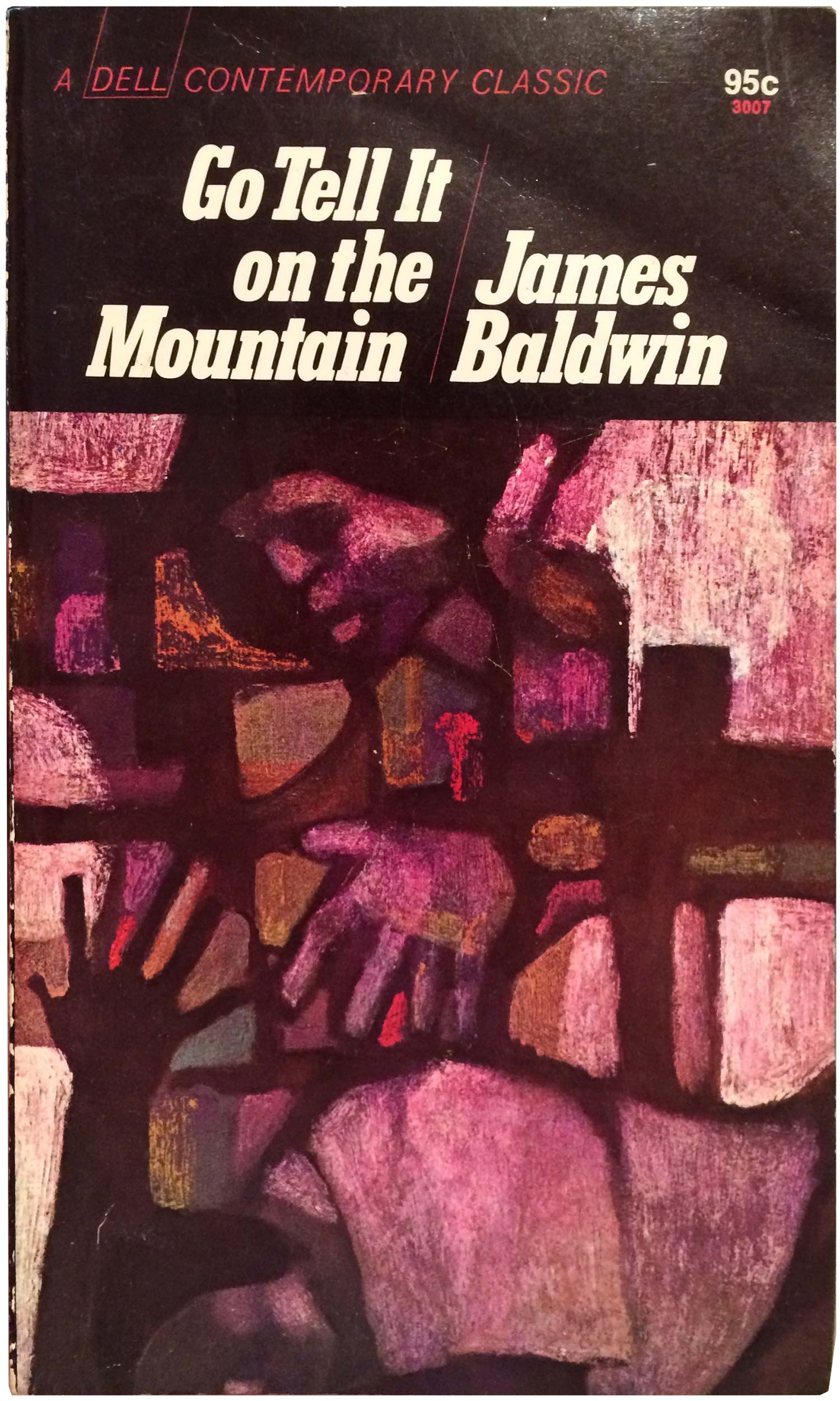
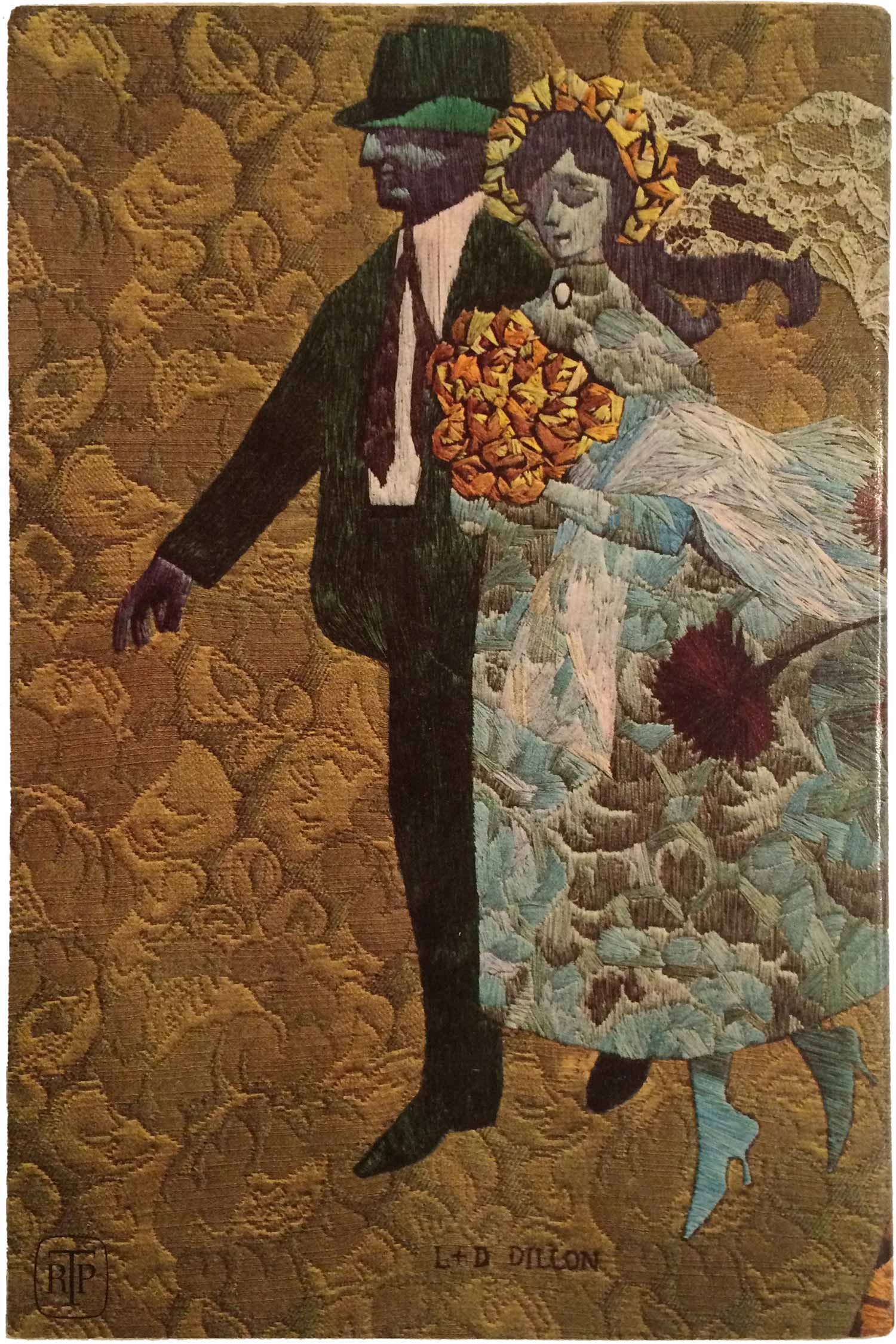
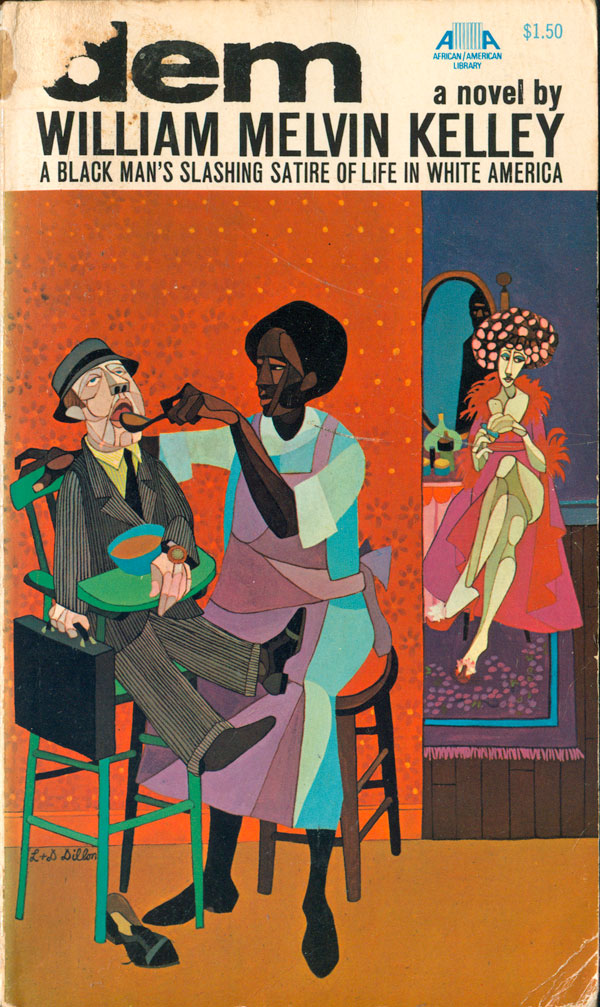
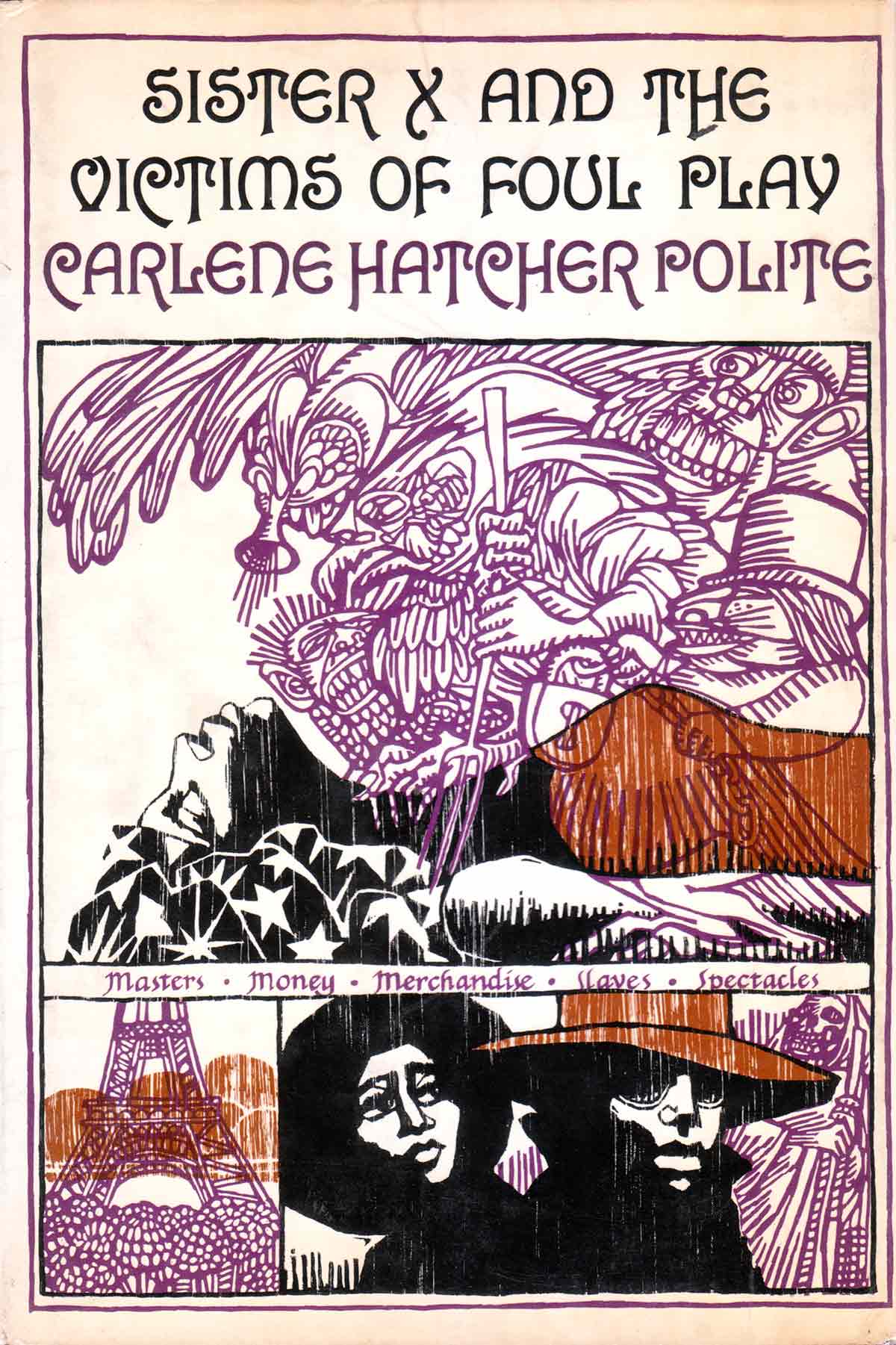
Next are a series of covers for James Baldwin mass markets that Dell was putting out in the 1980s. I know there are more of these, but I haven’t stumbled across them yet. The cover for dem I previously shared when I was featuring the Collier Af/Am library (see HERE), and is a personal favorite. Back then I labeled this cubism channeled through Faith Ringgold and Jacob Lawrence, but now I can see this is straight Robert Gwathmey. And finally the cover for Carlene Hatcher Polite’s 1975 novel Sister X and the Victims of Foul Play is something else entirely. Here they mutate again, merging Black Power imagery with 17th century European block prints. At first glance you would never think this is one of their covers, but the closer you look the more some of their signatures are visible like color overprinting and heavy yet highly detailed outlining. And then two very different designs for the Time-Life novel series, the McCuller’s cover warm, yet strange, the de Poncins design about as chilly as you can get.

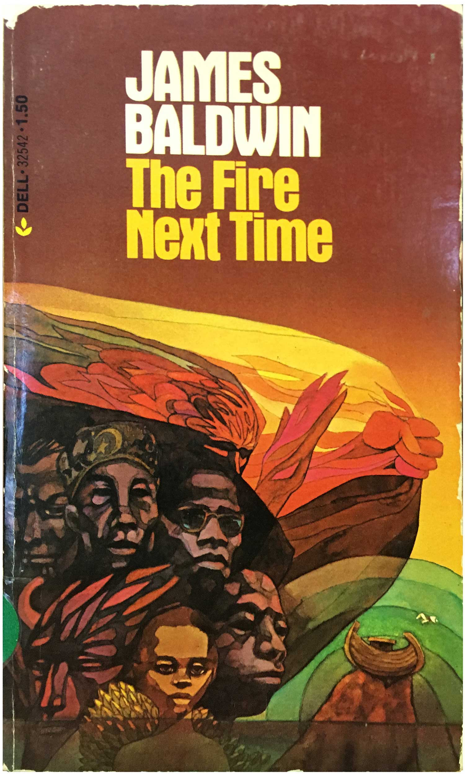
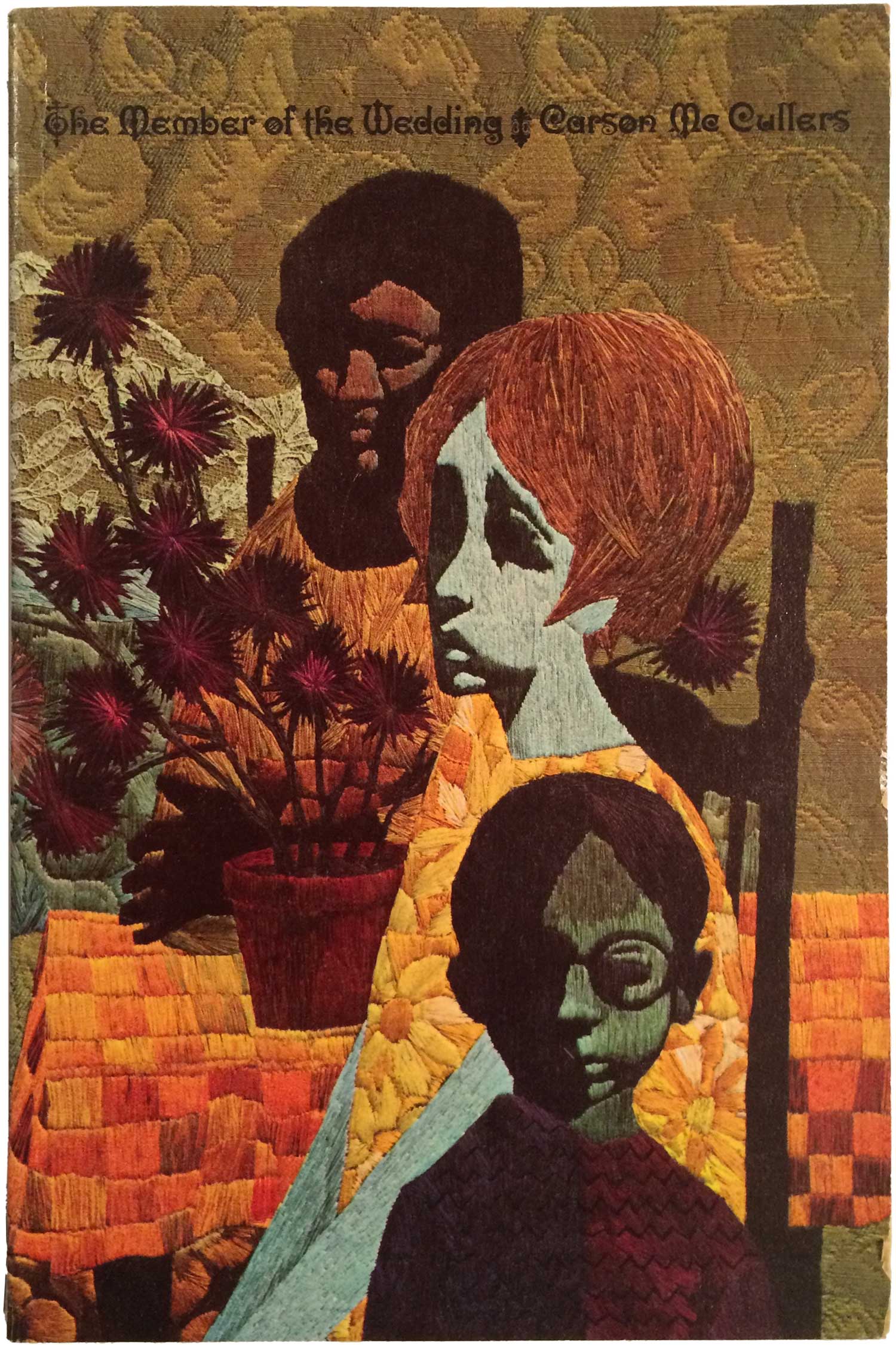

Alec tells me there are websites dedicated to the work of the Dillons, but I’ve actually purposefully avoided them. Most of the fun is finding the books in person, and then getting to share the little collections I’ve been able to cobble together here on Justseeds, and it doesn’t really matter much what other people think or are up to. But, if this handful of covers peaks your interest, you should definitely look the Dillons up further, as there is a huge world of their work to explore!
Bibliography for this week’s books—Ace Science Fiction Specials:
Non-ASFS:
For those interested in science fiction book covers, I’ve written a handful of related posts: One on the UK Science Fiction Book Club covers of the 60s and 70s (HERE); two on the covers of Zamyatin’s We (HERE and HERE); one on abstraction and sci-fi cover design (HERE); and another on covers that engage with contemporary political themes (HERE).



Is it possible the Dillons did this paperback cover illustration for Thomas Pynchon’s V. (1968)?
https://thomaspynchon.com/pynchon-cover-art/cover-art-v/
Please let me know. Thanks!
Tim
Tim, the 1968 cover certainly looks like it could be them, although there were others that used similar styles. While did “job” work, most of their covers by the late ’60s had them attributed on the back or on the copyright page.
I have been a follower of the Dillons book cover creations since the 1970’s.In addition,I am a collector their
books.My daughter and I were able to meet them and they were the most cordial toward us.How they merge together their expressions to create one product is amazing!!Just as amazing is how long they had been successful illustrators.They did what they loved and made a career of it.