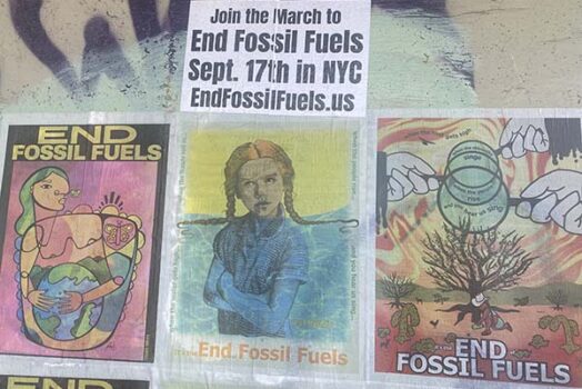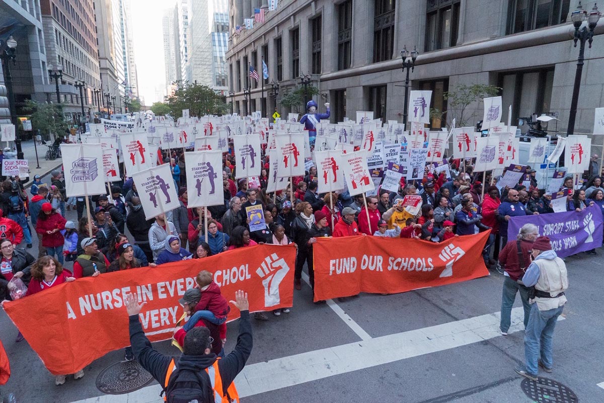
The October 2019 strike for education justice by CTU (Chicago Teachers Union) and SEIU 73 strike ended with a new agreement after eleven-days on the picket line by more than 30,000 teachers and support staff. The five-year tentative agreement includes a deal to ensure that every school in the district hires a nurse and a social worker. It also adds support staff to schools, specifically homeless coordinators and special education case managers. Teachers also won $35 million in funding to reduce classroom size throughout the district. The new contract also includes teacher pay raises, including pay increase for the lowest paid workers in both CTU and SEIU 73.
This is not the first time CTU has used the power of a strike to improve school conditions for teachers and students in the nation’s third-largest district which educates over 300,000 children. The CTU strike in 2012 positioned public education unions as the vanguard of the labor movement. CTU’s actions in 2012 led to the #RedforEd movement and the wave of teacher strikes ranging from West Virginia, Oklahoma, Arizona, Los Angeles, Oakland, and Denver, among many others. These unions have demonstrated that teachers have real power when they take collective action and fight for the schools all students deserve. In recent years many of these unions have also harnessed the power of art and movement culture to visualize their demands. They have also harnessed the power of art builds.
CTU / SEIU 73 hosted an art build on October 4th-6th. This art build produced over 60 banners, 1,200 picket signs, five parachute banners that were 24′ wide, over 1,600 patches, and over 1,000 posters. The art build was organized by a team of artists, activists and educators: CTU teachers Jessica Rosenbaum and William Estrada, Chicago artist and Justseeds member Aaron Hughes, and the Milwaukee-based Art Build Workers (Paul Kjelland and Nicolas Lampert from Justseeds, Joe Brusky from MTEA, Kim Cosier, Josie Osborne, Claudio Martinez, and Jeanette Arellano) who have co-organized massive art builds for public education unions over the past three years.
Previous posts that I have done on the Justseeds blog following an art build have recapped what has worked and what has needed improvement in the builds, be it Oakland, Los Angeles, Maryland, Minneapolis/Saint Paul, Houston, or Milwaukee but this post differs. This post looks at how the art was used in the streets and the picket lines. It examines how some of the key decisions made during the art build by artists, organizers, and the CTU and SEIU 73 staff set the stage for how the art would communicate in the streets and to the media.
Banners
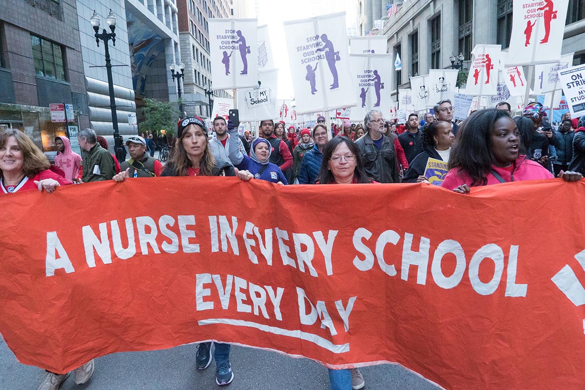
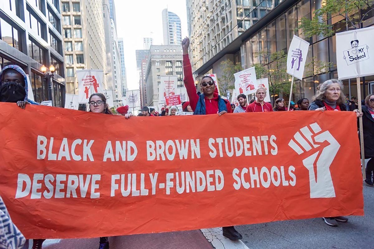
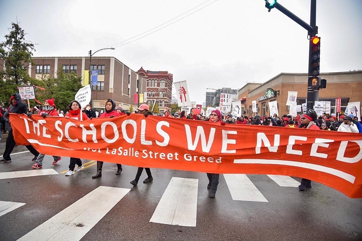
The Chicago art build was unique in that two unions co-sponsored the build: CTU and SEIU 73. The union leaders and staff provided the artists with the slogans that they wished to amplify. They also stressed the importance of the union colors: red for CTU and purple for SEIU. This created the color scheme for the bulk of the banners. We decided early on that it was important to paint as many banners as possible in the two-and-a-half day art build. You can’t crank out 60-plus banners if the designs are complex. So we simplified. We chose to paint 90% of the banners with a standard banner design: one that had the same font for each banner and a fist logo on one side. We also created multiples of each slogan so that some could be painted in red for CTU and some could be painted in purple for SEIU. The simplified design was successful for a number of reasons. They were relatively quick to trace and more importantly they were easy and fast to paint, especially for those at the art build who were not coming from art backgrounds. Each text-based banner took four people around 30 to 45 minutes to paint. In the streets these banners allowed the slogans to take center stage.
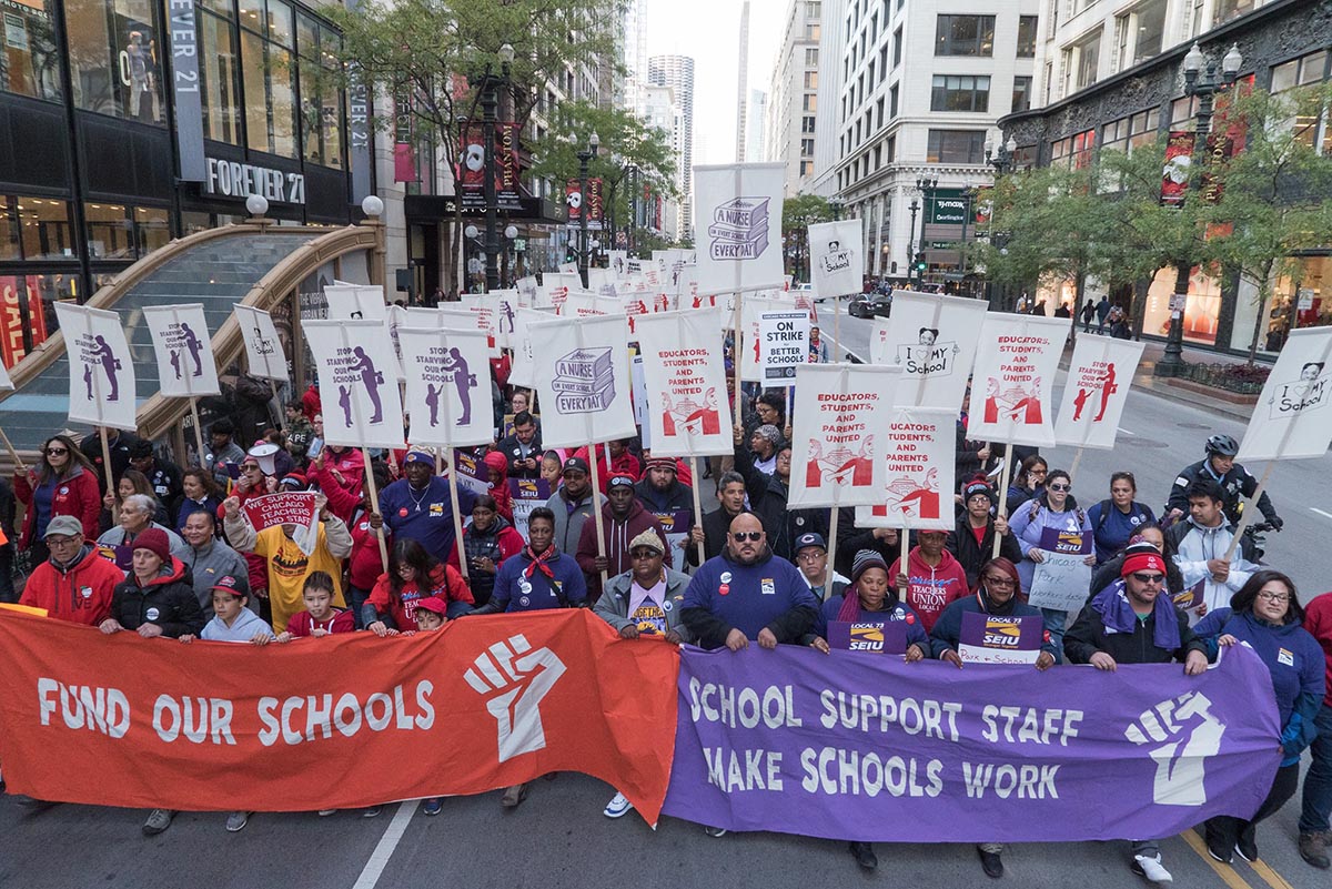
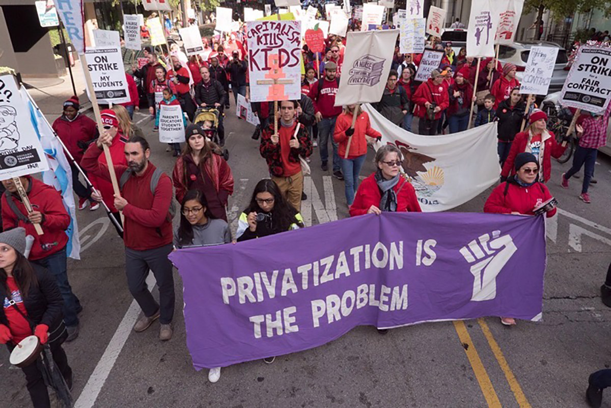
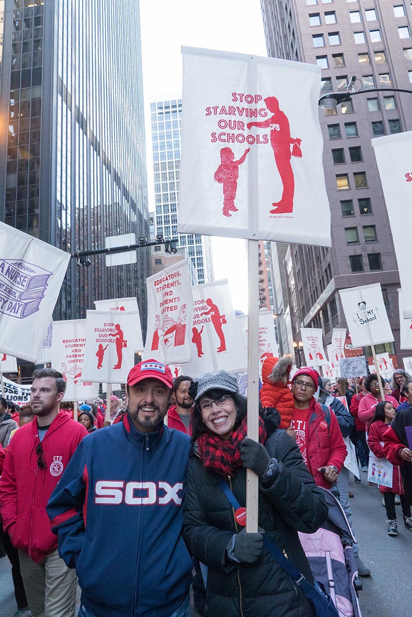
Prior to the art build we spent a lot of time working with our point people in CTU and SEIU 73 on the slogans. The unions chose the slogans, but we made suggestions on how to shorten the slogans. This is important because long slogans are not easily read from a distance (or by the camera) and they often do not fit well on certain mediums (mainly the parachute banners and the picket signs.) So when CTU / SEIU 73 requested the slogan “Parents and Educators United for Fully Funded Public Schools” we suggested “Educators, Students, and Parents United.” For the slogan “Privatization is the Problem, Not the Solution” we suggested the shortened slogan: “Privatization is the Problem.” These slogans said essentially the same thing. They were just shortened for clarity – making it easier to read and to paint.
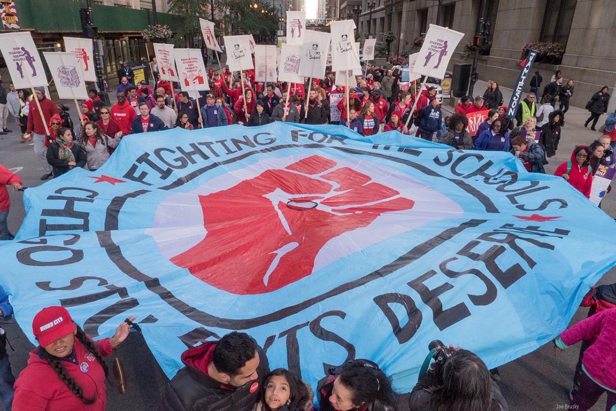
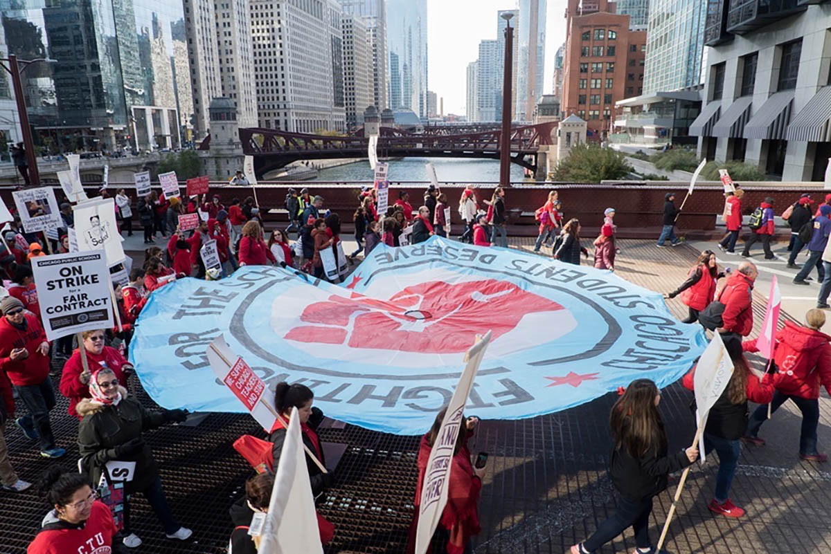
Here are some examples of the text-based banners in the marches and picket lines:
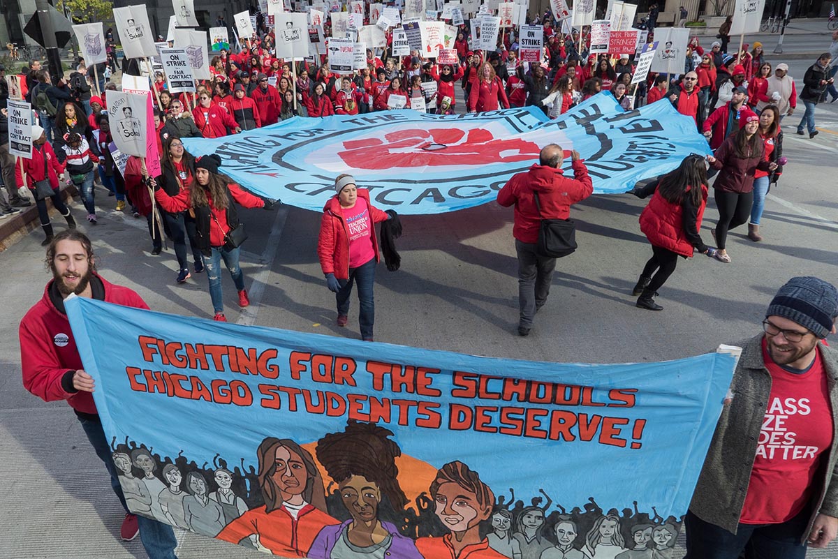
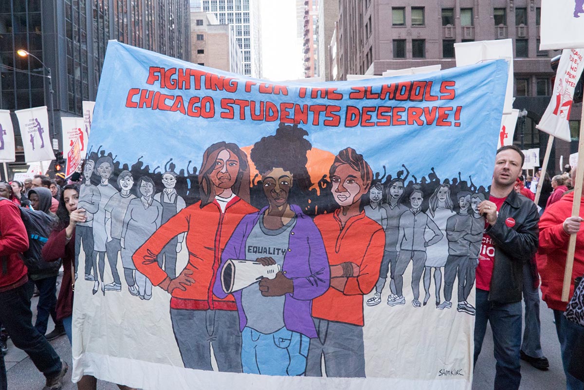
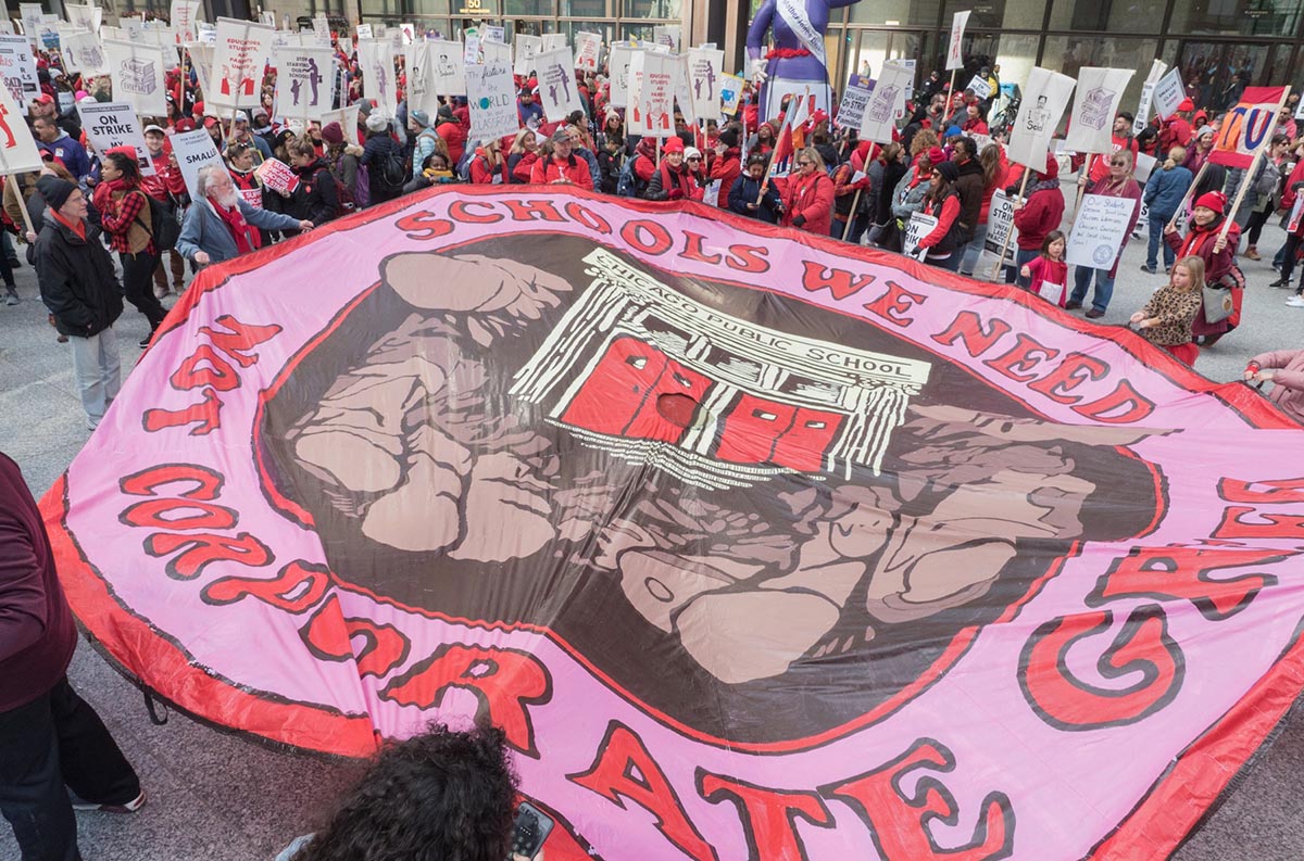
We also made the decision early on have a handful of more complicated banners to paint during the art build. Aaron Hughes did an outstanding job reaching out to local artists who were commissioned to create designs based off the slogans provided by CTU and SEIU 73. The complicated designs were a good counter balance to the more simple banners because they represented 5-10% of the total banners and they allowed some really skilled artists at the art build to focus their time on painting these designs. One of the banners was designed by Sam Kirk and it took a team of 3-4 artists a full ten hour day to paint her banner. You can see how stunning the banner by Sam Kirk looks in the streets via this photo from Joe Brusky:
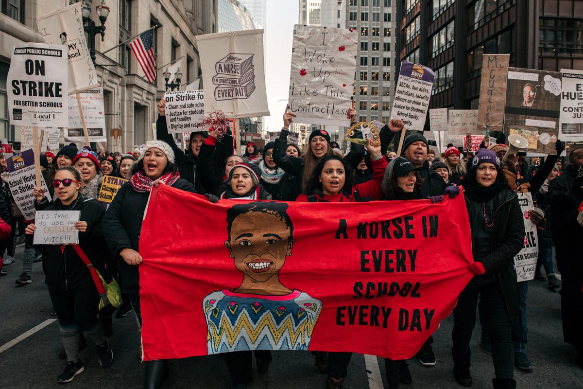
Another “complicated” banner design was by Paul Kjelland. This banner, much like Sam Kirk’s banner combined an image with text:
Paul’s banner and Sam’s banner are exceptional, yet had all the banner designs been this complicated to paint we would have likely only completed 7-10 banners during the entire art build – despite having a large turn out. The success of the strategy for the banner production was to have 90% of the banners be simple and easy to paint and a handful of banner be more detailed and complex.
Another decision for the banners that worked was made in a split second during the art build as we were tracing banner designs (or better stated as Kim Cosier and a team of people were tracing banners for two-and-a-half days straight.) We typically have painted banners in past art builds that are 8-10 feet long, but Aaron Hughes interjected and said, “This is Chicago. We take over the entire street when he march. We need some banners that are 20 feet wide.” And he was right. Local artists and local activists always know what is best.
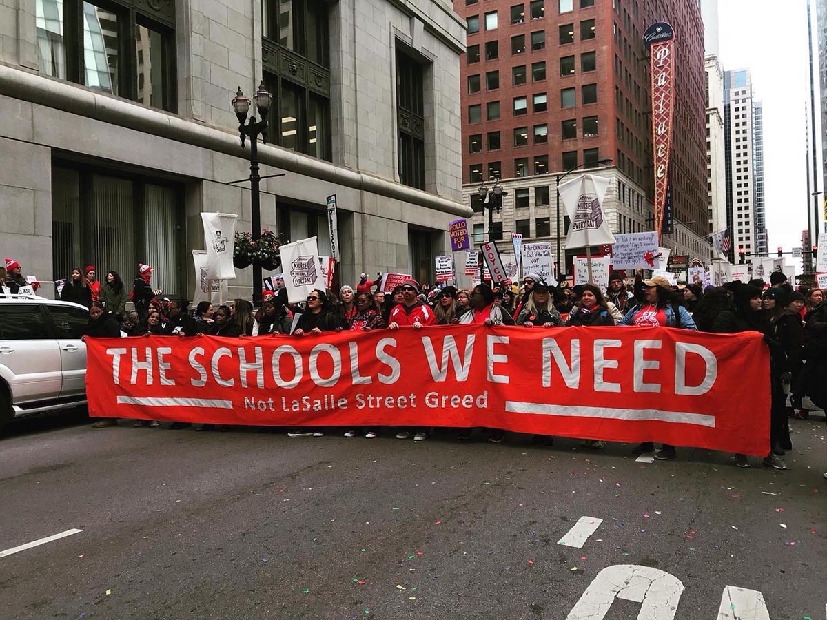
The “Solidarity” banner also utilized a 20 foot scale. This banner (designed by myself) was not originally on the list of slogans to design that was provided to the artists. Typically we (the artists) take the lead from the union organizers, the teachers, staff, and students as they know the issue better than anyone. But at times it is wise for artists to use their creativity and to think outside the box. This includes coming up with ideas for slogans and suggesting images and slogans that the union may not have thought of prior to seeing the design draft. The result was this banner:
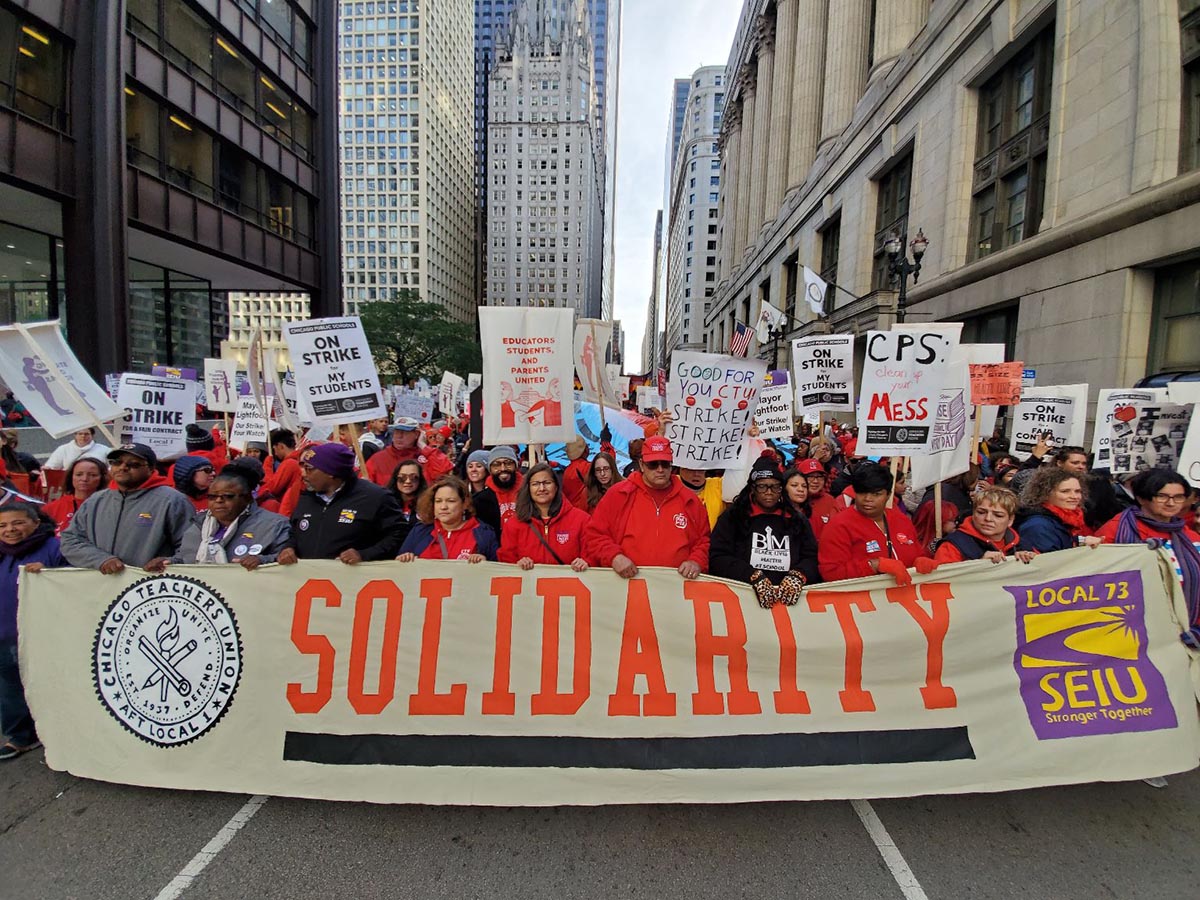
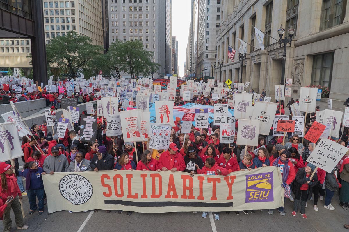
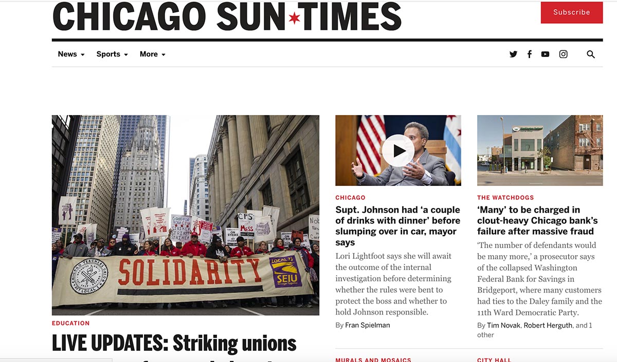
These bold messages resonate with the camera. Here is a screenshot from the Chicago Sun Times:
These types of banners work because they are easily understood by the reader – be it the person viewing the sign on the streets, in the newspaper, or online. It takes one second for this message to be communicated. What is communicated is solidarity: teachers, staff, parents, and students marching to demand justice for their schools. Bay Area art organizer David Solnit said to myself and Paul Kjelland once about why font size matters in banners and signs: “It you can’t see it, you can’t read it, you can’t win it.” We took that message to heart. If your going to design for the movement make sure the font is large and the slogan is powerful and uplifting. One regret that we had in the banners was that we did not include a full series of text-based banners in Spanish. This error was on all of us involved in the art build – from the union leaders down to the artists, but the banners that we produced for the marches and picket lines represented just a fraction of the banners and signs that were in the picket lines and the marches and thankfully others created signs in Spanish that made up for our error.
Picket Signs
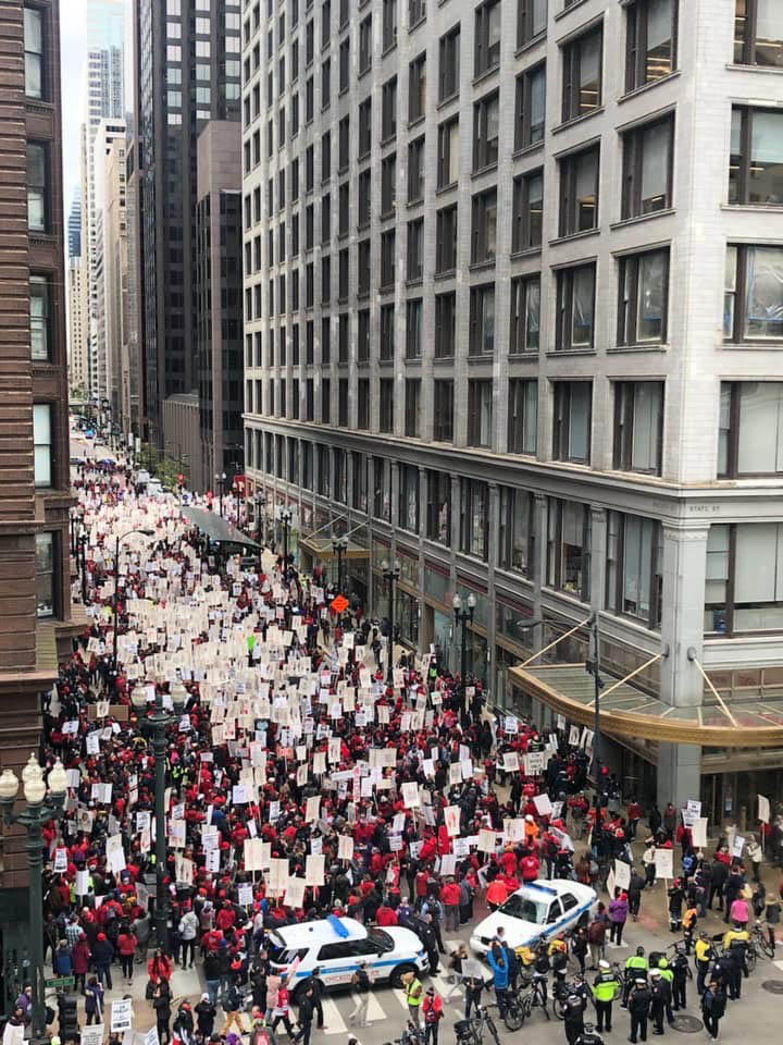
The 1200 picket signs (350 copies of four different designs) also followed the tactics of the red and purple banners: images with large text and designs that were relatively quick to print. We screened one-color prints in either red or purple ink of designs by Chicago-based artists: images by Monica Trinidad, Aaron Hughes, Regin Igloria, and the Chicago ACT Collective. A few things stood out to me about the pickets signs. One was that screening and assembling 1,200 picket signs during a two-day art build is no easy task. We had 3-4 screen printers going for twelve hours a day and we had a crew of 8-12 people assembling signs on the last day of the art build for 10 hours and we barely finished in time. That said, the signs always look stunning in the streets. We made the call to keep half the 1×2 sticks at 8 feet the other half at 6 feet. The 6 feet sticks are easier to store and to transport but the 8 feet sticks really stand out above the crowd as evident by this photo by Joe Brusky:
And this photo shows the impact that hundreds of the signs make within a crowd:
I also really appreciated how some people handpainted some of the one-color picket signs, like this design by Aaron Hughes where the heart was handpainted red:
Or this embellished picket sign design by Monica Trinidad that Therese Quinn shared via Instagram:
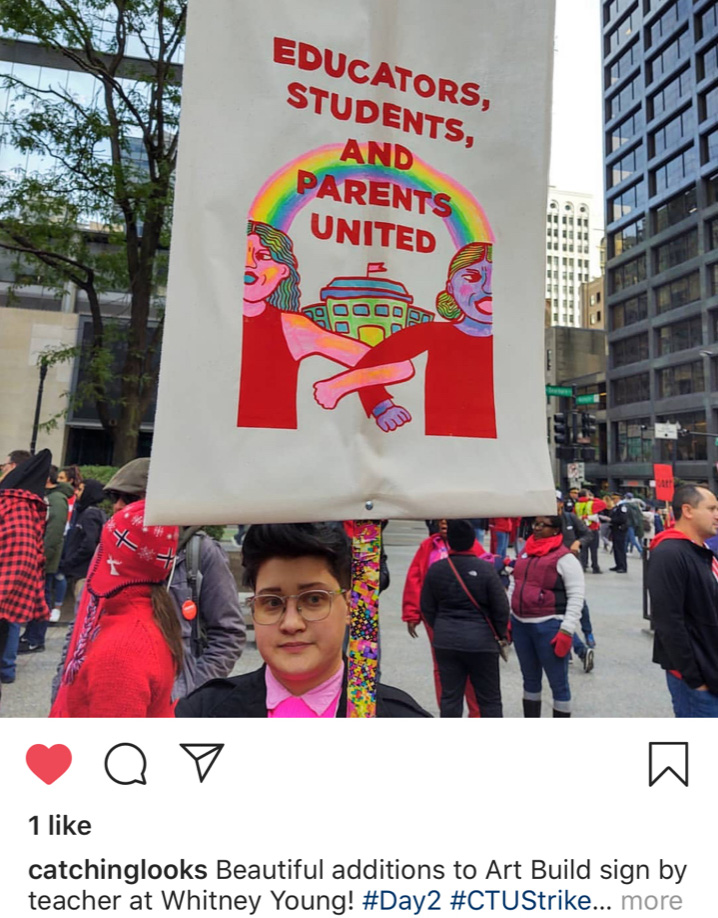
What is remarkable about this sign is that the stick was also hand painted. In essence, the sign became personalized. This matters because many of these signs and banners will continue to communicate their messages long after the strike. Movement culture (the signs, the placards, the banners) matter to people because these struggles matter. They define our lives, our work, and our times. The signs will likely find their way to the walls of the union hall and peoples homes and offices. They may also find their way to the archive and the museum where the art will continue to teach and inform people about the Red for Ed movement and this vital labor history.
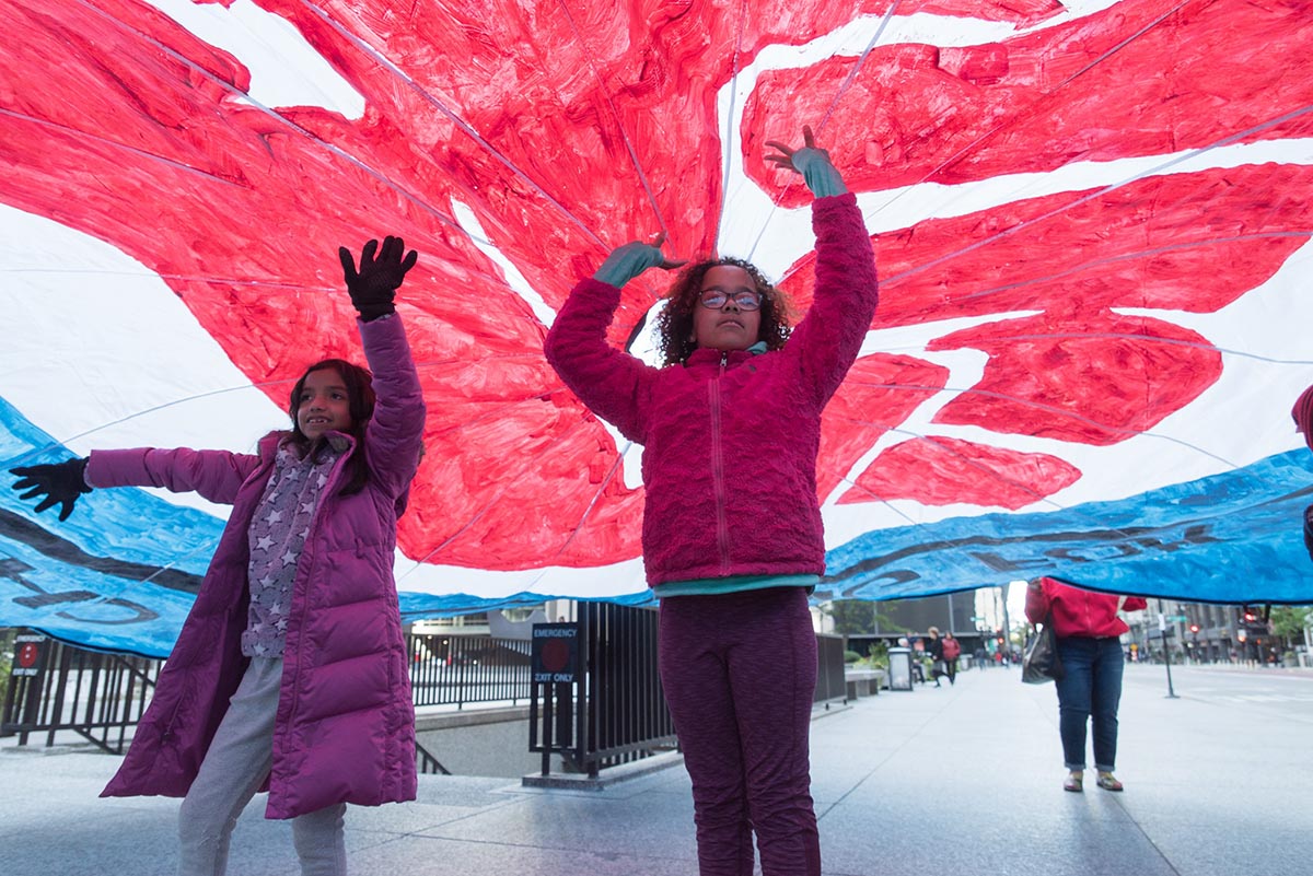
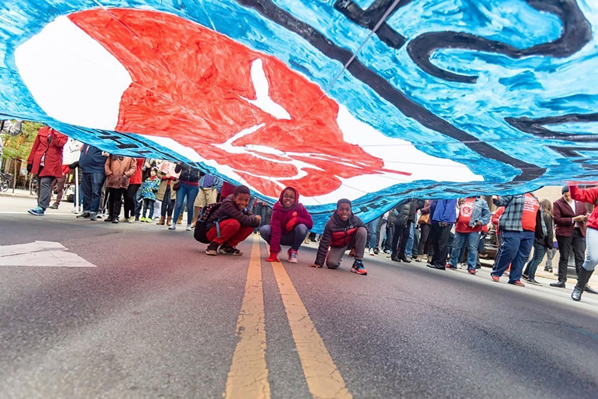
Parachutes
The last tactic I want to discuss is the parachute banners. These banners also excel at scale. The parachute designs are painted on 24′ wide “play parachutes” and become the perfect surface to paint large-scale images that face upwards to the sky when they are carried in the streets. This is key because the parachutes can be read in large crowds by the camera on top of buildings and by news helicopters. However, the parachute banners are not just for the camera and onlookers to see. They are also aimed within: the parachute banners are for those marching in the streets. Parachute banners become an object of solidarity. They have handles that allow 16-20 people to carry them which in itself is an act of unity. They become an object of joy when kids run under the parachutes and they bring celebration to the movement. Below is a series of photos from Joe Brusky that show some of parachutes in action. This design was by Claudio Martinez:
And a design by Aaron Hughes:
I will close this post with photos of kids playing under the parachutes during the march. I close with these images because it exemplifies how the narrative of teacher strikes is no longer just about better pay and benefits. Teachers are striking to improve their schools that have been decimated by funding cuts, privatization schemes, and systemic racism. CTU and SEIU 73 went on strike for better pay, smaller class sizes, for nurses in every school, for more aids, and for more assistance for students who are homeless, to name just some of the issues on the bargaining table. These issues speak to the many inequalities that exist in society. CTU and SEIU 73 were fighting for their students and for their communities. They reasserted the narrative that public schools are indeed the heart of the community. For the artist allies involved in this struggle it was an honor to share the tactics of art builds with CTU and SEIU 73 and to work in solidarity with this powerful movement.
Photos by Joe Brusky from the CTU / SEIU 73 art build
Photos by Joe Brusky from the CTU / SEIU 73 strike: Rally at the Chicago Temple Building, Day Two, Lane Tech College Prep picket line, Lake View High School picket line, CPS Administration Building march.
Articles about the CTU / SEIU 73 strike:
Featured Artists:
- William Estrada
- Jessica Rosenbaum
- Monica Trinidad
- Grae Galindo Rosa
- For the People Artists Collective
- Aaron Hughes
- Regin Igloria
- Chicago ACT Collective
- Sam Kirk
- Eric J. Garcia
- Art Build Workers (Paul Kjelland and Nicolas Lampert from Justseeds, Joe Brusky from MTEA, along with Kim Cosier, Josie Osborne, Claudio Martinez, and Jeanette Arellano)