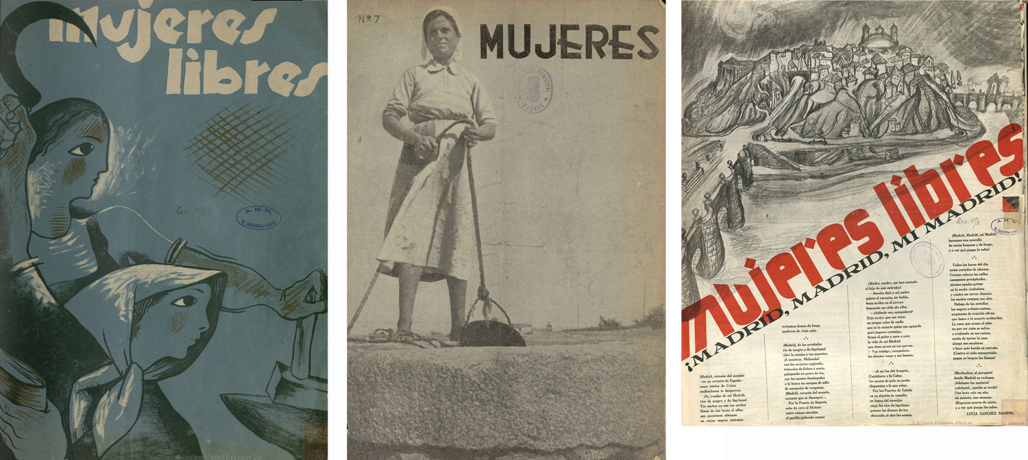
The fonts in this pack are created from letterforms found in publications associated with three Spanish Civil War era publications: Mujeres Libres (associated with the anarcho-feminist organization Mujeres Libres, produced in Barcelona), and also from Mujeres (a feminist communist publication associated with the Madrid chapter of the Association of Antifascist Women (AMA)).
“Mujeres Libres, or Free Women, was an organisation founded in 1936, largely by anarchist women workers who defended anti-fascism and social revolution, but without losing sight of women’s protests and demands. Inheriting the ideas of Teresa Claramunt, the federation would come to gain 25,000 members in the Civil War years, a total of 147 groups across the whole Spanish State. Their declared primary goal was “to emancipate women from the triple enslavement to which they have been subjected: ignorance, as women, and as producers,” and their gender perspective never dissipated. In their endeavours to position themselves as an independent feminist organisation from the National Confederation of Labour (CNT) and Iberian Anarchist Federation (FAI), they were not supported by prominent anarchist figures such as Federica Montseny, who was not an advocate of establishing the feminist struggle separate from the anarchist movement.” (Free Women and AMA: Associations and Their Magazines)
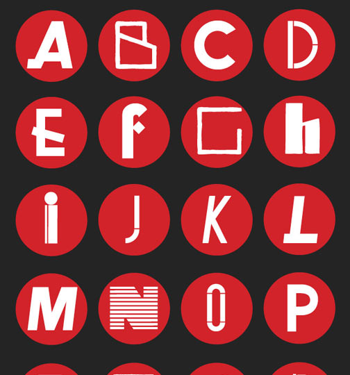
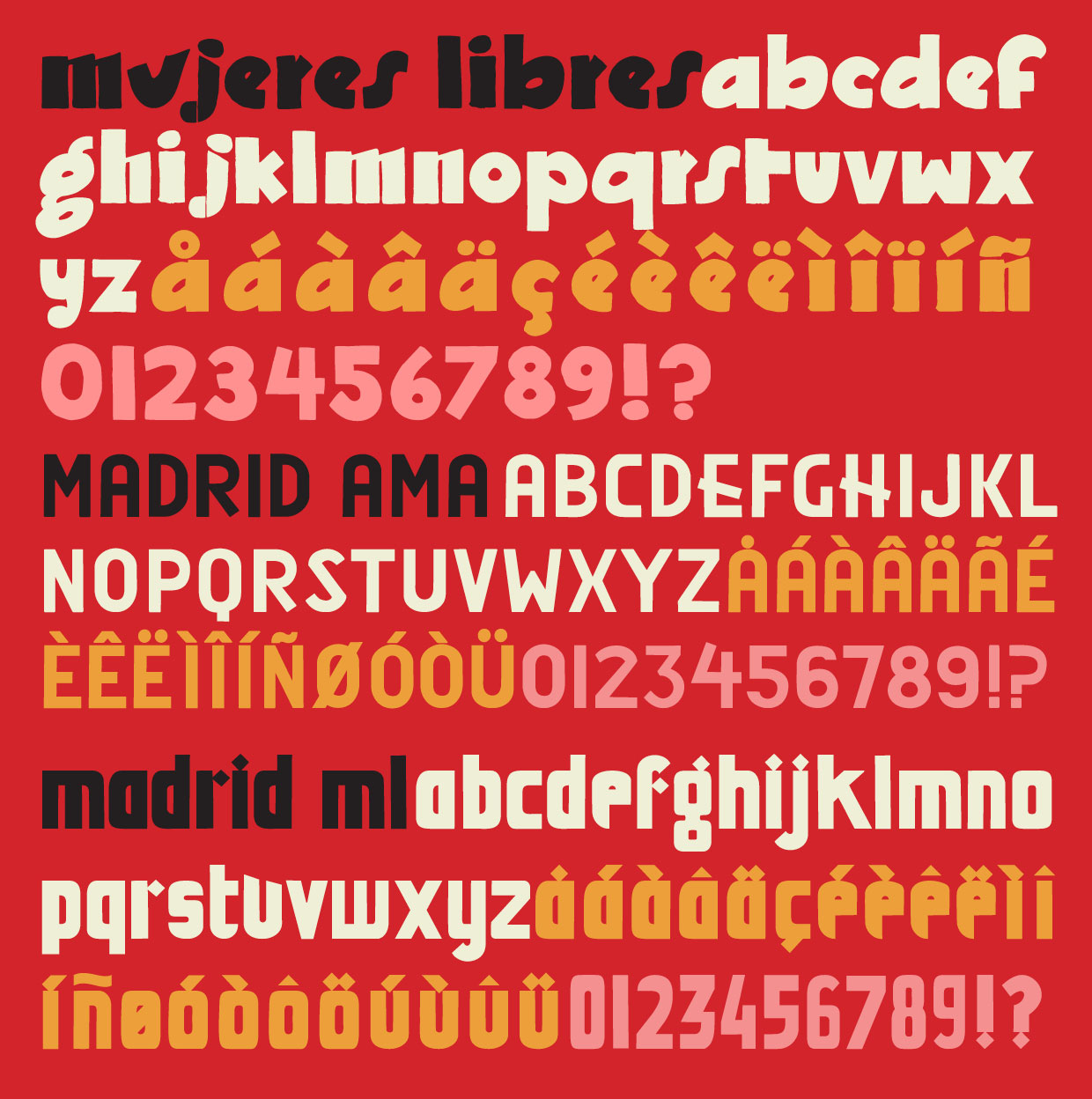
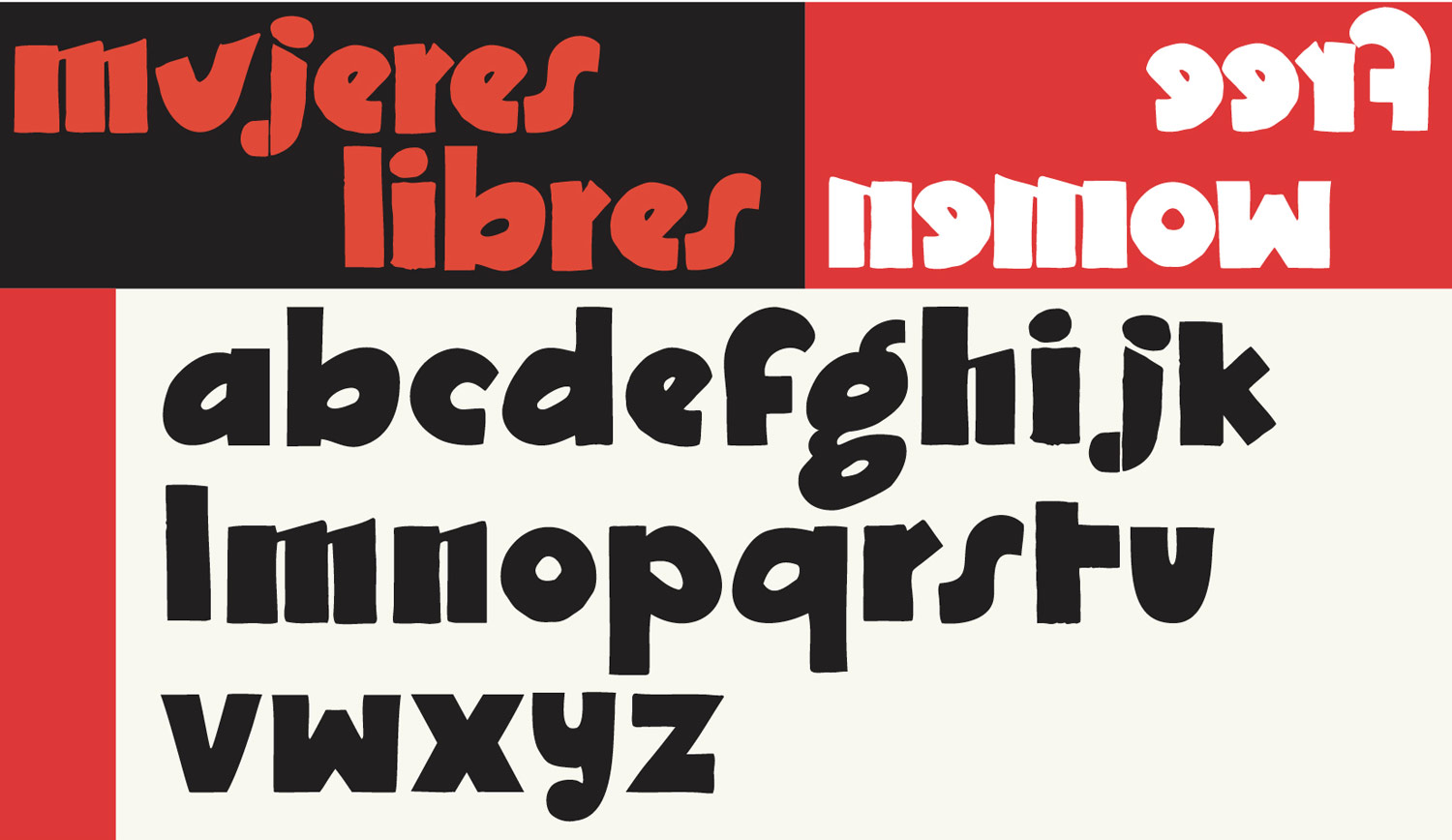
The adapted font here, titled ‘Mujeres Libres’ was the title font used on at least 9 covers of their magazine of the same name. This is an all lower case font with solid and humble aspects.
A second font was adapted from the cover of Mujeres Libres #6, where it looks as if someone took the major characteristics of the the old cover font and modernized it. This font retains the short upstroke from the ‘r’, the oddly angled ‘u’, the thickness of the letterforms, and the openness of the ‘e’ but has produced something sharp and almost science fictional with hints of Germanic blackletter. In truth it might have too much character! Perhaps that’s why is it was only used on one single issue, with subsequent issues going back to adaptations of the main title font. Here it’s titled ‘Madrid ML’, because the cover of that issue is about the defense of Madrid (not because it originated from Madrid necessarily).
The third font comes from the magazine Mujeres, produced by the Madrid chapter of the Association of Antifascist Women (AMA), a feminist-communist popular front organization. The ‘E’ with the angled down stroke on the middle bar is the real attention getter here, giving a pretty normal-looking sans serif font some real bump and verve.
The revolutionaries in the Spanish Civil War had a staggering degree of talent across all aspects of the graphics arts–especially so in illustration and typography, samples of which are rather hard to find outside of the region. We’ll be digging up and adapting more fonts from publications from this era (Mujeres, Mujeres Libres, Pasionaria) over the next couple months.
The attached zip file contains three OpenType fonts: Mujeres Libres, Madrid AMA, Madrid ML.
Madrid ML updated 10/8/23.
Madrid AMA updated 3/31/24.
All fonts are licensed under a Creative Commons Attribution-ShareAlike 4.0 International license (CC BY-SA). This Creative Commons license means that these fonts can be used, shared, and adapted; attributed when appropriate; and any adaptations must fall under the same license. This license enables reusers to distribute, remix, adapt, and build upon the material in any medium or format. If you remix, adapt, or build upon the material, you must license the modified material under identical terms.
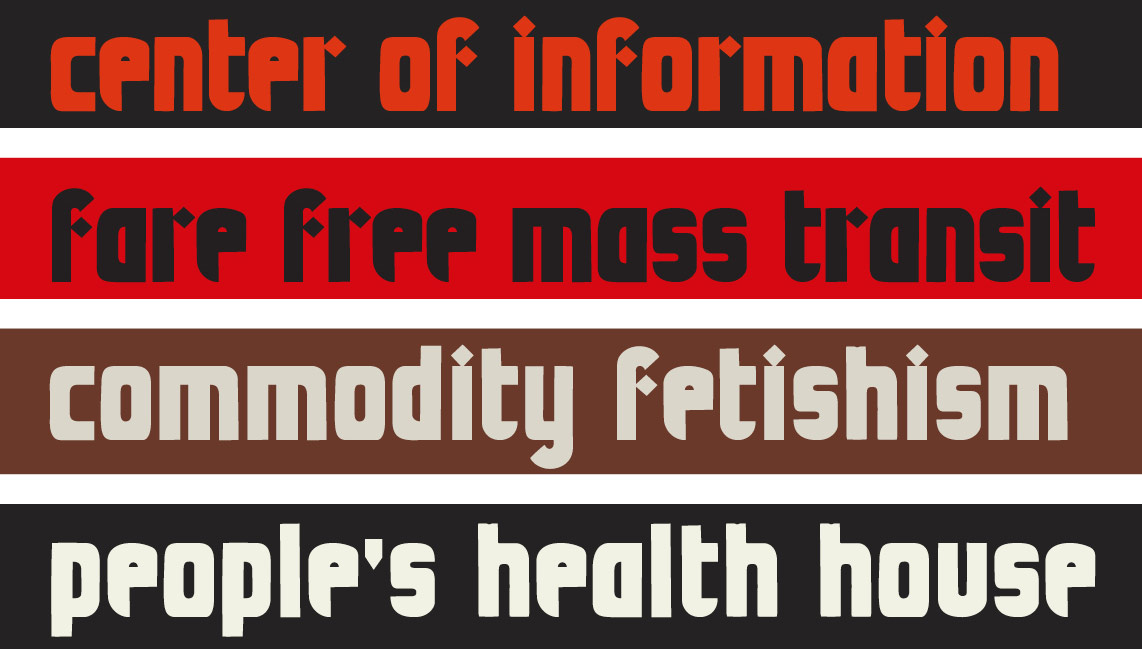
These fonts can be used for activist projects of all sorts. These fonts can be used for liberatory social and cultural productions. These fonts are not for sale and must be shared freely.
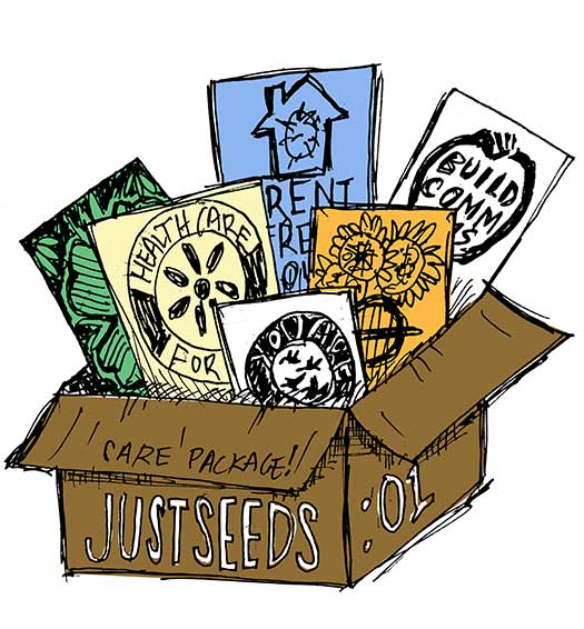
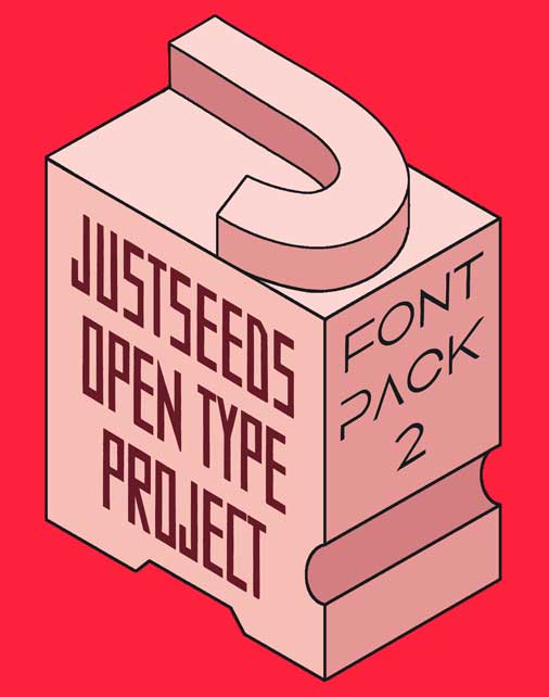
These fonts are part of the Justseeds Open Type Project.
Justseeds Opens Type Project fonts are free! If you use fonts from the Justseeds Open Type Project and would like to donate, any donated money will go to the Justseeds general project fund. These donations help us fund art donations to political groups that are used for benefits and fundraisers, as well as special projects & site specific actions by Justseeds members and allied organizations. Any amount is appreciated. PayPal link here.