The two fonts in this pack are created from letterforms found in the anarcho-feminist Spanish Civil War era publication Mujeres Libres (associated with the anarcho-feminist organization Mujeres Libres). Produced in Barcelona, Mujeres Libres was aimed at the organization’s base–revolutionary working class women.
“Mujeres Libres, or Free Women, was an organisation founded in 1936, largely by anarchist women workers who defended anti-fascism and social revolution, but without losing sight of women’s protests and demands. Inheriting the ideas of Teresa Claramunt, the federation would come to gain 25,000 members in the Civil War years, a total of 147 groups across the whole Spanish State. Their declared primary goal was “to emancipate women from the triple enslavement to which they have been subjected: ignorance, as women, and as producers,” and their gender perspective never dissipated. In their endeavours to position themselves as an independent feminist organisation from the National Confederation of Labour (CNT) and Iberian Anarchist Federation (FAI), they were not supported by prominent anarchist figures such as Federica Montseny, who was not an advocate of establishing the feminist struggle separate from the anarchist movement.” (Free Women and AMA: Associations and Their Magazines)
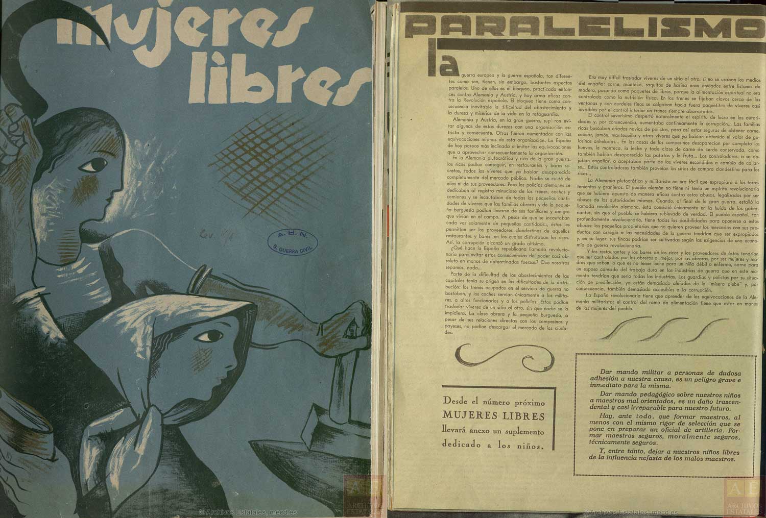
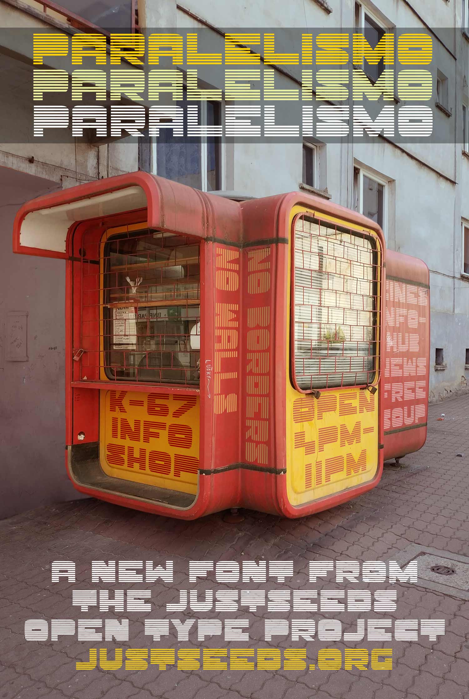
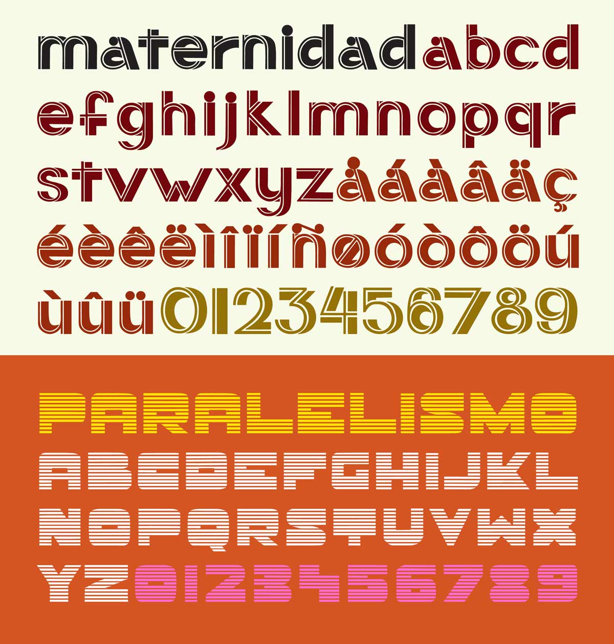
Both fonts in this pack come from Mujeres Libres’ 11th edition (pictured above, on left). The first font, titled ‘Paralelismo ML’ was the title font used on an interior article about the parallels between (post World War 1) Germany and Spain and about the difficulties and corruption around food distribution in times of severe food scarcity. The article posits that leaving the power of food distribution in the hands of a political party, the police, business, or government all breed inefficiency, hunger, and corruption. It concludes, “Control of the food industry has to be in the hands of working class women.” The designer produced a nice all caps title font consisting, appropriately, of parallel lines (issue cover and article pictured above). It has a very sensuous and futuristic character!
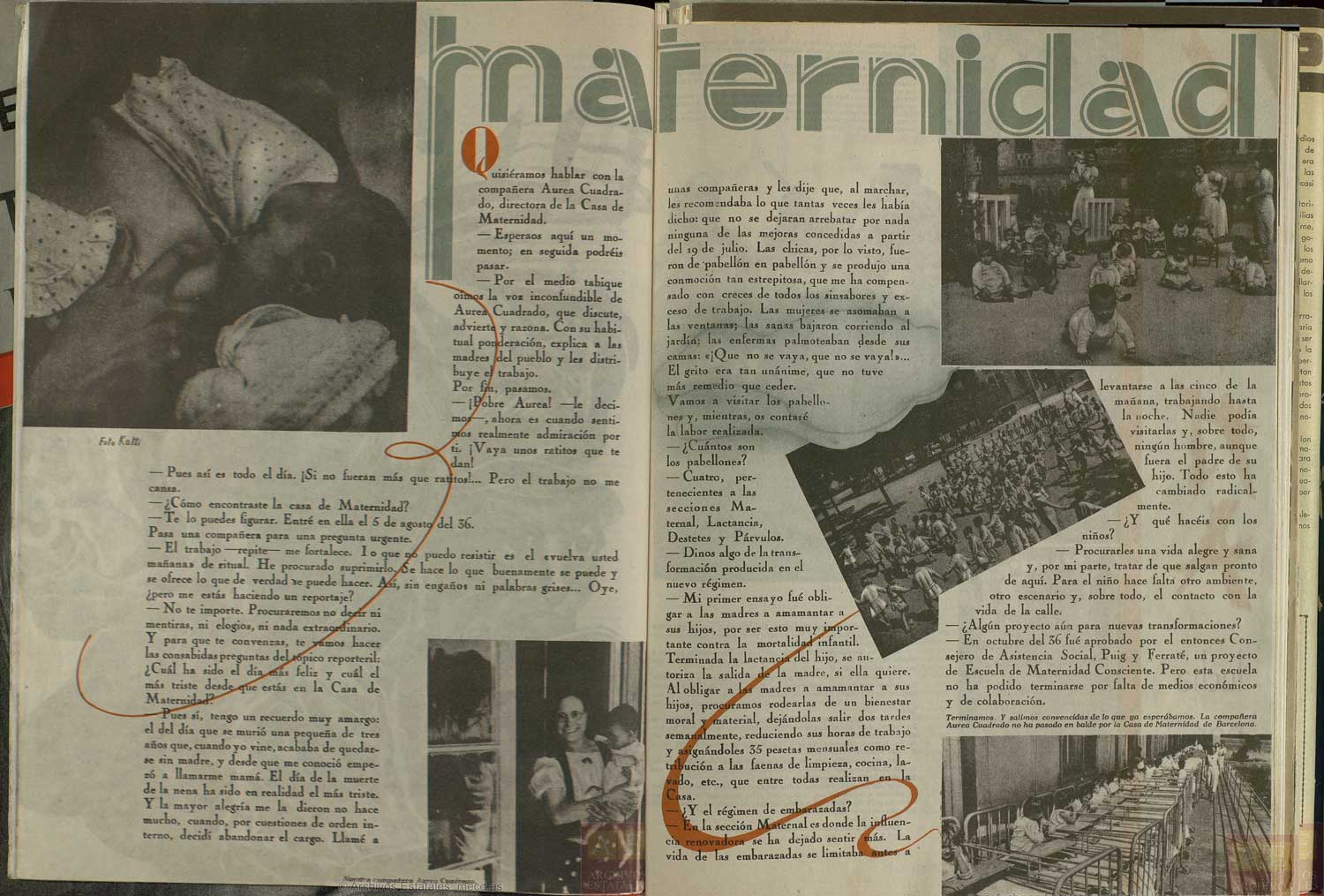
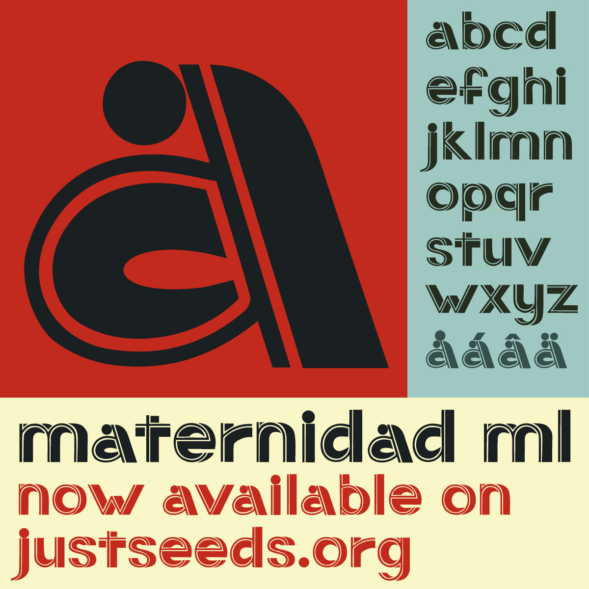
The second font (Maternidad ML) was adapted from the same issue of Mujeres Libres. It was used as a headline for an interview with the director of a maternity ward and covers the scientific and revolutionary innovations in her work there. These are gorgeous letters consisting of a basic sans serif skeleton with large shadows, but the ‘a’ and the ‘i’ with their big black circles break the font’s internal logic and really elevate the whole set of letters into something very cool.
The attached zip file contains two OpenType fonts: Paralelismo ML & Maternidad ML.
All fonts are licensed under a Creative Commons Attribution-ShareAlike 4.0 International license (CC BY-SA). This Creative Commons license means that these fonts can be used, shared, and adapted; attributed when appropriate; and any adaptations must fall under the same license. This license enables reusers to distribute, remix, adapt, and build upon the material in any medium or format. If you remix, adapt, or build upon the material, you must license the modified material under identical terms.
These fonts can be used for activist projects of all sorts. These fonts can be used for liberatory social and cultural productions. These fonts are not for sale and must be shared freely.
These fonts are part of the Justseeds Open Type Project.
Justseeds Opens Type Project fonts are free! If you use fonts from the Justseeds Open Type Project and would like to donate, any donated money will go to the Justseeds general project fund. These donations help us fund art donations to political groups that are used for benefits and fundraisers, as well as special projects & site specific actions by Justseeds members and allied organizations. Any amount is appreciated. PayPal link here.