A friend of mine recommended that I take a picture of the stencil armature I built for a print I just finished, and I figured I might as well write up a whole How-To. Many of us in Justseeds are finishing up a run of prints for an upcoming portfolio we’re doing with the Iraq Veterans Against the War, something of a followup to the Operation: Exposure street campaign we did last November in Chicago. I didn’t make an image for the original campaign, so I needed to start fresh for this portfolio…
I don’t print as much as most folks in Justseeds, and when I do I favor the simplicity, limitations, and mechanics of letterpress. The first prints I ever made were from stencils, so I also fall back on some of my old techniques when I’m just not feeling too excited about screenprinting. I was originally thinking that I would use this project as an opportunity to make a debossed image on a screenprinted field, which basically involves running part of the print through a press without any ink, thus creating an indention in the paper. Doing this would have put the print pretty firmly in the currently-popular boutique letterpress genre (which I am a sucker for), but this is a design for a campaign, and I was concerned with other folks’ ability to reproduce this image if they wanted to. If someone sought to use my image for a magazine, or make a PDF to print on a desktop printer, the debossing would never translate. I decided to do a reversed stencil image instead, to err on the side of boldness and still keep each print a little different.
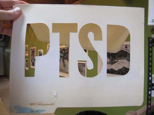
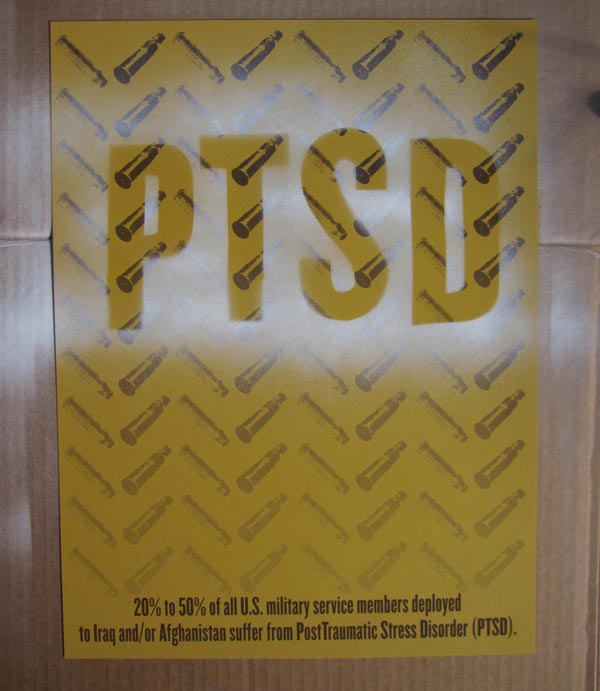
I knew the issues IVAW wanted to address in this project, and I thought about them in terms of the potential for bold text. I chose to work with PTSD, the acronym for PostTraumatic Stress Disorder, partially because of how it might communicate as a simple graphic letterform and partially because of my own reflections on how PTSD has effected people in my life. I’d really been admiring Josh and Jesse’s uses of heavily-bitmapped images lately, as well as Mary’s pattern fields, and I was drawn to combine the two in an effort to illustrate the madness that PTSD can bring to someone’s life.
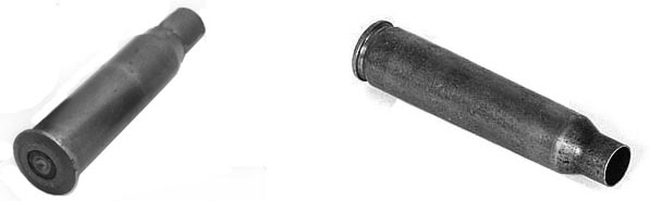
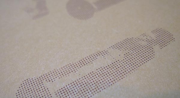
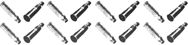
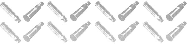
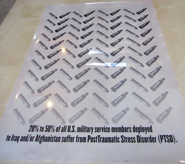
I started working with the concept of making a pattern from bullet casings, and did a bit of research to be sure I had the right kind of casing. Standard issue rifles for American GI’s are still M-16s, so I grabbed some images of the appropriate spent casings off the web through a simple Google search (or, at least, I was pretty sure they were the right ones). I brought them into Photoshop, dropped the whole document into a grayscale scheme, and amplified the contrast and levels so that the two images, which were from different photographic sources with different lighting schemes, would come closer together visually. I duplicated them to make a back-and-forth pattern, and then, using ruler guides to help with repetitive placement, made the pattern descend down the page.

I wanted a bit more context to back up the design, because I wanted to focus the print on PTSD as it specifically applied to re-deployed troops, so I went over to the IVAW website to get some of the already-researched facts that they have been using in press releases and messaging. Turns out 20 to 50 percent of deployed troops suffer from PTSD, an absolutely alarming fact! Nothing like a damning statistic to make the blood boil. I double-checked whether “post traumatic” should be one word, or two (or if it mattered), typed up the quote in a bold, sans-serif font (Knockout, one of Josh’s favorites), and placed it at the bottom of the page for weight. Everything thus far was staying simple and bold.
Then, I got really obsessed with making the bullet casings deteriorate into bit-mapped oblivion as they approached the bottom of the print, but I was having a hard time making it work. Eventually I figured it out, but not before asking for a bit of help from Josh and Mary, and a lot of trial and error. If you are not accustomed to using Photoshop (or any other consumer-level graphics program), use Google to scour forums for the techniques you are trying to use, and spend some patient time reading those forums. There are so many people out there writing helpful how-tos for software that a little time and patience will generally get you the technique you are looking to achieve… almost every piece of software I use, I taught myself how to use either by asking for help from friends or by taking the time to learn online (for “free”).
I applied my gradient, and when I exported to bitmap, I was looking at, more or less, the effect I had been trying to achieve. I was compromising a bit on my original idea, but compromise can go a long way towards reducing frustration, especially when it comes to computers, printing, and anything else that allows for one million things to go “wrong”.
I order paper from French Paper – the go-to for a lot of printers I know, or at least most of the folks in Justseeds. Usually I work small and with whatever I can get my hands on, but for this project I needed quality, thick paper in good condition (I promise French’s isn’t sponsoring me to say that – but if they wanted to send some free paper our way, we’ll sure use it!). I found a color I liked, one that mimicked the current issue camo schemes that GI’s are wearing these days, and ordered 200 sheets (about $50 plus shipping).
Mary lent a hand screenprinting at Artists Image Resource, the Pittsburgh-based screenprinting non-profit I go to when the need arises. Chances are pretty high that you don’t have an analogous printshop in your city – if not, check out some online DIY screenprinting setups, or consider doing something that involves less equipment. I got started stenciling because I didn’t have access to other ways of printing that I enjoyed. I’m forgoing a screenprinting how-to here because there are a LOT of them online that are thorough.
I was originally going to do a split color fountain on the print, to get a blend of colors that might compensate for the fact that I was only planning on running one layer of ink. It turned out that, with the bitmap fade, I got a nice variation already, so I mixed a pretty simple brown (just enough to set it apart from that out-of-the-jar color) and ran 170 prints. I only needed 130, but it goes without saying that some of them weren’t going to come out great, and it’s always nice to have extras to give away later (or try to sell on your cooperative’s website).
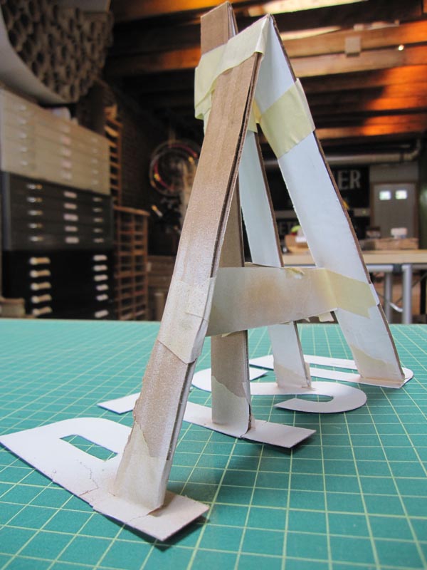
Stenciling can look predictable, especially when it’s just text, so I opted for a reversed look which would float the letters, using a misty overspray to actually apply the color around an area “masked” by my design. I cut the letters out of an old file folder, which is sturdy enough to take a lot of spraypaint over time, and I made a kind of crazy armature to hold the letters in place. I first taped the letters to the table in the spacing that I wanted, and then cut a bunch of strips of cardboard and started building a structure to hold them in place. I wanted something that wasn’t too bulky, that I could spray around, and that would keep my fingers out of the way. Usually when cutting a stencil, you want to leave bridges in key spots to float the insides of letters or designs and keep it all together: this is basically the opposite, but you still want the letters to hold in place. The cardboard strips did tweak the letters and twist them a bit, so after the initial build I found myself patching with masking tape… trial and error!
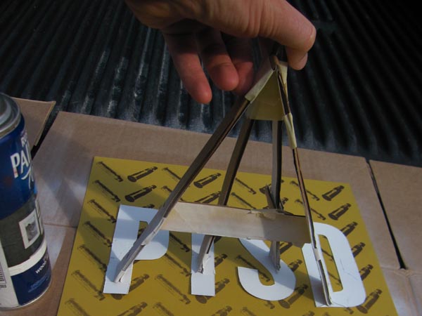
When spray-painting on paper, don’t buy cheap paint! Get something decent, and get a flat finish if you can find it in the color you want. Crappy spraypaint will do strange things, the worst of which might be clogging in the nozzle (well, actually the worst might be turning into a fireball in your hand, eh?). Look for a tip with a broad spray, and don’t go overboard – a little paint goes a LONG way on paper. In this case, I was just misting the paper, because I wanted a “ghostly” effect.
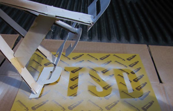
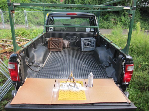
Also, screw hubris: wear a respirator mask with the right filters for sparypaint fumes. You want something that filters volatile organic compounds (VOC), not just a particulate filter. If you’re working in a controlled space and can afford a mask or can borrow one, do it! Work outside if you don’t have access to a good vent-hood, stay away from your neighbors’ open windows, food gardens, children, open flames, etc. I worked out of the back of my truck…
I ran a few variations with different colors I had, on a themed palette. I even tried using the folder I had cut the letters out of, to see if I liked a more predictable stencil after all. It’s always helpful to try some variations, you might come up with an unexpected version that you like a lot better than your first idea. Show them to people, see what reads best, what looks best…
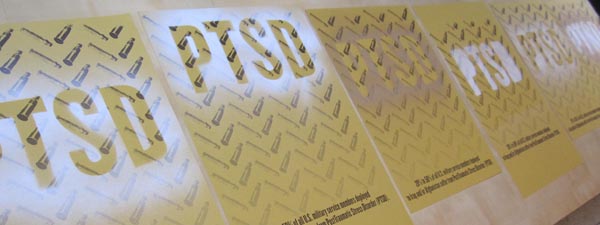
I decided to go with the first one I tried, which was a high-contrast white, set a little higher than the middle of the page, letting the pattern guide the eye down to the bad news below…. and then I got on that second layer of printing with the stencil.
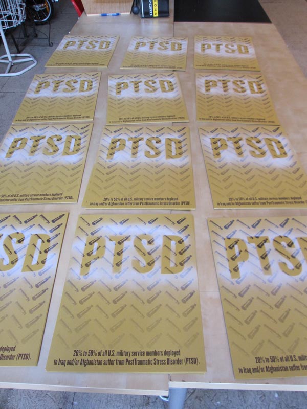
Here’s how it came out:
I hope this was helpful to folks. I think a lot of artists take certain elements of their process for granted, so even if something like this print came off as simple to execute in my mind, my friend’s fascination with the weirdo stencil armature I made had me thinking that the process would be worth sharing. Thanks for reading! And if you really like the print, you can grab one of the limited extras here… and keep an eye out for the whole portfolio, coming out this fall!
love it! was just thinking about how i’d like to see more how-to/process stuff up here
thanks for the detailed how-to explanation of a truly remarkable print. The stencil armature is ingenious. Great post and terrific resource that I will share with printmaking students.