Let’s start off the second installment of Fanon biographies with Jock McColloch’s Black Soul, White Artifact (Cambridge University, 1983), which takes the African mask metaphor further than any of the previous covers, replacing the mask with an ancient and worn African stone sculpture. Unlike the other covers deploying the masks, here it is wholly appropriate, illustrating the books title, and I assume the point that the White gaze freezes Blackness into a rigid form onto which all kinds of assumptions and baggage can be dumped.
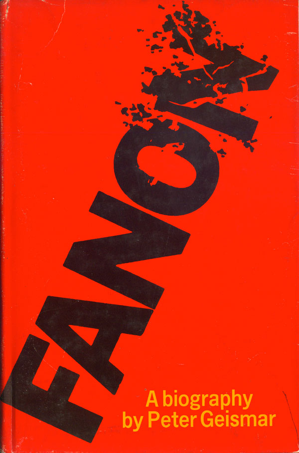
An earlier and popular study was by Peter Geismar, whose Fanon: A Biography was published in hard cover by Dial Press and mass market paperback by Grove, both in 1971. The Dial cover is striking in its simplicity. Fanon is represented only by his name, and the violence he studied and advocated for is suggested by both the explosion of the O and N, but also by the black text on a stark red background. The paperback is more accessible, with a portrait of Fanon framed in the center, and his name in groovy, rounded and flowing blue/green duotone letters. A subtitle is also added: The Revolutionary as Prophet, making the book seem very “now.”

A more recent biography is Alice Cherki’s Fanon: A Portrait. In 2000 the book was published in France by Seuil (the original publisher of Fanon himself), and then in 2006 it was translated into English and published by Cornell University. Both covers rely on cropped and fuzzy portraits, but the French book is much more traditional and clean, while the English attempts to capture some of the edginess of Fanon with his name in a grunge font and his photo manipulated to look like a surveillance camera shot.


The next four covers are all rooted in the same portrait of Fanon, I believe a photo of him later in life. Anthony Alessandrini’s Frantz Fanon: Critical Perspectives (Routledge, 199) is my favorite, with the photo pressing out from the page, unsymmetrically cropped, and largely obscured by Fanon’s name. The deep green monotoning of the title and image are also very effective.
Alessandro Aruffo and Giovanni Pirelli’s Fanon (Erre Emme Edizioni, 1994) is much less interesting, with the same photograph stuck floating in the middle of a cover which is somehow both empty and cluttered. The page is largely blank, but here and there are bits of graphic and textual information, including two inscrutable purple crayon lines through the center, few of them giving the viewer any useful information to assess the value of the book.


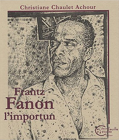
Below the same photograph is used as the basis for two very different illustrations. The cover of Christine Chaulet Achour’s Frantz Fanon l’importun (Chevre Feuille Etoilee) is built around a realistic but stylistically expressionistic rendering of the Fanon portrait by a D. Martinez. The drawing is accomplished, and a refreshing change from all the photographic representations. Deborah Wyrick’s Fanon for Beginners features a very different drawing, one much more comic in style, and while possibly more accessible to a general public (which I assume was the intention), is also less effective at capturing a sense of who Fanon was.

In the category of “we need a cover quick, it doesn’t matter what it looks like!” we have the below two books. On the left is Lewis Gordon’s Fanon and the Crisis of European Man (Routledge, 1995). The stick figure cut out filled with a montage of a map and a sliver of Ranon’s face should never have been made, never mind put on a book cover.
Max Silverman’s Frantz Fanon’s Black Skin White Masks (Manchester University, 2006) is exceptional in just how ugly it is. The blurry inverting of the face on the cover is unnerving, but not in a good way. These are great examples of academic publishing, where absolutely no one is expected to buy (or possibly even read) the book, so why invest anything in what it looks like?


And to round out this week, two covers for Renate Zahar’s Frantz Fanon: Colonialism and Alienation. On the left is the 1974 edition published by Monthly Review. By featuring a photo it diverges in design from the Monthly Review covers of Fanon’s books themselves, which strickly stuck to graphically playing with the type. But this cover works, the blown-up and heavily cropped portrait is separated from the title and author by a thin red line, putting the image in a tight square and giving the sense that Fanon is bursting out of the book.
The Mexican edition, published by Siglo Veinte in 1976, is also based on squares, but here they are largely decorative, building a frame around the central image, a montage of anxious and unhappy children. The square conceit seems unnecessary, yet at the same time the image is so creepy that I wouldn’t want it taking up any more room on the cover.


Next Monday will be the last look at Fanon covers. Stay tuned.