
In Signal:01, Alec Dunn and I ran an interview with Rufus Segar, the graphic designer who did the vast majority of the covers for the British monthly journal Anarchy. Not to be confused with the polemical, and somewhat unhinged, US publication Anarchy: a Journal of Desire Armed, this Anarchy was edited by Colin Ward and published by Freedom Press. It was a strange animal—very much a product of post-war UK anarchist intellectual thought, but also aimed at a much broader intellectual audience.
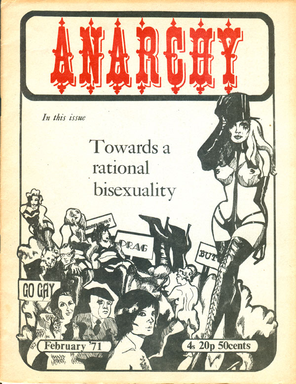
In 1970, Ward quit as editor, and Segar jumped ship soon after. Anarchy as it existed (a very consistent—in content and aesthetics—monthly half-letter sized magazine) dissolved, and in February 1971 a new, second series of Anarchy begun. A significant change is immediately apparent. Although Segar’s cover where often graphically inventive and challenging, they were never lurid or attempting to shock, but the first cover of the new series (by Christine Charlton) throws up a near naked woman with long black gloves, boots, a top hat, and an impossibly thin waist. She stands to the side and above a pile of entangled bodies—some in lingerie, others ambiguously gendered—and a pair of high heeled feet sticking up from the back.
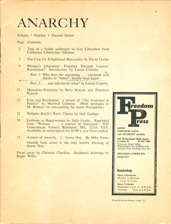
The chaos of the cover begs the question of what exactly the understated title, “Towards a rational bisexuality,” actually means? Throw the baroque and carnivalesque “Anarchy” on top and it’s pretty clear this publication has been taken over by a new generation of anarchists. Although Freedom was still the publisher, Ward was replaced by an editorial collective (unnamed in this issue) and the content follows from a much more youthful, post-New Left spirit, with a focus on sexual liberation via critiques of gender, the women’s liberation movement, and discussions of Wilhelm Reich.
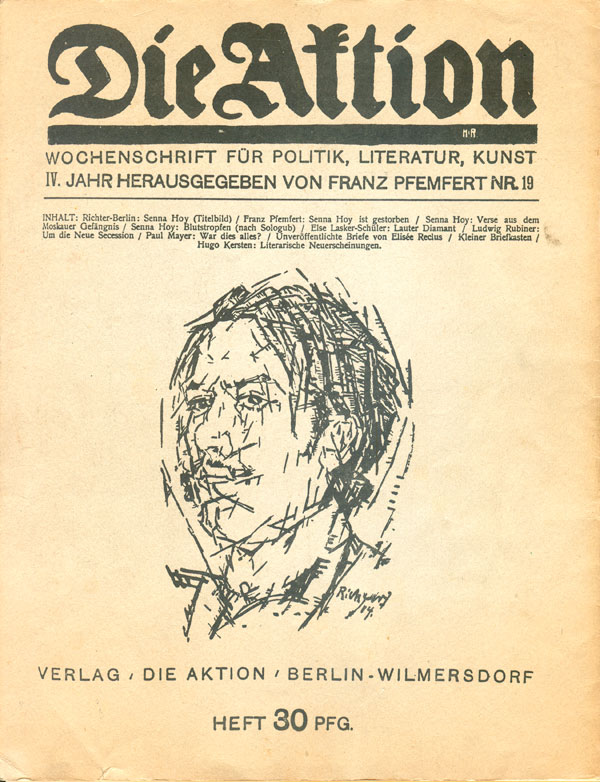
An inside back cover illustration by Arthur Moyse solidifies the page this new Anarchy turned. Part underground comic, part naive scribble, part proto-punk editorial cartoon, the image mixes hidden phalluses with surrealist mergers, send ups of state and religious authority with Gothic images of death. The back cover is a reprint of a cover of the German radical WWI-era publication Die Aktion. On the cover (on the back cover) is an illustration of the anarchist poet Senna Hoy by Heinrich Richter-Berlin. Senna Hoy features in the first of multiple installments of this new Anarchy‘s “Aspects of Anarchy” series.
Although the content has changed, the aesthetics within the magazine a largely similar to the first series, with simple typeset columns and a couple small illustrations on a cheap newsprint stock.
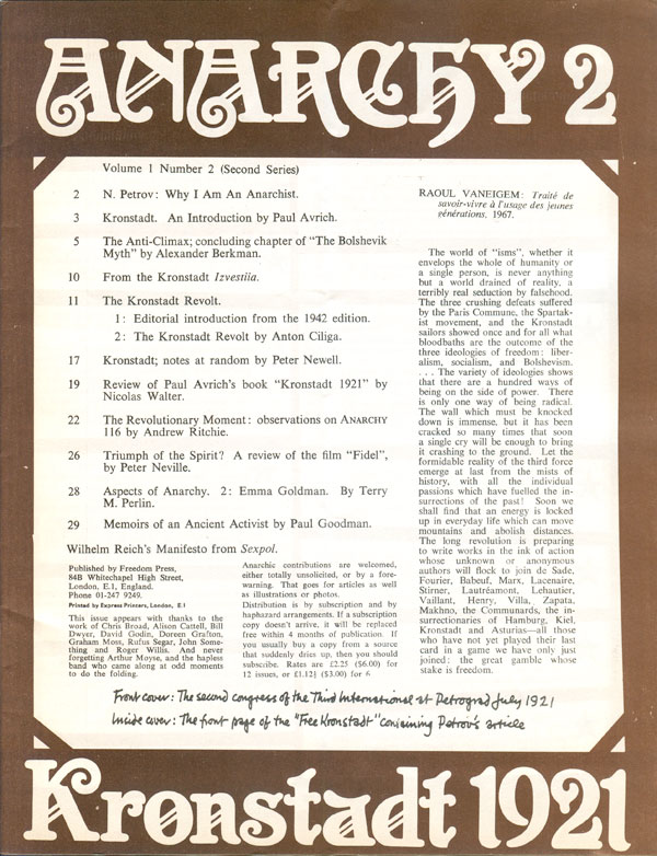
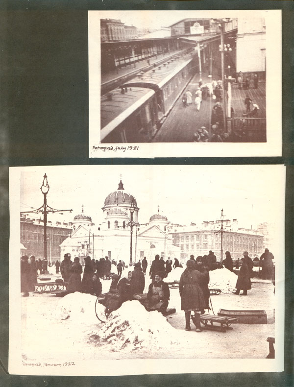
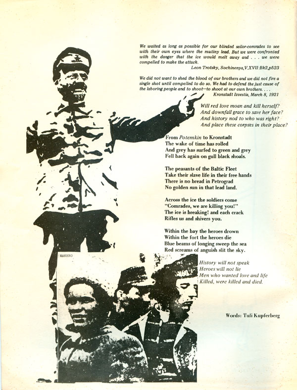
The second issue takes a different tack with the cover, using an entirely new font for the masthead and superimposing it on an image of the issue’s subject: Kronstadt 1921. The image wraps around the back, making a nice panoramic image when the issue is opened. A cover designer is not listed, but it is possible that Segar was involved in this issue, as he is thanked inside.
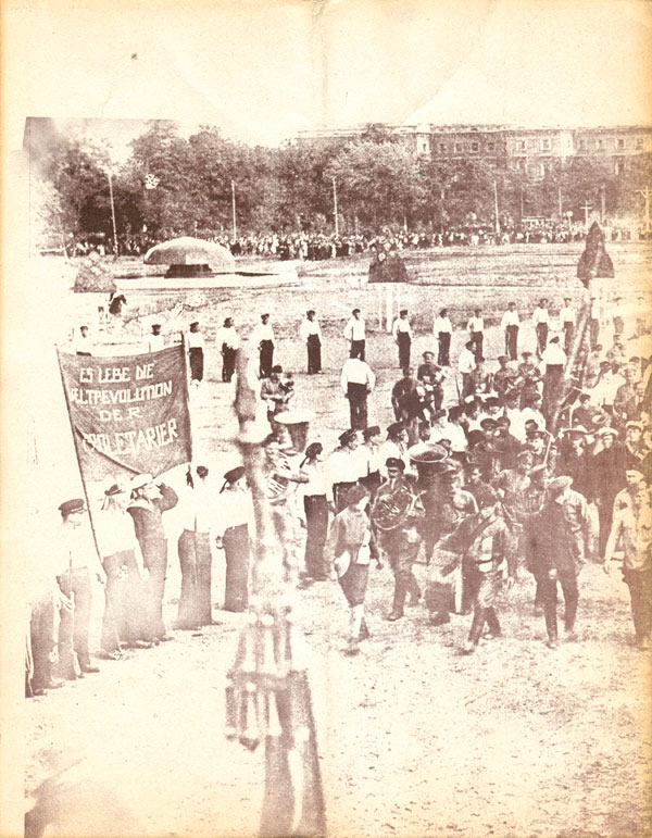
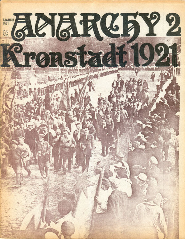
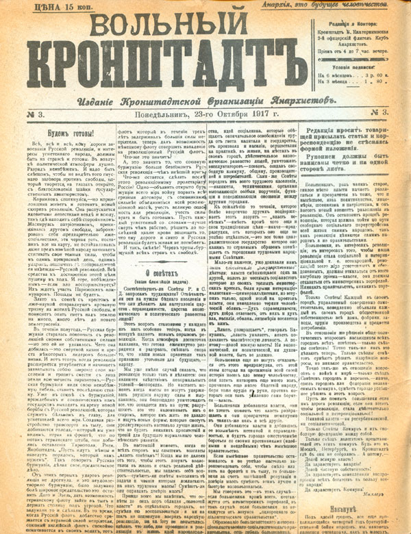
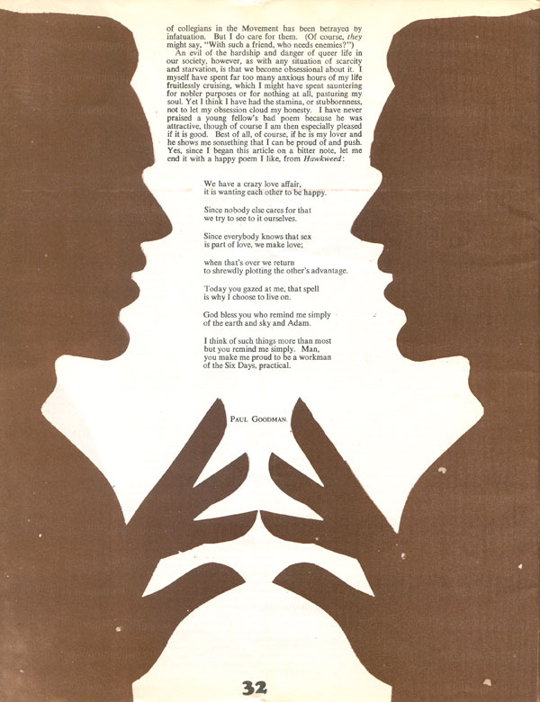
The inside front cover is a reproduction of the front page of the third issue of Free Krondstadt. With the issue’s focus on such a classic anarchist subject, and content by Paul Avrich, Alexander Berkman, and about Emma Goldman, it is a less extreme break with the older Anarchy, but the new editorial direction comes out in content by Raoul Vaneigem, Wilhelm Reich again, and US New Left anarchist Paul Goodman.
A much stronger new aesthetic begins to creep in here too, with the traditional typeset columns filling the middle twenty four pages, but the outer 12 pages are much more free-flowing in layout, with loose paste-ups, the same brown and black duotone as the cover, integrated illustrations, photographs, and broader range of fonts and handwriting.
The Paul Goodman article in particular is striking, with Cooper Black (a font seemingly forever stained a “70s” until being re-popularized more recently by American Apparel) titles and giant mirror image figures framing the text.

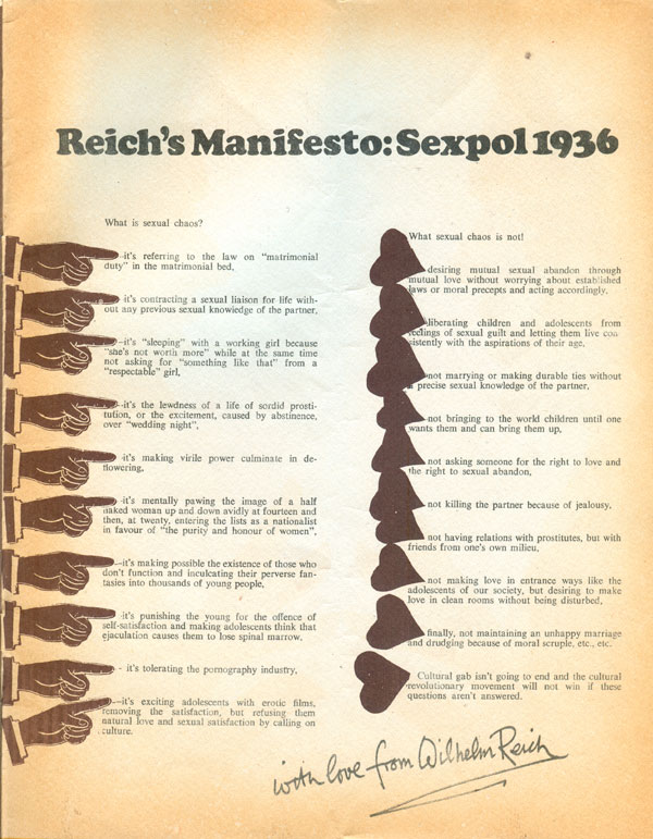
Reich reappearing in the second issue compounds the new focus on sexual liberation. Aesthetically, the page is interesting, with roughly-placed hearts and pointing fingers acting as bullet points. The fingers are clip-art from another era, and illustrate Anarchy‘s turn from an intellectually inquisitive yet aesthetically clean publication to a more post-modern pastiche picking up lessons from the 60s underground press, but a half a decade late.
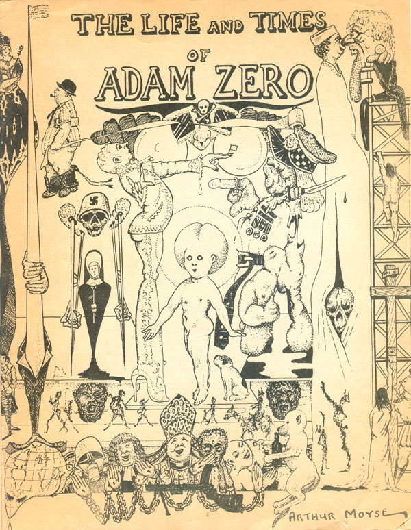
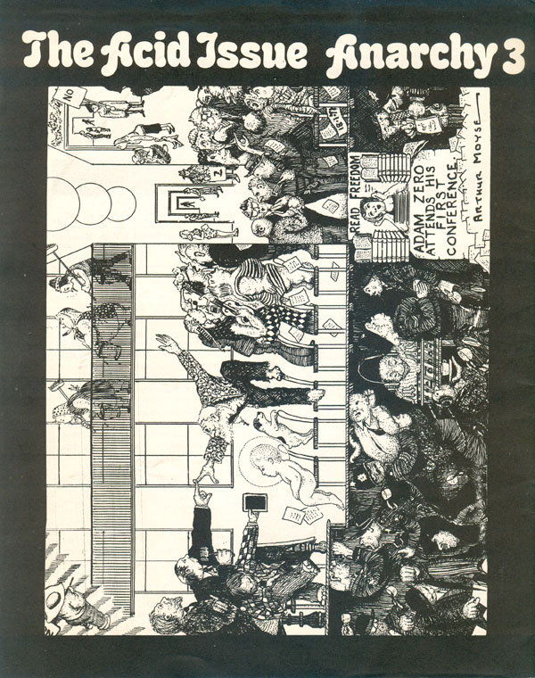
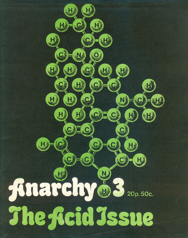
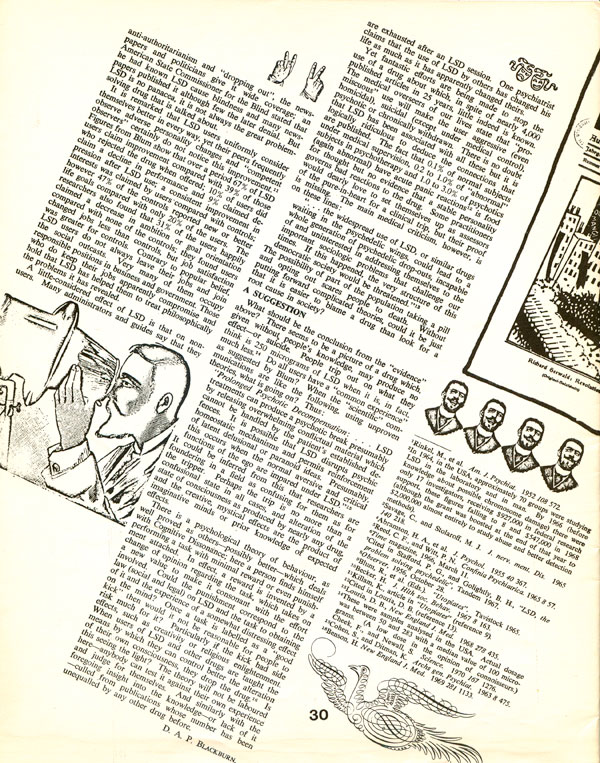
Anarchy #3 features the best cover so fair, a clean and engaging design illustrating the chemical composition of the issue’s theme, LSD. Funny that the “trippy” issue should have the cleanest and best designed cover. The back cover more than makes up for it with another wild Arthur Moyse comic featuring “Adam Zero,” which I think is the creepy, haloed baby to the center left of the image.
The interior design continues to break from traditional layout, with the columns falling to the right and old clip art thrown in to break up space. A strange brew of 1910s aesthetics and a more psychedelic placement.
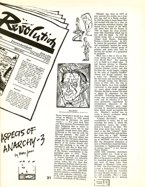
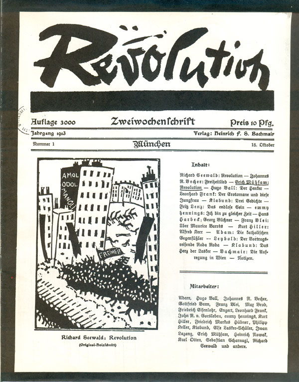
The inside back cover is another reprint of a cover of a historical revolutionary publication, this time a 1913 issue of the German paper Revolution, featuring a cover illustration by Richard Seewald of a mass of people marching under the black flag of “Freiheit”—freedom. Revolution was a Munich based paper sympathetic to anarchism that published Erich Mühsam, among others.
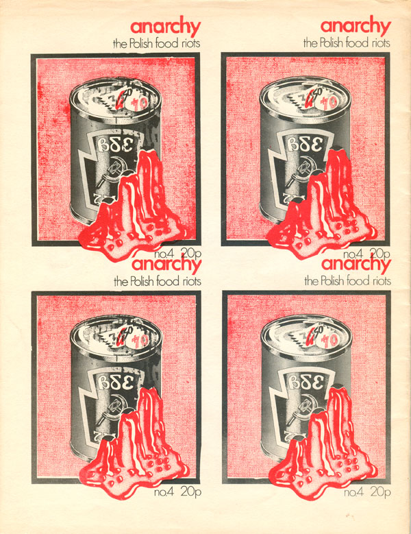
Issue #4 has another well designed cover (by Dave McWhinnie), this one illustrating Poland’s growing revolt against Communism. A twist on Warhol’s soup can, Soviet Communism is shown to be just as monolithic a commodity as Campbell’s, but in Poland its purchase was enforced by bullets. The titling is understated and well done, explaining what the publication is without getting in the way. The back cover 4-up reproduction of the front is a nice touch, especially the decision to multiply the entire cover, and not just the can. This reads to me as a tongue in cheek poke at the fact that Anarchy is a commodity as well.
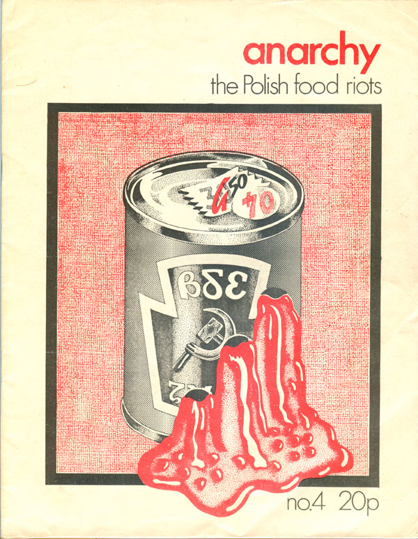
The inside front cover features my new favorite illustration, a clown car overflowing with “Petit Bourgeois Anarchists on Ego Trip [sic].” I love the old school anarchist with the pointy hat in the back, looking all sad at where anarchism is going!

Next week I’ll look at the next round of issues. This second series of Anarchy ran for 38 issues from 1971 to 1986, so I’ll probably be making my way through those over the next month or so. As you can see, the editorial goal of an issue a month never panned out after these first couple, they only put out an average of a little over two issues a year. I have most of the issues, but the few I’m missing Anarchy collective member and anarchist artist handy man (in the 80s he regularly did artwork for a wide range of anarchist groups and publications) Phil Ruff. Thanks Phil!


Josh, thanks for writing this fascinating series of posts! It sounds like you have these in print; do you know if there are plans afoot to get them scanned or archived by anyone, maybe a radical-friendly university library program or through the IAS?