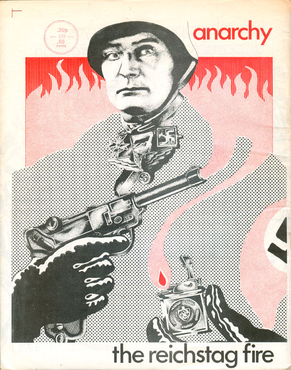
Welcome back to part two of our tour through the second series of the UK Anarchy magazine. Click HERE to see last week’s entry. Let’s pick up where we left off, with issue #5. It is with this issue that we really begin to see the disorganization, or possibly just disagreements, within the editorial collective which lead to decisions such as not only failing to include an issue number on the cover (a fairly regular occurrence, as you shall see), but on this particular issue not even including the title of the magazine! I suspect at some point, either on purpose or by mistake, the back and front covers were swapped, so Dave McWhinnie’s stylish zipatone and pointillist montage on the Reichstag fire (which features the title Anarchy) got put on the back.
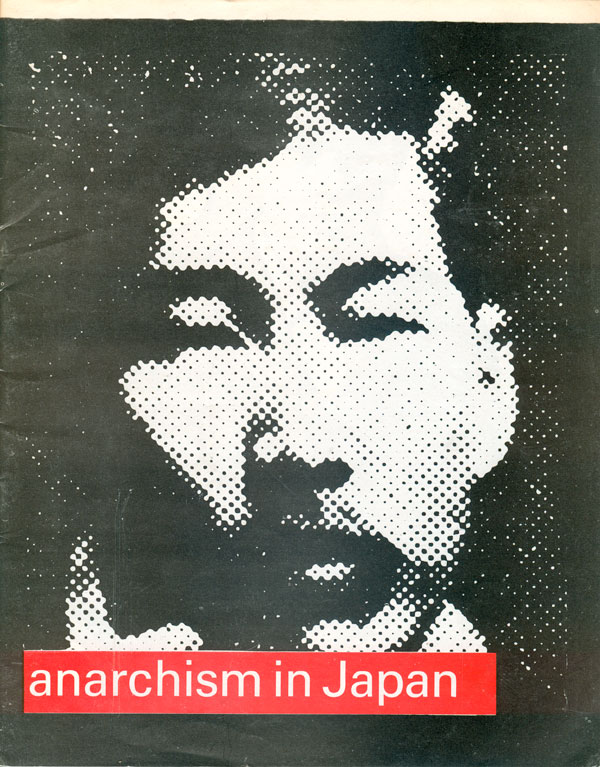
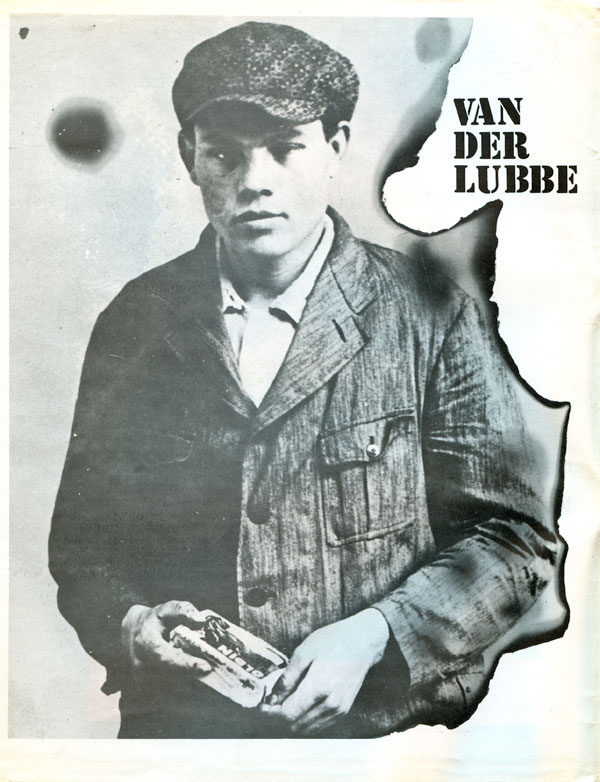
I suspect that starting with #4, and solidified with this issue, there was a change in the editorial collective. The magazine no longer appears to be published by Freedom Press (although it is still connected through address and printing), and there is a distinct turn away from the counter-cultural concerns of the first couple issues and back to more traditional anarchist material, particularly a focus in on anarchist history (with a long article attempting to exonerate anarchist Marinus van der Lubbe’s burning of the Reichstag from Nazi influence, a two part piece on the history of anarchism in Japan, and a reprint of Bakunin’s writing on the Paris Commune). This historical turn seems to have effected a broader swath of the UK anarchist scene, with similar movements happening in the Black Flag camp, which would solidify with Stuart Christie and Albert Meltzer’s launch of Cienfuegos Press. All three of the historical articles in this issue would have comfortably fit in the forthcoming Cienfuegos Anarchist Review. (The covers of which were featured in this earlier JBbTC post HERE and HERE.)
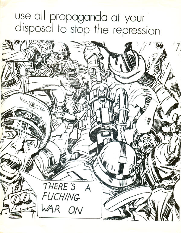
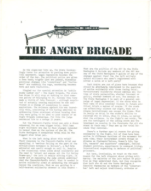
While the content was becoming more “traditional,” the aesthetics were still stuck in an in-between phase, with classical typesetting making up much of the publication, but Dave McWhinnie and others’ hip and counter-cultural style creeping in, and even framing everything else. This is also the first issue where pictures of guns begin showing up in all the little blank spaces in the layout. It’s no surprise that this is also the moment that the Angry Brigade bursts onto the UK scene, re-popularizing ideas of “propaganda of the deed” and “revolutionary violence.”
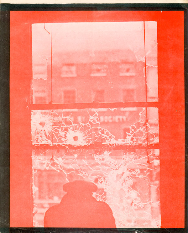
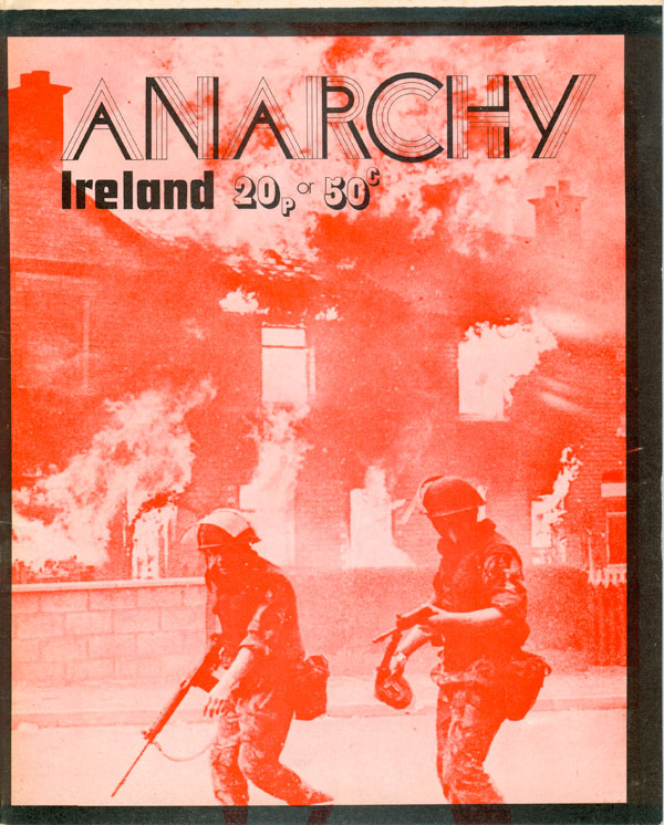
With the sixth issue of Anarchy, we see the return of the title to the cover—in a snazzy new logotype!—but still no issue number. The focus here is on Ireland, and the red-printed photos of military, fires, and broken windows leave no ambivalence about where the editorial collective places the blame for the troubles. At the same time the celebration of guns and guerrilla warfare inside the magazine makes for a strange bedfellow with the content, which largely focuses on the actions of People’s Democracy, a N. Ireland left grouping with roots in non-violence and sympathies with anarchism.
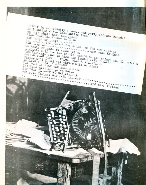
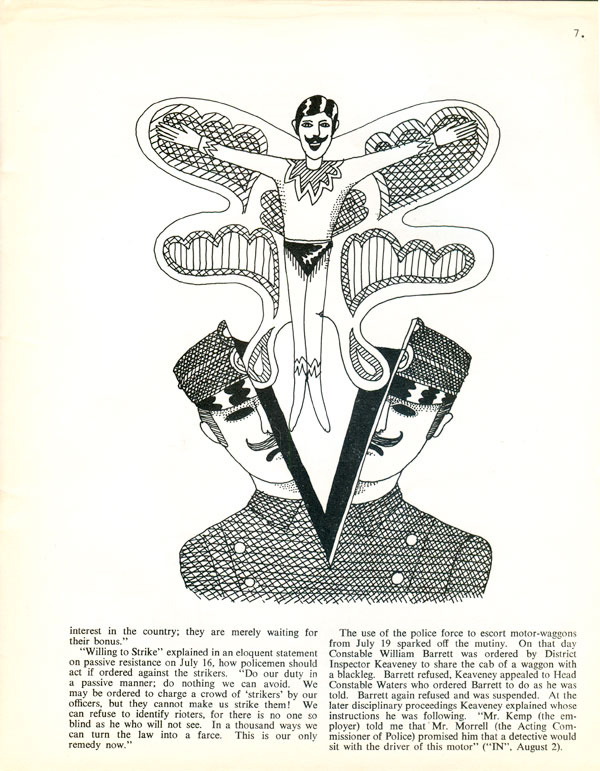
Design-wise we still have a nice mix of the proto-punk and the 60s counter-cultural. Below to the left is the inside front cover, a typewritten and photo montage that would be more than comfortable on a Crass record a couple years later. On the right an internal illustration (by Robert McKay, I believe) for a story about the 1907 Belfast Police Mutiny, where the policeman is a dead cocoon, just waiting for the splendid and glorious butterfly of the liberated mutinous ex-cop to emerge! It’s an amazing image, a conversion of cops into little, winged Freddie Mercurys.
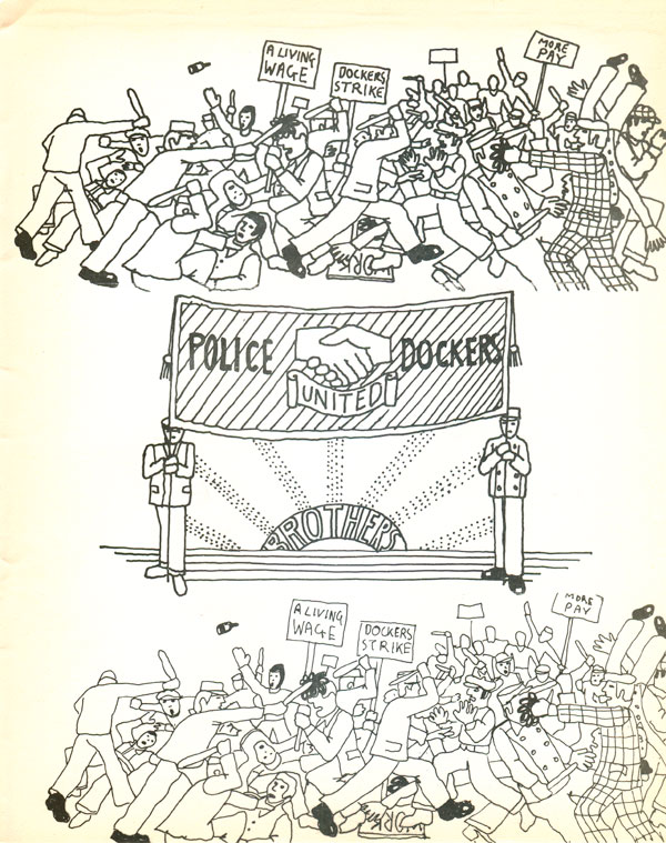
Robert McKay also illustrates the conflict between police and dockers in N. Ireland a couple pages later, and although not as fabulous as the illustration above, there is a real charm to the naively drawn image of a giant brawl. Its reproduction above and below the unity banner counterpoint is less convincing, and it might have been better to give each image more room to breath.
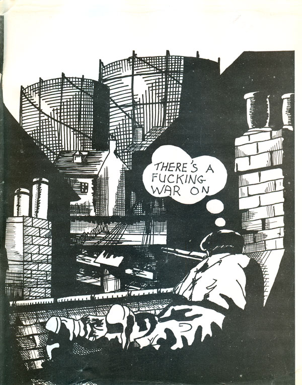
The inside back cover best illustrates the increasing ambiguity and ambivalence of Anarchy’s relationship to violence. The figure here is a sniper on a rooftop, giving thought to his place within a warzone—in fact his very existence acknowledges that he is in a warzone. But it is completely unclear with whom this figure sides. Is this a British soldier, taking aim at Republicans, or even civilians? Is this a member of the I.R.A., looking to shoot Protestant militia? Or is this a fantasy projected by the illustrator or members of Anarchy, of a lone guerrilla, motivated by antiauthoritarian politics and a love of the people?
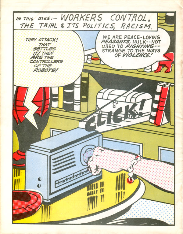
The next issue (#7, although you wouldn’t know it from the cover) returns to zipatone, but rather than McWhinnie’s nuanced collage illustrations we have strait-up detourned comics. The back cover appears to be from a Hulk comic, I’m not sure about the front. The detournement is minimal, consisting of the addition of word bubbles filled with awkwardly written text.I’m usually a sucker for giant, enlarged sections of old comic books, but this really doesn’t do much. It’s also an interesting image choice given this is the first cover to jump from 2 color printing to 4. It seems like a waste of CMYK process.
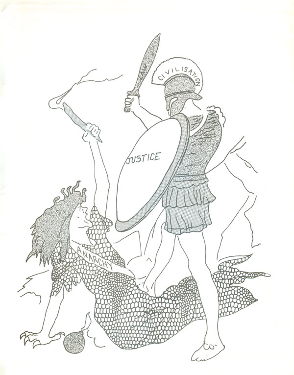
The inside cover (left) continues to flirt with violence and celebration of the guerrilla, while inside back cover is just strange. It appears to be a redrawing of some sort of late nineteenth century editorial engraving that would have been in a mainstream publication, with Anarchy embodies as a reptilian Medusa being slain by the heroic Civilization. I wonder if in the context of the big trial around the Angry Brigade in London this image was used here to show the connections between historical and contemporary witch hunting on anarchists, but that’s only a guess.
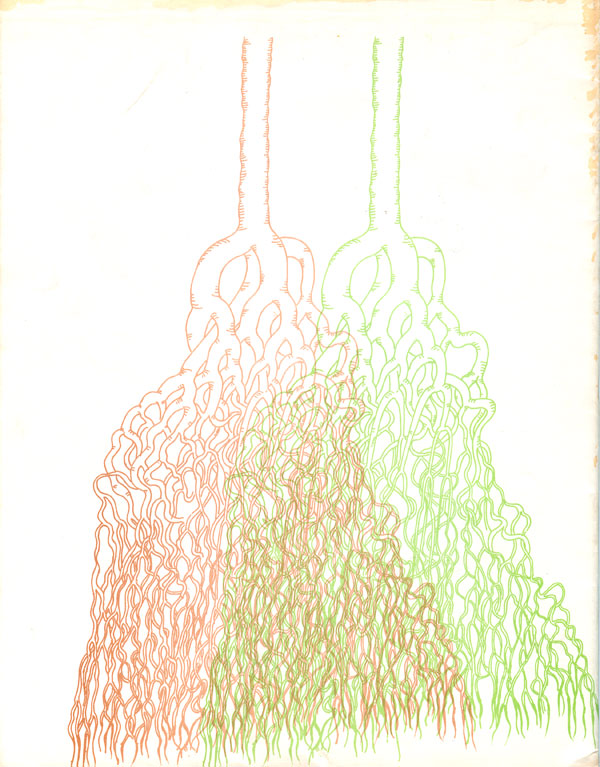
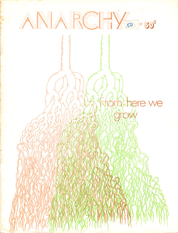
With issue 8 we’re back to a duotoned cover, but it’s nice that neither color is black. I’m quite attracted to the brown and green roots, especially where the overlap in the center. Once again there is no issue number on the cover anywhere, which makes me think by this point it’s a conscious decision, maybe an attempt to give each issue a longer shelf life as the collective struggled to get them out on time and seems to have continually been way behind schedule. This issue was guest edited by the Friends of Malatesta group in Buffalo, NY and is very US centric, including material on Sitting Bull, Thoreau, a piece by David Weick, and one of the first re-publications of an excerpt from the very influential 70s text “Anti-Mass Methods for Organizing Collectives.”
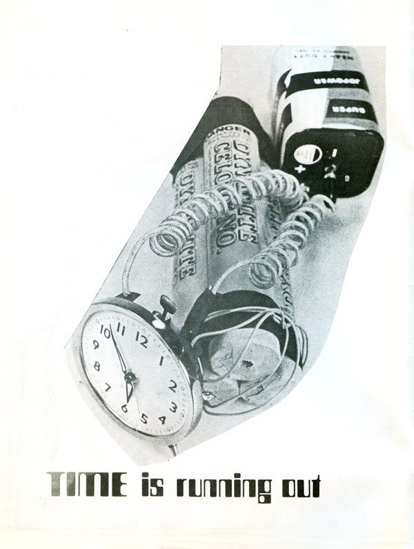
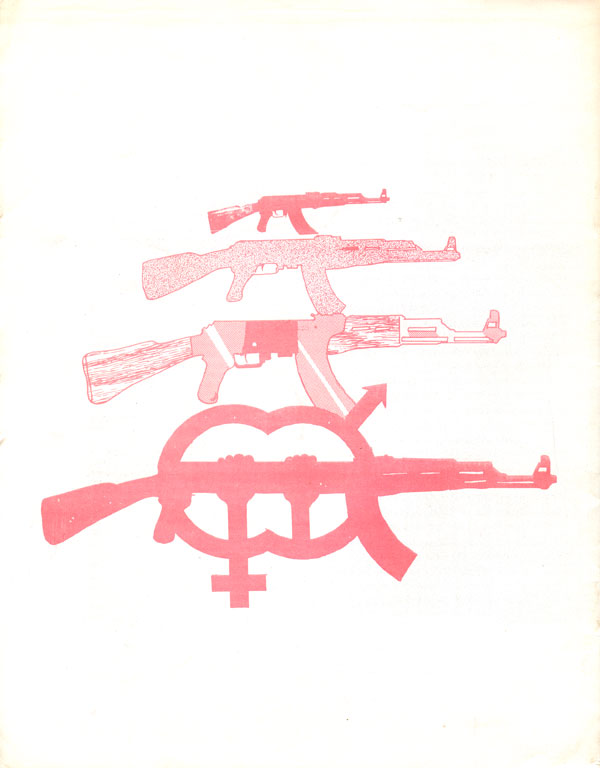
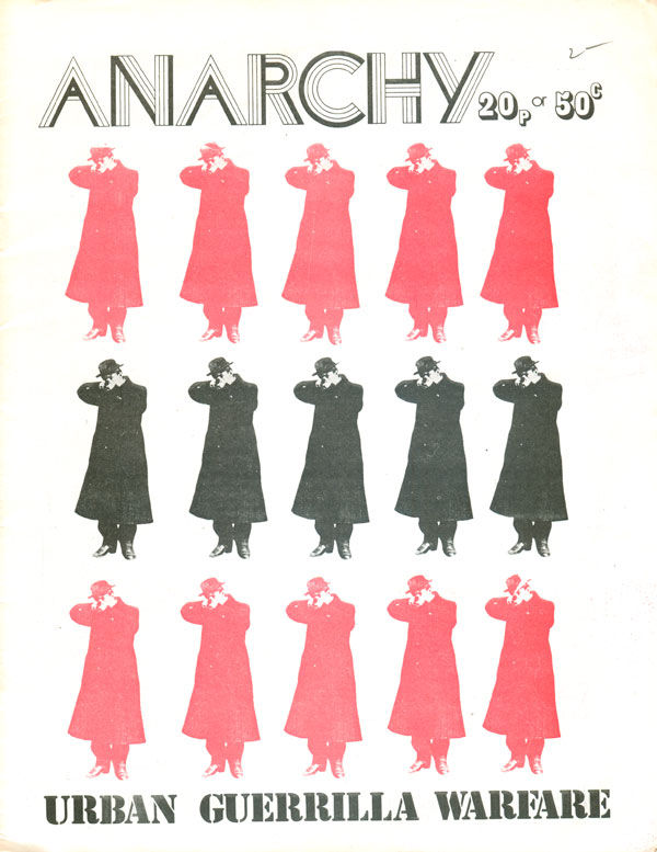
The gloves are off with Anarchy #9! No more beating around the bush, their full-blown support for the guerrilla is on full display here. French illegalist Jules Bonnot pointing a gun at the reader becomes a decorative motif on the front cover, labeled “Urban Guerrilla Warfare” in militarized stencil font. The back cover shows a AK-47 convert into the logo of the Angry Brigade.
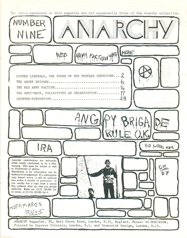
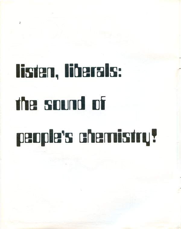
Guns litter the insides, as well as shout outs to the Red Army Faction, IRA, Wethermen, Tupamaros, the Japanese Red Army, and Mau Mau. While editorially there is a claim to be “initiating real debate on the question of revolutionary violence,” it’s interesting that the imagery is so gleeful that it’s hard to imagine this issue as anything less than a call to arms. While the pictures of guns everywhere gets tiresome, full pages laid out with calls to listen to “the sound of people’s chemistry!” in large and clean in a pseudo-computer-y font borders on brilliant agit-prop. It’s hard not to get caught up in the excitement.
Stay tuned next week for more Anarchy!