
For this fourth look into the book covers of Seven Seas, I’m going to just run through the rest of the titles I’ve been able to find. (To see the three previous entries about this publisher, click HERE.) Lets start with Johannes R. Becher’s Farewell (1970). The tinted photo and ostentatious frame evoke the early 20th century setting of the novel (and also maybe Haight-Ashbury?), while the cut out and removed head of the young boy toy with the idea of “farewell.” By this point, 1970, Seven Seas designer Lothar Reher appears to be extremely confident in his craft, and only does the minimal necessary in text and image work to pull a successful cover together. All the covers here are by him unless otherwise noted.
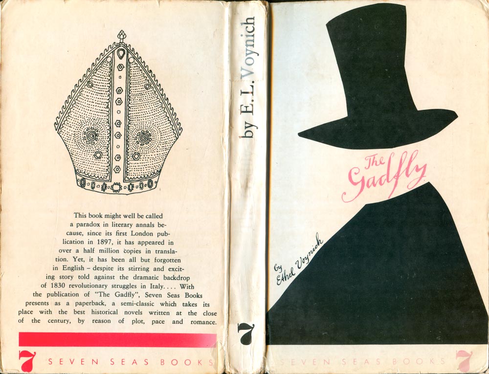
The cover of Ethel L. Voynich’s The Gadfly (1967) is decidedly simple, yet extremely strong. The rough cut black shapes become a top hat and cape, evoking the 19th century setting of the novel, while the miter on the back places the book in Italy. The front image is definitely creepy, and it’s amazing how such simple shapes can break up the space and come together into such a powerful image.
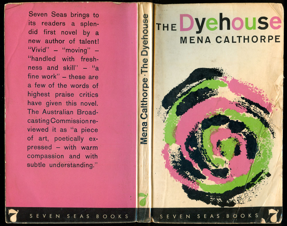
Mena Calthorpe’s The Dyehouse (1964) is an Australian working class novel, and the cover is most notable for the bold colors and combinations, with the intense green and pink swirling in a mass that is both alluring and vomitous. What I love about this book’s design is the title page, which is inexplicably printed in a bright pink to match the cover, and is the only color in the entire interior of the book.

The Forest by William Pomeroy (1965) is the tale of an American involved in the guerrilla war in the Philippines. The cover successfully pulls the viewer into a dense forest, and the scratchy quality of the image and lines adds a bit of foreboding. The line quality actually reminds me of the work of Kevin Pyle (artist and illustrator of political comics like World War 3 Illustrated and kids books such as Blindspot).
Rolf Schneider’s Deep Waters (1968) is an East German crime novel, and Reher has really captured a strong noir feeling, with the montaged buildings giving the cover an Eastern Bloc modernist touch. The buildings are almost half-heartily placed around the center circle, but it works visually as it echoes the crooked and broken body. The use of a very minimal amount of red—only for the lines in the target—turns the entire operation sinister. The book appears to be a bit of an anomaly for Seven Seas, being a German popular book translated for an English audience, rather than the more standard reprinting and distribution of international, yet heavily anglo, political texts and novels with communist leanings.


The below two covers are nothing particularly special, but another example of the flexibility of Reher as a designer, successfully aping modernism on the left, and the more organic and expressionist on the right. The scratchy and uneven look of the Kaufman cover is neither intentional nor part of the design, but instead the product of the peeling off of the top layer of mylar from the cover. All Seven Seas books were printed in the GDR, and it appears that it was standard to give them a gloss coat which was not a finish on the paper (as is standard in printing today) or a coating printed onto the page, but instead a layer of thin plastic which was used to cover and coat the entire book. As that plastic coating ages, it begins to crack and come loose from the cover, often pulling pieces of the printed image with it. You can see the same phenomenon (although not as severe) above in the Schneider cover with the whitish half circles on the left side.


It appears as if throughout the period Seven Seas were publishing they had a direct relationship with International Publishers, the primary publishing wing of the Communist Party, USA. A small percentage of the output from both publishers, at least from 1969-78, was both designed and produced in the GDR. The basic design, by Lothar Reher, is exactly the same as the Seven Seas covers, but the text and logo in bottom stripe is replaced by “International Publishers” and their logo. The books are also clearly produced by the same press as the Seven Seas books, as they have the identical plastic coating which so easily cracks and peels off with age. The Montagu, Brecht, and Eisler books below are all International titles, but produced by Seven Seas. Although I don’t have copies of the actual German editions, I assume they are identical except for the name and logo at the bottom. The Eisler cover was designed by Klaus Krüger, one of the rare titles not put in the able hands of Lothar Reher.


Then I found this one interesting glitch in the above theory, which is DuBois’ John Brown, which was published by both Seven Seas (below left) and International (below right), but the two editions differ radically in design and material production. Possibly the above were Seven Seas books which were licensed to International for US sales and distribution, while the DuBois’ title is the opposite, an International Publishers book which Seven Seas reprinted specifically for European audiences. Regardless, it is also an anomaly in as much as the US cover is actually superior. Very strange considering how accomplished Reher is, and how many terrible looking books International has put out over the years!


Once again, I’m not going to do a full bibliography of these titles here because most of them are listed on 50 Watts HERE. If you have any questions about titles not there, or any other comments, just drop me a note at josh [at] justseeds.org.